Critical Exploits. Interrogating Infrastructure
Posted in: Uncategorized



Gestores da comunicação mundial, seus problemas acabaram! Saibam aqui no sexto CREEKS: creative geeks o que as agências tem a aprender com as empresas de software. Quais as diferenças no processo de trabalho? É possível misturar os prazos da publicidade com as incertezas do software? Dá para fazer um site, hospedar num plano de derreal e anunciar no Luciano Huck?
Nossos especialistas Cris Dias, Daniel Bottas, Daniel Sollero, Dado Tronolone, Mariana Malanconi e Vinicius Melo debatem o assunto e chegam a conclusões incríveis e indispensáveis para este mercado sempre em transição.
O CREEKS: creative geeks é gravado ao vivo toda quinta, 22h, em creeks.tv. Você pode assistir a gravação e mandar perguntas e palpites usando os comentários da transmissão ao vivo do YouTube.
 Post originalmente publicado no Brainstorm #9
Twitter | Facebook | Contato | Anuncie
Quem se impressionou com o Content Aware do CS5, não deve esperar mais nada para ver Bryan O’Neil Hughes, Gerente de Produto do Photoshop, falar frases hipnóticas no vídeo acima.
Ele mostra a evolução do Content Aware, e não é só essa coisa de estica e puxa. Preste atenção na parte em que ele seleciona – sem trabalho algum – uma moça de vermelho e arrasta para outro lugar
Pra você que já passou horas fazendo path no Photoshop, é a realização de suas preces. Tenho certeza que quando o mundo acabar vamos pagar por esse tipo de bruxaria.
 Post originalmente publicado no Brainstorm #9
Twitter | Facebook | Contato | Anuncie
Tudo começou com a animação que imortalizou de vez a pergunta: What does Marcellus Wallace look like? Alguns dizem que a linguagem foi inventada no Brasil, 4 anos antes disso. Chupada ou cultura do remix você já viu animações estilo kinetic type em uns 200 outros vídeos diferentes e ficou com vontade de fazer um? Seus problemas acabaram!
Seguindo a máxima do software livre de coçar sua própria coceira o estudante Scott Garner precisava de uma animação para um trabalho do curso de motion design e criou um software que pega um arquivo mp3 e outro txt com as marcações de tempo e gera uma animação com o trecho de filme ou música que você preferir, o TypeStar, disponível para baixar no site.
É claro que (ainda?) não dá para fazer nada no estilo dos clássicos do kinetic type mas quem sabe já dá para você montar alguma coisa com um trecho de Xuxa em O Mistério de Feiurinha. Ou alguém aí se candidata a montar o tema do BraincastTV?
Via letsblogar, via Massa Cultural.
 Post originalmente publicado no Brainstorm #9
Twitter | Contato | Anuncie
Veja a ironia das coisas. Ontem, que foi o lançamento oficial do Windows 7, a Apple mandou pro ar três novos comerciais da extensa campanha “Get a Mac”, cutucando, é claro, o novo sistema operacional da Microsoft. Você pode assistir os três no player abaixo, na sequencia:
Já a Microsoft, em sua campanha para o Windows 7, reforça a atuação dos usuários no desenvolvimento do novo produto, falando de ideias e colaboração. Criação da Crispin Porter + Bogusky.
A briga entre Apple e Microsoft ganha mais esse capítulo, no exato momento em que o Windows 7 está sendo considerado o melhor sistema operacional da empresa de Redmond. OK, pode não ser um grande elogio pra quem antes tinha o Vista no mercado, mas definitivamente o novo Windows coloca a Microsoft novamente nos trilhos.
Já a Apple, acredita que não precisa fazer mais nada além de piadas com os velhos problemas e a falta de confiabilidade do Windows. A campanha “Get a Mac” rendeu excelentes momentos, mas a fórmula já cansou. Sinais já demonstrados nas inciativas anteriores com o conceito.

Não é uma discussão para fanboys de um sistema ou de outro. Eu mesmo sou usuário de Mac e PC em diferentes momentos do dia. Não largo meu MacBook por nada, mas por outro lado encontrei um Windows 7 leve e bonito impossível de imaginar em anos anteriores. Como afirmou a Wired em sua análise, 7 é o número da sorte da Microsoft.
É uma questão de comunicação, de futuro. Até quando o tom arrogante vai continuar sustentando o ponto da Apple? Longe de ser politicamente correto e de querer que a maçã de Cupertino siga o rumo paz e amor e sustentabilidade, como eu disse, “Get a Mac” rendeu comerciais hilários e importantes nessa briga. Mas juro que gostaria de ver a TBWA\Media Arts Lab com um novo briefing nas mãos.
 Post originalmente publicado no Brainstorm #9
Twitter | Contato | Anuncie
Alan Dunning, Morley Hollenberg and Paul Woodrow are working since 1996 on the Einstein’s Brain, a project that explores how the brain can act as an interface between bodies and worlds in flux, that examines the idea of the world as a construct sustained through neurological processes. In collaboration with scientists, artists and technologists from around the world the team is investigating ideas about consciousness and embodiment through the realization of virtual environments and the construction of surrogate bodies.
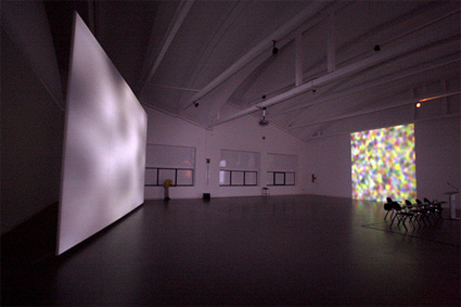
The Canadian collective has a very uncanny and captivating installation on view until mid-January at LABoral Centro de Arte y Creación Industrial. in Gijón (Spain.)
Ghosts in the Machine, uses the ideas inherent in Electronic Voice Phenomenon (EVP) to examine ways in which we construct the world and extends it to the visual. EVP is the recording of errant noises or voices that have no explainable or physical source of origin. For some, the voices are subjective interpretations (similar to some form of anthropomorphisation) of what are actually random patterns of sound. For others, the voices are genuinely mysterious, opening up for example the possibility to communicate with other realms.
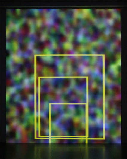
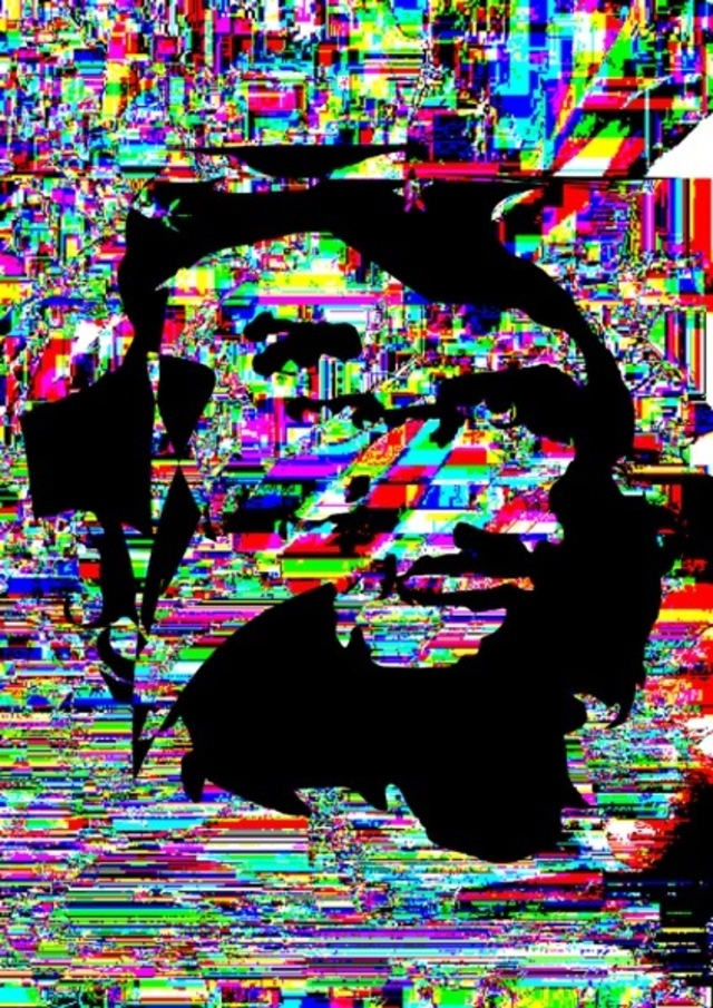
The installation Ghosts in the Machine looks simple: two large images are projected onto the walls of a room. One projection shows video static overlaid with text and the outlines of bounding boxes, the other shows b&w images of what appear to be blurry and ghost-like images of human faces. Ambient noise fills the space. Just at the threshold of recognition can be heard what appear to be human speech in different languages. A box, encloses tightly a CCD camera, only letting through the video noise inherent in the system. Audio patterns are scanned by a voice recognition system that looks for words and sentences which are then projected as words and played as voice-like sounds in the exhibition room.
Face tracking algorithms look for any combination of pixels that form the basic characteristics of a human face. When the software finds a combination of pixels akin to eyes, nose and mouth with a sufficient degree of symmetry, it draws a bounding box defining the area and zooms the area to full screen, its contrast and brightness is adjusted, blurred and desaturated to clarify the found images. More often than not the images produced fail to resolve themselves into anything recognizable. But occasionally, images are produced that are strikingly like a face although in actuality containing only the barest possibility of being so.
As the authors of the project explain: It is the very ambiguity and intedeterminacy of the images that allows the brain to reconfigure them as indexical. This work is one of several that examine systems of meaning making that rely on pattern recognition, and the problematized relationship between meaning and the meaningful.
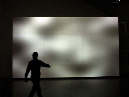
The project examines how we construct worlds, and bodies in worlds, through pareidolia, (when a vague and random stimulus is perceived as significant), apophenia (the seeing of connections where there are none) and the gestalt effect (the recognition of pattern and form).
All images courtesy LABoral Centro de Arte y Creación Industrial.
Ghosts in the Machine, produced by LABoral’s Projects Office, is on view at LABoral, in Gijón (Spain) through January 12 , 2009.
More ghosts this way ladies and gentlemen: Man Machine 2, The Museum of Jurassic Technology, Haunted pixels, (don’t) Show me the Chip, Ghost by Olaf Breuning, and a vacuum cleaner to capture goblins.
Yet another project i liked at the exhibition Banquete_nodos y redes which is currently running at LABoral Art and Industrial Creation Centre in Gijón, Spain.
Vacuum Virtual Machine nevertheless required me to sit down and read carefully (twice, at least twice) what it is about.
This graphic software explores and visualizes the changing reticular self-organization of atoms and molecules. The graphics are the external expression of a virtual machine. Approaching the concept of artificial intelligence, this artefact works tirelessly to develop codes in order to change himself.
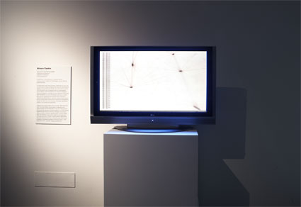
Image courtesy of LABoral Centro de Arte y Creación Industrial
The software is a generative model for the visualisation of complex behaviours through a simple interface. Adopting the appearance of membranes and tissues, the user finds a three-dimensional and synthetic understanding of the self-organization of living systems.
The developed of the project is Ãlvaro Castro. Based in Madrid, this young researcher and architect is interested in the wider spectrum field of architecture and in the generation of visual solutions for urban environments and non-linear systems. I asked him to give us the lowdown on his project:
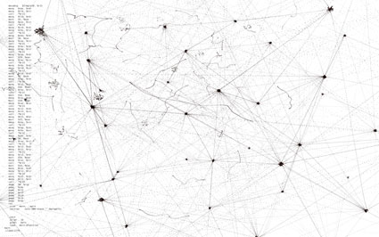
Program screenshot
Could you guide us through the development process that lead to Vacuum Virtual Machine? What was the biggest challenge you encountered while developing it? How does it relate to or build on your previous programming and visualizing projects?
It started one year and a half ago as a continuation of a small research paper I prepared about self-organized maps applied to urban design, and went through the interaction with some institutions and people, which I believe strongly affected this project. At that time, the research was more scientifically oriented, although I was not convinced of the usefulness of that way of development for the ideas I was working with. Mostly, because I had some experience showing ideas that are scientifically rooted in very different areas in which I’m not an expert. That doesn’t mean that the ideas were imprecise or incorrect, but that the amount of work and personal effort for transmitting an idea in each one of the specific doctrines involved in such a widely scoped research is much bigger than the actual research possibilities. I didn’t want that to stop the investigation, where I think that even in the case of a small noise in the original concepts could eventually be very beneficial -although that is another topic-. So after writing that paper and presenting it in a computer and mathematics congress in Bulgaria, I decided to focus on possible generalizations and incorporations of what I learnt there, which lead to newer topics, closely related to what I was doing. So I began investigating some experimental computation systems. I think it was more or less at this time when it was furthest to the previous work on AI visualization IC_ Emergent processes particle projector, which was exclusively a perception system, since I had no visualization intentions at all. I wanted to develop something purely virtual and capable of gluing together all informational living systems I was studying: neural networks, evolutionary computation, cellular systems, membrane computation…
Through the conceptual development of the project, many new interests raised, that somehow shaped new ideas, like loop quantum gravity theory or particle physics. However, it was more the opportunity of contrasting some ideas and working directly with Luis Rico and Alfonso Valencia, from Instituto Nacional de Bioinformatica in Spain what finally fed Vacuum Virtual Machine with some key concepts from what is called epigenetics. Then the project could begin a more practical exploration.
At that time I was also doing my last design course in the architecture school so I started developing sketch visualizations of how this could look like and trying to apply it as conceptual tool for the architectural design. Roughly, it ended up being a set of interrelated and human-aware creatures sustained on an information system which, at its core was this virtual machine. From that moment on, the last months of the development of Vacuum Virtual Machine v1.0 are mostly about solving technical issues and building the program. From the process, this project seems to be a continuation of the previous works on computation, but as programming requirements for this project are far more severe it required stronger technical development and hidden machinery for the end user.
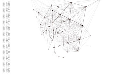
Program screenshot
VVM is an extremely complex artefact with some kind of artificial brain and without any physical existence. Do you nevertheless foresee some application of the programme in other context(s) such as physical architecture or any other discipline?
Although it aims to be a virtual entity, its ultimate motivation is a potential -although not close in time- application to IA paradigm development. In other words, it could be used as a framework for programming other -more specific- intelligent or self-organized systems. Currently it has all the elements necessary for such purpose, but it is computationally inefficient and very immature. Indeed, currently any computer could be simulated using this virtual machine, but is so costly that it would take years to do what current hardware is doing in real time. In this sense, applications are only theoretical, not practical at all. But on the other hand, all said shouldn’t be misunderstood as that the only purpose of this project is this research framework, but there is another important motivation on machine dynamics and computational perception. These are not an applications, but as I said, motivations.
Anyway, referring to applications in architecture -considered as designing and constructing buildings- is not as far is it may seem. But the most important thing to point out regarding this is related to the notion of space and visualization: while I suggest applications are not so distant in architecture they are not related to current spatialization of the internal behavior of the program -what we can actually see when we look at VMM-. These possibilities are precisely tied to previously mentioned notions of AI, and, by no means, the visualized spatial network taken as spatial operations. It wants to be a thinking machine that we can inspect; which could be specialized for architecture but whose visualization can be architectural only in a metaphorical way.
VVM seemed to me like an autonomous creature trapped on a screen and evolving without any concern for the public watching it. Do you feel something similar to that, even if you are the creator of the software? Or do you think that you still have total control over it? How can the public relate to what they observe on the screen? What makes VVM closer to our human daily existence?
I feel as part of the public. I want it to be autonomous because I want it to surprise me and let me feel like I haven’t seen it before. That might be why I do software, as getting unexpected results is something relatively common. For artificial intelligence researchers the ultimate goal is that their system is completely independent once finished, but there is always some tweaking -also in this case- to have some degree of control over it. While VMM is autonomous, it can suddenly self-destroy or saturate its connectivity, also can grow bigger than its physical host’s memory or make it function too slow, or even enter a loop. For all this cases there are safety checks that keep an eye on this constrains and take pre-programmed actions. These actions are completely controlled by me, so I can stay confident that it can run for days without intervention.
On the other hand, I really think the work is somehow obscure for the public, since its dealing with different and technical concepts simultaneously; however, it can work as a visual intuition of how a real machine like this could work at its core. Public can be related to what they see if they feel the same fascination I do feel for the workings of complex systems: living, informational, physical, musical or architectural. But probably, understanding VVM closer to our human daily existence is something that is rapidly becoming evident with the naturalization of technological systems. In other words, systems like those described by this software are extremely common in nature, and eventually we seek for that on artificial devices so we can use our brain potential for what it was evolved. Either VVM or modify our brain.
Thanks Ãlvaro!
Previous entries about Banquete_nodos y redes: Sightseeing telescope reveals open wifi networks in urban space and The Bank of Common Knowledge.
Apart from Joshua Davis’ talk, the other main highlight of OFFF, the software and visual communication conference which took place last week in Lisbon, was the panel on Data Visualization curated and moderated by the European evangelist of the discipline: Jose-Luis de Vicente.
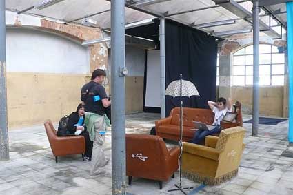
Lounge at the LX factory where OFFF took place this year
As the abstract of the panel reminds: data visualization is a transversal discipline which harnesses the immense power of visual communication to explain, in an understandable manner, the relationships of meaning, causes and dependency found among great abstract masses of information generated by scientific and social processes.
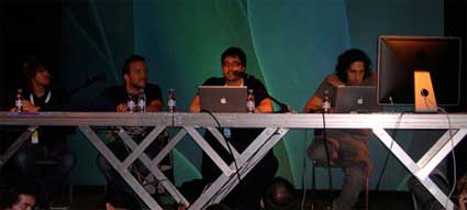
Aaron Koblin, Manuel Lima, JL de Vicente and Santiago Ortiz (image JL de Vicente)
Interaction designer, information architect and design researcher Manuel Lima discussed the story of the website Visual Complexity and the lessons he learnt since he launched it 3 years back. Visual Complexity is not a blog, it is a collection of (so far) over 570 projects of data viz, it is also a space for people to discuss about what is happening in this area.
The project started while Lima was following an MFA program at Parsons School of Design. While working on his thesis project Blogviz: Mapping the dynamics of information diffusion in Blogspace, he had to research extensively the visualization of complex networks, and found out that there was a need for an integrated and extensive resource on this subject.
Lima’s presentation was very very fast with a lot of information crammed in a small amount of time. But here’s a few elements from it:
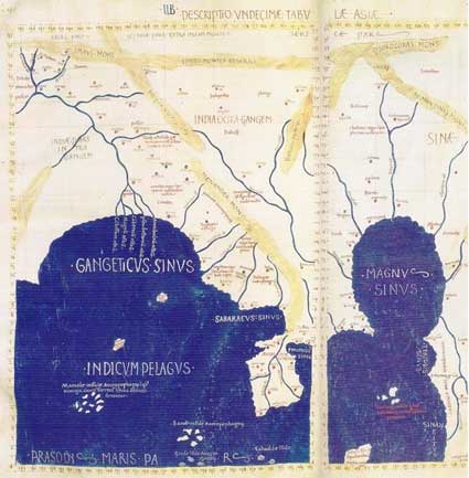
South-East Asia detail from Ptolemy’s geography. Redrawn in the 15th century
The transmission of information started with the wall paintings, got more sophisticated with the oldest registry of a written language (the Sumerian cuneiforms) and later with Ptolemy’s world map. More key landmarks for data viz can be found in Alfred W. Crosby‘s essay The Measure of Reality: Quantification and Western Society, 1250-1600.
One first important factor for the development of data viz is computer storage.
Our ability to generate data has by far outpaced our ability to make sense of that data. As someone at Razorfish said, everything that can be digitalized will be. When Lima started Visual Complexity, data viz blogs were just a handful. Today there are dozens of them. Kryder‘s Law draws from Moore’s law and declares that magnetic disk areal storage density doubles every 18 months. In 2001, iPod storage capacity was 5 GB, in 2007 it was 160 GB.
A second key factor for the development of data viz is Open Databases. Data has never been so widely available at minimal cost (not to say free).
See Swivel and IBM’s Many Eyes.
A third factor is online social networks.
Not as tools for mapping relationship between people but as instruments which help disclosing patterns within the abundance of shared content. Examples: uncovering music affinities like TuneGlue does; discovering how humans categorize information del.icio.us-like; human curiosity.
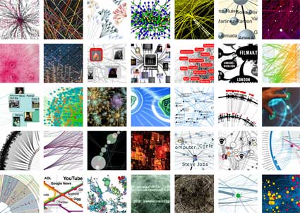
Over his three years observing dataviz, Lima spotted a number of trends: mapping blogosphere relationships, visualizing del.icio.us tags, terrorism, air routes, gps data, etc.
Next spoke Santiago Ortiz who started by presenting the spectacular website that Bestiario has put online a few days ago. The website gets a third dimension as you can “twist” and manipulate it in order to see its full length. The nicest feature is the navigation: you can browse Bestiario’s projects anti-chronologically of course but also according to the number of hours they spent working on the projects, by keywords, combination or exclusion of keywords, etc.
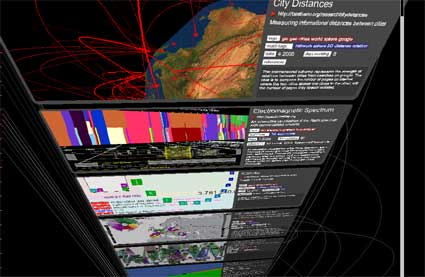
Bestiario’s brand new website
Founded 2 years ago, Bestiario is a small Barcelona/Lisbon-based company with a very impressive portfolio. Combining art and science (Ortiz is also a mathematician) they design interactive information spaces which follow their own moto: ‘making the complex comprehensible.’
It wasn’t the first time that i got to be impressed by Bestiario’s work and Ortiz’ thoughts on dataviz. One of Bestiario’s project was exhibited recently at LABoral as part of the Emergentes exhibition which closed a few days ago. The imaginary biological universe Mitozoos encodes and creates virtual organisms called “mitozoos” which interact among themselves. You can watch their life in a 3D environment that simulates birth, existence of a genetic code, the quest for food, energy dissipation, reproduction and death. Each variable and parameter of the model has a graphical representation.
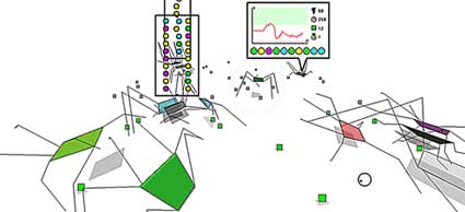
Mitozoos
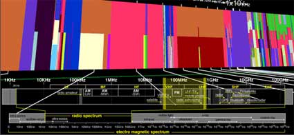
One of Bestiario’s latest projects was developed together with Irma Vila and JL de Vicente. The Atlas of Electromagnetic Space is an interactive representation of the services that use our electromagnetic radiospectrum, ranging from 10Khz “radio navigation” to 100Ghz “inter-satellite communication”. The activities which unfolds throughout the spectrum (e.g. mobile, satellite, wireless internet, broadcasting) are sorted by electromagnetic frequency. What totally won me over was the features showing the artistic interventions that are commenting on and/or taking place in the spectrum.
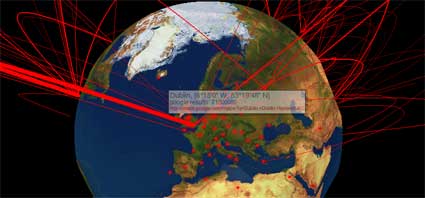
City Distances illuminates the strength of relations between cities from searches on google. The main idea is to compare the number of pages on internet where the two cities appear one close to the other, with the number of pages they appear isolated. This proportion indicates some kind of intensity of relation between the cities. The “google proximity” is then divided by its geographical distance. The result indicates the strength of the relation in spite of the real distance, a kind of informational distance between cities.
Finally, Aaron Koblin took the stage to present his own work. Crap! this guy is so talented it’s scary. Aaron studied Design and Media Art with Casey Reas at UCLA and used processing a lot in his projects which not only represent huge amounts of data, but are also producing data to raise questions about a series of issues.
Narrative made sense for cultures based on tradition and a small amount of information circulating in a culture – it was a way to make sense of this information and to tie it together (for instance, Greek mythology). Database can be thought of as a new cultural form in a society where a subject deals with huge amounts of information, which constantly keep changing, said Lev Manovich whom Aaron quoted to further ask the audience:
A first answer is that visualization help us understand what it means to have dozens of thousands of planes flying above North America every day. Video demonstrating how Flight Patterns does exactly that:
Data from the U.S. Federal aviation administration is used to create animations of flight traffic patterns and density.
The Sheep Market is one of my favourite projects ever. The very Petit Prince work manages to be critical and poetical at the same time. Thousands of workers on Amazon’s Mechanical Turk webservice were paid two cents to “draw a sheep facing to the left.” Their sheep drawings were collected over a period of 40 days, selected and printed on stamps. You can also head to the project website and spend the evening counting the animals.
Video showing Aaron Koblin explaining The Sheep Market:
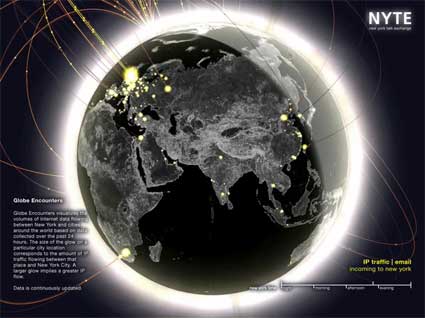
Aside from his purely artistic works, Aaron also works for Yahoo and collaborate on research project. For example, he developed the visualizations for the New York Talk Exchange, a project by the Senseable City Lab at MIT.
Based on a principle similar to The Sheep Market, Ten Thousand Cents has thousands of individuals working in isolation from one another painted a tiny part of of a $100 bill without knowledge of the overall task. Workers were paid one cent each via Amazon’s Mechanical Turk distributed labor tool. The total labor cost to create the bill, the artwork being created, and the reproductions available for purchase are all $100. The project, which has been developed in collaboration with Takashi Kawashima, explores the circumstances we live in, a new and uncharted combination of digital labor markets, “crowdsourcing,” “virtual economies,” and digital reproduction.
Video of Ten Thousand Cents:
The panel ended with JL de Vicente reminding the audience of the Visualizar workshops he periodically organized at Medialab Prado in Madrid. A new call for project proposals will be launched later this year.
Related: Coverage of Visualizar workshop.
The pleasure of testing.
Advertising Agency: Wunderman Y&R, Zurich, Switzerland
Creative Director: Christian Erni
Art Director: Reto Clement
Copywriter: Ivan Madeo
Graphics: Pascal Deville
Photographer: Reinhard Hunger
Other additional credits: Nathalie Busslinger, Thorsten-D. Künnemann
Published: January 2007
“Quark†is also the name for “curd cheeseâ€, a popular dairy product sold in every German supermarket.
Advertising Agency: Rapp Collins, Hamburg, Germany
Executive Creative Director: Olaf Klumski
Creative Director: Ute Lange
Art Director: Anne Kathrin Lüders