Data Visualization panel at OFFF, Lisbon

Apart from Joshua Davis’ talk, the other main highlight of OFFF, the software and visual communication conference which took place last week in Lisbon, was the panel on Data Visualization curated and moderated by the European evangelist of the discipline: Jose-Luis de Vicente.

0aalexfact.jpg
Lounge at the LX factory where OFFF took place this year

As the abstract of the panel reminds: data visualization is a transversal discipline which harnesses the immense power of visual communication to explain, in an understandable manner, the relationships of meaning, causes and dependency found among great abstract masses of information generated by scientific and social processes.

0afromhispfotoste.jpg
Aaron Koblin, Manuel Lima, JL de Vicente and Santiago Ortiz (image JL de Vicente)

Interaction designer, information architect and design researcher Manuel Lima discussed the story of the website Visual Complexity and the lessons he learnt since he launched it 3 years back. Visual Complexity is not a blog, it is a collection of (so far) over 570 projects of data viz, it is also a space for people to discuss about what is happening in this area.

The project started while Lima was following an MFA program at Parsons School of Design. While working on his thesis project Blogviz: Mapping the dynamics of information diffusion in Blogspace, he had to research extensively the visualization of complex networks, and found out that there was a need for an integrated and extensive resource on this subject.

Lima’s presentation was very very fast with a lot of information crammed in a small amount of time. But here’s a few elements from it:

0aapttolemiss.jpg
South-East Asia detail from Ptolemy’s geography. Redrawn in the 15th century

The transmission of information started with the wall paintings, got more sophisticated with the oldest registry of a written language (the Sumerian cuneiforms) and later with Ptolemy’s world map. More key landmarks for data viz can be found in Alfred W. Crosby‘s essay The Measure of Reality: Quantification and Western Society, 1250-1600.

One first important factor for the development of data viz is computer storage.
Our ability to generate data has by far outpaced our ability to make sense of that data. As someone at Razorfish said, everything that can be digitalized will be. When Lima started Visual Complexity, data viz blogs were just a handful. Today there are dozens of them. Kryder‘s Law draws from Moore’s law and declares that magnetic disk areal storage density doubles every 18 months. In 2001, iPod storage capacity was 5 GB, in 2007 it was 160 GB.

A second key factor for the development of data viz is Open Databases. Data has never been so widely available at minimal cost (not to say free).
See Swivel and IBM’s Many Eyes.

A third factor is online social networks.
Not as tools for mapping relationship between people but as instruments which help disclosing patterns within the abundance of shared content. Examples: uncovering music affinities like TuneGlue does; discovering how humans categorize information del.icio.us-like; human curiosity.

0aavisucomplexity.jpg

Over his three years observing dataviz, Lima spotted a number of trends: mapping blogosphere relationships, visualizing del.icio.us tags, terrorism, air routes, gps data, etc.

Next spoke Santiago Ortiz who started by presenting the spectacular website that Bestiario has put online a few days ago. The website gets a third dimension as you can “twist” and manipulate it in order to see its full length. The nicest feature is the navigation: you can browse Bestiario’s projects anti-chronologically of course but also according to the number of hours they spent working on the projects, by keywords, combination or exclusion of keywords, etc.

0aalewebsitess.jpg
Bestiario’s brand new website

Founded 2 years ago, Bestiario is a small Barcelona/Lisbon-based company with a very impressive portfolio. Combining art and science (Ortiz is also a mathematician) they design interactive information spaces which follow their own moto: ‘making the complex comprehensible.’

It wasn’t the first time that i got to be impressed by Bestiario’s work and Ortiz’ thoughts on dataviz. One of Bestiario’s project was exhibited recently at LABoral as part of the Emergentes exhibition which closed a few days ago. The imaginary biological universe Mitozoos encodes and creates virtual organisms called “mitozoos” which interact among themselves. You can watch their life in a 3D environment that simulates birth, existence of a genetic code, the quest for food, energy dissipation, reproduction and death. Each variable and parameter of the model has a graphical representation.

0amitozzzzzo.jpg
Mitozoos

One of Bestiario’s latest projects was developed together with Irma Vila and JL de Vicente. The Atlas of Electromagnetic Space is an interactive representation of the services that use our electromagnetic radiospectrum, ranging from 10Khz “radio navigation” to 100Ghz “inter-satellite communication”. The activities which unfolds throughout the spectrum (e.g. mobile, satellite, wireless internet, broadcasting) are sorted by electromagnetic frequency. What totally won me over was the features showing the artistic interventions that are commenting on and/or taking place in the spectrum.

0aanatlast.jpg

City Distances illuminates the strength of relations between cities from searches on google. The main idea is to compare the number of pages on internet where the two cities appear one close to the other, with the number of pages they appear isolated. This proportion indicates some kind of intensity of relation between the cities. The “google proximity” is then divided by its geographical distance. The result indicates the strength of the relation in spite of the real distance, a kind of informational distance between cities.

0aadublinooo.jpg

Finally, Aaron Koblin took the stage to present his own work. Crap! this guy is so talented it’s scary. Aaron studied Design and Media Art with Casey Reas at UCLA and used processing a lot in his projects which not only represent huge amounts of data, but are also producing data to raise questions about a series of issues.

Narrative made sense for cultures based on tradition and a small amount of information circulating in a culture – it was a way to make sense of this information and to tie it together (for instance, Greek mythology). Database can be thought of as a new cultural form in a society where a subject deals with huge amounts of information, which constantly keep changing, said Lev Manovich whom Aaron quoted to further ask the audience:

If the database is the new narrative, then what is the role of visualization?

A first answer is that visualization help us understand what it means to have dozens of thousands of planes flying above North America every day. Video demonstrating how Flight Patterns does exactly that:

Data from the U.S. Federal aviation administration is used to create animations of flight traffic patterns and density.

The Sheep Market is one of my favourite projects ever. The very Petit Prince work manages to be critical and poetical at the same time. Thousands of workers on Amazon’s Mechanical Turk webservice were paid two cents to “draw a sheep facing to the left.” Their sheep drawings were collected over a period of 40 days, selected and printed on stamps. You can also head to the project website and spend the evening counting the animals.
Video showing Aaron Koblin explaining The Sheep Market:

Aside from his purely artistic works, Aaron also works for Yahoo and collaborate on research project. For example, he developed the visualizations for the New York Talk Exchange, a project by the Senseable City Lab at MIT.

0aanytenute.jpg

Based on a principle similar to The Sheep Market, Ten Thousand Cents has thousands of individuals working in isolation from one another painted a tiny part of of a $100 bill without knowledge of the overall task. Workers were paid one cent each via Amazon’s Mechanical Turk distributed labor tool. The total labor cost to create the bill, the artwork being created, and the reproductions available for purchase are all $100. The project, which has been developed in collaboration with Takashi Kawashima, explores the circumstances we live in, a new and uncharted combination of digital labor markets, “crowdsourcing,” “virtual economies,” and digital reproduction.

Video of Ten Thousand Cents:

The panel ended with JL de Vicente reminding the audience of the Visualizar workshops he periodically organized at Medialab Prado in Madrid. A new call for project proposals will be launched later this year.

Related: Coverage of Visualizar workshop.

Visualizar workshop: Casas Tristes (“Sad Houses”)

I’m on the lookout for a new flat in Berlin again and i still have to recover from the discovery that prices have increased fast and implacably, at least in the Prenzlauerberg area. Which brought back to my mind a project i discovered while visiting the Visualizar workshop at Medialab Prado last November (more Visualizar stories).

0aalascasaaai.jpgCasastristes.org, by Mar Canet, Gerald Kogler, Jordi Puig, explores housing problems in Spain. Its objective is to serve as an information and resources exchange platform in line with the Web 2.0 philosophy, through the creation of a reliable public database of empty houses in Spain.

By providing data visualization and a list of references on the website, the project also aims to offer resources likely to help clarify ambiguous concepts and strengthen the network of citizens, associations, collectives, etc. concerned about housing and on the lookout for a a way to communicate with each other, become visible, and make proposals.

Casastristes.org questions concepts such as “the advantages of buying a home instead of renting”, and highlights the abundance of empty houses in contrast to the generally accepted theory of “a lack of buildable land”. The purpose is to look for solutions given the extremely high percentage of empty homes in Spain, evaluate the reasons so many people do not leave their parents’ home until age 35, and propose alternative housing policies.

I asked interactive designer Mar Canet, a member of Derivart, an interdisciplinary art group whose work focuses on the intersection between art, technology and finance, to tell us more about the project:

Casastristes.org “aims to provide a broad overview of housing problems in Spain, examining both causes and consequences. Its objective is to serve as an information and resources exchange platform in line with the Web 2.0 philosophy, through the creation of a reliable public database of empty houses in Spain.” Last November in Barcelona, I saw another work you collaborated to as part of the collective Derivart. The interactive installation El Burbujometro explores the housing market in Spain as well. Before focusing on Casas Tristes would you mind telling us a few words about El Burbujometro?

A year ago, we started exploring the polemical question “Is there a real estate bubble in Spain?” Apartments were more expensive than ever, some financial analysts were forecasting that the bubble would burst and others were predicting the opposite. Official data showed that the prices of apartments kept getting higher and higher. Starting from this ambiguous situation, and taking the opportunity offered by Javier Duero to participate to the festival Observatori 2007, we came up with the idea to create the Burbujometro, an installation in which Spanish cities are represented as bubbles. Their respective sizes differ according to the price per square meter. Users, equipped with a gun, have to shoot the bouncing bubbles on the screen to discover the price of a home in that particular city.

0aburbujome.jpg

We’ve noticed how some users would shoot with energy, very often asking us if they can make them all explode…. but the bubbles keep on reappearing after a few seconds, triggering a strange (and sometimes frenetic) desire to reach an impossible end: the empty screen coming after a metaphorical burst.

User can see how prices have increased in a general manner all over the country, and not only in big cities like Madrid or Barcelona. The phenomenon impacted also smaller cities which are influenced by their proximity to or by the influence from a bigger city. Through the game people dedicate a relaxed time to the exploration of the price in the whole Spanish holography.

The prices were collected from the well-known estate portal Idealista. For this work, we didn’t want to use statistical data emerging from State organisms, like the Instituto Nacional de EstadÃŒstica (INE – National Institute of Statistics) or the Banco de Espana (BDE – Bank of Spain). We felt it was extremely important to work with the prices that people would encounter when looking for a house at any time. With Idealista we were able to update the data with more regularity.
.
0aaaburbujooo7.jpg

Is Casas Tristes a project which puts the finishing touch to your interest for the estate market in the country?

We are preparing other projects which have a very different theme. And we still don’t know for sure if Casas Tristes will be the last project that tackles the issue of the real estate.

0aaalabhomepagcasa.jpg

You exhibited Casas Tristes at Medialab Prado in Madrid. Did you have a chance to discuss with visitors of the exhibition? Do you know how they reacted to the project?

Yes, during the day of the presentation we had the opportunity to discuss to quite a few people who gave a wide range of opinions and ideas. For example some people warned us that the maps of empty houses could be used by people whose profession is to look for buildings to buy and later sell them to build. We actually have little control on the final use of the database, only the users can decide that.

We nevertheless believe that it is important to open the debate on the housing issue. Similarly other people asked us if we wanted to encourage the illegal occupation of empty houses. Our database aims to raise a discussion. Of course we believe that houses exist for people to live in. New laws are approved such as the one on the Right to have a house, approved on December 17 by the Autonomous Government of Catalonia. The law tries to enforce the renting of empty houses in areas where there is a high demand for flats to rent.

0ahowtobuyahouse.jpg

Now that the project is online and working, do you find that the research on data visualization taught you elements that you didn’t suspect would emerge?

The projects changed over the production process at the Visualizar workshop in Medialab Prado. The collaborators and tutors (Adrian Holovaty and Ben Fry) had a key role in improving the original idea. Of a great help was also Daniel Remeseiro’s surrender of the Drupal platform casasvacias.org. It was a big change of paradigm for the project as we suddenly found ourselves with the implementation of the system that enabled to visualize houses on the maps and upload them on the web. We were thinking of creating visualization on the theme in order to build up a community around a database made of empty flats and created by its users.

We wanted to use the same aesthetic employed in journalism infography, where data graphics are easy to understand. But we wanted to add a level of interaction that allowed the user to navigate historically in the data, the daily press doesn’t allow you to do that.

0aaaliquilar.jpg

Do you have any plan to develop the project further?

This is only the first step of the project because the theme is very large. For the time being, our main interest is to encourage the participation of users who are invited to add new empty houses to the database and create a community which goes beyond the virtual aspect of the project. For example, by having a walk around their city and spot empty houses and by generating discussion.

We have several visualizations which will be published over the next few months. Among them, let’s highlight the realization of a visualization that uses the data provided by idealista (a weekly compendium of news related to real estate and published in the media). Another visualization we are working on attempts to show the mortgages currently active.

We also have more ambitious ideas but they are long-term ones such as the development of a map which displays the houses built over the last decades and use that data to create an animated evolution (with several levels of zoom) of the houses constructed.

Thanks Mar!

The Burbujometro will be on view at LABoral in Gijon (Spain) as part of Homo Ludens Ludens, an exhibition which will explore play in contemporary culture and society. The show opens on Friday and will run until September 22, 2008.

All images courtesy of Mar Canet Sola.

Related: Santiago Cirugeda’s “Casa de pollo” (Chicken House), a 30 sq meter prototype of urban dwelling.

Visualizar workshop: Cascade on Wheels

Working together with Cristóbal Castilla, José Hernández, Ricard Marxer, Julian Oliver and Nicolas Tremeaud, Steph Thirion developed a gorgeous traffic data visualization project during the Visualizar workshop which took place at MediaLab Prado in Madrid last November.

Cascade on Wheels intends to express the quantity of cars we live with in big cities nowadays. The data set of daily car count averages is visualized per street (and segments of streets) in the center of Madrid in 2006.

To better express the meaning and extent of the harm car traffic is doing to both the city and its inhabitants, the team created two visualizations of the same dataset. One is a 3D representation, where holes are used as a metaphor of the volume of cars, in a map where the streets look like open wounds. The second is a sound toy, where noise is the metaphor, and the user has to explore the data by drawing its own visualizations.

Steph is half portuguese half french and has been living for 4 years in Barcelona. He works mostly as a web designer and developer for advertising agencies and design studios. He also teaches classes about being creative with code. Right now he is focusing his energy on personal projects and on teaching. I asked him a few questions about his data visualization work:

Cascade on Wheels “intends to express the quantity of cars we live with in big cities nowadays.” Why do you think that there is a need to map urban traffic in a new way? Isn’t there already online instruments which do just that? Which new elements does CoW brings to the issue?

Most traffic mappings are realtime information for drivers, to help them trace their route depending on the current state of traffic. The broader view, which is representing the average quantities over time, is not so popular. That’s a shame, because this is about something that affects every single inhabitant of the city, not just the drivers.

And the existing maps that cover this subject usually have failed to make that data truly readable. The website of the Kansas Department of Transportation hosts static maps with average car count for each of its cities, and they are worth the detour, they’re even pretty, but have poor readability. The Madrid website where our data set comes from also hosts a static map, but it has bad readability, lacks precision, and – although the source data is quite rich, categorized by types of vehicles – only shows the totals.

So I wouldn’t complain of a lack of data, but I think there’s a blank space that is begging to be drawn on. I’d love to see more visualizations on this subject.

wallsmap.jpg
Wall Map

We wanted to fix some of these issues. While trying to find a functional and readable way to represent all that data we had, we were inspired by Ben Fry‘s Isometrick Blocks, where different spatial angles and perspectives reveal different visualizations of the same data. In our Walls Map piece, streets are raised in space relatively to their traffic. Seen from the top it is a flat 2D street map, but once the angle is tilted and the view enters 3D, shapes like walls are revealed, holding additional data on their sides: the proportions of car types. By rotating the model or tilting the angle it’s quite easy to explore the data, see where most traffic concentrates, how it branches out, or which streets have many buses and which don’t.

Moreover, a defining element of the project was emotion. Apart from representing the data, the idea was to express its meaning. In its early prototype the streets in Walls Map were actually lowered, making holes in the ground. The walls of the columns were red, so the streets looked like fresh wounds contouring the buildings. We ended up reversing them to improve readability, and the streets became walls, which is also a great metaphor for traffic.

At the end of the concept process, we ended up with two different visualization ideas we were happy with, and we couldn’t choose one, so we did both. The Traffic Mixer, which is the second piece, is a weird and beautiful hybrid. It’s both a visualization and sound toy, where the user explores and gets involved with the data in a playful way. Here the metaphor for traffic is audio noise. On this piece, emotion was given prominence over direct readability, so the two pieces ended up complementing each other.

trafficmixer.jpg
Traffic Mixer

You choose to visualize a data set of daily car count averages per street (and segments of streets) in the Madrid city center. The project is currently exhibited in Madrid. Have had a chance to discuss with visitors? How are they reacting to a project which engages so closely with their everyday life?

Sadly, I haven’t had the chance yet. The inauguration of the exposition was the evening before we left Madrid. And until now Walls Map, which is the clearer piece data-wise, has been at an early stage. There’s been only shapes, no numbers. Users have been able to see the differences between streets, but couldn’t read that on the avenue a block away from there, more than 100.000 cars passed by every day. Hopefully now that we’re updating the piece we’ll get feedback. The Medialab, where the pieces are exposed, is the perfect setting for that.

Now that the project is online and working, do you find that the visualization taught you elements that you didn’t suspect would emerge? How does the final result differ from your own expectations?

The biggest impact was before the visualization, when we first laid our eyes on the numbers. For me it was the first time I read that kind of data on streets I knew, and while it wasn’t a surprise that we cohabit with huge amounts of cars, seeing the actual numbers was still a shock.

After the visualization was complete, I think the only surprise was at noticing that some segments of streets had high quantities of cars while the next one had a tenth of it. In some cases that can be explained by the fact that not all streets are accounted in the data set, so some traffic can flow into non-visible streets. But when there’s such a big difference between segments, it’s actually because the traffic goes into the underground tunnels. So you can see it on the visualization, the city council of Madrid actually did a good job in making part of the traffic disappear in the underground.

Can you give us some details about the sound element of the project? How does it work? How does it complete the data visualization?

In the Traffic Mixer is a special case, it’s a bit more than a visualization. The sound here is partly about giving expressiveness to the numbers, but it’s also about getting the user involved with the visualization. By drawing circles on the map, streets are selected, and produce audio noise. There’s both a visual and a sound feedback, which adds more variables to shape the result and makes the experience more immersive. When we presented to the public, Cristobal, who directed this piece, got a bit carried away demoing. He stood there for a while constructing sounds and playing with different musical intensities. When he concluded, the public applauded. It was like he had made a sound performance. With a visualization.

Do you have plan to develop the project any further?

At this point I just want to polish it, I’m not planning to go further than that. This project could be seen as an exercise, a prototype for something bigger, with more areas, more cities, with the time dimension, connecting to different online APIs. But these kind of functionalities would be quite a big endeavor and I couldn’t work on that, at least in a near future. But I would be delighted if someone would start off this point and make something better out of it.

2080798756_bcb25cd768_o.jpg

Thanks Steph!

CoW is exhibited at Medialab Prado in Madrid, until February 24, along with the other projects developed during the Visualizar workshop.

All images courtesy of Steph Thirion.

Visualizar workshop: tweetPad

A second project developed in November during the Visualizar workshop directed by Jose Luis de Vicente and organized by the Medialab Prado in Madrid. Participants had two weeks to develop data visualization projects, with the help of three instructors, in addition to assistants and collaborators.

screenshot_with_interaction.jpg

Elie Zananiri is mostly interested in combining stop-motion animation, computers and micro-controllers through interactive video installations and data visualizations.

Elie currently works at Obx Labs in Canada as the lead developer on Citywide and NextText for Processing. He also does freelance programming.

The project he developed in Madrid is tweetPad, a software for a more dynamic visualization of the Twitter feed, enabling the user to use simple mouse gestures and manipulate the feeds. This is done by deconstructing the text; scrambiling the letters or words, breaking sentences apart, replacing words, combining multiple entries into one, etc.

tweetPad also visualizes statistics on the source of the incoming messages (web, sms, instant messages, or 3rd party software) and the number of characters per message.

tweetPad is software used to visualize Twitter feed in a new, dynamic fashion. Why do you think that Twitter users would need such tool? What can tweetPad bring to their relationship with the now famous s ocial networking and microblogging service?

Most social networks work in a similar way: someone posts something, others look at it and sometimes reply. The idea behind tweetPad is to not only be on the receiving end of these feeds but to be able to manipulate them, on a lower level of abstraction. It’s about dropping the meaning and just playing with the text. Instead of responding to a statement, you deconstruct it, i.e. scrambling the letters or words, breaking sentences apart, combining multiple entries into one, … Your reply is a re-hash of the original. It’s a different approach that’s more fun and prone to experimentation. I find that it’s an interesting tool for Twitter users because it’s a radical way of looking at interacting in social networks.

0aastatsfocuuu.jpg

Could you take us through the design of tweetPad? Which kind of design solution did you develop to make the navigation and use of the software clear for everyone?

The main idea was to have an abstract, yet natural interface. Although traditional GUI elements such as menus, buttons, and checkboxes are recognizable and work well, I find that they are quite bland, so I am always thinking of new ways to interact with software. For tweetPad, I thought it would be interesting to use mouse gestures that are simple enough so that users could figure them out on their own. For example, a clockwise-turn on a word will swap it for a synonym and a horizontal shake will scramble the words in the message. The navigation is not clear right off the bat, but I think that it can be easily discovered after a few minutes of clicking around and playing with the software. My goal was to design something playful and intuitive, not necessarily to-the-point, and I think it adds a nice dimension to the piece.

I was reluctant to use any informative text at first, because my idea was that text is the medium in tweetPad, but I realized I would have to for the statistical aspect of the piece. There are two sets of animated curves at the bottom of the display that count the number of characters per tweet and the tweet sources, and they are much more interesting to look at when you understand what they represent. It was hard to guess what they meant without a legend, so I figured that transmitting the information clearly was more important than a somewhat obscure conceptual ideology.

0aatewetpad4.jpgThe tweetPad software offers a vast array of possibilities. Yet you managed to finish the project in a relatively short time. What were the biggest challenges you encountered while developing tweetPad and how did you overcome them?

The biggest challenge was to wrap my head around the project as a whole to be able to plan out the development over 2 weeks. I was working alone 90% of the time but everybody was giving me really great feature ideas all the time, so I was constantly torn between incorporating them and finishing on time. For example, the synonym swap idea came about early in the workshop, but it still took 3 full days to implement properly. It was definitely worth it because it’s quite a nice touch, but it took a couple of sleepless nights to get back on schedule.

Another great challenge was incorporating meaningful statistics. This is another component I had not originally thought of, but being at a data visualization workshop, the topic obviously came up many times. I had written code for slick-looking curvy lines that stretched and squeezed and flowed nicely, but when I mapped them to actual data, I had to use randomly selected units of measure (for example, a line represents a message with 0-35 characters and has a new point added to it every 2 minutes), and although the result looked cool, it was confusing and did not transmit any information. I finally dropped that for the current design, which is both good-looking and understandable.

Do you have any plan to develop the project further?

Definitely.

The first feature we had thought of was to be able to break the messages apart into words and to further break the words apart into letters. We could then re-arrange the words and letters, kind of like those word magnets people have on their fridge, and combine a bunch of messages to make a new tweet that could be submitted by the user to his own account. I haven’t had time to implement this at the workshop but this is the original goal of tweetPad, so I will definitely find the time to do it.

It would also be interesting to add a personal module, where the tweets that come in are only from people you are following. The issue with this is that there won’t be as many messages coming in, so it would need to be altered somehow to stay interesting.

And since the beginning, I keep thinking that I need to try it on a big screen, with a wiimote instead of the mouse.

Thanks Elie!

All images courtesy of Elie Zananiri.

Previously: Visualizar workshop: Visualizing: tracing an aesthetics of data; HumanFlows.

Visualizar workshop: HumanFlows

As announced a few days ago, i’m going to highlight some of projects developed in November during the Visualizar workshop curated by Jose Luis de Vicente and organized by the Medialab Prado in Madrid. Participants had two weeks to develop data visualization projects, with the help of three instructors, in addition to assistants and collaborators.

Here’s a first project: Human Flows, by Miguel Cabanzo (with the collaboration of Nathan Yau, Mónica Sánchez and Iman Moradi), aims to visually and interactively map global migrations in a bid to understand their causes. In its current state, it is a framework with which to develop further visualisations.

Miguel is a graphic designer with a growing interest in interactive installations. He is originally from Bogotá, where he studied visual communication, and worked as art director and freelancer). He’s been living in Venice for 3 years as a masters’ student at IUAV, University of Venice.

0agrossdomestic.jpgGross Domestic Product

Human Flow’s aim is to “visually and interactively mapping global migrations in a bid to understand its causes.” Why do you think that there is a need to map migration in a new way? Isn’t there already online instruments which do just that? Which new elements does HF brings to the issue?

Most of the online instruments tend to concentrate on particular moments on migration, showing a partial view of the problem. This happens because global migrations are strongly connected with the current situation (economical, political, social, etc.) of each sending and receiving country, and that produces one of the usual ideas of the migrant: they migrate because they are poor, or their home counties are insecure. But even if this is partially true, I think that seeing this migrations from an historical point of view can raise interesting questions: Why did migrations to Germany become so strong from mid nineties, even from European citizens? Why is so important for Latin American people to go to the United States? Why are Africans risking their lives crossing the ocean to be here? Why were migrations in the eighties so different from today’s migrations?

I think mapping problems helps to understand where the problems are and underline how hard they are. Even if the prototype has inflows from just 13 “well-being” countries from the world, it is incredible to see how 70% of the global population has moved to those countries for the past 15 years, and continues to do so. Why?

0aimmmmigrflow.jpg

2ngry, your website, mentions that you study at IUAV, in Venezia. I spent 4 years as a `’migrant” in Northern Italy myself and although i’m European i experienced how the issue of migration is still a very problematic one here, even more than in other countries. That might be explained by the fact that migration is a relatively new phenomenon in the country. Is there anything in the very particular situation of Venezia which inspired this project or makes it more relevant?

Yes. Even if my position as a student put me somehow aside of the xenophobia problems, is obvious that migration is more than an issue here. Being a relatively new thing, migration seems to be a problem for a lot of northern Italians, who tend to see foreigners (or better: non-tourists) as a threat for the economy. And with the high percentage of illegals entering the country each day, a lot of right wing politicians are basing their careers on it.

0aamigroplois.jpg
Image from Migropolis, Buba sells fake bags in Venice

So if on the one hand you see people praising SS methods against immigrants, in the other you have companies devoted to using them in order to make money, spending a lot in advertising with immigrants as their target group. Add to the picture that lots of Africans are selling Chinese or Napoletan fake bags on the Venetian streets (and “robbing” precious money to the glass stores selling Chinese glass), and you have a strange, contradictory scenario.

Having this in mind, I get involved the past year in a fantastic project called Migropolis, a book about immigration and its spectacularization in Venice. Working for this publication gave me some knowledge about the issues, and served as a starting point for humanflows.

Now that the project is online and working, do you find that the visualization taught you elements that you didn’t suspect would emerge? How does the final result differ from your own expectations?

If brilliant colors means well being, and the flows are going from dark colors to brilliant ones, you can confirm the idea of the poverty-based migration. Of course there were some surprises. I didn’t expect to see so many people going to Russia or germany, and even if I come from Latin America and I know the situation, it was a surprise to see how much people is going in search for their American dream.

Now, I see the project as a framework for further development. To be really enlighten, the project still needs to show more interesting data and, more importantly, clever connections between the data. For instance, it would be interesting to see how migration is affecting criminality in receiving countries, or how much taxes the immigrants are paying, how much they are contributing to the local economy. Remittances are another important field to visualize.

I am very satisfied with the job done, this is a very good starting point.

Do you have any plan to develop the project further?

Yes, humanflows is part of my MA thesis, so the project will be developed furthermore in its conceptual and graphical part in order to show it as part of an exhibition in the near future.

Thanks Miguel!

Also by Medialab Prado: the Interactivos? workshop.

Visualizing: tracing an aesthetics of data

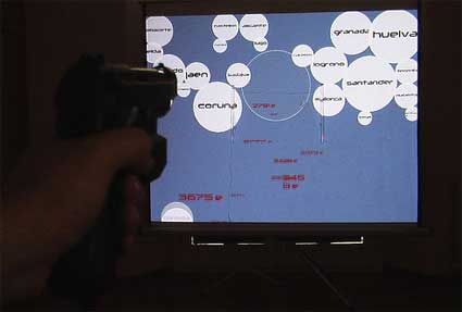
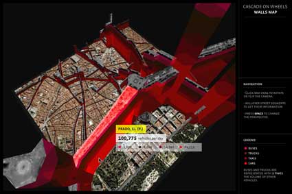
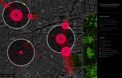
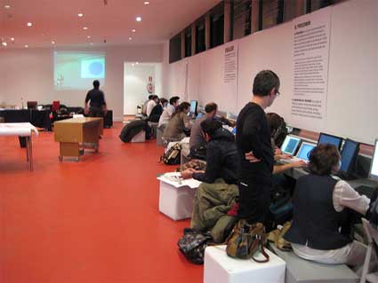
Last November, i spent a few days in Madrid to get a sneak peak at the Visualizar workshop at Medialab Prado. The projects that came out of the workshop are quite interesting and i’m currently interviewing some of the project leaders to get more insight on their own work, so stay tuned!

Medialab Prado is currently launching a new call for the Inclusiva-net. The workshop will explore the relationship between digital networks and physical space in the context of the increasingly widespread use of portable technology and Web applications in connection with the production and management of geographic information. Given the quality of Medialab Prado’s events, my advice would be “go ahead! answer the call!” The teachers will be Lalya Gaye (whom i interviewed over a year ago), Julian Oliver of the Selectparks fame, and Juan Mart??n Prada.
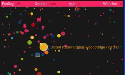
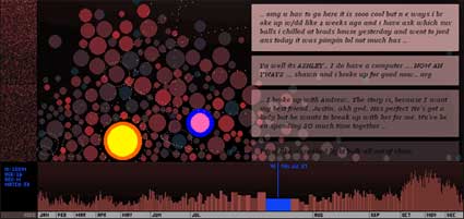
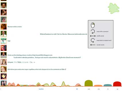
0aawefeelfine.jpg
We Feel Fine

But let’s get back to the Visualizar workshop. As you might guess by its name, Visualizar explored the fascinating world of data visualization. In his introductory text , Jose Luis de Vicente, the curator of the workshop, described data visualization as a cross-discipline which uses the vast communicative power of images to offer a comprehensible explanation of the relationship among meaning, cause, and dependence that can be found among large abstract masses of information generated by scientific and social processes. Arising from the field of science two decades ago, InfoVis and DataVis combined strategies and techniques from statistics, graphic design and interaction and computer analysis to create a new communication model more suitable for clarification in the emerging Age of Complexity.

Jose Luis gave such a great talk about the subject last year that i’ve spent some time translating bits of it in english for you. The video is available online in spanish.

Visualising: tracing an aesthetics of data.

JL started by going back one century and a half ago. At the beginning of the end of the most powerful man of the time: Napoleon. The beginning of the end was the Russian campaign.

0aagrandearmee.jpg
In 1812 by Illarion Prianishnikov (1840-1894)

On June 24, 1812, Napoleon’s Grande Arm??e of 691,501 men, the largest army assembled up to that point in European history, headed towards Moscow. Once they arrived in the capital, they found an empty city. It had been evacuated and stripped of all supplies. There was no official surrender and Napoleon felt that the situation robbed him of a traditional victory over the Russians.

The army had to retreat. Supplying the army on its way back was nearly impossible, mainly because of the harsh weather. The lack of grass weakened the army’s horses, almost all of which died or were eaten by starving soldiers. With no horses the French cavalry became footmen, cannons and wagons had to be abandoned, depriving the army of artillery and support convoys. As starvation and disease took their toll the desertion rate soared. Elements of the Grande Armee were defeated by the Russians at Vyazma, Krasnoi, and Polotsk. The crossing of the river Berezina was the final French catastrophe of the war, as two separate Russian armies inflicted horrendous casualties on the remnants of the Grande.

On December 14 1812 the Grande Arm??e was expelled from Russian territory. Only about 22,000 of Napoleon’s men survived the Russian campaign.

0aaengineee4rf.jpg
Minard’s map shows the advance of Napoleon’s Grande Arm??e into Russia in 1812. (full resolution)

What is one of the most epic moment in History has been turned by Charles Joseph Minard into a pioneering example of infoviz. In 1861 the French engineer published a Carte figurative des pertes successives en hommes de l’Arm??e Fran??aise dans la campagne de Russie 1812-1813, an information graph published in 1861 on the subject of Napoleon’s disastrous Russian campaign of 1812. The graph displays several variables in a 2D image:
– The thickness of the line indicates the strength of the army, with numbers indicating strength at critical points. From left to right : the thickest line on top is the army crossing the river with 422,000 men, advancing into Russian territory and stopping in Moscow with just 100,000 men. From right to left, returning west, and crossing back on river Niemen with 10,000. The numbers may go down or up, as the army joins with reserves (e.g. before river Berezina).
– The lower portion of the graph is to be read from right to left. It shows the temperature on the army’s return from Russia, in degrees below freezing on the w:en:R??aumur scale. (Multiply R??aumur temperatures by 1?? to get w:en:Celsius, e.g. ???30??R = ???37.5 ??C)]] Starting at ) degree in Moscow to minus 30 towards the end of the disastrous adventure.

This sole drawings translates in a very visual way the magnitude of the event and the way the campaign went from bad to worse over the course of a few months. The map embodies perfectly the power of dataviz, the communicative power of the image: using various factors, the map manages to translates in a sole image the importance of the fiasco that was the Russian campaign and how the disaster took place. One of the strength of information design and later of data visualization is that it can reduce the time necesssary for understanding a given event while at the same time it augments the capacity to grasp concrete phenomena of the past.

0adaghostmapp.jpg
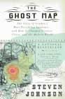
The other story JL mentioned takes place in London around the same period and Steven Johnson wrote about it in his book The Ghost Map.

The most devastating disease striking big European cities in the 19th century was cholera. Lacking garbage removal, clean water, sewers infrastructure, London was the perfect breeding ground for a disease no one knew how to cure. The consensus was that cholera was carried through the air, you could catch it by breathing “foul air” or coming into contact with someone suffering from cholera.

Physician and self-trained scientist John Snow was quite skeptical about that view and he set himself the task to prove it by investigating what could be the cause(s) of the lethal disease.

By talking to local residents (with the help of Reverend Henry Whitehead), he identified the source of the outbreak as the public water pump on Broad Street (now Broadwick Street). His studies of the pattern of the disease were convincing enough to persuade the local council to disable the well pump.

0aacholeraaaa.jpg
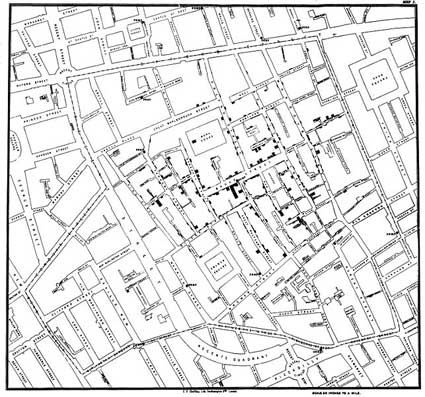
Original map by Dr. John Snow showing the clusters of cholera cases in the London epidemic of 1854

Snow used a spot map (back dots represents cases of cholera and crosses indicate a well) to study and illustrate how cases of cholera were centred around the pump. He also made a solid use of statistics to illustrate the connection between the quality of the source of water and cholera cases. He showed that companies taking water from sewage-polluted sections of the Thames delivered water to homes with an increased incidence of cholera.

Those two stories illustrate how an image is able to have meaningful patterns emerge from a mass of data.

Digital artist Ben Fry sees information design as the capacity of “thinking with the eyes”. An image can help us see things which we would otherwise no be able to fully understand, it externalizes our cognitive skills. The capacity of making meanings emerge through the power of vision is very high. Simple example: you’d take a piece of paper and a pen in order to break down the complexity of a mathematical problem. Similarly, the communicative qualities of a graphic design enables us to externalize a problem.

The communicative capacity of graphic design and the capacity to externalize the problems are united in this new forms of codifying information from an abstract mass of data to a spatial composition which are visually expressed.

So what is the state of the art today?
What happens when graphic designer, information designers, etc. start to use these tools in a social context?

A first example concerning the crisis between Lebanon and the US in the Summer of 2006 when Britain, Israel and the US were left exposed for refusing to comply with UN’s demand to end to hostilities. The news appeared in most newspapers around the world. Yet one of them came up with a visually striking representation of the issue:

0aceasefireback.jpg
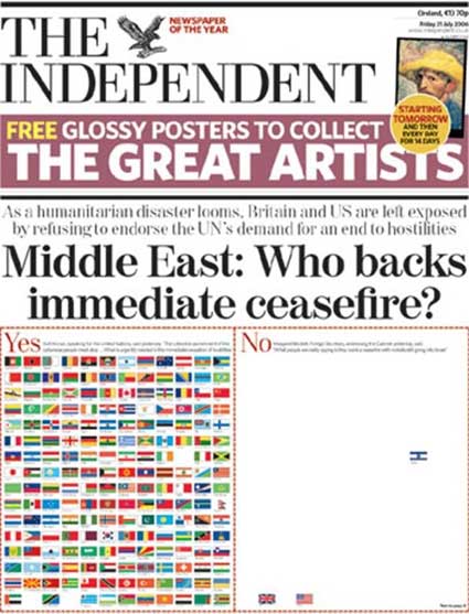
Middle East Crisis: Who backs an immediate ceasefire? (see cover of the newspaper here and here)

The impact of the news is much different if we put it into words or if it is translated in a visual code. Newspapers are making an increasing use of data visualization.

Of course, there are many other examples to be found in the artistic and scientific sphere.

Examples:
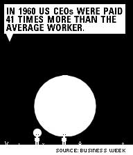
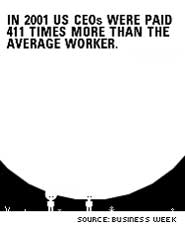
Inequality, created by Josh On using Processing, demonstrates in a crystal clear way that while in 1960 US CEOs were paid 41 times more than the average worker, in 2001 their pay was 411 times higher than the average worker.

0aajoshon11.jpg 0aajohson2.jpg

If you were to put the same data on a traditional statistical graphic, you’d get the same information. Minus the immediate appeal and the interactivity.

(artificial.dk has a great interview with the artist btw and there’s a video of one of his talk at one of The Influencers conferences).

Information design has its limits: the dataset is quite static, the assembly of data has a certain level of simplicity and there is no interaction. That’s where enters a new discipline which will influence cartography, graphic design and other transversal disciplines.

Starting in the ’90s a new class of visualization practitioners, half way between the analysis of digital information and strategies of representation, emerge and propose examples where data visualization is not only applied to analyze abstract data but where it also proposes other levels of interpretation and readings.

0aazipdecoden.jpg

Example. Ben Fry wanted to find an answer to a simple question: “How exactly are zip codes assigned across the U.S.?” His answer is zipdecode which is as simple as the postal code system might appear to be complex.

0aaaarctextarc.jpg

TextArc, by Bradford Paley who used to be the designer responsible for the visualization system at Wall Street, shows quite well how the infoviz genre is hybrid and multi-disciplinary. TextArc is a fascinating visual representation of a text –in this case Alice in Wonderland and Hamlet— on a single page. Paley dismounted the novel and turned it into a spatial structure where the position of the elements indicate their importance and the lines which circulate around them trace the connections that link the words.

Other example, Color Code an interactive treemap displaying about over 33,000 English nouns, each of them is represented by a rectangle, which has been assigned a color based on the average of the colors found via an image search for that noun. in addition, the words are clustered so that similar words are near each other.

0aanewsmappp.jpg

JL then showed one of my favourite infoviz projects ever: Marcos Weskamp‘s Newsmap.
The application visually reflects the constantly changing landscape of the Google News news aggregator. dividing information into easily recognizable bands which, when presented together, reveal underlying patterns in news reporting across cultures and within news segments in constant change around the globe.
The aesthetical choices have a semantic translation, they correspond to different levels of meaning to organize the information in a certain way.

0aa10per10.jpg

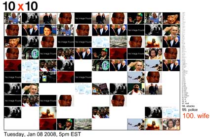
10×10, by Jonathan Harris, is an interactive and ever-changing snapshot of the words and pictures that define the time. The system monitors leading international news sources and every hour, it collects the 100 words and pictures that are deemed most important on a global scale, and presents them as a single image. Over the course of days, months, and years, 10×10 leaves a trail of these hourly statements which, stitched together side by side, form a patchwork of human life.

JL pointed out that the representation of a data set is always arbitrary. There are obviously many other ways to represent a set of data and the relationship that emerge between them.

Besides, data visualization is the visual embodiment, the translation to another language of a series of process which some call data mining, the science of extracting useful information from large amounts of data or from a database. Data mining is being used as a technique for investigation which slowly moves from the scientific sphere to a more social and cultural oriented level.

Freakonomics.jpgFreakonomics: A Rogue Economist Explores the Hidden Side of Everything, a book available at any airport and published in 2005 by economist Steven Levitt and New York Times journalist Stephen J. Dubner. In the book Levitt uses techniques of statistical analysis to give answers to a series of (sometimes quite surprising) questions. The book has raised debate, especially regarding the chapter which explains how criminality in New York fell sharply in the ’90s. In his view, the main factor which justifies the drop of violence is the legalization of abortion in the ’70s.

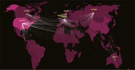
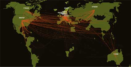
Other example: with the Enron Explorer, Trampoline engineers offered access to the 200,000 Enron internal emails released during the fraud investigation. The system generates a visualisation of each employee’s social network and allows users to explore the way those social networks were somehow responsible for factors which led to the fall of the American energy company.

the case of Enron marks a transition in the journalistic techniques from an era where the focus was on telling facts to an era focused on filtrating data. The Watergate scandal emerged because a hidden information was discovered. The case of Enron was different, it was a journalist who used public data, started analyzing them and realized at some point that the relationships between the data didn’t match the activities that Enron was supposed to carry out.
00aaparkeweherpla.jpg

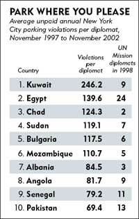
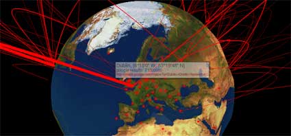
Another very simple example shows how to tell a story by using a set of data. Corruption is believed to be a major factor impeding economic development, but the importance of legal enforcement versus cultural norms in controlling corruption is poorly understood. To disentangle these two factors, two researchers went through the stationing of thousands of diplomats from around the world in New York City. Diplomatic immunity means there were not fine for parking violations, the researchers were therefore left to examine the role of cultural norms alone (at least that’s what they believe). The result of their investigation appears on the image on the left.

To give even more strength to the usual cultural stereotypes, the diplomats who receive the smallest number of fines come from Norway, Denmark, Sweden, etc.

Another case is the one of a journalist from Wired who thought that there might be some relationship appearing between pedophile (data on convicted sex offenders are public in the United States) and users of MySpace. He thus wrote a script that ferreted out registered sex-offenders on the social platform. Some of the offenders he found were just hanging out with their friends and families, but 3 of them were actively soliciting sex from children — his work led to the arrest of one such, Andrew Lubrano. The code has been made available.

0aada0us.jpg

A famous fashion to manage data is the tag cloud. Example, the US Presidential Speeches Tag Cloud which gives an overview of the words that US presidents used most frequently in their speeches, showing which issues they deemed important over time.

Another area where infoviz can do wonder is when it plays the role of sociograms, unveiling the relationship between people and the kind of structures that emerge from these relationships.

0aaconspiraccym.jpg

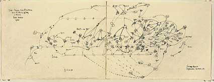
Artist Mark Lombardi was fascinated both by complex social structures and conspirations and he merged both passion in his famous Conspiracy Maps which analyzed affairs such as The Watergate, the collapse of the Vatican bank and the Iran-Contra scandal.

Which brings to our mind one of the most famous piece of media art of the past 15 years: They Rule by Josh On. The application reveals some of the relationships of the US ruling class, how the boards of some of the most powerful U.S. companies share many of the same directors, how some individuals sit on 5, 6 or 7 of the top 500 companies. It allows users to browse through these interlocking directories and run searches on the boards and companies.

The strength of a work like They Rule is not that it “gives you the solution” or tells you whether the people sitting at the boards hate each other or are friends but it artistically shows levels of complexities of our reality which would otherwise be difficult to comprehend.

0a1dataglonos.jpg

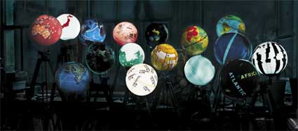
World Processor by Ingo G??nther projects on physical world globes the geographical distribution of various social, environmental and political world parameters: international migrations, countries debts, wealth distribution, countries with biggest emission of CO2, etc.

Chicago Crime database projects on Google Maps data about criminality in the country as discovered by the police.

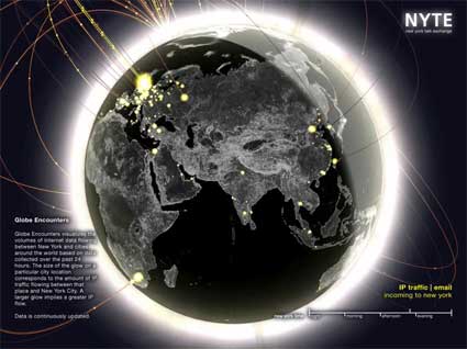
The Database of Intentions (as coined by John Battellle). An important change in the creation, classification and dissemination of data is that it is no longer a result of scientific, economical or statistical processes. Instead it has become a social reality. Each of us has become a generator of data. We can thanks web 2.0 for that and also search engines. Each time we look for a word on a search engine we obtain information at the same time as that search engine gets information from us: what we want, what we look for, what interests us, what scares us, what worries us, etc.

A sad example is how AOL released massive amounts of data concerning the queries made by its users. They later apologized but it was way too late.

0aacullisng7.jpg

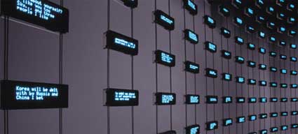
Listening Post by Mark Hansen and Ben Rubin poetically give a face to the flow of data. The installation culls text fragments in real time from chat rooms, bulletin boards and other public forums. The texts are read by a voice synthesizer, and displayed across a suspended grid of more than 200 electronic screens.

Digg Labs, developed by Stamen, translates visually and in real time the activity of the social community.

But how do you classify the quality of a social activity?

0aaadumpstrr.jpg

Golan Levin showed in the brilliant The Dumpster how to visualize the romantic breakups of teenagers.

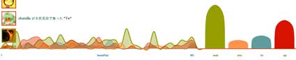
A somewhat similar and more ambitious project We Feel Fine, by Jonathan Harris and Sep Kamvar, investigates human emotions by harvesting data about web user’ moods and feelings from weblogs. A script searches newly posted blog entries for occurrences of “I feel” & “I am feeling”, records the full sentence & identifies the “feeling” expressed in that sentence (e.g. sad, happy, depressed, etc.).

JL ended by an anecdote about They Rule. Apparently two kind of people check out TR. The web users who is curious about the project but also the very people who are part of TR, the board members who use it see how they could reach another person, who in their entourage is connected to someone who is connected to that person.

However, the main danger of the fascinating images generated by these data designers is to believe that reality can be defined and limited by an image. That they suffice to grasp and interpret reality.

Related entries: A series of posts about one Medialab Prado’s latest workshop, Interactivos?, Interview with Jose Luis de Vicente.