Link Lust: Been around the world and I, I, I I can’t find my linky

So, boingboing has been tipped to yet-another-website ripped off story where the originator found the copy via the copies dumb-arse hotlinking of the original sites images. So what does the original site do? Replaces all of the images with color co-ordinated pictures of dildos. Oh how terribly original, not – but at least they bothered to make it stylish! you thought we wouldn’t notice is a cool ‘badland’ blog for design of all sorts though (and yes, there have been many many many of those too) worth a bookmark.

And in our inbox waits a ‘press release’ about yet another millionpixelcrappetycrap homepage spinoff – this time for each pixel bought they’ll supposedly plant a tree: www.pixelfortree.com. Even with the cute eco angle I don’t think I can take any more millionpixel spinoffs. Hey, here’s an environmentally friendly idea – shut your damn servers off already, OK thanks.

Here’s another thing I’ve seen before – Paris Hilton naked shilling something presumably not “Paris Hilton”. Flying spagetti monster, there’s not enough eggnog in this damn office if I’m gonna last another year of these reruns.

read more

PC and Mac go toe to toe with Christmas greeting

Talk computers with a group of wired types, and one fact will become evident. Fans of the Mac swear by the product with fervor normally found at a tent revival in a small town where religion is a passion rather than a pastime. The journalists and graphic artists I know are especially fond of Mac, and these professionals sing the praises of that product so consistently I’m thinking of going that route when my current PC goes wherever a PC goes once its purpose becomes irrelevant.

The Christmas ad touting the Mac over the standard PC is a model of subliminal and direct messaging. For one thing, the Mac fan looks the part, down to the baggy jeans and sparse hair tufts on his chin. The PC fan fits the bill—a run of the mill management type in a tie and khakis, who buys into his product without question—brainwashing comes to mind.

The ad carries a message in low-key style typical of a company that makes a quiet no-frills statement and who has carved a niche for itself by offering less not more only in the messaging style. The humor can be appreciated—even Santa (not thinned down here for political correctness, but shown in jolly fat elf mode) casts a doubtful eye at the PC fan as he breaks the rhythm of the popular Christmas song. Making a strong suggestion without alienating or viciously bashing the competition—that’s a Mac trademark, and it works well in this Apple commercial, especially with Santa the central figure who, by directing a simple glance full of meaning, apparently agrees with the geek. In other words, what’s good for Santa should be good for us.

State of Emergency

With journalism on its deathbed and desperately clinging for life, the media needs to atone for its sins if it has any chance for survival. 

Living in a snowglobe can’t be that hard

Snowglobe
McKinney sent me an e-mail about that employee who recently spent 78-plus nonconsecutive hours inside an inflatable snowglobe at the agency’s office in Durham, N.C. Is work from actual clients that scarce? McKinney’s claims that “Snowglobe Boy” became “a Web phenomenon” and set some kind of “world record” are pretty dubious. His first appearance on AdFreak didn’t garner a single reader comment! (This blog is my digital bible of cool—make it yours.) Plus, he didn’t even write any songs in the globe, unlike Cartel, which managed to toss off a few three-chord clunkers during its overhyped spring incarceration. I’ve got an old beanbag chair in my cube, and I’m not leaving it for … OK, stopwatch out … there! Sixteen consecutive seconds. I’m an Internet sensation! Oh, and like the McKinney guy, I’m “eco-friendly”—I nibbled on an Au Bon Pain salad while I was writing this post. Where’s my Green Effie? I’m probably disqualified, as the beanbag chair is leather.

—Posted by David Gianatasio

A Social Net You Can Bring Out to the Bar

SAN FRANCISCO (AdAge.com) — Want to know how long the line is outside your favorite club on a busy Saturday night? Or the guy-to-girl ratio at a bar before you pay the cover? That's the promise of BuzzD, a new local-search/networking service from mobile pioneer Nihal Mehta.

Really silly ad for the Ukranian army – Tank cruising for babes!

Please tell me this ad with its not so subtle “tank cannons are phallic!” symbolism isn’t for real. It does direct viewers to kontraktnik.mil.gov.ua at the end so it just might be though. If this is really how they lure young men to the Ukrainian army, those young men must be pretty disappointed that they aren’t roaming the country in their awesomely cool tanks picking up miniskirt-clad babes in every town. I mean seriously, they’re selling “Join the army” on cruising? Tank-cruising no less, which is cooler than a convertible, I must admit. Found via the idea grove.

read more

We drank a toast to innocence. We drank a toast to now. And tried to look beyond the emptiness. But neither one knew how.

Dan_fogelburg_lp_4

Dan Fogelberg died this weekend of prostate cancer. He was just 56 and was diagnosed only three years ago. Yikes. Yes I realize it was the 70s. Yes it rings a little cheesy. Yes he was saddled with the label of being one of these so-called “sensitive singer-songwriters.” But I’m telling you today, still to this very moment of my quite cynical life, I cannot hear “Leader of the Band” without shedding a tear.

Another old lang syne indeed.

Abstinence is easy if you have ugly friends

Abstinator
The AIDS Resource Center of Wisconsin and Milwaukee’s Serve Marketing are taking “a less dogmatic approach” to advocating teenage abstinence. This means threatening them with herpes. At least, that’s happens when you dare to suggest on the Maybe You Should Wait Web site that maybe you’d like some action. This is also their idea of winking, subtle humor. However, if you’re interested in waiting to have sex, you get to enjoy a fake infomercial in which Dr. Richard (get it? Dick!) Woody hawks all manner of products to make you (and others) as physically unappealing as possible, to make abstinence easier. But this project, like all of its peers, is doomed, as band camps across America have shown us. Perhaps they could try some of that “comprehensive sex education, which includes lessons on safer sex,” that they claim to have.

—Posted by David Kiefaber

Asterisks hunters for Bright House Networks

Brent Harris has directed two spooky spots for Fry Hammond Barr, Orlando where the common house-asterisks and the asterisks found in the wild are depicted as the plague that they really are…. Bright house says “We’re not big fans of the asterisk or any of the fine print surprises that go with it. And apparently you aren’t either.” There’s a cute website asteriskhunters.com to go with the campaign.

read more

The least effective ads need some love, too

Effies
The Green Effie, honoring effective eco-marketing campaigns, shouldn’t be the only new prize at the show. In a long-overdue and pleasingly ironic inversion to its mandate, I propose that the organization also fete the least effective effort of the year, honoring work that’s instantly forgettable and fails to generate any brand recognition or sales. If this sounds familiar to any agencies out there—and I suspect it will strike a few chords at Lowe—consider entering, if you can even remember which ads you wanted to nominate. If you can’t, they’d probably win. But that’s confusing, so let’s move on. As a prize, I’d suggest a gold Cannes Lion. I can call for such a category because, as my performance evaluations keep reminding me, I’m the least effective member of the AdFreak organization, and its second-worst-dressed (sorry, Griner). Needless to say, list your nominees below. We don’t want to bug the Effies with a glut of sarcastic e-mails about a nonexistent prize. Do we?

—Posted by David Gianatasio

DDB Malaysia “waterworld” ambient underwater poster

From Naga DDB Malaysia comes this interesting twist keeping Regional Environmental Awareness at the top of mind while taking a relaxing swim in a public pool. They’ve painted the poster straight on the tiles of pool. Or printed? I’m not actually sure how they did it, I just know they did.

read more

Zebra crossings as ad space in Italy

we just got this note in our inbox:

Zebra Crossing is now one of the most popular element of guerilla marketing. This time, it has been used in order to draw attention to the “Settimane dell’Architettura e del Design“, an international appointment between designers, architets and passionates.
MTN Company, a brave and innovative integrated communication agency of South Italy, has experimented zebra crossing advertising in Cava de’Tirreni (Salerno) using 7 different decorations realized by the local ceramists.

I didn’t even know that Zebra crossings were such a popular media space – one would think that traffic laws would frown upon that sort of thing.

read more

Lowe Australia caught plagarising quantum mechanics lecture, donates money to kids science

Two months ago, Scott Aaronson discovered that an Australian Ricoh advert from Lowe had taken it’s dialog straight from his quantum mechanics lecture.

Ricoh Printers – Smart Models – (2007) :30 (Australia)

Now Scott and Lowe have reached a settlement, to make good for their boo-boo, Lowe Australia are now donating $2,000 of the settlement to BrisScience and $3,000 to the Physics Demo Troupe. Why BrisScience? Because nerds are really funny people, and Scott liked the name:

I immediately asked her to repeat the name.

“BrisScience,” she said.

“Spell it?” I asked.

“B-r-i-s-Science. Why, is there something funny about the name?”

“No, no, it shouldn’t be a big deal in Australia.”

read more

Digital Veil

Soomi Park is studying for a master degree of Digital Media Design at IDAS (International Design school of Advanced Studies), Hong-Ik University, Seoul.

Born from a curiosity about new types of emotional design, his Digital Veil project engages with the increasing fascination and banalization of plastic surgery not only in Korea but also in many countries around the world.

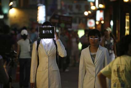
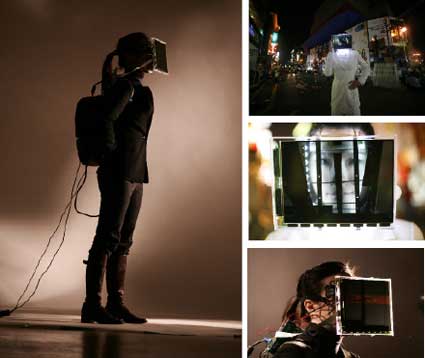
Digital Veil looks like a simple LCD used as a veil for the face. Through some modification of the device, the viewers watch neither the face of the wearer nor the B&W animations on the LCD screen but a hybrid between the two.
veil3.jpg

Digital Veil is a very intriguing piece. It was inspired by the quest for beauty. Have you tested it on women obsessed with their looks? How did they react to your project?

I prepared the exhibition “Run_Human” last July at the Triad New Media Gallery (Seoul, South Korea) with my supervisor David Hall and media designers Jinyoung Choi and Minsoo Kang. Digital Veil was a part of my project displayed at the exhibition. Before the exhibition in July, I staged a street performance with two models wearing the Digital Veil and LED Eyelashes, another media work of mine that portrayed fetishism. The performance attracted a good number of passers-by who responded to the grotesqueness of wearing the veil and eyelashes on the face. I think they were also intrigued by the way dynamic animation was printed on the face by wearing the LCD screen directly on the head. At the exhibition, I put the Veil on mannequins. But I was able to place the Veil on both on a model and mannequins during the opening, and I think having a person to wear the Veil communicate my design intention in a more effective way to viewers.
veil1.jpg

Another project item, the LED Eyelashes, is a set of artificial eyelashes attached with LED lights. I tried to project Korean’s obsession to big eyes, and how this fetishism is interpreted into excessive plastic surgery done on the eyes among Korean women. I really thought the obsession with big eyes can be represented through media design, because both yearning for bigger eyes and projecting the look through lights can be done by distorting the representation and creating new images. The LED Eyelashes have a mercury sensor that controls the light on the face. When wearing the LED eyelashes, you look embellished as if you were wearing a piece of fashion jewelry. It was really pretty and models who wore them and viewers who watched them wanted it!

0aaewelasj.jpg

I was very satisfied with people’s reaction. People were actually having fun with my design product and my design intention was communicated to them. I was particularly happy about the fact that people were amused by the distortion of images with which they were obsessed. I want to be a media designer who makes enjoyable products. Media fashion design products like the Veil and the Eyelashes actually represent people’s deepest inner desire in a way the desire can be externalized through design in a less serious manner. The desire of wanting to have bigger eyes and to get plastic surgery targets to deform their original figures, and in my view, people are excessively obsessed with the deformation, to a degree that can be called fetishism. My interactive media and fashion design piece does not disfigure people’s appearance and is hopefully less damaging to the body, but it generates the similar effect. I’m hoping that people can see that the media fashion can be one of the solutions for this fetishism through the LED Eyelashes and the Digital Veil.

What kind of animation appears on the screen?

Continue reading…

Advertising During Recession

Buckle up.

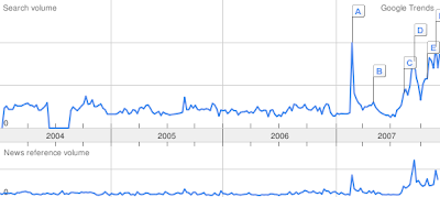
Washington Post (Nov 26, 2007): “Widespread expectations of a recession could be self-fulfilling because of how financial markets and mainstream America are interconnected. If investors are sufficiently convinced a recession is ahead, they would be reluctant to lend money to businesses that want to expand, making it so.”

Here are the expectations:


Google Trends: term “recession” in searches and news (U.S).


Blogpulse: term “recession” in consumer-generated media (blogs, newsgroups)

NY Times (Dec 4, 2007): “Growth in advertising spending in the United States is slowing considerably, according to several forecasters whose predictions are closely followed. But they believe the continuing strength of ad spending online — as well as the stimulative effects of the elections and the Summer Olympics — should keep the industry from suffering a recession in 2008.”

Telegraph (Dec 15, 2007): “Morgan Stanley has issued a full recession alert for the US economy, warning of a sharp slowdown in business investment and a “perfect storm” for consumers as the housing slump spreads.”

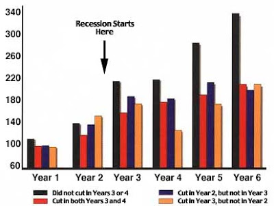
Time to dust off the trusty chart showing how advertising during recession is good for business in the long run:


The results of a McGraw-Hill research that showed companies advertising during the 1981-82 recession averaged higher sales growth (source).

FREAKY AD MOMENTS OF 2007, SWEET 16: Orville Deadenbacher vs. anti-anorexia ads

The Freakiest Advertising Moment of 2007 contest continues today with the Sweet Sixteen. (See the full bracket here.) Vote below for a winner in eight freaky matchups. Voting in this round continues through midnight on Monday night.

—Posted by Tim Nudd

Sixteen1b

Matchup #1:
Orville Deadenbacher
vs.

Italy’s anti-anorexia ads.

  Orville and his cold, dead stare may be the favorite, but he has an unhealthy challenger in Isabelle Caro, the French woman who was featured in Italy’s anti-anorexia campaign. 
  UPDATE: Deadenbacher is out, as Isabelle sends him back to the grave. See the vote totals here.

FREAKY AD MOMENTS OF 2007, SWEET 16: Canada’s Lost Jaw vs. DirecTV’s naked Burt

Sixteen2b

Matchup #2:
Canada’s anti-dip ads
vs.

DirecTV’s naked Burt Reynolds.

  A tobacco-disfigured face and a naked Burt Reynolds—neither is too appealing to look at. But only one will be freaky enough to advance to the Elite Eight.
  UPDATE: Even without his game face on, the Lost Jaw kid wins this round easily. See the vote totals here.

Links for 2007-12-16 [del.icio.us]

Lakai – Fully Flared skates


By far one of the most beautiful videos I’ve seen lately.
 
It seems the guys at Lakai took this video down from every streaming website there is. Quite a shame. For those of you who saw it, hope you liked it. Those who didn’t, I’ll try to find it again and when I do I’ll post it right here. 
Link: Lakai.
Via: ComputerLove.

NoFearToPaper release party


This is kind of a local event in Santiago, Chile. So if you’re not in the area maybe you won’t be interested in this post… Anyways…
 
My homie Veggie is spreading the word about the release party being held for his NoFearToPaper project.
 
At the event you’ll be partying with a lot of design people and also be able to see all the little boxes that made the cut.
 
It looks to be quite an event so if everything goes well, I’ll be seeing you there.
 
To view the bigger image just click on it.