Bourbon Ad Shows You the Peculiar Way People Get Around in Woodstock, Ky.

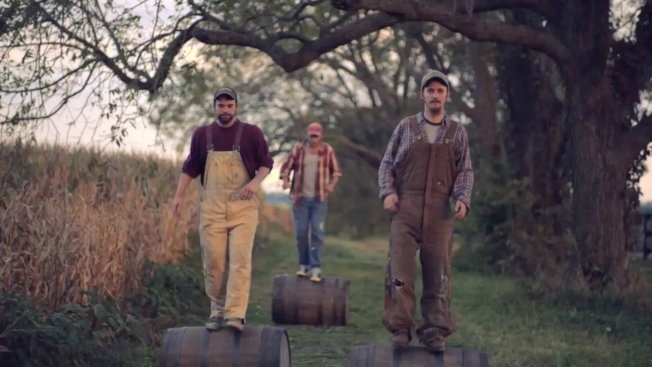
Woodstock Bourbon's ad showing its hometown's enthusiasm for the brand is pretty funny (well, besides that "Barrellel Parking" sign—groan). But it's right on the brink of being one of those fake homespun liquor ads that Henry Rollins used to laugh at, what with the fiddle music and rural aesthetics. It's like O Brother Where Art Thou? but less subtle.

Perhaps this is because it was made by Australian agency CumminsRoss for the Australian market, and so it needs to show a somewhat cartoony version of Kentucky.

Still, you can't deny the funny visuals. Perhaps Mila Kunis can take a day trip from the Beam distillery in Clermont and learn how to barrel roll like this.

Credits below.

CREDITS
Client: Asahi Premium Beverages
General Manager, Marketing: Kate Dowd
Woodstock Brand Manager: Kelly Jones

Creative: CumminsRoss
Chief Executive Officer: Sean Cummins
Executive Creative Director: Jason Ross
Copywriter: Chris Ellis
Art Director: Aaron Lipson
Managing Director: Chris Jeffares
Group Account Director: Hayden Isaacs
Account Director: Damiano Dipietro
Account Manager: Jessica Chamberlain
Agency Producer: Susannah George

Media: CumminsRoss
Chief Media, Innovation Officer: Kirsty Muddle
Media Manager: Tom Johnson

Production Company: Guilty
Producer: Jason Byrne
Director: Tony Rogers
Director of Photography: Shelley Farthing-Dawe
Postproduction: The Butchery, The Refinery
Offline Editor: Tim Parrington
Online Editor: Eugene Richards
Grade: Vincent Taylor
Sound Design: Flagstaff Studios
Sound: Paul Le Couteur
Stills Photographer: Christopher Tovo


Ikea’s Amazing RGB Billboard Is One of the Coolest Ads It’s Ever Made

Outdoor ad geeks, here's your latest bit of brilliance, courtesy of Ikea.

German ad agency Thjnk and production studio I Made This teamed up to create Ikea's "RGB billboard," which—much like Ikea furniture itself—makes the most of some very limited space.

The board features three different headlines superimposed on each other in different colors—cyan, magenta and yellow. At night, the board shines red, green and blue (RGB) lightbulbs on the board, revealing, in turn, the different headlines. Red bulbs illuminate the cyan text; green lights up magenta; and the blue-purple lights make yellow visible.

And that's how you turn nine square meters of ad space into 27 square meters.

It's a delightful little visual trick that embodies Ikea's space-saving message. Now, if only it worked a little better during the day.

Via Mindfields on Tumblr.


Domino’s Calmly Deals With Twitter Customer Who Says He Burned His Junk on a Pizza

Here's a pretty good example of a brand dealing well with a troll on Twitter—mostly by sticking to the script, with a few flourishes along the way.

On Monday, Domino's Pizza in the U.K. had to deal with a customer who claimed to have burned his penis while "making love" to one of its pizzas.

You can see the whole exchange below.

Even as @ITK_AGENT_VIGO's tweets get increasingly irate and obscene, @Dominos_UK remains calm—amusingly nonchalant, in fact. At the end, though, the brand allows itself a little freedom, taking an even more absurd claim from the man at face value and admitting "that is not what is expected of our pizzas. We raised them better than that!" (Hopefully that doesn't count as legal admission of sexual misconduct by the pizza.)

Would have been fun to see how Tesco Mobile would have dealt with this guy.

Daily Star via Complex. Photo via Flickr.


Small Agency’s Devious Recruiting Ads Invite You to Apply to Droga500 and MMMMother

Droga5 is great and all, but it stands to reason, mathematically, that Droga500 would be one hundred times as awesome.

Nail, a small agency in Providence, R.I., invokes the hallowed names of Droga, Mother and Goodby, Silverstein & Partners in a series of cheeky new recruitment ads that acknowledge the greatness of those agencies—and then invite you to apply to better versions of them.

Three job ads posted on Google+ include links to droga500.com, mmmmother.com (the "tastier" version of Mother) and goodbysilverstien.com, each of which links through to Nail's site, where you can either apply for a job there (or if you're an "angry attorney," connect with a guy named Jeremy, who can hopefully talk you down).

Says the agency: "We are a small creative shop that competes for talent with big, famous creative shops. So we figured if we can't inspire young creatives to apply for a job here, at least we might be able to confuse them into it.?"

Via Disco Chicken.


Can’t Wait for Mad Men’s April 13 Return? Watch Don’s Entire Journey So Far in 2 Minutes

How many times can a two-minute recap of Don Draper's six-season-long journey on Mad Men capture the off-the-rails boozer puking into a potted plant? Zero. But the rest of his repertoire is nicely represented in this short promo video ahead of the Season 7 premiere.

There are the suave drags on cigarettes, highball in hand, the prolific womanizing, the creative genius. AMC, as usual, has been stingy in releasing new material for the upcoming, final season. Hence the look back at Draper's world-by-the-tail early days on Madison Avenue through his infidelities, betrayals, failed marriages and, where fans last saw him, forced sabbatical from his namesake ad agency.

It's not much, since the Season 7 premiere is still six weeks away. But it's a decent, stylized refresher. What would make the April 13 series return not seem so distant? Two-minute Joan, two-minute Peggy, two-minute Bob. Definitely two-minute Bob.

Also, for a deeper dive, check out our archive of Mad Men Minute video recaps of every episode.


Jennifer Lawrence’s New Dior Ads: Totally Gorgeous, or a Photoshopped Mess?

You might think that Dior, after paying Jennifer Lawrence a lot of money to be an endorser, would want the woman in its new ad to look pretty obviously like Jennifer Lawrence. But not everyone is convinced she does.

The print ad above, featuring the actress, is drawing praise, but also some criticism for excessive Photoshopping. It's not on the usual social-ethical grounds but because, as Emily Leaman over at Philly Magazine suggests, the ad looks more like a "pre-pubescent 12-year-old boy than the strong, broad-shouldered, post-pubscent Jennifer Lawrence we know in movies like Silver Linings Playbook and The Hunger Games."

That's a bit of a rhetorical stretch, but you might find yourself blinking hard once or twice before you realize who it is. In reality, it's pretty clearly her—especially when you compare it to some of her early modeling photos. But it is fair to say that between the aggressive retouching (which she tends not to mind) and the haute trappings, Lawrence doesn't look much like the straight-talking girl next door image she's grown into.

Jessie Heyman over at Huffington Post, for her part, thinks Dior's new Lawrence looks like Leonardo DiCaprio circa Titanic. Then again, that might be a compliment … he was one of the prettiest young women in Hollywood.

More pics from Lawrence's new Dior campaign below.


The World’s Weirdest Supermarket Ad Is Both Super Cool and Super Crazy

This wonderfully warped three-minute music-video commercial for Germany's Edeka supermarket chain certainly lives up to its title, "Supergeil," which can mean both "super cool" and "super sexy" (or "horny") in German.

Paunchy middle-aged crooner Friedrich Liechtenstein bathes in milk and cereal, boogies in the aisles, fondles sausages, cavorts with a dude dressed like a battery and reels off naughty double entendres to a techno beat. At one point, he rhymes "muschi" (German for "cat," or "pussy") with "sushi," while a woman slurps raw fish nearby. ("Supergeil" does not translate to "super classy," after all.)

His subdued yet insane performance transcends language barriers, though it's a hoot that one line translates to "Organic is also very, very cool/Very cool organic products, excellent," while a suave chorus exhorts viewers to "Check it out, very, very cool fries, super/Very cool cod, by the way, very cool/Oh look here, toilet paper, ooh, now that's soft/Very, very cool, super." You don't learn to write copy like that in portfolio schools.

Some liken the clip, from ad agency Jung von Matt, to a German "Gangnam Style," citing its funky take on local pop culture. Others compare the bearded Liechtenstein to Dos Equis's Most Interesting Man in the World. Frankly, he reminds me of a different ad character: It's easy to imagine Liechtenstein strutting down a sun-soaked European beach, well-fed gut straining against his Speedo. Easy to imagine, though not particularly pleasant.


Mila Kunis Puts Her Love of Bourbon to Work as the New Face of Jim Beam

The new face of Jim Beam, the iconic bourbon brand, might not be quite what you expect. While a rough-around-the-edges cowboy or country rock star might seem to fit the bill—Jim Beam has used Kid Rock at times in the past—its newest spokesperson is the petite and beautiful Mila Kunis.

The 30-year-old actress, who says she is a big fan of bourbon in general, is featured in two new 30-second Beam ads, as well as five other videos ranging in length from 15 seconds to more than three minutes.

The first commercial features a series of quasi-historical events (the transition to the '60s is a little visually jarring), and in the second, Kunis is seen branding her own barrel of bourbon. She narrates, and smolders, in both. "Make history" is the tagline of the new global campaign.

The supporting videos are pretty fun. Save for "Mila Kunis & Hibernation," which feels a little bit too much like a production of a scene in Indiana Jones, the other shorts are funny and quirky and a little less serious than the two main spots. And if you find yourself feeling the need to whisper "Shut up, Meg," it's because Kunis—no stranger to voiceover work—has been the voice of Meg Griffin on Family Guy for the past 14 years.

Nice move on Jim Beam's part in an attempt to appeal to millennials. The campaign is by FutureWorks, a new entity comprised of three regional Beam creative agencies—StrawberryFrog in New York, The Works in Sydney, Australia, and Jung von Matt, Hamburg, Germany.


Cuervo Imagines What Its Website Would Have Looked Like in 1795, 1880, 1945 and 1974

How does the world's oldest tequila maker introduce a brand-spanking-new website? By keeping one foot firmly in the past.

McCann New York has launched a new site for Jose Cuervo that's actually five sites in one. In addition to its new site for 2014, the brand also imagines what the brand website would have looked like in 1795, 1880, 1945 and 1974.

"Fully actualizing the concept in an authentic way required researching the language and design tropes of each chosen year, and then presenting what we needed to say about Cuervo through those stylistic realities," the agency says.

It's a fun idea, and 1945 and 1974 are both particularly groovy. The only downside, in fact, is that the 2014 version feels visually staid by comparison.

Screen shots and credits below.

1795 website:

1880 website:

1945 website:

1974 website:

2014 website:

CREDITS
Client: Cuervo, Proximo Spirits
Client: Elwyn Gladstone
Agency: McCann, New York

Chief Creative Officers: Tom Murphy, Sean Bryan
Group Creative Director: Mat Bisher
Design Director: Brad Blondes
Senior Art Director: Elinor Beltrone
Copywriter: Sarah Lloyd
Designer: Ledi Lalaj

Production
Chief Production Officer: Nathy Aviram
Executive Integrated Producer: Catherine Eve Patterson
Senior Integrated Producers: Geoff Guinta, Jill Toloza
Associate Producer: Lauren Bauder

Production Company: Transistor Studios
Executive Creative Director: Aaron Baumle
Executive Producer: Damon Meena
Head of Production: Jesse Kurnit
Creative Director: Jamie Rockaway
Art Director: Geoff Keough
Developer: Brian Hersey
Designers: Ryan Weibust, Diana Park, Mauricio Leon, Edgardo Moreno, Tesia Jurkiewicz, Chris Murray and Carolyn Frisch


PSA Tells the Popular Kids in High School: ‘It Doesn’t Get Better’

Hey, it's filmmaker Jason Headley! You might remember him from such short films as "It's Not About the Nail," and now he's lampooning the "It Gets Better" project with this mock PSA from people who peaked in high school.

"It Doesn't Get Better" has its moments—the IROC-Z guy and the brunette have great delivery—but it showed up kinda late to the party and isn't quite clever enough to compensate for that. Also, the whole nerdy teen/yacht owner thing almost never happens in reality.

If life in the workforce has taught me anything, it's that most high school nerds end up working for rich, thick-headed dudebros with MBAs.


Agency Improves Whittling Skills, Carves Faces of New Hires Into a Totem Pole

Philly-based ad agency Red Tettemer O'Connell + Partners is back to carving likeness of its new employees, but it's graduated from crayons to wooden totem poles.

The details of the faces are pretty rough in both mediums, but the new material is clearly more forgiving—if less endearingly weird. Still, particularly lucky hires get adorable paper-doll versions of themselves. It could be an apt bit of foreshadowing, as a career in the industry might leave them feeling flattened, or square anyways. Either approach, however, makes for a more fun welcome-to-the-office present than the usual nothing, and a far more entertaining gift to the world than a run-of-the-mill press release.

One downside (or perhaps it's an upside): One of the new hires can lay claim to literally being the low man on the totem pole.

As far as offbeat staff announcements go, though, RTO+P has some pretty stiff competition in Barton F. Graf 9000's airplane-banner method.


Barbie’s Life Is a Lot Less Perfect in British Artist’s Disturbing Photographs

Meet Domestic Abuse Barbie, a doll that will not be modeling for Sports Illustrated or appearing in toy stores anytime soon.

Sam Humphreys, an artist out of the U.K., has transformed the iconic doll for her photo series called "What If?" The images, some of which could be seen as raising awareness of domestic violence (though the artist says they're "by no means intended to be used as an educational tool"), are based on a theoretical question: “What if we were to teach our children at an early age about the harsh realities that face some?”

On her website, Humphreys says the series is not for children, but she is demonstrating that life for some isn't as perfect as Barbie's life suggests. While some images depict Barbie with black eyes and a bloodied mouth, the series also "explores insecurity, loneliness, illness and addiction."

This Barbie needs to set up a playdate with Teen Mommy Darci.

More images below. Via PSFK.


Meet the Superhuman Moms in P&G’s Stirring Ad for the 2014 Paralympics

Procter & Gamble's "Tough Love" ad, which celebrates the pride and determination of athletes and their moms ahead of next month's Paralympic Winter Games in Sochi, Russia, manages to play on the heartstrings without hitting a saccharin note.

Not long ago, images of kids without limbs struggling to excel in sports would have been viewed as appropriate for fund-raising PSAs but too downbeat for other types of advertising. It's a mark of how far we've come that such visuals are now seen as inspiring and triumphant. And the found footage in this minute-long clip from Wieden + Kennedy, Portland, Ore., showing determined youngsters swimming, racing and skating (with their supportive moms nearby), is especially soul stirring.

Paralympic snowboarder Amy Purdy narrates: "You could have protected me. You could have taken every hit. You could have turned the world upside down so that I would never feel pain. But you didn't. You gave me my freedom because you were strong. And now, so am I."

The ad, running both online and on TV, debuted on Feb. 19 and has racked up 2.2 million YouTube views so far. Part of P&G's "Thank you, Mom" campaign, the spot serves as a companion piece to W+K's similarly themed viral hit "Pick Them Back Up," which follows four athletes from their baby steps to Olympic glory.

Taken together, the two spots make the point that all athletes, regardless of ability or skill level, similarly strive toward their goals. They fight to overcome long odds, personal travails and self-doubt—often relying on the dedication and perseverance of their moms to help them succeed. Such equality communicates a simple, universal truth: You have to let them fall a few times before they can soar.


LG Advertises Ultra-Thin TV on Magazine Spine That’s Exactly the Same Width

Here's your clever media placement of the day: M&C Saatchi in Stockholm has advertised LG's OLED-TV, which is 4 millimeters thick, on the spine of electronics magazine Lyd & Bilde (Sound & Image), which is also 4 millimeters thick. Throw in a double-sided arrow, a line of copy and the LG logo, and you're done. Via Adland.


Do You Like This Incredibly Bubbly Ad for Coca-Cola Light, or Do You Love It?

Coca-Cola is really having a go at social media this week. Earlier, we had the Coke video that offered a fashionably questionable solution to social-media addiction. And now we have this ultra-peppy new global Coca-Cola Light commercial from ad agency Johannes Leonardo.

Its point is that "liking" things just isn't enough. You have to love them. And you have to love them enough to roll around in them, swing on them, set fire to them, dance with them, kiss them (with gold teeth, preferably) and float away to heaven with them.

Ambivalence toward the "like" is hardly a new stance for marketers, but here it's aggressively communicated with broad, boundless energy as well as other, smaller details—you'll notice there are no computers or smartphones anywhere, and someone is even (gasp) seen reading a book. (The song is "Love Me Again" by English artist John Newman.)

It's a fine message for Coke, really, although it makes the 79,691,932 people who like the brand on Facebook maybe look a little foolish.


Agency’s Ice-Cold Prank Turns DHL’s Rivals Into DHL Advertisers

Some evil genius of an agency is getting global buzz for delivery service DHL with a endearingly cold prank on the brand's rivals. There's just one problem: DHL didn't have anything to do with it.

In a video that's exploded across the Web over the last two days, we see how delivery services like UPS were tricked into toting around large packages that were essentially mobile billboards saying, "DHL is faster." The stunt was supposedly accomplished by wrapping the boxes in thermo-active foil that, when cooled, hid the message until well after the packages had been picked up by the competition.

Many viewers debated whether the stunt was real or fake, which still isn't quite clear. What is certain, though, is that it's not an official ad for DHL.

In an email to Consumerist, DHL issued the following denial of responsibility:

"This was not something that was initiated by DHL. The video was created by an external agency for their own internal competition. We were aware in advance of the intention to use it for this purpose. We were not aware of any plans to share it externally."

Oops.

The brand stopped short of naming the agency behind the "Trojan Mailing," but the supposed video case study, already viewed more than 600,000 times, is hosted by German firm Jung von Matt/Neckar.

Real or staged, it's hard-hitting advertising at its best. Attention grabbing and not afraid to show its teeth, but also clever enough to avoid just being obnoxious.


A Little Girl and Her Cat Sing the Perfect Duet in Britain’s Latest Adorable Commercial

It must be nice to be Three.

The British mobile network has the most fun-loving advertising slogan around: "We all need silly stuff." And Wieden + Kennedy in London makes the most of that promisingly vague positioning. Last year, we had the dancing Shetland pony. Now, it's time for the singing cat.

The new ad is brilliantly shot by Traktor, and features remarkable performances—not just by the preternaturally talented kitty but by the girl, too, who apparently was born to lip-sync old Starship songs. (W+K London has lots of relevant feline experience, too, of course, having also done the much-loved "Cats With Thumbs" work for Cravendale.)

The only downside: The related website, where you can upload your photo and "star in your own kitten-rocking, face-morphing music video," doesn't load outside the U.K.

Credits below. Via Unruly Media.

CREDITS
Client: Three
Agency: Wieden + Kennedy, London
Creative Directors: Dan Norris, Ray Shaughnessy
Creatives: Chris Lapham, Aaron McGurk, Luke Tipping
Production Company: Partizan
Directors: Traktor
Postproduction: MPC


Cadbury Brings the Joy Yet Again With James Corden’s Lip Sync

Cadbury is following up last month's charming "Yes Sir, I Will Boogie in the Office" spot with another winner. U.K. actor James Corden, best known as the creator of hit BBC sitcom Gavin & Stacey but probably more familiar to Americans from his Doctor Who appearances, stars in the latest video for Cadbury's "Free the Joy" campaign.

It's a solid two minutes of dancing and lip-syncing. That length might seem tiresome, and Cadbury's product barely features in it, but it's so fun that I had no problem watching all the way through. Twice. And judging from the clip's 1.5 million views in two days, I think others might agree.


Live Without Your Phone 10 Minutes and Help a Child Living Without Clean Water

To raise awareness of the millions of children going without clean water each day, Unicef is challenging you to see how long you could deny yourself something as simple as checking your phone.

Mobile visitors to UnicefTapProject.org can join the challenge (and help raise money for the cause) by following a few simple instructions and putting their smartphone down. For every 10 minutes you leave your phone alone, the project's sponsors will fund a day of clean water for needy kids worldwide.

The mobile Web app is currently in beta and scheduled for official launch March 1. Droga5 helped to conceive the campaign, part of an annual program now in its eighth year, and MediaVest serves as a media partner. While your phone is parked, the site fills your screen with stats and information about the need for clean water. It also encourages you to keep going and contrasts your elapsed time with the number of frivolous tweets, texts and Instagrams that have been posted while you've been participating.

Surely, even hardcore mobile addicts set down their phones for 10 minutes each day—perhaps while taking a nice hot shower, which millions of less-fortunate folks around the world would view as a luxury. 


Neil Patrick Harris Sings a Sexy Song for His Favorite Sleep-Inducing Beverage

Neil Patrick Harris goes all Miley Cyrus on a bottle of Neuro Sleep in this goofy music video for the brand's "Sleep With Neuro" campaign.

The video was directed by Jon Jon Augustavo, who also did Macklemore's "Thrift Shop" video, and has NPH in full Barney Stinson mode, silk pajamas and everything. I guess that nightshirt phase he went through didn't last.

There's a fair amount of corny R&B video tropes to be found here, both in the visuals and Neil's delivery, which is top notch as always. That's the nice thing about him—you never feel like he's phoning it in, no matter what ridiculous or beneath-his-talent thing he's doing.

NPH's appearance in the video came from a Neuro customer survey that asked people who they would like to have a slumber party with—35 percent of the responses went with Neil. It also didn't hurt that he and Neuro Sleep founder Diana Jenkins are friends.

Plus, How I Met Your Mother is finally finishing up, so he needs to keep the wolves off his doorstep somehow.