Pantone's Color of the Year Is Marsala, and It Has Some Critics Throwing Shade

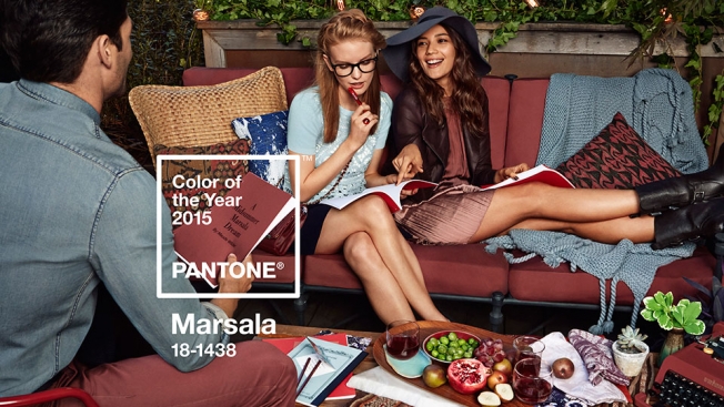
Designers always eagerly await Pantone’s December announcement of its Color of the Year, predicting which hue will be ubiquitous in the year ahead. The 2015 Color of the Year, unveiled Thursday, is Marsala—a deep reddish brown. And it has some critics seeing more red than brown.

“It’s a color that makes you want to go to Olive Garden or order Tampax in bulk,” says New York Magazine’s The Cut blog in perhaps the most scathing critique.

And for its part, Olive Garden seems elated.

Not all of the reaction to Marsala has been negative, but it does feel muted—perhaps appropriately so—compared to previous COYs like Tangerine Tango (2012), Emerald (2013) and Radiant Orchid (2014).


Marsala, meanwhile, is “a naturally robust and earthy wine red,” Pantone says.

The executive director of the Pantone Color Institute, Leatrice Eiseman, further elaborates:

“While PANTONE 18-3224 Radiant Orchid, the captivating 2014 color of the year, encouraged creativity and innovation, Marsala enriches our mind, body and soul, exuding confidence and stability. Much like the fortified wine that gives Marsala its name, this tasteful hue embodies the satisfying richness of a fulfilling meal, while its grounding red-brown roots emanate a sophisticated, natural earthiness. This hearty, yet stylish tone is universally appealing and translates easily to fashion, beauty, industrial design, home furnishings and interiors.”

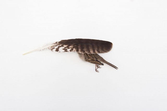
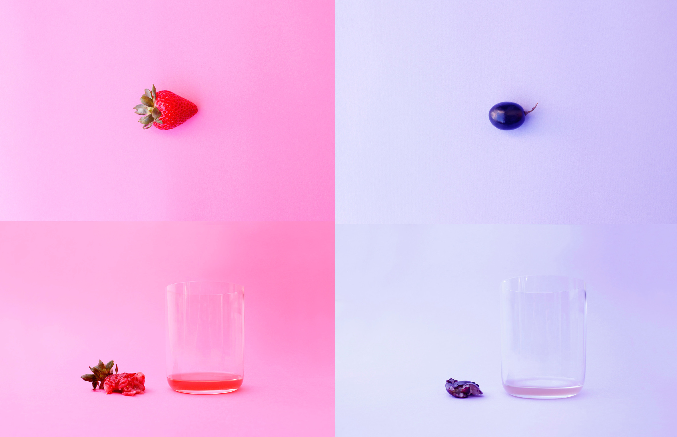
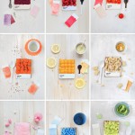
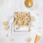
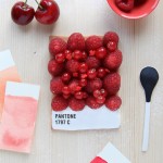
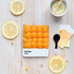
Pantone’s agency of record, experience design firm Sub Rosa, created the brand’s overarching “Make It Brilliant” platform—and did the creative for the Color of the Year campaign, including all of the images here.

“To bring the color to life, Sub Rosa was tasked with creating a series of images that were as bold and exciting as the color of the year itself,” the agency tells AdFreak. “To do this they created a print and social campaign that makes Marsala the star. The creative team worked closely with Pantone to ensure the tone and energy would drive the mood of an imagined ‘place.’ Sub Rosa organized this story through food, drink, cooking and friends coming together at various stages of an evening meal: appetizers, dinner and dessert.”

“In each vignette, Sub Rosa meticulously planned details to create multiple layers that speak to the broad design audience. As this party moves from appetizers on the deck to dessert by the fireplace, Sub Rosa played into varying elemental associations and feelings that Marsala evokes by appropriately adjusting the character and contents of each ‘room.’ “

So, what do you think of the choice of Marsala?


Kai Aragaki Photography

Agé de 17 ans, le photographe Kai Aragaki, basé en Arizona, aime prendre des photographies minimalistes sous forme de kits avec des suites graphiques jouant avec les formes et les couleurs : de jolis dégradés de fleurs, de maille de laine et de crayons, des origamis et des mots intelligemment associés à des pantones.

kaiaragaki-40
kaiaragaki-39
kaiaragaki-38bis
kaiaragaki-38
kaiaragaki-37
kaiaragaki-36
kaiaragaki-35
kaiaragaki-34
kaiaragaki-33
kaiaragaki-32
kaiaragaki-31
kaiaragaki-29
kaiaragaki-28
kaiaragaki-27
kaiaragaki-26
kaiaragaki-25
kaiaragaki-23
kaiaragaki-22
kaiaragaki-21
kaiaragaki-20
kaiaragaki-19
kaiaragaki-18
kaiaragaki-17
kaiaragaki-16
kaiaragaki-15
kaiaragaki-14
kaiaragaki-13
kaiaragaki-12bis
kaiaragaki-12
kaiaragaki-11
kaiaragaki-10
kaiaragaki-9
kaiaragaki-8
Processed with VSCOcam with f2 preset
Processed with VSCOcam with g3 preset
kaiaragaki-5
kaiaragaki-3bis
kaiaragaki-3
kaiaragaki-2bis
kaiaragaki-2
kaiaragaki-1

Tiny Objects Pantone

Dans sa série « Tiny PMS Match », la designer Inka Mathew a imaginé des pantones s’accordant à la couleur de petits objets du quotidien aussi banals que surprenants : des fleurs, des bonbons, des jouets en plastique loufoques, des coquilles et des fruits. Sa série est à découvrir dans la suite de l’article.

InkaMathewTinyPMSMatch22
InkaMathewTinyPMSMatch21
InkaMathewTinyPMSMatch20
InkaMathewTinyPMSMatch19
InkaMathewTinyPMSMatch18
InkaMathewTinyPMSMatch17
InkaMathewTinyPMSMatch16
InkaMathewTinyPMSMatch14
InkaMathewTinyPMSMatch13
InkaMathewTinyPMSMatch12
InkaMathewTinyPMSMatch11
InkaMathewTinyPMSMatch10
InkaMathewTinyPMSMatch9
InkaMathewTinyPMSMatch8
InkaMathewTinyPMSMatch7
InkaMathewTinyPMSMatch6
InkaMathewTinyPMSMatch5
InkaMathewTinyPMSMatch4
InkaMathewTinyPMSMatch3
InkaMathewTinyPMSMatch2
InkaMathewTinyPMSMatch1
InkaMathewTinyPMSMatch0

Fruit Juice Series

L’artiste chinois Enle Li a fait une série conceptuelle appelée « Fruit Juice ». Chaque fruit est pris individuellement sur un fond identique à la couleur du fruit, pour ensuite être pressé ou mis en bouilli afin de voir la quantité de jus qu’il contient. Le grand gagnant est évidemment la pastèque.

fruitjuice-22
fruitjuice-21
fruitjuice-20
fruitjuice-19
fruitjuice-18
fruitjuice-17
fruitjuice-16
fruitjuice-15
fruitjuice-14
fruitjuice-13
fruitjuice-12
fruitjuice-11
fruitjuice-10
fruitjuice-9
fruitjuice-8
fruitjuice-7
fruitjuice-6
fruitjuice-5
fruitjuice-4
fruitjuice-3
fruitjuice-2
fruitjuice-1
00

Mosaico transforma mais de 21 mil Pantone chips em “pixels reais”

O departamento de design da OgilvyOne, que trabalha tanto com impresso quanto digital, juntou essas duas disciplinas para fazer uma instalação artística em seu escritório em Londres, chamada de Paper Pixels.

Dois pilares de 3 metros de altura foram cobertos com mais de 21 mil fichas destacáveis da Pantone, transformando cada uma dessas fichas em um “pixel real” para formar dois grandes mosaicos de emoticons – ícone da cultura digital.

PaperPixels_s_04

Dezenas de pessoas trabalharam por quatro meses destacando e separando cada ficha colorida dos livros concedidos pela Pantone. Depois foram necessários 4 dias para a colagem de cada “Pantone pixel” nos pilares.

“Assim como pixels em uma tela digital, você não consegue ver a imagem de perto, mas se afastando um pouco os emoticons aparecem.”

Nas palavras do Head of Design, Rory Campbell, “assim como pixels em uma tela digital, você não consegue ver a imagem de perto, mas se afastando um pouco os emoticons aparecem. Essa ilusão de ótica destacou visualmente o departamento de design, unindo os times de digital e impresso.”

A idéia partiu do designer Hiten Bhatt. O resultado você assiste no vídeo acima 🙂
Web

Web
PaperPixels_s_07
PaperPixels_s_06
PaperPixels_s_05
PaperPixels_s_03
PaperPixels_s_02
PaperPixels_s_01

Brainstorm9Post originalmente publicado no Brainstorm #9
Twitter | Facebook | Contato | Anuncie

The Pantone Project

Nouveau focus sur Paul Octavious, un photographe qui cherche avec cette série à faire correspondre ce qui l’entoure dans son quotidien à des blocs de couleur du nuancier « Pantone » qu’il tient dans sa mains. Une belle idée « The Pantone Project » très bien réalisée à découvrir dans la suite de l’article.

The Pantone Project-10
The Pantone Project-9
The Pantone Project-8
The Pantone Project-7
The Pantone Project-6
The Pantone Project-5
The Pantone Project-4
The Pantone Project-3
The Pantone Project-1
The Pantone Project-2

Infográfico: Celebrate Color marca os 50 anos da Pantone

Os anos 1960 foram marcados pelos tons psicodélicos em roupas, objetos de decoração, na arte e no design em geral. Nos anos 1970, vieram os tons terrosos, substituídos pelas cores vibrantes que marcaram os anos 1980. As décadas de 1990 e 2000 foram períodos marcados por nuances e cores expressivas. Em resumo, é isso o que mostra o infográfico que a Pantone criou para celebrar seus 50 anos, mostrando como as cores marcaram cada década.

O infográfico também mostra as cores que dominaram as mídias sociais em 2012 – vermelho, azul e verde -, como elas são utilizadas em alguns dos logos mais famosos do mundo e explica um pouco sobre a Cor do Ano, determinada por especialistas da Pantone desde 2000.

Enfim, é um material de referência interessante.

Pantone_Celebrate_v8_English

Brainstorm9Post originalmente publicado no Brainstorm #9
Twitter | Facebook | Contato | Anuncie

Slip Into Underpantones, Underpants That Come in Pantone Colors

South African design agency Mark recently mocked up some Underpantones—underwear that come in various Pantone colors. They're intended for both men and women, and each pack is helpfully labeled with the color's swatch number. Some are hailing Underpantones as wonderful social commentary, in that they call attention to just how overexposured the Pantone brand is becoming—sort of like the Helvetica font, post-documentary. On the other hand (or cheek), making a Pantone product isn't a terribly effective way to thumb one's nose at all those charlatans making Pantone products. I do want to see someone in a pair of Pantoneloons next, though. More images below. Via PSFK.


Pantone Food

Voici une série d’images rappelant le travail de la française Emilie Guelpa pour Fricote Magazine. En effet, Alison Anselot s’est inspirée de la couleur de certains plats pour s’amuser à composer des clichés représentant des couleurs Pantone. Une déclinaison à découvrir dans la suite de l’article.

Pantone Food9
Pantone Food7
Pantone Food6
Pantone Food5
Pantone Food1
Pantone Food3
Pantone Food4
Pantone Food2
Pantone Food8

Pantone 2013 Calendar

Afin de mettre des couleurs dans cette nouvelle année, voici le Pantone 2013 Calendar pensé par le studio Pentagram Design. Publié chez Abrams, ce calendrier (proposé aussi bien en carnet ou encore sous forme murale) éclairera vos journées grâce à des choix visuels et de nuanciers Pantone très réussis.


 width=

Pantone_Calendar_2013_062
Pantone_Calendar_2013_032
Pantone 2013 Calendar13
Pantone 2013 Calendar12
Pantone 2013 Calendar10
Pantone 2013 Calendar9
Pantone 2013 Calendar8
Pantone 2013 Calendar7
Pantone 2013 Calendar6
Pantone 2013 Calendar5
Pantone 2013 Calendar4
Pantone 2013 Calendar3
Pantone 2013 Calendar2
Pantone 2013 Calendar1
Pantone 2013 Calendar11

Beertone: Uma paleta de cores de cervejas

As cervejas possuem diversas escalas de cores. A mais usada pelas cervejarias modernas é a SRM (Standard Reference Method), que determina a cor medindo a atenuação e absorção da luz que passa através de um centímetro do líquido.

É algo bem técnico e destinado para a indústria. Por isso a proposta do Beertone é criar um prático índice de cervejas pelas cores, usando as escalas oficiais e referenciando também as mais conhecidas RGB, CMYK, Web e Pantone.

Projeto de dois brasileiros que vivem na Suiça, o Beertone será impresso em formato de copo de cerveja (17.5 cm x 5 cm), e vem em três edições diferentes, custando entre 42 e 64 dólares. Também serão lançadas edições específicas para cada país.

Por enquanto está em fase de pré-venda, com entrega prometida a partir de 10 de dezembro. Pode ser um bom presente para os amantes de cervejas (ou cores), e também servir de guia na hora de escolher a bebida.

Dá uma olhada no site: beertone.ch

Brainstorm9Post originalmente publicado no Brainstorm #9
Twitter | Facebook | Contato | Anuncie


Advertisement


Human Pantone

L’artiste espagnole Angelica Dass nous présente son projet Humanae. Ce projet applique la classification alphanumérique de la coloration « Pantone » en fonction de la couleur de peau de différentes personnes photographiées. Un projet simple et visuellement réussi à découvrir en images dans la suite.

Human Pantone11
Human Pantone12
angelicadasshumanae4
tumblr_m6ix0mz6fh1rvapjbo1_1280
tumblr_m6kxk8cyTb1rvapjbo1_1280
tumblr_m6kxt3neTV1rvapjbo1_1280
tumblr_m6kuyjzACJ1rvapjbo1_1280
tumblr_m6ixiqj6LD1rvapjbo1_1280
angelicadasshumanae7
Human-Pantone5-640x640
Human Pantone8
Human Pantone7
Human Pantone6
Human Pantone5
Human Pantone3
Human Pantone2
Human Pantone1
Human Pantone4
Human Pantone9
Human Pantone10

Comidinhas inspiradas na escala Pantone

Olha aí uma dica de cardápio para quando você for dar aquele jantar para designers, criação da fotógrafa Alison Anselot. Via @aldera30. Clique nas imagens para ver cada receita.


Tartar de manga e salmão

Pasta verde
Pasta verde

Cheesecake de framboesa e limão

Sopa de repolho vermelho

Risoto de açafrão e parmesão

Carpaccio de vieira
Carpaccio de vieira


Tortinha de morango

Brainstorm9Post originalmente publicado no Brainstorm #9
Twitter | Facebook | Contato | Anuncie


Advertisement


Pantone Tarts

Présentée dans le magazine spécialisé Fricote, cette série de photographies de tartes pensée par Emilie Guelpa donne faim. Reprenant le principe des couleurs Pantone avec l’utilisation de nourriture, le rendu des différentes tartes est à découvrir dans la suite.


pantone-tarts21

pantone-tarts3

pantone-tarts1


Previously on Fubiz

Copyright Fubiz™ – Suivez nous sur Twitter et Facebook

Pantone Hotel

Découverte du Pantone Hotel, situé dans le centre-ville de Bruxelles. Conçu par le designer Michel Penneman et l’architecte Olivier Hannaert, l’hôtel reprend les 7 palettes de couleurs Pantone. Un hôtel chic doté de 59 chambres, à choisir en fonction de son humeur du moment.


red-room

brown-room

tablechair

pantone-hotel-lobby-10_1869

pantone-hotel-lobby-4_1863

pantone-hotel-lobby-3_1881


Previously on Fubiz

Pantonecans

Dans la lignée des déclinaisons autour du nuancier Pantone, voici ce projet personnel réalisé par l’artiste Nico189. Intitulé “Pantonecans”, il s’agit de bombes de peintures bien connu du milieu du graffiti. Un objet non destiné à devenir un produit commercial.


pantonecans1

Portfolio de Nico189.

Previously on Fubiz

A copycat masterpiece? / Peinture plus très fraîche

mona2006 mona2009
THE ORIGINAL?
Dulux Paints – 2006
“the whole world of colours”
Source : Eurobest GOLD, Cannes Archive Online, AdForum,
Agency : JUNG von MATT (Germany)
LESS ORIGINAL :
Skenpoint Printing House – 2009
Source : Adsoftheworld
Agency : Newmoment, (Macedonia)
Une reprise identique au pixel près. Un vrai “chef d’oeuvre” de reproduction.
Un exemple paru dans CB News Mag N°1023
2 people like this post.

Pantone Bags

Autour de la mode Pantone (Badges, Rubikube, Mugs), voici une nouvelle gamme et déclinaison avec les Pantone Bags. Des sacs existant en bandoulière et conçus par Whitbread Wilkinson. Le tout sous license Pantone pour un prix de vente de 45£.


Jonny Thompson Photography - W2 products 2.08

Jonny Thompson Photography - W2 products 2.08

Jonny Thompson Photography - W2 products 2.08

Jonny Thompson Photography - W2 products 2.08

Jonny Thompson Photography - W2 products 2.08

Fiche Produit.