White Gold is White Gold

After the captivating and beautifully interactive Get The Glass, I was eagerly anticipating the next Milk campaign. I can’t say I was necessarily anticipating anything, but I was blown away by the newest campaign, White Gold. White Gold

I have yet to fully explore the site, yet the interactivity is pretty inspiring, and the campaign is bizarrely different. Odopod has done some impressive work once again. And the series of YouTube music videos with White Gold and The Calcium Twins defies words.

And as it should be, even the YouTube and MySpace pages are awesome. I have a good deal of exploring left to do, as I try to wrap my brain around the epicness of White Gold. Pretty interesting stuff for something as simple as Milk.

Cadbury says Don’t Stop Me Now!

You might remember the Cadbury Gorilla spot we wrote about a while back. The question was posed:

Is it a worthwhile piece of content simply because it makes people watch? Or is it missing the boat because it has no connection to the brand?

Well, something as unique (and bizarre) as a gorilla drumming to Phil Collins is hard to top, but Cabral and Fallon have certainly done their best.

Both the drumming gorilla and this new spot share a bizarre semi-disconnect from the brand, and a similar feeling of enjoyment and satisfaction. And as touchy as I am at the use of Queen, this spot does it beautifully, just as the Gorilla did justice to “In The Air Tonight.” And then there’s the whole whole Cadburyesque purple sky, which is creatively beautiful.

Does it work? Can the “campaign” be continued successfully (and if so, does this accomplish it?) or was the drumming gorilla enough?

The insides of the BMW V8 M3 on film

Sure, there are dozens of ways to judge advertising as “good,” but it’s important to remember that good advertising needs to grab the attention of the target. GSD&M|idea city certainly kept that in mind with this spot introducing the BMW V8 M3 – my auto enthusiast friends (and not advertising/creative-minded folk) have been talking a lot about it – which I’d imagine is the most important goal for BMW.

After touring Europe and visiting the BMW M factory in Munich to study the engine, idea city folks figured out how to take three of the Belgium-build V8 engines and cram cameras, lenses and lighting into ‘em. Then after filming for four 20-hour days, they captured (at 10,000 fps) what happens in a single revolution inside of the 420hp beast of an engine. Without any CGI. It’s amazing that something like that still happens. But it’s incredible, and certainly creating a bit of buzz in the auto world.

Regardless of whether or not it’s a 100% accurate representation of the engine under full running load, it’s an impressive feat in terms of cinematographic execution and in not falling back on CGI. It definitely makes a powerful statement for BMW.

Rickrolling the NY Mets

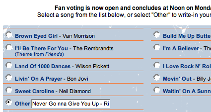
As if Rick Astley wasn’t getting enough inexplicable renewed popularity, here’s a bit more. A brilliant digg user decided to solicit the help of fellow dig users on a level of epic proportion when he discovered that the New York Mets are holding a contest to vote for the 8th inning sing-a-long song. Potential to be quite possibly the largest Rickrolling of all time.

And for those not too familiar with the concept of Rick Rolling, here’s an excerpt from Wikipedia:

Around the year 2003, an Internet prank known as “rickrolling” appeared involving misleading links redirecting to the music video. It increased in popularity as a 2008 April Fool’s Day joke through various media, including YouTube rickrolling all of its featured videos on that day, and a website allowing people to Rickroll their friends phones.

In ‘a couple of weeks’, about 13 million people had been ‘rickrolled’ into watching Astley’s video, the BBC reported on 1 April, 2008.”I think it’s just one of those odd things where something gets picked up and people run with it,” Astley told the Los Angeles Times in late March 2008, adding: “That’s what’s brilliant about the internet.”

So now the link has been dugg over 8000 times, and it’s spreading on fark and 4chan as well. Tomorrow is the final day to vote. It’s certainly a very real possibility that the NY Mets (and fans) may have just been Rickrolled like never before. Which says a good deal for internet memes and the significance of internet users (like those on digg) in swaying public polls – and who knows what else. Just something to think about while you try to imagine a packed Shae Stadium sinning “never gonna give you up…”

Typography tastes good.

I’m a typophile at heart and regardless of the project I’m working on, typography always plays one of the most crucial roles. Bad type is despicable and good type often near-orgasmic. For a quick refresher of the beauty of type, take a look at this short film:

It was Created by Vancouver Film School students Boca (a.k.a. Marcos Ceravolo) and Ryan Uhrich in the VFS’s Digital Design program. Impressive, to say the least. And inspirational. And just a quick & friendly reminder of the criticality of good type.

Song choices can be pretty significant

The following Taco Bell commercial from last fall has had a recent inexplicable resurgence on broadcast TV over the past few weeks, and it’s got me thinking a bit about tv spots and the music chosen to accompany them.

Aside from the bizarre appearance of the grim reaper and a few other oddities, the most bizarre (or at least thought provoking) thing about the commercial is the use of Modern English’s “I melt with you.” While the song has a special place in my heart, I’m not sure that the connection with Taco Bell really works for me. New Wave and Cheesy Beefy Melt don’t really go hand in hand in my mind, and I’m left thinking about Modern English – not ye old Bell.

It’s really no different than a few other fast food commercials over the past year, most notably the Wendy’s spot that used the Violent Femmes’ “Blister in the Sun” on TV and radio. There was also the Nintendo DS commercial with all the kids singing “Santeria” by Sublime. Not necessarily horrible, but peculiar choices, and ones that I don’t think i would have consciously made.

Does dumping a cult classic or one-hit wonder song into a commercial always make sense? Is it always the best idea? Does the grim reaper really eat at Taco Bell? Just a few questions that have been mulling around in my head lately.

Simple can be a good thing

I spent the weekend moving, which took a good bit out of me, both physically and mentally. In my semi-exhausted mental state, some of the more complex thought processes and mental connections just aren’t happening, and I’m fully willing to acknowledge that. The same can be very true for any communication, advertising included. While I’m not always in the midst of catastrophic brain flatulence, sometimes the simple ideas are just easier to grasp. I’m all for complex, multi-stage campaigns that ask for a good deal on the part of the viewer/reader, but it’s important to realize that it isn’t necessarily the best course of action, and sometimes the complexity overrides the effectiveness of the message. Convoluted and deep might just yield more confusion (or complete lack of awareness). On that note, I wanted to point out a recent commercial I stumbled upon while surfing the internet that’s aimed to the young Japanese audience that speaks well to the idea of “simple,” and amuses me in my exhaustion.

The spot, done by Australian commercial production company Plaza, is so simple, it works. I got it. And the message sunk in. Quickly. Which is the ultimate goal, especially when promoting for groups like The Whale and Dolphin Conservation Society. It could just be the classic Godzilla fan in me (and my mental exhaustion), but there’s something about the simplicity, the creativity, and the slight weirdness that just makes everything come together. And I payed attention. That simplicity and effectiveness doesn’t need to be reserved for children’s communication and simple messages. Sometimes the most complex ideas can be communicated unimaginably simply.

Full creative credits @ youtube, via Osocio.

Lenovo says Apple is just “hot air”?

lenovo_art_of_thin.jpg

New, trendy, and flashy products are often ripe targets for competitive ads. I always secretly enjoy when one company directly targets another via their advertising, despite knowing that a more creative (and ultimately more effective) solution most likely exists.

Lenovo seems to have had enough of the ever-so-popular Macbook Air, and takes a shot at it with the release of their new ThinkPad X300. Not only do they say “everything else is hot air,” but they even go as far as to loosely reference the Apple typefaces, gradients, and button styles of apple (below). It kind of takes the whole Mac vs. PC thing to a whole different level.

macbook_air.jpg

Sneaker Wars Roundup: Nike says “my better is better” & Pony is back

In today’s environment, with technological advances, marketing strategies and celebrity endorsements, shoes have become much more than just footwear. Brands are scrambling to assert their top-dog status, and today finds Nike is in the midst of launching one of their broadest multimedia campaigns to date, including a :60 spot to air on American Idol and college basketball tournaments asserting that “my better is better than your better”:

The emerging Nike campaign is in direct response to the Under Armour Superbowl spot proclaiming “The Future is Ours,” announcing their entrance into the cross-trainer marketplace. Under Armour quickly rose to dominance in the “compression fitting apparel” category, and after entering the market less than a year ago, has taken a 1/5 market share of football cleats. An interesting article in today’s Oregonian has some interesting info and quotes regarding the Nike campaign and the shoe/athletic apparel battle:

“This was definitely an all-out attempt to stop Under Armour in its tracks,” said John Horan, publisher of trade newsletter Sporting Goods Intelligence. “They want to make sure they don’t get surprised on this category.”

Follow the jump for the Under Armour spot, a bit of Adidas, and some Pony action

Simplicity: Land Rover Defender

landroverbridge.jpg

These days, simplicity is far from the norm, both in advertising and in life. A new product or campaign launch often contains an advergame or two, viral easter eggs, shot codes, fake viralesque videos, blogs, and on and on and on. We live in a world where multitasking is the norm and our brains are expected to do the filtering. That’s why it’s such a surprise when an ad is simple and makes a quick point without any hidden messages/games/web interaction/etc.
The print ad above, from RKCR Y&R in London for the Land Rover Defender is so simplistically perfect, it hurts. It’s not the greatest art direction ever and the copy isn’t earth-shattering, but it communicates a message well and quickly, without tumultuous effort. It can be done. And is worth remembering every now and then.

Gmail in Russia, paint and paper style

This spot (by Saatchi, Moscow) introducing Russia to Gmail is certainly an orchestration of simplicity and visual presentation, impressive in it’s own right. I’m more interested, however, in the fact that the stop-motion bare bones style was used. Especially for something as digital as Gmail. Does it make it more human to have people entering the search terms and starring your messages? Does it become more personal and more accessible? I’d like to think there is a specific and logical reason behind it, and not just someone wanting to do some cool stop motion construction. Either way, it’s an impressive execution that’s fun to watch.