Fools for April Fool’s Pranks

Ok so today is April Fools day and while jokes and pranks are spreading all around, sometimes you just cannot distinguish the funny ones from the serious ones. Remember, jokes are jokes but when it comes to drawing the line you better be careful.

Take this video ad for example. You will probably end up playing an April Fool’s joke on your friend or co-worker wherever you may be. However be careful because just like this guy, you may end up getting the false impression of being the fool on April Fools Day!

Simple can be a good thing

I spent the weekend moving, which took a good bit out of me, both physically and mentally. In my semi-exhausted mental state, some of the more complex thought processes and mental connections just aren’t happening, and I’m fully willing to acknowledge that. The same can be very true for any communication, advertising included. While I’m not always in the midst of catastrophic brain flatulence, sometimes the simple ideas are just easier to grasp. I’m all for complex, multi-stage campaigns that ask for a good deal on the part of the viewer/reader, but it’s important to realize that it isn’t necessarily the best course of action, and sometimes the complexity overrides the effectiveness of the message. Convoluted and deep might just yield more confusion (or complete lack of awareness). On that note, I wanted to point out a recent commercial I stumbled upon while surfing the internet that’s aimed to the young Japanese audience that speaks well to the idea of “simple,” and amuses me in my exhaustion.

The spot, done by Australian commercial production company Plaza, is so simple, it works. I got it. And the message sunk in. Quickly. Which is the ultimate goal, especially when promoting for groups like The Whale and Dolphin Conservation Society. It could just be the classic Godzilla fan in me (and my mental exhaustion), but there’s something about the simplicity, the creativity, and the slight weirdness that just makes everything come together. And I payed attention. That simplicity and effectiveness doesn’t need to be reserved for children’s communication and simple messages. Sometimes the most complex ideas can be communicated unimaginably simply.

Full creative credits @ youtube, via Osocio.

Keep Your Ads Appealing and Simple

Gap Ad

As far as creating advertisements are concerned, it is best to keep them simple. Not too wordy or too sophisticated. Remember that the first thing you have to consider is that people are not too fond of seeing ads with too much on it.Background colors are nice or even silhouette pictures. Use one or two expressive but general words that can capture the attention of your target market. The essence of a good ad is luring in the wandering eyes of the public. Once they are up and close, that is when they will start to read the fine print and see what you really have to offer.

Sony: the Playstation Network

In a gaming landscape that seems to be focusing more and more on relationships and connectivity, it’s no surprise to see greater emphasis put on features like xbox live and the communal aspects of the Wii (”wii would like to play“). At the same time, differentiating one on-line gaming service from another in the eye of the non-initiated public is no simple task. While it may be the gaming wave of the future, getting more people to jump on board takes some skill, and sometimes a slightly different approach.

This newest spot for Sony’s Playstation Network definitely sits outside of the traditional gaming system mold. The art direction, filming style, and soundtrack all give it an atmospheric quality not usually seen with video game systems. It’s certainly a different answer to the question of online gaming.

Oregon political advertising takes an interesting turn (or hook, if you will)

Out here in the Pacific Northwest, things are occasionally done a bit differently. Politics is obviously not exempt from the sometimes bizarre. As the political campaign for State Senator is ramping up, one candidate in particular is standing out in the crowd, so to speak, enough so to be gaining a fair bit of national attention.

And another Steve Novick political spot that’s been playing pretty much ’round the clock:

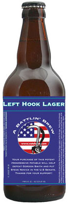
An interesting turn in Novick’s advertising and marketing is the recent release of Left Hook Lager, “A Battling Brew”.

lefthook_lager_store.jpg

That’s right, a politically endorsed beer. Nothing speaks to Oregonians quite like craft beer, so labeling bottles from small Eugene, OR craft brewer Ninkasi only makes sense (in a bizarre sort of way). If you’re so inclined, more info on purchasing the beer is available here.

And unlike many of these slightly bizarre campaigns, Novick’s campaign is quickly gaining ground and winning supporters. Last week, he received the endorsement from former Oregon Governor John Kitzhaber, and this week won the support of the Oregon Education Association. I hope this means we’ll be seeing some more entertaining political spots before this campaign is over. *And just a note – I’m definitely not proclaiming my political support for Novick – merely pointing out my appreciation for the advertising and marketing strategies that we’re seeing*

Sneaker Wars Roundup: Nike says “my better is better” & Pony is back

In today’s environment, with technological advances, marketing strategies and celebrity endorsements, shoes have become much more than just footwear. Brands are scrambling to assert their top-dog status, and today finds Nike is in the midst of launching one of their broadest multimedia campaigns to date, including a :60 spot to air on American Idol and college basketball tournaments asserting that “my better is better than your better”:

The emerging Nike campaign is in direct response to the Under Armour Superbowl spot proclaiming “The Future is Ours,” announcing their entrance into the cross-trainer marketplace. Under Armour quickly rose to dominance in the “compression fitting apparel” category, and after entering the market less than a year ago, has taken a 1/5 market share of football cleats. An interesting article in today’s Oregonian has some interesting info and quotes regarding the Nike campaign and the shoe/athletic apparel battle:

“This was definitely an all-out attempt to stop Under Armour in its tracks,” said John Horan, publisher of trade newsletter Sporting Goods Intelligence. “They want to make sure they don’t get surprised on this category.”

Follow the jump for the Under Armour spot, a bit of Adidas, and some Pony action

Schweppes: Burst (complete with Schweppervesence!)

Maybe it’s the little kid in me that likes popping balloons and throwing water balloons. Maybe it’s the music from Cinematic Orchestra that captures my attention and sucks me in for the full minute and a half. It could be the stunning cinematography with outstanding depth of field, color, etc. Or it could just be that it’s so bizarre, I can’t stop looking. Anyway, there’s just something about this new spot from George Patterson Y&R out of Melbourne that really tickles my fancy, so to speak. And I have to say that I’m a sucker for the Schweppervesence tag. It just makes perfect sense to me.

Billboards that target you – literally

wwftargetpractice.jpg

The other day I mentioned the possibility of billboards with head tracking in the future. Well, this isn’t exactly the same thing, but the end result may be just as effective. Placed in Beijing’s Fang Zhuang passage back in December, the WWF billboards by O&M Beijing were removed after only one day due to the alarm they raised. Effective would probably be an understatement. An interesting and creative way to turn the traditional billboard into something more powerful – without a whole lot of effort. [click the image above to enlarge]

Simplicity: Land Rover Defender

landroverbridge.jpg

These days, simplicity is far from the norm, both in advertising and in life. A new product or campaign launch often contains an advergame or two, viral easter eggs, shot codes, fake viralesque videos, blogs, and on and on and on. We live in a world where multitasking is the norm and our brains are expected to do the filtering. That’s why it’s such a surprise when an ad is simple and makes a quick point without any hidden messages/games/web interaction/etc.
The print ad above, from RKCR Y&R in London for the Land Rover Defender is so simplistically perfect, it hurts. It’s not the greatest art direction ever and the copy isn’t earth-shattering, but it communicates a message well and quickly, without tumultuous effort. It can be done. And is worth remembering every now and then.

Unintentional International

Jokk Juice is made from berries from far far away. This Swedish ad from Saatchi & Saatchi highlights how hard it is to get the berries that go into Jokk Juice. But what’s really hard is finding information on Jokk Juice on Google. If you type “Jokk Juice” in your search bar you will be shown links to the ad in blogs and advertising registries. Most people have good things to say about the advert, but what if you wanted to know more about what’s in it and you don’t live in Sweden? When you type “Jokk” in Swedish Google your results will be a little better if you can read Swede. Saatchi did a good job of creating an ad, but did not plan for the viral effects that are so common today. There’s a disconnect between broadcast and digital that can be solved by planning digital scenarios. If the ad is being seen and appreciated around the world, perhaps a multinational splash page could be created to provide basic information. Even if the product is only sold in Sweden, people outside the market are becoming familiar with the ad but not the brand. A simple page and some search engine tweaks could save millions in the long run if there are plans to expand internationally. But then again I don’t know much about the brand or its plans for world domination.

When Ad Kids Attack

The Super Bowl has come and gone. There were some good ads and there were some stupid ones (like the Planters nut perfume ad… creeeepy). Being in the industry, I find that we can be harsh critics, note example above. When ad (brand) people get together to watch ads the gloves come off. Good ads have to pass the scrutiny of insiders who share a love for the craft. That last statement is mostly true for award shows. In reality ad people are a cynical bunch who can find something wrong with perfection because we know it is an oxymoron in this line of work. We don’t hate everything, just most things that suck. It’s difficult to gauge what ad people like and what they are going to piss on. One moment they could be laughing enjoying themselves, the next moment they take turns jabbing someone else’s baby(creative work). If you’ve ever wanted to see elusive ad people in their native environment, here’s your chance. The footage you are about to see gives you a rare glimpse into what happens when ad kids attack.


The Housing Bubble

Cookie cutter houses and neighborhoods are as common as cookie cutter Realtors in pant suits. They have mean handshakes and aren’t afraid to use them. A single sale can produce generous margins, enough to stock up on bland business cards that feature stock image houses and  executive photos of themselves. Some agents are bold. They’ll even create magnetic calendar versions of their cards just in case we forget what month it is when we’re reaching for a midnight snack. Why not create a huge billboard identical to your business card? Because when I decide to buy a house, nothing says “buy” like a yearbook photo and a phone number. I have nothing against these peddlers of the American dream who provide a much needed service. I do have something against business as usual. The housing market is where it is because of lender over-speculation and loan baiting. Real estate agents aren’t bad people, just bad marketers in the advertising award show sense. Now that people are buying less square feet if any at all, real estate agents have to work harder for their cut. Those in the know will work smarter. There is some hope for the industry. I found a real estate ad that appeared to have a concept and even appealed to a specific target.

I found the ad in RVA magazine, a local Richmond artsy community publication. They have designers who create ads that fit the magazine’s image. In this competitive landscape (wink wink) agents around the country can benefit from a little creative risk, at least until the market gets better. In an unrelated note, Richmond area home values are on the rise.

Renault: Everything is Sport

For most people in North America, memories of Renault consist of temperamental cars like LeCar and the AMC/Renault co-branded Alliance (both examples of model naming at it’s best). But Renault is alive and well in the rest of the world, competing bumper to bumper with the other industry leaders. They consistently produce some impressive advertising, and this newest spot for The Megane Sport by Publicis London is no different.

A simply beautiful concept. An exquisite “Everything is Sport” tagline that speaks volumes. Quite possibly one of my favorite automotive tags/concepts of late. It positions the Megane Sport perfectly and actually begins to define and mold the target as well. And the direction and production, paired with Vivaldi, produces something memorable. Not just as a cool spot, but as a spot for the Megane Sport, which is another impressive feat in and of itself. Now I just need to figure out how to get a Megane Sport over to this side of the Atlantic.

Swedish Beatboxing

beatbox.jpg

Great time waster, courtesy of the Swedish telecom giant Tele2 is something called BeatBox that lets you record your own beat box tune with a basset hound DJ.

This is the sort of fun, not-available-elsewhere-in-a-superior-format toy that brands should strive for online. It’s a quick little hit, has enough of a connection with a telecom company to be relevant, and is very well-done: you don’t have to speak Swedish to get it. Perhaps one of our European readers could fill us in on whether the basset hound figures in their advertising at all.

Gmail in Russia, paint and paper style

This spot (by Saatchi, Moscow) introducing Russia to Gmail is certainly an orchestration of simplicity and visual presentation, impressive in it’s own right. I’m more interested, however, in the fact that the stop-motion bare bones style was used. Especially for something as digital as Gmail. Does it make it more human to have people entering the search terms and starring your messages? Does it become more personal and more accessible? I’d like to think there is a specific and logical reason behind it, and not just someone wanting to do some cool stop motion construction. Either way, it’s an impressive execution that’s fun to watch.

Toyota “Corolla the X” microsite

Corolla the X

While the Toyota Corolla Superbowl ad received a fair bit of praise, I wasn’t entirely satisfied. Fortunately, I stumbled upon the new microsite for the car, dubbed “Corolla the X,” complete with an impressively elaborate crest. The site is a fairly bold yet unobtrusive mix of animation, audio, video, and games, managing to do a fairly impressive job at showcasing the features of the Corolla with some humor and without the usual buy-this-car spiel. The site even makes me appreciate the superbowl spot slightly more. My only big question (and maybe slight hesitation) is whether or not “Corolla the X” can really work. The Toyota Corolla has never been in the upper echelon of the automotive world. Can its image reflect it effectively? Will it be able to persuade buyers? Then again, it IS the Corolla… not exactly an unknown in the field.

The softer side of Microsoft.


And by soft I mean good. Check out the latest work for MS Office:Mac 2008. Kudos to McCann for producing this smart, clean and well executed site. It’s refreshing to see Microsoft embrace white space and a light-hearted approach. Smart writing and a quirky illustration style breathe life into a familiar product that doesn’t need to be over-sold. Supported by an equally clever ad campaing (check out the ads here) this site rewards exploration and discovery, speaking well to the Mac audience. Thanks for talking to me and not down to me.

Technorati Tags: , advertising, online,

Lab coats, ties & musicians sell cars?

I’m intrigued by what seems to be a recent trend in high-production automotive advertising. The number of commercials containing either an orchestra or a large group of people similarly dressed in a stereotypical factory worker or scientist get-up is fascinating. The newest spot continuing this trend is the Audi A4: Strings 1:30 spot by DDB Barcelona.

I could dig deep and analyze conceptual execution, soundrack choices, and overall production value, but what piques my interest is all of the people wearing lab coats. Who are they? Why are they this experienced at playing with string? And if they are Audi designers, is there any reason they’re all wearing matching lab coats? The only good answers I can come up in my head involve either the visual simplicity it creates or the pseudo-scientist-authority figures it yields. Either way, I still want to know how they got that skilled with string games.

I probably wouldn’t take much notice, but the Audi spot certainly isn’t the only recent advertisement to use the lab coat. The recent Problem Playground spot by W+K London for Honda has a plethora of scientists, construction workers, office execs, and other similarly dressed official-looking people taking part. Do they bring any authority to the message Honda is pushing? Or is it just some visual variety and I’m attempting to read too much into it? And then what of the Ford Focus Orchestra? Does having a musician play an emissions system of a Ford really make me any more likely to purchase a Ford? I’m by no means complaining. I think all the new spots are stellar in their own ways. I just find it interesting the direction that automotive advertising is going. We’ve definitely changed a bit since Joe Isuzu.

And for your viewing pleasure, I’ve embedded the “Problem Playground” and “Orchestra” spots after the jump.

The Viral and Digital Media Today

To say that the digital world is evolving would be both an understatement and stating the obvious. However it’s fascinating to observe the shifts and the push and pull from media and viewers alike. “Digital” and “viral” are no longer the marketing catchphrases they were a year or two ago, and many consumers are not pulled in by just any viral or digital marketing tool. With news of Havas planning a digital media arm, Havas Media Lab, and other agencies and holding groups attempting to similarly tackle the beast that is digital media, it’s becoming an interesting time to watch trends.

How does a YouTube video of Spongebob Squarepants clips mixed to Soulja Boy have nearly 27 million views and the evolution of dance video rise to the top YouTube clip with nearly 75 million views? Is there any possible application to branding and marketing at that level or is the “entertainment” vs. “advertising” paradox insurmountable in the YouTube age? I can’t say I have the answers, but it’s interesting to ponder as both the internet culture and the marketing structures are evolving.
It’s also interesting to see the changes in the media being produced. The novelty of “internet video” has all but worn off, so successful media has to be truly tailored. And just for some practical application and a bit of advertising candy, here’s one of the newer viral’s that has caught my eye, done by W+K Amsterdam for EA Sports FifaStreet 3. Interesting? Successful? Effective? Are those even questions that can be answered right now?

Adidas: telling the story of Adi

Storytelling is an art that is slowly fading away. There are even groups dedicated to the preservation of stories and of storytellers. With with new technologies and advancing digital techniques, the story is often lost. There are still those occasional stories that get told with passion and care, and they are truly beautiful. Adidas, founded 60 years ago, is one of the most iconic brands today with a logo that speaks for itself. Yet 180 Amsterdam has crafted a beautiful animated short about the history of Adi Dassler and the beginnings of Adidas. Simple, beautiful animation, but most important, an incredible and uplifting story from a true storyteller that speaks louder than any logo could. It’s nice to see a real story every now and then.

And you can check out the :60 version on YouTube here.

Technorati Tags: Adidas, shoes, film, animation, story, beyond madison avenue