Dushan Milic + Charuca Vargas + Christoph Niemann

Dushan Milic

  • Dushan Milic est un illustrateur spécialiste des portraits. Un style bien trash, bien à lui, perso, j’adore ! Et vous ?

Charuca Vargas

  • Charuca Vargas est une illustratrice espagnole très cute. Style vectoriel et épuré un peu à la Pucca.
  • Très tendance pour les filles, j’aime bien quand même. Vivement l’ouverture de son « shop« 

Christoph Niemann

  • Christoph Niemann est illustrateur pour journaux, livres et contes.
  • Je suis beaucoup moins fan du style mais on ne peut pas dire qu’il n’a pas de talent ;)

Flotsam Jetsam

0aaferiu78.jpgOn the left, an aerial shot of the dam (image The Times)

The Three Gorges Dam is the largest project in China since the Great Wall and the Grand Canal. The hydroelectric river dam, probably the biggest concrete construction in the world, spans the Yangtze River. The total electric generating capacity of the dam will reach 22,500 MW, at which point it will also claim the title of the largest hydro-electric power station in the world by capacity. The dam is not expected to become fully operational until about 2011.

0aasymbolfde5.jpg
A billboard in the port of Wushan shows the height that the water will reach, ultimately submerging all of its wharf facilities (image BBC)

Unfortunately and despite the economic benefits such as flood control and hydroelectric power, the project also sets records for number of people displaced (at least 1.3 million), number of cities and towns flooded (13 cities, 140 towns, 1,350 villages). The 600 kilometre long reservoir will flood some 1,300 archaeological sites and the effects on the environment is quite frightening (the quality of water in the higher banks of Yangtze is falling rapidly, biodiversity is in danger, etc.)

0aadecebji.jpg
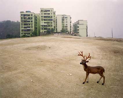
Hua Building Shot and Reverse, 2007, image courtesy of Franco Soffiantino gallery

Flotsam Jetsam, is an art project produced by Patty Chang and David Kelley in the Three Gorges area and currently on view at the Franco Soffiantino gallery in Turin.

0aacaptain8.jpg
Chang & Kelley, Captain, 2007, image courtesy of the Franco Soffiantino gallery

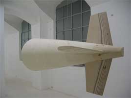
Upstairs is a screening of the Flotsam Jetsam video along with photographic material. Downstairs, there’s a wooden model of the submarine and Embankment, an experimental documentary created during a research trip in the Three Gorges area and which you’re invited to watch lying on water beds.

0aa4head.jpg 0a1tail.jpg
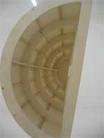
Submarine Head and Tail (Italian version)

Very quietly and elegantly, the work engages with landscape’s relationship to identity, in the midst of the deep infrastructural changes at the Three Gorges site. The first video details the process of fabricating a submarine, launching it below the Three Gorges Dam, following the submarine’s progress along the river and through the dam’s boat locks to the reservoir. Along this journey various performances are enacted. These vernacular tales compose a third narrative regarding landscapes link to imagination. Inspired from a collection of sources including: Chairman Mao’s many swims in the Yangtze, Jules Verne’s 20,000 Leagues Under the Sea, and contemporary news’ exposés on economic development and imaginaries of the Asia ’s modernization.

0aaflotasam.jpg
Chang & Kelley, Hua Building Shot and Reverse, 2007, image courtesy of the Franco Soffiantino gallery

More images from the exhibition.
At the Franco Soffiantino gallery, Turin, until January 19.

Olympic Fever

olympic_logo.jpg

With just 244 days (Aug 08, 2008) to go until the Beijing Olympics it’s probably a good time to flag any Olympic promotions with your client. It’s like the last minute Xmas cards they they forgot to brief you on.

Cashing In:

Just like The Ashes companies officially sponsoring the event will be there in full force but so will sidelined companies with no sponsorship dollars in the pot. Oh and the portals will be there in full force too capitalizing on increased traffic and page impressions that the event should generate.

Good news for Australian broadcasters is China shares a similar time zone with Australia so the events won’t take place at 3am. Hazaah! for TV spends.

I checked out the official Beijing Olympics site and found a funny mistake in the first section I clicked on. They have a section to help people learn other languages. All the audio files are provided in an annoying Windows Media format but the English one I tested was wrong.

There is going to be a lot of people asking for their passport when they really want to change rooms. This section must have seemed like a good idea but the way it’s presented online is useless. I could dissect it further but the mistakes are obvious.

You can also check out the Official Australian site for the 2008 games. In all it’s blue and confusing hierarchy glory.

Mascots:
You can also check out the official mascots called FUWA, which are cute pandas.

china_mascots.jpg

Although not as cool as the Vancouver 2010 Winter Olympic Mascots.

2010_mascots.jpg

How long until we get pixel mascots?

Here’s a site that has archived the Olympic mascots although hasn’t updated for a while.

I’m looking forward to the Olympics next year(for both sporting and business reasons) as Australia just doesn’t cut the mustard in the Winter games and in the Commonwealth Games we dominate too heavily. (Sorry England and Canada we kicked your asses.) With the Olympic games it’s a real competition.

Meet The New Boss

A new class of kings has taken over Wall Street and they’re ravishing everything that lies before them. 

Björk + Michel Gondry = Declare Independence


When two geniuses collide.
 
Via: ComputerLove.

From Spark to Pixel (Part 2)

From Spark to Pixel (Part 1)
Second part of the visit of the exhibition From Spark to Pixel. Art + New Media, which is running at Martin Gropius Bau in Berlin until 14 January 2008.

Christian Partos had some impressive installations.

M.O.M. – Multi Oriented Mirror pixelises the artist’s mother’s portrait with 5000 micro-mirrors whose infinitesimal slant makes the intensity of the reflected light vary. If you stand close to the installation all you see is just lots of tiny bits of mirror. Take a few steps back and the the portrait of Partos’ deceased mother appears. The effect is really amazing. No picture of it in the press kit, sorry. I made this blurry image which might give you a very vague idea of what it was like.
0aaskippingrop.jpg
Christian Partos: Visp, 2000. photo: Lepkowski Studios

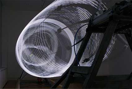
The Swedish artist had another work on show, Visp, a continuously changing shape made of 5 light-wires, 30 feet long, spinning like skipping-ropes, two revolutions per second. A computer, which also revolves, switches the LEDs on and off to create animated patterns on the revolving surface. Bitmap pictures, text etc. can be sent to the sculpture via radio link. Made for the Swedish Pavilion Expo 2000, Hanover.
0aaondulatio.jpg
Thomas McIntosh with Emmanuel Madan and Mikko Hyninnen, Ondulation, 2002. Photo: Lepkowski Studios

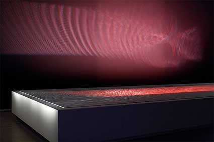
Ondulation, by Thomas McIntosh in collaboration with Mikko Hynninen and Emmanuel Madan is a truly hypnotizing composition for water, sound and light. A two-ton pool of water is set in motion by powerful loudspeakers. Waves travel across the basin, rising or falling in response to the sounds. Lights, bouncing off the moving surface, send reflected ripples over the walls of the gallery. The surface of this “liquid mirror” is slowly shaped by the sound into a kind of 3D expressions of the music which in turn become reflections on the wall. The simultaneity is such between the sound and light waves that we are left with a sense of seeing the sound and hearing the image.

Shiro Takatani (whom you might remember for a work Vicente recently reviewed: LIFE: fluid, invisible,inaudible… ) had some lovely installations and that’s is too bad for you if you can’t go and see the exhibition in Berlin because, once again, the press kit snubbed him. Chrono, a fiberglass cone recreates the exactitude of each pixel of an almost infinite number of fish-eyed images of skies shot in one day in Australian desert. Camera Lucida was commissioned for the retrospective of the nuclear physicist Ukichiro Nakaya (1900-1962) by the Museum of Natural History at Riga. Nakaya was the first to perform a systematic study of snow crystals and their different shapes. Camera Lucida is an intimate piece using fibre optics to explore the micro building blocks of nature.
0aadumbty.jpg
Dumb Type, Voyages, 2002. Photo: Jirka Jansch

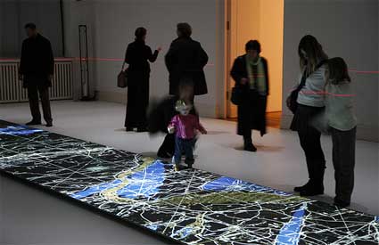
Takatani is one of the founders of Dumb Type. The Kyoto-based collective is showing Voyages, a work which brings to light the feelings of uncertainty and dislocation that accompany today’s shifting realities. Images of nature and other scenes are projected upon a narrow panel on the floor, circles showing a network of flight routes are superimposed. Visitors are invited to remove their shoes, step on the panel and embark on a journey through these multilayered realities. By adjusting their upheld palm to “catch” a projected circle, they can bring a “handheld” image into focus.
0aaartandfom.jpg
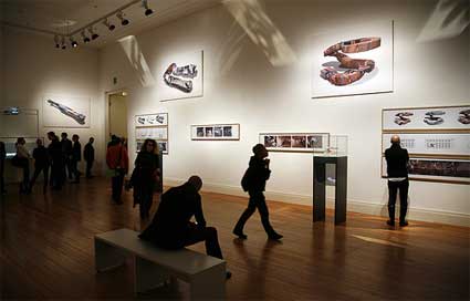
Joachim Sauter, Dirk Lüsebrink, ART+COM, The Invisible Shapes of Things Past, 1995–2007. Photo: Jirka Jansch

Joachim Sauter and Dirk Lüsebrink (Art + Com) had a room filled with architectural objects and sculptures generated from existing film stills, using a method they developed in the ’90s and which they call The Invisible Shapes of Things Past. The project enables users to transform film sequences into interactive, virtual objects.

In The Invisible Shapes of Things Past stills of a film sequence are arranged in a row in accordance with the camera movement with which they were shot. Thus, a straight camera movement produces a cube-shaped object and a pan a cylindrical object.
0adacccrem9.jpg
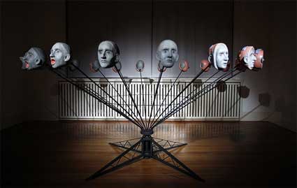
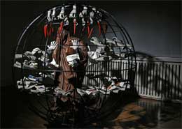
Gregory Barsamian, The Scream, 1998. Photo: Jirka Jansch

Gregory Barsamian uses relatively simple technoloty (strobe lights and motors) to transform his dreams into 3D animations. Using the idea of the zoetrope, the 19th century automated flipbook, Barsamian utilizes strobe lights synchronized to objects mounted on rotating armatures to create series of rapidly changing images. For each flash of the stroboscope, one sculpture representing a stage of the metamorphosis follows after the other, giving the impression of a constant transformation of its shape. Through the “persistence of vision,” the human mind transforms the images into the illusion of motion. An animation without the film.
0anononeveralone.jpg

Video of one of his pieces.

The Scream is a self portrait which concerns the issue of mind clutter: bits of unwanted information, songs and sound loops, images and nonsense syllables. In this piece a head emits a scream. The mouth widens and widens not stopping until the head turns inside out revealing some of the detritus within.

Image on the right: Greg Barsamian, No Never Alone, 1997. Photo: Jirka Jansch

The name of another of Barsamian’s installation, No, Never Alone, is taken from a Christian spiritual. A central figure is shrouded and thus blinded. The figures surrounding it are constantly taunting it for its intentional blindness. Hands dangle a carrot in front of it as well as show it an eye chart that it obviously cannot see. Another pair of hands holds an open book on whose pages dances a blind dervish while hands clap in time.

Here’s a slideshow of the exhibition. Please do not forget the credits for each image if you use any.

Video of the day

When Xeni Jardin from boingboing tv visits a tissue culturing workshop at Machine Project in Los Angeles and meets Oron Catts and Ionat Zurr of the biotech art collective SymbioticA.
Video report:

Philippe Starck on design


TED’s Talks are truly amazing. I’ve been watching them for some time now but only recently I’vwe come to realize their true amazingness.
 
If you don’t know, TED is a worldwide event where the brightest mind on the planet speak. From design to biology, society, filosophy, technology, etc.
 
The thing is that on TED’s website you can find the talks updated weekly and in great quality. By far one of the best resources on the internet today.
 
This time I’m showing you an exposition by Philippe Starck, who speaks in a very funny and gesticular yet profound way about why we design and why we must know when not to.
 
Link: TED Talks.

Coffee Morning: It Makes Coffee Happy

189294422_a01fdfb0d0
What, oh what, would we do on Friday mornings if we didn’t hang out and drink coffee? Sleep maybe? Work out? Watch the same 10 clips on ESPN about 32 times? Who really knows. One thing is for sure, though. When we go have Coffee Morning on Fridays, we make coffee happy. It’s true. Check out this happy cup of coffee as evidence.

This Friday, we’ll be making all sorts of coffee happy at Mildred’s. It starts at 7:30, which means you only have to watch the same 10 clips on ESPN around 12 times.

Clone Wars

As scientists move closer toward cloning human beings, artists and philosophers warn us that we may end up copying the worst part of ourselves. 

Tom Geraedts


Tom Geraedts is only 19 years old and has an amazing future in motion graphics.
 
Via: Fubiz.net

Really? This is how far we’ve fallen.

Burnhampointe

The copy, with annotation, follows.

“The most outstanding glass and steel hi-rise (rising penis, no doubt) in Printer’s Row is doable (get it, it’s a pun because the hot girl in the picture is doable too!). Close to the most popular nightlife (Lots of hot ho’s who love big wallets) and shops in the neighborhood (Screw shopping? Where the chicks at?), Burnham Pointe is Chicago’s ‘NOW’ building. (Now with more access to big tits and tight jeans) With amenities including resistance pool, hot tub, (How many times has a BP resident stuck his thing into a girl’s thing in here) fully equipped fitness center (sweaty residents! TONS of MILFs!) and sundeck (Can you say orgy!) all waiting to be customized to your taste. At these attractive prices, Burnham Pointe is within your reach. (around, reach around).”

Come on man. This is brutal.

Going WAY Beyond Batman Begins

_1179708837A while back I started to notice quite a bit of cool viral marketing going on for the next Batman movie, The Dark Knight. We’re talking microsites galore and massive user participation. On one microsite, users were asked to answer location-specific questions from across america to reveal a phrase. Then, after that, there was a chance to send in a photo of yourself dressed up as the Joker.

Today, over on FirstShowing.net, all of the previous viral marketing attempts have been chumped, big time. It appears that now the people behind this marketing campaign has taken their execution to a new level — physical items.

On December 3rd a new page appeared at whysoserious.com/steprightup with a hammer game and some teddy bear toys. Each toy had an address on it located in a number of cities around the US. The note on the game told people to go to that address and say their name was “Robin Banks” (get it, “Robbing Banks”) and they’d get something there. It was first come, first serve, and each location was a bakery. What they were given was a cake with a phone number written on it. Now here’s the best part: inside the cake was an evidence bag (complete with Gotham City Police printing) that contained a cell phone, a charger, a Joker playing card and a note with instructions.

If you’re not following along, the lucky few to receive the cakes now have a cell phone that someone will call at a later time. In essence, Warner Bros. is creating their own Joker army.

Damn geniuses.

WotNext.. Porn Peddling by Telstra?

**** Update : Thursday 6th December. As expected, the Federal Communications Minister has today ordered an investigation by ACMA into the sale of adult content ****

Australia’s #1 Telcommunications carrier, Telstra is this morning embroiled in a scandal involving it’s YouTube styled user generated content site WotNext, which was found to have a number of soft-porn clips.

WotNext is unique in that it has a revenue sharing model whereby contributors earn money each time a user of Telstra’s NextG mobile service downloads a clip. Each clip is charged at $1 and Telstra takes 50%, with the other 50% being credited to the user.

The key issue is that no age verfication takes place either on the site, or the mobile handset, therefore minors can access adult content.

News.com.au and the Sydney Morning Herald are both reporting the story, with News.com.au having captured and censored one of the clips for publication.

It will be interesting to see whether Telstra will undertake an audit of its userbase to ascertain whether any minors have indeed accessed adult content and whether Telstra is prepared to refund any money it earned through minors having access. No doubt the incoming Communications Minister, Senator Stephen Conroy, will be asking Telstra to ‘Please Explain’.

Furthermore, Telstra may have potentially committed a criminal act by selling porn to minors. The Australian Media and Communication Authority’s (ACMA) “Internet Content Guidelines” and “Adult Verification Scheme” has specific guidelines relating to the access of adult content online.

Earlier this year, the site was lauded for its effort by the Australian Direct Marketing Association (ADMA) when it won Best of Show at the 2007 Mobile Marketing Awards. The agencies credited include, George Patterson Y&R and Tiger Spike.

Unlike YouTube, Telstra claim the site is moderated. However this Google cache snapshot, clearly shows at least one of the controversial videos was posted back in July 2007, casting doubt over Telstra’s assertion that the site is moderated.

Beware the pitfalls of user generated content!

AWARD & ADMA 2007

_bannerblog.gif
Some weird and wonderful work amongst the stuff that’s been awarded at this year’s AWARD and ADMA awards.

Big kudos to Saatchi and Saatchi New Zealand who picked up Agency of the Year, and to Tequila and Host, who had a number of winners peppered through different categories

It seems AWARD certainly hasn’t been easy-going with the pencils, and I’ve heard from one judge who confirmed that it was indeed “a tough year”.

Some of the categories are of course getting even more blurred. Mobile and innovative media? Should that be included here?

More work is spilling out into other sections, which is awesome. Mobile is crossing over into online (and vice versa), and integrated work is becoming the standard rather than the exception.

Hmm.

Well, below are the main winners in the categories that as of 2007, are currently known as “Interactive”.

(Compare to what won at Cannes in the Cyber category here.)

BRONZE – DIGITAL CAMPAIGN, SILVER – ONLINE AD
Only two banner executions picked up anything, and those were part of the follow-up Staedtler The Pen is Mightier than the Mouse campaign by Host.

_staetdler.gif

BRONZE – WEBSITE
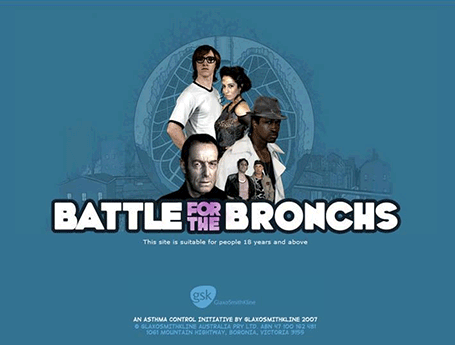
Nicely-told story of the Battle for the Bronchs done by Tequila

_battle.gif

The black character does look a little like Allen Iverson, no?

allen.gif

BRONZE – MICROSITE
It almost looks like Tenacious D themselves had a hand in The Greatest Website in the World again by Tequila Australia

_tenacious.gif

BRONZE – MICROSITE
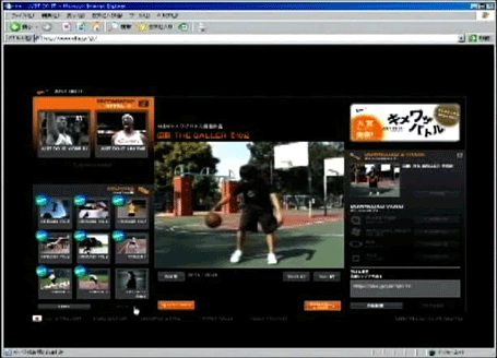
Tight make-your-own-ad for Nike with Kimewaza Battle by Beacon Communications Japan

_nike.gif

GOLD – ONLINE AND MOBILE GAME, SILVER – WEBSITE
ElectroCity by Rivet New Zealand is the kind of game you would have tried to get your school teacher to let you play instead of doing real work. Nicely crafted too.

_electrocity.gif


BRONZE – INTERACTIVE VIRAL

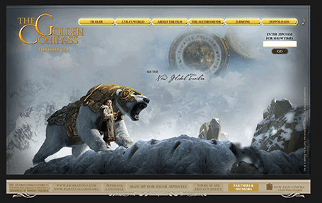
Golden Compass Daemons by Tequila again. (You might have to dig deep into the Flash for it.)

_golden.gif


BRONZE – OTHER DIGITAL MEDIA

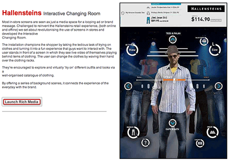
And the Hallensteins Interactive Changing Room by Saatchi’s New Zealand which I believe also won in the newly-created Dressing Room Innovation Category

_hallen.gif

Over at ADMA, some of the big winners were the lovingly-crafted Home Sweet As by Host, the Aussie-as Ashes Viral by Tribal DDB and Clemenger Proximity picking up a big tick for “social networking” withV-Raw

A text only PDF of ADMA and AWARD winners can be found here and here respectively. And Campaign Brief, in a great move forward with digital technology, have actually got color pictures of the winners in their PDF round-up.

More work to be posted as we come across it.

Well done to those who won. To those who didn’t, we best get working for next year.

The Upside Down Under

Kevin Rudd may have knocked off John Howard to become Australia’s Prime Minister, but now the hard part comes in trying to lead a country that has never had a sense of direction.

Snoop Dogg – Sensual Seduction


For those of you who don’t know, Snoop Dogg is a rapper. A gangsta, bitch-slapping-cop-killing rapper.
 
But Snoop, on top of this, is an artist with an amazing trayectory that has already surpassed hip hop, and he’s had the vision to collaborate with artists of all kinds.
 
Now, for a change, he recently released a hottt video. There are many like this one, I know, but this must be one of few I’ve seen that is so well executed.
 
Check the small details, like when the image repeats itself as the echo fades. Classic!.
 
And while we’re at it. The song is pretty damn cool too.
 
He’ll be coming to Chile soon, so those of you who are going, let me know how it was.

Graduating Design Students

It’s December which means that all the universities and colleges will be hosting their graduating exhibition. In the hope that the students will get a good job somewhere.

You would expect this part of the course to be the most important. The entire 2-4 years of study is wasted unless you get a job. Theory, attendance, attitude are all meaningless it all comes down to how good your book it. Does your work stand out from the pack? But how do you stand out when ou’r work is shoved into a corner of a room somewhere.

With that in mind why don’t the uni’s make more of an effort to sell their students to prospective companies. Why isn’t there a special screening of students just for potential employers? Why doesn’t every uni have an online database of students with their work samples?

Hyperisland seem to do this well but no uni (well none that I have seen) even come close to having a way to access a list of students and their work online.

There’s talented people all around Australia but there’s no way I’m going to Canberra on the chance I can see someone. Let alone Perth, Adelaide or any of those states.

What this does create is a way for the determined students to get a leg up on other students, but sadly the most determined students aren’t always the best.

Does anyone else have the same experience? or am I expecting too much?

Economic Indoctrination

The neoliberal indoctrination of young economics students in universities around the world all starts with one textbook – N. Gregory Mankiw’s Principles of Economics.

The Canadians have creeped me out.

Holy jumping bass! I know I must be way, way late to the conversation about this campaign but, sweet baby peas, this made me jump right out of my chair.

I had heard tale of a campaign from the big, snowy that made Safe Happens look like an Archie comic, but  I just ran across it today. What say ye people? Horror film or effective ad? I’ll go first. Generally, I don’t go for the gore. But I have to admit these do change my thinking about safety. Or, at least, they really have made me think about safety. Somehow that gets me over the "taste’ hump.