 It might come as a surprise but i actually do not like design. I don’t care about lemon juicers, that new phone all my ifriends want me to itry, “interactive and playful” lamps, lamps on top of a horse, chairs that change colours and sing, tables that “communicate with your remote partner”, lamps that you can punch, lamps that juice lemon (though i quite like the chairs that do the same job), etc. Still, every year i grumble but go to the Salone del Mobile in Milan and other furniture gigs. It’s because i do know that some designers can amaze me better than many techno-art geniuses. Eelko Moorer is one of them. Quite often my admiration for a creator seems to dwindle over time because of the way they repeat themselves or because my own interests shift. Didn’t happen with Eelko’s work. I discovered his Stilts a few years ago, i remember that they left me so dumb i even forgot to take a picture of them, then i fell in love with the rubber bearskin, i’m still laughing at the Emergency Games: A Manual For Extreme Experiences In The Danger Of Your Own Home and that was just the beginning.
Eelko Moorer studied at Utrecht School of the Arts (The Netherlands) 3D design and shoemaking before setting up his own studio and developing products for fashion, performances and works on the borderline between art and design. In 2003, the year he was nominated for the Rotterdam Design Prize, he enrolled at the Royal College of Art in London where he received his MA in Design Products in 2005 exploring new territories and contexts for his work. Based in London, he now works on a freelance basis for companies, individual customers and on self-initiated projects.
I have never asked this question to anyone so far because it is kind of cheesy but i cannot help it this time. Where do you find your inspiration? How do you get all those ideas?
Do you envision a particular type of user before or when you design a new piece or do you just go ahead, follow your inspiration and see what happens later?
Design for me is a vehicle for exploring larger social and cultural ideas that I am interested in. The start of most projects therefore is from a personal motivation and interest and themes always seem to revolve around nature-culture, body-desire, interior-exterior (society). I move from the personal to the generic. I mix everyday myths and facts for which I find inspiration in literature, film, material culture studies, newspaper articles, etc. From these elements I construct users that are fictional.
I am interested in what psychological effects contemporary life has on the individual and what possibilities for design there are in this area to design new sensations for the desensitized. tired of feeling and seeing.
I find that today’s designed environment has too much of the same conventional products, focusing on comfortability and the practical, that are the result of a too much systemized and industrialized society. On the contrary I believe in the value of difference, co-existence and the eccentric.
In the production process I explore the personal and the expressive in relation to the anonymous and the mechanized and through playing with form and meaning and through association I communicate ideas as well as through their function. The ideas and proposals are often critical and ironic at the same time.
Next to this I also work a lot from material experiments that I do. I believe that materials and techniques speak to you and technology is never neutral, that machines have politics behind them. Reflecting on form and meaning I analyze these material experiments and so see what they tell me in that context and how they relate to themes I’m interested in.
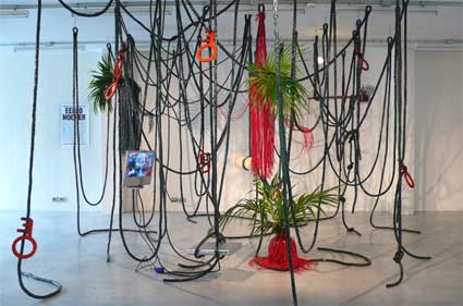
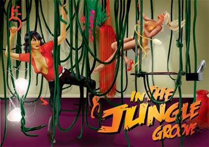
At the Salone del Mobile in Milan you exhibited In The Jungle Groove, a site specific installation made of swings, vines and suspended objects. Can you explain us what you were trying to achieve with this work? How do you imagine that people could use it?
Milan is all about the aesthetics of interior objects and not really about concepts of living, so I decided to present an alternative living space, a new experience, with new behaviors and new and unique designs.
I found that today’s home has too much of the same conventional products, focusing on comfortability and the practical. The contemporary home has become a passive and merely consumptive transient non-place filled with electronics.
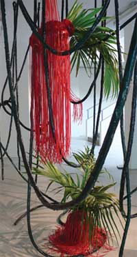 I wanted to design a living environment that was more about the emotive and physical and that would explore the values of discomfort, danger and especially play. The Jungle proposes a new interior space, literally and metaphorically. The Jungle is a hide out, a retreat from the outside world, a place to escape inward, a redesigning of the home as a place to reclaim the self.
In its form I was exploring the cultural meaning of the jungle as image and as a theme in relation to modernity as it emerges in popular culture with its connotations to the internal of the mind, the exploration of the unknown and as a the projection of man’s fears and desires.
I wanted to specifically use ‘environmental storytelling’, like it is also used in amusement parks like Walt Disney’s, or theme hotels as Las Vegas’ ‘The Mirage’ for example. This story element is infused into the design of the physical space and so gives meaning to the user’s experience.
Using associations to pre-existing stories already known to users through books, film, television, comics and other media allows the user to enter physically into a space they may have visited before in their fantasies. And so to evoke and make concrete memories and imaginings through which they can wander and with which they can interact.
Such a pre-existing story provides structure to the experience but is therefore in danger of limiting the imagination of the user by definition. It is, 1, by designing only an atmosphere and not fill the story in too much that there’s still enough room left for the user’s mind to wander and imagine themselves Tarzan, Jane, Liane The Jungle Goddess, King Kong, Kurtz from Conrad’s Heart Of Darkness’, etc.
And, 2, on top of that by entering this immersive and associative narrative environment the user can play via swinging on the vines and arrange and re-arrange by knotting the vines and objects in the space to his own liking. This provides space for game play and interaction. Room to play, to hide, and to perform. Within the given structure they can D.I.Y. their own plots and so experience the characteristics of interactive play such as freedom, power and self-expression.
People can use elements of it in their homes. I can also see it used in a hotel environment for example.
What I wanted to present in Milan is an idea, an atmosphere, a theme that I could continue working in. Right now I am designing more things for the jungle that are more product oriented and that can be sold.

Is the Jungle related in any way to Emergency Games?
Both the Jungle and the Emergency Games deal with exploring ‘play states’ (deep play, role play, etc) with the aim of designing a more creative and physical interaction with the home environment. While the Emergency Games sets out a direction and is a bit darker, the Jungle is a first attempt to materialize the idea in a lighter way.
You seem to be fascinated by rubber. Why this interest for the material?
Rubber is child- and toy-like. It transforms objects into a toy-like plastic reality. Into some sort of projected mental space where desires and fears are concretized and fictions and myths begin taking shape.
There’s desirability to it whilst at the same time being quite cheap looking and pulp, a bit subversive. It looks hard but is in fact relatively soft. There’s an element of ‘bad taste’ to it that I like.
Besides that there’s something magical for me about casting. Releasing an object from the mould and then having ‘a double’ or many ‘doubles’ that are exactly the same, and they way their meanings and relations to each other change, is something that keeps on captivating me.

Perch, 2005
What motivated our work Bird People? What were you exploring with that project?
I was exploring what psychological and therapeutic function designed objects can fulfill as props for living and the new typologies that could derive from this.
The story was about somebody that feels completely absorbed in his mechanized routines of everyday life, cannot relate to society anymore and because of this he feels dislocated and depressed. He feels unreal and wants to experience his physicality again, to release his desires, to let his animalistic side out again. He wants to set himself free, to become a bird literally.
Results were a perch chair: A new typology of a chair that asks for balance and concentration and the user takes a position that is protective and completely introverted.
The Balcony seat lets you experience a feeling of taking off, a feeling of falling over. It puts you in a contemplative state deriving from the existentialist notion that you can only experience life’s meaning in the face of death.

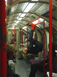
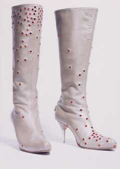
On the right, Tube Shoes, 2005
The Bat shoes enables to act out, to reclaim the public space for desire through play. Here the user is experiencing himself, but he also becomes a performer because by doing a surreal intervention, he transforms a mundane daily routine of traveling on the tube and produces some sort of myth.
And how did it end up in the Evening Standard and other mainstream media?
It was presented on the TV-set that hung in the jungle, a small part of the jungle installation in Milan. Somebody of the Evening Standard newspaper wanted to feature it. When they did, the Press Association put it on their website and it started rolling from there: ITV’s six ‘o clock news ran it too that day and it kind of escalated a little bit after that ending up on BBC’s Breakfast Show on TV, BBC radio and Irish national radio, various other pulpy newspapers and a lot of blogs all over the world.
You recently explained me that the objects that you design are not mere commodities but some desirable pieces? Can you explain what you mean by that?
I was more talking about that commodities have the characteristic of being as smooth, anonymous, impersonal as possible. The personal is then added via an atmosphere created through advertisement. I am interested in designing objects and products that would combine the personal and the associative with the anonymous and mechanized in its actual physical appearance. So the object or product would completely become an image and the image the object/ product. So the entire object/ product’s content and meaning are projected out onto its skin. There’s nothing behind its surface and so the object/ product quite literally becomes completely superficial.
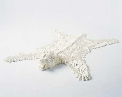
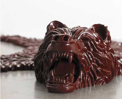
The bearskin for example is maybe the most extreme example of this. It is an object that is completely useless in comfort and not practical. Yet at the same time extremely desirable via its associations. The object is a play with form and meaning, change of context, transformation and scale and the references and associations that come out of this.

The rug refers to a lost exotic romantic world of hunting and intimacy that has been replaced and subverted by a toy-like plastic reality. It deals with the human desire for some ‘otherness’, but at the same time can also be understood as reference to a larger cultural and critical context (hunting trophy – man over nature, a nod to animal rights…).
The original model has been executed by hand in clay. From this a silicone mould has been made.
The materiality of the object plays with attraction through an almost carnal sensuality due to the handcrafted surface and at the same time a rejection of softness and presence of immateriality through the use of rubber and the objectʼs reproducibility. This play with attraction and rejection creates a fetishistic desirability, an erotic anesthesia.
How did you get to design Footwear for Rui Leonardes?
I know Rui from RoXY, a former nightclub in Amsterdam, where we both were hanging out a lot in the early to mid 90’s. We didn’t see each other for years until we met at the RCA-bar in 2003 where we both just started studying. He studying Footwear and myself Design Products. We’ve kept in contact ever since and he then asked me to do some shoes at some point. We share a similar kind of attitude so it combined well together.
Why do some of the shoes you design look so uncomfortable?
Well, the stilts for example look uncomfortable because they are. The idea was not to make wearable footwear necessarily, but more footwear that could function as a therapeutic prosthetic object with a psychological function for the user. It lets the user experience his own body making him conscious of the flesh through strapping on the stilts in a bondage kind of way and via balancing on the tips of the heels.
Oh! Btw, is there any place where I could buy a pair of “Wellies�
I’m afraid the company went bust a short while ago.

I usually think of you as both an artist and a designer. Are you comfortable with my blurring of your “label�
I always look for the ambiguous, the in-between spaces, the borderlands, or twilight zones, both in work and in life because these areas provide me with a feeling of freedom, inspiration and this is where identity and difference are negotiated. I see these territories as places where new perspectives and thoughts are being born.
Besides that, a lot of the work that I do balances between the descriptive of the arts, but contains the process, the context and the prescriptive elements of design.

On the left: Wonderland, 2001, in collaboration with Zjef van Bezouw
Where do you think that you “fit�
I see myself as a multidisciplinary designer. A designer because I use design methods and design research and that’s the context I function in. And multidisciplinary since I am moving on and mixing the boundaries of design, fashion and art, because I think different ideas and stories function best in different contexts. In general I guess you could describe my work as couture in a way if you like: conceptual and theatrical atmospheres and experiences that are often handmade and function as one-offs, or small series, exhibited and sold in galleries.
Let us put aside design for a moment. Which artists do you find most inspiring and why?
At the moment I would say:
I love Franz Kafka. Especially ‘The Trial’ and ‘The Castle’. How he transforms everyday reality and actions in surreal and absurd adventures. The way he psychologically drags you into his twisting and turning so you are totally confused yourself and so lets you feel the absurdity of systems and constructed realities. Also I love his ‘Observations’, who are beautifully sharp and short.
Antonioni’s L’Eclisse for how he portrays the feeling of loss of human intimacy and natural context of the protagonists by putting them against a man-made landscape of technological progress and modernist architecture. Together with a slowing down in time this makes the actors seem disjointed and lost between all that materiality. He makes alienation and estrangement feel so tangible and look so beautiful in that film.
J.G. Ballard’s novels in which his protagonists are conditioned and where they take action via some sort of release exposing an underbelly of a seemingly perfect social model. Although his earlier writings are a bit too SF for me, the later works deal with the psychological effects of technological, social or environmental developments and are more subversive and surreal in a subtle way.
Books like Cocaine Nights, Crash, Super-Cannes show visions of a nearer dystopian future that’s very well possible, or might even already be here. And in doing so, like all SciFi, showing a portrait of tomorrow, but actually talking about today.
Henry Miller because reading his books give me a feeling of being centered in what life really is about: experiencing total freedom regardless, the energy and joy of life, faith in chance, things like that.
Mike Nelson’s fictional narrative environments because they are so incredibly immersive and imaginative. Sometimes it feels the spaces are alive and spirited. I like the way he connects literal and highly detailed familiar looking spaces with abstract ones and leaves detailed traces that are humorous, slightly subversive, surreal, etc.

The artists that make the drawings for the covers of those pulp magazines and the anonymous designers/ makers that have made the objects that can be found on carboot sales and flee markets.
Thanks Eelko!






 It might come as a surprise but i actually do not like design. I don’t care about lemon juicers, that new phone all my ifriends want me to itry, “interactive and playful” lamps, lamps on top of a horse, chairs that change colours and sing, tables that “communicate with your remote partner”, lamps that you can punch, lamps that juice lemon (though i quite like the

 I wanted to design a living environment that was more about the emotive and physical and that would explore the values of discomfort, danger and especially play. The Jungle proposes a new interior space, literally and metaphorically.

