Squarespace Captures Its Users' Businesses in Super Slow Motion in These Eye-Catching Ads

Beautiful design is at the heart of the Squarespace brand, and so its ads must have a high aesthetic value as well. For this latest round, the website maker again calls on ad agency SpecialGuest, which this time showed up with a Phantom Flex4K camera and a plan to really slow things down.

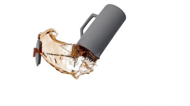
The result is three new spots, directed by 1stAveMachine’s 1stAveMachine, that capture objects from real customers’ businesses in super slow motion—as they ultimately land as beautiful still images on Squarespace pages.

The tagline is, “Build It Beautiful.”

The selected Squarespace customers worked with SpecialGuest and the client team to show how the platform allowed them to create state-of-the-art online identities—presented here with what the brand called “the aesthetic purity of motion.”

“The campaign is a truly collaborative effort, working with these businesses to properly convey the passion and energy behind the Squarespace community,” says SpecialGuest creative director Aaron Duffy. “That’s part of what makes Squarespace great, both as a creative partner and as a platform: ultimately Squarespace is about more than just building websites. It’s also about helping to support and empower its community.”

As the moving images resolve to static ones on the website, a voice says, “Isn’t it beautiful when things just come together?”—in which ad watchers will surely hear an echo of the famous Honda “Cog” spot, which used the line, “Isn’t it nice when things just work?”

More spots and credits below.

CREDITS
Client: Squarespace
David Lee: Chief Creative Officer
Ness Higson: Creative Director
Jenn Grossman: Creative Partnerships
Donovan Mafnas: Designer
Luis Gonzalez: Designer
Michelle Liv: Designer

Creative Partner: SpecialGuest

Partner/ECD: Aaron Duffy
Business Director: Ashley McGee
Creative Director: Jonathan Emmerling
Producer: Barry Gilbert
Sr. Art Director: Morgan Harary
Jr. Art Director: Eddy Choi
Creative Development: Chloe Corner

Production Co: 1stAveMachine

Partner/Executive Producer: Sam Penfield
Director: Tim Brown
Head of Production: Lisanne McDonald
Visual Effects Supervisor: John Loughlin
Line Producer: Alec Sash
Director of Photography: Martin Ahlgren
Still Photographer: Dylan Griffin
Production Designer: Clement Price-Thomas
Editors: Karl Amdal, Jonathan Vitagliano
Compositors:  Michael Glen, Joseph Pistono, Gerald Mark Soto

Color Grading: Seth Ricart @Ricart & Co
Sound Design: Joseph Fraioli
Music Supervision: Brienne Rose @ NoiseRacket
Audio Mix: Gramercy Post
Music Composition: Apothecary: Sofia Hultquist / Greater Goods: M. Colton / Yield: Adam Arcuragi + Jonny Diina

Chef Eric Ripert Serves Up Zen, Food Porn for Squarespace

Web-building/hosting platform Squarespace follows its Wieden + Kennedy-created, Jeff Bridges-starring Super Bowl spot this week by teaming up with New York City entertainment agency ACE Content and superstar chef Eric Ripert for an ad that may just whet your appetite.

Ripert, the James Beard award-winning founder of NYC restaurant Le Bernadin, shows us in a matter of 30 seconds how food translates into art with the help of some aesthetically pleasing slo-mo moments.

Just like W+K’s Bridges Squarespace spot, this latest effort — dubbed “Build it Beautiful” — evokes a sense of inner peace and seamless technology (minus the chanting and instrumentation of the former).

Unlike the Bridges ad, however, this one may leave your stomach rumbling for gourmet goodness.

W+K, Jeff Bridges Make You Sleepy for Squarespace

Squarespace has teased its ad from W+K featuring actor Jeff Bridges and if the teaser is any indication this may be the strangest ad broadcast during the Super Bowl.

The spot opens with an oddly-framed shot of Bridges as the actor says, “I love listening to intriguing sounds when I drift off into my dreams.” He’s plugging his album Jeff Bridges Sleeping Tapes, as a means of showing how even oddball ideas benefit from the Squarespace treatment. Proceeds from the album, full of “intriguing sounds, noises and other things to help you get a good night’s rest,” go to No Kid Hungry.

“We wanted to create a campaign to illustrate that any idea, no matter how wild or weird, can be presented beautifully and meaningfully through Squarespace,”  Anthony Casalena, Squarespace founder and CEO, told Adweek.

Squarespace does not plan to release W+K’s ad prior to the Super Bowl, but you can learn more about Bridges’ sleep album here. According to David Kolbusz, executive creative director at W+K New York, it really works. “[Bridges’] voice is like oak and leather and cigar smoke and the wilderness. I personally have fallen asleep to the recording on more than one occasion,” he said in a statement.

Squarespace reúne o que há de pior na internet em filme para o Super Bowl

Minha primeira reação ao assistir ao teaser de A Better Web Awaits foi algo do do tipo: “tá, e daí?” Em sua estreia no intervalo do Super Bowl, a empresa de design de sites Squarespace resolveu juntar um monte de memes, vírus e lixos virtuais que tornam a internet um péssimo lugar, em um filme criado in-house, com direção de  Malcolm Venville.

A situação melhorou um pouco com o filme completo, que já pode ser visto no YouTube, apesar de o comercial ter sido classificado de “deprimente” pela Adweek. Levando-se em conta que é apenas uma representação do que rola na internet, então poderíamos dizer que a internet é deprimente? Ou será que deprimente seria a maneira como a utilizamos?

É daí que a mensagem final acaba sendo algo bacana: “Nós não podemos mudar o que a web se tornou, mas podemos mudar o que irá se tornar.” É claro que um site bacana, como diz a mensagem, pode ajudar. Mas fundamental, mesmo, seria uma mudança no comportamento dos usuários de forma geral. Algo bem mais complicado de se conseguir.

Brainstorm9Post originalmente publicado no Brainstorm #9
Twitter | Facebook | Contato | Anuncie

Squarespace Unveils Its Full Super Bowl Spot, and It Sure Is Depressing

The Internet is Times Square pre-Giuliani, says Squarespace's Super Bowl ad—the full version of which went live Monday online, a week and a half after a teaser rolled out.

The spot, produced in-house, aims for a grand, dark vibe, but after a decently arresting opening image, it falls flat. It's hard to do convincing futuristic dystopias on the cheap, and it's clear Squarespace didn't put enough dollars into the production of this. If you want to see an amazingly rich, dark, circus-like world in advertising, with great directing and voiceover work, go back and watch Hal Riney's old First Union spots. Then come back and watch this. The difference is stark. You have to pay for it, but it pays off.

Also worth noting: People really don't want depressing messages on the Super Bowl. Here you've got 24 seconds of bleak followed by six seconds of bland. It will bomb on Sunday.


Advertising: With Previews, Super Bowl Advertisers Borrow From Hollywood

Chatter on social media outlets like Twitter helps encourage Super Bowl advertisers to release commercials early to whet consumers’ appetite for the game-day ads.


The Web Is One Sketchy Place in Squarespace’s Super Bowl Teaser

Website design service Squarespace has posted a teaser for its Super Bowl ad, which paints a pretty dreary picture of today's Internet.

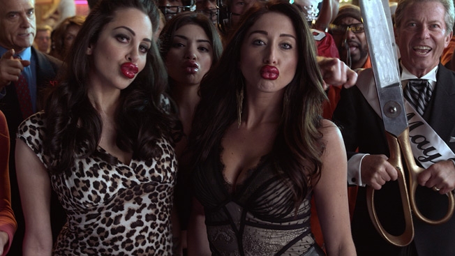
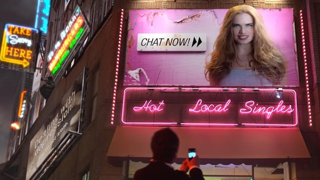
Opening on a face-swapped baby, which is creepy enough, the ad cuts quickly from real-life incarnations of the Joseph Ducreux meme to annoying banner ads to chat requests from "hot local singles." We then see the ad's jaded protagonist turning to find something that gives him hope, a light in the dark alleys of digital debauchery. But what is it?

Spoiler alert: It's probably Squarespace.

Squarespace is a first-time Super Bowl advertiser and one of the smallest companies to buy a national spot in the game. The ad was created in-house and directed by Malcolm Venville. For many more details on this year's game-day ads, be sure to check out Adweek's Super Bowl Ad Tracker.