“Get your 50% back. Get more than 50%. Lourenço Divorce Attorneys.”
Advertising Agency: Rái, São Paulo, Brazil
Executive Creative Directors: Camila Maschietto, Maurício Cavalcanti
Creative Directors: André Baldez, Bruno Cirello
Art Director: Bruno Cirello
Copywriter: André Baldez
Photographer: Fernando Manso / GettyImages
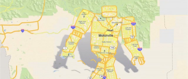
Coup de cœur pour le dernier projet de Patrick Jean intitulé « Motorville » et produit par Iconoclast. Après son excellent film Pixels, cette vidéo utilise les codes graphiques de Google Maps pour les détourner et nous raconter l’histoire d’une carte d’une ville américaine partant à la recherche d’essence.
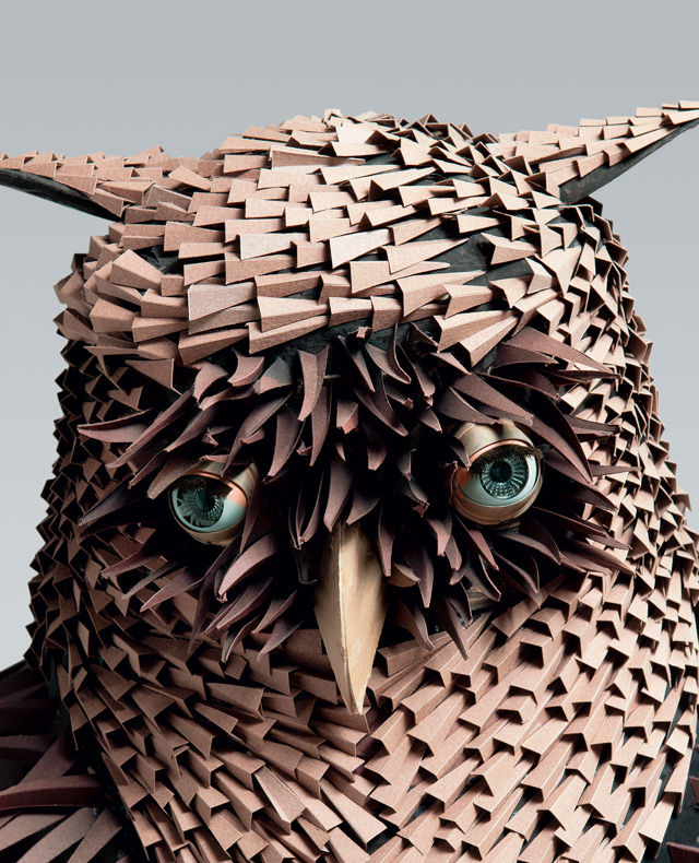
Voici les travaux splendides du designer industriel Irving Harper, à la retraite depuis 2001, et qui ont été récemment réunis dans un livre à son honneur appelé « Works in Paper » par l’éditrice Skira Rizzoli. De beaux clichés mettant en avant les œuvres variées de l’américain. A découvrir dans la suite.
Advertising Agency: Rái, São Paulo, Brazil
Executive Creative Directors: Camila Maschietto, Maurício Cavalcanti
Creative Directors: André Baldez, Bruno Cirello
Art Director / Illustrator / Designer: Marcel Cuzziol
Copywriter: Diogo Patoilo
Photographer: Fernando Manso
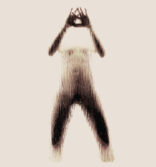
Coup de cœur pour l’artiste grecque Anastasia Mastrakouli étudiant actuellement à l’Ionian University Department of Audio Visual Arts. En utilisant le corps féminin nu masqué derrière une vitre humide, elle créé un alphabet des plus réussis appelé « Naked Silhouette Alphabet ». Plus d’images dans la suite.
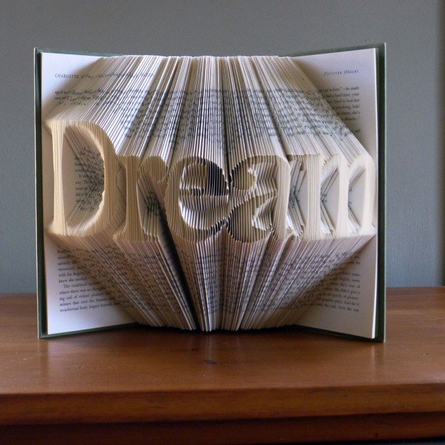
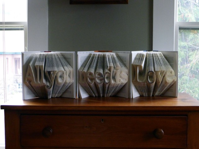
Découverte du travail de Luciana Frigerio, qui imagine ces superbes sculptures faites en partant de livres dont elle plie les pages pour créer différents designs et compositions. Un résultat visuellement très réussi avec de nombreux exemples qui sont disponible à la vente. Plus d’images dans la suite de l’article.
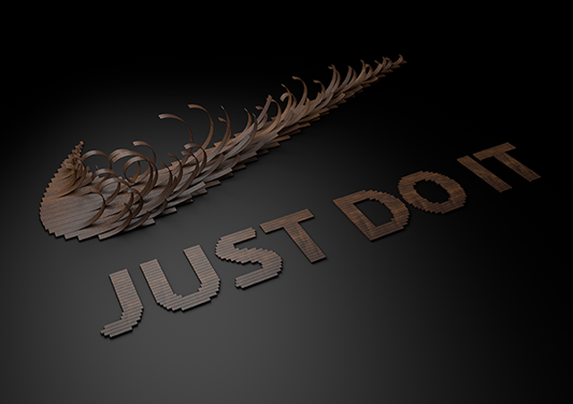
Focus sur Txaber qui est un infographiste espagnol basé à Bilbao possèdant un talent impressionnant pour la typographie. « Just Type It » est un alphabet qu’il a réalisé pour la marque Nike composant visuellement chaque lettre de lamelles de bois. Une véritable réussite à découvrir de A à Z dans la suite.
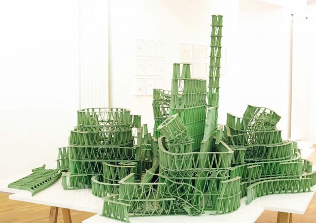
When it comes to paperwork, the designers at TBWA\South Africa in Johannesburg are a cut above. As an exercise in self-promotion, the design group transformed some of the agency's creative briefs—those not specifically requiring design recommendations—into three-dimensional paper sculptures using the pages of the documents and their nondescript envelopes as raw materials. The results, intended to capture the essence of the brand from which each brief was received, are amazing. My faves: the dress shirt for Bio Classic washing powder, with one corner of the garment composed of billowing soap bubbles; the insanely detailed ship in a bottle for Mainstay vodka; and the heaping bowl of shredded-paper noodles for Fatti's & Moni's pasta. Snatches of text from the original briefs peek through here and there. Such brand-specific words and phrases provide intriguing visual flourishes for these fusions of art and commerce. More images below. Via The Inspiration Room.
CREDITS Client: TBWA\Hunt\Lascaris Johannesburg Executive Creative Directors: Matthew Brink, Adam Livesey Art Director: Jade Manning Copywriter: Vincent Osmond Creative Directors: Sacha Traest, Mike Groenewald Design: Sacha Traest, Leigh-anne Salonika, Katleho Mofolo, Graeme Van Jaarsveld, Ilze Venter, Jason Fieldgate Typographer: Hazel Buchan Photographers: Graeme Borchers, Des Ellis Account Manager: Vanessa Maselwa Director: Brett de Vos Sound: Cut and Paste, Opus Production: Craig Walker, Simone Allem, Ingrid Shellard, Gillian Humphris
Although TBWA\Hunt\Lascaris is well established as an above-the-line agency, our clients were yet to be introduced to the wealth of talent that TBWA\ Design has to offer. So, to get our clients’ attention, we intercepted existing above-the-line briefs and used the physical advertising brief as our canvas. Instead of answering the brief in a traditional manner, we conceptualized various designs that captured the essence of the brands, then brought them to life using only the cardboard job bags and the briefs that were attached to them. We created intricate pieces of paper art, transforming our client’s briefs into multi-dimensional design pieces. We then sent our clients’ briefs back to them, proving that TBWA\ Design can do amazing things with their briefs. Our campaign was a huge success. The design studio received their first new brief from our client just 5 days later. Even more notably, new design work in the system rose by 450% within the first 6 weeks.
Advertising Agency: TBWA\Hunt\Lascaris, Johannesburg, South Africa
Executive Creative Directors: Matthew Brink, Adam Livesey
Art Director: Jade Manning
Copywriter: Vincent Osmond
Creative Director: Sacha Traest, Mike Groenewald
Design: Sacha Traest, Leigh-anne Salonika, Katleho Mofolo, Graeme Van Jaarsveld, Ilze Venter, jason Fieldgate
Typographer: Hazel Buchan
Photographer: Graeme Borchers, Des Ellis
Account Manager: Vanessa Maselwa
Director: Brett de Vos
Sound: Cut and Paste, Opus
Production: Craig Walker, Simone Allem, Ingrid Shellard, Gillian Humphris
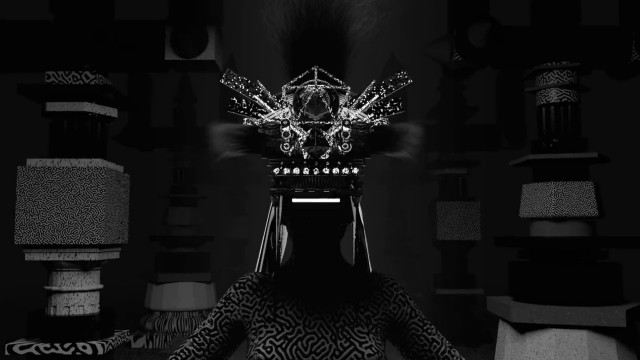
Alexander Dueckminor basé à Munich, plus connu sous le nom The Crystal Beach, a imaginé ce clip visuellement impressionnant illustrant le morceau « Don’t Let Me Go » de Ruckazoid. Une création hypnotique en noir & blanc nous plongeant dans un univers futuriste à découvrir dans la suite de l’article.
We wanted to inform wealthy assistance clients and also the board of directors of the VR-Banken about the quality of the investment products of akzent Invest and ensure costumer loyalty. Our audience received a handmade mailing consisting of three bottles of wine where the alcohol percentage equals the highest potential profit of the certificate.
Advertising Agency: serviceplan, Munich, Germany
Chief Creative Officer: Alexander Schill
Executive Creative Directors: Christoph Everke, Alexander Nagel
Art Directors: Matthäus Frost, Dimitrios Arampatzioglou
Copywriters: Katharina Keith, Melanie Madaus
Production: Katy Pergelt
Advertising Agency: ageisobar, São Paulo, Brazil
Creative Director: Carlos Domingos
Art Directors: Henrique Mattos, Cristiano Rodrigues, Cicero Souza, Roni Marques
Copywriters: Daguito Rodrigues, Ricardo Porto, Nicholas Bergantin
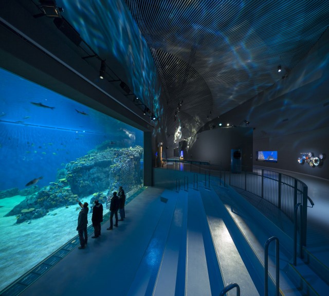
The Blue Planet est le nom du plus grand aquarium d’Europe du Nord qui vient d’ouvrir à Karstrup au Danemark. Avec une architecture signée par le studio 3XN, ce lieu au design incroyable, inspiré par le mouvement perpétuel de l’eau est à découvrir en images dans la suite de l’article.
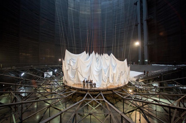
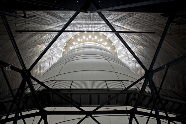
Le duo d’artistes Christo et Jeanne-Claude ont imaginé une installation magnifique en intérieur pour le Gasometer Oberhausen. Présenté jusqu’à la fin de l’année, il s’agit d’un ballon « Big Air Package » de 90 mètres de hauteur et de 50 mètres de diamètre dans lequel les visiteurs peuvent rentrer. Plus dans la suite.
L’artiste français Jérémy Laffon aime utiliser des éléments insolites pour réaliser des installations. Avec ces œuvres artistiques « Hollywoodoscopies », il créé des compositions uniquement à base de la matière des chewing-gums. Un rendu intéressant à découvrir à travers plus images dans la suite de l’article.
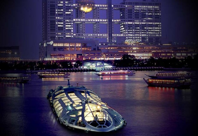
Ressemblant à un vaisseau spatial, le Jicoo Floating Bar propose depuis plusieurs années aux visiteurs et habitants de Tokyo de découvrir la capitale japonaise à bord de ce bateau-bar dessiné par Leiji Matsumoto, mangaka mondialement reconnu et à l’origine d’Albator. Plus d’images dans la suite.
Windows of New York é um lindo projeto de José Guizar, um jovem designer mexicano que mora em Nova York. Assim que mudou pra lá, José desenvolveu uma obsessão pelas janelas da cidade e, desde então, ilustra semanalmente seus achados.
Tudo começou por suas andanças em Manhattan e a admiração pela arquitetura da cidade. Em especial, as janelas o chamavam a atenção por guardar um mundo escondido dentro delas e também pelo poder de imaginação que emanam por cada aspecto seu.
A partir de fotos que José tira em suas jornadas diárias, ele criou um estilo de ilustração minimalista, que lembra os cartoons de Chris Ware.
A abertura do filme “Oz: Mágico e Poderoso” de Sam Raimi, atualmente em cartaz, é uma espécie de diorama que apresenta pontos importantes da trama em pouco mais de dois minutos.
A inspiração estética veio do clássico de 1902 “Viagem à Lua”, de Georges Méliès, com a utilização de objetos físicos conectados por fios e hastes. O estilo vintage dos créditos iniciais, aliás, foi adotado até no aspecto de imagem, 4:3, e em preto e branco.
O estúdio yU+co, responsável pela trabalho, também criou as ótimas aberturas de “Watchmen” e a “As Aventuras de Pi”.
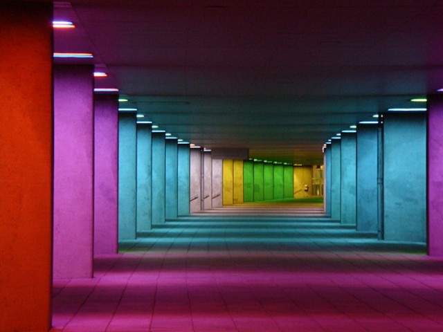
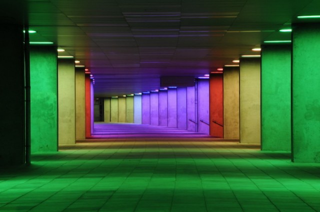
L’artiste néerlandais Peter Struycken a imaginé sous le Netherlands Architecture Institute une série étonnante de montants en béton colorés par des lumières, permettant de proposer une œuvre d’art de 170 mètres de long. L’ensemble est à découvrir en images et en détails dans la suite de l’article.
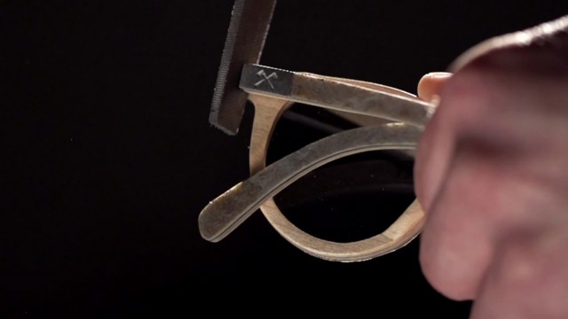
Après Skateboard Shades, la marque de lunettes Shwood nous propose cette superbe vidéo « The Stone Collection » démontrant toutes les étapes amenant à la construction de la paire incroyable limitée à 200 exemplaires. Une création réalisée par Joe Stevens à découvrir dans la suite.
This is site is run by Sascha Endlicher, M.A., during ungodly late night hours. Wanna know more about him? Connect via Social Media by jumping to about.me/sascha.endlicher.