Foster's Embraces a Male Rugby Cheerleader and the Tagline 'Why the Hell Not?'

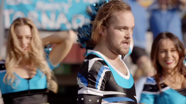
Adam&eveDDB and Glue Society director Gary Freedman made this British spot for Australia’s Foster’s beer about, of all things, a male rugby cheerleader. The ad is part of a growing trend of faux-documentary ads about people with quirky jobs, though it’s also a throwback to ’80s- and ’90s-style beer ads. (The beer commercial may be the last safe-ish haven for gender jokes like this.)

The male cheerleader here isn’t all that weird, even though he looks like Jack Black’s trash-eating hobo cousin, but he has to put up with ridicule from his parents and unceasing awkwardness at work as the only dude on a cheerleading team full of women. His uniform chafes, too. Still, he has found success on his own terms, and is functional enough to drink in a bar with other normal humans. The “He’s one of us” tone is essential to ads like these.

Adweek responsive video player used on /video.

brightcove.createExperiences();

The most noteworthy thing here, aside from the cheerleader’s Zoolander-esque uniform, is Foster’s new slogan, “Why the hell not?”, which seems a trifle fatalistic for a consumer product. They might as well snipe from Hot Shots and go with “Foster’s: No one lives forever.”

Kids Swear Their Faces Off in This Uncomfortably Hilarious Ad for Smart Cars

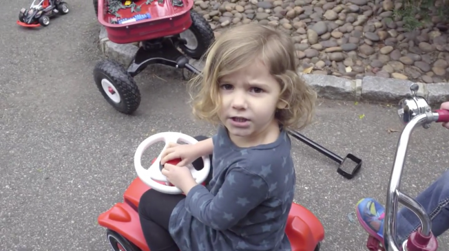
Next up in our Kids Behaving Inappropriately series, BBDO Berlin got a bunch of children to yell extremely dirty words to make a point about Smart cars, and how they can lead to a more calm, lighthearted temperament.

My favorite is the little guy in the suit. Angry, angry young man.

Smart cars look a lot like artisanal jelly beans, but that is by design—Mercedes-Benz design, as it turns out. The video goes on to show off the car’s maneuverability and convenient parking size, although the street was oddly free of traffic hazards in what was supposed to be a stressful urban environment.

Where was the random car sitting in the middle of the lane with his hazards on? The pedestrians running into traffic without looking? The 1,000-person family all using the crosswalk one at a time? C’mon guys, give those kids something to really swear about!

Actually, don’t. That’s more their parents’ job, anyway.

Babies' Poop Faces Captured in Glorious Slow Motion in Award-Winning Pampers Ad

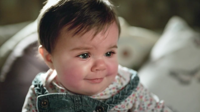
Everyone knows babies make hilarious faces when they poop. For that matter, so do most adults. Whether or not knowing this universal truth entices you to watch a medley of babies’ faces as they poop is a gamble that Saatchi & Saatchi London decided to take. Its “Pooface” video for Pampers baby wipes is literally 75 seconds of what I just described.

Oh, and it was filmed in slow motion (400fps!) and set to Strauss’ “Thus Spake Zarathustra,” which we all recognize from every other film project that either aspires to or mocks maturity. It’s also “Nature Boy” Ric Flair’s theme music. I honestly can’t decide which of these is the less dignified use of that song.

In any case, the spot won a bronze Lion in Film at Cannes, and a silver and a bronze in Film Craft, so clearly Cannes judges are into this kind of potty humor. Not bad for a glorified YouTube Vine compilation with better production values. (The concept has also been floating around for years, mostly in scam ads.)

Also, is it me or does the baby at 0:44 look like a young Nathan Lane?

Norwegians Object to Giant Penis Squirting Them With Confetti in PSA Stunt

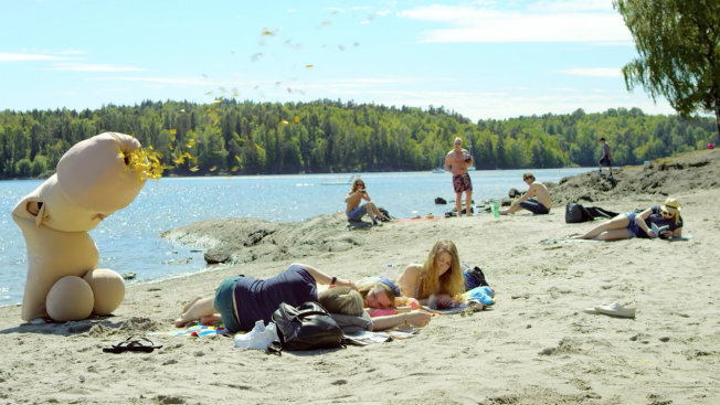
Believe it or not, there are a few situations where dressing up as a giant penis and spraying people with confetti is inappropriate. Promoting condom use on behalf of a sex education charity is one of those situations, according to thirtysomething Norwegians.

To clarify, sex education charity RFSU hired ad agency Involve! to come up with something for a condom use campaign, which began as a response to rising chlamydia rates in Norway. Involve! then hired 19-year-old student Philip van Eck because he was tall enough to fit in the giant penis suit they’d built. Once properly fitted, Philip ran around spouting golden confetti at total strangers in service of the campaign’s tagline, “Tiss kan overraske,” which means “Penis can surprise you.”

If they’d set the ad to Da Vinci’s Notebook’s “Enormous Penis,” it would have been perfect.

Involve! meant for this to be cheeky and fun, and kind of gross, and they succeeded, but not across all audiences. Young people apparently loved it, but the over-30 crowd didn’t like it one bit, and many of them called the stunt pointless and banal.

Philip thought the whole thing was hilarious, because he’s 19. But it wasn’t without a few hiccups. “If I can do a good thing for others, just by being a dick, there is nothing better,” Philip said. “The filming was not unproblematic, as passers-by wanted selfies with the giant penis. Suddenly, lots of people wanted to touch the penis and take pictures with the penis. I almost felt harassed.”

Have I mentioned how fortunate we are to live in this time?

Noooooooooo! This Loony British Ad for Mints Ends With a Comic Shocker

This Trebor Mints ad from Wieden & Kennedy London has a bit of that 1990s Gushers weirdness to it, either as a tribute to nostalgic thirtysomethings or just for shiggles.

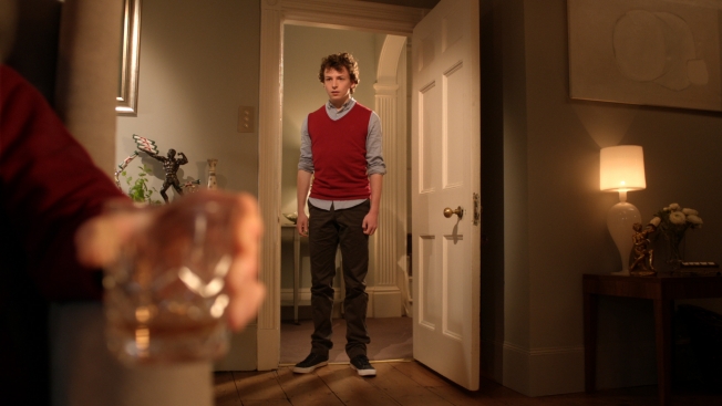
It opens with a teen admitting to his father that he prefers soft mints to their harder contemporaries, which makes his dad go all Malory Archer and crush his whiskey glass out of anger. Weird how that never cuts anyone’s hand on TV.

And it only gets stranger from there.

Though the concept is hardly revolutionary, they kept the weirdness to one element of the ad that mostly delivers, so it works. For my own sanity, I won’t get into the Punnett square logistics that resulted in minty dad’s human son. No sense asking questions I don’t want answered.

CREDITS
Client: Trebor
Marketing Manager, Gum & Candy, Mondelez: Elena Germani
Senior Brand Manager, Mondelez: Elena Mallo
Project Name: “Choose Your Trebor”
Agency: Wieden + Kennedy London
Creative Directors: Kim Papworth
Creative team: Max Batten & Ben Shaffrey
Executive Creative Directors: Tony Davidson / Iain Tait
Agency Executive Producer: Danielle Stewart
Group Account Director: Andrew Kay
Account Director: Hanne Haugen
Head of Planning: Beth Bentley
Planning Director: Georgia Challis
TV Producer: Lou Hake
Creative Producer: Danny Wallace
Designer: Michael Bow
Production Company: Hungryman
Director: Taika Waititi
Executive Producer: Matt Buels
Producer: Camilla Cullen
Director of Photography: Bob Pendar-Hughes
Editorial Company: Work Post
Editor: Rachel Spann
Post Producer: Josh Robinson, The Mill
VFX Supervisor: Dan Adams, The Mill
Music+Sound Company: Wave
Sound Designer: Dugal Macdiarmid
Producer: Rebecca Boswell
Mix Company: Wave
Mixer: Dugal Macdiarmid
Producer: Rebecca Boswell


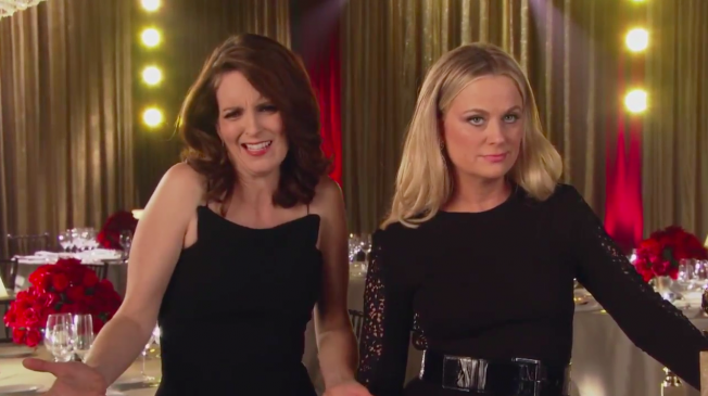
Tina Fey and Amy Poehler Explain Their Hosting Strategy for Sunday's Golden Globes

Tina Fey and Amy Poehler lay out their hosting strategies for this year’s Golden Globes in this blooper-reel-style NBC video that leans rather heavily on the ladies’ charm (and some well-timed edits), rather than the strength of their material.

For example: Tina’s “I’m not gonna dope” line, which would fall flat without the quick cut. Or Amy’s joke about Hollywood Foreign Press members being ghosts, which sounds like a rejected Anchorman line, though her bright-faced delivery makes it work. (We’ll ignore the Banksy thing altogether.)

Still, the spot fulfills its intentions to the letter. Awards shows are awkward and cursed with uninspired writing, but if the hosts are good enough, they still basically work.


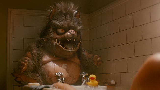
Getting Insurance Shouldn't Be Like Dealing With a Hideous Pig-Faced Bathtub Monster

This lunatic British ad admits dealing with life insurance can be “a bit of a nightmare.” How much of a nightmare? It feels like having your nice bubble bath interrupted by a screaming pig-faced beast who sprays you with tap water and beans you with you own rubber ducky.

Frankly, the anti-bubble-bath sentiment expressed by that thing is offensive to me. Don’t bath-shame, ugly.

Fortunately, the beast has some kind of heart attack or asthmatic seizure, and—well, just watch for yourself. I haven’t exactly worked out the details, which is OK, because I don’t think the agency who made this hurt themselves thinking about them, either.

Credits below.

CREDITS
Client: Beagle Street
Managing Director: Matthew Gledhill
Agency: The Corner London                              
Creative Director: Tom Ewart                    
Copywriter: Robert Amstell                       
Art Director: Matthew Lancod                                  
Planning Director: Neil Hourston
Planner: Ollie Gilmore                                                  
Business Director: Fleur Andrews                           
Account Director: Tenzin Pooch               
Agency Producer: Daisy Mellors
Assistant Producer: Lauren Gray                             
Media Company: MEC                                  
Production Company: Colonel Blimp                     
Director: David Wilson
Production Company Producer: Sam Levene                                                     
Editor: Max Windows at Stitch                                                 
Post prod Producer: Fi Kilroe                    
Post-production House: Finish                 
Audio post-production: Sam Ashwell at 750mph


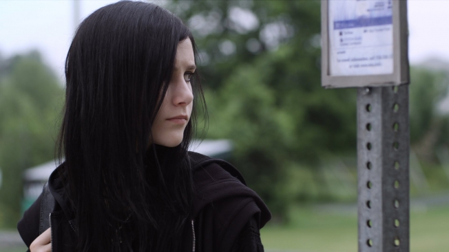
Cutest Goth Ad Ever? It's Super Bleak, but You'll Be Smiling by the End

Ad agency Heimat in Berlin has made the cutest teenage goth ad since Kodak film taught my generation that cheerleaders and dudes in fishnet shirts could be friends.

In this spot for German home improvement brand Hornbach, a gloomy-but-not-sour goth girl is soundly rejected by everyone in her community, who all wear pastels. The direction and camerawork make the contrast more subtle than it sounds. And let’s also acknowledge that hers is a totally understandable response to life in that town. If everyone in my neighborhood dressed like extras from an Aaron Spelling sitcom, I’d start listening to Spahn Ranch and moping through gym class, too.

Fortunately, the girl’s dad is much less of a douche than everyone else, and his obvious desire to relate to her comes through in the end. Yes, it’s corny and tugs at the small (or large) piece of us that feels misunderstood and adrift. But it also highlights the too-often-overlooked moment when someone realizes his or her parents are also kind of weird.

For another great goth spot, take a look back at this vulgar yet ultimately sweet ad from Denmark, which was one of 2013’s best candy commercials.

Via Co.Create.


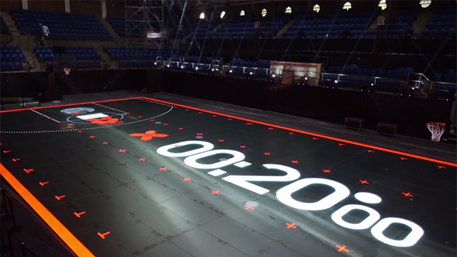
Nike and AKQA Create an LED Basketball Court to Help Kids Learn Kobe's Moves

Global design firm AKQA and ubiquitous shoe manufacturer Nike have collaborated on a full-size LED basketball court for Nike Rise, a program designed to train Chinese youth based on the techniques and practice drills of Kobe Bryant.

Called House of Mamba (a reference to Kobe’s Black Mamba nickname), the LED court guides and reacts to the players’ movements with an impressive range of visual displays, to the point where you wonder how the athletes aren’t distracted by it. 

Nike Rise centered on a reality show where 30 Chinese teens trained with Kobe and LeBron James, and three of them will go on to the Nike World Basketball Festival next month.

Via DesignBoom.


Hot Wheels Rolls a Life-Size Darth Vader Car Into Comic-Con

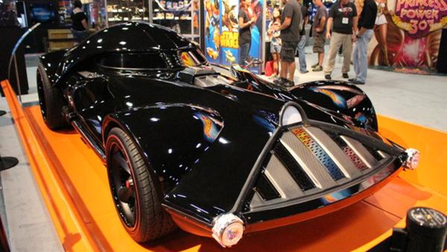
To promote its new line of Star Wars-themed character cars and die-cast ships, Hot Wheels showed up at San Diego Comic-Con this week with a life-size Darth Vader car.

The car, a modified Chevrolet Corvette C5, incorporates a lot of Vader’s helmet details into its design, along with a 526-horsepower LS3 engine and custom red line tires. It’s always the details that make things like this so fun.

The ad promoting it mixes driving footage with a custom Emperor Palpatine monologue, otherwise presenting itself almost like a typical car ad. But I think the atypical car on display here more than makes up for it.


Sarah Harbaugh and Jon Gruden Fight the Scourge of 'Dad Pants' for Dockers

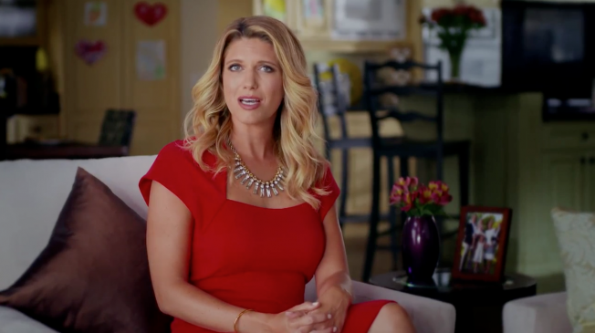
Dockers prepares men for fatherhood, among other things, in these two videos from Red Tettemer O’Connell + Partners, timed to Father’s Day. Former Tampa Bay Buccaneers head coach Jon Gruden gives a speech that is loaded to the gunwales with quotables (“You’re just hired help paid in groin kicks!”) to a room full of soon-to-be dads, while Sarah Harbaugh—wife of San Francisco 49ers coach Jim Harbaugh—tearfully warns men about the dangers of “dad pants.”

Didn’t Dockers make those popular in the first place? Just asking questions. It’s nice to see gendered advertising that doesn’t go out of its way to insult anyone for a change, but did I hear Gruden take a swipe at dad jokes? Like hell those are going away.


Overgrown Beards Are Like Wild Animals Clinging to Your Face, Schick Ads Say

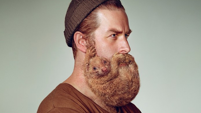
Y&R New Zealand turns manly beards into cute animals for Schick’s “Free Your Skin” campaign, which takes a bold anti-beard stance in this golden age of hirsute ruggedness. 

Of course, sneering observers are all calling the Schick models hipsters, so maybe the ads also tap into a sort of cultural exhaustion with all things bearded, buttoned-down and knit-capped. Seriously, I think Tony Montana said the F-word fewer times than I’ve read the word “hipster” doing research for this post. 

Y&R did a brief interview with Metro about the campaign, claiming that the bearded creatives in the agency’s employ “all confessed that their beards aren’t actually that pleasant to live with.” Lies and slander! They also claim that “women actually find beards kinda gross,” which science would argue is only half-true.

Via Design Taxi.


U.K. Watchdog Puts a Lid on Rihanna's Sultry Perfume Ad

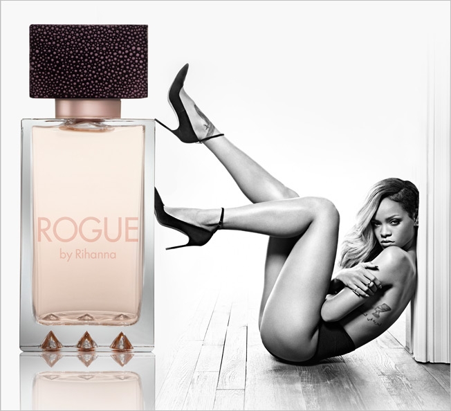
Britain’s Advertising Standards Authority is once again stepping in to save us all, this time from a saucy ad for Rihanna’s perfume, Rogue.

The ad, which is basically a nude Rihanna sandwiched between a wall and a giant perfume bottle, is too “sexually suggestive” to be seen in areas heavily trafficked by children, the U.K. watchdog group has decided. The specific complaints addressed the ad’s placement on elevator doors in a shopping mall.

The ASA had received complaints saying the ad was demeaning to women and inappropriate to children.

Parlux Ltd. (the company that makes Rogue) is protesting the restriction by arguing that the ad doesn’t feature “improper nudity or offensive, suggestive or demeaning imagery,” and that Rihanna’s posture is powerful rather than demeaning.

The ASA agreed the ad isn’t demeaning, but that’s not to say the image conveys power either. I mean, the poor woman is jammed into a really awkward position and scowling like she just caught the bad end of a slow-moving fart.


Ads for Hawaii’s Kona Beer Remind Us Mainlanders That We’re Doing It Wrong

Hawaii-based Kona Brewing Co. has released a new ad campaign from Duncan/Channon reminding stressed-out mainlanders to enjoy life.

One of two new spots, "Sad Hour," suggests that we set aside one hour a day for all the tedious crap we hate doing so the other 23 hours of the day can be happy. A second spot, "Single-Tasking," introduces the concept of only doing one thing at a time (drinking beer, for example).

Kona is borrowing heavily from old Bartles & Jaymes ads here, and adding a healthy dose of island life stereotyping, but the big guy's delivery is good enough to make it all work.

The ads will air in Orlando, San Diego and Los Angeles markets throughout the summer. "The 'Dear Mainland' campaign truly captures the unique Hawaiian spirit of Kona Brewing and, in a fun way, delivers our message that reconnecting with family, friends and community is what truly matters,"
says Aaron Marion brand manager at Kona Brewing.


Honda Creates Bottled Water Brand in Honor of Vehicle That Emits Only Drinkable H2O

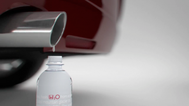
The compressed hydrogen-powered Honda FCX runs so clean, its exhaust contains only water—and it's so clean, it's drinkable. To celebrate this, Honda Australia and Leo Burnett Melbourne came up with a memorable stunt—creating a new bottled-water brand, H2O.

As seen in the case study below, the automaker gave the water away in movie theaters around Australia (as free samples, no less) as a way of showing people what they're doing for the environment. There are also plans to make the water available at Honda service stations and dealerships.

Copy on the bottle reads: "Delicious, fresh H2O from a pristine mineral spring, cool mountain glacier or … the exhaust pipe of the Honda FCX. The world's first hydrogen-powered car that emits only water. Water so clean and pure, you could put it in a bottle and drink it. Now isn't that refreshing?"

Note the use of "could." It doesn't appear that this water is actually the by-product of FCX. Still, a neat idea. The product is nicely designed, too, with an effective minimalist aesthetic. I really like how well the Honda logo works as the hydrogen symbol in H20.

Via Popsop.


Designer Brews Up a Super Set of Comic Book Beer Labels

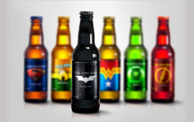
For adult comic fans, superheroes and beer always go together. But Orlando, Fla.-based graphic designer Marcelo Rizzetto is taking that pairing to a new level by creating beers inspired by each member of D.C.'s Justice League.

His first six bottles honor Batman (of course), Superman, Wonder Woman, Green Lantern, Aquaman, and the Flash. In addition to incorporating each hero's logo into their beer label, he's created varietal names that correspond with each character. For example, Batman is a dark ale, Green Lantern is a pale ale, the Flash is an Irish red ale, and Wonder Woman is a classic American lager.

Honestly, that last one should have gone to Aquaman, just to continue the old joke about American beer being mostly water.

Check them all out below:

Via Design Taxi.


Smart Cars Will Fit Anywhere, Even in the Slim Space Between Other Ads

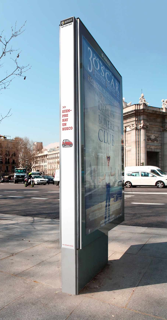
In a world of crowded ad spaces and precious few parking spaces, Mercedes and Madrid agency Contrapunto BBDO are hoping to make the most of both shortcomings with these cleverly placed Smart car ads.

Printed on the narrow side of an outdoor ad display, the small image of a Smart is joined by the phrase "Siempre hay un hueco," Spanish for "There's always a space." 

As commenters on Ads of the World were quick to point out, this idea isn't exactly a first of its kind. The line and basic premise were even used in a student project in Argentina last year.

Duplication aside, there's also a more pertinent issue: I doubt I would have even noticed it if someone else hadn't pointed it out as an ad.


Who Will Save This Famous Billboard in Baltimore With Mr. Boh and the Utz Girl?

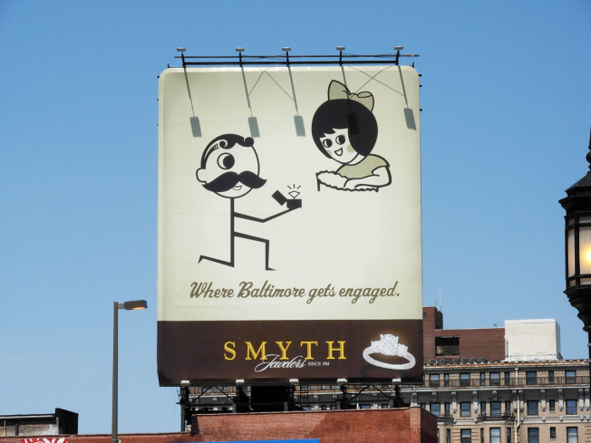
After seven years overlooking Baltimore's Penn Station, the Smyth Jewelers billboard showing National Bohemian beer mascot Mr. Boh proposing to the Utz girl has to move.

Turns out the dorks who own the billboard itself want to switch it over to a digital video display in May, so Smyth is trying to find a new home for its now-classic ad, which was put together by Owings Mills, Md., agency MGH.

"Natty Boh and the Little Utz girl are Baltimore's version of the royal couple," Smyth president Tom Smyth tells the Baltimore Sun, "which is why it's imperative that their next home pay homage to the sense of pride they instill in our city."

I don't know that I'd go that far. Clearly John Waters and Divine are as close as we here in Baltimore are ever getting to royalty, but he's right that the city has a fondness for that image that won't extend to a video board. That kind of gaudy, touristy crap should be restricted to the Inner Harbor.

Luckily, the smaller version of the Boh-Utz ad in North Baltimore doesn't seem to be going anywhere.


Brewer Goes for Adorably Terrifying With Half-Pony, Half-Dinosaur Mascot

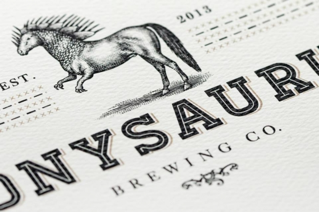
Durham, N.C., resident Keil Jansen may have quit his job as a teacher to start a nanobrewery, but judging by its name, Ponysaurus Brewery, his old profession clearly rubbed off on him.

Raleigh ad agency Baldwin& designed the brewer's unique logo—half pony, half dinosaur—which looks like a McSweeney's parody of a medical illustration.

"There is a certain tension within the entire Ponysaurus design, where we are trying to balance a sense of the absurd and fantastical with the fact that we are dead serious about making the best beer," Jansen tells Cool Hunting. "The combination of 'old-timey' details, for example the style of the Ponysaurus drawing that invokes old medical or biology textbooks, with the fact that the drawing itself is of a half-pony, half-dinosaur is an excellent shorthand for what we wanted to achieve."

I don't know how well "The beer beer would drink if beer could drink beer" stacks up against every other goofy-named microbrew on the market right now, but I'd like to see Ponysaurus take on Kegasus in a drinking contest.


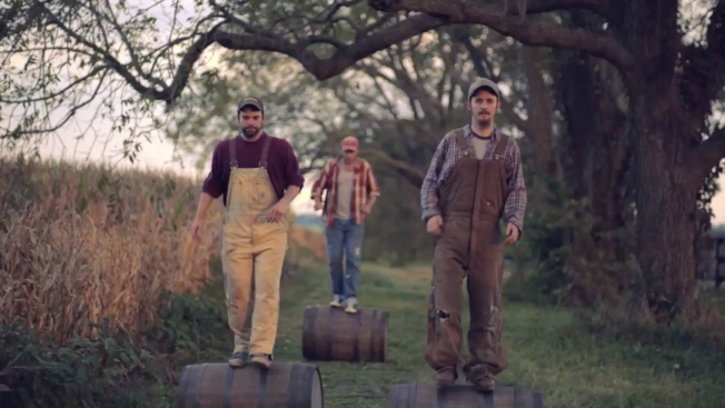
Bourbon Ad Shows You the Peculiar Way People Get Around in Woodstock, Ky.

Woodstock Bourbon's ad showing its hometown's enthusiasm for the brand is pretty funny (well, besides that "Barrellel Parking" sign—groan). But it's right on the brink of being one of those fake homespun liquor ads that Henry Rollins used to laugh at, what with the fiddle music and rural aesthetics. It's like O Brother Where Art Thou? but less subtle.

Perhaps this is because it was made by Australian agency CumminsRoss for the Australian market, and so it needs to show a somewhat cartoony version of Kentucky.

Still, you can't deny the funny visuals. Perhaps Mila Kunis can take a day trip from the Beam distillery in Clermont and learn how to barrel roll like this.

Credits below.

CREDITS
Client: Asahi Premium Beverages
General Manager, Marketing: Kate Dowd
Woodstock Brand Manager: Kelly Jones

Creative: CumminsRoss
Chief Executive Officer: Sean Cummins
Executive Creative Director: Jason Ross
Copywriter: Chris Ellis
Art Director: Aaron Lipson
Managing Director: Chris Jeffares
Group Account Director: Hayden Isaacs
Account Director: Damiano Dipietro
Account Manager: Jessica Chamberlain
Agency Producer: Susannah George

Media: CumminsRoss
Chief Media, Innovation Officer: Kirsty Muddle
Media Manager: Tom Johnson

Production Company: Guilty
Producer: Jason Byrne
Director: Tony Rogers
Director of Photography: Shelley Farthing-Dawe
Postproduction: The Butchery, The Refinery
Offline Editor: Tim Parrington
Online Editor: Eugene Richards
Grade: Vincent Taylor
Sound Design: Flagstaff Studios
Sound: Paul Le Couteur
Stills Photographer: Christopher Tovo