Mad Men Is Auctioning a Chararacter's Suicide Rope and These 9 Other Weird Props

Mad Men creator Matthew Weiner was nothing if not detail-oriented—each scene had to have the right wardrobe, furniture, tchotchkes, and so forth, for the time period—so it makes sense that at the end of the show’s seven-season run there would be quite a few props leftover.

Roughly 1,400 items are currently up for auction on Screenbid until Aug. 6, and they range from iconic and practical to altogether odd. (Sadly Ginsberg’s nipple isn’t for sale.) 

Here are the weirdest (and yes, there will be spoilers for those who haven’t watched all the way through):

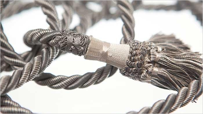
Lane’s Rope — $225

Description: “It all became too much for Lane. He was found in his office late in season five, hanging from this rope just inside the door.” 

Only someone who’s a fan of the macabre would want this. 

Ken’s Eye Patch — $200


Description: “The things Ken Cosgrove did for his clients. In the twelfth episode of season six, he returns to the office wearing this eye patch, after a duck hunting trip with his clients at Chevrolet results in him accidentally being shot in the face.” 

Just think about how much sweat from actor Aaron Staton’s face is on that patch. 

Roger’s LSD Sugar Cane Tray — $300 

Description: “Yes, you too can imagine you’re watching the 1919 World Series! From a bathtub! While on LSD! This Suisse Langenthal ceramic plate with golden-colored plating was used to serve Roger and his wife LSD in the sixth episode of season five.” 

If you’re looking to have a trip like Roger, purchasing this tray isn’t the way to do it. Plus, this is certainly more expensive.  

Duck’s Duck Print — $175 

Description: “Herman ‘Duck’ Phillips took his nickname seriously. This is one of two large, framed duck prints we found in his office.”

Duck’s drinking problem makes more and more sense. 

Sally’s Psychiatric Evaluation Folder — $125

Description: “Sally Draper needs a shrink… or so her mother is convinced. Sally exhibits some disturbing behavior in the fifth episode of season four and Betty wastes no time trying to find out what is happening to her little girl. Here is a black folder containing young Sally’s psychiatric evaluation by Dr. Edna Keener.” 

Yes, the psychiatric evaluation of a fictional teenage character is valued at $125. 

Don’s Note to Megan on Whale Picture — $325

Description: “In the ninth episode of season five, Betty discovers this drawing of a harpooned whale (“Why is he smiling?”) and a note from Don to Megan on the back (“Lovely Megan …”). This leads Betty to reveal part of Don’s past to Sally.” 

While the note did factor into the show’s plot in a major way, the actual whale drawing, credited to a young Bobby Draper, really isn’t much better than any other small child would do. 

Joan’s Ceramic Clown in Frame — $100  

Description: “This ceramic Chinese girl sits alone in a black frame, with no back cover. An interesting piece that belonged to Joan.” 

Not even the auctioneers knew how to sell this one. And no one should ever own clown art, even if it belonged to Joan Harris.

Playtex Media Plans —$125

Description: “‘Playtex protects a woman’s touch,’ some excellent work from Sterling Cooper Draper Pryce’s star copywriter Peggy Olson. Here are two of the Playtex Media Plans offered to executives in season four episode eleven of ‘Mad Men.'”

These might be a good investment, if you had a one-on-one pitch meeting with Peggy.  

Don’s Why I’m Quitting Tobacco Newspaper Ad — $3600

Description: “It’s among the more memorable moments in the entire run of “Mad Men.” In the 12th episode of season four, without informing the other partners, Don pens the letter ‘Why I’m Quitting Tobacco,’ which is placed as a full-page ad in the Sept. 16, 1965 edition of The New York Times.” 

Buying this piece of memorabilia isn’t all that odd but its price sure is. 

Don’s Typed Pages About Advertising  $950

Description: “‘It’s bigger than a car. It’s everything.’ In the eighth episode of season six, Don typed this rambling page of thoughts on advertising while in a drug-induced haze.” 

We watched Don Draper pontificate about the ad business for seven seasons. Is it really worth buying a printed version of his Jack Kerouac-esq ramblings, too? 

Facebook Just Updated Its Logo Ever So Slightly. Can You Tell the Difference?

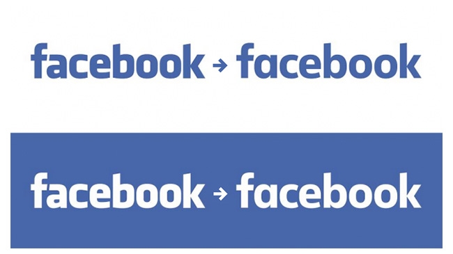
Facebook has basically used the same logo since 2005—its name in white, in Klavika font, on a blue background. But this week, the company, which is now allegedly worth more than Walmart, decided to change its logo font, opting for a custom font designed in-house, according to Mashable

Click the play button in this tweet to see the old and new logos overlaid on each other:

The new typeface is an attempt to “modernize” the logo and make it appear more “friendly and approachable,” says Josh Higgins, Facebook’s creative director. Higgins also noted that Facebook explored many options but ultimately landed on updating its logo instead of redesigning it completely.

So, what’s different? The changes might be hard to spot until you focus on the “a” in the logo, which is now rounder and thinner. 

It’s definitely a subtle change, though not as subtle as Google’s most recent logo tweak.

What do you think? 

Gay Marriage Opponents Act Like an Oppressed Minority in Despicable New Ad

About halfway through this two-and-a-half-minute film from conservative nonprofit the Catholic Vote, its treacly, overlystylized message becomes clear. These Catholics are nervous about revealing their stance on same-sex marriage because they’re (spoiler alert!) against it.

That stance is nothing new. What’s galling is the ad’s appropriation of LGBTQ themes to marginalize LGBTQ people and their rights under the law. The ad, with a straight face, position Catholics as a persecuted group for not having their message of intolerance (here ludicrously recast as its opposite) widely accepted these days.

The video even plays like a coming-out video for Catholics who are afraid to take the “brave” step of voicing their objection to equality. That’s a shockingly audacious tactic—disrespectful and despicable, to say the least.

Beyond that, it is rather illogical. You can’t reposition a group as oppressed when there is no movement to oppress them. And you certainly can’t equate being called a bigot for spouting intolerance with anything near what members of the LGBTQ community have experienced for decades. 

The empowering music is on point, though. 

Oh, and thankfully there’s already a parody…

Max Greenfield Helps the Hipster Hamburglar Push McDonald's Sirloin Burgers

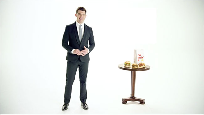
The Hamburglar got the Internet’s attention last week—the jury is still out on whether he’s hot or creepy—but he won’t be pitching the Sirloin Burger on TV, at least not this month. That job has been taken by New Girl’s Max Greenfield, whose cute—dare we say, adorkable—ads debuted Monday. 

The actor shot 25 spots in a single day, says McDonald’s vp of marketing Joel Yashinsky, telling Burger Business that the campaign is part of the brand’s mission to be transparent.

“That’s what really led to our doing 25 different TV commercials,” Yashinsky says. “They talk about different attributes and the flavors, about it being sirloin and North American sourced. That’s what the overall campaign is designed to get across to the customer. From everything we’ve seen, we think it will connect with customers.” 

Check out some of the new work, by Leo Burnett, below.

CREDITS
Client: McDonald’s
Agency: Leo Burnett Chicago
Campaign: “Sirloin Third Pound Burger Lovin’ Reminders”
Chief Creative Officer: Susan Credle
Executive Creative Director: John Hansa
Senior Creative Director: Tony Katalinic
Creative Directors: Michael Porritt, Frank Oles
Associate Creative Director: Gloria Dusenberry
Art Director: Scott Fleming
Copywriters: Brandon Crockett, Chris Davis, Leigh Kunkel
Head of Production: Vincent Geraghty
Executive Producer: Denis Giroux
Senior Producer: Scott Gould
Business Manager: Shirley Costa
Senior Talent Manager: Linda Yuen
Music Supervisor: Chris Clark
Managing Account Director: Jennifer Cacioppo
Account Directors: Josh Raper, Jennifer Klopf
Account Supervisor: Dave Theibert
Account Manager: Sue Rickey
Planning Directors: Claudia Steer
Legal: Carla Michelotti, Laura Cooney
Clearance: Michelle Overby
Editorial Production: Cutters Studio
Post Production: Flavor Chicago
Audio: Another Country


How Pepsi, HBO, Denny's and a Dozen Other Brands Are Celebrating 4/20

Brand tweets can seem unnecessary, even annoying, on many holidays. But 4/20? Seeing them get creative with cannabis references? Well, that’s actually kind of fun. 

We’ve rounded up some of the better brand tweets so far.

Check them out below:  


Parks and Rec Made a Bunch of Fake Ads for Last Night's Show, and They Were Great

NBC’s Parks and Recreation will soon come to an end, and the writers of the heartwarming, droll comedy have been knocking it out of the … well, park.

The first of last night’s two episodes featured Chris Pratt’s character Andy Dwyer saying goodbye to his kids’ program, Johnny Karate’s Super Awesome Musical Explosion Show. By using the bottle episode format, we got a glimpse at what fictional Indiana town Pawnee’s advertising might look like. 

Because this season of the show takes place in the near future, 2017, they can satirize what American companies Verizon, Chipotle and Exxon might be doing. 

But the earnest, well-intentioned messaging of the combined companies—one of “America’s eight companies”—is just the beginning.

 
Fast-food chain Paunch Burger—a stand-in for the McDonald’s, Burger King, Carl’s Jr. and Wendy’s of the world—practically bullies its customers into eating. 

 
Of course, we also got an ad from the Wamapoke Tribe, which shameless uses its heritage to get people to its casino. 

 
And we got to see Nick Offerman’s, er, Ron Swanson’s version of advertising, too, which you can probably guess is minimal and straight to the point. 


Natalie Portman, a Runaway Bride, Gets a Helicopter Rescue in Miss Dior Ad

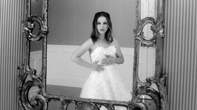
In this attractive new Miss Dior ad, Natalie Portman outdoes Julia Roberts’ runaway bride by nabbing a helicopter after she ditches her groom at the altar. Portman’s escape, soundtracked by Janis Joplin’s epic “Piece of My Heart,” has the actress running barefoot and shedding her handmade gown. 

Director Anton Corbijn, known for A Most Wanted Man, tells People magazine that his vision of Miss Dior was a feminist one.

“It’s interesting to see that these women are kind of worshiped by men, projecting what men want to see, and yet they say they are feminists,” he said. “For me it’s still coming from a man’s perspective. The great thing about Janis Joplin, for instance, is that the female perspective prevails.”

He notes that the team behind the spot was careful with the song choice. “It took a long time to find the music, and this choice seemed to fit perfectly from all angles, including the song’s meaning,” he says. 

Now, back to the gown: It took 600 hours to make and consists of hundreds of hand-cut fabric flowers which were dyed into shades of pink and white to create an ombré effect. 


SNL Shows Housewives All the Fun They Could Be Having While Not Watching the Super Bowl

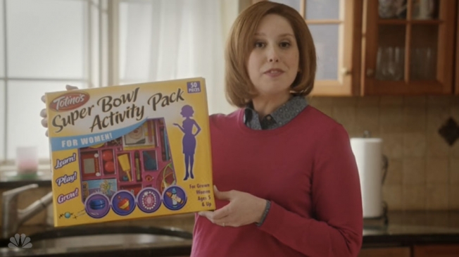
One of the things Saturday Night Live does best is skewer advertising tropes, so it’s no surprise that in last night’s pre-Super Bowl episode, the show did just that. With a parody Totino’s ad, no less. 

In the spot, Vanessa Bayer gamely plays a bored housewife who doesn’t know what to do with herself after she’s served her hubby (host J.K. Simmons) and his pals their snacks for the Big Game. Enter Totino’s Super Bowl Activity Kit for Women.  

The skit makes fun of ads that play up the role of a doting wife for the Big Game. It helps, too, that the activity pack looks like something Hasbro would make—with a top, a set of jacks and other kid’s toys inside.


Scorsese, De Niro and DiCaprio Finally Team Up for a Film, Which Turns Out to Be an Ad

Martin Scorsese famously has two favorite actors, Robert De Niro and Leonardo DiCaprio. But De Niro and DiCaprio have never worked on a Scorsese project together—until now.

The trailer below, for a short film called The Audition, stars both actors and the director—and sets up a rivalry between De Niro and DiCaprio, with the two vying for the same acting role. The short film will reportedly be unveiled later this year—and will also feature Brad Pitt, for extra star power.

The catch? The whole thing is an elaborate advertisement for two casino resorts City of Dreams Manila in the Philippines and Studio City Macao in China.

It seems that old rascal Scorsese has gotten De Niro and DiCaprio to venture to Manila and Macao hang out with him at these resorts because these places are “incredible.” As you can imagine, this short has everything: drinking, glamorized gambling and hijinks. Plus, De Niro is menacing and DiCaprio is still sporting that dreadul man-bun-and-beard combo. 

Brett Ratner, a producer on the project, said in a statement: “This short film is a historic event because it is the first film ever to star such legendary actors as Robert De Niro, Leonardo DiCaprio and Brad Pitt in one film together.”

He adds: “The cooperation between Mr. Scorsese and the Melco Crown Entertainment brand is synergistic because of the fact that Mr. Scorsese directed the film Casino starring Robert De Niro. Mr. Scorsese has collaborated with Mr. De Niro on eight films and with Mr. DiCaprio on five films and is working with Mr. Pitt for the first time. Our hope is that the trailer for The Audition gives audiences an early look into what will surely be an important cinematic experience directed by one of the most culturally influential directors in the history of Hollywood films. I look forward to the global premiere of the film at the launch of Studio City in mid-2015.”


New Pizza Hut Campaign Challenges Italians to Taste Sriracha

The new Pizza Hut campaign doesn’t include full credits, and AOR Deutsch LA may or may not provide them.

But the spots, which earned coverage in both Adweek and The New York Times this week, mark a change in direction for the newly rebranded company.

First, a trip to the town of Boring, Maryland with your favorite announcer Dick Vitale:

After the jump: a visit to Bland and somewhere in Italy.

(more…)

New Career Opportunities Daily: The best jobs in media.

White House's Powerful New PSA Implores Men to Stop Sexual Assault Before It Happens

The White House’s new PSA is a call to action for men who see sexual assault about to happen, and asks them to do something to stop it.

As part of the ongoing “It’s On Us” campaign, which President Obama has said is about “condemning sexual assault as loudly as we should,” the new spot is focused on a party bystander who sees a young man stop a woman from leaving the party when she’d like to.

The ad comes as colleges and universities across the country enter into a “National Week of Action,” from Nov. 17-21, geared to motivate students to get involved in the “It’s On Us” campaign. According to White House research, bystander intervention programs help to change social norms and teach people to speak out.

“Bystander involvement can be very important, and oftentimes men underestimate other men’s attitudes toward violence,” Valerie Jarrett, senior advisor to the President, tells BuzzFeed. “They don’t understand that other men are opposed to violence, too. So if they get the sense that it’s OK [to intervene] because everyone else around the room feels the same way you do, the first person who gets up will inspire the next person to get up, and the next person and the next person.”

The self-aware PSA isn’t too wordy, though it does employ Jon Hamm’s velvety pipes. 

CREDITS
Agency: Mekanism
CEO/President: Jason Harris
CD: David Horowitz
Head of Strategy: Eric Zuncic
Design Director: Albert Ignacio
Associate Director, Brand Manager: Caroline Moncure
Senior Producer: Kati Haberstock
Creative Technology Director: Sean Cosier
Senior Producer: Amber Cope
Production: PARK PICTURES_BYSTANDER TV
Director: Vincent Haycock
EP: Mary Ann Marino
Producer: Alex Fisch


ESPN Uses Golden Girls Theme Song to Salute the SEC's Animal Mascots

Do you enjoy looking at adorable animals and singing along to “Thank You for Being a Friend,” the Andrew Gold song whose cover by Cynthia Fee rightfully belongs to Blanche, Rose, Sophia and Dorothy from The Golden Girls?

Then ESPN’s new spot by McKinney is for you.

Well, you and the mascots for Mississippi State (“Bully”), Arkansas (“Tusk”), Texas A&M (“Reveille”), Auburn (“War Eagle”), Louisiana State (“Mike”), Georgia (“Uga”), South Carolina (“Sir Big Spur”) and Tennessee (“Smokey”).

The ad, “Animals,” features the mascots for the Southeastern Conference schools to help launch the SEC Network, a new national sports network from ESPN that debuts Aug. 14.

Credits below.

CREDITS
Client: ESPN
Spot: “Animals”
Agency: McKinney
Chief Creative Officer: Jonathan Cude
Associate Creative Director: Matt Trego
Art Director: Jordan Eakin
Copywriters: Roger Fish, David Sloan
Agency Producer: Naomi Newman
Director: Michael Lawrence

Allstate Has a Black Cat Who Will Predict the Loser of the World Cup Final

Sure, we could listen to pundits or statisticians to try to predict the outcome of the World Cup final on Sunday. They’ve got suits and numbers. But what they don’t have is a black cat.

Why listen to logic when there’s a feline (named Lucky, natch) who can—and will—tell you who will lose the World Cup. At least, that’s what Leo Burnett and Lapiz have cooked up for Allstate’s interactive World Cup campaign. Let’s not forget that Allstate is a fan of mayhem, and black cats, of course, are well-known harbingers of bad luck.

If you tweet the hashtag #EnviaMalaSuerte (translation: “Send bad luck”) with the name of the team you’d prefer to lose, some cat food will drop into that team’s bowl. On Sunday, before the game, during a live YouTube broadcast, Lucky will get to choose between the Argentina and Germany bowls. Whichever bowl Lucky chooses to nosh at—well, that team will not win the World Cup. Allegedly.

It’s a silly (and cute) campaign. Rooting for sports teams can bring out some odd behavior, so why not play with people’s fan rituals?


Carl's Jr. Ad for Sticky Buns Wonders Where You Would 'Pull One Off'

Carl’s Jr./Hardee’s isn’t a shy fast-food chain. But this time they’ve traded oiled-up models for innuendo. I won’t spoil the new spots, but let’s just say they aren’t too subtle.

The approach shouldn’t be too surprising, as this is the same restaurant chain that once asked people if they preferred A holes or B holes. I am curious as to how they expect people to eat these Cinnamon Pull-Aparts anywhere (wouldn’t the icing drip?), but I will give them points for having both men and women allude to masturbation. Kudos?

Agency: 72andSunny. Via Adland.


2014's Bleakest World Cup Ad Is Full of Cheering but Will Leave You Devastated

We’ve talked a lot about the connection people feel for their respective teams during the World Cup, and the advertising that celebrates it. But this haunting PSA reminds us that it isn’t always positive. Check out the spot below, part of Tender Education and Arts’ #StandUpWorldCup campaign. Via Jezebel.


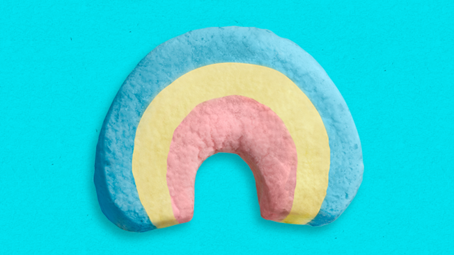
Lucky Charms, the World's Rainbowiest Cereal, Comes Out Big for Gay Pride Month

Sometimes the best thing a brand can do is lean into the conversation that’s already going on around it. And that’s exactly what Lucky Charms, a brand that some people have always seen as a little queer, is doing, in part to support LGBT Pride Month.

With it’s new #LuckyToBe campaign, the General Mills cereal is encouraging people to share what makes them unique via social media platforms. And it’s made GLAAD—an organization that works for LGBT equality—well, for lack of a better word, happy.

Check out the campaign video from McCann New York below.


Ad Agency Creates Jewelry Meant to Combat Sexual Assault

When JWT Singapore was tapped by the Association of Women for Action and Research (AWARE) to create an educational campaign about date rape, the agency decided to go in a different direction.

The result was Guardian Angel, a personal safety accessory line that looks like jewelry but is also designed to get women out of dangerous situations.

The $120 device, which can be worn as a necklace or bracelet, has a button that, hen pushed, automatically triggers a call to the wearer’s cell phone. That method is billed as a way for a woman receiving unwanted attention to create a convenient excuse to leave. If things become more serious (read: dangerous) the wearer can push the button and hold it down, sending a text alert to a designated contact, who will receive the wearer’s GPS coordinates and an automatically generated request for help.

While the idea is interesting and seems to be made with good intentions, there’s something problematic here: If you take a look at Guardian Angel’s website, you’ll notice it’s filled with cloudy backgrounds and waifish young women in white tops and little makeup. The image we’re presented with is one of innocence. While the visuals are probably supposed to look heavenly and angelic in the vein of the product name, the end result is that the Guardian Angel is a device to protect innocence. 

Why is that a bad thing? Because sexual assault isn’t something that just happens to cute, unassuming young women. And sexual assault doesn’t have a gender or sexuality associated with it. (Yes, many sexual assaults do involve young men attacking young women, especially those that are widely reported and picked up by media outlets, but assaults don’t happen to a specific type of person.) Sexual assault is pervasive and upsetting and a huge issue in our culture, so let’s try to keep that in check while creating the visual idea of an assault victim.

On The Verge, Adi Robertson describes a deeper problem with the idea of everyday assault-prevention tools:

“That’s what’s wrong with the Guardian Angel’s gauzy, stereotypical femininity: it ends up normalizing rape as an unremarkable, if unfortunate, part of the female experience. The soothing language—making women ‘feel less vulnerable’ so they can ‘live their lives to the fullest’—smacks of the vagaries in tampon commercials. It’s something everyone knows about but nobody wants to hear about, and certainly nothing that we want to acknowledge is a shamefully common plague in our schools, our prisons, our armed forces, and almost every other social institution.”

Maybe if the Guardian Angel’s creators had more directly acknowledged how awful it is that we need a piece of technology like this to begin with, then maybe the mission could resonate more.

Via Fast Company.


ESPN Celebrates the Weird, Wonderful Time Warp That Happens During the World Cup

We’re only 16 days away from the start of the World Cup. And ESPN—which will present all 64 matches of the quadrennial tournament across the ESPN, ESPN2 and ABC networks—released its latest teaser commercial on Tuesday, this one devoted to the time warp that happens for viewers around the world every four years.

The spot, by Wieden + Kennedy in New York, feels like the beginning of an action movie, where the team is getting together before a big heist—except here, we’re seeing how different people around the world are getting ready for the World Cup. And wherever they are in the world, day or night, they’ll be setting their countdown clocks to Brazil time.

The spot moves seamlessly from metropolis to metropolis, with business executives, children, fisherman, etc., getting ready for the event. It opens on a favela rooftop in Rio and goes around the world—to a pub in England, a social club in Ghana, a fishing boat off Spain, an apartment in Russia, a car heading to Tehran, a bar about open at dawn in Japan, an office in Seattle, a family barbecue in Mexico and a research station in the Andes—before returning to Brazil.

“Every 4 years the world has one time zone,” says the end line. (That follows a spot earlier this month that said, “Every 4 years the conversation starts again.”)

Thanks to our longitudinal proximity to Brazil, Americans will see the matches at exceedingly humane hours, with kickoffs generally scheduled for noon, 3 p.m. or 6 p.m. ET. That’s a lot better than other recent World Cups—in particular, the 2002 tournament in Japan and South Korea, whose daily slate of matches began at 2:30 a.m. and wrapped up shortly after breakfast.

CREDITS
Client: ESPN

Agency: Wieden + Kennedy, New York
Creative Directors: Brandon Henderson, Stuart Jennings, Gary Van Dzura, Caleb Jensen
Art Director: Mathieu Zarbatany
Copywriter: Andrew Jasperson
Producer: Luiza Naritomi
Executive Producer: Temma Shoaf
Account Team: Casey Bernard, Katie Hoak, Alex Scaros

Production Company: Imperial Woodpecker
Director: Stacy Wall
Executive Producer: Doug Halbert
Line Producer: Terry Shafirov
Director of Photography: Corey Walter

Editorial Company: Final Cut
Editor: Jeff Buchanan
Assistant Editor: Geoff Hastings
Post Producer: Beth Fitzpatrick

VFX Company: MPC
Senior Producer: Matthew Loranger
Production Asst.:
Lead Flame Artist/Creative Director: Gigi Ng

Mix Company: Heard City
Mixer: Philip Loeb
Producer: Sasha Awn

Music Company: Travis + Maude
Creative director: David Wittman
Producer: Kala Sherman


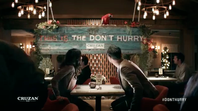
Cruzan Rum Wants You to Slow Down, Which Means No Speed Dating or Speed Chess

If you've been settling into a slower pace of life with Kona beers but want to move on to something stronger, Cruzan Rum might be right for you.

Building on last year's campaign, themed "The Don't Hurry," the brand illustrates that its version of relaxation isn't constricted to the kooky metaphorical island from which it hails. Nope, it's all about a state of mind—and whether you're speed dating or playing chess, you've got to kick back and savor life (and rum).

The five new spots by ad agency Walton Isaacson are similar to last year's, which highlighted the eccentric air that came with drinking the rum. This time, though, they've swapped spokesmen, promoting the soothing Barry White-esque voiced parrot.

CREDITS
Client: Beam Suntory
Vice President, General Manager, Mixables Category Business Team: Jared Fix
Senior Director, Rum and Cordials: Brendan Lynch
Senior Brand Manager, Rum: Nabil Wanna
Global Manager, Consumer and Market Insights: Janu Lakshmanan
Brand Assistant, Rum and Cordials: Corine Reed

Agency: Walton Isaacson
Co-Owners: Cory Isaacson, Aaron Walton
Executive Producer: Dana Offenbach
Group Creative Director: Miguel Garcia Castillo
Creative Director: Mark Westman
Associate Creative Director: Jose Martinez
Senior Designer: Laurent Varlet
Senior Account Director: Nick Vitellaro
Account Executive: Kelly Clark

Production Company: Tool of North America
Executive Producer: Oliver Fuselier
Director: J.J. Adler

Editing Company: Beast
Executive Producer: Peter Hulliger
Editor: Angelo Valencia

Music: Ramblin Man
Executive Producer: Yupa Wathanasin
Composer: Daniel Belardinelli


This Ad Has No Respect for Personal Space, but at Least Honda Does

How do you sell a car to people who live in a city with plenty of transportation options? Simple. Offer them personal space. From there, it's cake.

This new ad for Honda's City vehicle by Leo Burnett's Melbourne office may be geared for Australians, but showing the sheer variety of ways that some jerk can invade your personal bubble works for any metropolis.

It could be my Northeast upbringing (I'm uncomfortable if someone outside my immediate family tries to hug me), but I appreciate just how annoyed these people are. Contrasting that with the visible space and relief the vehicle's interior offers is a nice effort.

Environmentally friendly mass transit, be damned!

Credits below.

CREDITS
Client: Honda
General Manager, Communications: Jason Miller
Brand Communications Manager: Melissa Altarelli

Agency: Leo Burnett, Melbourne, Australia
Executive Creative Director: Jason Williams
Creative Director: Andrew Woodhead
Head of Copy: Sarah McGregor
Senior Art Director: Rob McDowell
Senior Agency Producer: Cinnamon Darvall
Group Account Director: Chris Ivanov
Senior Account Director: Jaime Morgan
Account Manager: Jacquelyn Whelan

Production Company: The Sweet Shop
Director: Noah Marshall
Producer: Tony Whyman