Yahoo! prepara rebranding com um novo logo por dia até setembro

Como parte de sua reorganização, o Yahoo! está preparando uma mudança de marca que será revelada no próximo dia 4 de setembro. Porém, antes disso, a empresa iniciou um projeto chamado “30 Days of Change”, que vai alterar o logo no site e perfis de redes sociais todos os dias até que a versão final

Segundo o Yahoo!, essa é uma maneira de preparar o espírito das pessoas para a mudança. O fiasco da GAP, que teve sua nova identidade visual rejeitada e destroçada na internet, fazendo a empresa até voltar atrás na decisão, tornou-se um exemplo a ser evitado.

Independente das escolhas de design, esse tipo de rebranding é sempre traumático, e com essa ação, simpática até, o Yahoo! já deixa seus usuários de sobreaviso durante todo o mês. O departamento de marketing da companhia também já garantiu que o ponto de exclamação e a cor roxa serão mantidas.

O primeiro logo desses 30 dias é esse abaixo:

Yahoo!

Brainstorm9Post originalmente publicado no Brainstorm #9
Twitter | Facebook | Contato | Anuncie

How Does Office Design Affect Productivity?

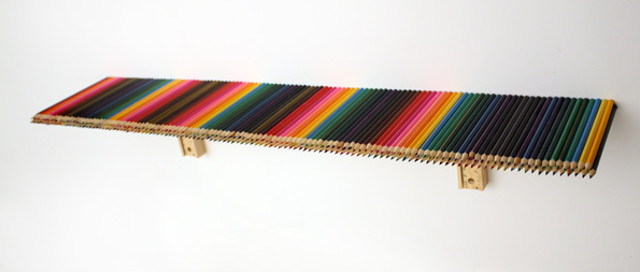
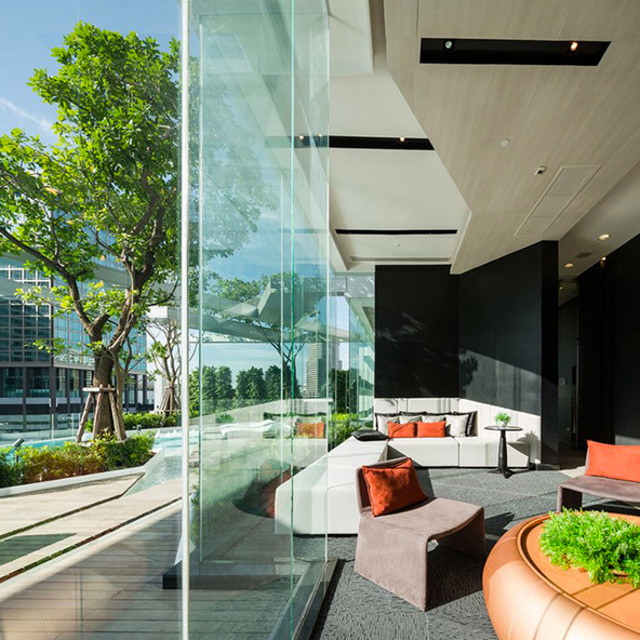
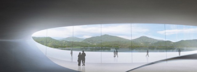
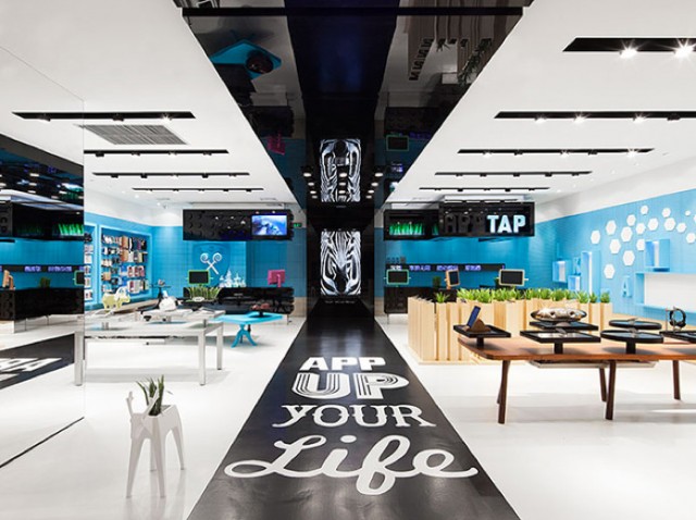
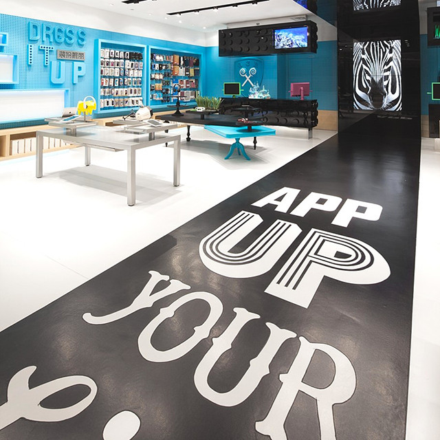
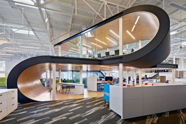
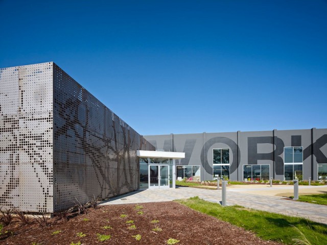
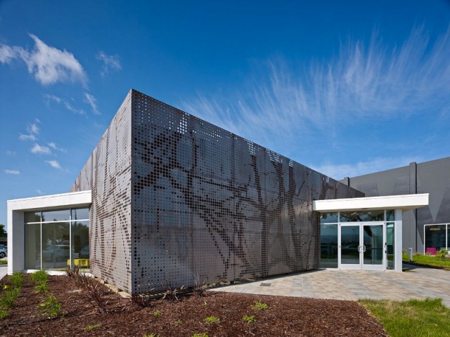
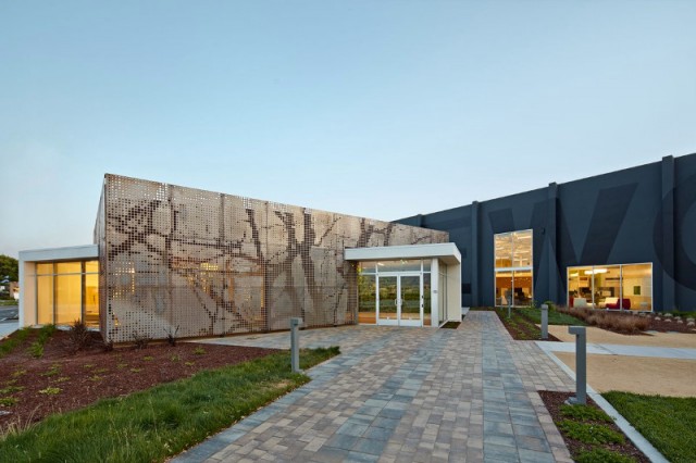
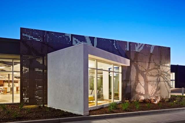
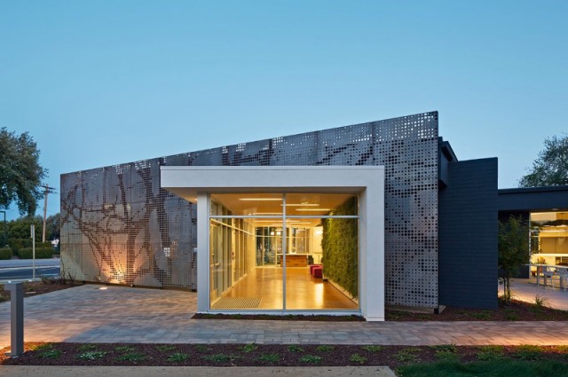
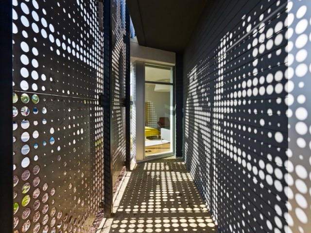
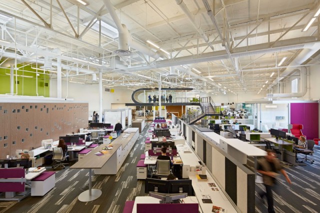
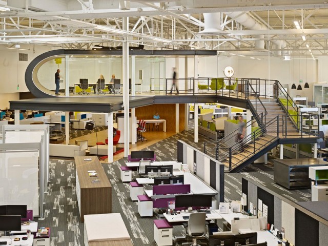
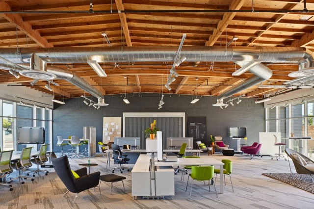
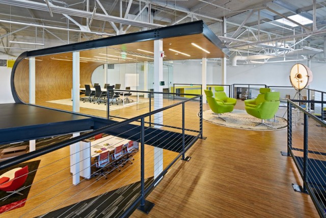
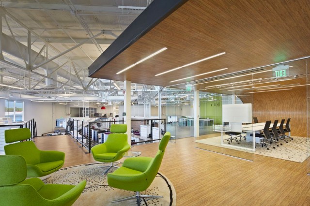
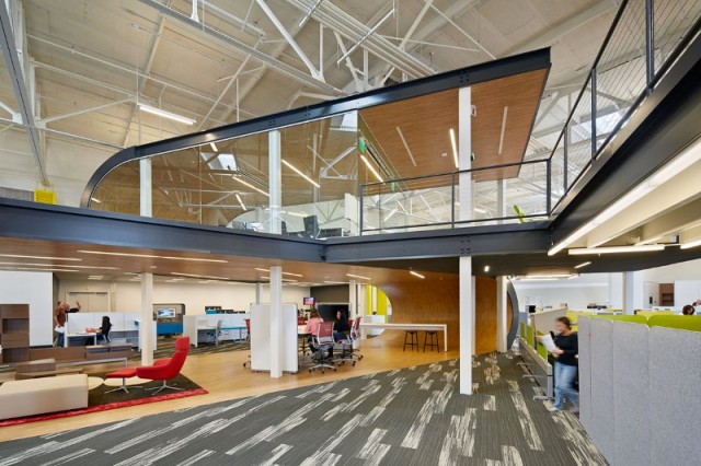
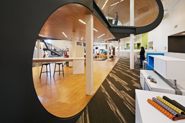
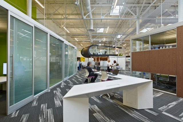
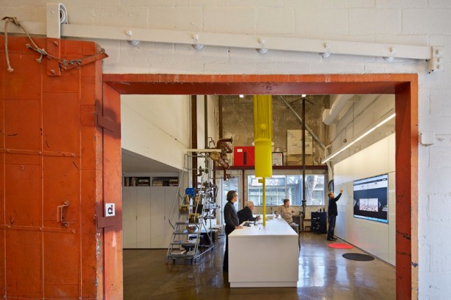
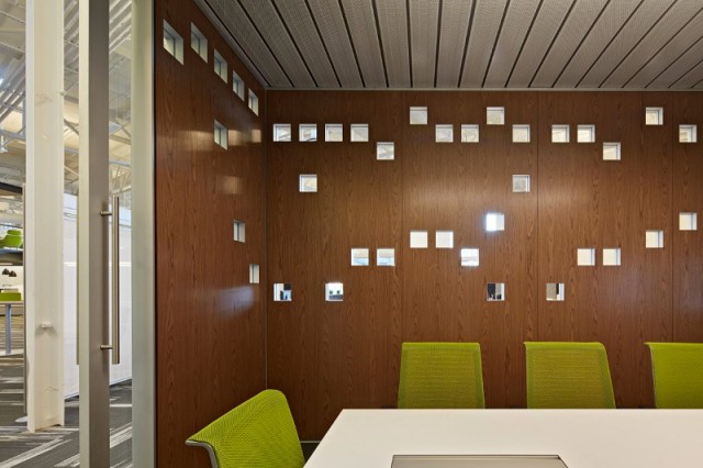
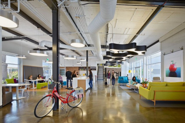
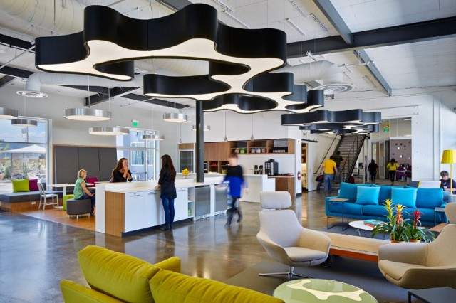
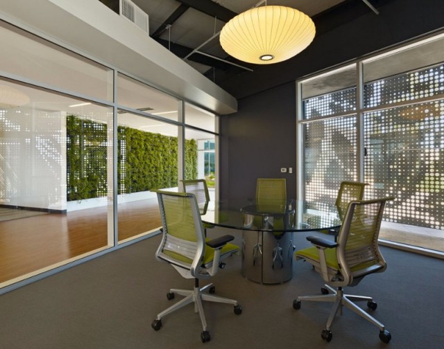
Startups have become kind of synonymous with “cool” office design. The exposed ducts, and wide open spaces are commonplace in the tech scene, where employees can sometimes be spotted working from the couch. At any given gaming or tech startup, you’re likely to find a fully stocked fridge and big cushy chairs.

Is all this design worth it?

Some anecdotal evidence suggests startups are great places for community building and that workers tend to form friendships that last throughout their careers there. Just ask the founder of Maptia, who moved his company to a beachfront office property in Morocco to keep his love of surfing alive. If keeping your employees happy means investing in their workspace, consider which improvements are likely to have the best impact.

Remote Employees

Contract work is becoming more commonplace, especially amongst small businesses where individuals often share the work burden with another contractor. In this case, virtual office design is just as important for productivity. Keep a Google Doc with a task list that your contractor can access at his or her schedule. Encourage freelancers you work with to change their scenery and exercise too. Moving around in a new space is a surefire way to get creative juices flowing.

Coworking

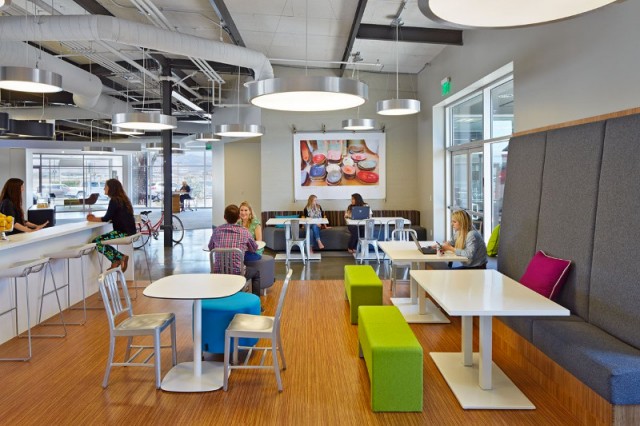
For some, coworking is another approach to the small business in-home office. Rent space in trendy parts of your city to get a full day of new scenery. Coworking is also great for collaboration. Talk with others about the challenging projects you’re taking on, or offer advice to help. Coworking generally doesn’t leave much room for a worker to customize his space, but it can be a great tool for networking. Look for coworking events in your area to meet new business owners tackling some of the same challenges as you.

Sound Levels

Controlling sound inside your office involves a few concerns. Some offices let employees listen to music, so choosing a radio station for the office could become an unnecessary productivity killer. If employees listen to headphones, they may be unable to hear someone else in the office talking to them. Customer service employees on a handset will also pick up residual noise when speaking with clients. Advanced headsets like those from Headsets Direct will help control the voice level and keep communications with the clients seamless. Another helpful tip would be to adopt an internet based chat program for the office, they can help employees listen to music quietly while remaining engaged with the group.

Posture

Sitting in chairs for extended periods can wreak havoc on one’s back, shoulders, and wrists. Proper posture is important, but there are a few things you can do besides spending thousands on office furniture. Encourage employees to actually sit properly with their back straight, shoulders level and monitor raised to eye level. The employee’s elbows should rest comfortably at the sides of the chair, with wrists straight and slightly elevated. Offering small pillows for an employee’s back will provide some extra support. Also encourage stretch breaks, where employees get up and exercise between tasks so that their bodies remain limber.

Air Supply

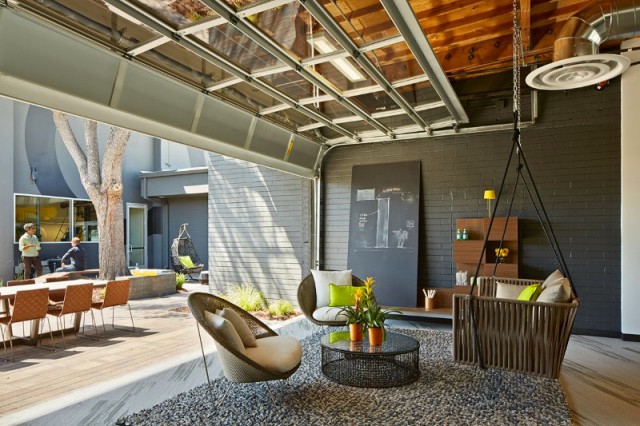
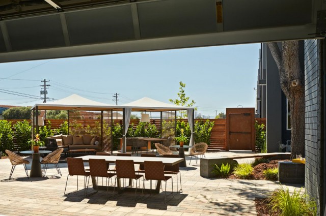
Encouraging employees to take a walk outside isn’t just about losing weight. Proper air supply from a natural source has benefits to your lungs and brain too. This means less headaches and a reduction in the chances of developing asthma. Employees also need sunlight, which is easy to miss out on when working 8-5 on weekdays.

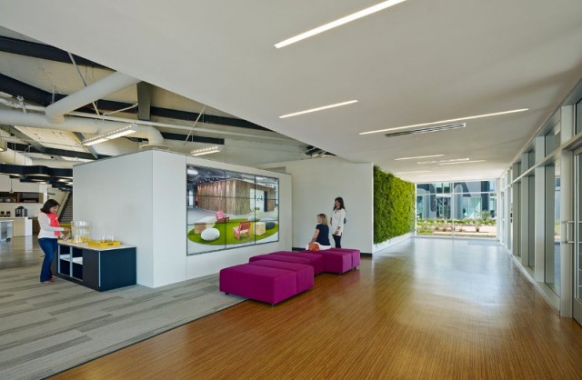
A well designed workspace can provide sunlight to workers, and give them more control over their light. Encourage your employees to be more proactive about their workspace and take pride of ownership over your company. It’s trendy to invest in the stocked mini-fridge, but your employees might be happier with a cozier workspace.

The post How Does Office Design Affect Productivity? appeared first on AdPulp.

Heróis x vilões tipográficos

Criar imagens usando tipografia não chega lá a ser uma grande novidade, apesar de haver alguns projetos que sempre acabam se destacando. É o caso da série de super-heróis e vilões criadas por Midu1995.

A regra costuma ser mais ou menos a mesma: usar palavras atribuídas de alguma maneira ao personagem retratado e a partir daí traçar seu contorno e preenchimento.

O que geralmente me chama a atenção nestes projetos é como os artistas evidenciam a personalidade de cada um dos heróis e vilões retratados – à primeira vista, todo mundo sabe que Batman é um personagem sombrio, mas ao examinarmos mais de perto, vemos palavras como raiva, solidão, vingança como parte do que eles são.

Visualmente, o resultado ficou muito bom, apesar de Bane parecer ter involuntariamente ganhado um par de chifres. Faz parte.

Batman

batman_by_midu1995-d68ub4s

Bane

bane_by_midu1995-d6bgp3k

Carnificina

carnage_by_midu1995-d6bolio

Homem-Aranha

spiderman_by_midu1995-d6bbnc6

Venom

venom_typography_by_midu1995-d68o17a

Deadpool

deadpool_by_midu1995-d6eanr6

Homem de Ferro

iron_man_by_midu1995-d68jnzv

Brainstorm9Post originalmente publicado no Brainstorm #9
Twitter | Facebook | Contato | Anuncie

Andrey Lobov Studio : Andrey Lobov’s Identity

Advertising Agency: Saatchi&Saatchi, Kiev, Ukraine
Creative Director: Kirill Chistyakov
Senior Art Director: Konstantin Schneider
Designer: Aleksandr Litvin

Pencil Shelf

Dans le cadre de son projet 30 jours de Speed Creating, l’artiste Dominic Wilcox doit réaliser un objet ou un type de création chaque jour du mois. Il livre aujourd’hui une de ses inventions une étagère faite de crayons de couleur collés les uns aux autres. Un projet très coloré et ludique à découvrir en images dans la suite.

 width=

s3
s1
s
s4

Ceramic Stereo

Créée par Victor Johansson, cet objet stéréo sans fil réagit selon l’endroit sur lequel on pose son téléphone sur le plateau : play, pause ou radio. Très design, elle est inspirée des bols dans lesquels on met les clés, à la manière d’un pense bête. Un très beau projet à découvrir dans la suite en images.

 width=

 width=

 width=

 width=

 width=

 width=

c5
c4
c2
c1
c
c3

Signs for the Homeless

Les 2 artistes Kenji Nakayama and Christopher Hope investissent les rues de différentes villes comme Cambridge ou Boston en créant de superbes pancartes typographiées avec le même texte que celles que possédaient les sans-abris. Un projet très touchant à découvrir en images.

 width=

 width=

 width=

 width=

 width=

 width=

 width=

 width=

 width=

 width=

 width=

 width=

 width=

a14
a13
a12
a11
a10
a9
a8
a7
a4
a6
a5
a3
a1

Coca Cola: The Wearable Movie

Advertising Agency: Ogilvy & Mather, New York, USA
Chief Creative Officer: Calle Sjoenell
Executive Creative Director: Corinna Falusi
Creative Director: Abe Baginsky, Tom Elia
Associate Director, Project Management: Akiko Nakashima
Account Director: Nicole Pinochet, Marianne Pizzi
Senior Technology Manager: Nate Schilling
Music Producer: Michael Freeman
Art Director: Jen Lally
Design Director: Lucas Camargo
Associate: Justin Bettman, Swati Prasad
Client: Coca-Cola
Animation: Psyop
Digital Production: Bossa
Original Music: Found Objects
Sound Design: Henry Boy

John Legend – Made to Love

John Legend a dévoilé récemment le clip du morceau « Made to Love ». Réalisé par Daniel Sannwald et sous la direction artistique de Yoann Lemoine, ce clip d’une grande beauté propose de découvrir les formes et les couleurs que prennent l’amour et la rencontre entre deux êtres à travers des modélisations 3D.

John Legend - Made to Love7
John Legend - Made to Love6
John Legend - Made to Love5
John Legend - Made to Love4
John Legend - Made to Love8
John Legend - Made to Love3
John Legend - Made to Love1
John Legend - Made to Love
John Legend - Made to Love2

All Action Films at Once

Focus sur « Eterna » : une fausse bande-annonce réalisée par Vadzim Khudabets réunissant des images issues de nombreux films d’action comme Thor, Watchmen, Tron Legacy, Pacific Rim, Avatar, 300, ou encore Spiderman. Un rendu réussi, très complet et dynamique à découvrir en vidéo dans la suite de l’article.

All the Action Films at Once7
All the Action Films at Once6
All the Action Films at Once5
All the Action Films at Once4
All the Action Films at Once2
All the Action Films at Once
All the Action Films at Once3

Globe Chair

Etudiant à la Design Academy d’Eindhoven, Michiel van Gageldonk a imaginé cette « Globe chair ». Avec un design très réussi, cette création alliant beauté et confort propose un dossier de forme sphérique. Un projet à découvrir en images sur son portfolio et dans la suite de l’article.

Globe Chair9
Globe Chair8
Globe Chair7
Globe Chair6
Globe Chair5
Globe Chair3
Globe Chair2
Globe Chair1
Globe Chair10

The Poetry of Motion

Après Kinetic Rain, projet nominé dans la catégorie Design des Fubiz Awards, Art+Com proposoe « The Poetry of Motion ». Cette symphonie est une collaboration avec le compositeur Ólafur Arnalds, mélangeant avec talent images et musiques pour cette performance présentée à la plateforme créative berlinoise MADE.

The Poetry of Motion7
The Poetry of Motion6
The Poetry of Motion5
The Poetry of Motion4
The Poetry of Motion3
The Poetry of Motion2
The Poetry of Motion1
The Poetry of Motion8

Imagens revelam estágios iniciais da criação de personagens famosos

Imagine se Yoda, o sábio mestre Jedi, tivesse a aparência de um gnomo de jardim, parecido com aqueles que a Ikea usou em um de seus comerciais. Ou que a simpática aparência de Shrek desse lugar a um ser com a cabeça desproporcional, em formato de cone? Chewbacca se pareceria mais com um monstro e menos com um cachorro, enquanto Síndrome, o vilão de Os Incríveis, seria uma mulher. Se tudo isso parece absurdo para você, saiba que essas ideias passaram, sim, pela cabeça dos criadores destes personagens, ainda que lá no começo do processo.

É o que nos mostram as imagens reunidas (já há algum tempo, é verdade, mas que se encaixa em Imagens revelam estágios iniciais da criação de personagens famosos) pelo site ScreenCrush. A equipe foi atrás das artes conceituais de conhecidos personagens do cinema, ainda nos estágios iniciais das produções. Algumas raridades – caso de Buzz Lightyear – são apenas rascunhos, enquanto outras já são mais bem acabadas.

É curioso perceber neste material como alguns personagens ficaram melhores no resultado final, enquanto outros não conseguiram sair bem como o imaginado. De qualquer maneira, é uma coleção bacana de imagens, tanto para quem curte cinema, quanto para quem se interessa pelo design de personagens.

chewbacca jabba
early_movie_concept_art_genie_aladdin a-bugs-life-hopper-early-concept-art early_movie_concept_art_sulley_monsters_inc early_movie_concept_art_wreck_it_ralph shrek-early-concept-art toy-story-buzz-lightyear-early-concept-art
early_movie_concept_art_the_incrediblesiron-man-whiplash-early-concept-art1 early_movie_concept_art_hellraiser early_movie_concept_art_bane_dark_knight_rises
early_movie_concept_art_loki_thorthor-early-concept-artamazing-spider-man-early-concept-art
x-men-first-class-emma-frost-early-concept-art beast-x-men-first-class-early-concept-art x-men-first-class-azazel-early-concept-artalice-in-wonderland-caterpillar-early-concept-art alice-in-wonderland-mad-hatter-early-concept-art

Yoda – Star Wars

Chewbacca – Star Wars

Jabba – Star Wars

Gênio – Aladdin

Hopper – Vida de Inseto

Sulley – Monstros S/A

Ralph – Detona Ralph

Shrek – Shrek

Buzz Lightyear – Toy Story

Síndrome – Os Incríveis

Whiplash – Homem de Ferro 2

Pinhead – Hellraiser

Bane – O Cavaleiro das Trevas Ressurge

Loki – Thor

Thor – Thor

Homem-Aranha – O Espetacular Homem-Aranha

Emma Frost – X-Men Primeira Classe

Fera – X-Men Primeira Classe

Azazel – X-Men Primeira Classe

Lagarta Azul – Alice no País das Maravilhas

Chapeleiro Maluco – Alice no País das Maravilhas

Brainstorm9Post originalmente publicado no Brainstorm #9
Twitter | Facebook | Contato | Anuncie

The Pool at Pyne in Bangkok

L’agence thaïlandaise de paysagistes Trop s’approprie la terrasse d’un immeuble de 42 étages au centre de Bangkok. Elle crée un véritable oasis de relaxation avec sa piscine entourée de petites terrasses et de végétation et est encadrée d’un structure lumineuse. Un superbe projet à découvrir en images.

 width=

 width=

 width=

 width=

 width=

 width=

 width=

 width=

 width=

 width=

ppb1
ppb2
ppb7
ppb3
ppb4
ppb5
ppb6
ppb8
ppb9
ppb

The Pingtan Art Museum

L’agence chinoise Mad Architects dévoile son projet hallucinant : le Pingtan Art Museum, une presqu’île artificielle aux formes harmonieuses composée majoritairement de béton, de coquillages et de sable issu de l’île de Pingtan. Destiné à devenir le musée privé le plus important de Chine, il ouvrira ses portes en 2016.

 width=

 width=

 width=

 width=

 width=

 width=

 width=

 width=

 width=

cnm8
cnm
cnm1
cnm2
cnm4
cnm3
cnm5
cnm6
cnm9

Cartaz emite som de bateria quando tocado

O papel pode parecer um meio em declínio, mas Novalia está tentando preservar a mídia impressa ao transformar superfícies estáticas em interfaces interativas.

Seu primeiro projeto resultou em um cartaz de bateria interativo. Usando tecnologia sensível ao toque para produzir sete tipos de sons diferentes, é possível tocar o instrumento junto às suas músicas preferidas, ou compor sua própria batida.

Funciona assim: sensores de toque foram impressos com tinta eletricamente condutiva, conectada a uma placa de circuito. O cartaz reconhece quando um gráfico foi tocado da mesma forma que o touchscreen em um smartphone reconhece seus dedos.

drumposter-2 drumposter-1

Os idealizadores estão fazendo uma campanha via Kickstarter que, se bem sucedida, pode tornar a produção mais rentável do que o seu método atual.

Duas versões do poster estão sendo produzidas. Uma irá se conectar ao iPhone ou iPad via Bluetooth, permitindo que o som da bateria toque via wireless. E uma outra versão, onde a superfície do papel será transformada em alto-falante através do mesmo módulo eletrônico que permite traduzir o toque em sons.

O papel não só emite áudio, como também vibra, permitindo que as pessoas sintam a música.

A equipe da empresa idealizadora do projeto, Novalia, é composta por sete cientistas, programadores e designer do Reino Unido, todos interessados em tornar o papel uma nova plataforma midiática, agregando funções tecnológicas.

Em um mundo onde o papel e eletrônicos são muitas vezes vistos como antagônicos e excludentes, Novalia quer mostrar às pessoas que pode sim haver uma conexão entre os dois, dando vida a um meio híbrido, reconfigurável e sem limites para a criatividade.

Brainstorm9Post originalmente publicado no Brainstorm #9
Twitter | Facebook | Contato | Anuncie

Um redesign conceitual do Twitter

Fazer conceito é divertido pois você não precisa se preocupar (tanto) com a funcionalidade e desenvolvimento, isso acaba ficando pra depois. Afinal, para inovar é preciso primeiro se libertar das amarras conhecidas.

Esse redesenho do Twitter criado pelo designer australiano Fred Nerby pode ter vários “poréns ” quando se trata de usabilidade, mas é definitivamente bonito, com uma experiência mais visual e seguindo a tendência do flat do design web.

O que mais me incomoda é o foco em celebridades, mas tem boas ideais aí, tanto sobre a abordagem que veículos de mídia podem ter e também uma reinvenção do serviço de música que o Twitter mesmo tem intenção de trabalhar.

Assista o vídeo acima e confira algumas imagens abaixo.

Twitter
Twitter
Twitter

/dica do leitor @gustavotampa

Brainstorm9Post originalmente publicado no Brainstorm #9
Twitter | Facebook | Contato | Anuncie

Tucca (Association against childhood cancer): Magic Coins

Advertising Agency: Lua Propaganda, Brazil
Art Director: Caio Grafietti
Copywritter: Davi Sabry
Creative Director: Átila Francucci
Rtv: Anna Bohm
Director: Matheus Siqueira
Producer: Margarida Filmes
Sound producer: Cabaret
Account executive: Ricardo Polmon
Aproved by: Ana Ferraz

Telecom Store Architecture

AISIDI, principal revendeur de produit et service mobile en Chine, s’associe avec Coordination Asia, un cabinet de design et d’architecture, pour le lancement d’une nouvelle série de magasins, AER. Slogan publicitaire inscrit sur le chemin noir au sol, comptoir Lego, jeu sur les typographies, le résultat est très réussi.

 width=

 width=

 width=

 width=

 width=

 width=

ts4
ts3
ts2
ts1
ts
ts5

One Workplace Headquarters

Leader dans la vente de meuble en Californie du Nord, One Workplace fait appel à l’agence d’architectes Design Blitz pour créer son siège à San Francisco. Ils créent un espace hybride très design destiné aux employés comme aux consommateurs. Une très belle et innovante collaboration à découvrir en images.

 width=

 width=

 width=

 width=

 width=

 width=

 width=

 width=

 width=

 width=

 width=

 width=

 width=

 width=

 width=

 width=

 width=

 width=

 width=

 width=

 width=

 width=

 width=

 width=

 width=

 width=

 width=

 width=

 width=

 width=

 width=

 width=

 width=

 width=

 width=

db35
db30
db33
db15
db13
db16
db14
db34
db12
db23
db20
db3
db26
db29
db2
db6
db9
db10
db17
db24
db27
db1
db
db5
db4
db18
db22
db21
db25
db28
db31
db19
db11
db8
db7
db32