This Porn Star's Startling Ad for a Sex Show Accuses Spain of the Ultimate Hypocrisies

A striking new ad from Spain is making waves there, accusing the nation’s culture of being completely disingenuous—and using an adult film star as its righteous messenger. 

“My name is Amarna Miller,” she says, staring into the camera, as she introduces herself in the commercial’s first shot. “I’m a porn actress, and was born in a hypocritical country, where the same people calling me a whore jerk off to my videos.” 

It’s a brutally effective opening salvo, and the 90-second commercial—promoting the 2016 Salon Erótico de Barcelona Apricots, a live sex show staged in that city—doesn’t let up, indicting bullfighters, politicians, financiers, priests and all other forms of forked-tongued bad actors. 

read more

For Love or Money? One Couple Doesn't Have to Choose in This Lovely Spanish Lottery Ad

The lottery may not have much to do with fate, but it’s a lot like love—if you don’t play, you won’t win, says a new ad from Spain.

The three-and-a-half minute commercial for EuroMillions, the country’s national cash raffle, offers a twist on a classic romance—boy meets girl, boy chases girl, boy and girl win gigantic sum of money in long-shot gamble, boy and girl live happily ever after.

read more

Midas Subjects Its Own Mechanics to the Most Advanced Lie Detector Test in the World

Perhaps unsurprisingly, six out of 10 Spaniards think mechanics are liars, according to the Spanish Organization of Consumers and Users (OCU). The country’s economic crisis has only exacerbated that belief. 

Midas, though, claims to have built its reputation on transparency and sincerity. To give that notion salience, Proximity Madrid subjected its mechanics to a Minority Report-style lie detector test. 

read more

This Agency Built an Online Library of Orgasms to Teach Us What Pleasure Really Sounds Like

Here’s a weird secret: I’m pretty sure the orgasm sounds I make with partners have been influenced by porn.

Now you know more about me than my doctor does.

Why I’m feeding you creepy personal facts: Based on the conviction that 70 percent of Spanish people believe the heaving, animal, almost painful cries depicted in pornography are what an actual woman’s orgasm sounds like, premium sex toy brand Bijoux Indiscrets has created an orgasm library, with help from agency Proximity Madrid. 

It’s a library! Of orgasms!

read more

BePoppins "Have more kids" (2016) :30 (Spain)

On International Day Of Families, brand new digital agency La Fuerza , based in Madrid, launched this campaign for BePoppins, an app that pairs you with the most qualified babysitters and nannies out there. So go on and get your bone on.

“Go on and get your bone on,” should probably be their new tagline although I don’t know if it works in Spanish.

Revista Líbero "LÍBERO DISCO" (2016) :30 (Spain)

Man with an impressive seventies style stash is so sure of himself and that he has pulled, he dances like a cat in heat. Alas, his dance partner isn’t quite as enamoured as he might have thought and she makes the distance line quite clear with Líbero Spray. Líbero Spray acts like the vanishing spray made popular during the World Cup and can be bought at select newsstands, on ebay and through the site: spray.revistalibero.com – because if you explain it with football, they get it.

See also teenage girl, night in and my personal fave bedroom. See also the long edit Libero Spray

Revista Líbero "LÍBERO SPRAY" (2016) :90 (SPAIN)

This is the long edit, putting together all those situations where the Líbero Spray may be useful. You see Líbero Spray acts like the vanishing spray made popular during the World Cup, and tells people to keep their distance. From the midnight snacks in the fridge. From your school. From you. Do not miss the 30 second breakdowns, like Disco, Teenage daughter and Bedroom, and Night in.

Innovation that has revolutionized football fields everywhere is now within everyone’s reach. An extraordinary invention, that helps men understand the required distance for any situation in life.

“Libero Spray is the same as using referees to explain to a player what is the required distance in a free kick. Our innovative product works the same way in order to explain to any man how much distance he needs to maintain from the TV remote, a diary, or even a person,” explains Diego Barcala, Director of the magazine. “We are thrilled at how the campaign strategy has moved into the territory of product development while keeping the concept, humor and insights that have made our brand grow.”

Líbero, is the magazine that covers culture, style, nostalgia and other content through football. Since the initial launch of the concept, “If you explain with football, you understand” results have been extremely effective. Distribution has grown from only Spain to include México, Argentina, Costa Rica, Colombia and Portugal. International subscriptions grew by 600% and local by 263% in the first months of the original campaign.

Líbero Spray will be available at select newsstands, on ebay and through the site: spray.revistalibero.com

Revista Líbero "LÍBERO PHONE" / Night in (2016) :30 (Spain)

You know by now that the spray will be used. But where? Aaaaah, so that he can’t reach his phone.

Líbero Spray acts like the vanishing spray made popular during the World Cup and can be bought at select newsstands, on ebay and through the site: spray.revistalibero.com – because if you explain it with football, they get it.

See also teenage girl, the Disco dancer, bedroom and night in . See also the long edit Libero Spray

Revista Líbero "LÍBERO BEDROOM" (2016) :30 (Spain)

The Misters is a little … hot to trot. Because it’s Tuesday, you see. And on Tuesdays he goes a little crazy. He goes a little *wink*… He … Goes away. What’s that spray the wife brought out of the night stand?

“Libero Spray is the same as using referees to explain to a player what is the required distance in a free kick. Our innovative product works the same way in order to explain to any man how much distance he needs to maintain from the TV remote, a diary, or even a person,” explains Diego Barcala, Director of the magazine. “We are thrilled at how the campaign strategy has moved into the territory of product development while keeping the concept, humor and insights that have made our brand grow.”

If you explain it with football, they understand.

Líbero, is the magazine that covers culture, style, nostalgia and other content through football. Since the initial launch of the concept, “If you explain with football, you understand” results have been extremely effective. Distribution has grown from only Spain to include México, Argentina, Costa Rica, Colombia and Portugal. International subscriptions grew by 600% and local by 263% in the first months of the original campaign.

Líbero Spray will be available at select newsstands, on ebay and through the site: spray.revistalibero.com

Revista Líbero "LÍBERO SCHOOL" / Teenage daughter (2016) :30 (Spain)

When you are the father of a teenage girl, you should understand that she needs privacy. She needs space. There are things you learn from. Your age tells you. That spray line tells you…..

See, if you explain with football, they get it.

Innovation that has revolutionized football fields everywhere is now within everyone’s reach. An extraordinary invention, that helps men understand the required distance for any situation in life. get yours now! spray.revistalibero.com

“Libero Spray is the same as using referees to explain to a player what is the required distance in a free kick. Our innovative product works the same way in order to explain to any man how much distance he needs to maintain from the TV remote, a diary, or even a person,” explains Diego Barcala, Director of the magazine. “We are thrilled at how the campaign strategy has moved into the territory of product development while keeping the concept, humor and insights that have made our brand grow.”

See also Bedroom.

Lotus Bakeries – Blind Coffee Date – (2015) case study (Spain)

Lotus Bakeries - Blind Coffee Date - (2015) case study (Spain)
Lotus Bakeries created “the first social experiment on which you did not know who you would have a cup of coffee with”, and all you had to do to join in was to book a time when you could have a blind date over a cup of coffee. Lotus Bakeries are convinced, you see, that any coffee enjoyed with their biscuit, is just the beginning of great conversations – and they set out to prove it. SO bloggers and social media e-celebs tried it out and soon so did other people connected to facebook and who knew that free biscuits and coffee would bring people together? Oh, that’s right, Lotus Bakeries knew. I’m not all that impressed with this, but I’m sure the people who participated had fun, it’s one of those ideas that doesn’t look all that great in a case study but might have been fun while you were there.

Celem – Abortiontravel #Glasslion shortlist – (2015)

Celem - Abortiontravel #Glasslion shortlist - (2015)
DDB SPAIN protested the idea of stricter abortion laws in Spain with this idea using a pop-up travel agency, showing how women would be selecting travels abroad to perform abortions. This idea for Celem (European Women’s Lobby) has been shortlisted in the #Glasslions award, cannes 2015.

Magnum – Be True to your pleasure – (2015) :60 (Spain)

Magnum - Be True to your pleasure - (2015) :60 (Spain)
Magnum believes “that everyone should indulge in their personal pleasure.” So they called on the drag queens to be their stars of this ad. Willam Belli, whom you may know from RuPaul’s Drag Race, Gregory Woo, Tye Olson (Taylor Quick) and Karis Wilde all strut their stuff. “Be True To Your Pleasure celebrates spontaneity and the joy of letting go. It means turning off that little voice inside our head that compels us to live up to social expectations and say no to pleasure. It’s about saying yes.” Set to a somber version of Rihannas “Umbrella” scouted by Jesper Gadeberg which is a Cannes good luck charm as practically everything he does ends up on the shortlist, the mood is more melancholic than your usual Magnum fare. I can’t put my finger on why, it may be the slow motion of the color-correction, but the ad has a slightly menacing vibe to it, and there are certain beauty shots shades that really don’t flatter the participants.

Sophie Galvani, global brand vice president for Magnum described this ad as “a beautiful illustration of Magnum’s philosophy. . .Everything we do at Magnum is about inspiring, enabling and daring people to take that moment of pleasure for themselves. It doesn’t matter who you are, or what you take pleasure in; this film has been created to inspire you to seize it. This film celebrates the ways one specific group of individuals embrace their personal pleasure in a particularly courageous way, in an effort to inspire and encourage all people to be true to their own pleasure.”

Cocktail Bar's Gin-Bottle Swimmers Honored as the Year's Best Package Design

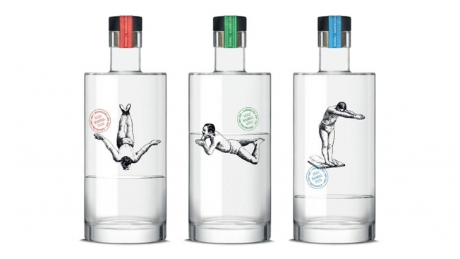
A tiny cocktail bar in Barcelona has won best of show at The Dieline Awards 2015, honoring the world’s best packaging, for its gin bottles showing swimmers cavorting in the stuff.

Barcelona design studio Dorian made the bottles for Bar Pesca Salada, an old fish shop converted into a maritime-themed gin-and-tonic bar. Each bottle features a man appearing to swim in the gin—and it becomes a visual game as the bottle empties.

Dorian also screen-printed the images on the bottles, rather than using a transparent label.

See the rest of the Dieline winners here.


This Beautiful PSA From Spain About Embracing Life Keeps You Guessing Until the End

A new Spanish PSA from Publicis wants you love life, and not ruin it entirely.

Hang picture frames, go running through the woods, get a tattoo, play rugby or hang out on a mattress somewhere. There’s plenty to keep you occupied—and away from darker choices—says the ad, which in some ways recalls the vibe of Puma’s “After Hours Athlete” and Levi’s “Go Forth” work.

The moralistic kicker, necessary as it may be, doesn’t seem ideal—and could turn teenagers off. Also, the spot might miscalculate just how many free hours kids can have to waste. But hopefully the message gets through anyways.

CREDITS
Directors: Marc Corominas, Lorena Medina
Client: FAD
Agency: Publicis
DOP: Oriol Vila
Art Director: Oian Arteta
Wardrobe: Ana Morera
Makeup: Oona Napier
Head of Production: Marta Antón
Head of Postproduction: Tamara Díaz
Assistant Director: Israel Marco
Production Team: Carles Pequerul, Ángela Puig-Pey, David Bello, María Asensio, Ana Terrero, Andrià Nebot, Eli Apezteguia, Sivila Arimany
Camera and Photography Team: Agnes Corbera (DOP assistant), Sergio Santana (Camera Assistant), Pablo Lagos (Camera Assistant), Moncho Bartroli (Electrics Head)
Warbrobe Team: Andrea Pi Sunyer (Assistant Wardrobe)
Art Team: Alexandra Jordana (Art Assistant), Cristina Hontiyuelo (Props), Anna Auquer (Props)
Rental Cars: Quadis
Travel Agency: IEST
Postproduction Coordination: Metropolitana


Spanish Soccer Magazine's Ludicrous Loop Ads Put Dancing in Terms Men Can Understand

Good news, soccer-obssesed dudes — it turns out if you can kick the ball, you can dance too, at least, as long as you also have a little help from a film editor.

A set of ads from Spanish soccer magazine Libero takes on the idea that men can’t cut a rug, by looping footage of casual soccer players doing warmups, feints, passes, and other tricks in time with music.

Visually, the spots, created by Lola, are basically GIF montages. But overall, they, do a nice job of wrapping the style into a clear message: that the publication covers culture—beyond sports—in terms football fans will enjoy. (The spots also fall less into the men-are-meatheads trap than the brand’s relationship-talk spots from early last year, which are still plenty funny.)

Sure, the “Can-can” video is a touch corny (who wants to hear that song again, ever, even as a joke?) But the rock and techno clips all more or less nail the movements with panache (Cumbia looks great, too… we just can’t call ourselves experts).

Of course, the ads might also be ruining a perfectly good excuse for the guys who were just being lazy. 

(Via Ads of the World)


Toyota Challenges Meteorologists to Drive Around With Sunroofs Synced to Their Forecasts

Everyone loves to complain about the weatherman messing up the forecast, but Toyota decided to actually do something about it.

At least, that’s the premise of this new reality-style ad for the automaker’s Aygo model (sold in Europe). In the two-minute spot, three television forecasters are given special versions of the car to drive, with a sunroof rigged to stay closed when he or she predicts rain, and open when he or she expects it to shine—regardless of what actually comes out of the skies.

Cue obvious footage of one weather anchor cursing as a small mountain of snow dumps onto her head (did she not see it, or did the rules bar her from sweeping it off before she got in?), and another hilariously pleading for mercy as he gets drenched in a downpour.

It’s all framed as an experiment, if tongue in cheek, so the results aren’t surprising— the world’s favorite rhetorical punching bags get the weather right some of the time. And as with most documentary marketing, it should probably be taken with more than one grain of salt.

In other words, Toyota isn’t exactly taking much of a risk by piling on. But it’s fun enough to watch, in a revenge-schadenfreude kind of way. For all those times you got caught in a thunderstorm without an umbrella, sit back and grab some popcorn, because it sure beats blaming the atmosphere.

Agency: Del Campo Saatchi and Saatchi Spain.


Burger King Surprised Apartment Hunters With One Whopper of a Kitchen Upgrade

If you’re apartment hunting for a three bedroom/two bath/one Burger King, this might be the spot for you.

Spanish agency La Despensa equipped a tasty pad in downtown Madrid with a BK kitchen and menu counter for a stunt touting the arrival of the chain’s home delivery service. You’ve got familiar brand signage, colorful meal displays and even some guy named Michael, dressed in a BK uniform, ready to take your order.

Because the agency listed the unit on local real-estate websites for roughly half its market value, “we had around 800 calls in five days asking to see the place,” La Despensa creative director Luis Monroy tells AdFreak. Hidden cameras recorded the reactions of prospective tenants, who seem amused and pretty psyched about the experience.

“It took around three days to assemble the restaurant after weeks of searching for the perfect place,” Monroy says. “Can you imagine what it’s like to carry up all the kitchen tools, digital screens for the menu-board … and the bar of 300 kilos to the third floor with no elevator?” Members of the marketing team, production company and agency all pitched in to help with the heavy lifting.

Of course, authentic BK cuisine was served. “It is a much more complete experience with a Whopper in your hands,” Monroy says. Soon after it finished the video, La Despensa (which translates to “The Pantry”—perfect, right?), the apartment, which really had been on the market, was snapped up, “unfortunately without the restaurant, and at a higher price.”

This well done prank manages to stay on-point and satisfy without seeming overcooked. And that’s kind of rare in this category.


This Suite of Fonts Was Made From the Handwriting of the Homeless

Homeless signs have been a font of ideas for creatives, but rarely has the focus been on the fonts themselves.

The Arrels Foundation in Barcelona has created Homelessfonts—typefaces based on the unique handwriting of the homeless people it helps. Each font comes with the story of the person who penned it and their personality. After all, few things are more personal than our handwriting.

The work not only helps fund the foundation, it humanizes the homeless and lets people see them as unique individuals, not as an amorphous problem. The video about the process is moving, but moreover, the fonts are actually good. The glyphs were captured with fat sharpies on poster board and then transformed by volunteer typographers.

If you are a typographer, you can donate your time and expertise to help create more fonts. If you just like the concept, you can download a free app to use the fonts in social media (be a nice person and make a donation, too). And if you’re a brand, you can purchase the fonts and the stories that come with them for professional use at surprisingly affordable prices.

Samples of the scripts as they might appear on packaging are included, so you can see just how beautiful and unique the font—and the people behind them—truly are.


Awesome Beer Cans Show the Pantone Color of the Brew That's Inside

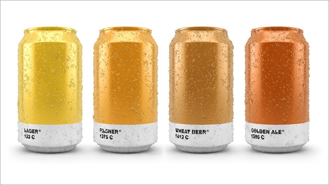
If you always suspected that a pale ale would rate a shimmering, golden 604C on the Pantone color system, have a pint on me.

Spanish agency Txaber matches brew types with their Pantone hues in this stylish package design exercise. It’s reminiscent of last year’s “Beertone” cards that provided the exact color values of various beers in RGB, CMYK and HTML code. Here, however, we get simple, gorgeous cans and bottles that really let the shades of the suds inside shine through.

See the whole collection on the Txaber site.

Beer packaging has been a powerful muse in the design world, inspiring some impressive work. The comeback of the can, particularly among craft brewers, “opened up a 360-degree canvas for label designers typically restricted to the few stickers on a beer bottle,” according to my AdFreak colleague David Griner. That’s true, though some creative types have made heroic efforts to sass-up humble glass containers and do that medium justice, too.

I like Txaber’s restrained, elegant approach. You get lots of color and, in tiny typeface (HipstelveticaFontFamily, which is free to download), the beer names and Pantone designations. That’s all you need. The results are especially compelling when the cans and bottles are grouped together. Their hues play off one another like the bands of a rainbow, ranging from pale ale’s carefree vibrance through the playful, almost purplish tones of the porter’s 1817C to the dark grandeur of imperial stout at 426C.

Though, as we’ve learned, nothing represents the vibrant soul of “black” quite like Guinness.

Via Design Taxi.