Taste Shapes According to the Nature

Partenaire du magazine Fricote, voici la série « Taste Shapes According to the Nature » avec une utilisation insolite de la nourriture, imaginée par Felipe Barbosa et réalisée avec l’aide de Rafael Medeiros. Des créations et plus d’informations sur la collaboration entre Fubiz et Fricote Magazine à découvrir dans la suite.

Cette série photographique est à découvrir dans le nouveau Fricote Magazine n°13 dont la couverture a été réalisée par Jean Jullien. Retrouvez aussi dans ce numéro un article « Food Art via Instagram » signé par l’équipe de Fubiz. Magazine disponible depuis le 14 novembre.

Taste Shapes According to the Nature for Fricote Magazine8
Taste Shapes According to the Nature for Fricote Magazine7
Taste Shapes According to the Nature for Fricote Magazine6
Taste Shapes According to the Nature for Fricote Magazine4
Taste Shapes According to the Nature for Fricote Magazine1
Taste Shapes According to the Nature for Fricote Magazine3
Taste Shapes According to the Nature for Fricote Magazine2
Taste Shapes According to the Nature for Fricote Magazine5

Fat & Furious Burger

Déjà en couverture du numéro de Fricote Magazine, le duo de designers français Thomas et Quentin a fondé le collectif Fat & Furious Burger, mettant ainsi en scène avec talent leur mets préféré dans diverses situations. A découvrir dans une sélection d’images dans la suite de l’article.

Fat Furious Burger7
Fat Furious Burger6
Fat Furious Burger5
Fat Furious Burger4
Fat Furious Burger3
Fat Furious Burger2
Fat Furious Burger
Fat Furious Burger-19
Fat Furious Burger-11
Fat Furious Burger-10
Fat Furious Burger-9
Fat Furious Burger-7
Fat Furious Burger-6
Fat Furious Burger-5
Fat Furious Burger-1
Fat Furious Burger-4
Fat Furious Burger-3
Fat Furious Burger-2
Fat Furious Burger1

3 Ad Agencies Try to Rebrand Feminism. Did Any of Them Get It Right?

Does feminism need rebranding? Elle U.K. thinks so, and invited three British ad agencies—Brave, Mother and Wieden + Kennedy—to work on it with three feminist groups.

The results, published in November's issue, are posted below. Brave, working with teenage campaigner Jinan Younis, produced a flow chart called "Are You a Feminist?" Mother, working with the newly launched Feminist Times, created an ad focused on equal pay. And W+K, teamed up with online magazine Vagenda, produced an ad about stereotypes that women have to deal with.

See the work below. Does any of it scratch the surface of the issue?

—Flow chart from Brave and Jinan Younis:

—Ad from Mother London and the Feminist Times:

Ad from Wieden + Kennedy London and Vagenda:


Ad-Free Issue of September Vogue Is an Engineering Marvel, but It Will Cost You

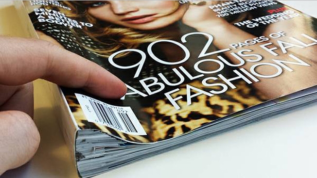
For anyone who avoided picking up this year's September issue of Vogue because it would cause back trouble to carry around, here's another option—an ad-free version is for sale on Craigslist, with all the advertisements either cut out or blacked out. This allows you to enjoy an "uninterrupted read" without all that pesky filler.

The only problem? The price. "I calculating the ad expenditure of this issue for 280 Full Page Ads and 45 Double Page Spreads," says the seller. "This was the amount advertisers spent so you could buy your copy of VOGUE at just $12 at your local bookstore. So obviously, without the ads, I will have to pass on the cost to you." That explains the asking price of more than $4 million. Seems maybe they forgot to divide that by the number of issues printed?

Full text of the Craigslist ad below. Via PSFK.

I am selling an "Ad-Blocked" issue of Vogue US, September Issue 2013. What I did was to cut out all the pages with advertisements, and left only the articles. For the pages I couldn't remove, I went over them with a big fat permanent marker. Now you can enjoy an uninterrupted read of the most anticipated issue of this fashion bible.

If this price is a little higher than you anticipated, let me explain. By referencing VOGUE's media rate cards, I calculating the ad expenditure of this issue for 280 Full Page Ads and 45 Double Page Spreads. This was the amount advertisers spent so you could buy your copy of VOGUE at just $12 at your local bookstore. So obviously, without the ads, I will have to pass on the cost to you.

There is good news though: the rate card did not include premiums for this being a "September Issue", which I am sure will bump the price up even more.

So what are you waiting for? This is a steal!


Binomes Series for Fricote

Partenaire du magazine Fricote, nous vous proposons de découvrir « Binômes » une série d’infographies combinées à des photographies résumant la relation entre divers duos français présents dans l’univers gastronomique ou graphique. Une série fruit de la collaboration entre William Roden et Richard Banroques.

Cette série photographique est à découvrir dans le nouveau Fricote Magazine n°12 dont la couverture a été réalisée par Fat&Furious Burger. Retrouvez aussi dans ce numéro un article « Eat and Hits » signé par l’équipe de Fubiz sur la nourriture dans les clips. Magazine disponible depuis le 5 septembre.

COUVE-640x426
Fricote n12 - Binomes15
Fricote n12 - Binomes14
Fricote n12 - Binomes13
Fricote n12 - Binomes12
Fricote n12 - Binomes11
Fricote n12 - Binomes6
Fricote n12 - Binomes5
Fricote n12 - Binomes4
Fricote n12 - Binomes3
Fricote n12 - Binomes2
Fricote n12 - Binomes1
COVER_FRICOTE12_low

The Standard Hotel Accused of Trivializing Violence Against Women

the_standar_woman_suitcase.gif

A new print campaign for New York’s The Standard Hotel has been accused of advocating or trivializing violence against women. The ad, which appeared in DuJour shows a woman lying face down on the pavement with a suitcase atop her back.

The publisher of Make Me A Sammich was none too pleased with the campaign and wrote, “I need to point out for anyone not clear on the concept that by using violence against women for something as crass as attempting to lure people to your “boutique” hotel chain these companies are helping to perpetuate the cycle of violence. They are normalizing it–treating it as something trivial, not worth taking seriously. Treating it as a joke. That teaches everyone regardless of gender that violence against women is No Big Deal. These messages in our media teach women to expect violence and teach men prone to violence against women that what they do is socially acceptable.”

To which The Standard responded, “The Standard advertisement utilized an image series created by the contemporary artist, Erwin Wurm. We apologize to anyone who views this image as insensitive or promoting violence. No offense or harm was intended. The Standard has discontinued usage of this image.”

In other words, the hotel said nothing.

Aspect: V21: A Good Place to Stop

61k

The title of this issue of the new media art dvd-magazine is literal: this is the final stop for a publication that, in 10 years & 26 DVDs, has shown, promoted, curated, archived and put into context the works of over 200 artists working in new or experimental media continue

Nivea Magazine Insert Charges Phones at the Beach

nivea_solar_phone_charger.png

Draftfcb Brazil developed a magazine insert with solar panels and a USB port affixed to it that could be used by beach goers in Brazil to charge their phones so they never have to leave the beach.

It’s an interesting dovetail between advertising and product development that many agencies are now exploring. Granted, this was done for a brand and not standalone by an agency but it’s unique in that it’s more than just an ad. It’s an actual product that is useful to the consumer in a way that perfectly relates to the product’s sponsor.

Sun. Beach. Sunscreen. Mobile Phone. Solar charger. It all ties together quite nicely.

While many agencies do not have resident skillsets such as product designers and software architects it’s a foregone conclusion agencies must make major adjustments to survive within an industry where old models centered on commission-based outbound marketing have given way to more content-focused inbound marketing approaches that are more focused on sales.

This is not to say agencies can’t make the necessary adjustments to their business models to mirror the changes in the way people now consume content (pull versus push). But, in addition, it would be wise for agencies to continue to explore new methods of generating revenue (by developing products that can be sold) using the skill sets they have at hand and the skill sets they should consider bringing in house.

Dove Magazine Ad Uses Carbon Paper to Show How Abusive Words Don’t Fade

The Dove Self Esteem Project and agency Torke+CC in Lisbon, Portugal, placed an ad (and a pen) in a parenting magazine and asked adults to write down the worst thing they remembered being called as a child. When they turned the page, the disparaging remark was printed (thanks to a hidden layer of carbon paper) across the shirt of a child—to illustrate that "Words mark children forever." The initiative increased the project's local Web traffic 20 percent and helped get schools involved in the program. That's all to the good, but I can't help feeling that the campaign's central metaphor is lacking and dilutes the overall message. A shirt is easily removed and discarded. It's highly impermanent. The pain of verbal abuse is more like a tattoo or a wound, something carved or seared into flesh that leaves its victims more permanently disfigured. Of course, attempting such visceral imagery, especially when kids are involved, might have provoked an outcry against the campaign itself. As it is, the work is well-intentioned and makes its point, but doesn't truly capture the lasting horror of abuse that can indeed scar or brand children for life.


60 Minutes in Skate

« One Second out of an Hour » est le nom de cette vidéo réalisée lors d’un shooting pour un magazine appelé Humbug par Sebastien Linda. La vidéo nous rappelle que pour un cliché d’Erik Gross effectuant un trick réussi, il faut bien une heure de préparation, de moments d’échanges ou d’échecs. A découvrir dans la suite.

601
60 Minutes in Skate7
60 Minutes in Skate6
60 Minutes in Skate5
60 Minutes in Skate4
60 Minutes in Skate3
60 Minutes in Skate2
60 Minutes in Skate1
602

Microsoft Ad Turns Forbes Print Magazines Into T-Mobile WiFi Hotspots

Microsoft stuffed a functional WiFi router into a limited number of the most recent issue of Forbes, perhaps inspired by Entertainment Weekly's use of tiny LCD screens in one of its print issues last year. Microsoft's ad, which is for Office 365, is a T-Mobile wireless router that provides 15 days of free WiFi with a two- to three-hour battery charge. Wasteful? Sure. Needlessly expensive and complicated? Totally. But it's also the coolest thing Microsoft has done in a while. Same goes for Forbes—well, along with giving NAH's newest album a thumbs-up. Via PSFK.


Incredible Cover of Boston Magazine Made of Shoes Worn in the Marathon

The stunning May cover of Boston magazine features a photo of shoes worn in this year's Boston Marathon, arranged in a heart shape. "We will finish the race," says the cover headline. Tragedies often bring out the best in magazine designers. Other notable Boston Marathon covers include those from The New Yorker and Sports Illustrated. And then, of course, there was the incredible Hurricane Sandy cover of New York magazine.

UPDATE: The back cover of the magazine is pretty great, too. (See below.) The magazine has also posted a blog item about the cover. An excerpt:

Our design director, Brian Struble, and deputy design director, Liz Noftle, came up with the concept of taking shoes worn during the marathon and arranging them so that the negative space is in the shape of a heart. … I knew as soon as I heard the idea that we had our concept—not just for the collection of essays, but also for the cover. In fact, I quickly realized that the stories of the runners who wore those shoes would be even more powerful than the essays we'd commissioned. We quickly changed course and settled on the cover concept and the outlines of a feature package: We'd shoot the shoes collectively to form the heart, but we'd also photograph them as individual pairs to illustrate the stories told by the runners in the package (which we called "The Shoes We Wore," and which you'll find in the May issue).


Fanta-Flavored Print Ad Probably Not Quite as Tasty or Refreshing as Fanta Itself

I was just thinking how much I'd like to eat a magazine ad right about now, and along comes this edible effort from OgilvyOne in Dubai for citrus-flavored Fanta. There's abundant text, which begins, "Just tear off a piece of this page, pop in your mouth & enjoy … !" Yeah, I'll get right on that. The vile concept is clearly designed to generate free-media coverage such as this post. (This includes calling it the first of its kind, which it is not.) So, choke on it, Fanta! Metaphorically, of course. Other stories about the ad have riffed about readers "eating their words" and pondering whether the work displays "good taste." Ad reviewers—what a bunch of buffoons. Ogilvy is becoming the go-to agency for edible ads, its Cape Town office having engineered Volkswagen's "Eat the road" print ad two years ago. David would be so proud.

You Can Eat This Ad

FANTA_280113-412x583.jpg

Yes. An ad you can eat. Seriously. Hey, magazine inserts have carried the stench of perfume for years. Why not an ad you can actually taste? OgilvyOne Dubai created a magazine ad for Fanta that allows you to rip a piece off the ad, place it in your mouth and taste the soda.

We’re not exactly how hygienic an act like this given how many people may have touched the magazine before you get your hands on it but we will give them points for doing something, anything, to make print advertising remain interesting.

Guizhou by LIFE Magazine

Coup de cœur pour Matthieu Belin qui a réalisé pour le LIFE China Magazine cette série de photographies envoutantes. En mélangeant l’univers de la province chinoise de Guizhou à celui de la mode, les clichés de ce photographe français vivant en Chine sont à découvrir dans la suite de l’article.

LIFE Magazine - Guizhou10
LIFE Magazine - Guizhou9
LIFE Magazine - Guizhou8
LIFE Magazine - Guizhou7
LIFE Magazine - Guizhou6
LIFE Magazine - Guizhou11
LIFE Magazine - Guizhou3
LIFE Magazine - Guizhou
LIFE Magazine - Guizhou4
LIFE Magazine - Guizhou2
LIFE Magazine - Guizhou5

Critical Making

88k

A handmade book project by Garnet Hertz in the field of critical technical practice and critically-engaged maker culture. Critical making is defined by Ratto as exploring how hands-on productive work – making – can supplement and extend critical reflection on the relations between digital technologies and society. It also can be thought of as an appeal to makers to be critically engaged with culture, history and society continue

Airport Bag Tags Form Expedia Campaign

expedia_7_0.jpg

Some ad campaigns are developed based on sound insight and detailed research. Others rely on “the big idea.” Both approaches have merit. Sitting squarely in the “big idea” category is this brilliant new campaign from Ogilvy for Expedia which combined airport IATA codes (the three letter tags they put on your checked bags) into words and phrases.

Of the campaign’s genesis, creative team members Jon Morgan and Mike Watson told Creative Review “It all started when we saw a woman walking through Heathrow with the word FUK hanging from her suitcase. Turned out she’d just flown in from Fukuoka in Japan. That got us thinking, ‘maybe there are more’.”

Using IATA codes from over 9,000 airports around the world, the team selected codes that created half-words and almost-words/phrases such as “SUN SEA SND SEX from airports Sun Valley, Seattle, Seno and Sernbach and WSH EWE WRE ERE from airports Brookhaven, Ewer Indonesia, Whangarei and Erave.

Nine iterations have run so far and more are planned leading up to summer.

expedia8_0.jpg

expedia2_0.jpg

expedia_labels9_0.jpg

expedia_6_0.jpg

expedia_7_0.jpg

expedia1_0.jpg

expedia_5_0.jpg

expedia_4_0.jpg

expedia_3_0.jpg

Second wave / Des créatifs au bout du rouleau?

1998surf2 2012surf2
THE ORIGINAL?
Venice Surf Magazine – 1998
Source : One show, Distinctive merit,
Agency : DM9DDB Sao Paulo (Brazil)
LESS ORIGINAL
BeachBrother Magazine – 2012
Source : LLLLitl
Agency : Les Piraates (France)

Pantone Tarts

Présentée dans le magazine spécialisé Fricote, cette série de photographies de tartes pensée par Emilie Guelpa donne faim. Reprenant le principe des couleurs Pantone avec l’utilisation de nourriture, le rendu des différentes tartes est à découvrir dans la suite.


pantone-tarts21

pantone-tarts3

pantone-tarts1


Previously on Fubiz

Copyright Fubiz™ – Suivez nous sur Twitter et Facebook

From the Arctic to the Rio Grande

89k

I’ve visited 5 photo exhibitions all over London yesterday. Here’s a few words about the ones i found most interesting. Starting with ‘Last Days of the Arctic’… continue