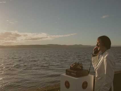
Photo by Magdalen Green
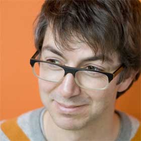
As i receive so many emails from young people who would like to graduate in media art, interaction design and other “cool stuff you write about on the blog”, i thought i should discuss more often with the teachers and researchers who run these courses in Europe, the US and in Asia. I’ve interviewed several of them before (Tom Igoe from itp in New York, Tony Dunne from RCA, Stephen Wilson from the San Francisco State University, Alejandro Tamayo from the Javiera University, etc.), today the victim of my curiosity is Graham Pullin.
Graham Pullin joined Interactive Media Design at Dundee after nine years as a senior interaction designer and studio head at IDEO where he most notably created together with Crispin Jones the Social Mobiles series. He has been involved in the design of mobile phones, hearing aids, furniture for children with disabilities and remote-controlled submarines. Previous to entering the design industry he gained an MDes from the Royal College of Art, this after a number of years as a medical engineer, having studied engineering at Oxford University.
The Home Viewing Chair (Boston, 1956) by Dave Reid and Craig Mitchell
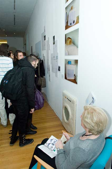
Dundee is a small city situated on the east coast of Scotland. I must confess that i had never heard of it until one or two years ago when the pieces developed by the students of Interactive Media Design (IMD) at Dundee University and shown at the Museum of Lost Interactions started to make a glorious tour of all the design and gadget blogs.
The BSc in Interactive Media Design brings together Computing modules, Design Studies modules and Interactive Media Design modules, in a range of hand-on projects that prepare students for a career in interaction design.
Your bio on the School of design website says that you are “passionate about work that blurs the boundaries between interaction design and industrial design”. Could you explain us what this involves? Any concrete example of this blurring of the boundaries?
Muji’s CD Player, designed by Naoto Fukasawa, has always been a favourite. The industrial design is the interaction design, suggesting a ventilation fan and inviting you to pull the cord, in the designer’s own words “Without Thought”… which is about so much more than ease of use – there is such a lightness of touch, such delight.
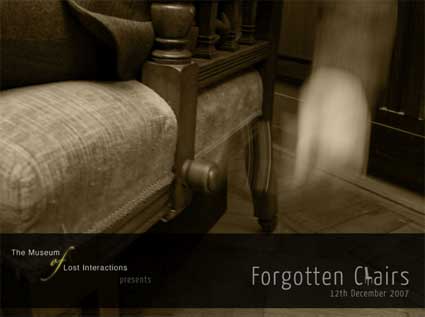
Forgotten Chairs, website designed by Jamie Shek and Ryan McLeod
Perhaps I feel more at home at these intersections – or in the gaps between – because of a twenty-five year journey from computer programming, via engineering and industrial design to (back to? I’m not sure) interaction design. I’m a little envious of my Interactive Media Design students for getting transgress these boundaries right from the start.
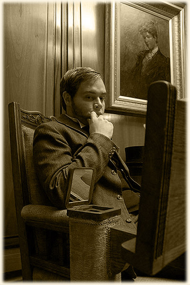
The Gentleman’s Chair (Edinburgh, 1898) by Ryan McLeod, Jamie Shek and Ian Shiels
For them, Forgotten Chairs is an introduction to designing interactions in the round rather than on screen. Recreating historical artefacts allowed them to find objects abandoned in charity shops and recycling yards, rather than build from scratch. Whether their exhibit is credible is a real test of whether they mastered the relationships between the three-dimensional and graphic design languages for their chosen period and the qualities of different media and technologies. The Gentleman’s Chair has a coherence and attention to detail that I hope Ian Shiels, Ryan McLeod and Jamie Shek will apply to everything they do next.
Why focus on “lost interactions”?
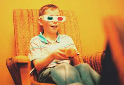
The theme of lost interactions connects young interaction designers to a heritage that is older and broader than the history of the personal computer. At the same time, it can provoke reflections on the pursuit of technical innovation for its own sake. PESTER by Euan McGhee and John Drummond is a 1970s mobile phone with built-in camera, music player and games.
PESTER (1970) by John Drummond and Euan McGhee
Designing within a historical period can also help the students to be more conscious of the possible social impact of technology, issues easier to gloss over when looking optimistically into the future. The Case Communicator by Alison Thomson and Shaun McWhinnie promises liberating mobility to the modern businessman, but condemns his 1930s secretary to even longer working hours, tethered to her telephone exchange.
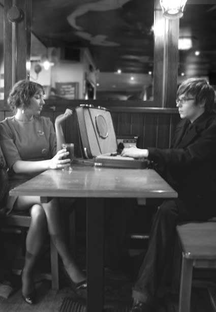
The Case Communicator (1936) by Shaun McWhinnie and Alison Thomson
… and do you feel that in general some kinds of interactions get lost over the years? Can an interaction became obsolete and how?
The radio dial is a loss: a magical interaction, a bit like safe-cracking (I’m told), to navigate a frequency band by half-second snatches of sound, occasionally stumbling across surprises. Instead, we now select a station name from a list – but isn’t this just because a little display has been added for the text streamed with Digital Audio Broadcasting and then adopted for the interface as well? If we browse images through thumbnails rather than filenames, why shouldn’t we continue to browse radio by its content?
Rather than lose this interaction, we could reinterpret it. True, there are inherent time delays in the way a digital radio tunes to a station and buffers sound, but this is a limitation of imagination more than technology – perhaps a secondary tuner might harvest recent content across all stations in the background? Making the technology work harder towards a richer, ultimately even simpler experience excites me more than adding features.
To be honest with you, i’m in a phase when i’ve seen so much interactive anything that i’ve started to be tempted to change room when someone invites me to “interact” with their screen/coat/clock/lamp, etc. I mean it is funny for a few minutes then my attention drifts away. Am i the problem in this scenario? Do you think that i need to see a doctor? What are the characteristics that makes an interactive work engaging and challenging beyond those first few minutes?
Can you make a double appointment for both of us? I am just reading The Poetic Museum by Julian Spalding which argues that the profundity and richness of original artefacts are being overlooked in the indiscriminate move to interactive exhibits. And MoLI certainly isn’t about where to draw this line…
But what it is, is a first opportunity for our students to jump in and learn that the success of an interaction depends on its realisation as much as its conception. And this is the reason it’s difficult to answer your question – you have to experience the experience for yourself to know if it’s working.
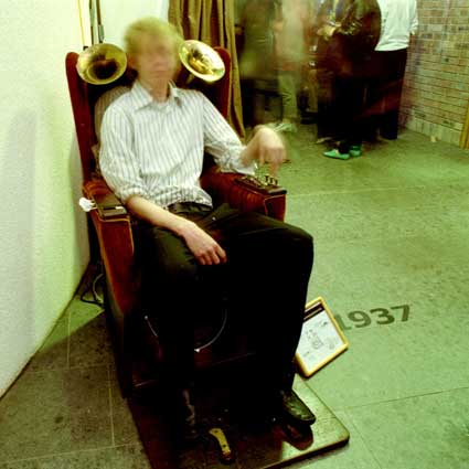
The Amazing Musical Chair (New York, 1937) by Graham Hancock and Raymo Holloway (photo: Chris Phillips)
The Amazing Musical Chair lets its occupant create a complex mix of 1930s instrumental sounds. This might have been a cacophony, but the whole exceeds the sum of the parts because Raymo Holloway and Graham Hancock crafted each loop and went to the trouble of recording musicians playing real instruments. Whereas the Barrow Rocker is just a mechanical music box that plays a note for each rock back and forth and owes its delight to Kirsty Woodend and Rebecca Rumble keeping it this simple.
The Barrow Rocker (Dundee, c.1870) by Rebecca Rumble and Kirsty Woodend (photo: Chris Phillips)
There is a high focus on documenting the students projects using videos. Is it important to the whole creative process? Or is it just the icing on the cake for the video-hungry web visitors?
On the Forgotten Chairs website, video is used to tell the story of each exhibit and place it in context (there’s some nice archive footage) but also to convey the interactivity to those who couldn’t make it up to Dundee and experience the chairs for themselves. I think that’s something I got wrong on the original MoLI site – most web visitors didn’t realise that the models actually worked.
But in general, video is an important and versatile tool for our students – to sketch ideas, even as they are building them, and also to make documentaries and advertisements to disseminate their designs. And some may pursue careers in which video is their primary medium, whether as design ethnographers, researchers or artists.
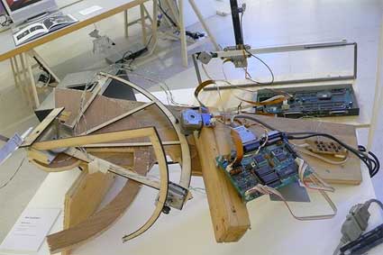
I had a look at the Degree Show projects from 2006 and was quite intrigued by Andrew Cook – Tactophonics. Could you give us some details about it, how it works, what inspired the project and what in this project embodies the IMD department way of thinking and teaching?
Andrew Cook is also a computer musician (under the name of Samoyed) and his project was inspired by how unengaging performances of computer music can be – how difficult it is to understand what sounds are pre-stored and which are being manipulated or created live. The difficulty in setting up any kind of rapport between the audience and the performer is unrewarding for both.
Tactophonics was about making interaction with computer music more physical by letting a performer choose any object – for their own reasons – and turn it into an instrument. It worked by attaching a series of contact microphones to the object, not using these sounds directly, but shaping other sounds generated in MaxMSP. At his degree show, Andrew exhibited a tree branch that had been wired up: shaking the whole bough, bending the branches, scratching the bark, even snapping off the twigs, each produced different sounds. The relationships between action and sound was at once abstract and intuitive, engaging to play, and also a compelling spectacle for other visitors.
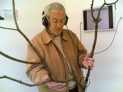
Tactophonics by Andrew Cook (photograph: Paul Gault)
I suppose this embodies our approach to thinking by making and playing. Andrew crafted a beautiful kit of parts and instructions, but this was just the starting point for each musician to create their own instrument and performances. It was about understanding this distinction, but also that design has a role within this creative whole.
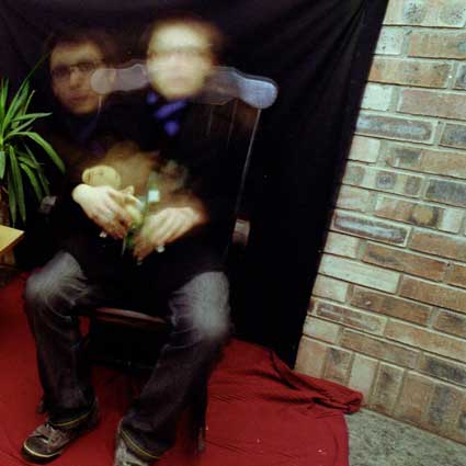
By coincidence – well, not really coincidence – Cook is now working with me as a PhD student. We are trying to make synthetized speech more expressive – in particular for some people with impaired speech who use communication aids based on Text-To-Speech technology. Current devices offer little or no control of tone of voice, which can give a false impression that the person using them is also emotionally impaired. We are going to start off by building six speaking chairs.
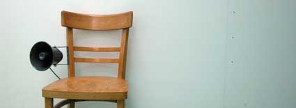
Six Speaking Chairs by Graham Pullin and Andrew Cook
This research is the real reason I left IDEO and came up to Dundee. My exploration of new interactions with speech started with Social Mobiles, a project that Crispin Jones and I led. The Speaking Mobile asked how much could be communicated with only the words “yes” and “no”, if their intonation could be controlled. Once bitten, I decided I had to devote more time to this intriguing and under-explored area.
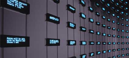
Social Mobiles by IDEO and Crispin Jones (photo: Maura Shea)
The Speaking Mobile (photo: Maura Shea)
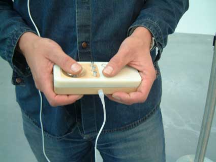
The Speaking Mobile (photo: Maura Shea)
Have you ever come across projects from interactive art which you found relevant and interesting for an interaction designer?
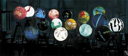
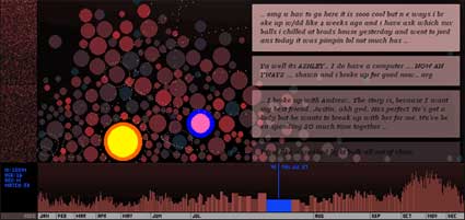
One of the most relevant and inspiring to my own work was Listening Post by Ben Rubin and Mark Hansen, an installation that sampled text from internet chat sites and played it back as hundreds of synthesised voices. Its aesthetic qualities came from these voices being deliberately monotonic and tuned to a scale. The whole effect was reminiscent of Gregorian Chant, eerie but quite beautiful. In a field dominated by the quest for so-called ‘natural’ speech, Listening Post is one of the few examples I have come across of synthetic speech being treated as a design medium.
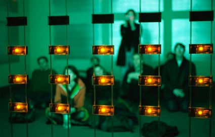
Listening Post, Brooklyn Academy of Music, Next Wave Festival, 2001
Could you name us one or more interactive media designer(s) whose work you find particularly inspiring?
Oh dear, I think I know how this is going to sound Régine, but please bear with me…
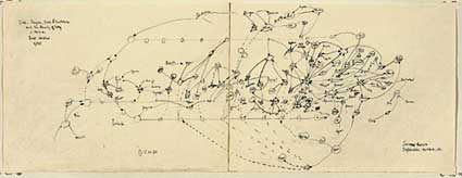
Wofgang von Kempelen, better known for the Mechanical Turk, built the first speech synthesiser in 1791 (here’s a sketch I made of it in the Deutsche Museum in München). Obviously, in those days, his Sprachmaschine was a mechanical analogue of the vocal organs and so speech sounds were derived from actions, not written language. But the design is also rather theatrical: the operator placed their hands through holes in a wooden box, so that no-one could see what they were doing, heightening the magic.
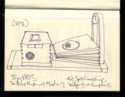
The Speaking Machine (1791) by Wolfgang von Kempelen
I realise this may sound nostalgic, especially following the Museum, but there is nothing nostalgic about the research that I am engaged with. I am quite serious about gaining inspiration from Kempelen and applying it to computerised Text-To-Speech. It’s the interaction that counts, not the technology.
The IMD website mentions that “Interactive media is one of the fastest growing sectors in the international economy”. I noticed when visiting design student shows that other departments, such as for example product design and industrial design, are getting more and more engaged in interactive projects. What is the specificity of IMD in Dundee?
I suppose I’m more interested in blurring again: interaction design and interactive media are part of so many sectors. In my 9 years at IDEO, leading projects and running a studio, that was increasingly the point: that interaction design had a role within a wide range of businesses and organisations, not just those focused on interactive media or interactive products.
Compared to product design courses, IMD is coming from the opposite direction, if you like. My current role is to introduce this shared territory to students who are already immersed in media and coding and narrative and interaction design – my colleagues Catriona Macaulay, Ali Napier, Shaleph O’Neill and Morna Simpson have backgrounds in design ethnography, sound recording, semiotics and content design.
On the other hand, we are a design course, which distinguishes us from a number of Computer Science or Human Computer Interaction courses that have rebranded themselves ‘interaction design’ or ‘interactive media design’. It is important that our studios are at the heart of an art college, sharing ideas as well as workshops with product design and textiles and illustration and fine art… as well as computing.
Why Dundee? Apart from IMD, what should make us put Dundee on a map?
It’s no coincidence that IMD is in Dundee, as it’s a collaboration between the School of Computing here and Duncan of Jordanstone College of Art and Design. The School of Computing has always focused on what it calls ‘applied computing’ rather than computer science and Duncan of Jordanstone has a great reputation in Scotland.
This year we are launching a Master’s course in design ethnography, aimed at students and professionals from human factors or design backgrounds. And there is lots of research going on across these traditional discipline boundaries.
http://www.computing.dundee.ac.uk/mde/
IMD has a sister course called IPD, which (a bit confusingly) stands for Innovative Product Design – where IMD is a blend of design and computing, IPD is a blend of design and engineering. IPD too has a strong point of view on “lighter and smarter” interactive products. Course director Polly Duplock has built a team with strong links with the RCA, Goldsmiths and industry, which now includes Jon Rogers, Andy Law and Pete Thomas. Second Year students on our two courses are currently working together on an invited brief for Microsoft’s 2008 Design Expo. We’re getting them to look at their relationships with their grandparents and consider where simple networked objects might play a role.
I will send a link for IPD next week – their new sit will be going live then
Any upcoming project, either personal or school related, that you could share with us?
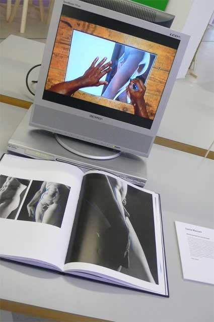
I have just written a book, ‘Designing Braille for the sighted (and other meetings between disability and design)’ which is being published by The MIT Press and should be out in the autumn.
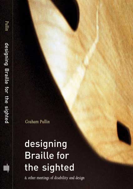
Designing Braille for the sighted to be published by The MIT Press
Twenty years ago, I spent three years as a medical engineer in a hospital designing products for disabled people. Then I went back to the Royal College and spent the next twelve years in design consultancy, designing all kinds of things for all kinds of people. The starting point is how distant these two cultures still are from each other – but how much each could inspire the other (sorry, it’s about boundaries blurring again…)
It starts with seven tensions between conflicting values and priorities. Is it more important for a wheelchair or a hearing aid or a prosthetic hand to be discreet or fashionable? Universal or simple? Sensitive or provocative? Is it more important to solve known problems or to explore new possibilities? Striking the right balance – and a different balance for different disabled people – requires the skills and sensibilities of both design cultures, not either one working alone.
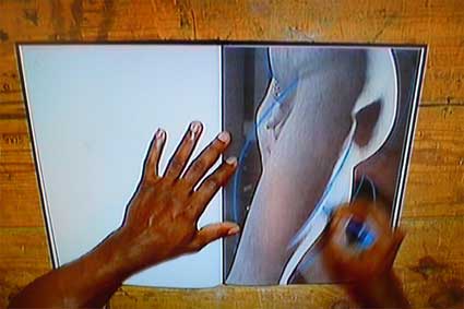
It ends with conversations with some designers I like – including Tomoko Azumi, Vexed, Crispin Jones, Michael Marriott and Graphic Thought Facility. We discuss design briefs related to disability in some way – wheelchairs and wheelchair clothing, prosthetic legs, watches for visually impaired people and Braille. Their first trains of thought are diverse and inspiring.
Sketching thoughts about step stools, by Tomoko Azumi
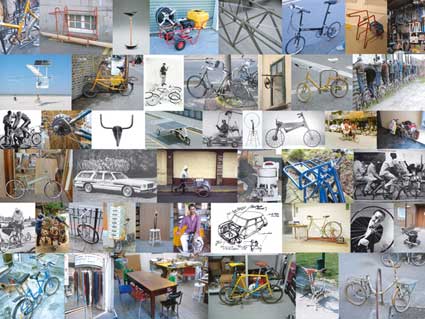
Collecting bicycles and chairs to inspire wheelchairs, by Michael Marriott

Sketching a Braille wall for visually impaired and sighted people, by Graphic Thought Facility
Despite the subject matter, this is anything but a textbook (there are several of these already!) It’s to be an affordable – and I hope beautiful – little book to carry in your pocket and read on a train journey.
…and some dates for your diary:
24 February – 12 May 2008: Social Mobiles exhibited as part of Design and the Elastic Mind, MoMA, New York
16 – 24 May 2008: IMD degree show at Duncan of Jordanstone College of Art and Design. This year’s IMD graduates were responsible for the first Museum of Lost Interactions
27 – 29 July 2008: Microsoft Design Expo 2008, that will feature the work of Dundee IMD and IPD students
Autumn 2008: The MIT Press due to publish ‘Designing Braille for the sighted’
December 2008: the opening of the next gallery of MoLI (sorry, the theme is a secret!)
Thanks Graham!


