Sagmeister’s book packaging


Things I Have Learned In My Life So Far is the latest book by the master Stefan Sagmeister, one of the grand designers of modern day design.
 
A while ago I read that the book’s packaging was laser cut to reveal different swapable patterns through Sagmeister’s face; but this video really explains how it works.
 
Awesome. The one I like the most is the T.
 
Plus the book is really cheap!. US$24 at Amazon.
 
Via: ComputerLove.

TODO, interaction design

Just today I received a comment on my blog from the very people who were behind the amazing Artificial Dummies I posted a while ago. They’re the great minds of TODO, and the heads up was from their very own Andrea.

TODO is, in their own words, an interaction and media design agency. Stablished in Italy, this group has a whole lot going for them. Kickass interactive works, a kickass website, a kickass video collection and even better, an amazing level of creativity.

At the risk of being a bit repetitive, the video I left you above is an explanation of the almighty Artificial Dummies. Beautiful music and a subtle explanation on the little creatures.

Still I urge you to check out their websites. Their work is really a pleasure to watch and imagine.

Thanks a lot Andrea on the heads up! Much success!.

Links:
TODO.
TODO at vimeo.

Keep Your Ads Appealing and Simple

Gap Ad

As far as creating advertisements are concerned, it is best to keep them simple. Not too wordy or too sophisticated. Remember that the first thing you have to consider is that people are not too fond of seeing ads with too much on it.Background colors are nice or even silhouette pictures. Use one or two expressive but general words that can capture the attention of your target market. The essence of a good ad is luring in the wandering eyes of the public. Once they are up and close, that is when they will start to read the fine print and see what you really have to offer.

Great line, Great poster

Helvetica

Pocket rainbow


By Masashi Kawamura.
 
Beautiful, simple and smart.
 
Via: DesignYouTrust.

Interview with Ben Hughes (MA Industrial Design at CSM)

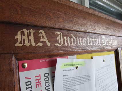
I usually associate industrial design with a high dose of virile technology, some big yawn ideas and a pretty lame design. I’ve seen enough Industrial Design graduation shows to say that only part of my lack of enthusiasm is due to my very own and very deep ignorance. However there’s one ID show i’m always happy to check out when June comes and graduation shows pop up all over London. It’s the MA Industrial Design (MAID) at Central Saint Martins College of Art and Design. The graduates projects are smart, funny, the design is yes! the design is good and they manage to created a quirky scenography to make the visit even more enchanting.

0aamaaaaadid.jpg

That’s why, dear readers, in my quest to always inform and entertain you, i’ve asked the Course Director of MAID, Ben Hughes, if he’d have time for an interview. Ben trained as an Industrial Designer in the UK, worked for consultancies in Taiwan and Australia and came back London where he’s been heading the course since 2000, writes about and practices design, and consults on industrial design, brand and marketing.

In last year’s department catalog, you wrote a collage “manifesto”: What can a collage approach offer to the design discipline?

The course has long encouraged the incorporation of collage into the design process. It is such a simple and powerful means of both generating and communicating ideas. It is also available to anyone with a pair of scissors and some glue. I first experimented with collage when I was studying for my own MA, influenced by a classmate from Spain (from where many of the Collage Maestros originate). He introduced me to the work of Joan Brossa and Max Ernst, etc. and I have been fascinated ever since. We have adapted the use of the technique for designers on the course and have run workshops with current maestros such as Graham Rawle and Sean Mackaoui. The article in the magazine is, in fact, taken from a forthcoming book; “The Secret Lives of Objects” by one of my former tutors, Jane Graves. Jane taught at Central for over 30 years and had a huge influence on the subject, particularly for the postgraduate students. This book is a collection of her essays, illustrated by my students using collage.

0aazecazz.jpg
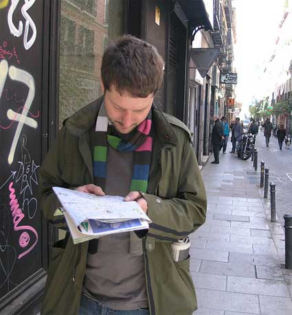
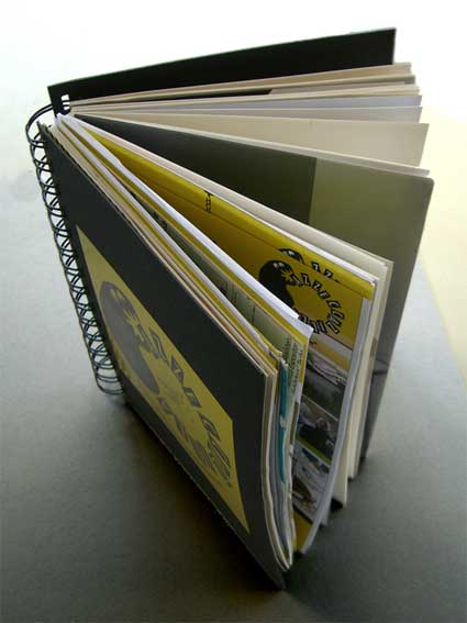
On a related theme – at last year’s Milan Furniture Fair, we mounted an exhibition workshop called Azzeccazilla, at the invitation of Stefano Mirti at NABA (Nuova Accademia di Belle Arti/ New Academy of Fine Arts). This involved each of our first year students scouring the whole of Milan for the most interesting design ideas and images, taking the brochures and leaflets concerned, and then collating them into beautiful spiral-bound A5 notebooks. Which we then sold to people for €5. Collage can be profitable, too!

0aazecababbbil.jpg

Our world is increasingly technology-mediated. How does it reflect on your course? Do you feel that students are more and more willing to engage with technologies like mobile phones or rfid system and develop projects that might sometimes look like they emerged from an interaction design department?

Certainly, we aim to adapt to the issues and technologies of the day, as well as the experiences of employers and graduates once they are in work. Industrial Designers need to be able to decode and evaluate these technologies so that they can incorporate them into products and services in a meaningful way. The term ‘Industrial Design’ relates, for me, to the mode of production, not to a dominance of particular archetypes or production methods. Enhancing a user’s experience, or making a product relevant to a particular group of people is core to the discipline. We have a number of projects every year that might sit comfortably with the category of ‘Interaction Design,’ but I am happier describing these in terms of Industrial Design i.e. how people relate to things.

0amaidclasss.jpg

We have been experimenting for several years with different means of prototyping interactive experiences in order to test them. We continue to incorporate everything from role-play to swift cardboard test-rigs to hacking existing systems, to basic programming. In terms of the latter, we have this year started working with Arduino, which look very promising. This year we also worked with colleagues in Textile Design and the Epigenome Network to explore ideas of Epigenetics using design thinking. I would draw the line at projects dealing with the entirely hypothetical, or ‘conceptual,’ as we are primarily interested in material culture; the 3 dimensional component of this stuff.

Several projects by last year’s graduates reflect on climate change, recycling and other eco-related topics. How present are the green issues in the course? Do you feel that sustainability and eco-consciousness will keep on taking a bigger place in the course? Do you see them as becoming an integral part of the course or will they appear only in separate lectures and workshops?

Projects that deal with these issues in one way or another have been part of the landscape, and rightly part of the responsibility of design education for over thirty years. Improving efficiency, reducing waste, and a focus on real, as opposed to created, needs are central to the skills and motivation of a good designer. That doesn’t mean that we disregard market-orientated projects, though. We cannot afford to be shortsighted – it could be argued that industrial design is part of the problem in which we now find ourselves. With any luck, it could also form part of the solution. Every project in the second year is expected to incorporate an ethical dimension, but it is up to the individual concerned to determine the prominence of this. For over 5 years we have had a regular first-year project dealing with ecological issues. Last year we teamed up with Natalie Jeremijenko and her students at NYU to share the findings of these. I am hoping to repeat the experience next year.

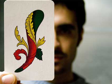
What’s with that Benjamin socket adapter on the pages of your course catalogue and personal website?

0aadaplusockettt.jpg

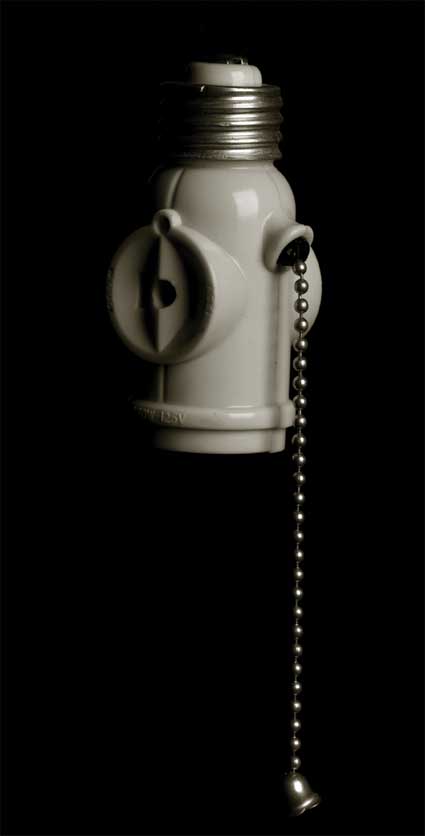
This was given to me by an ex-student. He (and it) is from Colombia, where, as I understand it, if you go into a hardware shop and ask for a ‘Benjamin’ you will be given one of these. There is no confirmed story as to why this is, but the most popular version has it named after Benjamin Franklin. I have always loved this kind of thing, which is both very clever and somewhat dangerous. I have some adapters from China, which will accept any plug from any country, although I am not sure it conforms to any British Standard. I also have a device that will recharge any mobile battery from any phone without any special adapters (the so-called ‘Omnipotence Charger,’ which has to be seen to be believed). The picture of me dressed up as a ‘Benjamin’ is part of an ongoing series that we have on the course, where students dress up as famous designers, or as in this case, designs.

0amaidhamster.jpg
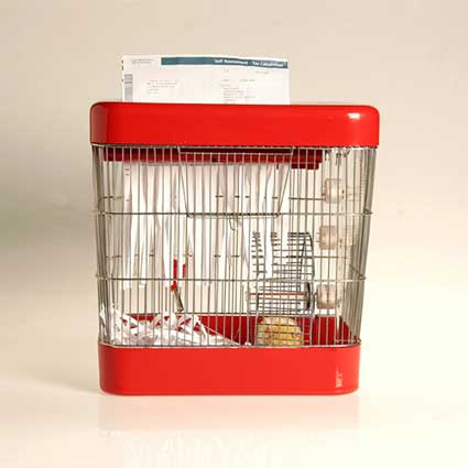
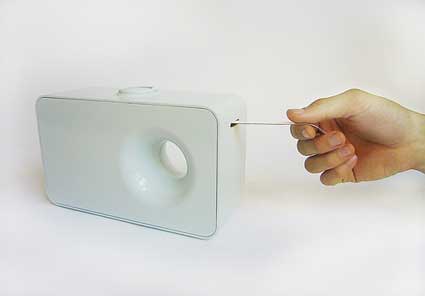
Thomas Ballhatchet, Hamster Shredder

Could you pick up some projects from recent graduates and explain to us why and how they reflect the spirit of the MAID course?

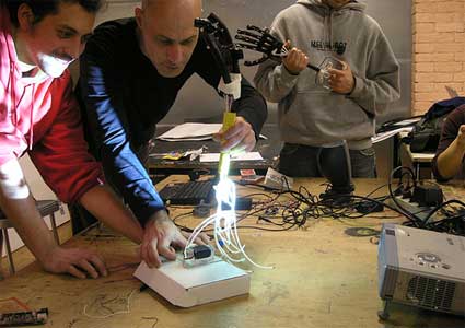
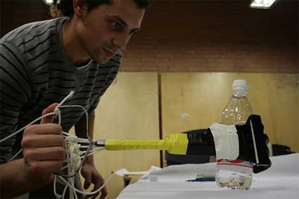
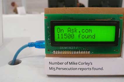
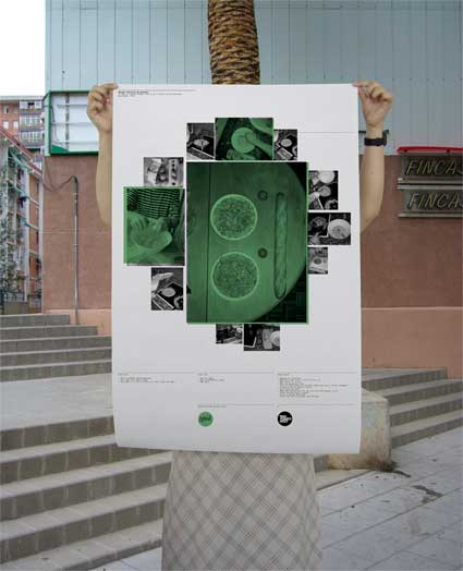
During the second year of the course, students pick their own area of study. A couple examples from this year’s show that come to mind are by Harry White and Tom Ballhatchet. Harry had a career prior to moving into Industrial Design as a scientist, working in the field of Genetics. He managed to combine this experience in a series of products that enable a user to better conceptualize certain scientific constructs. One of these is a set of measuring jugs that use unfamiliar units such as “ten billion grains of icing sugar” (not much) to “a tyrannosaurus rex brain” (even less), accompanied by a specially written recipe book, also employing these units. Harry also produced a set of “evo-cut” cutlery which demonstrate the basics of natural variation and gene mutation, and a “one-in-a-million” poster which depicts very clearly what this much-used expression really means.

0abillllion3.jpg
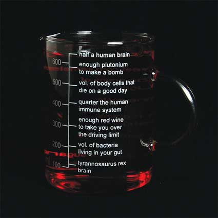
Harry White, Measuring Jug

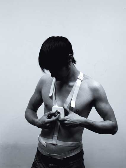
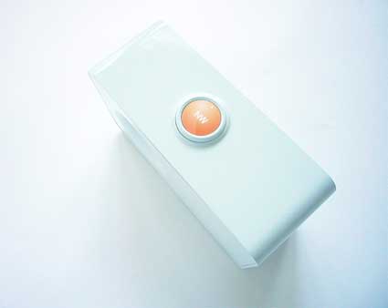
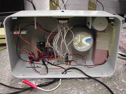
Tom Ballhatchet, on the other hand, was concerned with issues of waste and re-use. One of the things revealed through his research was the mystery, or opacity surrounding the majority of recycling initiatives. i.e. the reluctance of people to contribute to schemes where the benefits were only faintly evident. His response was to try to localize some of this activity, and therefore lend it some more meaning. Tom managed to demonstrate this through two very different products: the Hamster Shredder, in which the inhabitant participates in the manufacture of its bedding material; and the TV Packaging Stand, which combines both the packaging, and furniture for a flat panel TV.

0aaaadevonsmoor.jpg
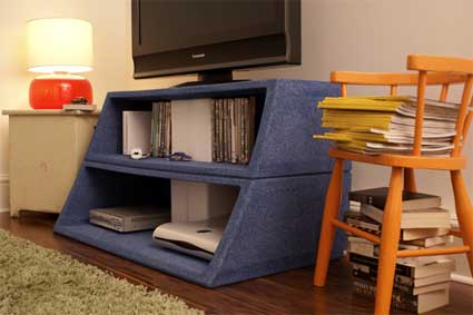
Tom Ballhatchet, TV Packaging Stand

I would say these two projects are representative the MAID course in three ways: firstly because of their sound application of a number of research techniques; secondly their confident but playful approach to innovation; and thirdly because they each achieved well-resolved final outcomes.

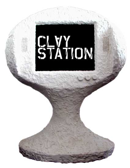
What is the idea behind Claystation? How well does this method of encouraging the audience participation work?

The Claystation project was born just over 5 years ago, when Piers and Rory at Designersblock were kind enough to let an outfit called the Design Transformation Group (of which I am a director) hold an event as part of their London exhibition. The principle motivation was the removal of ‘white cube’ reverence towards design objects, particularly in exhibitions. The method was to get a quarter of a ton of plasticine delivered to the show and then sell blocks of it to visitors, who then spent time making things and then animating them on a makeshift stage. We filmed the whole lot in stop-motion. It is somewhat painful to watch, although it gets better later on (it lasts over 10 minutes), as we worked out the basics of animation. The soundtrack is provided by a DJ working with samples created from instruments made by my students.

0aclaystation.jpg
Claystation 03 designersblock, Tea Building, London 25th-28th September, 2003

This first exhibition was a big, and unexpected success, and has been adapted to many different formats over the years. We have found the Claystation format to be useful with students in generating quick 3d responses to briefs. There is now an architectural version, a product version, a chair version, a bag version, and most recently an automotive version. This year I worked with companies such as Porter International and NICE car to put on interactive exhibitions in London, Milan and New York. In Scotland, I have worked Alex Milton on the furniture version at the National Museum, and we are planning one with a sustainability theme for the Scottish Parliament next year.

0aaclaystatttion.jpg
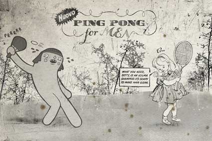
Pongovision at designersblock Milan 2005, 23rd – 26th April, 2005

Over the course of their design studies, students are often free to let their creativity run wild. How much is it still possible after they have left the school?

That depends largely on where they target their efforts. I have had ex-students express frustration with jobs. This is not because they think they are too good, but rather that their working lives are eaten up with so much tedium. At college you are encouraged to believe that design can make a difference, and to explore the ethical, and aesthetic alongside the actual business of design. This is right and proper. But it can seem a bit distant when you find yourself in a meeting, or even in a job, where the entire focus seems to be on cutting costs. Many of our students are lucky to get themselves into positions which focus on research, or design management. Many also set up their own businesses.

0amaidbois.jpg

Sustainable fashion, online service, eating behaviour, etc. The work of your students embrace so many aspects of design. Is there any aspect of life left untouched by industrial design? How broad is the discipline?

If it’s an aspect of life that involves people, things and production, then no, not really. Many people appear nervous about defining what they do as ‘industrial design’ because it seems too broad, or maybe ‘old-fashioned.’ I don’t have a problem with any of this, and consider myself lucky to work in an inclusive discipline that incorporates the widest variety of practice, particularly at postgraduate level. My background is in retail design and consumer electronics, but the course can support much more diversity than this as our team of contributing tutors and mentors are drawn from all specialisms.

Who are the designers, artists or architects who inspire you most?

I am inspired by anyone who is clearly in love with the possibilities of invention; anyone who manages to do something well by doing it differently. Although I didn’t really understand what he was doing with his last show in Milan, Marcel Wanders is clearly one of these people. As is Gaetano Pesce. I have always admired Denis Santachiara‘s work, which is full of invention, irreverence and wit.

Recently, I have really enjoyed Maarten Baas‘ stuff. He seems to be in the same mould as the others I’ve mentioned, whilst lacking the pretension of many emerging ‘stars.’

Closer to home, I think designers have a huge amount to learn from Tim Hunkin. As far as art is concerned – the things that make most sense to me are the those that reveal something about the nature of objects, mass production and consumption. So Oldenburg, Duchamp, Cornell, Joan Brossa, Chema Madoz are favourites. Also Richard Hamilton- not only did he make his name through collage, has also worked with readymades (famously including a Braun electric toothbrush), but he also worked for part of his career as an industrial designer.

Thanks Ben!

The MAID course will do a couple of shows from April 16 to 21, during Milan Furniture Fair. One in Satellite and one at NABA, Via Darwin 20 (map).

0acoursecatalog.jpg
Course catalog

Design salaries 2007 survey


The fellas over at Coroflot take a yearly survey to designers from different areas and places all over the world. It’s purpose is to answer different questions regarding salaries throughout countries, creative fields, specialities, etc.
 
The image shown above shows the yearly income around the world for a designer in year 2007. For our short-sighted friends around here, the country with the lowest yearly income is Brazil with US$25,869, and the one with the highest is India with US$65,262 a year.
 
Be sure to check the survey to see several other interesting charts as well as prior years’ surveys.

etech08: Information Visualization is a Medium, by Stamen Design

I arrived in San Diego for etech08 after a 25 hour trip. The morning after i was sitting in the main conference room wondering why on earth i was doing that to myself. I could have stayed quietly in Europe, avoided the jetlag and the artificial food enriched with extra-anti-oxidants and extra-vitamins.

… Until Eric Rodenbeck, founder and creative director of Stamen Design, took the floor and gave his waaaay too short talk on Information Visualization is a Medium. He highlighted a couple of the works they developed, threw in some interesting thoughts and saved my severely jetlagged morning.

0aericrocdenbc.jpg

Many of you are probably already familiar with the work of Stamen, especially with the visualizations they created for Digg.com (Swarm and Stack) or the brilliant cabspotting.

The focus of the talk was on process of analysis and how the concept works both for Stamen and culturally. For Stamen Information visualization is a medium, not a technique per se.

0aadadabbau.jpg
Housing built on an artificial lake: Discovery Bay

The first project that illustrated this statement is Trulia Insight, a real estate aggregator, search and information tool they developed for Trulia, a real estate company based in San Francisco which aggregates information about properties around the United States.

The mashup combines historical real estate data with a “heat map” that displays which properties are hot. People looking for a house can search for real estate by zip code, or other parameters like size, cost, and building type. Houses glow different colors as they are built and re-built over the years, enabling buyers to watch growth trends and movement in residential areas.

0aaamiamiii.jpg
Trulia, Miami, 1988

It is almost like a pollution map as it shows the impact of men on the landscape. The most fascinating aspect of the work is to compare the real estate growth from city to city. A city like Plano in Texas for example experienced a somewhat chaotic growth pattern from 1970 to 2008. Meanwhile the real estate flow in Los Angeles looked easier and more organic.

0aaaokland.jpgOakland Crime Spotting, a project initiated by Mike Migurski.

This interactive map of crimes in Oakland was developed with the idea of offering a tool for understanding crime in cities.

You can get a precise overview of what is happening in your neighbourhood (or the one where you plan to rent a house) over time, you can select the crimes you want to see and if you like that sort of thrill, crime alerts can be delivered to you in almost real time via RSS or email.

Crimespotting helps people explore public information, draw connections, see pattern emerge and find new possibilities for questioning.

The website says: We believe that civic data should be exposed to the public in a more open way. With these maps, we hope to inspire local governments to use this data visualization model for the public release of many different kinds of data: tree plantings, new schools, applications for liquor licenses, and any other information that matters to people who live in neighborhoods.

0aacrimespottt.jpg

The idea is not to offer a search programme that would give you a way in but rather to give a map display as a way out for users to explore. It is not enough to simply analyzes and it is not enough either to simply entertain.

In Stamen’s project there is always an editorial choice, their projects are not totally value free, they are more than just a pretty accumulation of data. They attempt to give people a way to access information they care about, to engage them in data and keep them interested.

Related: Sascha’s report on Stamen’s participation at OFFF in Barcelona.

Star Wars vs Saul Bass


I had to post this. Star Wars credits as if they were made by Saul Bass.
 
Superb.
 
Via: Vecindad Gráfica.

Justice – DVNO


Incredible transitions and logos in this new kickass video by the geniuses of Justice. Animations by Machinemolle and designed by So Me.
 
Via: 30gms.

Designing for Distributed Content

Avenue A | Razorfish suggests we “treat every page like a home page.”

Every page is now a home page, each of which will have a wider reach, a lasting shelf life, and the ability to attract a new audience like never before. To capitalize on this, ensure that every page has a strong, clear global navigation scheme and related content that is visibly promoted. And don’t forget to make sure that display advertising gets prominent, above-the-fold, home-page-like treatment (300×250 rectangles and 728×90 leaderboards). Remember, every page can be accessed in any conceivable manner and in any conceivable order. You can’t design properties to control user flow anymore.

Adobe Cards


Beautiful…
 
Adobe Cards

Usable Witchery

Yaniv Steiner has been running a class at the Visual and Multimedia Design graduate programme from the University of Architecture in Venice a few weeks ago. Its approach was slightly different from classical physical computing classes, starting with the name of the class: Usable Witchery. Students learned magic tricks with coins and cards, and then built up some Animatronics elements trying to humanize machine and robots to look and feel more like humans.

0acaacard6.jpg

I’m just going to give a summary of the course as i feel its spirit might be relevant to the interests of many readers. But i’ll keep it short as i’ve decided a while ago not to cover anything i haven’t had the opportunity to see nor experience myself. Rules are supposed to have exceptions, right?

Usable Witchery investigated how products could be less a result of technical thinking, and become more “humanized”, natural and intuitive. As Yaniv told me recently: “I will trade many functional elements to magical and slightly more poetical element in any of my devices. I hope the student will apply it one day as they go and work for IDEO and Nintendo J.”

0aaiaaavv3.jpg
Image by Yaniv Steiner

He explains with further details this association between magic and interaction design in a list of reasons why advanced technology can be compared to magic. According to him, interfaces are actually doing the same to some extent. His text illustrates the point by giving examples of interaction procedures, viewed from this frame of reference: calculators displaying, without revealing how, the correct series of digits, mountains of information “leaping” invisibly in the air, “hold” switches, etc.

But still… Harry Pottering design students?

“Regarding the coin tricks, think about it as a mean of presentation, a critical presentation that can go only two ways, good and enjoyable or simply fail,” explains Yaniv. “Once a successful magic been produced, the observer appreciate the illusion, sometimes even on the emotional level. While learning sleight of hand tricks and practicing the art on the physical level, one can theoretically apply this art into other fields, interaction/interface design is just one of them.”

“Regarding the animatronics part, I feel it is dealing with humanization of machines in relation to Physical-Computing,” he goes on. “We all saw the blinking LED – Blink; and how motors can move robotic limbs with the grace of “Marvin the paranoid android”. We conducted experiments with ways to humanize these artifacts, making them closer to the way we, humans, interact and communicate with the world around us. And thus giving a small humanized illusion.”

0aaaanimatronii8.jpg
Image by Synodic Month

Tons of images from Usable Witchery.

Related entries: Yaniv Steiner’s talk on rapid prototyping process and Opensourcery (where Zach Lieberman learns a few tricks from Mago Julián.)

A suspicious radio/printer for Mike Corley

A day of conspiracy theories…

DSC0uu4768.jpg

Mi-5 Persecution is the subject line of a series of Usenet posts, originated by Mike Corley, an IT specialist living in London.

His messages usually detail how British intelligence has bugged his home and is sending people to follow him around and harass him. He has also claimed in his posts and on the pages of his own website that television personalities are mocking him or talking about him in code and are part of the MI5 conspiracy. According to him, MI5 with the assistance of the US has started in August 2005 to use a mindcontrol technology which not only reads his mind but can also send voices and thoughts on his mind. This has led to claims that he has mental health issues. Corley has been banned from posting through Google for his abuse of Usenet bulletin boards and has been similarly bounced from most ISPs in England. His story has even been turned into an opera last year.

In the past, his posts were relatively easy to filter out, due to his similar subject lines and email address. However, at the start of 2008, he began a series of posts that avoided filters through sporgery and slightly varying his subject line of “MI-5 Persecution”. The regular expression Subject: {M[‘,-`. ]I[‘,-`. ]5[‘,-`. ]P} will filter this.

Corley Radio, by Design Interactions students Tommaso Lanza and Ross Cairns, is a combination of printer and a radio. It prints out specific words picked up while continuously scanning public and commercial radio stations. Any keywords can be programmed, but in this case they relate to the ongoing Mike Corley story about the MI5 (the UK’s counter-intelligence and security agency) trying to ridicule him through radio and television broadcasts.

The designers imagined that Mike Corley would use the radio to keep track of who is talking to or about him, to help him find all possible conspiracies against him, that he by himself could never possibly detect.

0amikecorely.jpg

3 questions to Ross & Tommaso:

Is it a working prototype or a concept?

Mechanically it works, however we couldn’t get access to suitable voice recognition software, so for the purpose of the exhibition we faked the print outs based on details from the MI5 Persecution Reports. These are written reports from Mike which he spams to the internet daily at a truly astonishing rate (we’ve set up a crude tracking system recording the number of his posts found on the internet – we know many companies who would love to have this sort of ranking on Google).

0nasksohuc8.jpg

Why choose Mike Corley?

Sometime ago we stumbled across these reports from Mike on Usenet and we started to get obsessively curious as to what they were about. The radio concept alone could be used by anyone. Here in London we could imagine Amy Winehouse or her family using it. A day never seems to go by without some form of unintended tabloid focus on them. However, during this project the story around Mike Corley became increasingly interesting.

I had never heard of that man before so i looked for information about him online and felt very sad for him. Have you tried to get in touch with him?

We know what you mean, it is a strange space we are operating in. This is about a person who is very real and an active part of the ‘uk.misc’ Usenet community. Many of the active community’s members have met him. We have not contacted him (yet). He is constantly receiving nasty replies to his posting from webmasters or forums users. Should we be part of this or passive? Mike is manipulating technology to make his message public and we are feeding off this, highlighting it and using it; but as designers we are very clear about our role. We are not passing judgment on Mike but leaving the project open for interpretation.

Thanks Ross & Tommaso!

DSC06162.jpg

Images 1, 2 and 4 courtesy of the designers.

Prosthesis for a lost instinct

The theme of Susanna Hertrich‘s thesis at the Design Interactions department, RCA, in London, is a reflection on humans and animals in the context of “Human Enhancement”: How much do we want to borrow from animals and what are the risks this would involve? How much of the animal is still living inside us? How much of the original animal that we once were has been has been lost in the evolution process?

0aaaalertdetal.jpgThe project that Susanna was showing at the work in progress show a few weeks ago is the Alertness Enhancing Device.

The risks we fear the most are often the ones most unlikely to be encountered. The human animal has lost its natural instinct for the real dangers. When worn directly on your skin, the Alertness Enhancing Device will act as a physical prosthesis for a lost natural instinct of the real fears and dangers that threaten us – as opposed to perceived risks that often cause a public outrage.

The idea is it stimulates goosebumps and shivers that go down your spine and make your neck hair stand up, waking up the alert animal inside. You become more alert and ready for the real dangers in life.

0aabef4aftr.jpg
Before / after

Why would we need such device? Studies on risk perception show that many people are seriously afraid of terrorist attacks and their anxiety is heavily exploited in media and politics. A look at statistics shows that the probability of becoming a victim of terrorism is quite small. Meanwhile other real hazards are perceived as rather uninteresting and raise far less fear, for example environmental pollution or car traffic.

0aelecrtromshjoi9.jpg

While we consciously know what are the things that really threatens us, we tend to dedicate much more of attention to spectacular disasters with many deaths.

That’s when the Alertness Enhancing Device comes in. If you feel dispassionate and bored when reading news stories about another environmental pollution scandal, it’s probably time to turn the dial of the device on.

0aaaalertbn.jpg

And since it’s a wearable device, you can even alert yourself in any situation, even in public contexts.

“The project is pretty much in a work-in-progress state,” explains Susanna. “What I’ve shown in the exhibition was “just” a form prototype, but I have been experimenting with micro-current stimulations. This is quite unpleasant if placed between your shoulder blades and on your neck, but not as “in your face” as a plain electrical shocks. And…it allows you can alter the current, so you can decide how much you can take for now. Which is how I intend this first prototype to work.”

How is the project going to evolve?

“For the next version I plan to work with much more sophisticated sensations on the skin than microcurrents. The project now has shifted more into “skin as interface” and I plan to play with “apparent movement” sensations and “somatosensory illusions” as beeing explored in haptic research. I’m currently in touch with scientists in London and Tokyo to get an insight into how these things work and how I can use those techniques.
I’m not sure if the second version will work the same way as the first prototype. Probably the second version will be triggered automatically by data that is collected from some other place. I see it rather as “desktop device” than a wearable, and maybe it is something next to your door that you want to check before leaving the house. But I need decide on all the details during the next weeks…”

Thanks Susanna!

All images courtesy of Susanna Hertrich.

CNTS & The KDU


Quite a while ago, when my interest for digital art started turning obsesive, I realized that most of the artists that blew me away then (and still do today), had one thing in common: They all were part of the Keystone Design Union.
 
It was then that I set myself as a long term goal to one day be a part of this select group of artists and visionaries I admire so much. And today finally, it’s true. I’m finally a member of the group I so admire.
 
My deepest thanks to the good David Harris for all his assitance and answering my ever-growing amount of questions, and of course to the great David Gensler for recruiting me.
 
It’s an honor to share up-close with such talented people.
 
So from now on around here, you can also trust The KDU.

News without the fear

Ticker Tape is an internet radio for people who suffer from Euphobia, “a persistent, abnormal and unwanted fear of hearing good news”. Designed by Will Carey, it was exhibited at the work in progress show of the RCA in London a few weeks ago.

Ticker Tape is a working prototype that simulates the interaction but as this was a project done in only two weeks some details are still to be fixed. Using RSS feeds, Ticker Tape scans for light-hearted news stories from around the world broadcasting them to the listener who can manage the content via the Ticker Tape website (still in construction).

0aabypullg.jpg
Activating the radio

Pulling the cord allows the user to choose the duration of the broadcast.

0aalebutttton9.jpg
Tuning direction

The origin of the news stories can be selected by the dial on the top of the radio.

This project explores playful interfaces for the future of digital radio, and is part of wider ongoing research.

As Will was in Tokyo when i visited the show, i wrote him to get more information on the radio:

The first time i read the description of the project, I thought the radio was meant for people who are afraid of bad news. But it is the exact opposite. You created it for people suffering from “euphobia”. Do such people really exist?

Yes they do, although very few people experience this condition. The intention was to use a phobia as a starting point for the design process, and the radio was inspired by euphobia, “a persistent, abnormal and unwanted fear of hearing good news”.

So why not make the radio that everyone would expect, the one that people who hate hearing bad news would want to buy?

I think this would leave less to the imagination. I wanted to suggest how someone who really suffers from such a fear could overcome it, either via team therapy or by getting used to hearing good news once they had had the initial support from a therapist. By pulling the tape the person can acclimatise themselves to hearing good news in small measured doses.

While the original intent is to cure a phobia, it can also be used to create more insightful solutions for interaction with technology. (This is not to say that one is trying to make light of what are indeed serious and real fears. But changing oneÂ’s mindset as a designer and moving away from marketing-driven design and thinking about solutions from a completely different perspective, can encourage new interactions and designs to emerge.)

0aaasemblingprty.jpg
Assembling the prototype

Ticker Tape has a very sleek, pure and shiny design, does this reflect its own “mission”?

The design has considered a neutral and inviting form, which means you almost have to encounter the object and discover out how it works, yet there are some cues and signs that it is a domestic product. I wanted the radio to be made from ceramic – the prototype is plastic, perhaps that is why it’s so shiny. The void running through the object is for the speaker and the overall form is inspired by an old Braun SK25 radio designed by Dr Fritz Eichler in 1955.

Thanks Will!

All images courtesy of Will Carey.

0aaatunnnij8.jpg
Tuning the radio

Good 50×70 2008: Creative Minds Helping Social Communication

Social marketing has an interesting, often overlooked, and somewhat confusing place in the advertising world. Using talent and skills to promote actual social change is no easy task, and it’s good to see agencies and events promoting positive social messaging every now and again. Good 50×70 is back in it’s second year, promoting “awareness amongst the creative community of the power they have to be a force for good.” Good 50×70, while much more at it’s core, is essentially a poster design contest:

There are 7 briefs from 7 charities on 7 issues that affect thousands of people around the world. All you have to do is pick a topic that inspires you and submit a poster on that theme. 210 posters (30 from each brief) will be selected by our jury of leading designers and exhibited around the world and published in a catalogue,but more importantly they’ll be presented to the charities for their use as a potential campaign.

This year has a broad and impressive list of charities involved and a hefty list of endorsers, including AGI, icograda and BEDA.

Cool stuff. Photos from last year’s event are on the Good50×70 flickr page. Good 50×70 is open for entries starting today, February 18, 2008, and entries are accepted through April 20th, 2008. And as it should be, entry is 100% free.
[via osocio :: photo via flickr]

Book Review – Enter Spanish Creativity

0aaenterspanishr.jpgESC – Enter Spanish Creativity, edited by CLA-SE (Amazon USA UK).

Been lazy with the book reviews this month so i’m slowing going back to business with an easy one.

Publishers Actar says: Every system needs an escape valve, a decompression mechanism. In professional graphic design, this escape device is more than the ‘escape’ (esc) on a keyboard; it is the visual seduction by new and experimental formulas. This is the defining concept of emergent Spanish design today. Spain has become an international laboratory where creators from all over the planet retro-nourish and influence one another.

Works by Basedesign, Ipsum Planet, Enric Jardí, Paco Bascuñán, among many others.

I love Spain. They make my favourite food (tortilla de patatas), the most wonderful landscapes, some of my favourite activists (list is too long) and architects (or both as in the case of Santiago Cirugeda), some of the smartest blogs in my rss readers (again, way too long but you can try this one), etc. As my Italian (and slightly annoyed) boyfriend would tell you i could go on for hours.

0aajojamiro.jpg
Design from the latest collection of José Miró (Pasarela Cibeles)

Maybe the most appealing characteristic of Spain is that while visiting it you keep on switching from the utterly ridiculold-fashioned to the very edgy. ESC has a lot of the latter and nothing of the former.

The design studios selected in ESC are ordered alphabetically. Each designer showcases up to 4 works and has a little bubble space to explain what the work is about and leave their website url for more if affinities. Easy, fuss-free, fast and delightful. Most of the designers are based in Barcelona though, does that catalano-centrism really reflect the state of graphic design in Spain?

Here’s my pick:

max-o-matic. I have spent what? 40? 60 minutes? on his website, going from one image to the other and doing it a second time just for the pleasure.

0aaleninno9.jpg

0aamaxomati2.jpg
Ping-Pong Remix

Un mundo feliz for the 5th anniversary of Guantanamo detention camp (almost as great as those Agent Provocateur Fair Trial My Arse pants):

0aguantananoo09.jpg

Spy. For their “Interventions” and re-use of street furniture.

0aainterventionstree.jpg
Street Wars

Gregori Saavedra. I still have to master the art of navigating his b&w website but whatever…

0aabonesfestess.jpg

Pop-up wedding invitations hand-made by Fundición Gráfica:

0aaapopupp0.jpg

Oh! Look! i made a little trailer for you:

A last one that made me happy. Twopoints (who designed the very swanky book Super Holland Design) made a poster explaining how to cook a real “Tortilla de patata”.

0atorritllasw.jpg

Knitted Shields

The project that Zoe Papadopoulou presented at the RCA work in progress last week show ticks all the right boxes: there’s the knitting, the sense of humour and the techno-induced diseases.

0aaayumyumtoadst.jpg
Knitted Shields is inspired by people suffering from electromagnetic hypersensitivity.

The solution imagined by the young designer is to cover all electronic devices in the house with a cozy. By weaving a thin thread of copper in the wool and grounding it, she ensures that the electromagnetic fields are blocked.

0aaaaardioknit.jpg

According to the designer, the shields work better on some objects than on others. The microwave and radio cozies for example block the waves very well. It seems to depend on the density of the knits and the thickness of the copper wire.

0aadakettlle.jpg
By bringing together ideas about knitting and domestic artifacts, this project challenges the assumption that technologies are taking over our lives, and that we can have no response. It is as much through the process of production, as the protective qualities of the “cosies” themselves, that the knitter feels empowerment and control.

Video.

0atthedashoww.jpg
At the show opening, Zoe had a lady knitting with wool and copper wire, who was also available for quick introductions to this technique.

All images courtesy of Zoe Papadopoulou.