Dove Magazine Ad Uses Carbon Paper to Show How Abusive Words Don’t Fade

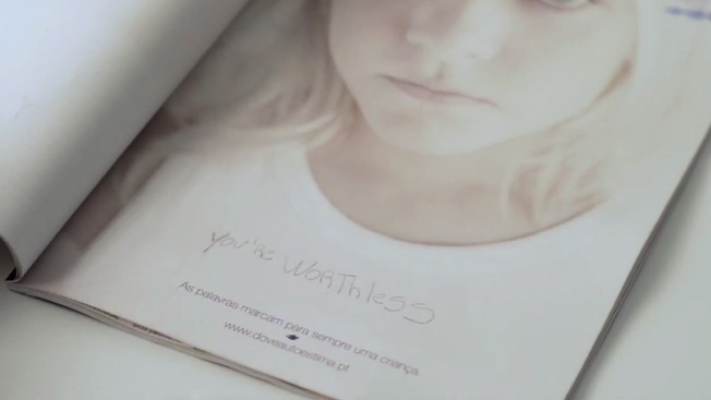
The Dove Self Esteem Project and agency Torke+CC in Lisbon, Portugal, placed an ad (and a pen) in a parenting magazine and asked adults to write down the worst thing they remembered being called as a child. When they turned the page, the disparaging remark was printed (thanks to a hidden layer of carbon paper) across the shirt of a child—to illustrate that "Words mark children forever." The initiative increased the project's local Web traffic 20 percent and helped get schools involved in the program. That's all to the good, but I can't help feeling that the campaign's central metaphor is lacking and dilutes the overall message. A shirt is easily removed and discarded. It's highly impermanent. The pain of verbal abuse is more like a tattoo or a wound, something carved or seared into flesh that leaves its victims more permanently disfigured. Of course, attempting such visceral imagery, especially when kids are involved, might have provoked an outcry against the campaign itself. As it is, the work is well-intentioned and makes its point, but doesn't truly capture the lasting horror of abuse that can indeed scar or brand children for life.


Google Celebrates Moms With Poignant Ad for Mother’s Day

Google traditionally does a special Google Doodle for Mother's Day. This year, it's adding another gift—the commercial below from creative agency Whirled, saluting moms for everything they do. As Procter & Gamble has learned in recent years, you really can't go wrong in giving mothers some love. And in fact, it's becoming a specialty for Whirled, too. After the jump, check out a second Mother's Day spot the agency did this year—for the ASUS VivoBook touchscreen notebooks.


Mahindra Powerol

Advertising Agency: Interface Communications, Mumbai, India
Creative Director: Robby Mathew
Art Director: Vipul Salve
Copywriter: Rakesh Menon
Photographer: Cocktail Art Co.

ad_powerol_dodo_33x24

ad_powerol_stego_33x24

The post Mahindra Powerol appeared first on desicreative.

Ad for My First Rifle, Used to Kill 2-Year-Old, Is Way Too Much Like Any Other Toy Commercial

The problem with this 30-second spot for Crickett's My First Rifle .22-caliber single-shot gun is that it basically markets it as a toy. We see a school-age boy wide-eyed with excitement when he gets his shiny new weapon—"My first rifle," the voiceover enthuses, "a moment you never forget!"—while his chum is glum because he has to make do with a soccer ball. Sis gets a pretty pink Crickett, and the whole happy, gun-toting clan shoot together at the range. (That kid's ear protection is bigger than his head!) The commercial plays like an anti-firearms parody forged by left-wingers … but feels cruelly ironic in the wake of the accidental fatal shooting of a 2-year-old Kentucky girl by her 5-year-old brother, who'd received a Crickett rifle as a gift the previous year. The most troubling aspect of the ad is its attempt to portray the main kid as a miniature adult, even dressing him in shooting vest and matching cap (with Crickett's logo and tagline clearly visible). Guns should be for those who are old enough to appreciate what life and death really are, and who can take responsibility for their actions, never mistaking a potentially deadly weapon for a toy. Crickett—which removed its website after the shooting—stresses learning gun safety at an early age in the spot, which is all well and good. But accidents happen, even in supervised situations. Besides, kids aren't exactly known for their impulse control, or for always following rules, and I doubt many of them, especially at the age shown here, can truly understand the awesome obligation that comes with pulling a trigger. Expecting them to do so assumes an unreasonable level of maturity and seems horribly unfair; it strips away a bit of their innocence best left intact for a few years more. Via Slate.


PETA Looking to Spook Horse Racing Fans With This Ad at the Kentucky Derby

The 139th Kentucky Derby takes place at Churchill Downs on Saturday. The spectacle is as much a soiree and fashion occasion as it is a prestigious horse race. Thousands will flock to the grounds in their Sunday best. For women, flowered floppy hats and sundresses are always a hit. As for the men, a seersucker suit with a festive tie will do. But all that beauty and enimence won't hide the fact that horse racing can be, and often is, a dark sport. To that effect, PETA is launching a new mobile billboard, which will be driven outside the racetrack, to remind visitors of the cruelties that can lie beneath the surface of the thoroughbred sport. The ad, created by a Temple University student, shows a horse with a marking on his nose that looks like a syringe. (He probably races under the name Old Needleface.) The copy reads, "Drugs. Breakdowns. Death. Horse racing is a bad bet." PETA had better get the ad out there early tomorrow, though, because we all know no one remembers anything after that second mint julep.


Two Friends Are Not Quite Who They Appear in Touching British Juice Ad

I'll admit to not seeing the twist ending coming in this evocative new spot by BBH London for fruit-drink brand Robinsons. You could quibble with the end lines, perhaps—and here's why—but that's overthinking it. It's an extremely sweet ad, expertly shot by the directing duo of Si & Ad at Academy Films. The commercial breaks Saturday in the U.K. during Britain's Got Talent and will run in 30- and 60-second executions. Credits below.

CREDITS
Client: Robinsons
Agency: BBH, London

BBH Creative Team: Matt Moreland, Chris Clarke, Sarah Hardcastle, Elliot Shiels
BBH Creative Directors: Hamish Pinnell, Justin Moore
BBH Producer: Glenn Paton
BBH Strategic Business Leads: John Harrison, Becky Russell 
BBH Strategist: Lilli English
BBH Team Director: Alex Monger

Production Company: Academy Films
Director: Si & Ad
Executive Producer: Lizie Gower
Producer: Dom Thomas
Director of Photography: Barry Ackroyd
Postproduction: The Mill
Editor, Editing House: Joe Guest @ Final Cut
Sound: Nick Angell


Bra Company Tries to Reclaim the Acronym MILF for Mother’s Day

Adrants draws our attention to this odd campaign by True&Co, an online bra outfitter. True&Co is trying to reclaim the pejorative acronym MILF. Specifically, they'd like to turn "Mom I'd like to f–k" into "Mom I'd love to fit'—as in, fit for a bra. You see, they have the same setup as Warby Parker. They send you five bras to try on at home, you send back what you don't want. Presumably, this means you get the perfect fit. And, during this promotion, you also get a free MILF temporary tattoo!

"Mommy, what does MILF mean?" "Um. That's how you spell milk." "Cool! Can I have a tattoo, too?" At this point, it's best for True&Co to just apologize, act contrite and enjoy the attention. The company did offer this explanation on its website: "The term brings to mind pervy frat boys but who says they should own an acronym? … We think there's nothing objectifying about a woman owning her sexuality. We'd be proud to be considered a MILF (Mom I'd Love to Fit)."

Now, I'll admit, there are moms out there who would like to be considered MILFs, but the weirdest part about this whole thing is the art direction. It's all adorable pictures of moms with their kids, and True&Co even wants you to send in your cute pics for its Mother's Day contest and online gallery. The truth? Even if you are sex positive and proud of your smoking-hot MILF status, you probably don't want to involve the kids.

A bunch more images below.


Business Line Celebration by Ogilvy Chennai

Advertised brand: Business Line – Cerebration
Advert title(s): The Annual Business Line Corporate Quiz
Advertising Agency: Ogilvy, Chennai, India
Associate Creative Director: Binu Varghese, Mridula Joseph
Creative Controller: Deepan Ramchandran
Art Director: KD Divya
Copywriter: Deepan Ramachandran
Illustrator: KD Divya

2012 Quiz ad final version

2012 Quiz ad final version


2012 Quiz ad final version


The post Business Line Celebration by Ogilvy Chennai appeared first on desicreative.

Little Debbie’s Logo Change Is So Subtle, It Becomes a Spot the Difference Game

Little Debbie did not consult with Gap, JCPenney or any other noted logo overhaulers before updating its own logo—the first tweak to the design since 1985. The change is remarkably subtle, so much so that the dessert-snacks brand is challenging its fans on Facebook to see how many differences they can find. "Leave a comment with the changes you can spot, and share it with your friends to see how keen their eyes are," the brand says. For hints, check out the 1,200 comments left so far.

UPDATE: Below, check out the original 1959 photo of Debbie McKee, and the first logo, from 1960, which was based on the photo.


Masked Warriors Primp and Pose in Teaser Trailer for Call of Duty: Ghosts

There are knights in armor, Aztec warriors, ninjas, samurai and special ops commandos outside. There goes the neighborhood! This trailer by 72andSunny (and director Mark Romanek from Anonymous Content) for Activision's upcoming Call of Duty: Ghosts features assorted masked warriors, most sporting ornate headgear or fearsome face paint. "There are those who wear masks to hide. And those who wear masks to show us what they stand for," the voiceover says. "There are those who wear masks to protect themselves. And there are those who wear masks to protect us all." That's about it. We don't really learn anything about the nature of Ghosts itself. I'm guessing it's one of those games where you bat a blob of light across the screen, but I could be wrong. We'll know for sure when Ghosts debuts at an Xbox event on May 21, with the actual release set for November. Some may yearn for gameplay footage, but I'm enjoying Activision's teaser approach, which initially masks the details. The riotous "Replacer" spots for Black Ops 2: Uprising, by the same agency, generate excitement while giving little way, and I'd wager the ominous tone and impressive visuals of the Ghosts promo will get the faithful stoked for battle. Well played!


Mark Sanford Is Latest Victim of an AshleyMadison Billboard Attack

AshleyMadison.com doesn't get political unless there's a sex scandal to exploit, so of course they jumped all over Mark Sanford. Wait, that came out wrong. The extramarital dating website is endorsing Sanford, the former governor now running for Congress, with a billboard in his home state of South Carolina that says "Next time use AshleyMadison.com to find your 'running mate.' " That's a reference to his "Appalachian Trail" excuse for why he went missing that time for six days. I don't see how AshleyMadison would have helped him since a) his other woman lived on another continent and he still got caught, and b) Sanford is kind of an idiot. But AshleyMadison's job is sleaze, not logic. Not to be outdone, Larry Flynt has also endorsed Sanford, hailing him as "America's great sex pioneer."


Reminder: Do Not Show a Man Having Sex With a Pig on Your Billboard

Of all the images to take from British TV series Black Mirror, the one that made a billboard for Australian TV network Studio was of a man doing the underpants Charleston with a pig. Cable provider Foxtel issued an apology in response to the immediate blowback, and it's as spineless as the offending image was tasteless and bewildering. "[The billboard] was intended to provoke," it said in a statement, "but it is clearly in appalling taste and demonstrates a lapse of judgment by Studio, and a failure in the approvals process at Foxtel." Well, no kidding. Why even move forward with an idea like that when you know you'll just have to apologize and take it right down? Part of me wants to see what would have happened if they'd stood their ground.


The Hindu by Ogilvy

Advertised brand: The Hindu
Advert title(s): Friday Review November Fest 2012
Headline and copy text (in English): Where every story has its song.
Advertising Agency: Ogilvy, Chennai
Associate Creative Director: Mridula Joseph, Binu Varghese
Art Director: Apeksha Sharma
Copywriter: Archana Abraham
Client Servicing: Karthik Hariharan, Aruna Narsi
Illustrator: Jonathon Stephen

ad nov fest

ad nov fest ad nov fest

The post The Hindu by Ogilvy appeared first on desicreative.

Domino’s New Site Lets You Watch Live Stream of Pizza Being Made Somewhere in Utah

Life just got more stressful for the workers at a Domino's Pizza restaurant in Salt Lake City. That's because that particular location is the guinea pig for the chain's new Domino's Live experiment, dreamed up by Crispin Porter + Bogusky. The agency has installed five cameras at the store to show workers making the pizzas in real time—kneading the dough, adding the toppings, popping the pies in and out of the oven. All through the month of May, anyone who orders a pizza online from any Domino's nationwide will be directed to DominosLive.com, where they will see … well, people making someone else's pizza, not yours (unless you happen to live near that location). The single-store pilot program went live today at 1 p.m. ET (11 a.m. local time), and so far we can see … hmmm, yep, there's some pizza being made. The footage is almost comically boring, but I suppose that's what you get with "transparency"—an inside look at a pretty tedious process in action. CP+B should have used hidden cameras instead. Then we might be in for more of a treat.


JCPenney’s Brutally Honest New Ad: ‘It’s No Secret’ That You Hate Us

JCPenney is looking to bounce back from an absolutely wretched 2012, when it shed customers at an astonishing rate. But first, it wants to say sorry. In this admirably honest new commercial—the first work from JCPenney's new lead creative agency, Young & Rubicam in New York—the retailer admits that it's troubles are "no secret," but that it's committed to winning you back.

The voiceover says: "It's no secret. Recently, JCPenney changed. Some changes you liked, and some you didn't. But what matters with mistakes is what we learn. We learned a very simple thing: to listen to you. To hear what you need to make your life more beautiful. Come back to JCPenney. We heard you. Now, we'd love to see you." The spot ends with the full JCPenney name, and the lines "Come back to see us" and "We're listening on Facebook."

One viewer responded on YouTube by writing: "Thank you for admitting your mistake! My friends, family, and I will be shopping? here again!" See how easy that was!


Latest Parody of Ogilvy’s Dove Campaign Is Sketchy and NSFW

Frankly, I needed a testicle-themed parody of Dove's "Real Beauty Sketches" like I needed a kick in the crotch. Portal A was only too glad to oblige, producing this NSFW effort which becomes the second notable spoof of Grupo Ogilvy Brasil's mega-hit in which an FBI-trained sketch artist drew women as they see themselves, and as others see them. The point: "You're more beautiful than you think." (The Dove spot was released only two weeks ago. Feels like it's been around forever.) The Portal A clip is a one-joke parody … though, anatomically speaking, I guess there are a pair. An "Encino P.D. forensic artist" sketches, well, balls, first based on descriptions from their owners, and next by others who have seen them. The point: "Your balls are more beautiful than you think." The acting's solid, and the testicular descriptions ("It's like a frog that died, that's been in the road for two or three days") are amusing. But I feel deflated—this particular sack seems half empty. When you do balls humor, go big! Let it all hang out! All of the sketches look like fairly accurate representations of the body parts in question. Why not have the ones done from the guys' descriptions look outlandishly awful—draw a frog that's been dead in the road for two days—contrasted with sketches of giant smiley-face emoticons, Fabergé eggs and the package on Michelangelo's David? What we have is far too restrained. Back to the drawing board, guys.


JetBlue Aims High With Online Tribute to NBA’s Jason Collins

The outpouring of support has been impressive for NBA player Jason Collins, the first openly gay male athlete in a major U.S. professional sport. Marketers, though, have been largely silent about Collins since yesterday—except for Nike, of course, whom he already endorses. (In a statement, the company said: "We admire Jason's courage and are proud that he is a Nike athlete. Nike believes in a level playing field where an athlete's sexual orientation is not a consideration.") About an hour ago, though, JetBlue posted an image created by its ad agency, Mullen, showing a rainbow image of the "i-people" from the company's "You Above All" brand campaign—to show support for Collins. "Thanks Jason, today we're all on the same team," reads the caption on the image, which was posted to Twitter and Facebook. Response has been mixed, with many fans and followers lauding the airline for supporting Collins and others wishing it had stayed "neutral." The brand's courage here is but a shadow of the player's courage, but it's brave nonetheless. Have other brands come out in support of Collins? Let us know in the comments.


Man Killed and Stuffed Down Toilet at Ad Agency, Google Photos Suggest

Google Business Photos is an interesting service through which companies can pay to add interior shots of their offices to Google Street View. The temptation to abuse the service by posting goofy or shocking photos would seem to be irresistible to creative agencies—and indeed, many of them have apparently been uploading prank images. The most curious so far have come from British agency Ideas by Music, which staged a gruesome shower-stall murder for one photo—and then showed the body stuffed unceremoniously into a toilet stall a few doors down. The same agency also staged a Shining tribute by putting a red tricycle in the middle of a hallway, and a mysterious girl standing nearby. Ideas by Music doesn't mind if you stumble across these disconcerting images—on the contrary, the agency's website is the Google Street View of its interior. Let's see if some U.S. agencies can step up and have some fun with this. Via The Atlantic.


Budweiser’s ‘Buddy Cup’ Might Be the Dumbest High-Tech Brand Innovation Yet

All you've ever wanted is to make it easier for that too-friendly guy you were too polite to while drunk at that party to stalk you the next day. No? Budweiser Brazil has the solution for you, anyway. The Buddy Cup (not a sexual position) comes with a QR code and built-in chip that connects it to your Facebook profile, so every time you toast some rando at a Bud-sponsored event, they gain instant access to your Facebook life. Because the world needs another uselessly hi-tech advertising innovation, and because the bar for being Facebook friends these days needs to be even more like blinking at a stranger passing on the street. Brought to you by Agencia Africa, which was also responsible for Bud's less idiotic Will.i.am magazine ad that doubled as a vinyl record.


The Most Awkward Ad Ever for a Local Transmission Repair Shop

George from Arlen's Transmission might not be the next Chuck Testa, but he certainly gave 100 percent to this new commercial, created by local-ad legends Rhett & Link. Compare and contrast the new spot with Arlen's previous commercial, from 2009. Actually, the music's not that different.