Target Loved the Guy Who Trolled Its Haters, Judging by This Genius Facebook Post

How did Target really feel about Mike Melgaard posing as a Target customer service rep on Facebook and caustically replying to angry messages left by haters opposed to Target’s gender-neutral product labeling?

The retailer issued a pretty dry statement after AdFreak broke the story yesterday. (“Clearly this individual was not speaking on behalf of Target,” it said.) But behind the scenes, the brand was apparently loving it—at least judging by this Facebook photo that Target posted on Thursday evening.

The photo showed a couple of toy trolls. The caption read: “Remember when Trolls were the kings of the world? Woo hoo! They’re back and only at Target stores.”

Not only was this a clear reference to Melgaard’s antics, but Melgaard himself responded in the comments—under his own profile—writing, “Target. Seriously. You are AWESOME.” (With almost 2,500 likes, that is the most-liked comment on the photo.)

Following Melgaard’s expert trolling, Target’s post is pretty devious as well. And it confirms Melgaard’s earlier hunch that, yes, Target’s PR people are smart enough to know that a guy like Melgaard is their friend, not their enemy.

Alfa Romeo Responded to This Forlorn Fan With One of the Best Personalized Tweets Ever

A lot of brands try for a personalized, poignant touch with their social media fans, but few have ever pulled it off this well.

When Daniel Hancox of England’s Burton upon Trent tried to buy an Alfa Romeo Giulietta, he arrived at the dealership to find someone else had snatched up the car he had his eye on. Clearly heartbroken, he wrote a poem about the missed connection and sent it to Alfa Romeo UK on Twitter:

The brand’s response did not disappoint. Check out the follow-up poem:

From there, things seemed to be progressing nicely:

I followed up with Hancox, who says he’s still hopeful that a long-term relationship is in the cards:

Hat tip to Aneta Hall at Wells Fargo, via LinkedIn.

Kevin Durant Goes Nuts for a Street Baller's Dunk in Ad for Nike and Foot Locker

Kevin Durant may be a basketball star, but he knows how to cheer for the little people, too.

In this new co-branded ad for Nike and Foot Locker, the Oklahoma City Thunder player gets so excited while sitting courtside at a street game that he throws his legs—and his namesake KD 8 Nikes—into the air.

It’s just one part of an epic crowd reaction when a player—wearing the same Joker-esque purple and green shoes—lands a reverse dunk. Other highlights from the stands include a super slow-mo “Oh no!” face, a sax solo and even a kid blasting off with a jetpack (which doesn’t really seem like the safest idea given the crowd below, but anyways).

In fact, the only spectator who doesn’t lose his mind is Zach LaVine of the Minnesota Timberwolves—the NBA’s 2015 slam dunk champion—who barely bothers to look up from studying a copy of a book titled The Funk on Dunk (which sadly doesn’t appear to be a real title … or at least, not one that’s currently in print).

Though to be totally honest, the move itself doesn’t come close to Blake Griffin’s latest for Jordan—or even Marvin the Martian’s.

CREDITS
Clients: Nike & Foot Locker

Agency: Wieden + Kennedy, Portland, Ore.
Creative Directors: Chris Groom, Stuart Brown
Copywriter: Sheena Brady
Art Director: Mike Warzin
Producer: Kevin Diller
Interactive Strategy: Reid Schilperoort
Strategic Planning: Brandon Thornton
Media/Comms Planning: Charles Lee, John Furnari
Account Team: Jordan Muse, Katie Gurgainus, Chase Haviland, Luke Purdy
Business Affaires: Alicia Willett
Project Management: Emily Norman
Executive Creative Directors: Joe Staples / Mark Fizloff
Head of Production: Ben Grylewicz

Production Company: MJZ
Director: Steve Ayson
Executive Producer: Emma Wilcockson
Line Producer: Mark Hall
Director of Photography: Philippe Le Sourd

Editorial Company: Exile Editorial
Editor: Kirk Baxter
Post Producer: Toby Louie
Post Executive Producer: CL Weaver

VFX Company: Saint
Flame Artist: Robert Trent
VFX Producer: Helen Park

—Digital/Interactive
Agency: Wieden + Kennedy, Portland, Ore.
Creative Director: Chris Groom, Stuart Brown
Copywriter: Sheena Brady
Art Director: Mike Warzin
Producer: Kevin Diller
Interactive Strategy: Reid Schilperoort
Strategic Planning: Brandon Thornton
Media/Comms Planning: Charles Lee, John Furnari
Account Team: Jordan Muse, Katie Gurgainus, Chase Haviland, Luke Purdy
Executive Creative Directors: Joe Staples / Mark Fitzloff
Agency Executive Producer: Ben Grylewicz
Digital Designer: Justin Morris
Exec Interactive Producer: Ben Oh
Content Producer : Keith Rice
Art Buying: Amy Berriochoa

Amazon Gets Shamelessly, Ridiculously Cute in Prime Ad Starring a Dog With a Bad Leg

My heartstrings are getting awfully sore, Amazon U.K.!

Last month, it was the “Nursery” ad with that bespectacled, mop-topped kid struggling to fit in on his first day of school. I wept for a week. Who wouldn’t?

I’d just gotten back on solid foods and … bam! … your new Amazon Prime spot, “Best Friends,” sends us all into spasms of blubbering, branded histrionics—by featuring a puppy with a bum leg!

It can’t romp and play in the park like the other mutts, chasing balls and chomping squirrels, or whatever. So, its owner (who wouldn’t look out of place in One Direction) whips out his phone, taps the Amazon app, and orders the perfect product to help Fido carry on stronger than ever before.

My keyboard is slick with tears.

Please, Amazon Prime, no more. I mean, what’s next? Babies? Cats? Baby cats? Baby cats in tiny Superman capes, hobbling around on crutches? I couldn’t take it. I’d need a box of Kleenex and the rest of the afternoon clear to Skype with my shrink.

CREDITS
Client: Amazon
Agency: Joint London
Creative director: Damon Collins
Creatives: Algy Sharman, Al Brown
Director: Kevin Thomas

The 5 Strangest Things the 2016 Presidential Candidates Are Selling Online

The 2016 election may be more than a year away, but things are already getting weird.

One of the first places the strangeness is showing is in candidates’ campaign stores, so we decided to compile a few of our favorite fundraising oddities.

(For the purposes of this list, fan-created merchandise is left off, though there are some truly laudable puns and other bits of wordplay out there like the Christie Creme t-shirt, “Feel the Bern” and “I’m Ridin’ With Biden.”

As with any time you see election coverage, just remember: this is our circus, and these are our monkeys. We’ve gone through all 22 declared candidates’ campaign stores to find you the strangest things that are offered:

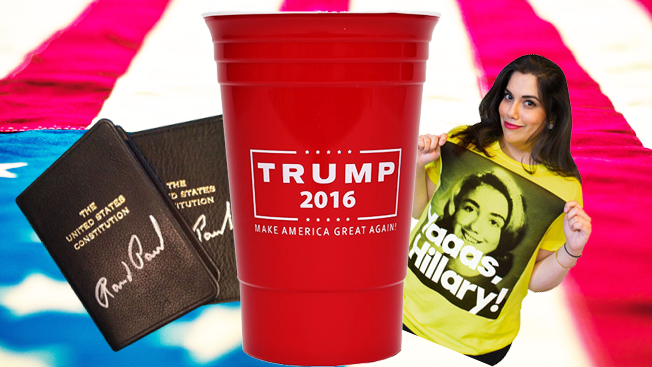
5. The Trump Party Cup ($20)

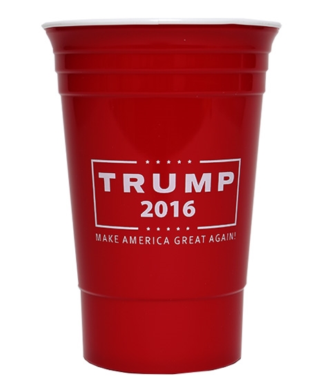
Official description: “Trump for President! Show your support while you sip your favorite beverage out of our campaign party cups.”

These 16-ounce cups aren’t quite big enough to get you through a predential debate drinking game, but at least you’ll be making your allegiances known (for better or worse). 

But for $20, I could buy a 50 pack of actual Solo cups and a fifth of Old Grand-Dad bourbon—a purchase sure to bring more lasting happiness than three cups I have to wash by hand.

Ted Cruz’s store’s drinkware category gets an honorable mention. If you’re tailgating the R.N.C., check out his stadium cups. In comparison to Trump’s, these are a steal at six for $20.

4. Scott Walker’s Biography, at a Mere 2,250% Markup ($299)

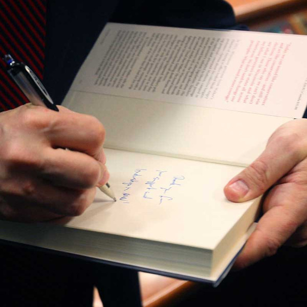
Official description: “Don’t miss your chance to get Governor Scott Walker’s book, ‘Unintimidated,’ signed with a personalized note from the Governor. This exclusive item would make a great gift or memorabilia for the Scott Walker fan. Secure your book today while supplies last.”

Unintimidated is currently selling for $12.74 on Amazon. But if you’ve been bitten and smitten by the Walker virus, you can spend a considerably steeper $299 for a signed and personalized copy. If you’re looking for some Republican memorabilia on a tighter budget, a signed version of Ted Cruz’s tome is $85 ($16.79 unsigned on Amazon), and an unsigned copy of Rand Paul’s is $30 ($18.79 on Amazon).

3. A U.S. Constitution Signed by Rand Paul ($1,000)

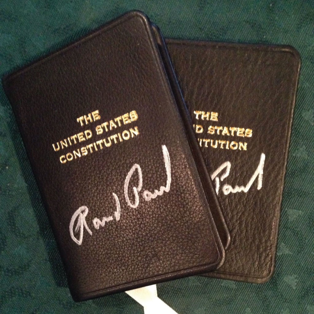
Official description: “It’s hard to find a greater defender of the U.S. Constitution in the Halls of Congress than Rand Paul. As a Constitutional conservative, he makes it the core of everything he does in Washington. If you would like a signed Constitution in a neatly bound book, contribute $1,000 and we will send you one. It’s [sic] size is perfect for comfortable carrying in the pocket of a sport coat, a purse, laptop bag or in the back pocket of some worn out jeans.”

Unless it’s dipped in gold and hand delivered to me by Rand Paul, I’m not spending $1,000 on a copy of the Constitution, a document I can print off the Internet. Even if I had the money and wanted a copy, I’d pass on principle: if you’re going to ask for that much money, at least pay someone to fix your grammatical errors. 

2. (TIE) Hillary’s Everyday Pantsuit Tee and the “Yaaas, Hillary” T-shirt ($30 each)

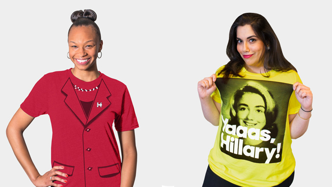
Official description (Pantsuit Tee): “Bringing a whole new meaning to casual Friday. Pantsuit bottoms not included. American Made. Union Printed.”)

Official description (Yaaas, Hillary T-shirt): “Need we say more? American Made. Union Printed. 100% Cotton.”

I’m all for not taking yourself too seriously. But the former secretary of state’s campaign website appears as though her PR team recruited a bunch of college kids, threw a kegger, and let them throw darts to determine which products made it into the shop.

Other highlights include: a coozie emblazoned with “More like Chillary Clinton, amirite?” and a “Grillary Clinton” spatula.

1. Jeb Bush’s Guaca Bowle ($75)

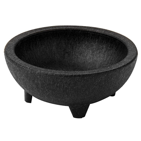
Official description: “Jeb and Columba love whipping up guacamole on Sunday Funday. Now, you can get in on the act with this ‘Guaca Bowle.’ Jeb’s secret guacamole recipe not included…yet.”

Seriously? Jeb, Williams-Sonoma carries the same thing for less than $50, and it actually comes with a recipe. It’s like someone in the campaign Googled “how to be folksy lol” and then used the search results to write the description for this guacamole bowl.

It also puts a bit too much faith in the shopper catching that it should be pronounced “Guaca Bowl-ee,” unlike its golf-clap-worthy competitor, the Marco Polo.

Factory Farming Playset Encourages Kids to Be the Worst Farmers Ever in Biting Parody

Lots of kids play with barnyard toys, but the reality of factory farms isn’t as rosy.

A new anti-factory-farming campaign takes that probably obvious truth to the extreme, with a series of online mini-games, and an actual block set, featured in a biting—if also smug—product demo parody.

Animal welfare group Compassion in World Farming (CIWF) and agency Nice and Serious created the ad, website and physical toys, which include box-shaped hens, pigs and cows that cram too perfectly together into cages inside a barn. There are even little removable bacon strips.

The whole thing is basically a more square, interactive version of Chipotle’s famous and similarly themed “Back to the Start” campaign, minus Willie Nelson’s killer Coldplay cover and Johnny Kelly’s stunning animation.

The online games are basically farming-themed skins on classics like Whac-a-Mole (in this case, Whack-a-Sick-Chicken-with-Antibiotics, which will become less effective for humans the more they’re used in food). Other gripes include that cramped quarters make animals more prone to sickness, that rainforests are being torn down to make room to grow their feed, and that factory farming methods may result in meat that’s less nutritious (though given what people are willing to stuff in their faces, less delicious might be a more convincing argument).

It also casts labels like “100 percent natural” as misleading—a case that another group has made in more compelling fashion. In fact, CIWF runs into a familiar problem for animal advocacy organizations in that it feels like it’s preaching to the choir, even if its goal is to accrue signatures on a petition. 

And sadly, the toys themselves don’t appear to be actually available for purchase—which puts them at a distinct disadvantage to popular competitors like the John Deere Farm Set.

Man Poses as Target on Facebook, Trolls Haters of Its Gender-Neutral Move With Epic Replies

Brands can’t be as honest as they might like in dealing with haters on Facebook. But sometimes other Facebook users can do it for them.

That dynamic played out in particularly rogue fashion on Target’s Facebook page this week. As the retailer received a steady stream of nasty comments from people upset about its move toward gender-neutral in-store labeling, Facebook user Mike Melgaard posed as Target with a fake Facebook account—Ask ForHelp, with a bull’s-eye profile pic—and began excoriating the haters with comically sarcastic replies.

He got away with it for about 16 hours, too, commenting on about 50 posts before the fake account was shut down. Here are a few of his greatest hits:

Melgaard tells AdFreak that he was just surfing Facebook on Sunday night when he noticed that Target was moving away from gender-based labels in both the toy and children’s bedding sections.

“Immediately, I knew there would be your typical outraged American spouting emotional reactions on their Facebook page,” he says. “After taking a look, I was literally laughing out loud at my computer. A few more minutes in and it struck me how hilarious it would be to portray myself as a parody customer service rep. So, I did just that, and the rest was history. Honestly, it was like striking comedy gold. Every one of these people gave me the ammunition I needed for a great response.”

A self-described “pot-stirrer,” Melgaard says his stunt was more about the comedy than taking a stance on the issue. “I definitely side with Target and support their decision wholeheartedly,” he says. “That being said, this was, for me, more about the laughs. I absolutely love satirical humor, and I think America could use a little more laughter.”

Target is aware of Melgaard’s behavior but has not yet responded to AdFreak’s inquiries about it. For his part, Melgaard says he probably wasn’t doing the retailer any harm.

“Of course they could get upset,” Melgaard says, “but in this day and age I’m willing to bet their marketing team is intelligent enough to predict people like myself who come along to ‘stir the pot.’ I actually suspect that what I did shone an overall positive spotlight on Target.”

See more of Melgaard’s trolling below.

Here's an 8-Bit Video Game That Every Ad Agency Intern Should Be Playing

Ad agency interns love to get real-world experience. Sometimes that means actually working for real clients. Other times it means sitting around playing 8-bit video games.

The interns at Ottawa, Ontario, agency McMillan get to do a bit of the latter—thanks to a game called Interns, which is a bit of goofy 8-bit fun that simulates the intern experience.

“We didn’t want our interns here at McMillan to feel unprepared or unappreciated, so we created an 8-bit video game that featured them as playable characters,” the agency tells us.

The object of the game: Walk around the office collecting 10 ideas for an upcoming client presentation. It’s a bit ridiculous, but also amusing enough, and more edifying than getting coffee for everyone. Props, too, for the AdFreak mention.

Bic Apologizes for Women's Day Ad That Mostly Just Made Women Furious

Bic continues to have trouble talking to women.

The pen maker, which was the object of ridicule a few years ago for its absurd “Bic for Her” pens, failed spectacularly in South Africa this week, posting a tone-deaf ad on social media for national women’s day that drew swift criticism—and soon led to an apology.

The “Look Like a Girl” and “Think Like a Man” lines were both pretty infuriating, and the Internet reacted mercilessly to the brand’s misstep. Bic made things worse by trying to defend itself in one half-apology before deleting that (further angering people who’d commented on it) and posting a second apology.

That one read: “Hi everyone. Let’s start out by saying we’re incredibly sorry for offending everybody—that was never our intention, but we completely understand where we’ve gone wrong. This post should never have gone out. The feedback you have given us will help us ensure that something like this will never happen again, and we appreciate that.”

This Designer Brilliantly Re-creates Classic Ads as Single 8-Bit Images

Graphic artist Michael Myers (not to be confused with the Wayne’s World guy or the killer from Halloween) was hired by Copypop to recreate images from classic ads as retro pixel art, and the finished products are pretty great.

The images include the Geico gecko, Cadbury’s gorilla drummer, and Coke’s “Hilltop” singers, and they’re all rendered pretty well, with impressive detail given the obvious limitations of 8-bit. Myers’ color game is strong, too; all the images really pop against the backgrounds he chose for them.

As it turns out, he’s made a lot of pixel art for various projects (and some just for fun), so he clearly isn’t just banging rocks together out there in Iowa. Well, maybe he is. I don’t know what his other hobbies are.

Via Design Taxi.

Wheaties Is Now Making Beer, for Those Who Want a Different Breakfast of Champions

Wheaties is wheat cereal. Hefeweizen is wheat beer. Now, General Mills has done the inevitable and created a Wheaties-branded Hefeweizen in partnership with Minneapolis craft brewery Fulton.

“We were intrigued from the get-go on this idea for many reasons, including that we’re both Minneapolis companies, and that the beer and the cereal both started from the same place in terms of raw ingredients and the same city,” Fulton president and co-founder Ryan Petz says in this General Mills blog post.

“We had been sampling a number of Hefeweizens, so we had been discussing with the Wheaties team what we liked,” says Petz. “Someone on the team said HefeWheaties, and it kind of sprung out from there.”

Everything from the recipe to the can design was a collaboration, which came about simply because some General Mills employees are friends with some of the folks at Fulton. (Petz even worked at General Mills for a while.)

At least for now, you’ll have to travel to Minnesota to sample the stuff. Beginning Aug. 26, it will be available in the Twin Cities market in 4-pack cans of 16oz. tallboys. it won’t be available for shipment or purchase outside Minnesota.

“We’ll see how people react to it,” says Petz. “If it’s something everybody loves, we’ll obviously consider doing it again in a bigger and more widely distributed way in the future.”

This Guy Just Made the Most Hilariously Insane Political Campaign Ad Ever

If crazy political ads are their own kind of art form, this one is something of a masterpiece.

Wyatt Scott is an independent candidate for Canadian parliament. And taking his new spot as evidence, his platform consists primarily of riding giant geese and then jumping off to slay dragons with a sword. In other words, he’s sure to have the J.R.R. Tolkien fanboy demographic locked up, along with more general appreciators of science fiction and fantasy.

But even if his policies seem on the well-intentioned and compassionate side, his ridiculous pitch also includes some imagery that could be construed as vaguely offensive. (“Alien” is not the most politically correct term for undocumented immigrants, at least south of the border, though at least Scott gives the extraterrestrial a friendly fist-bump while talking about social programs.)

Nor is it clear what an image that appears to ancient Mayan temple Chichen Itza, located in Yucatan, Mexico—some 3,800 miles away from Scott’s electoral district in British Columbia—has to do with the indigenous people of Canada. (Though it’s true you could get there pretty fast on the back of a 747-sized Canadian goose.)

Regardless, those minor factual details pale in comparison to the greatest threat Canada apparently faces—which is a 1960s, Mars Attacks-style giant killer robot. Luckily, Scott has superpowers beyond being able to grow an instant beard.

Via TVSpy.

Any Idea What These Remarkably Subtle Mercedes-Benz Ads Are Trying to Say?

Subtlety is a valuable thing in advertising, as consumers will always feel better about a brand that lets them connect the dots instead of hammering them over the head. But there is such a thing as too subtle, as well.

Mercedes-Benz rides that line in these ads from BBDO Chile. We stared at them for a few minutes trying to work out the message, and not just because the copy has been translated.

We spoke to BBDO art director Leonardo Rocha about the ads. But before we give away his explanation, let us know what you think they’re about.

Click to enlarge. Via Adeevee.

CREDITS
Client: Mercedes-Benz
Agency: BBDO, Santiago, Chile
Executive Creative Director: Jorge Espinoza
Creative Director: Rodrigo Peralta
Art Director: Leonardo Rocha
Copywriter: Felipe Araya
Photographer: Javiera Eyzaguirre

Yahoo Is Bringing Back Its San Francisco Billboard, but It Won't Be as Iconic as It Was

Yahoo is celebrating its 20th anniversary this year, and to celebrate, it’s reviving the iconic billboard that welcomed (or repulsed) San Franciscans driving on Interstate 80’s eastbound approach to the Bay Bridge. The original board was taken down only four years ago, so calling it a revival might be a stretch, but whatever. Let them have their fun.

As you may recall, the original ad looked like a campy roadside motel sign, with a yellow-and-purple color scheme that always seemed a bit too John Waters for that side of the country. It did have a lot of personality, though—check out these great snapshots on Flickr—but that’s unfortunately been stripped away from the drab new sign, which is just an oversized version of the current Yahoo logo.

Here are some photos of the construction:

The new board will be used primarily to update people on product offerings, local events and other company news worth sharing. I feel like they’re missing a lot of opportunities for fun, but that’s why they’re Yahoo and not Google.

VW Designed a Baby Stroller With Automatic Braking After Joking About It in an Ad

Volkswagen Netherlands aired a TV spot in April in which VW owners had great expectations for their other possessions—including one mother who couldn’t understand why baby strollers don’t have automatic braking.

The automaker posted the ad on Facebook, and the most-liked comment came from a fan who suggested that VW actually build just such a futuristic stroller.

And so, VW did.

Check out the video above, in which a joke from a commercial (by ad agency Achtung!) becomes a prototype in just a few short weeks. It includes a cameo from the Facebook fan himself, and also shows some humorous footage of the stroller in action.

Sorry, moms, it seems lazy dads will be the biggest market for this new vehicle.

A Dream Home Is One Where You Can Get as Freaky as You Want, Says New Trulia Campaign

When it comes to purchasing a home, you want it to be somewhere you’ll feel comfortable to be yourself. For its new digital campaign, Trulia takes that to the extreme, showcasing people at home doing the strange stuff people only do when they’re home alone.

Trulia tapped Mekanism in San Francisco for three 30-second digital spots, released today, slated to run into the fall.

“You’re a different person than you are in public,” said Michael Grant, creative lead for Mekanism. “Once we started diving into those stories, we realized they were pretty weird and fun and that everybody has one. That’s why we wanted to run and tell these stories. There is some absolute truth in all of the spots.” 

Mekanism also created a microsite for the brand, which targets home buyers in the 25- to 40-year-old range. The site features the ads as well as a set of confessional videos where consumers reveal their own strange at-home habits. 

Trulia is running a sweepstakes—also on the microsite—where consumers have the chance to win $25,000 to help them buy a new home. 

Check out the ads and credits below:


CREDITS

Agency: Mekanism 
CEO/President: Jason Harris
ECD: Brian L. Perkins
Sr. Copywriter: Michael Grant
Executive Producer: Kati Haberstock
Sr. Producer: Danielle Soper
Sr. Digital Producer: Andrew Devansky
Managing Director: Michael Zlatoper
Director Brand Management: Laura Szu-Tu

Video Production Credits
Production Company: Tool of North America
EP: Lori Stonebraker
Producer: Kelly King
Director: Shawn Z
Director of Photography: Chris Mably
Production Design: Jesson Moen

Editorial Company: Beast Editorial – SF
Post Producer: Vickie Sornsilp
Editor: Brian Lagerhausen
Assistant Editor: Nick Haynes
Colorist: Steve McEuen
Visual Effects Artist: Greg Gilmore
Music Composition: Andrew Duncan
Audio Post Facility:  M Squared Productions
Audio Engineer:  Mark Pitchford
Assistant Audio Engineer:  Phil Lantz
Sound Design:  Mark Pitchford

Everyone Is an Emoji in This Bizarre and Terrifying French McDonald's Ad

What are we all but a bunch of emoji with arms and legs and a hankering for McDonald’s?

An insane new French ad for fast-food chain shows a city full of people going about their daily lives—driving around with friends, getting a shave at the barber, break dancing in the streets. But instead of human heads, they all have giant, 3-D, cartoon faces.

The soundtrack—a bubbly electro pop cover of the Buggles’ 1978 classic “Video Killed the Radio Star”—almost makes the ad feel like a music video. But the song, a rendition apparently created specifically for the ad, when coupled with the visual concept, which feels fresh in and of itself, seems to imply a critique of technology that’s more contemporary than the one baked into the lyrical hook, and a bit out of place for a major fast-food marketer.

McDonald’s and agency BETC Paris have explicitly created a world where digital communication reduces facial expression—a wildly subtle and complex phenomenon—to a series of shiny yellow orbs representing monolithic and equally monochromatic feelings. That’s a pretty excellent premise for a video, but the brand presents it here without any of the real anxiety about change that defines the text of the original synth pop song—or the deadpan theatricality with which the Buggles promoted and performed it; or, say, the more explicitly ironic bitterness and dissatisfaction of the 1996 alt-rock cover by the Presidents of the United States of America.

Instead, McD’s presents everyone being a stiff caricature of their own ids as a good thing. And that only really makes sense if you’re a faceless corporation that deals in cardboard platitudes like Happy Meals peddled by a brightly colored clown mascot, and other overly processed hamburgers that can save the doomed love lives of awkward young adults.

It probably doesn’t help the brand’s case that the tagline, “Venez comme vous êtes,” which translates to “Come as you are,” inadvertently bastardizes the spirit of another classic song about the tension between individuality, conformity and perception. (To be fair, that tagline has been around for years—and McDonald’s France has used it to, among other things, promote gay rights.)

Within the emoji ad’s own construct, it includes clever little tidbits—some of them perhaps more deliberate than others, like the kid who turns from angel to devil, as opposed to the weatherman with the smarmy, oafish look on his face. The spot also deserves credit for doing a distinctly better job of getting its message across than some other emoji-driven attempts at marketing. (In fact, it’s way simpler and more accessible—if less delightful—than some of the brands that decided to try to invent their own emoticons.)

It’s also worth noting that BETC Paris is experienced in creating absurd viral sensations, having graced the world with Evian’s classic roller-dancing babies, and the agency appears to be swinging for the fences again here. But the idea, for all its potential, suffers as a result of its attempt to be broadly appealing to what’s seen as the perpetual sunshine ethos of millennials. In that, it turns into a nauseatingly saccharine panacea—without near enough sarcasm or skepticism about what it’s actually saying.

In fact, the insistence on framing a fundamentally disturbing set of images as lighthearted and upbeat can’t keep the dark subtext and implicit social critique at bay. So, the whole thing ends up seeming unintentionally dystopian, like the Kia hamsters tossed into a meat grinder with a deadmau5 helmet and Katy Perry fever dream, with the resulting slime squeezed out into a bunch of circular, cookie-cutter nuggets, baked golden and plopped onto a bunch of necks.

Ultimately, it mostly adds credence to Taco Bell’s case that Ronald McDonald is actually a Stalinist looking to control all aspects of your life—only he’s way more insidious than you thought, mostly interested in brainwashing us into grinning idiots by defining happiness in terms of Big Macs and faces made of pixels.

Plus, you know the spot can’t be trusted because it doesn’t show anyone who just gobbled a McDonald’s burger and turned into the emoji for “I have a stomach ache and I wish I hadn’t eaten that”—which isn’t available yet, but is slated for release in 2016.

A Fascinating, Step-by-Step Look at How This Trippy, Drippy Ice Cream Logo Was Designed

The process of logo design is pretty intriguing, particularly when a designer takes you step by step through the development of a mark. The video below is a great example, as Kath Tudball of design firm Johnson Banks explains the creation of a gourmet ice cream startup called Mr. Cooper.

The logo uses negative space to great effect, and also has a nice drippy quality that fits the brand well. But the mark you see above was the end point of a very involved process, which Tudball shows in great detail.

The video is longish, but worth it. Via Creative Bloq.

Leinenkugel's Beer Tricks Out Homes in Brooklyn and Austin, and Rents Them on Airbnb

As if the hipster havens of Brooklyn and Austin weren’t already funky—and beery—enough, Leinenkugel’s has transformed vacation properties in each location into Northwoods, Wis.-style “Leinie Lodges,” and made the units available for rent on Airbnb.

The promotion is designed to help the Chippewa Falls, Wis.-based brand (owned by SABMiller) gain extra visibility in those markets, where it has been testing its brews of late.

“We wanted to create a space where people can relax and enjoy beer,” founder Dick Leinenkugel told Austin Fusion. The two-bedroom Brooklyn property (above) can accommodate six guests, includes a roomy roof deck and rents for $449 a night. Down in East Austin (below), you’ll pay $375 for three bedrooms with space for eight.

The rentals are available through the end of August.

Airbnb has become renowned for offbeat promotions, both for itself and in tandem with other brands. Stunts range from hosting a sleepover in an Australian Ikea store to tricking out an Alpine ski lift as a mountaintop crash pad.

The “Leinie Lodges” provide more down-to-earth accommodations. Renters get thoroughly modern, upscale digs—with lots of Leinenkugel’s-branded extras. These include bean-bag toss games, bar signage, canoe paddles, Adirondack chairs and plenty of crimson throw-pillows embroidered with the brewer’s name. At each location, the fridges come packed with Leinenkugel’s brews such as Summer Shandy, Grapefruit Shandy and Canoe Paddler.

So, you’ll basically be living inside a huge ad, stocked with toys and free beer. You’ll be living the American Dream. Cheers!

Raunchy Old Women Hawk Vintage Handbags in These Cheeky, Campy Ads

If you’re lucky enough to live into your golden years, you’ve earned the right to act as ridiculous as you want.

This campaign for Ethel + Frank, a new online store for vintage handbags, charmingly plays on the theme of old lady swag—aka, the raunchy, shameless stylings of women 65 and above. Three videos present slow-motion, tongue-in-cheek portraits of ladies decked out in full kitsch, making eyes at the camera while showing off their most outrageous dance moves.

The overall production is distinctly reminiscent of camp masters Tim and Eric‘s Super Bowl commercial for Loctite via Fallon. But it’s a good fit for Ethel + Frank’s niche positioning, which itself is timely given the zeitgeist’s general fascination with nonagenarian icon Iris Apfel and her ilk.

“When it comes to fashion, old ladies are the shit,” reads the “About” copy on the Ethel + Frank website, which is dripping with bravado. “They ignore magazines and trends because more than anyone, they know style has little to do with the outfit you wear.”

The clips are all funny in their own ways, though “Nanee” might the richest thanks to the understated brilliance of its star, who wields a banana like a pistol in a modern nod to Mae West (with Groupon overtones) and enjoys a sort of Scarface-Carmen-Miranda moment.

Kelly Diaz, a copywriter who’s worked at agencies including Mother New York, launched Ethel+Frank just last week, and created the ads with director Michael Immerman. Diaz said she “wanted to launch a chick brand with some attitude and a sense of humor after working on one too many ‘vanilla’ female-targeted campaigns.”

Extra points for also not being obnoxiously posh.