Aug
11
A Fascinating, Step-by-Step Look at How This Trippy, Drippy Ice Cream Logo Was Designed
Posted in: Uncategorized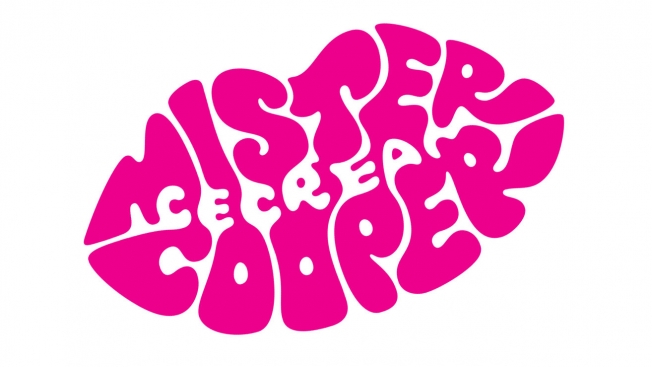
The process of logo design is pretty intriguing, particularly when a designer takes you step by step through the development of a mark. The video below is a great example, as Kath Tudball of design firm Johnson Banks explains the creation of a gourmet ice cream startup called Mr. Cooper.
The logo uses negative space to great effect, and also has a nice drippy quality that fits the brand well. But the mark you see above was the end point of a very involved process, which Tudball shows in great detail.
The video is longish, but worth it. Via Creative Bloq.
![]()