Here's What 22 Famous Logos Would Look Like If They Swapped Colors With Competitors

We already know what makes a successful logo—remember, simplicity is key. But what about its color scheme? 

A Brazilian graphic designer, Paula Rúpolo, recently experimented with 22 major brand logos, swapping the colors of a brand’s logo with that of its competitors. The results are mesmerizing and, surprisingly, viscerally unsettling. 

“There’s something unbelievably awkward and uncomfortable about seeing globally-familiar brand logos wearing someone else’s clothes,” as Rúpolo puts it.

For brands like Dunkin Donuts and Sprite, where the design is minimal and the brand relies on color to make its logo pop, the outcome is especially off-putting. For others, like Amazon, where there’s very little color to begin with, the swap totally overwhelms the design. 

If anything, the experiment shows how ingrained the colors of major brand logos are in our perception of their designs—and the importance of balancing the two elements. 

Check out the rest below. 

Via Design Taxi

'Petite Randy Moss' Is Cable's Latest Victim in DirecTV's New Height-Mocking Ad

Grey New York plays the height card in a new ad touting DirecTV’s NFL Sunday Ticket.

The commercial stars Randy Moss, a future NFL Hall of Famer mulling a comeback. In the spot, tall Randy has SundayTicket, so he can watch his favorite teams every Sunday no matter where he happens to be. Clearly, this dude rocks. Short Randy, meanwhile, has cable, which doesn’t carry the games of his hometown team, so his life, apparently, is not so great.

Reviewers at USA Today and SB Nation find it funny. A number of YouTube commenters, never short on opinions, are predictably weighing in with outrage.

“Here we go again!” says 5f4ohno. “Tall=Positive human being, Short=negative subhuman. Try doing this with any group in the USA and you get crucified. But short people are put on this planet to get shit on. Hello DirecTV ! Some of us are getting tired of this bigoted crap known as heightism.

Or, in the more pointed words of Greg: “Welp, guess I’m not good enough for DirecTV because I’m a short man. Will be calling up to terminate my subscription tomorrow. This is like making an ad where a ‘Black Rob Gronkowski’ is seen as inferior, learn how to advertise without offending your customers if you want money.”

LightAbyssion cuts really deep: “Next time DirecTV makes a commercial, use a fat or flat woman to represent inferiority. Don’t just mock what’s politically correct to insult. Go all out. Otherwise, your company is full of hypocritical cowards.”

Full disclosure: I’m 5’8″ in three-inch lifts. OK, 5’5″. And while the commercial doesn’t bother me personally, and I’d dismiss a fair share of its detractors as trolls, I’m surprised that a major corporation would even bother to go to the trouble of producing it in 2015 (In 2010, maybe. In 2005, sure).

Then again, stirring up a little controversy and the extra press attention may well be the objective. At this point, it’s a call from a well-thumbed playbook. Offend some folks, but not too much. (“Petite Randy” is just a little bit controversial, after all).

Indeed, for its part, DirecTV seems pleased. “Randy Moss was one of the tallest receivers to play the game, which of course is the joke,” the brand tells AdFreak in a statement. “Besides, these ads obviously take place in an alternative reality, something our viewers understand. The feedback we’re getting is the vast majority enjoy them.”

In earlier Season Ticket commercials, Eli Manning and Tony Romo face off against “lame versions” of themselves, but the approach was too blatantly cartoonish for anyone—save bad comedians and die-hard arts and crafts fanatics—to take offense. And the whole lesser-men-have-cable concept is born of DirecTV’s run of ads starring Rob Lowe as ugly, creepy, and awkward, which fired up plenty of viewers, too.

Moving forward, it would probably be wise for advertisers and agencies creating humorous scenarios to bear in mind that derogatory depictions of most aspects human physicality—height, weight, ideals of “beauty”—are out of bounds (Didn’t 1977 teach us anything?). Marketers that don’t play by the rules run the risk of being swiftly penalized in the arena of popular opinion, even if they win the game.

Watch This Solemn and Thoughtful Minute of Silence Marking Hurricane Katrina's 10th Anniversary

Hurricane Katrina’s devastation of the Gulf Coast is mostly remembered for the chaos it created. But a new remembrance video captures a different aspect: the eerie silence of broken lives and communities.

Created by the ethically focused British agency Nice and Serious to mark the storm’s 10th anniversary this weekend, “One Minute for Katrina” is a stark visual reminder of the rampant destruction caused by Katrina, which left more than 1,800 Americans dead and caused nearly incalculable economic loss for the region.

The video doesn’t end with any sort of call to action, and in fact it contains no text at all. Instead it’s made entirely of animated clips modeled after real, iconic photos taken in the storm’s aftermath.

“It was our way of remembering and hopefully helping others remember the event and its aftermath too,” said agency editor Serafima Serafimova. “Often our busy lives don’t leave many opportunities for us to stop and reflect—even when it’s only for a minute. We hoped that by producing this animation we could give people the space to do this.”

Flying Notebooks Chase Students Around in This Drone-Packed Ad for a Scanning App

What’s an appropriate visual metaphor for an app that lets you scan handwritten notes to your smartphone? If you’re U.K. stationery brand Oxford, it’s a drone that follows you everywhere, lugging your paper notebooks.

In this new video from gyro Paris, flying reams of study materials distract. haunt, and taunt a bunch of stylish teens. All that to promote Oxford’s SOS Notes app, which lets users scan Oxford notebooks and save them to various devices as .pdf files.

Setting aside whether that’s a task that really needs its own app, it’s hard not to wonder if Oxford should really sell it as an oppressive, inescapable nuisance. Then again, that’s probably how most students feel about their homework already. And theoretically, the product is actually making their lives easier—mostly by reducing work to share notes with friends, but also by lightening their physical load, while they, say, skateboard.

That makes the playful, unencumbered tone of the clip, fit pretty nicely—even if it does seem weird for Oxford to introduce this new element of its brand as an extension of the surveillance state. The kids would probably roll their eyes at that kind of handwringing, though, then hop on a hoverboard and high five a robot. 

And in fairness, it looks like it must have been a lot fun to shoot, given the fleet of drones. Interrupting a make-out session is just rude, though.

CREDITS

Brand: Oxford?
Agency: gyro Paris
?Executive Creative Director: Sebastien Zanini, Pierre-Marie Faussurier?
Art Director: Aurelie Casimiri?
Copywriter: Margaux Castanier
?Business Director: Rebecca Cremonini?
Account Executive: Marion Lasselin?
Head of Strategy: Evelyne Bourdonne, Zoe Sabourdy
?Media Strategist: Pascal Deneuter?
TV Production: Yelena Nikolic?
Director: Romain Quirot?
Production Company: Fat Cat

A Father Gets to Say the Goodbye He Couldn't in This Chilling Campaign About Heart Disease

This quietly terrifying multi-channel campaign from the British Heart Foundation strives to keep its audience off balance in more ways than one.

Surprise is the key theme of the campaign, breaking today via DLKWLowe in London. Each facet mimics the swiftness and unexpectedness of the malady itself.

“Compared to other terminal illnesses, like cancer, heart disease can be especially cruel,” Dave Henderson, chief creative officer at DLKWLowe, tells AdFreak. “Its suddenness means families often never get the chance to even say goodbye, which has a huge emotional impact on those left behind.”

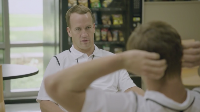
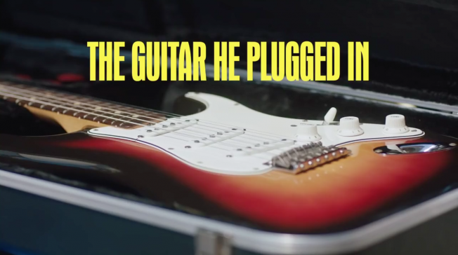
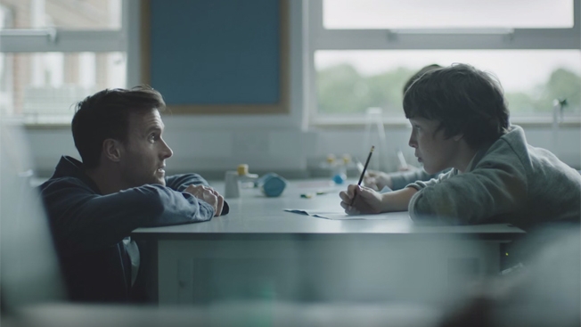
A minute-long TV commercial, “Classroom,” directed by Tom Tagholm of Park Pictures, shows a whispered conversation between father and son, hinting from the very beginning that something isn’t right.

The twist itself isn’t that hard to guess. But the dawning realization of what’s coming increases the story’s power—it becomes more and more unsettling as it progresses. In the end, it’s clear that as that as sad as this conversation is, it’s sadder still that when dealing with heart disease in real life, people don’t get to have those talks. The tagline drives home that point: “Heart disease is heartless. It strikes without warning.”

Ultimately, the organization is seeking help from viewers. “By making people contemplate the unexpected devastation that heart disease causes, we hope to inspire people to donate funds to continue BHF’s lifesaving research,” says Carolan Davidge, the client’s director of marketing and engagement.

“I don’t think we can tip toe around a disease that’s so cruel anymore,” adds Henderson. “We have to hit people with the reality of what we’re dealing with here. And the impact and reality of heart disease is personal to every person so each piece of creative in this campaign seeks to speak to different audiences.”

Several online spots created by Make, the DLKWLowe’s in-house production company, have a different tone and feel than “Classroom,” though they ultimately pack a similar punch.

In one, a Skype chat between a youngish mom and dad on their fifth wedding anniversary ends particularly badly.

In another, a backyard game of catch turns into a tragic afternoon for a cute pooch and its owner.

For some, that approach may seem unintentionally humorous (in a dark sort of way), even verging on parody. Still, the sense of disorientation and confusion—the WTF! moment, if you will—is exactly what the spots are all about. This is how quickly lives can irreparably, irreversibly change for the worse.

Meanwhile, in a mini-doc, real heart-disease patients keep the beat to remind us that one in four who are stricken don’t survive.

In an effort to make the message even more personal, there’s even a “Heart Attack Simulator.” A mobile app that asks users to hold their phones against their hearts, it delivers a jolt that isn’t so much physical as emotional—the phone rings, and a chilling recorded message, the kind no one wants to receive, begins to play.

Overall, each element of the wide-ranging campaign has a distinctive flavor, but they all manage to stay on point, memorably delivering the message. And while fear-based advertising can be tough to stomach, that’s a small price to pay for the possibility of preventing more lives from suddenly sliding into ruin and despair.

Booking.com Is Now Turning Your Best Summer Snapshots Into Clever, Silly GIFs

Summer may be coming to an end, but here’s a fun way to keep reliving the good times—high-quality GIFs of your photos from the season, courtesy of Booking.com.

The Priceline-owned online travel agency is inviting consumers to submit pics of their summer adventures, then turning its favorites into animated GIFs. For eight days between today and September 3, Booking.com will release a new batch of winners. And if the launch samples are any indication, the results will be pretty great.

Highlights so far include ice-cream thievery, cocktail snorkeling, and a zany rainbow. Check out them out below—the original photos are on the left, and their GIF versions on the right. 

Overall, the contest is an extension of the company’s “Wing Everything” push, celebrating spontaneous vacation. Would-be participants can compete by hash-tagging a pic #WingItYeah on Twitter or Instagram, or submitting via the Booking.com Facebook page. Wieden+Kennedy Amsterdam has hired four digital artists to create the GIFS: James Kerr, Cari vander Yacht, Chris Timmons, and Justin Gammon

As for Booking.com’s criteria for selecting which photos to GIF, the marketer says its looking for “jealousy-inducing” shots of things like “infinity pools” and “epic views.” In other words, it wants to reward you for doing what you were doing on social media anyways: bragging. 

See more GIFs, and the campaign credits, below.

CREDITS 

“BOOKING.COM–WHO WON BOOKING SUMMER?”

Chief Marketing Officer: Pepijn Rijvers
Head of Brand: Manuel Douchez
Brand Communications Director: Andrew Smith
Brand Specialist: Robert Schreuders
Social Media Product Owner: Julian Poole
Media Planning Director: Anoeska van Leeuwen
Media Manager: Kelly Lee
Media Specialist: Marie Lootvoet

WIEDEN+KENNEDY AMSTERDAM

Executive Creative Directors: Mark Bernath, Eric Quennoy
Creative Directors: Genevieve Hoey, Sean Condon
Art Directors: Jeffrey Lam, Kia Heinnen
Copywriter: Jake Barnes
Director of Interactive Production: Kelsie Van Deman

Interactive Producer: Matthew Ravenhall
Strategic Planner: Emma Wiseman
Communications Planner: Josh Chang
Group Account Director: Jordi Pont, Marcos Da Gama
Account Director: Aitziber Izurrategui
Account Manager: Caroline-Melody Meyer
Head of Design: Joe Burrin
Designer: Thomas Payne
Project Manager: Stacey Prudden
Business Affairs: Kacey Kelley

GIF ARTISTS

Cari van der Yacht
Chris Timmons
Justin Gammon
James Kerr

SOCIAL LISTEN AND RESPOND TEAM

AKQA London

Madden Season Is Freakishly Bigger Than Ever With This 5-Minute Fake Movie Trailer

Last year’s Madden Season promo, featuring Kevin Hart and Dave Franco, was a hit with fans and award show judges alike, which left the bar pretty high for this year’s follow-up.

Now the wait is over, as EA Sports has released the bizarrely over-the-top 5-minute clip starring Franco (again) alongside NFL stars like Rob Gronkowski, Antonio Brown and Julio Jones.

Produced by San Francisco agency Heat, the epic video for Madden 16 is a sprawling homage to 1980s action movies, replete with haircuts and wardrobe choices that are regrettable to the point of being admirable.

Don’t like football? Don’t worry, there’s not much of it in this ad. You can just sit back and enjoy the pure insanity.

CREDITS

Agency: Heat
Client: EA Sports
Chairman/Executive Creative Director: Steve Stone
Creative Directors: Anna Rowland and Warren Cockrel
Senior Art Director: Nichole Geddes
Producer: Jonathan Matthews
Director of Content Production: Brian Coate
Director of Client Service: Aaron Lang
Account Director: JT Pierce
Account Supervisor: Julia Wu
Assistant Account Manager: Rachel Majors
Business Affairs: Julie Petruzzo

Advertiser: Electronic Arts
CMO: Chris Bruzzo
SVP Marketing: Todd Sitrin
VP Global Creative: Dana Marineau
Senior Director, Global Creative: Dustin Shekell
Senior Manager, Global Creative: Jessica English
VP Marketing: Anthony Stevenson
Senior Director Product Marketing: Joshua Rabenovets

Production Company: Hungry Man
Executive Producer: Mino Jarjoura
Director/Writer: Wayne McClammy
Director of Photography: Bryan Newman
Line Producer: Dave Bernstein
Production Designer: Laura Fox
Stunt Coordinator: Vlad Tevolski
First AD: Brian Stevens

Editorial Company: Rock Paper Scissors
Executive Producer: Angela Dorian
Producer: Helena Lee
Editor: Christjan Jordan
Assistant Editor: Pieter Vijoen

Postproduction: MPC
Creative Director: Paul O’Shea
Visual Effects Supervisors: Benji Davidson and Zach Tucker
Compositors: Gizmo Rivera, Brian Williams, Ben Persons
Animation Lead: Stew Burris
Lighting Lead: Corinne DeOrsay
Colorist: Ricky Gausis
Executive Producer: Elexis Stearn
Producer: Brian Friel

Music: Beacon Street Studios
Composers: Andrew Feltenstein & John Nau
EP/Head of Production: Leslie DiLullo
Sound Design and Mix: 740 Sound
Executive Producer: Scott Ganary
Producer: Jeff Martin
Engineer: Chris Pinkston
ADR: Stephen Dickson, Larry Winer
Sound Design: Chris Pinkston, Eric Marks and Rob Marshall

Organic Valley Is Back to 'Save the Bros' Again, and This Time You Can Help Brononymously

Earlier this year, Organic Valley launched a brilliantly idiotic campaign to save bros from synthetic protein. Now, the dairy marketer wants you to know the work isn’t done.

A new video from Alex Bogusky-backed agency Humanaut introduces an anonymous bro-themed hotline, where would-be good samaritans can try to help without risking juvenile retaliation (recounted in the ad as 60 Minutes style confessionals).

The hotline promotes an online component that asks users to name the Twitter handle of a bro in need of saving, and select up to seven of his bro qualities, like whether he has a tribal tattoo. Each quality comes with its own special video appeal.

Overall, the new work’s best part might be the spokeswoman’s crazy eyes—clocking in at a higher degree of intensity than in February’s more deadpan launch spot. The basic concept here is, at its heart, the exact same joke as the original, just stretched further, at moments to the point of feeling thin.

But it does benefit from new gems, like suggesting that if bros weren’t propping up the market for gold chains, the value of precious metals (and ultimately the world economy) might collapse. Other excellent little touches include an edit halfway through the clip on tanning, when the spokeswoman suddenly turns orange, or the video on puerile innuendo, when she addresses the viewer as “a real Edgar Allen Bro.”

And anyway, the whole thing wouldn’t really capture the essence of bro if it didn’t harp on the same gag over and over again.

CREDITS
Client: Organic Valley
Product: Organic Fuel
Campaign: The Brononymous Hotline

Agency: Humanaut
Creative Advisor: Alex Bogusky
Creative Director: David Littlejohn
Strategy: Andrew Clark
Account Director: Elizabeth Cates
Copywriter: Andrew Ure / David Littlejohn
Art Director: Matt Denyer / Daniel Edelman
Senior Designer: Stephanie Gelabert
Creative Intern: Sam Hazelfeldt

Production Company: Fancy Rhino, Chattanooga, Tenn.
Director: Daniel Jacobs
Producer: Katie Nelson / Ivannah Flores
Director Of Photography: Phil Dillon
Photographer: Jaime Smialek / John Goodridge / Cooper Winterson
Editor: Colin Loughlin / Tyler Beasley
Colorist: Andrew Aldridge
Production Designer: Chad Harris
Music Company: Skypunch Studios, Chattanooga, Tenn.
Composer: Carl Cadwell
Media Partner: Redwood, Inc.

This Art Director Just Designed a Shower Cap You Might Not Be Horrified to Wear

Grandma used to wear a flimsy plastic shower cap, and when she stepped under the shower it sounded like angry rain on a tin roof. And her hair always got wet anyway.

That’s a throwback image, to be sure, but it points to a modern problem for women who are trying to keep their freshly blown-out ‘dos intact. The lowly shower cap has been stuck in time, says Jacquelyn De Jesu, an art director who launched a startup called Shhhowercap. To fill a void she saw in the market, she developed a sleek turban-like shower cap that’s waterproof, noise reducing and machine washable.

De Jesu says she wanted a product that actually worked—hers is made from nanotech fabric and has rubber grips for a secure fit—and wasn’t hideous or bedazzled. “I needed a shower cap, but I wouldn’t buy one,” says De Jesu, a veteran of Saatchi & Saatchi and BBDO Chicago. “It’s like needing a car, hating all the cars you see, and just deciding to walk.”
 

She figured there were plenty of other gals in the same boat, especially with the explosion in popularity of Dry Bar and other salon services. When she found little branding in the category, she decided to self-fund Shhhowercap. (She didn’t fully give up her day job—she’s still working as a freelance art director for Huge, 360i and other agencies.)

Marketing kicks off with a website and colorful photos starring Instagram influencer Taylor LaShae, and will continue with digital content and social media that intends to wipe out the stigma of Great Aunt Helen’s coif protector. “No one wants to be caught in one, no one wants to admit they use one,” De Jesu says. “Maybe that will change.”

72andSunny's 72U Just Turned a Vacant Lot in Venice Into a Great Community Meeting Spot

What’s inspiring about a dusty patch of ground in Venice, Calif., populated with a few scraggly weeds and hemmed in by a chain link fence? Plenty, according to the team at 72andSunny’s in-house creative residency, 72U.

The six-member group looked at the forlorn piece of property and saw an opportunity for a community gathering spot and open-air workspace. Using crowdsourced info, they spent eight weeks creating a 1,500-square-foot pop-up park with free wi-fi, portable desks, fences that convert to tables and art installations. The space on Abbot Kinney Boulevard, meant to “inspire and connect the community,” its designers say, will be open for nine months.

It’s the latest project from 72U, which gathers creative thinkers from outside the traditional ad world, tosses them together for three months and challenges them to create art-meets-technology-meets-culture concepts. Other fruits of the program’s labor include a Craigslist-style interactive music video and two four-story murals about privacy in the digital age.

Taiwan Has Fallen in Love With This Doll-Faced 'Goddess' Who Works at McDonald's

Could this part-time McDonald’s worker in Taiwan become the next Alex from Target?

The stunning, porcelain-doll-faced gal, who has earned the unofficial title of “McDonald’s Goddess” to go along with her adorable nickname, WeiWei, appears in a series of workplace photos that reportedly have folks rushing to the fast-food joint for a gander at her.

The Taipei City restaurant should be used to this kind of attention by now, since Wei Han Xu and her fellow burger slingers have been dressing as maids, cheerleaders and other cosplay favorites for the last few years. WeiWei, a student and aspiring model who could easily double as an anime character, has seen a jump in her Facebook and Instagram followings—now about 150,000 fans combined—since the snapshots made their way to social media. She’s also snagged a few appearances on local variety and talk shows.

But she has yet to reach the lofty heights of Texas teenager Alex, with his 1.9 million Instagram and 750,000 Twitter followers. That poor kid, though, had to hide in the stockroom after his photo, shot surreptitiously and posted on Tumblr, went viral. (His managers at Target said there were too many lovesick girls creating chaos in the place.)

Despite her notoriety, or maybe because of it, WeiWei is still, by all accounts, working the front counter.

Peyton and Eli Manning Punk College Kids With a Very Demanding Gatorade Vending Machine

Peyton Manning is back to shame more lazy people into earning their Gatorade with sweat, and this time he’s brought his brother with him.

In a new reality-style ad series from TBWAChiatDay, Peyton, quarterback of the Denver Broncos, and Eli, quarterback of the New York Giants, play coach to college students who are foolishly trying to use money to get drinks out of a Gatorade vending machine. Rob Belushi, who starred as the convenience store clerk in a similar series last year, returns here as a deadpan janitor.

Despite the possibility that everything is staged, the reactions of the kids, when it dawns on them that the two adults hovering over him are actually football stars, are pretty priceless. And it’s refreshing to see an automated dispenser that refuses to comply, no matter what you do. (The kids are advised that they have to “Sweat it to get it,” but that doesn’t seem to work, either.)

Some other spots show Houston Texans defensive end J.J. Watt putting other students through the wringer in various ways.

The concept first launched last August. The “Sweat it to get it” tagline is still charmingly snide, but seems to cut out a significant portion of the population who drink Gatorade only to recover from hangovers—unless that counts as hard work, which it should.

Regardless, the Mannings can’t easily beat their ridiculous rap bit for DirecTV—at least not by sitting back and letting everyone else do the heavy lifting.

Bob Dylan Went Electric. And You Should Too, With a Plug-In Hybrid, Says Audi

A new hybrid-electric Audi is just like that time Bob Dylan shocked audiences by playing an electric guitar at the Newport Folk Festival, says Audi.

This new video from the automaker, a sponsor of the 2015 festival, interviews a mix of historical figures, like documentarian Murray Lerner, and modern musicians, like Courtney Barnett, Jim James of My Morning Jacket, and Colin Meloy of The Decemberists—artists who were part of the lineup at Newport this summer, which celebrated the 50th anniversary of famous Dylan’s 1965 show.

So, what exactly are the differences between a Fender Stratocaster and an Audi A3 Sportback e-tron, you might ask? It doesn’t matter, because when you’re driving around in your sweet $40,000 car, you’ll feel like a pioneer and a rebel cranking out creamy licks on your finely tuned instrument.

It also may be worth noting that while it’s widely believed audiences booed Dylan’s decision to go electric, that account is also disputed—other theories include that crowds were upset by bad sound quality, or the shortness of his set. But that’s nowhere near as good a story.

To be fair, the clip does include some charming rumination on music and its evolution. But the implicit message—”Don’t hate progress. Buy an Audi”—isn’t the most compelling song. Especially when other car marketers are making the case that fuel-efficient alternates can literally run on cow crap.

CREDITS
Client: Audi
Spot: “Plugging In”
Executive Producer: Joseph Assad
Director: Phil Pinto
Narration: ?Holly Laessig
Agency: PMK•BNC/Vowel
Production Company: One Thousand Percent
Producer: Tyler Byrne, Kristopher Rey-Talley & Rebecca Assing
Director of Photography: Sam Wootton
2nd Unit Director: Antonio Santos
Associate Producer: Victoria Lada
Editorial: One Thousand Percent
Editor: David Yoonha Park & Ryan Dickie
Post Producer: Kristopher Rey-Talley
VFX Company: Motion Atelier
Nuke Artist: Paulo Dias
Titles/Graphics: Wax Magazine
Animation: Konrad & Paul
Sound Designer: Colin Alexander
Mixer: Greg Tobler

This London Bar Serves Drinks in the Form of a Liquor Cloud You Breathe In

If “Who Shot Mr. Burns?” taught me anything, it’s that getting loaded from strange fumes is probably unhealthy, but possibly lucrative. British architecture firm Bombas & Parr evidently learned the same thing, because its latest zany bar gimmick is a place called Alcoholic Architecture, where the signature cocktail is an atomized cloud of liquor that you drink by breathing.

What would you charge for that, I wonder?

Anyway, the booze cloud is made up of a 1-to-3 ratio of spirits to mixers, and special protective suits are required to protect your mucus membranes from overexposure to it. This all sounds (and is) incredibly unsafe, but openly taunting death is a hallmark of debauched London hedonism.

“One of the frustrations of doing things like flooding buildings with booze that people have to boat across before drinking it is that they are so short lived,” Mr. Bombas told Fast Company. “We always wanted to open a bar, and Alcoholic Architecture is the bar from our wildest fantasies, made into reality.”

The bar’s other drinks and spirits are more traditional, taking their theme from an old monastery neighboring the bar, although they do serve Buckfast, which is the Scottish version of 4 Loko. I wonder if Bombas and Parr have been to the Heart Attack Grill. Something tells me they’d like it.

Kyle Chandler Is Back as Coach Taylor in This Great PSA, but Is Anyone Listening?

Kyle Chandler’s got one more inspirational speech in him, and we’d all better listen up.

The Austin-based actor reprises his best role—as Coach Taylor from Friday Night Lights—in this great spot for the Alamo Drafthouse movie theater. We don’t want to spoil the ending, so just watch it first:

It’s a delightfully meta bit of work—his annoyance is our annoyance—and hopefully it’s effective.

Seriously. Please. It’s 2015 and going to the movies is expensive, especially if you’re going out in cities like New York or Los Angeles or even Austin, where the Alamo Drafthouse was founded. So, when you’ve shelled out $10, $12 or even $15 dollars to see the latest flick and someone in the audience is texting away, distracting you from the experience you’ve paid for, it’s obnoxious in the extreme.

3M Builds a Rube Goldberg Machine From Its Esoteric Products, but Is It the Best Metaphor?

3M, which makes lots of different kinds of random, practical objects like sandpaper and stethoscopes, has now combined a bunch of them into one highly impractical but somewhat entertaining object—a Rube Goldberg machine.

The video below makes the manufacturer the latest in a long line of brands (e.g., Honda, Red Bull, Panera) to create one of the iconic contraptions as part of its marketing. 3M’s angle? Building the machine using its own products, from welding helmets and plastic sheeting to, naturally, 25,000 Post-it notes and many rolls of tape.

Tempting as it is to groan at the reprise, cascading devices do have an intrinsically sticky appeal, at least in terms of viewer impulse control—it’s hard to peel yourself away when you’re wondering what will happen next.

In this case, the big finish comes in the form of brightly colored streamers made of Post-its. That sets up the tagline, “Science. Applied to life,” which, for all its approachable gravitas, feels ultimately anti-climactic. The most powerful emotional appeal the brand can conjure is a bunch of bits of neon paper flying through the air.

That’s probably because all the other fascinating stuff it can do requires the audience to think way too hard. And the interlocking products also risk unintentionally suggesting that 3M’s varied businesses might encumber it (a notion its CEO dismissed as recently as March, in the midst of launching this new push to rationalize and modernize its public image). A Rube Goldberg machine may be functional, but it doesn’t exactly scream efficiency.

So, maybe the company is better off adhering to more useful displays of its technology. Or it could just copy GE—another hard-to-describe conglomerate—and rely on a mishmash of esoteric art projects, pop sci-fi references and insane product demos with Jeff Goldblum.

Two Men Dressed as Turds Emerge From Butt to Tell You About Dude Wipes

Meet Plip and Plop, the anthropomorphized piles of feces who star in this ad for Dude Wipes. After exiting a giant butt crack with some unsavory jets of brown liquid and plopping into a pool below, Plip and Plop let us know what’s up. If you want a clean butt, you need to use Dude Wipes. Your asshole will thank you—as he does in this highly sharable video.

And young dudes probably will share it, because it shows grown men dressed as turds and falling into a pool in the name of a product hilariously called Dude Wipes. Dude Wipes are exactly what they sound like: baby wipes in masculine packaging that aim to protect the fragile male ego from the shame of purchasing pre-moistened toilettes with a picture of Winnie the Pooh on the box.

There’s nothing unique about the wipes themselves, but sometimes you have to sell the category in order to sell the product. Coincidentally, America is pretty sold on the category right now, with adults are creating a huge boost in baby-wipe sales as popular opinion shifts to suggest mere toilet paper isn’t enough.

According to Mintel, wipe sales grew 23 percent from 2008 to 2013. But this sudden uptake in butt-crack hygiene is also clogging sewage systems across the nation, as lazy-ass Americans have taken to flushing their non-flushable wipes right down the crapper.

So, if you require a refreshing Dude Wipe to tame the devilment of Plip and Plop, toss it in the trash after your done. Don’t let it dance around in the pool like the unnamed wipe in this ad. Remember, dudes don’t let dudes flush their Dude Wipes.

TBWA Designs a Bike-Lock Poster From Pieces of Competitors' Broken Locks

To introduce AXA’s Victory bicycle lock, TBWANeboko scoured the streets of Amsterdam looking for other companies’ broken bike locks, and used pieces of them in this memorable poster and billboard campaign (which even has its own making-of video).

The cracked, bent bits of metal form letters that spell out AXA’s message about Victory—that it’s “The lock that should’ve been on your last bike.” A sleek, shiny new Victory lock plays a key role in this found-object alphabet, serving as the “O” in the Dutch word for “lock.”

“Holland is the country of bikes,” explains agency art director Rogier Verbeek. “Almost everyone has a bike. Or had one. Because a lot of them get stolen.” More than 300 get pinched there every day, “so if you own a bike, you probably also know the feeling of having your bike stolen,” Verbeek adds.

That made using the remains of rivals’ broken locks to create the typography a no-brainer. Often, such piece are “the only thing left when your bike is stolen,” Verbeek says. “Since Amsterdam is full of bikes—and people stealing them—they weren’t that hard to find.”

Alas, Verbeek speaks from experience, as his own bicycle—not protected by an AXA lock, he concedes—was stolen while he was working on the Victory poster.

“It got stolen from in front of the agency,” he says. “I was pretty bummed, since we were working on this campaign. It was a nice bike and my kid’s seat was on it. Hope the current owner gets himself a better lock.”

As far as Verbeek knows, no cycling enthusiasts or typography fans have stolen the poster from public display, “but it would be great if someone did.”

CREDITS
Client: AXA
Advertising Agency: TBWANeboko, Amsterdam
Agency: TBWANeboko
Art Director: Rogier Verbeek
Copywriter: Matthijs Schoo
Graphic Designer: Reza Harek
Photographer: Paul Theunis

Clothing Crackles With the Meaning of Life in These Excellent European Fabric Softener Ads

Kudos to Procter & Gamble brand Lenor (known in the U.S. as Downy) for managing to eroticize fabric softener in surprisingly poetic fashion.

Each of these four long-form ads from Grey Dusseldorf delivers a cheeky ode to a different type of garment—skirts, trousers, shirts and scarves.

The first may be the wittiest, but overall they feature some of the richest copy in recent years, full of little twists and turns perfectly juxtaposed with a wildly varied montage that splices contemporary footage with older live clips, stills and cartoons spanning the better part of a century—not to mention a few much older works of art. (Modern highlights include a nod to the No Pants Subway Ride, and a sideswipe at Americans for misusing the word “pants” altogether.)

Even when the prose does get a bit purple, it stays oddly delightful. That’s in large part because, despite reveling in its own wordplay, it hews pretty closely to a truth-telling tone—not in a myopic, product-peddling kind of way but in a broader, clever and observational sense. 

“So let’s not skirt around the subject,” explains the voiceover in a quirky Icelandic accent that doesn’t hurt the work’s charm any, either. “You turn heads, drop jaws and make grown men speechless. You help us in our search for Mr. Right, but locate so many Mr. Wrongs.”

In other words, it doesn’t always take the most progressive tack, but the whole thing is credible and entertaining enough to make you feel like Lenor doesn’t just want to reach into your pocket and pull out the cash (along with whatever blue lint it can find).

Rather, it wants to share the secrets to a life well lived. Because what is doing laundry about, if not the meaning of existence?

Baby Brand Tommee Tippee Made Baby Wipes From Reams of Actual Parenting Advice

New parents eventually get so sick of advice, they’ll want to wipe their baby’s butt with it. And now, infant feeding brand Tommee Tippee has made that possible—with a limited run of baby wipes made from actual parenting advice.

The new Advice Wipes—made from a recycled mix of parenting books, magazine articles, printed-out blog posts and more—aren’t available for sale to the public (yet—they might be someday). Rather, they’ve been made in a limited edition for special distribution as part of a new campaign from McCann themed “#ParentOn,” which aims to give parents the confidence to put away the baby books and trust their instincts when it comes to raising their kids.

Check out the brand’s new video about the Advice Wipes here:

An established baby brand in the U.K. that is looking to expand further in the U.S., Tommee Tippee came to McCann with Eric Silver when he arrived earlier this year as North American chief creative officer. (Silver + Partners had picked up the brand earlier.) It’s been a while since Silver was a new father—his daughters are 16 and 14—but he’s still plenty familiar with the pressures of modern parenting, which Tommee Tippee is trying to ease.

“One of the lines we used early on with the client was, ‘Humans were having babies for 200,000 years before the first baby book was written,’ ” he says. “We’re saying to new parents, ‘You got this. You know what you’re doing.’ “

Not only weren’t there baby books in prehistoric times, there also wasn’t an Internet half a century ago (when Tommee Tippee was founded) to amplify the pressure on parents, as the brand’s #ParentOn site reminds us.

“When questions were raised on how to raise a child, you just figured it out,” says a post on the Tumblr-like site. “There was parent and child. There was instinct. And there was Tommee Tippee. For 50 years we’ve made products that are smart and simple, innovative and intuitive. For 50 years, we’ve helped parents parent the way they were made to.”

The site also includes this anthem spot:

The baby-products industry in many ways is invested in making parents feel insecure—so the products can be the antidote. And while a handful of brands, including Similac and Plum Organics, have acknowledged that fact, and turned it on its head, the Tommee Tippee campaign is one of the first to say parents can really do just fine on their own.

And it does so with an approachable, fun-loving vibe—and with elements like the Advice Wipes that could get some buzz. Says Silver: “We thought it would be funny to take all that advice and actually wipe a baby’s ass with it.”

For more about the avalanche of advice doled out to new parents, check out the Tommee Tippee infographic below, based on the brand’s survey of 1,000 U.S. moms: