Comic Icon Archie Will Die Taking a Bullet for a Gay Politician

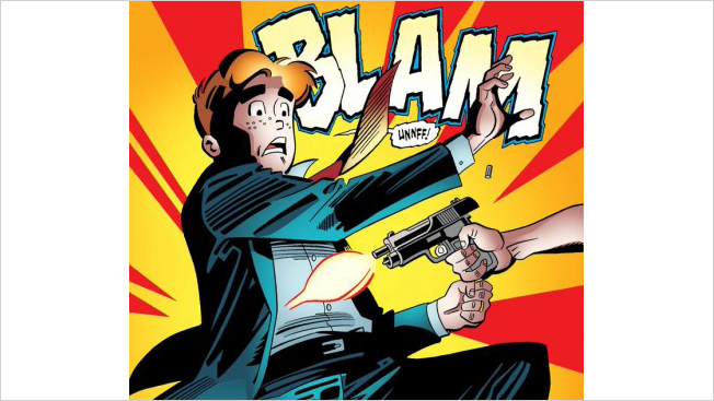
Archie Andrews, the iconic American comic book character introduced 73 years ago, will die this month when he takes a bullet meant for an openly gay U.S. Senator who supports stricter gun control.

His death (which we should note isn’t much of a spoiler since it was revealed by the creators months ago) occurs in Life With Archie No. 36, and its aftermath will be featured in No. 37, the final volume of a series that follows the grown-up adventures of the character and his pals from Riverdale, USA. The more familiar teenage Archie lives on in other titles, which, like many comics, have their own continuities. 

Archie has focused on serious social topics quite a lot in recent years, with stories exploring cancer, death, affordable healthcare and gay marriage. (The wedding of his friend, Kevin Keller, sparked a boycott from conservative group One Million Moms in 2012.) The main character’s death, however, clearly ups the ante and has generated considerable media attention since the twist was revealed in April. (The details of Archie’s death weren’t disclosed until this week, and the shooter’s identity hasn’t been disclosed.)

Major comic book characters have “died” before, notably Superman, Captain Marvel and Spider-Man, but Archie’s demise is different because he’s a mortal with no special powers who sacrifices himself in a politically charged narrative.

“He’s human. He’s a person. When you wound him, he bleeds. He knows that. If anything, I think his death is more impactful because of that,” Archie publisher and co-CEO John Goldwater told the Associated Press. “We hope by showing how something so violent can happen to Archie, that we can—in some way—learn from him.”

For the most part, public reaction has been mixed, and mainly split along progressive/conservative lines. One Huffington Post commenter says Archie’s writers have “taken this venerable old line and breathed a new essence into it,” while another chides, “It is exasperating to see the extent of childish propaganda in our society.”

A Verge reader asks, “Is it really appropriate to take a character that’s been a comic book character and a pop culture icon for 70+ years and to kill him off for the sake of a modern political statement? That’s like… killing off Donald Duck to protest the Vietnam War, or killing off Charlie Brown to protest the Affordable Care Act.”

Some question whether a potentially powerful message is undermined by offing Archie in one story arc while he remains youthful and alive in other series still available on newsstands. “While I’m all for tackling tough issues in comics, my problem is that Archie isn’t going to stay dead,” writes a commenter at ComicsAlliance.com. “When you write a story tackling something like gun violence, when the main character of the book eventually comes back the whole point of the story loses its weight.”

Chris Cummins, who follows comics at DenOfGeek.us, takes a broader view, and believes that Archie’s martyrdom is in keeping with his selfless personality and true to the spirit of the overall series: “This demise is a fitting and tonally perfect tribute to a character who has always put his friends first.”


Florida Newspaper’s Front Page Is Practically Throbbing With 2-Hour Erection Ad

It can get really, really hard to turn away ad dollars in the newspaper industry, but here's a case where the raging desire for revenue is practically erupting across the front page.

Today's South Florida Sun Sentinel prominently features a local Ponzi scheme update, a photo from the Heat's semifinals win … oh, and a page-width ad about erections. 

"When you come to our clinic, you get FIRM," boasts Maxim Men's Clinic, which also promises "erections from 30 min – 2 hours." 

Sure, erectile dysfunction went mainstream more than a decade ago, but this ad practically makes AshleyMadison look classy.

Poynter reached out to the publisher and asked if the staff had received any reader complaints. He responded: "I have gotten zero."

UPDATE: According to media observer Jim Romenesko, the publisher now says the placement was "an honest mistake" and was supposed to appear in Sports. 

Image via the Newseum.


Magazine Puts Half of Its New Issue in a Time Capsule and Will Open It in 2024

Dodo magazine might only be on its second issue, but it's got big plans for the future. In fact, one idea directly involves the future.

The magazine is putting together a "time capsule" double issue—half of the edition is available now, and the second half will be sent out in 2024 to everyone who subscribes to Dodo this year. Also, if you follow the website prompt and write a letter to your future self, you'll also receive that with your 2024 half issue. If Dodo sends each issue in a vintage Trapper Keeper, it will have officially reached Peak Middle School.

This isn't their first goofy marketing stunt, either. Dodo printed just one copy of its "Issue Zero," which it buried in a treasure chest that interested parties needed a map to find.

The time capsule thing relies on the bold presumption that a print magazine can make it 10 years in the digital era. But I want Dodo to succeed, if only because I'm wondering what else they've got planned.

Via PSFK.


NatGeo Kids Creates Cover So Small, 2,000 Could Fit on a Grain of Salt

I know it can seem like the magazine business is shrinking, but this is ridiculous.

According to the folks at Guinness World Records, National Geographic Kids just created the world's smallest magazine cover. It measures 11 by 14 micrometers, roughly the size of a red blood cell—so small that 2,000 of the covers could fit on a grain of salt.

The cover was etched into plastic using an IBM silicon chisel with a tip that's 100,000 times smaller than the point of a pencil. The image, chosen by readers, shows twin pandas. Aww!

Obviously this microscoping approach to printing isn't going to do much to increase readership. The technology is actually expected to be used for applications like security tagging of passports and artwork.


Author Brilliantly Recreates Famous Meals From Literature

We're not normally coffee-table book people, but this? This is awesome.

Designer Dinah Fried has just published a collection of fascinating images called Fictitious Dishes: An Album of Literature's Most Memorable Meals. To compile the 128-page labor of love, she cooked, photographed and art directed recreations of 50 meals found in literature, from Oliver Twist to The Girl With the Dragon Tattoo (who can forget all those oh-so-Swedish egg and cheese sandwiches with coffee?).

"Many of my most vivid memories from books are of the meals the characters eat," Fried writes. "I read Heidi more than 20 years ago, but I can still taste the golden, cheesy toast that her grandfather serves her, and I can still feel the anticipation and comfort she experiences as she watches him prepare it over the open fire."

Check out a few of the literary tableaus below and see several more on Brain Pickings, where Fried's former Rhode Island School of Design adviser, Maria Popova, describes the evolution of the concept:

The project began as a modest design exercise while Fried was attending the Rhode Island School of Design a couple of years ago, but the concept quickly gripped her with greater allure that transcended her original short-term deadline. As she continued to read and cook, a different sort of self-transcendence took place. … A near-vegetarian, she found herself wrestling with pig kidney for Ulysses and cooking bananas 11 ways for Gravity’s Rainbow.

Swann's Way by Marcel Proust (1913): Tea and petite Madeleines.

The Catcher in the Rye by J.D. Salinger (1951): Swiss cheese sandwich and malted milk.

The Girl With a Dragon Tattoo by Stieg Larsson (2005): Cheese and hard-boiled egg sandwiches with coffee.

On the Road by Jack Kerouac (1957): Apple pie and ice cream.

The Secret Garden by Frances Hodgson Burnett (1911): Roasted eggs and potatoes with salt.

Fear and Loathing in Las Vegas by Hunter S. Thompson (1971): Grapefruit and tequila.

Moby-Dick by Herman Melville (1851): Clam chowder.

Heidi by Joanna Spyri (1880): Cheese toast.

The Metamorphosis by Franz Kafka (1915): Half-rotten vegetables, bones and other refuse.

Fictitious Dishes: An Album of Literature's Most Memorable Meals is currently available on Amazon for a little under $15

Hat tip to my friend Theodore Hahn for pointing out this project on Facebook.


Reincarnation Isn’t Kind to Trump, Zuckerberg and Gates in Luxury Magazine Ads

Donald Trump, Bill Gates and Mark Zuckerberg get reincarnated as an owl, a llama and a sheep, respectively, in AlmapBBDO's unusual campaign for Top Magazine, a luxury fashion and lifestyle title in Brazil.

"In his next life, even Donald Trump could come back as an owl," we're told. "The time to enjoy your money is now."

The visuals are most amusing. Gates keeps his trademark glasses, while Zuck's wooly locks and dental work survive the transformation. And of course, Trump's hair is still atrociously—wait for it, because it's worth the wait, here it comes—feathered. (OK, it wasn't worth the wait.)

Belgium's TMF channel tried a similar theme in 2008, showing Amy Winehouse as a sad sheep in a most unsavory barnyard scenario. And a South African employment site once suggested that lawyers, tobacco execs and paparazzi would return as ticks, maggots and dung-heap flies. By comparison, Top's beastly trio really don't fare so badly at all. C'mon, Zuck, why the long face?

Credits below. Via Ads of the World.

CREDITS
Client: Top Magazine
Agency: AlmapBBDO, Brazil
General Creative Director: Luiz Sanches
Creative Directors: André Kassu, Marcos Medeiros, Bruno Prosperi
Art Director: André Sallowicz
Copywriters: Dudu Barcelos, Filipe Medici
Illustrators: Surachai Puthikulangkura, Supachai U-Rairat
Photographer: Surachai Puthikulangkura
Graphic Producers: José Roberto Bezerra, Alberto Lago
Account Executives: Gustavo Burnier, Filipe Bartholomeu, Johana Quintana, Matheus Trigo


Oops? Rolling Stone Has John Hancock Sign the Constitution on Julia Louis-Dreyfus Cover

If you've seen Rolling Stone's latest cover featuring Julia Louis-Dreyfus of Veep fame, your initial thoughts were probably along the lines of "Elaine from Seinfeld is naked!" or perhaps "JLD looks damn good for 53!" or maybe even "I want a tattoo of the U.S. Constitution on my back, too!"

But if you paid attention in history class (nerd alert), you'll notice something else: The big ol' "John Hancock" tattooed just north of Louis-Dreyfus' derriere is a mistake. Hancock signed the Declaration of Independence, not the Constitution.

Always quick to ruin everything, the Twittersphere wasted no time in pointing this out.

Louis-Dreyfus also addressed the gaffe in her own Twitter account, putting the blame on her Veep character Selina Meyers' generally incompetent communications director, Mike.

A source at Rolling Stone, however, said the John Hancock signature was deliberate and was meant to be "in the spirit" of Veep's farcical tone. "The Declaration of Independence is on the other side, but we couldn't fit all the signatures on there," the source said.

UPDATE: A day later, Louis-Dreyfux continues to have fun with it:


Alt-Weekly Mocks Its Own Buyout With a Cover That Looks Just Like Its New Owner

When you're an alt-weekly known for skewering the establishment, how do you tackle the fact that you've been bought out by the establishment?

Baltimore City Paper takes a commendably self-effacing approach with today's issue, the cover of which was designed in the staid style of the paper's new owner, The Baltimore Sun.

Acknowledging that its buyout by the city's mainstream newspaper is "beyond absurd," City Paper squeezes an impressive amount of dark humor into its satirical cover. (Click here to see a full-size version.)

The Sun's lofty motto, "Light for all," has been replaced with "Jobs for some," a reference to the pending raft of City Paper layoffs. The lead story, speckled with obscenity and drug references, ends with the jump tease "MORE CURSE WORDS, Page 14." Each reporter's byline is a cobbled medley of media ownership, like "Baltimore City Paper, no wait, The Sun—no wait—The Hartford Advocate, no, The Sun, maybe? Taco Bell?"

While this spot-on cover surely won't be enough to placate readers and observers who are concerned about City Paper becoming a gutless annex of The Sun, the move definitely shows it might be possible to sell out without giving up.

Via Julie Bykowicz on Twitter.

Here's a comparison of how the two papers normally look:

And here's the full cover for this week's issue of City Paper:


Sports Illustrated Brings You Kate Upton in Zero Gravity

We all know the purpose of the Sports Illustrated swimsuit issue is to create spank-bankable material in a format convenient for reading on the toilet. But the baseness of its purpose doesn't mean it can't be creative. On the contrary, SI continues to boldly seek new frontiers of wankspiration.

Perhaps to counterbalance the rather immovable Barbie, SI put bombshell Kate Upton on a Zero-G plane and took photos of her floating about in swimsuits. The results really are out of this world.

The whole concept is brilliant. Think about it. What is the sole enemy of big, glorious boobs? Why, gravity, of course. And in these photos, Upton laughs in the face of physics, achieving superhuman results previously available only to superheroines.

The 2014 SI swimsuit issue lands on newsstands today.


Can Ad Agencies Teach Women to Love Their Bodies?

Female empowerment was a major advertising theme in 2013, particularly in the area of self-esteem—led by Dove's "Real Beauty Sketches." But freed of client constraints, can ad agencies alone get women to love their bodies?

Marie Claire Australia asked six shops to try—OgilvyOne, Publicis Mojo, M&C Saatchi Australia, Airborne, Whybin\TBWA and DDB Group Sydney. Each produced a print ad on the topic. You can see all of them here. OgilvyOne's entry, above, is probably the most striking and memorable. Several of the others are interesting, too, although as a whole, it goes to show how the topic is a tough one to tackle in a single print ad.

See the text from the OgilvyOne ad below.


Ad Blogger Copyranter Goes Out With a Bang After Getting Fired From BuzzFeed

BuzzFeed, the curator of all things viral on the www, fired Mark "Copyranter" Duffy last month after employing him for a year and a half. And he did not go quietly. In a new article on Gawker titled "Top 10 Best Ever WTF OMG Reasons BuzzFeed Fired Me, LOL!", Duffy pulls no punches.

He reveals that he took a $43,000 annual pay cut to leave the agency world, worked as many as 70 hours a week for BuzzFeed, ranked seventh out of about 100 writers for traffic—and yet was canned anyway over "creative differences." A photo shows his termination paperwork with a sticky note that says "CUTE" on it—perhaps BuzzFeed's most egregious error in all of this. "A 53-year-old man, BuzzFeed's oldest ever employee, jobless and without health insurance? CUTE as a fucking bug's ear," Duffy writes.

He then shares, BuzzFeed style, 10 reasons why he might have been fired. They range from "Age" (reason No. 10—Duffy is 53, while most of his colleagues are in their 20s) to "I regularly challenged editors" (reason No. 6) to "I am just an asshole" (reason No. 3). He also admits to sending out inappropriate company-wide emails and drumming at his desk incessantly, which are their own entries, though they could probably also fall under No. 3.

The article includes a lengthy response from BuzzFeed's Ben Smith, the target of most of Duffy's criticisms, who closes with: "I'm sorry the Cute sticker upset him." The comments are worth a read, as well, either ripping BuzzFeed for choosing fluffy clickbait over Duffy's tougher material or ripping Duffy for being, e.g., "an entitled fucking whiner, dude."

From an outsider's point of view, the Duffy/BuzzFeed marriage just didn't seem like the best fit for either party. We hope he gets a column at a publication that suits him, as well as a soundproof office and maybe some well-padded mittens.


Create Your Own Overly Emotional, Click-Baiting Headline With the Upworthy Generator

You've undoubtedly seen them: the saccharine-slathered headlines of Upworthy.com, promising you'll "never see the world the same again" after watching some YouTube video about bullied kids or racism or whatever. Now you can create your own must-click words of wisdom with the Upworthy Generator, which combines random emotional video screen grabs with cobbled cliches for results like "Try Not to Let Your Jaw Hit the Floor When You Hear These Twelve Words."

Created by digital content mastermind Mike Lacher, who penned McSweeney's beloved article "I'm Comic Sans, Asshole," the Upworthy Generator mocks just about all the stereotypes you'll find in the site's overly optimistic presentation style. Lacher, a man all too familiar with headline trappings from his days as a creative director for BuzzFeed and creator of that site's Pepsi-branded "Listiclock," nails Upworthy's recurring themes of wisdom from children, popular icons fallen from grace, emotional righteousness and David-versus-Goliath battles against bullies/authority/oppression.

A few of my personal favorites, randomly created by the Upworthy Generator:
• Think Things Used to Be Better When You Were a Kid? Maybe You Should Listen to This Disgraced Former Model.
• That Moment When an Oscar Winner Doesn't Accept Bullying.
• Here Is What Happens When a Beauty Queen Gets Real About the Biggest Problem in America.
• Try Not to Shout With Rage When You Hear the Eighth Word.
• Watch a Bullied Veteran Become an Inspiration With Five Words.
• What This Transgender Mother of Three Did Is Genius.

Try it out for yourself on UpworthyGenerator.com. Hap to to Jelena Woehr for sharing this one.


Famous Photos Reimagined as Selfies in Newspaper’s Wonderful Print Ads


Two Almost Entirely Blank Pages in Today’s New York Times Are an Ad for a Movie

Here's a pretty expensive way to say (almost) nothing: Buy two consecutive pages in the A section of The New York Times, and leave them completely blank except for a tiny URL in 12-point type at the bottom of the second page.

That's what you'll find in today's paper—and it turns out it's an ad for a movie.

The URL, wordsarelife.com, links to a microsite for the upcoming film The Book Thief. The innovative ad ties into the message of the movie's larger ad campaign, "Imagine a world without words," and the film itself, which is about a young girl in Nazi Germany who steals books from war-torn areas and shares them with others.

Twentieth Century Fox approached the Times with the ad concept, and it was approved by the paper's ad standards team. Impressively, it doesn't even feature an "Advertisement" stamp, which you might expect to be added to reassure readers that it's not a printing error.


Man Uses Grappling Hook and Rope to Flee Michael Wolff in USA Today Ad

USA Today has begun promoting several columnists in short YouTube videos—the most entertaining of which stars Michael Wolff, erstwhile Adweek editor and current writer for USA Today's Money section. In the spot, Wolff's takes-no-prisoners reputation has one suit literally running scared—he uses a grappling hook and rope to flee his office building upon hearing that the columnist has arrived and wants a word. Alas, they meet on the sidewalk, and the man barks, "This is off the record!"—as Wolff, nonplussed, silently tries to comprehend the man's desperation. The voiceover, echoed in on-screen copy, says: "Read Michael Wolff. And thank your lucky stars he's not writing about you." Commercial acting—is it everything Wolff expected and more? "All in a day's shamelessness," he tells AdFreak. See the paper's ads for columnists Christine Brennan and Susan Page below.


3 Ad Agencies Try to Rebrand Feminism. Did Any of Them Get It Right?

Does feminism need rebranding? Elle U.K. thinks so, and invited three British ad agencies—Brave, Mother and Wieden + Kennedy—to work on it with three feminist groups.

The results, published in November's issue, are posted below. Brave, working with teenage campaigner Jinan Younis, produced a flow chart called "Are You a Feminist?" Mother, working with the newly launched Feminist Times, created an ad focused on equal pay. And W+K, teamed up with online magazine Vagenda, produced an ad about stereotypes that women have to deal with.

See the work below. Does any of it scratch the surface of the issue?

—Flow chart from Brave and Jinan Younis:

—Ad from Mother London and the Feminist Times:

Ad from Wieden + Kennedy London and Vagenda:


Ad-Free Issue of September Vogue Is an Engineering Marvel, but It Will Cost You

For anyone who avoided picking up this year's September issue of Vogue because it would cause back trouble to carry around, here's another option—an ad-free version is for sale on Craigslist, with all the advertisements either cut out or blacked out. This allows you to enjoy an "uninterrupted read" without all that pesky filler.

The only problem? The price. "I calculating the ad expenditure of this issue for 280 Full Page Ads and 45 Double Page Spreads," says the seller. "This was the amount advertisers spent so you could buy your copy of VOGUE at just $12 at your local bookstore. So obviously, without the ads, I will have to pass on the cost to you." That explains the asking price of more than $4 million. Seems maybe they forgot to divide that by the number of issues printed?

Full text of the Craigslist ad below. Via PSFK.

I am selling an "Ad-Blocked" issue of Vogue US, September Issue 2013. What I did was to cut out all the pages with advertisements, and left only the articles. For the pages I couldn't remove, I went over them with a big fat permanent marker. Now you can enjoy an uninterrupted read of the most anticipated issue of this fashion bible.

If this price is a little higher than you anticipated, let me explain. By referencing VOGUE's media rate cards, I calculating the ad expenditure of this issue for 280 Full Page Ads and 45 Double Page Spreads. This was the amount advertisers spent so you could buy your copy of VOGUE at just $12 at your local bookstore. So obviously, without the ads, I will have to pass on the cost to you.

There is good news though: the rate card did not include premiums for this being a "September Issue", which I am sure will bump the price up even more.

So what are you waiting for? This is a steal!


Buy the Guardian and Observer, or Your Weekend Will Be a Complete Disaster

BBH London expands its "We Own the Weekend" campaign for the Guardian and Observer's Saturday and Sunday newspapers with a pair of dark-humored spots that focus on the "Tech Monthly" and "Cook" supplements. In one spot, a guy is unable to control the destructive force of his high-tech "MegaGlove"; in the other, a woman's hosted luncheon ends poorly for all involved. Ah well, if it bleeds, it leads.

"If our initial campaign was designed to inform the public that the Guardian and the Observer own their weekend, this follow-up dramatizes the repercussions of resistance," says David Kolbusz, deputy executive creative director at BBH. "When you try to own your own weekend, things can turn out very badly. Frankly, I feel sorry for anyone who doesn't buy their papers."

The work maintains the high quality of the three-minute January launch film starring Hugh Grant. Still, I can't help feeling it's all for naught. No matter how smart its marketing gets, the newspaper business long ago got "owned" by digital media—every day of the week.

Credits below.

CREDITS
Client: Guardian and Observer
Director of Brand and Engagement: Richard Furness
Head of Marketing and Engagement: Toby Hollis
Product Marketing Manager: Charlotte Emmerson

Agency: BBH London
Creative Team: Gary McCreadie, Wesley Hawes, Matt Fitch, Mark Lewis
Deputy Executive Creative Director: David Kolbusz
Producer: Chris Watling
Strategic Business Lead: Ngaio Pardon
Strategy Director: Agathe Guerrier
Strategist: Alana King
Team Director: Jon Barnes
Team Managers: Fiona Buddery, Jonny Price

Production Company: Biscuit
Director: Jeff Low
Executive Producer: Orlando Woods
Producer: Kwok Yau
Director of Photography: Ed Wild
Postproduction: The Mill
Editing House: Final Cut
Editor: Ed Cheeseman
Sound: Factory
Sound Engineer: Sam Robson


Racy Ad Claims Newspaper’s New Website Is Better Than Sex (NSFW?)

Israeli newspaper Ha'aretz has ruffled some bedspreads with this truly odd (and probably NSFW, though it's not really explicit) commercial positioning its new website as way more exciting than boring old sex.

"The design is impressive and comfortable, but the user experience as a whole … there's a slight sense of 'Been there, done that,'" the actor says in mid-copulation, according to The Hollywood Reporter, apparently referring to the experience of reading a traditional newspaper. The new website, though, is where the real thrills lie. "Life is not as interesting as Ha'aretz's new website," says the slogan at the end.

THR reports that women's groups in Israel were immediately outraged by the spot and formally protested it with a letter to the publisher. But 10 days after it was posted, it remains up on YouTube—and has more than 180,000 views.

Via The Ethical Adman.


Solar Panel Inside Nivea Print Ad Generates Power to Charge Your Cellphone

A print ad that uses solar power to charge cellphones? At long last, mankind's prayers have been answered! Giovanni + Draftfcb in São Paulo, Brazil, developed the ad, which includes a wafer-thin solar panel and phone plug, to promote the Nivea Sun line of skincare products. It ran in Brazilian magazine Veja Rio, and there's a sun-soaked beach video that shows the device in action. Of course, the ad is mainly a gimmick to generate publicity through media coverage, which we're pleased to provide, though the work also suggests that adding novel functionality to traditional campaigns could be a smart way to stir things up. What will they think of next—a billboard that generates drinking water out of thin air?