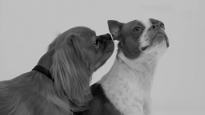
Stranger dogs tend to get pretty intimate pretty quickly, and so all the hesitancy in the first half the video, I suppose, is the joke here. Before long, though, there are plenty of noses in butts and all is right with the world again.
The original "First Kiss" video, by the way, has topped 40 million views since Monday.
It's been years since Burger King's U.S. advertising was truly weird. You have to go back to the Crispin Porter + Bogusky stuff from the mid-2000s—in particular, the deeply troubling "Eat Like Snake" ad from 2006.
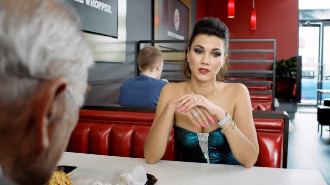
Colenso BBDO, however, is keeping BK ads weird for the New Zealand market. Check out the three spots below from director Nick Ball, featuring the most unlikely BK patrons ever—Sir Roger Poppincock and Baron von Cravat, along with an elderly gent on oxygen and his young, pissed-off Russian bride.
Reaction, it's fair to say, has been mixed.
"Hey Burger King, just have to say I think your latest TV ads are dreadful," one Facebook commenter writes. "So much for a tasteful and family orientated pitch. Do you really think that people would find that funny? Old men with some young girl saying when are you going to die, apart from the obvious stereotypes, ageism and sexism, what about the cultural offense you cause by assuming that women from Russia only marry older men? Not impressed." (BK replied: "We are sorry you're not loving our ads. Thank you for taking the time to let us know your thoughts, we appreciate all feedback."
The chain also got some heat for advertising its lamb burger with a billboard that said: "Cute, cuddly & now delicious." In response to that, another Facebook commenter wrote: "I would like to complain on behalf of vegetarians and vegans about the morally and ethically offensive nature of the 'Cute, cuddly & now delicious' lamb burger billboard in Sandringham. Marketing should have been more considerate."
"Our advertising isn't intended to offend, just to get noticed," the marketer replied. "We hope that there was sufficient humour in this billboard to demonstrate our position and are sorry that this campaign upset you."
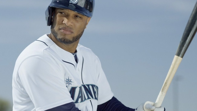
The Seattle Mariners considered Robinson Cano to be a heavenly catch this off-season, and there's a divine aura about him in the team's first ad with its $240 million second baseman.
Seattle's Copacino + Fujikado, now its 20th season handling ads for the Mariners, welcomes the 31-year-old with the 30-second spot below, in which Cano doesn't have to utter a word to communicate just how awesome he is.
Agency co-founder and creative chief Jim Copacino tells AdFreak he felt a fair amount of pressure to produce a special debut commercial with Cano. C+F almost got Ken Griffey Jr. to do a spot with Cano (it would have been about how they both wear No. 24, though actually Cano is switching back to his original Yankee number, 22), but Griffey had a conflict and couldn't make the Arizona shoot. So, they went with this spot instead, and Copacino says the shoot couldn't have gone smoother.
"With a guy of this magnitude coming in, we didn't want to trivialize him or be too cute," he says. "A writer here, Andy Corbett, a very funny guy, came up with this notion that Cano has this charismatic aura that follows him everywhere he goes—slow motion and music. It was an easy spot to shoot. The first time we worked with him, we didn't want to burden him with too much responsibility in terms of lines and acting."
Four more new ads focus on three other players and on Henry Chadwick, who invented the baseball box score in the 1860s and came up with the letter K for strikeout.
One particularly amusing ad celebrates the old-school style of third baseman Kyle Seager. "Kyle is a quiet, soft-spoken guy from North Carolina," says Copacino. "He says 'Yes, sir' and 'No, sir.' He's quietly becoming one of the better third basemen in baseball. He's fundamentally sound. And to me, he just seems like he was plucked from the '50s and put down into modern baseball. It was fun to create this fiction about him being kind of a throwback."
At one point, Seager is seen tweeting from a typewriter. "He said, 'You know, I don't actually tweet,' " says Copacino. "And we said, 'That's fine! In fact, that's perfect!' "
C+F also put together the highlight reel below of its 20 years of Mariners spots. At least in its advertising, this is a team that's on a long winning streak.
CREDITS Client: Seattle Mariners Agency: Copacino + Fujikado Executive Creative Director, Writer: Jim Copacino Creative Director, Writer: Mike Hayward Writer: Andy Corbett Art Director: Andy Westbrock Production Company: Blue Goose Productions Director: Ron Gross Executive Producer: Bill Hoare Account Supervisor: Cole Parsons Account Manager: Melissa Figel Broadcast Producers: Kris Dangla, Patti Emery Editor: Troy Murison, Dubs Inc. Digital Postproduction: Kevin Adams, Workbench Music: Chris White, Comrade
The surest sign that you've created a viral juggernaut is that the parodies quickly come flowing in. This will be especially true of Wren's "First Kiss" ad, which is so stripped down visually that it will be easy to spoof. First out of the gate is a British brand with a reason to jump all over this—Snog frozen yogurt. (A "snog," of course, is British slang for a makeout session.) Check out the parody below, and wait for the onslaught of about 5,000 more by tomorrow. Agency: Krowd.
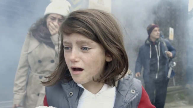
For PSA campaigns aimed at getting people to help the children of Syria, job one is making the crisis feel immediate rather than remote.
Last month's hidden-camera stunt in Norway, in which a child sat freezing without a coat at a bus stop in winter, did just that. Now, Save the Children has released its own U.K. campaign to make the horror in Syria feel real—the 90-second video below, which does so to devastating effect.
The ad, by creative agency Don't Panic, imagines if what has happened in Syria were to happen in London. Amazingly shot, it uses the structure of the popular one-second-a-day videos to show an ordinary girl's world falling apart over a period of a year (from birthday to birthday)—as her comfortable middle-class existence evaporates and she finds herself a homeless and fatherless refugee amid the horrors of war.
The video coincides with the buildup to the third anniversary of the Syrian crisis, which has left 100,000 people dead and 2 million more as refugees. On-screen text at the end reads: "Just because it isn't happening here doesn't mean it isn't happening."
"It's easy to forget that Syria was a middle income country, where children enjoyed the benefits of education, healthcare and the other basic rights our children take for granted—not to mention Facebook accounts, video games and youth culture," says Jack Lundie, director of brand and communications at Save the Children.
"We hope the video will resonate with the public, particularly those who don't know much about the situation in Syria, and offer a new perspective on the devastating impact this conflict is having on innocent Syrian children."
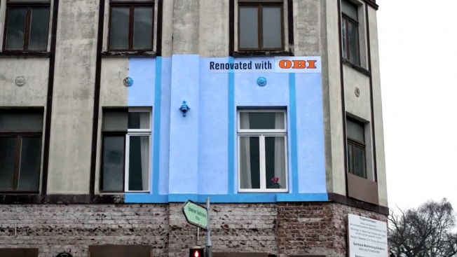
German home-improvement chain OBI is advertising its renovation products by actually renovating homes. Well, parts of them. Ad agency Jung von Matt/Elbe measured out billboard-size sections of run-down buildings and fixed them up—creating visually delightful billboards that really show the difference between before and after on an improvement project.
Germany has something of a tradition of doing inventive ads for home-improvement stores, as seen in the rich, weird and often epic marketing done by OBI rival Hornbach.
Credits for the OBI work below.
CREDITS Client: OBI Advertising Agency: Jung von Matt/Elbe Chief Creative Officers: Dörte Spengler-Ahrens, Jan Rexhausen Creative Directors: Felix Fenz, Alexander Norvilas Art Directors: Michael Wilde, Max Pilwat, Michael Hess Copywriter: Felix Fenz Creative Team: Michael Wilde, Max Pilwat
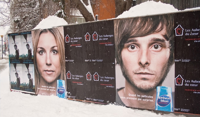
Montreal agency lg2 found a goofy but practical use for all the snow this winter—it made it look like dandruff gone berkserk on outdoor ads for Selsun Blue. Pity the fool who had shoveling duty on this project, though.
"Dandruff flakes typically occur in winter," the agency says, "due to the use of heating sources such as electricity. Selsun Blue and lg2 thus decided to launch an offensive at a time when people are most in need of dandruff-fighting shampoo."
The headline, "Quand les pellicules vous prennent par surprise," translates to, "When flakes take you by surprise." Credits below.
CREDITS Client: Sanofi – Selsun Blue Agency: lg2, Montreal Creative Director: Marc Fortin Creative Team: Mathieu Dufour, Marie-Ève Leclerc-Dion Account Services: Julie Simon, David Legendre, Safia Dodard Print Production: lg2fabrique Media: Publicité Sauvage
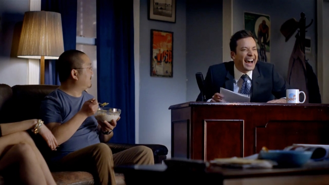
Late-night talk-show hosts already commandeer your living room in the wee hours. Now they're expanding their purview.
Following Jimmy Kimmel's bit before Sunday's Oscars in which he pretended to climb through the camera into a couple's living room to berate them, today we have this new Time Warner Cable ad starring Jimmy Fallon—in which the Tonight Show host shows up (with his whole band) in a guy's home just as he's eating breakfast. The point: Now you can watch NBC shows anytime as part of TWC's on-demand services.
Fallon is already everywhere these days; it only makes sense that he should be there anytime as well. He even popped up briefly in Ogilvy New York's previous ad for TWC—the minute-long extravaganza, also posted below, hosted by Diddy.
It might seem strange that PepsiMAX based its second "Test Drive" prank video with Jeff Gordon around doubts some people had about the first one. But it turned out to be a creatively fruitful approach.
First, it was a way to draft off the success of the earlier megahit. It also gave the second video a strong narrative. (Gordon, again in disguise, takes one of the big doubters—Travis Okulski of auto blog Jalopnik—on a very real, hair-raising ride of his own.) And finally, in many ways it used Gordon's pride as an accelerator. This isn't a guy, after all, who would want you to think he couldn't do these stunts himself.
Following the release of "Test Drive 2" on Thursday morning, we spoke with Marc Gilbar, creative director at Omnicom's Davie Brown Entertainment/The Marketing Arm in Los Angeles, which concepted and handled creative execution on the new video. (Like the first one, this one was directed by Peter Atencio of Gifted Youth.)
Below, Gilbar tells us all about the production, from the genesis of the idea to the safety issues to the moment when Okulski almost kicks out the camera inside the taxi.
AdFreak: The first "Test Drive" video did so well. I suppose a sequel is a no-brainer. Marc Gilbar: The first one was a huge hit. But as with any sequel, the difficulty is to do something fresh and original.
For every Godfather II, there's a Godfather III. Exactly. It's tough. We did [PepsiMAX's] Uncle Drew, and that's one where we just tried to expand the narrative and create a story people would like. But that's harder to do with "Test Drive," because of the character.
Pepsi, to their credit, wanted to address the haters. Haters is a general term, because I don't think that characterizes Travis, the guy we actually used. But the Internet audience is a conspiracy-driven audience that will literally break down every moment of your video. We always got a lot of amusement out of that, but we thought a lot of people could relate to it, too—and if we could incorporate or reference it in some way, it would be fun for people.
There happened to be this incredible article following the release of the first video. I had noticed it at the time. And when we got the brief and started thinking about it, we went back and looked at it, and realized how great Travis was and his whole breakdown of the first video—everything from the sound of a V8 engine versus a V6 to the cup holders on this model of Camaro. It was pretty funny. We thought he would make a great mark for the second one.
You weren't involved in the first video, though. No, [TBWA\Chiat\Day] did the first one. Pepsi will give a jump ball on a lot of these projects. The "Zero-Calorie Cola in Disguise" came out of Uncle Drew and sort of expanded into the world of racing. Chiat did that first one, which was great and a huge success. The second one was more of a jump ball, and we had this particular idea.
It's interesting to focus on claims that last year's ad was faked. Is that just a hook to get people in—to draw off the success of the last one? Yeah, I think it was a way to take a new angle. Anything else would have felt like you were doing the same thing over again. I think the honesty of it is what makes it great. With a lot of these pranks, if the setup is earned and done right, it makes the prank that much more enjoyable. If you just saw Jeff take a random person on a crazy cab ride, it may be funny, I guess, but the fact that this one had a specific purpose makes the drive that much more fun for the audience.
Shortly after the first one, I spoke to the director, Peter Atencio. He could only say so much. But it's not the point of the second video to really address whether the first one was real or not, correct? I think that's right. What drove it, to a large degree, is that Jeff really wanted to show his stuff. He's a competitor. In the second one, there's no doubt that he's the guy behind the wheel. And obviously he's very capable of taking Travis on a crazy ride. Jeff was very involved early on. To get a Nascar driver to pull something like this off, there would be a lot of hurdles, I think. But the fact that he was so excited about it made it possible.
How do you get a guy like Travis to do this unwittingly without signing a disclaimer? Part of the thing about Travis in particular is that he's such a big auto enthusiast. There was a lot of talking with his friends and his editors and the people around him just to feel out what kind of a guy he was. He's such a great sport. There's always risks involved. But he loves cars, he loves racing, he races cars. And his friends and editors also said he's excitable. He's a guy who gets excited.
Well, that turns out to be very true. Right, it's perfect. There's a lot of unknowns with something like this. We had one shot at it, which was kind of nerve-wracking. But we felt good about the course and the safety of the course. We had designed it and tested it several times the day before, and with Jeff. We made sure it was super safe. And Travis just seemed like the kind of guy who could be taken for a ride, but also kind of enjoy the whole thing. At the end, he even wanted to go and do it again. He wanted to drive. He's a true gearhead.
There's one moment where he kicks the divider. Were you worried he was going to dislodge the camera? There are so many moments in there where we got really lucky, in the way he reacts. That one was totally unexpected. I believe his foot even covers the lens at one point. We tested our cameras. They're pretty durable. And we built that whole divider and reinforced it. At the time we were just sitting back and watching what was happening. We saw the camera was still working, so that was good.
You only have one take to get it right. That's right. And there's really no way to fake this kind of thing. Watching it afterward, we saw that his reactions were pretty big, so we were confident that we got what we needed. And then we had a consumer on set who had won a test drive with Jeff Gordon. So after he had finished the drive with Travis, we put the contest winner in the car, and this teenager got to go around the course once, which was fun.
Was Jalopnik wary of being part of an advertisement? They were very intent on keeping their journalistic integrity. I think they saw the potential for a great story. They were obviously super collaborative and really fun to work with. But they wanted to keep that wall up and make sure Travis wasn't compensated in any way. If you read his article, it doesn't really talk about the product or the campaign—just the experience. And that was the story for them. They got a great story out of it—what it was like for him.
What it was like was terrifying. I read the article this morning, and he really breaks it down, which is his style. Every thought in his head. Afterward we all had the same questions for him: What were you thinking? And he said in those moments, you're not thinking. He's been responding to commenters on Twitter, people saying, "You didn't see the cameras?" And he's like, "No, I was scared for my life!"
I'm sure you're hoping this second video will be just as big as the first. You know, that's a big number. Just the fact that people are sharing it and enjoying it is the goal. It's hard to really predict the numbers, but it seems like that's happening so far. We're excited about it.
You don't have to worry about Jalopnik criticizing it, anyway. Right! We'll leave that to other people. There are plenty of other critics out there, I'm sure. We'll have to go after them some other time.
Canadian snack maker Krispy Kernels had a sleeper hit a couple of years ago with its "Couch" commercial, a delightful bit of oddvertising that absconded from Cannes with a bronze Lion.
Now the brand is back with this amusing new ad, "Meditation," which mixes zen meditation with furtive snack eating, with unexpected results.
So much oddball work seems forced these days, but this stuff, from Quebec agency Lg2, is up there with the classic Skittles and Fruit by the Foot ads.
Credits below.
CREDITS Client: Krispy Kernels Spot: "Meditation" Agency: Lg2, Quebec, Canada Creative Director: Luc Du Sault Copywriter: Andrée-Anne Hallé Art Directors: Luc Du Sault, Andrée-Anne Hallé Account: Mireille Côté, Sandie Lafleur Director: François Lallier Production House: Nova Film Producer: Simon Corriveau Sound Design: Boogie Studio
Outdoor ad geeks, here's your latest bit of brilliance, courtesy of Ikea.
German ad agency Thjnk and production studio I Made This teamed up to create Ikea's "RGB billboard," which—much like Ikea furniture itself—makes the most of some very limited space.
The board features three different headlines superimposed on each other in different colors—cyan, magenta and yellow. At night, the board shines red, green and blue (RGB) lightbulbs on the board, revealing, in turn, the different headlines. Red bulbs illuminate the cyan text; green lights up magenta; and the blue-purple lights make yellow visible.
And that's how you turn nine square meters of ad space into 27 square meters.
It's a delightful little visual trick that embodies Ikea's space-saving message. Now, if only it worked a little better during the day.
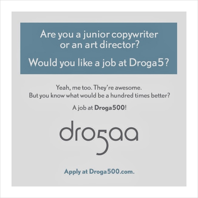
Droga5 is great and all, but it stands to reason, mathematically, that Droga500 would be one hundred times as awesome.
Nail, a small agency in Providence, R.I., invokes the hallowed names of Droga, Mother and Goodby, Silverstein & Partners in a series of cheeky new recruitment ads that acknowledge the greatness of those agencies—and then invite you to apply to better versions of them.
Three job ads posted on Google+ include links to droga500.com,mmmmother.com (the "tastier" version of Mother) and goodbysilverstien.com, each of which links through to Nail's site, where you can either apply for a job there (or if you're an "angry attorney," connect with a guy named Jeremy, who can hopefully talk you down).
Says the agency: "We are a small creative shop that competes for talent with big, famous creative shops. So we figured if we can't inspire young creatives to apply for a job here, at least we might be able to confuse them into it.?"
How does the world's oldest tequila maker introduce a brand-spanking-new website? By keeping one foot firmly in the past.
McCann New York has launched a new site for Jose Cuervo that's actually five sites in one. In addition to its new site for 2014, the brand also imagines what the brand website would have looked like in 1795, 1880, 1945 and 1974.
"Fully actualizing the concept in an authentic way required researching the language and design tropes of each chosen year, and then presenting what we needed to say about Cuervo through those stylistic realities," the agency says.
It's a fun idea, and 1945 and 1974 are both particularly groovy. The only downside, in fact, is that the 2014 version feels visually staid by comparison.
Screen shots and credits below.
1795 website:
1880 website:
1945 website:
1974 website:
2014 website:
CREDITS Client: Cuervo, Proximo Spirits Client: Elwyn Gladstone Agency: McCann, New York
Chief Creative Officers: Tom Murphy, Sean Bryan Group Creative Director: Mat Bisher Design Director: Brad Blondes Senior Art Director: Elinor Beltrone Copywriter: Sarah Lloyd Designer: Ledi Lalaj
Production Chief Production Officer: Nathy Aviram Executive Integrated Producer: Catherine Eve Patterson Senior Integrated Producers: Geoff Guinta, Jill Toloza Associate Producer: Lauren Bauder
Production Company: Transistor Studios Executive Creative Director: Aaron Baumle Executive Producer: Damon Meena Head of Production: Jesse Kurnit Creative Director: Jamie Rockaway Art Director: Geoff Keough Developer: Brian Hersey Designers: Ryan Weibust, Diana Park, Mauricio Leon, Edgardo Moreno, Tesia Jurkiewicz, Chris Murray and Carolyn Frisch
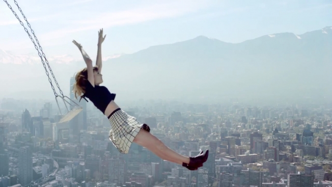
Coca-Cola is really having a go at social media this week. Earlier, we had the Coke video that offered a fashionably questionable solution to social-media addiction. And now we have this ultra-peppy new global Coca-Cola Light commercial from ad agency Johannes Leonardo.
Its point is that "liking" things just isn't enough. You have to love them. And you have to love them enough to roll around in them, swing on them, set fire to them, dance with them, kiss them (with gold teeth, preferably) and float away to heaven with them.
Ambivalence toward the "like" is hardly a new stance for marketers, but here it's aggressively communicated with broad, boundless energy as well as other, smaller details—you'll notice there are no computers or smartphones anywhere, and someone is even (gasp) seen reading a book. (The song is "Love Me Again" by English artist John Newman.)
It's a fine message for Coke, really, although it makes the 79,691,932 people who like the brand on Facebook maybe look a little foolish.
The British mobile network has the most fun-loving advertising slogan around: "We all need silly stuff." And Wieden + Kennedy in London makes the most of that promisingly vague positioning. Last year, we had the dancing Shetland pony. Now, it's time for the singing cat.
The new ad is brilliantly shot by Traktor, and features remarkable performances—not just by the preternaturally talented kitty but by the girl, too, who apparently was born to lip-sync old Starship songs. (W+K London has lots of relevant feline experience, too, of course, having also done the much-loved "Cats With Thumbs" work for Cravendale.)
The only downside: The related website, where you can upload your photo and "star in your own kitten-rocking, face-morphing music video," doesn't load outside the U.K.
CREDITS Client: Three Agency: Wieden + Kennedy, London Creative Directors: Dan Norris, Ray Shaughnessy Creatives: Chris Lapham, Aaron McGurk, Luke Tipping Production Company: Partizan Directors: Traktor Postproduction: MPC
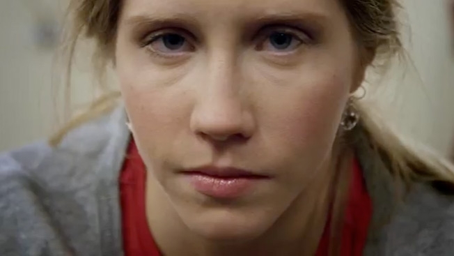
Funny how Alex Bogusky is still seeing opportunities where brands and agencies are missing them. Case in point: A recent tweet to Liberty Mutual urging the insurance company—whose Winter Olympics ads are all about overcoming setbacks—to make a commercial about Heidi Kloser, the U.S. skier who was badly injured the day before the Sochi Games began.
USA Today has the story. "It was pretty much a no-brainer," says Bogusky, a fellow Coloradan and a big fan of Kloser's. He sent a direct message to Liberty Mutual, which got its agency, Havas Worldwide, working on a commercial. They filmed Kloser, 21, at home in Vail, Colo., where she had returned for surgery and rehab on her knee. Her parents appear, too, and recall Heidi's poignant question to them after the injury. (You probably remember Kloser walking with the help of crutches during the Opening Ceremony.) The ad, which you can see below, will air Wednesday night during NBC's Olympic coverage.
"At Liberty Mutual, we believe that with every setback, there's a chance to come back. And rise," says the voiceover for the company's anthem spot (also posted below), which has been running throughout the Games.
That fits Kloser perfectly, as she is already looking to 2018—although, as she admits to USA Today, "I'd rather star in a commercial because I won a gold medal."
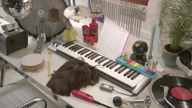
When you use Old Spice hair products, your hair is capable of anything.
First, it leaps off your head—that's a given. Then, as we've seen, it either hits on women at work or skillfully operates claw machines on the boardwalk to retrieve lost children.
Now, though, it reveals its most impressive talent to date—playing all the best-loved Huey Lewis and the News songs on the keyboard. In the interactive video below, also embedded at ThatsThePowerofHair.com, you can request any of 29 Huey Lewis songs, and a mop of hair will play them soulfully for you, supported by props like a disco ball and Hula girl.
"The Power of Love," "The Heart of Rock 'n' Roll," "I Want a New Drug," "Bad Is Bad," "Doing It All for My Baby"? Hear all those and 24 more great hits right now.
The digital experience, on desktop and mobile, is being embedded online in custom banners, news sites and Old Spice's social channels. Agency: Wieden + Kennedy.
Credits below.
CREDITS Client: Old Spice Project: "That's the Power of Hair"
Agency: Wieden + Kennedy, Portland, Ore. Creative Directors: Craig Allen, Jason Bagley, Matt O'Rourke Copywriter: Jason Kreher Art Director: Max Stinson Executive Interactive Producer: Mike Davidson Director of Broadcast Production: Ben Grylewicz Director of Interactive Production: Pierre Wendling Technology Lead: Ryan Bowers Account Team: Georgina Gooley, Liam Doherty, Nick Pirtle, Michael Dalton, Jessica Monsey Executive Creative Directors: Susan Hoffman, Joe Staples
Production Company: MJZ Director: Tom Kuntz Executive Producer: Scott Howard Producer: Emily Skinner
Editorial Company: Rock Paper Scissors Editor: Carlos Arias Asst. Editor: Christopher Mitchell Producer: Lisa Barnable
VFX Company: Framestore, New York Creative Director: Mike Woods Producer: Christine Cattano Head of Commercial Development: Ming-Pong Liu Lead Developers: Sebastian Buys and Nien Liu Lead Compositor: Mindy Dubin
Music Company: Stimmung Executive Producer: Ceinwyn Clark Post Engineer: Rory Doggett Composer: Greg Chun
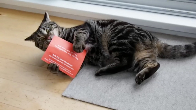
In retrospect, it seems obvious. To get cats to pay attention to your direct mail, just soak the damn fliers in catnip—and watch the kitties lose their minds when the mail arrives.
That's what Vancouver agency Rethink did recently for a cat litter client. As seen in the video below, the engagement with the marketing is undeniable—and pretty cute to watch also.
Owners have been targeted through their pets' olfactory senses before, of course, though in somewhat grosser ways—like the old Animal Planet ads that smelled like urine, placed at the foot of lampposts in the U.K.
Credits below.
CREDITS Client: Bulk Cat Litter Warehouse Agency: Rethink Canada, Vancouver Creative Directors: Ian Grais, Chris Staples Art Director: Leia Rogers Copywriter: Bob Simpson Designer: Lisa Nakamura Account Manager: Marie Lunny Print Producer: Cary Emley / Sue Wilkinson Printer: Metropolitan Fine Printers Editor: Chris Nielsen Cats: Mona, Bella, Ommie, Jojo, Paul, Linus, Malo, Taika, Riley, Gracie, Prince Ruv, Bagheera, and Pebble
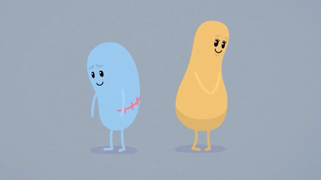
Fifteen months and 71 million YouTube views after its storied premiere, McCann Melbourne's "Dumb Ways to Die" train-safety campaign is back with this cute, grotesque little spot for Valentine's Day. Turns out the greedy little blue blob who sold both his kidneys on the Internet now has easy access to other vital organs through the stitched-up wounds. Despite his best intentions, death, naturally, ensues. "Be safe around Valentine's Day … and trains," says the on-screen copy.
This is just the second new "Dumb Ways" video released since the staggeringly successful original—following a 15-second promo made for the Melbourne International Film Festival last July. For those who have to sing it loud, though, there is also the official karaoke version of the original.
Caribou Coffee, whose previous out-of-home ad stunts have included heated bus shelters in Minneapolis, is back with another special campaign—a giant, five-story-tall Pinterest board built (with help from ad agency Colle+McVoy) at the Mall of America in Bloomington, Minn.
Caribou used pinned images from fans as inspiration for its new Real Inspiration Blend variety of coffee. That sounds like a stretch, but the giant Pinterest board is pretty impressive. It includes two large screens that feature inspirating photos from fans on Instagram and Twitter that are tagged with the hashtag #CaribouInspires.
This is site is run by Sascha Endlicher, M.A., during ungodly late night hours. Wanna know more about him? Connect via Social Media by jumping to about.me/sascha.endlicher.