Grey New York Makes It Stick in First Post-It Campaign Since 2013

Grey launched a new campaign for 3M’s Post-it brand, extolling the virtues of handwritten notes to help people remember and complete tasks, entitled “Make it Stick,” the brand’s first campaign since 2013.

In the 30-second spot “Jump,” that task is tied to physically sticking a Post-it to the wall. A girl is seen placing increasingly higher Post-it notes on her bedroom wall, which is curious until we learn the reason. The next day she appears at basketball tryouts and is the first to demonstrate her vertical leap, placing a Post-it reading “Tomorrow I’ll jump even higher” on the backboard.

Tying the brand to such a task is a bit strange, as the stronger argument in writing things down physically involves improved retention and having an actual physical reminder to complete a task. Still, something about it works as a metaphorical demonstration of how the brand can help you complete a variety of tasks.

The premise of the campaign is based around a 2007 study entitled “The impact of commitment, accountability, and written goals on goal achievement,” which found that people are 42% more likely to complete a handwritten task, Jeff Hillins, global business director for 3M’s stationery and office supplies division, told AdAge. Lest you question the applicability of a study almost a decade old, 3M also commissioned a survey of Gen Z, (those born between 1995-2012), which found that 85 percent of email respondents said they learn best from a mix of digital and traditional learning tools, with 81 percent saying they’d feel limited by sticking just with digital. 

More to the point of the study, perhaps, is the first in an online documentary series. It tells the story of Imani Davis, a young poet whose craft benefitted from daily writing sessions. The spot documents Davis’ rise from anxiety-riddled student to aspiring young poet who performed at the Apollo, and the function Post-it notes have played in her writing process.

Agency Post-it Wars Are Spreading, as Other Shops (and Even 3M) Join the Fun

There was a time when a big company like 3M might have sent a nasty letter to the agencies waging a Post-it war on Canal Street—telling them to quit sullying its brand name in social posts. These days, though, any company that knows anything about social would be thrilled to see something like this develop.

And 3M was.

read more

Proximity Russia Repurposes Retargeted Ads for 3M

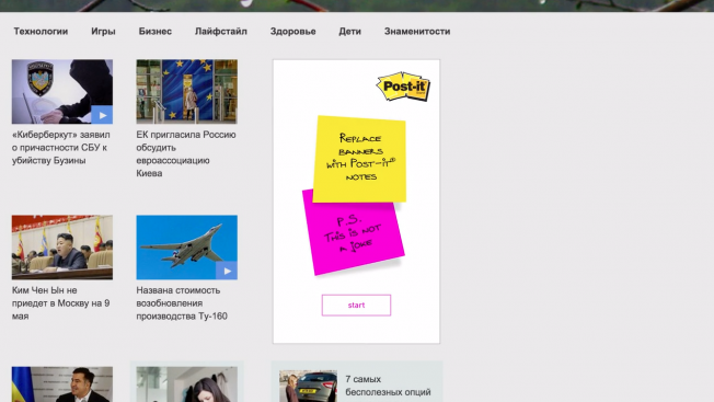
Proximity Russia pulls off the neat trick of finding a practical purpose for retargeted ads in its latest effort for 3M.

The agency collaborated with different banner networks in Russia to implement a technology that transforms retargeted banner ads into virtual post-it notes that users can customize. As Adweek points out, this turns retargeted banner ads’ weakness — they keep popping up, over and over again — into a strength, as it allows users to create messages to remind themselves of important information. Like the banner ads they replace, the notes follow users from site to site, but they turn what would be a nuisance into a useful tool. It’s a clever trick that doubles as a covert ad for 3M’s Post-it notes, illustrating their usefulness.

Credits:

Client: 3M
Marketing Supervisor: Sergey Smolentsev
Marketing Coordinator: Yulia Smirnova
Agency: Proximity Russia
Creative Director: Andrew Kontra
Senior Copywriters: Polina Zabrodskaya, Anna Migaleva
Senior Art Director: Fernando Muto
Business Development Director: Mikhail Vdovin
Digital Director: Alexander Makarovsky
Senior Account Manager: Polina Zvereva
Digital Production House: INDEE Interactive
Producer: Alexey Zinchenko
UI designer: Egor Bernikov
Coders: Arina Vernidub, Andrey Zakurdaev, Oleg Nikanorov

3M Makes Retargeted Banner Ads Less Annoying by Turning Them Into Post-it Notes

Retargeted banner ads are the sledgehammer of the web, bashing you again and again with the same random product you looked at once, whether you like it or not.

But 3M figured it could use the retargeted banner’s weakness as a strength. If the same banner comes up again and again, the company figured, why not make it a Post-it note where you could jot down info that might be useful later—when the ad pops up again?

Proximity Russia did just that in a recent campaign. Check out the case study below. It seems like ad-blocking software, but it’s not. 3M simply used retargeting technology and gave it an interactive spin.

The agency collaborated with several banner networks to get the Post-its on top websites in Russia. Clicking on the banners led you to a Post-it page, where you could create more stickers, edit or delete them all.

CREDITS
Client: 3M
Marketing Supervisor: Sergey Smolentsev
Marketing Coordinator: Yulia Smirnova
Agency: Proximity Russia
Creative Director: Andrew Kontra
Senior Copywriters: Polina Zabrodskaya, Anna Migaleva
Senior Art Director: Fernando Muto
Business Development Director: Mikhail Vdovin
Digital Director: Alexander Makarovsky
Senior Account Manager: Polina Zvereva
Digital Production House: INDEE Interactive
Producer: Alexey Zinchenko
UI designer: Egor Bernikov
Coders: Arina Vernidub, Andrey Zakurdaev, Oleg Nikanorov


Guy Proposes to His Girlfriend Using a Skyscraper and a Million Post-it Notes

There’s a famous scene in Sleepless in Seattle where Meg Ryan’s character looks out the window and sees the Empire State Building all lit up with a heart in the windows, setting unrealistic expectations for every starry-eyed romantic in the free world. 

To celebrate White Day in South Korea (another romantic holiday a month after Valentine’s Day), agency Innored and Post-it were clearly inspired by Meg—creating a clever stunt that uses plenty of Post-its to communicate a man’s affection for his girlfriend. Watch as this resourceful dude has 250 messengers create a special message for his special lady:

With almost 2 million views on YouTube, it’s already a viral hit. As the guy places a Post-it on the window in front of her at the end with “OK?” on it, we’re all still wondering if she replies, “Uh, totally.”


Pendrives do futuro são adesivos, anotáveis e coloridos como post-its

O vencedor do Red Dot Award 2014, dataSTICKIES, é um conceito de design criado para revolucionar as formas de anotar, gravar e carregar dados.

dataSTICKIES são feitos de grafeno, cuja fina camada é capaz de carregar um enorme volume de dados.

Criado por Parag Anand e Aditi Singh, o projeto visa resolver algumas inconveniências de um pendrive, como seu tamanho, tipos de acesso e formas de posicioná-lo nos dispositivos.

Tomando como base a facilidade e a agilidade de um post-it, dataSTICKIES possui uma camada adesiva condutora que age como um meio para transferir dados. Ele pode ser destacado de uma pilha e preso na superfície óptica de transferência de dados – um painel acoplado aos dispositivos como computadores e tablets. Sua camada adesiva também permite que seja descolado e reutilizado sem deixar marcas.

dataSTICKIES-3
dataSTICKIES-22

Compartilhar um arquivo com alguém ficou tão fácil quanto dividir um Post-it.

Ainda similar aos post-its, os dataSTICKIES vem em variadas cores e estampas para facilitar na organização das informações. E, dando ênfase tanto ao exterior do produto como seu funcionamento, os usuários podem escrever etiquetas ou notas sobre sua superfície. Além disso, quando estão sendo acessados por um dispositivo, suas bordas ficam acesas.

Infelizmente o projeto ainda está em fase conceitual. Porém, após a premiação de melhor Conceito de Design no Red Dot Award deste ano, esperamos ver a próxima geração de dados portáteis em breve nas lojas.

Brainstorm9Post originalmente publicado no Brainstorm #9
Twitter | Facebook | Contato | Anuncie

Post-it usa flipbook para mostrar como capturar uma ideia

Muito provavelmente, o marido de Emma discordaria que um Post-it é a melhor forma de capturar uma ideia antes que ela escape de nossa mente. Mas é exatamente esse conceito que a agência Noise, da Suíça, resolveu defender neste comercial feito para a 3M, com produção do estúdio Trikk17.

No filme, os blocos de Post-it são transformados em flipbooks para contar a história de um personagem que deixou uma ideia escapar e agora precisa enfrentar diversos obstáculos para conseguir capturá-la.

Os criativos do estúdio Trikk17 mostraram que o produto também é capaz de estimular a imaginação, apresentando-o como uma ferramenta criativa, e não apenas um bloco de anotações. O resultado ficou bem bacana.

post1 post3 post2

Brainstorm9Post originalmente publicado no Brainstorm #9
Twitter | Facebook | Contato | Anuncie

Mario – Post-It Life

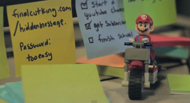
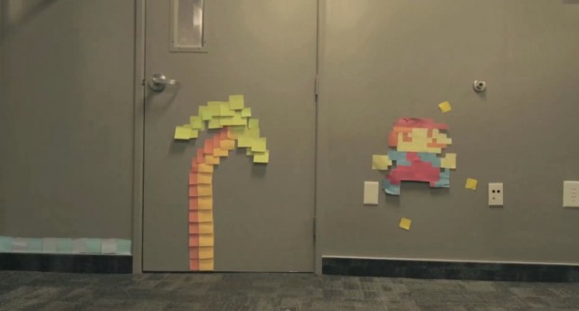
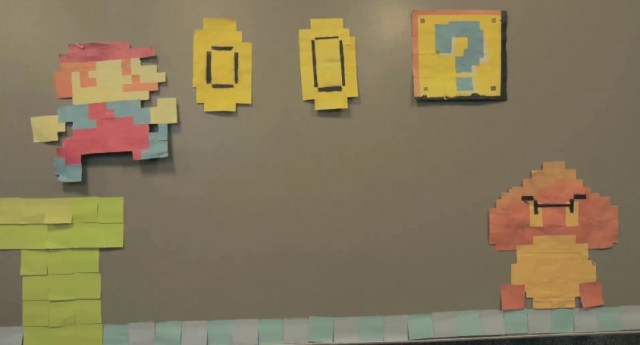
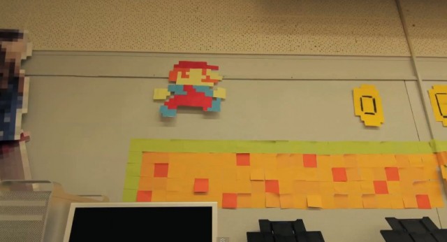
Zach King, aussi connu sous le pseudonyme the Final Cut King, a décidé de rendre hommage à Super Mario Bros et Pac Man en créant cette vidéo en stop-motion. Nécessitant plus de 7000 post-its pour l’occasion, ce dernier parvient à faire vivre le plombier le plus connu au monde.

Mario - Post It Life4
Mario - Post It Life3
Mario - Post It Life2
Mario - Post It Life