The Economist: Signs

Advertising Agency: Ogilvy & Mather Vietnam, Ho Chi Minh City, Vietnam
Executive Creative Directors: Todd McCracken, Steve Back
Art Directors: Richard Copping, Anthony Tham
Copywriter: Juggi Ramakrishnan
Illustrator: Jimmy Leow
Typographers: Richard Copping, Anthony Tham
Producer: May Lye

L’Oreal Revitalift Laser X3: Upside Down

Advertising Agency: McCann Worldgroup, Singapore
Executive Creative Director: Danny Higgins
Creative Director: Jatinder Sandhu
Copywriter: Jatinder Sandhu
Art Director: Thomas Kerk
Photographer: Micky Wong
Art Buyer: Karen Leong
Account Supervisor: Bobee Chua
Account Manager: Mimi Lee
Planner: Gen Cruz

Glad: Bring a Smile

Advertising Agency: DDB, Dubai, UAE
Creative Directors: Makarand Patil, Kartik Aiyar
Associate Creative Director: Ramy El Sakka
Art Directors: Makarand Patil, Kapil Mayekar
Copywriters: Ramy El Sakka, Kartik Aiyar
Photographer: Jithesh Narayanan
Editor: Nader Shousha
Account Management: Ruchdi Aragi, Arpan Roychowdhury
Producer: DejaVu Studioz

DFCB Montreal Asks Hockey Fans to Slapshot Support for Canadiens

The Montreal Canadiens bowed out in the first round of the NHL Playoffs this year, losing 4-1 to the Ottawa Senators. Making things worse: Montreal was a No. 2 seed that lost to a No. 7 seed. It turns out that a recent interactive outdoor experience near the Bell Centre not only gave fans a chance to show off their slapshots, but it also could’ve improved the product on the ice. How many mediocre sports movies have been started this way? A team underachieves, a fan of that team goes through some transformative process and gets to reveal supernatural talent. Rookie of the Year, anyone?

The interactive setup comes from DraftFCB Montreal, MEC Canada, Thinkingbox, and Coors Light. During the first round of the playoffs, 299 fans had the chance to hit a slapshot and watch the computerized result on a huge screen with customized graphics. The idea isn’t all that different from a radar gun at a minor league baseball game, albeit with some super-duper technology. Fans were encouraged to share their experiences on social media (again, not all that different in today’s world). But hey, it’s beer and hockey for Canadians, so you get the idea nobody thought too hard about it and just had fun…until their team lost.

Credits after the jump.

continued…

New Career Opportunities Daily: The best jobs in media.

Adobe Photoshop Bus Stop Prank Delights Commuters

adobe_creative_day_bus_stop.png

Working with Swedish agency Abby Norm to promote Adobe Creative Day, Adobe pulled a delightful bus stop prank that involved clandestine photography, on-the-fly-digital manipulation and some nifty diorama dynamics. Commuters who visited a Stockholm bus stop, were photographed and quickly added to an electronic billboard next to the bus stop.

We’ve seen ambush stunts before and most come off as overly invasive. Not this one. This one has fun. A of of fun and those pranked truly seem to have enjoyed their digital manipulation experience especially one man who was transformed into a he-man-esque superhero.

The video of the prank has been viewed 9.5 million times since it was posted Friday.

E se a IBM aderisse ao “Think Different”?

Resignificar coisas. Chamar a atenção atribuindo um uso inusitiado. Gerar simpatia oferecendo algum benefício. Nada disso é novo na publicidade. O Fun Theory da Volkswagen mostrou que subir ou descer uma escada pode ser muito mais divertido (além de saudável) do que pegar a escada rolante.

Kit Kat já deu uma nova função para os posters mostrando que eles podem ser excelentes cadeiras.

A Book já ajudou a amenizar longas esperas transformando fichas de espera em um pouco de leitura.

Mas a IBM deu um passo a frente. Não só transformou sua propaganda em bancos, abrigos contra a chuva e rampas, mas levantou tudo isso como uma bandeira na busca de soluções para uma cidade mais inteligente.

Claro que eu poderia dizer que a minha primeira impressão ao ver essas coisas foi pensar que o “Think Different” da Apple seria uma assintura perfeita para a campanha. Mas isso seria muito maldade.

Achei a campanha fudida. Mais uma vez a criação é da Ogilvy Paris.

IBM
IBM
IBM

Brainstorm9Post originalmente publicado no Brainstorm #9
Twitter | Facebook | Contato | Anuncie

PETA: Fur Hurts

The campaign is to reveal the horrific truth about Chinese fur farms. The life-like sculptures created by Shenyang University Art Department portray the animals suffered in fur trade, such as rabbits, minks and foxes â in 550 thousands of tiny needles. In Mar. 27-28, 2013, The installation exhibited at the Zhuozhan Shopping Center in Shenyang as an invitation to make a pledge against buying fur.
Three respective 3D outdoor billboards are sculpted with sewing needles, bearing information and showing around Beijing and chilly northeast provinces of China where fur demand is high. We also built a site where people could pledge never wear fur and share their thoughts on a social platforms. For each pledge collected, a needle will be removed from and replaced with a strand of fur. Chinese celebrities like movie star Sun Li joined the cause, her promo video and Weibo tweet also grew an outrage against fur industry.
After over 5 mainstream TV news, 30 digital media and 40 Chinese artists spread this campaign in various channels rapidly, more than 300,000 people pledged to give up fur and acquired 20,564 Weibo retweets, 44,541 clicks in promo video within only one week.

URL: http://furhurts.petaasiapacific.com/

Advertising Agency: Ogilvy & Mather, Shanghai, China
Advertising Agency: Ogilvy & Mather, Beijing, China
Chief Creative Officer: Graham Fink
Executive Creative Director: Juggi Ramakrishnan, Wilson Chow
Creative Director: Xingsheng Qi
Senior Creative Director: Morris Ku, Peggy Wang
Art Director: Ashley Chen, Hang Qi
Head of Copy: KweiChee Lam
Associate CD / Copywriter: Paul Bo, Awing Chen
Associate CD / Art Director: Ming Law
Business Director: Uma Wang, Canna Jiao
Head of Digital: Peony Wu
Social Marketing Manager: Olivia Fang
Photographer: Zhong Shi
Account manager: Freya Yan
Senior Account Manager: Iris Huang

Prudence Condoms: Sex Code

Advertising Agency: Z+ Comunicação, Brazil
Executive Creative Director: Manoel Zanzoti
Creative Director: Manoel Zanzoti
Art Director: Danillo Ferrari
Copywriter: Juliano Ribas
Planner: Rodrigo Cerveira
Account Director: Renata Vieitas
Agency Producer: Alice Imamura
Illustrator: Tércio Alves

Boost Energy Drinks: Boost

Advertising Agency: Big Communications, London, United Kingdom
Executive Creative Director: Dylan Bogg
Copywriter: Josh Pearce
Creative Group Head / Copywriter: James Cross
Creative Group Head / Art Director: Tim Jones
Designer: Duncan Bancroft

Breakfast Makes A New, Beautiful Thing: ‘Points,’ the Sign of the Future

Take one trip to Penn Station and you will realize the importance of smart signage. Maybe it’s just the overpowering stale-Starbucks stench in that underground space that causes confusion, but surely, if it featured more well-placed arrows, we would feel less like salmon swimming desperately upstream.

Not only are they semi-non-existent, but it seems ridiculous that our signs are still stagnant. Thankfully, finally, Breakfast NY has come up with a solution. Points, “the most advanced sign on earth,” is digital and dynamic, changing direction and display depending on pre-programmed or social data. At an event like Coachella music festival, Points could indicate imminent shows. On a street corner in DUMBO, Brooklyn, Points would give tourists direction to Foursquare-recommended coffee, boutique shopping, and the soonest subway.

continued…

New Career Opportunities Daily: The best jobs in media.

That JCPenney ‘Hitler’ Billboard Says ‘Hitler’ in the Copy

hitler_jcpenney_billboard.jpg

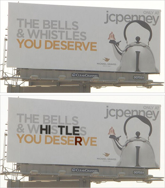
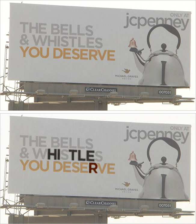
Now this is interesting. You may have heard about that JCPenney billboard ion Culver City that sparked debate because the visual of a tea kettle looked like Hitler. Now, it seems, even more Hitler has been found on the board. A copywriter who publishes the VerdantMug Tumblr noticed that within the billboard’s copy, Hitler’s name — in order — is spelled out.

Is this like that sick joke where some art director placed some phallic symbol on the cover of a Disney video? Or is it just an odd coincidence? We may never know.

Prior to this latest discovery and following the news the image looked like Hitler, JCPEnney pulled the billboard and has said any resemblance is “unintentional.” The retailer has also remove the teapot from its online store.

Of course, some think the kerfuffle is just that; an over blowen reaction to an innocuous teapot. On JCPenney’s Facebook page, a woman named Leigh Anne posted, “People are so stupid! That teapot doesn’t look like Hitler anymore than I do.”

In pere-internet days, this would probably have blown over unnoticed. Now, of course, all it takes is a few people to publicly post their thoughts which results in the lemming-like behavior of everyone else, including the the media, to jump on the bandwagon.

Though we have to admit, discovering the word Hitler within the copy does call into question whether or not the billboard’s creators had any clandestine thoughts when they concepted the board.

hitler_jcpenney_billboard_530.jpg

Fabrica Dentis Dental Clinic: White, New one, Fix

Advertising Agency: NRM, Vilnius, Lithuania
Creative Director / Art Director / Copywriter: Laimonas Jonusas

Perfect Fools Encourages You to Get Into Staring Contest with Samsung G4

When the word “free” is involved, people will do anything. They’ll even stare at a new phone with eye-tracking software for an hour to win that phone for free. We can file this under the Must Be a European Thing Club, not because people will complete strange tasks to win free products, but because they did so as crowds of people cheered on the contestants. And it’s not as if they were just staring at a phone, they were staring at a phone secure in a tall box as chefs pretended to be on fire and motorcyclists drove by for distraction. If a contestant stayed focused on the phone for more than one minute, he/she received a 100 SFr (Swiss Franc) discount. If he/she looked away for a millisecond, their turn ended. One dude, looking very European in his sleek jacket with infinite pockets, won the grand prize, a Samsung S4, in the above video (go here for more). People cheered. He now has to pay for a monthly plan.

The campaign comes from Switzerland, where creative studio Perfect Fools and Swisscom agency Heimat incorporated the smartphone’s new eye-tracking abilities to generate some buzz. The original video was filmed in Zurich, and crews will also travel to Lucerne, Bern, and Lausanne for similar showcases. If you are a guy who owns a jacket with too many pockets, you may also be able to have an opportunity to stare at a smartphone for an hour. On your mark, get set, F-R-E-E.

New Career Opportunities Daily: The best jobs in media.

Coca-Cola: Happy Can

Its been a long year of political, economic and religious upheaval in Italy, but we believe just getting people to smile can make a difference. So we asked ourselves: what if every time you opened a can of Coke, it smiled back at you? So we went to the drawing board to get it technically right to see if we could change the opening of the can into the shape of a smile. And the idea was born – a smiling Coca-Cola ‘Happy Can’

URL: http://www.happycan.info/

Advertising Agency: McCann-Erickson, Milan, Italy

Heineken: The Wall of Opportunities

Advertising Agency: Publicis, Milan, Italy
Creative Directors: Cristiana Boccassini, Bruno Bertelli
Art Director: Valeria Vanzulli
Copywriter: Francesca Bonomi
Account Supervisor: Giada Salerno
Agency Producer: Mariella Maiorano
General Manager/International Client Service Director: Daniela Di Maio
Production: Dooley Srl
Executive Producer: Marco Astarita
Director and Coreographer: Nikos Lagousakos
Set Designer: Andrea Gallo, Pollo Design
Stylist: Claudia Tortora
Music and Sound Effects: Diego Maggi
Structure and Technology Producer: Giancarlo Campora, Lime Lite
Editor: Stuart Greenwald

GQ: Beard

Advertising Agency: Lew´Lara\TBWA, São Paulo, Brazil
Chief Creative Officer: Manir Fadel
Executive Creative Director: Mariana Sá
Creative Director: Cesar Herszkowicz
Art Director: Ary Nogueira
Copywriter: Manir Fadel, Igor Cabó

AMMAR: Corner

AMMAR is a non-profit organization, fighting for human rights and labor laws for sex workers in Argentina. More than 85% of these women are mothers seeking for a law to protect them from exploitation and police violence in order to support their families and work freely. But society and justice are still unnoticed to this controversial subject, that is why they needed to call for attention.

Advertising Agency: Ogilvy & Mather, Buenos Aires, Argentina
Executive Creative Directors: Javier Mentasti, Maximiliano Madalena
Head of Art: Diego Grandi
Creative Directors: Diego Bertagni, Ignacio Jardón
Art Directors: Valeria Zicarelli, Florencia Nieves, Alejandra Mazaira
Illustration: Diego Grandi
Production: Federico Faralla , Patricio Gomez Lambí
Photos: Los Vocalino, Patricio Gomez Lambí

Puma Flash Mobs Borussia Dortmund After Champions League Final

Celebrating athletic accomplishments is one thing, but serenading the soccer team that just lost a heartbreaking UEFA Champions League Final to Bayern Munich may not be the greatest idea, especially when that team is waiting in Stansted Airport and the players look like deflated tires in designer suits. Surely, there was hard work put in by all involved – dancers, singers, creatives – and that should be acknowledged. But, the three-minute clip almost looks like a spoof video; the players seem dazed and confused as the dancers spin around to “Movin’ On Up” by veteran Scottish act, Primal Scream.

Maybe it’s a European thing, or maybe I’m not a fan of flash mobs (which apparently will never die), but I’m not sure I comprehend the randomness of this particular gesture in relation to Borussia Dortmund. In the age of organic viral content, this latest work from Puma just feels clunky and off-beat.

New Career Opportunities Daily: The best jobs in media.

Yogoberry: Fat Free Poster Display

We created a poster-display where real cups form ‘six-pack abs’ in separate feminine and masculine silhouettes. We solved the space problem and also conveyed the brand’s concept in a creative and different fashion. Reminding the customer the whole time of the product’s main benefit: 0% fat.

Advertising Agency: Staff Brasil, Rio de Janeiro, Brazil
Creative Director: Paulo Castro, Neca Bohrer
Art Director: Bernardo Machado, Pedro Vargens
Copywriter: Lucas Ribeiro
Illustrator: Bernardo Machado
Account Manager: Rafaella Eyer
Account Supervisor: Renata Ouvidor
Graphic Producer: Ronaldo Las Casas
Advertiser’s Producer: Rafael Bae

AES Eletropaulo: Light Posts Projectors

Advertising Agency: dim&canzian, São Paulo, Brasil
Chief Creative Officer: Michele Dim D’Ippolito
Chief Media Officer: Marcio Canzian
Creative Director: Michele Dim D’Ippolito, Gabriel Araujo, Bruno Salgueiro
Art Director: Thiago Nabisco, Wanslez Quaresma, Bruno Salgueiro
Copywrite: Samuel Segatelli
Diretor: Marcos Alberti
Sound Design: Shuffle Áudio
Producer: Murilo Moura
Planner: Samantha Barbiere
Editor: David Donato
Editor: Teisson Froes