Une réalisation de Zaha Hadid pour la marque de prêt-à-porter Neil Barrett et sa boutique à Tokyo. Deux étages en blocs de corian blanc, pour un rendu dynamique et des lignes fluides. Plus d’images dans la suite.
Un design de robinet épuré et conçu par Shen Di pour gérer la pression de l’eau. Sous la forme d’un levier de vitesse avec 4 positions, il diffuse une quantité d’eau adaptée aux besoins de chacun. Explications dans la suite.
Gary Hustwit is working on a documentary about industrial design. “Objectified” will offer a look behind the scenes of everything from furniture to gadgets, with an emphasis on the creative process and the people behind it. The trailer looks very promising:
O Gatorade, popular bebida isotônica da PepsiCo, apresentou nos Estados Unidos suas novas embalagens e campanha, criadas pela TBWA/Chiat/Day.
A iniciativa é estrelada por diversas celebridades do esporte, como Muhammad Ali, Serena Williams, Dwayne Wade, Derek Jeter, entre outros. Além do filme que você pode assistir abaixo, foram lançados outros três (1, 2 e 3)
A campanha não tem demais, mas a mudança das embalagens ficou bem interessante, mais limpa e moderna do que as antigas.
Une réussite pour ce designer contemporain et français Charles Kalpakian, avec l’élégant meuble et armoire intitulée Graffititek Bookshelf. Une installation inspirée par le mouvement du street-art à Paris.
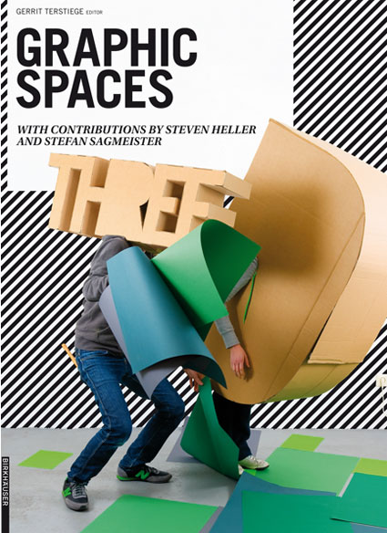
Three D: Graphic Spaces, edited by Gerrit Terstiege, the editor-in-chief of European design magazine form. Includes a design-historical essay by Steven Heller, an interview of Stefan Sagmeister about his typographical installations and various interviews with graphic designers by Sophia Muckle.
(Amazon UK and USA)
Publisher Birkhäusersays: Three D – Graphic Spaces highlights a current trend in international graphic design: more and more visual designers are staging their compositions as three-dimensional scenarios, in order to turn them into posters, magazine covers, web sites, and animated films. The result is a host of suggestive new pictorial worlds that range from playfully arranged still lifes to room-filling installations. Edited by Gerrit Terstiege, editor-in-chief of the European design magazine “form”, and designed by the prizewinning German studio Pixelgarten, this book offers an inspiring look at the various modeling techniques and means of expression involved.
The book collects designs of about 50 international creative individuals and studios. A volume on a similar subject, Book review: Tactile – High Touch Visuals, was published last year but Three D: Graphic Spaces is way more talkative, offering essays, deeper analysis and descriptions.
The projects are grouped into 4 main categories: Still Lifes Come Alive, Intricate Installations, Touching Type and Thrilling Animation.
Nice touch: at the end of the book, you’ll find a small description of the design studios as well as the contact address and url of their website.
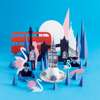
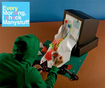
Damien Poulain, 3-D illustrations for Uniqlo paper no.3, 2007. Tokyo, New York and London are neatly and unmistakably represented using just a couple of landmarks and key elements of the local culture.
Uniqlo paper no.3 (worldwide). Photography: Lacey
Rita’s Living Room sketches the typical style of a Québec living room. Nothing glamor or ready for the pages of trendy design magazines, just simple, archetypical decoration and lay out. Ultimately, the designers ask: ‘Where is the design? What is design anyway?’
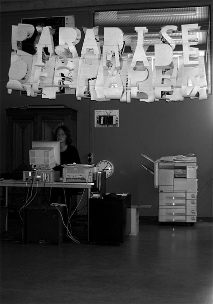
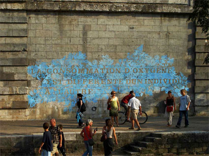
Jocelyn Cottencin‘s practice stands at the intersection of photography, video, installation and graphic design. Her 2004 wall drawing La consommation d’oxygène est différente d’un individu à l’autre (‘the consumption of oxygen differs from one individual to another’ video) is based on the typo ‘Floréale’ that she created in 2003. Convinced that the fate of her work was to disappear swiftly, she used chalk to draw the floral pattern. Surprisingly the work remained intact for 3 years.
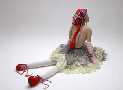
Elene Usdin‘s La Barbe Bleue series turns the most terrifying aspects of Bluebeard‘s butchery of his wives into dolls limbs and threads of wools.
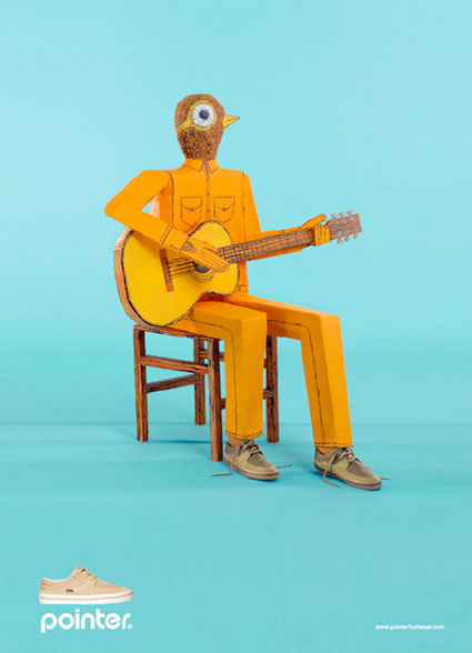
Playarea for footwear Pointer. Models are robots given the illusion of 3D life with the help of soft shadows.
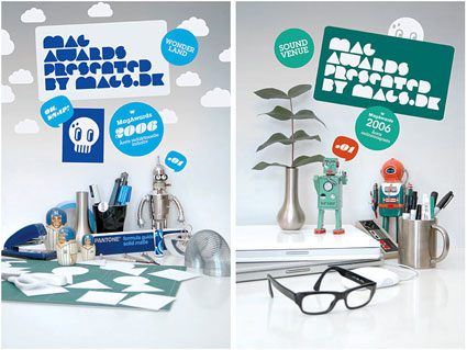
Emil Kozak‘s work for MAG, a competition for the best magazines in Denmark. All the posters Kozak designed for each award have a connection to the medium of the award.
By Gary Hustwit, the same man behind Helvetica: The Film, now comes Objectified, a documentary dedicated to our relationships with objects in everyday living, from the idea to the final product.
A must-see for any kind of designer at the very least.
The movie hasn’t been released yet. Any new information will of course be posted here.
Un chargeur de batterie universel sous la forme très originale d’un grille-pain. En activant le levier lorsque la batterie est chargée, elle remonte automatiquement, comme un toast. Un concept produit par le designer coréen Hyun-A Ko.
Une sélection d’excellents packagings à découvrir dans la suite sur des bouteilles de laits. La plupart sont conçus en point de croix, de manière très créatives par le studio Hattomonkey.
Incredible lamps looking like they are melting, by japanese studio Kyouei Design. Check out the rest of their stuff, they got some really interesting products.
Ces meubles sont conçus à partir de matériaux neufs et de planches en bois ancien. Grâce à l’artiste suédoise Katarina Häll, ils combinent à la fois fonctionnalité et simplicité.
Dans le même esprit que Pong Watch, voici 3 prototypes intitulés Tv Star, Tetris et Pong. Ils sont conçus pour la marque Nixon, sur une réalisation du graphiste Lysandre Follet.
Here’s a personal collection of things I’ve been wanting to blog about for a while, and it seems like the right time of the year to put them all together. Enjoy!
Yulia BrodskayaAmazing paper illustrations by the Russian designer (now living in London)
Knitta Please – Urban guerrilla knitting group. Illegal? Doesn’t look that illegal when it’s so colorful and harmless, right?
Here’s a little interview to the artist themselves:
Aspen Boutique(formerly Aspen Traders) – A long-standing tradition of mailing fanciful holiday cards to their customers, since 1987. Beautiful and creative X-mas cards designed by Gardner Design
So yesterday, when I visited one of my big clients, it turned out that as part of a “green” initiative, they decided to eliminate the sign-in sheets at the front desk to save paper.
If you’re also looking to save resources any way you can, try a href=”http://www.ecofont.eu/ecofont_en.html”Ecofont/a, the new font with little clear circles inside it so it uses less ink.
a href=”http://www.guardian.co.uk/environment/blog/2008/dec/22/waste-ethicalliving”The Guardian has more:/a
blockquoteThough rather striking, the typeface is wholly readable (no pun intended) and is, apparently, most effective at nine or 10 point. It’s also sans serif, because, of course, the little flourishes on serif fonts will use up more ink when being printed.
Spranq claims that the Ecofont will reduce ink use by up to 20% – not bad for something that was developed over “lots of late hours (and coffee)”./blockquote
pa href=”http://feedads.googleadservices.com/~a/fdhK5K5lbvl_ZOP3ebb1JIawF1M/a”img src=”http://feedads.googleadservices.com/~a/fdhK5K5lbvl_ZOP3ebb1JIawF1M/i” border=”0″ ismap=”true”/img/a/pdiv class=”feedflare”
a href=”http://feedproxy.google.com/~f/Adpulp?a=SqEzyBb4″img src=”http://feedproxy.google.com/~f/Adpulp?d=41″ border=”0″/img/a a href=”http://feedproxy.google.com/~f/Adpulp?a=tkxSaGw8″img src=”http://feedproxy.google.com/~f/Adpulp?d=43″ border=”0″/img/a a href=”http://feedproxy.google.com/~f/Adpulp?a=4gHE9kLs”img src=”http://feedproxy.google.com/~f/Adpulp?d=50″ border=”0″/img/a
/div
Le concept : une fondue au chocolat d’une taille de 12 centimètres en porcelaine, afin que le chocolat reste chaud sans jamais brûler. Une réalisation de Jakob Wagner, artiste en provenance du Danemark. Plus d’images dans la suite.
Bagvertising isn’t new, I’ve seen it many times before, but the results are often very nice.
Just like this one for example:
Although I like this example, I seriously doubt that the optical illusion is as good in real life as it is in these pictures. If the optical illusion is any good you can be sure of two things:
a) this bag will turn some heads when an old lady walking down the street is carrying it.
b) a lot of people are going to want one of these bags.
This is site is run by Sascha Endlicher, M.A., during ungodly late night hours. Wanna know more about him? Connect via Social Media by jumping to about.me/sascha.endlicher.