Foot Locker Catches Emoji Fever With 80 Individually Drawn 'Shoemojis'

If your brand hasn’t made custom emojis yet, sorry—it’s now mandatory.

Or so it seems, given the rush of marketers doing so. And the latest brand to jump quite literally into the mix is Foot Locker, which is stocking its smartphone app with a library of “Shoemojis,” beginning with 80 individually drawn sneakers from iconic brands like Nike, Adidas, Asics, Under Armour and more.

“Communicating with your fellow sneakerheads will never be the same,” says BBDO New York, which conceived the concept with the client. More images below.

CREDITS
Client: Foot Locker
Project: Shoemoji
Agency: BBDO New York
Chief Creative Officer, BBDO Worldwide: David Lubars
Chief Creative Officer, BBDO New York: Greg Hahn
Executive Creative Director: Chris Beresford-Hill
Executive Creative Director: Dan Lucey
ACD: Damjan Pita
ACD: Derek Harms
Director of Creative Technology, Experience and Design: Simon Mogren
Art Director: Bhanu Arbuaratna
Senior Designer: Jason Merenda
Copywriter: Allie Townsend
Director of Integrated Production: David Rolfe
Director of Digital Operations: Clemens Brandt
Senior Producer: Carissa Ranelycke
Director: Janelle Van Wonderen
Account Manager: Nick Robbins
Account Executive: Samuel Henderson
Senior Digital Strategist: Rhys Hillman
Production Company: The BBBDO Digital Studio
Technical Director: Michael Condouris
Associate Technical Director: Konstantin Rosinov
Studio Director: Marty Ford


Tiny Billboards for Ant-Man Are Popping Up That Ants Are Really Going to Love

There’s something irresistible about tiny billboards.

We’ve seen them before, of course—for example, there was this LittleBigPlanet campaign from 2008 and this Lego stunt from 2012. And now, the upcoming superhero film Ant-Man is joining the parade, with ant-size billboards popping up in several Australian cities ahead of that country’s July 16 release of the movie.

There’s even an ant-size bus shelter with an ad on the side.

Check out more images below, via Screencrush and This Is Film.

For its next stunt, the studio might want to enlist the World Wildlife Fund’s horde of leaf-cutter ants to parade the film’s tagline around.


NYC Agency Sagmeister & Walsh Says It Was Robbed, but It's Strange What Got Stolen

Sagmeister & Walsh says a brazen robbery has occurred at its New York offices, with three men making off with its most valuable property—and the whole thing caught on tape by the ceiling camera that normally streams live footage of the studio to the agency’s website.

Except … wait just a minute.

Creative Review reported on the robbery, and the agency tweeted a link to the story.

But it’s soon clear that something is fishy. The pantyhose over the head seems a bit clichéd. And then, the kicker—the Creative Review story says the thieves took the agency’s work. And apparently nothing else.

Asked today about the supposed crime, the receptionist at the agency laughed out loud and confirmed the gag. An agency so good that robbers come and steal the work? Well played.


Blindfolded Kids Try to Recognize Their Moms in This Lovely, Smash-Hit Mother's Day Ad

Are you unique enough that your child could pick you out of a lineup by touch alone?

The charm-bracelet pushers over at Pandora Jewelry have just released The Unique Collection, but you won’t see much jewelry in this two-minute spot by Grey New York. Instead, you can watch them prove how every woman is unique, and try not to cry, as kids are blindfolded and asked to pick out their moms by touch alone.

The children, ages 3-9, touch rings and bracelets, hair and noses. Check out the video to see how they do.

Even more touching is the worry on each mom’s face as she waits to see if her child would recognize her, followed by tears of joy when they do. It underscores how irreplaceable our moms are, and how important it is to them that we know them well—particularly on days like Mother’s Day. (Hint, hint, buy her some personalized jewelry.)

Though the video stars moms and has been released well before Mother’s Day (it already has more than 14 million views on Facebook and 7 million on YouTube), Pandora’s call to action wisely tells people to celebrate the woman in their heart—noting that all women are unique, whether they’re a mom or not.

It’s also a not so subtle hint to her significant other, because c’mon, that 3-year-old isn’t paying for the bracelet himself.


Kmart Celebrates Sloth With Joe Boxer's Inactivity Tracker and an Hourlong Ad About Nothing

Nike FuelBand may have fizzled out, but luckily the Joe Boxer Inactivity Tracker is here to take its place.

Kmart is promoting its Joe Boxer pajamas with a new digital bracelet that’s just like any of the other quantified-self fitness pieces on the market, only instead of making you feel guilty for missing your workout, it will celebrate you for it.

The brand is giving away the devices with select pajama purchases while supplies last—an accompanying app rewards extended sloth with badges like “Cryogenic” and “You rock!” (in this case, meaning the noun first, and the adjective second).

Even if you don’t snag one of these hot ticket items, you can enjoy the hourlong launch ad below—a window into the “2015 Joe Boxer Lounger Games,” where two guys sit in recliners trying to move as little as possible.

It really goes all in—purportedly focusing on the ninth hour of the fierce completion—and delivering 60 minutes of impressively inane announcer commentary, which makes it just like any other sport, really. (There are plenty of amusing tidbits mixed in if you skip around. Or if you have the stamina to watch all the way through, presumably, you can also tune back in for hour 10 on ESPN 35.)

The whole FCB project pokes some excellent fun at the tech-driven zeitgeist, and the world can always use more paeans to laziness. But any real pro couch potato will tell you it’s better to skip the long pants altogether, especially with summer coming up fast.


Craigslist User Warns Against Buying Secondhand Imperial II-Class Star Destroyer

If you’re not into Star Wars, you might as well sign off the Internet for the rest of the year. Not only are the filmmakers going to bombard you with content, everybody else is, too.

Case in point: A Craigslist user in California posted a “buyer beware” listing warning people not to purchase the Imperial II-Class Star Destroyer seen in the most recent Star Wars: The Force Awakens trailer.

Fake Craigslist ads are a hallowed genre, and this one is pretty solid—as the user warns that the vehicle is “totally infested with roaches and womp rats” and “there’s no way this thing is ever going to pass emissions.”

Check out the full text below.

BUYER BEWARE: Imperial II-class Star Destroyer – $1 (Mad River)

I just wanted to make sure people are aware, this is a total scam. I drove all the way out there to look at this thing and the guy wanted a huge deposit before he’d even let me take it for a spin.

After looking around a bit I’d be surprised if this thing could even finish the Kessel run, let alone do it in a decent time. It’s totally infested with roaches and womp rats, so when you figure the cost of a 6.2 trillion cubic foot fumigation job, this thing is a total write-off for that reason alone.

I know it’s had Sand People in it, but all the tracks are single file so who knows how many have been in there or what parts they’ve ripped off.

You can’t even get this thing licensed in most states until you remove all 384 turbolasers and the ion cannons will have to be retrofitted with low-capacity magazines (thanks Obama), and there’s no way this thing is ever going to pass emissions.

The “carbon scoring” is conveniently makes the serial numbers unreadable, so I can’t even verify what model year this thing is, but I suspect that it’s the year that no one wants because there weren’t any handrails on the control deck. The whole “open bridge” thing was a terrible idea. It’s like the Pontiac Aztec of star destroyers.

So save yourself a trip. The guy just wants this crap off his farm but doesn’t want to pay the Jawas to haul it away.

Believe me, this isn’t the star destroyer you’re looking for.


Tokyo Airport Terminal Is Designed Like a Running Track Ahead of the 2020 Olympics

Tokyo’s Narita International Airport has built a new terminal with walkways outfitted in the style of indoor running tracks—a fitting precursor to the 2020 Olympic Games, which the city is hosting (even if it’s a bit premature, as the 2016 Games haven’t even happened yet).

The terminal’s foot traffic lanes are color-coded and use stenciled symbols to represent various airport destinations. The design—for which Japanese agency Party can be thanked—is also a side effect of the project’s low budget (there are no moving walkways), and the flights operating from the terminal are mostly low-cost carriers.

As a whole, the theme provides some fun (if unintentional) commentary about the rush of modern air travel. And so as long as people can figure out the stencils/lane color pairings, it’s a success on a couple of fronts. If they don’t, they’ll get a head start on being aggressively inconvenienced by the time the Olympics show up to wreck their city for months on end.

Via PSFK.


W+K Travels to 1960s Iceland for This Wry and Beautiful Yogurt Commercial

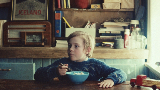
Somebody get this kid a bike! (And snowshoes, while you’re at it.)

Orri, the plucky little dude in this fanciful 90-second ad from Wieden + Kennedy London introducing Arla’s Skyr Icelandic yogurt to the U.K., Germany and the Netherlands, really has it rough. Most of the action takes place in 1968, as the boy braves storms and covers vast distances, always on foot, to deliver messages that arrive via his remote village’s only telephone. (Often, these communications are of a less-than-urgent nature, such as, “Your trousers are ready for collection.”)

Does he even draw a salary? Or get tips?

On the plus side, Orri enjoys heaping bowls of Skyr to power his travels.

The low-key, humorous film, W+K’s first work for the brand, is expertly directed by Dougal Wilson, who placed two spots (“Monty the Penguin” for John Lewis and “Adventure Awaits” for Lurpak) among Adweek’s top 10 ads of 2014.

This Skyr ad, “The Messenger,” really delivers, subtly touting the brand as a hearty snack or meal while keeping viewers engaged and smiling. W+K’s Thom Whitaker, who wrote and art directed the work with Danielle Noël, chatted with us about the commercial:

Where did the idea come from?
Skyr’s full of protein, so we wanted to tell a story of extraordinary Icelandic strength, but one which people weren’t familiar with or had heard before. We’d heard about young Icelandic kids working as telephone messengers back in the ’60s—which we thought could be the perfect story to tell.

Why go this route with the creative?
Because of Iceland’s tradition for Viking sagas, it felt right to create our own epic story for this Icelandic yogurt. We wanted to go back to the old tradition of classic storytelling—a bit like the old Stella Artois work.

Skyr has got a pretty wide appeal. It’s very much Scandinavia’s answer to Greek yogurt, and in Iceland it’s part of everyone’s daily diet, so we thought the story of the little boy was universal enough for everybody to enjoy.

Why keep the product mostly in the background?
We wanted to weave Skyr into the story in the natural way, while giving as much screen time as possible to the boy’s epic journey, so that the final payoff becomes even stronger.

Some have likened the approach to Wes Anderson. Agree or disagree?
It does have a bit of a Wes Anderson vibe to it, but that wasn’t really intentional. The brightly colored houses and the retro wardrobe might have something to do with it. We should have set the titles in Futura!

Any amusing anecdotes from the shoot?
The lighthouse scene was pretty interesting—a full-on Icelandic storm was battering the cliffs and it felt like we could be swept away at any second. I don’t think we’ve ever been so happy with a first take.

Skyr’s got more work coming out soon?
Short films [not by Dougal Wilson] are out next week on YouTube and Facebook and are called “Skyr Guides.” They’re also from W+K, but Toby Moore and Selena McKenzie are the brains behind them, not us [Thom and Danielle].

They’re basically two short portraits of modern-day Icelanders who exhibit the same sort of strength as Orri does in our film: Kolla, a cyclist who braves the Icelandic climate every day, and Joi, a modern-day Viking who’s a doorman at one of Reykjavik’s oldest nightclubs and who’s not averse to putting Skyr on his steak. They’re all about introducing us Brits to Skyr—the history of it, what it’s good with, how it’s pronounced.

CREDITS
Client: Arla Foods
Project Name: Arla Skyr
Media Channels: TV, OOH, DOOH, Online Films
Lead Client Name: Sam Dolan
Agency: Wieden + Kennedy London
Creative Directors: Dave Day, Larry Seftel
Copywriter: Thom Whitaker, Danielle Noel
Art Director: Thom Whitaker, Danielle Noel
Executive Creative Directors: Tony Davidson / Iain Tait
Agency Executive Producer: Danielle Stewart
Group Account Director: Katherine Napier
Account Director: Will Hunt
Account Manager: Maria Kofoed
Head of Planning: Beth Bentley
Planning Director: Theo Izzard-Brown
Planner: Rachel Hamburger
TV Producer: Matthew Ellingham
Creative Producer: Michael Winek
Production Company: Blink
Director: Dougal Wilson
Executive Producer: James Studholme
Line Producer: Ewen Brown
Director of Photography: Karl Oskarsson
Editorial Company: Final Cut
Editor: Joe Guest
Post Producer: Julie Evans
Post Executive Producer: Julie Evans
VFX Company: MPC
VFX Supervisor: Bill McNamara
Flame Artist: Tom Harding
VFX Producer: Julie Evans
Colourist: Jean-Clément Soret
Titles/Graphics: MPC
Music+Sound Company: Alex Baranowski
Composer: Alex Baranowski
Sound Designer: Anthony Moore
Producer: Becs Bell
Mix Company: Factory
Mixer: Anthony Moore
Producer: Becs Bell
Online Films:
Art Director: Toby Moore, Selena McKenzie
Copywriter: Toby Moore, Selena McKenzie
TV Producer: Greg Hemes
Production Company: TrueNorth
Editorial Company: WracK
Print Production:
Art Director: Thom Whitaker, Danielle Noel, Kelly Satchell
Copywriter: Thom Whitaker, Danielle Noel
Head of Design: Karen Jane


Google Joins the Hunt for the Loch Ness Monster With Underwater Street View

People have been looking for the Loch Ness Monster for centuries, but now Google has brought some high-tech dragon-hunting software to the search.

The company, with help from London agency adam&eveDDB, has brought underwater Street View to the famous Scottish loch, having introduced it last year to the Great Barrier Reef. You can now jump right into Loch Ness in Google Maps, and peer down into the murky depths.

You won’t see quite as much as you do at Great Barrier Reef. But it’s a charming conceit, and one that Google is running with—even going so far as putting a Loch Ness doodle on the Google U.K. homepage. Meanwhile, adam&eve made the video below to go with the project.

“A huge part of Google’s mission is to help make mysterious places more accessible to everyone, and there’s no more emotive, exciting example of that than revealing what’s beneath the waters of Loch Ness,” says Alex Hesz, director of digital at adam&eveDDB.

“This is a place of enduring mystery and profound beauty, and we were lucky enough to accompany Google’s underwater capture team on a truly extraordinary task. We think that the campaign really captures the scale of that undertaking, the beauty of the place, and the reasons why Loch Ness has retained such a sense of mystery and intrigue for so many, for so long. The fact that everyone can now explore it for themselves is hugely exciting.”

CREDITS
Client: Google
Project: Explore Loch Ness with Google Maps
Brief: Google gives access to explore hidden places
Creative agency: adam&eveDDB/Google Creative Lab
Chief Creative Officer: Ben Priest
Executive Creative Director: Ben Tollett, Richard Brim
Creative Director/s: Paul Knott, Tim Vance and Google Creative Lab
Planner: Will Grundy
Account Management: Alex Hesz and Sam Brown
TV Producer: Ben Sharpe and Jordan Cross
Production company: Sonny
Director: Nick Rutter
Editor: Gary Forrester
Edit House: Marshall Street Editors
Soundtrack name and composer:  “The Search” by Brendan Woithe
Post-production: The Mill
Audio post-production: Clang @ Marshall Street


Check Out the Amazing Welcome Kit This Ogilvy Office Gives Each New Hire

It’s a red box, but in some ways it’s more like a red carpet.

Ogilvy Cape Town has been giving a remarkable welcome box to employees over the past year. And now, it’s been shortlisted in the design competition for this year’s One Show. Deservedly so, as it’s probably the best agency employee welcome package we’ve seen.

The so-called “Induction Box”—made by Ogilvy’s RedWorks production arm (which was recently merged with its other production agency Hogarth Worldwide)—is based around David Ogilvy’s short book The Eternal Pursuit of Unhappiness and his famous eight habits of highly creative communities.

The box brings the concepts to life in a tangible way, making employees much more likely to read and absorb the philosophy underpinning the agency. Check out the contents of the box in the images below.

Click the images to enlarge.

We spoke to Ogilvy Cape Town about how the box came about, and how it’s been received.

What was the motivation for creating something like this?
The idea behind this is to give someone a piece of Ogilvy & Mather, because at the end of the day, the box represents who we are and what we stand for. It is easy to pull someone aside and say, “Welcome to the agency.” But with the Induction Box, we want to make people feel like they belong, like they have found a place here. Working at Ogilvy is so much more than just another job. We wanted to create something that reflects this.

How did David Ogilvy’s ideas inform the design of the boxes?
When you are hired by Ogilvy, it is because someone saw something great in you and that you would be a good fit here. There is a definite “Ogilvy Way” based on The Eternal Pursuit of Unhappiness (or Divine Discontent) and David Ogilvy’s 8 Creative Habits—Courage, Idealism, Curiosity, Playfulness, Candor, Intuition, Free-Spiritedness and Persistence. Getting new staff to understand and embrace all of this in a fun and engaging way was our main focus. The Induction Box solidifies the importance of what we stand for.

What was RedWorks’ role in designing the boxes?
Inspired by The Eternal Pursuit of Unhappiness, Redworks decided to unpack the eight habits by making them tangible. Their solution was a layered box containing interesting, fun, quirky elements representing the eight habits, accompanied by phrases elaborating on it. It not only reflects Ogilvy’s rich heritage, but also provides all the necessary information about the working environment in a visually stimulating way.

How do new hires generally respond?
The response has been well beyond what we could have imagined. It ties everything together beautifully. People light up when they receive them. We often get a nudge from existing employees asking if they can get one, too.

Have other Ogilvy offices shown interest in using the boxes, too?
Not only has the Ogilvy Induction Box been introduced to staff at Ogilvy & Mather Johannesburg and Durban, but O&M London and Australia have been working on their own adaptations to give to new employees.


South Dakota's Official Ad Campaign Asks: 'Why Die on Mars When You Can Live Here?'

South Dakota sets the bar low with a new ad campaign that basically says, “Hey, at least we’re not Mars.”

Aimed at both tourists and potential long-term residents, the campaign—developed by Sioux Fall ad agency Lawrence & Schiller—reminds us all that Mars is a barren wasteland with no water or oxygen, while South Dakota is, well, not that. Also, there are jobs. That is quite literally the tone they are using to sell people on life in South Dakota.

However cavalier their attitude may be, the campaign is based on research into the general perception of South Dakota, which itself can be summarized as a “barren wasteland.” One response even compared life there to “living in a mental asylum.” Yet the state has an unemployment percentage well below the national average and is seeing growth in a couple of different industries—plus it has none of North Dakota’s oil-shale boom towns driving up crime and other unpleasantness.

Seeing that the more serious tone of past campaigns hadn’t really changed anyone’s perceptions (including the one touting the state’s lack of income tax), Lawrence & Schiller decided to gamble on a looser tone that plays on a currently trending news item.

And why not? Even if it doesn’t work, it’s still less dumb than volunteering for a doomed Mars flight that probably won’t even happen.

Read more about the campaign here.


Men Face a Gut-Wrenching Choice of Their Own in This Parody of Dove's Doors Ad

Men, if you saw a door marked “Big Dick” and a door marked “Average Dick,” which would you walk through?

Two weeks ago, Dove released a new video in its long-running Real Beauty campaign where they put the words “Average” and “Beautiful” over doors and figured out which women lacked self-confidence and which were full of themselves. Just kidding, they tried to get women to see that they could choose to see themselves as beautiful.

The divisive video was greeted with booth cheers and jeers, caused a kerfuffle over at BuzzFeed, and like past Dove videos, was ripe for parody. And indeed, Funny or Die produced the little video below that suggests once again that men, at least compared to women, don’t have a lot of self-confidence problems.

Of course, in reality, men also suffer from self-esteem issues, but the parody brings up some excellent points that many detractors have leveled at the original video. Namely, what’s so bad about being average? And where in our culture do we draw the line between healthy self-esteem and being embarrassingly full of yourself?

The guys in this video run the gamut from full-of-yourself you’re delusional (“It’s a bit like Big Ben”) to depressingly desperate (“Have sex with me, please!”). When our society values both confidence and modesty, it’s hard for women or men to win the physical beauty game. The paradox is aptly put in the One Direction lyric: “You don’t know you’re beautiful, but that’s what makes you beautiful.” In other words, One Direction doesn’t think any of the ladies who walked through the beautiful door are actually beautiful.

Which brings about larger questions: Who’s the arbiter of beauty? Who gets to decide who’s beautiful or who’s dick is big? Are we talking length or width, inner beauty or outer? And of course, why does society prize physical beauty in women above so many other features—and big dicks for men above, say, the ability to actually please a woman?

But you don’t have to think about all that to enjoy the parody. All you need to know is: Ha ha, dicks!


This Cool Tumblr Imagines If Ad Agencies Were Ice Cream Flavors

If famous ad agencies were ice cream brands, what flavors would they be?

Aditya Hariharan and Joshua Namdar, a pair of students at the Miami Ad School in New York, took a swing at visualizing the answer with Agency Scoops, a Tumblr that features mockups of ice cream names and package designs for well-known agencies, themed around their more famous campaigns.

That means scary but tempting mashups like “Cookies ‘N Bacon” for 360i (for its well-known clients Oreo and Oscar Meyer). Other fun visuals include one of McCann’s “Dumb Ways to Die” blobs, who’s very plausibly eaten himself into an early grave by way of chocolate ice cream (the only flavor that really matters, in the end).

It’s a nice, simple job-hunting gimmick from Hariharan and Namdar, who are looking for summer internships. The front of the cartons also feature taglines that trend toward ingratiating, with some of them perhaps less flattering than intended. (DDB Lemon Sorbet, “a slow-churned classic agency with a hint of forward thinking,” might take exception to the idea that it’s only slightly innovative, like a 55-year-old VW Beetle with a new paint job, squeaking toward the future.)

Where real ice-cream might list ingredients, these cartons feature past creative highlights for each agency, as well as recent awards. There’s even a timely nod to the Mad Men craze, with a 10th design featuring fictional agency Sterling Cooper & Partners.

Ogilvy & Mather, represented as Coca-Cola, is maybe the only one that seems a bit off the mark, in spirit. Yes, the smash hit personalized bottle campaign originally came out of Ogilvy’s Sydney offices. And the “2nd Lives” campaign from China was a head-turner. But everyone and their mother has worked for Coke, somewhere in the world, and the agency’s brand might be more strongly associated IBM or Dove.

Then again, nobody wants to eat mint chocolate microchip or soap flavored ice cream.

See more at the Tumblr site.


3 New Businesses in Omaha Are Making People Cringe, but They're Doing Good Work

Three strange storefronts have popped up in Omaha recently that you wouldn’t to enter—but they’re part of a PSA campaign telling residents that, unfortunately, sexually transmitted diseases are open for business in the city.

Omaha has had a shockingly high STD rate for over a decade, and it’s only getting worse. Cases of gonorrhea and syphilis are up by 15 and 23 percent, and Chlamydia reached an all-time high in 2014 with 3,390 reported cases.

The storefront campaign by Serve Marketing, timed to National STD Awareness Month, aims to get people talking about the crisis—and give them information to get checked. The campaign includes TV, outdoor, radio, social and digital banners for the fake businesses.

“This has been a closeted issue in Omaha for decades,” says Serve creative director Gary Mueller. “If we want to ultimately lower the STD rate and change people’s behaviors, we need to be bolder and more aggressive about getting people to talk about the issue. We think this will get people talking.”

The storefronts:

The outdoor ads:

The commercials:

CREDITS
Agency: Serve Marketing
Creative Director: Gary Mueller
Art Director: Matt Herrmann/Carsyn Taylor
Copywriter: Nick Pipitone
Account Executive: Heidi Sterricker
Social Media: Alex Boeder + Lauren Wagner
Producer: Jessica Farrell
Director Of Photography: Quinn Hester
Editors/GFX: Special Entertainment LLC (Bobby Ciraldo + Andrew Swant)
Assistant Editor: Jon Phillips
Audio: Peter Batchhelder
Production Manager: Rob Birdsall


Milton Glaser Explains the Value of Design Beyond Just Selling Stuff

“By the time I was in kindergarten, I had been designated as class artist. Some of the older kids discovered that I could draw girls doing unspeakable things, and I could get a nickel apiece for those.”

Thus began the illustrious career of design legend Milton Glaser, 85, who discusses his life and work in this insightful and charming video made by Poppy de Villeneuve for The New York Times.

Among the many highlights packed into three minutes:

• Glaser recalls creating the iconic “I [Heart] NY” logo on an envelope while riding in a cab: “It was an expression that people felt, and it was sort of inside out rather than outside in.”
• He recounts the early days of New York magazine: “We learned on the job. It was so primitive—no computers of any kind.”
• And he reveals the simple yet awesome power of design: “You invent what is real when you look at something and draw it.”

It’s an inspiring piece that transcends its subject matter, reminding viewers that magic can happen in business and life when you follow your heart.

Separately, Glaser has also weighed in on Hillary Clinton’s much-debated presidential campaign logo. Check out his verdict here.

Via Design Taxi.


A 5-Year-Old Girl Calls the Police and Saves Her Mom's Life in This Remarkable PSA

Real audio of a 5-year-old girl calling 999 (Britain’s version of 911)—after her mother has had a seizure—anchors this compelling new PSA from Grey London aimed at getting more parents to teach their kids how to call the police in an emergency.

Elleemae Addison was home with her mother Loretta and her baby sister when Loretta had an epileptic fit in 2012. Luckily, Elleemae had been taught how to dial 999. Check out the how the call went here:

The PSA, supported by British Red Cross, is for parenting website Mumsnet. In a Mumsnet survey of 757 people, 37 percent of them said they had not taught their child to dial 999. Nearly half of them said it was because they didn’t think their child was mature enough.

“Nobody wants to think about the circumstances in which their child might need to call 999, but as Elleemae’s story shows, it can literally be a lifesaver,” says Mumsnet CEO Justine Roberts. “We hope this powerful film will encourage parents to take a deep breath and have a chat with their children.”

For visuals, the ad uses home movie footage of Elleemae and her family.

“Ads are glossy and distant. How we record our lives is awkward, beautiful, and constantly changing,” says Grey London chairman and chief creative officer Nils Leonard. “The black holes, mixed media, low resolution, distortion and awkward crops are the canvas of our real lives, and the craft leveraged here was all in service of amplifying this incredible phone call with as much emotion as possible.?”


David Hasselhoff Reaches Peak Self-Parody in Promo for Kung Fury

Dinosaurs, fingerless gloves, punks, skateboards, hacking and traveling back in time to try to kill Hitler. It’s everything you ever loved about the ’80s in one film—now including David Hasslehoff.

Kung Fury is a film that was funded on Kickstarter and is due to premiere May 28 on YouTube. The epic trailer for the film is what got the project funded, so they haven’t released a new one. Instead, they’ve just put out a music video with David Hasselhoff who sings the lead track, “True Survivor.”

And it is going to make this film #TakeHoff.

Hasslehoff is resplendent in a mullet, fingerless gloves, Converse high-tops and a custom airbrushed Kung Fury letter jacket as he saunters, shoots, splits and sings his way through the epic scenes of the film.

The synth is strong with this one, and the time is right, as millennials have come to that point in their lives when they have money and are willing to part with it for anything that reminds them of their childhoods.

Even if Harrison Ford and David Hasslehoff happen to look really old now.


Empty Wheelchair Chases People Around a Mall in One of the Meanest Ad Pranks Yet

Hand out fliers about the dangers of osteoporosis pretty much anywhere and see what happens. Crumple. Toss. No one reads all those statistics. But chase those same folks with a remote-controlled wheelchair? Now you have yourself a public service campaign.

Never mind that it could spike some heart rates—why is that contraption following me?—it’s for the greater good.

The prank-style awareness campaign, from FCB Health for Crouse Hospital in Syracuse, N.Y., shares some fairly alarming data: About 54 million Americans have osteoporosis or low bone density, and one in two women over age 50 will break a bone due to osteoporosis. Recovery can be brutal, or nonexistent—hence the wheelchair as the central prop.

With slightly more ominous background music, “Beware the Chair” could double as an ad for a horror flick. (Put a creepy baby in it, and you have a Thinkmodo production.) Initial reaction seems to be pretty strong, judging from the video. Or maybe those people were already trembling?

The work will get print, outdoor and heavy social media distribution via Crouse Hospital’s Twitter, Instagram, Facebook and YouTube. FCB is also offering it free to hospitals and health care groups across the country.


Groupon Employees Read Their Favorite Sexual Comments About the Non-Sexual Banana Bunker

For Groupon, it’s the Bunker that keeps on bunking (but not bonking).

The Banana Bunker, that famously suggestive-looking banana holder, is back “by popular demand” on the Groupon site this week. And given the success of its hilarious Facebook thread about the product last time (click here for a recap, if you were living in a real bunker at the time), the company had to do something special to celebrate.

So, it got some of its employees to read their favorite comments from the earlier thread.

Check out the YouTube video above. The video is also posted to Facebook, of course, which means there’s yet another comment thread. But Groupon is apparently not going to reply to everyone this time—just a few people (see below).

That’s understandable—it’s bunker-busting work.


Ikea Gets Into the Wedding Business, Promising to Marry People via Webcam

Does your dream wedding include getting married via webcam? You should sign up for Ikea’s newest service.

The Swedish furniture chain has launched “Wedding Online,” a (somewhat) tongue-in-cheek site that lets users pick a theme and setting—beach, boat, circus, forest, rooftop—and then hold a remote virtual ceremony by live-streaming their heads (and those of their guests) on to pictures of easily assembled wedding bodies.

“It’s love at it’s simplest,” says the launch ad. Which is true, in the same way that before the Internet, a drunken Vegas wedding with someone you just met was love at it’s simplest.

Don’t worry though, romance isn’t dead: The spot suggests you actually sit in the same room as your fiancé and the officiator—just put your laptops between you, and spare your family and friends the trouble of an actual destination.I

t’s not completely a gag. You can get married this way—for Swedish citizens, the site even supplies the proper paperwork. But mostly it’s a way to show off the brand’s products—you can click through items like bowls and light fixtures featured in the different settings to learn more and buy them.

If you do decide to tie the knot this way, instead of serving people real mediocre food, you can always just send them Ikea’s Swedish meatball emoticons.