Working together with Cristóbal Castilla, José Hernández, Ricard Marxer, Julian Oliver and Nicolas Tremeaud, Steph Thirion developed a gorgeous traffic data visualization project during the Visualizar workshop which took place at MediaLab Prado in Madrid last November.
Cascade on Wheels intends to express the quantity of cars we live with in big cities nowadays. The data set of daily car count averages is visualized per street (and segments of streets) in the center of Madrid in 2006.
To better express the meaning and extent of the harm car traffic is doing to both the city and its inhabitants, the team created two visualizations of the same dataset. One is a 3D representation, where holes are used as a metaphor of the volume of cars, in a map where the streets look like open wounds. The second is a sound toy, where noise is the metaphor, and the user has to explore the data by drawing its own visualizations.
Steph is half portuguese half french and has been living for 4 years in Barcelona. He works mostly as a web designer and developer for advertising agencies and design studios. He also teaches classes about being creative with code. Right now he is focusing his energy on personal projects and on teaching. I asked him a few questions about his data visualization work:
Cascade on Wheels “intends to express the quantity of cars we live with in big cities nowadays.” Why do you think that there is a need to map urban traffic in a new way? Isn’t there already online instruments which do just that? Which new elements does CoW brings to the issue?
Most traffic mappings are realtime information for drivers, to help them trace their route depending on the current state of traffic. The broader view, which is representing the average quantities over time, is not so popular. That’s a shame, because this is about something that affects every single inhabitant of the city, not just the drivers.
And the existing maps that cover this subject usually have failed to make that data truly readable. The website of the Kansas Department of Transportation hosts static maps with average car count for each of its cities, and they are worth the detour, they’re even pretty, but have poor readability. The Madrid website where our data set comes from also hosts a static map, but it has bad readability, lacks precision, and – although the source data is quite rich, categorized by types of vehicles – only shows the totals.
So I wouldn’t complain of a lack of data, but I think there’s a blank space that is begging to be drawn on. I’d love to see more visualizations on this subject.
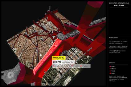
Wall Map
We wanted to fix some of these issues. While trying to find a functional and readable way to represent all that data we had, we were inspired by Ben Fry‘s Isometrick Blocks, where different spatial angles and perspectives reveal different visualizations of the same data. In our Walls Map piece, streets are raised in space relatively to their traffic. Seen from the top it is a flat 2D street map, but once the angle is tilted and the view enters 3D, shapes like walls are revealed, holding additional data on their sides: the proportions of car types. By rotating the model or tilting the angle it’s quite easy to explore the data, see where most traffic concentrates, how it branches out, or which streets have many buses and which don’t.
Moreover, a defining element of the project was emotion. Apart from representing the data, the idea was to express its meaning. In its early prototype the streets in Walls Map were actually lowered, making holes in the ground. The walls of the columns were red, so the streets looked like fresh wounds contouring the buildings. We ended up reversing them to improve readability, and the streets became walls, which is also a great metaphor for traffic.
At the end of the concept process, we ended up with two different visualization ideas we were happy with, and we couldn’t choose one, so we did both. The Traffic Mixer, which is the second piece, is a weird and beautiful hybrid. It’s both a visualization and sound toy, where the user explores and gets involved with the data in a playful way. Here the metaphor for traffic is audio noise. On this piece, emotion was given prominence over direct readability, so the two pieces ended up complementing each other.
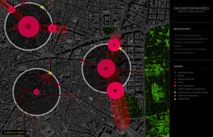
Traffic Mixer
You choose to visualize a data set of daily car count averages per street (and segments of streets) in the Madrid city center. The project is currently exhibited in Madrid. Have had a chance to discuss with visitors? How are they reacting to a project which engages so closely with their everyday life?
Sadly, I haven’t had the chance yet. The inauguration of the exposition was the evening before we left Madrid. And until now Walls Map, which is the clearer piece data-wise, has been at an early stage. There’s been only shapes, no numbers. Users have been able to see the differences between streets, but couldn’t read that on the avenue a block away from there, more than 100.000 cars passed by every day. Hopefully now that we’re updating the piece we’ll get feedback. The Medialab, where the pieces are exposed, is the perfect setting for that.
Now that the project is online and working, do you find that the visualization taught you elements that you didn’t suspect would emerge? How does the final result differ from your own expectations?
The biggest impact was before the visualization, when we first laid our eyes on the numbers. For me it was the first time I read that kind of data on streets I knew, and while it wasn’t a surprise that we cohabit with huge amounts of cars, seeing the actual numbers was still a shock.
After the visualization was complete, I think the only surprise was at noticing that some segments of streets had high quantities of cars while the next one had a tenth of it. In some cases that can be explained by the fact that not all streets are accounted in the data set, so some traffic can flow into non-visible streets. But when there’s such a big difference between segments, it’s actually because the traffic goes into the underground tunnels. So you can see it on the visualization, the city council of Madrid actually did a good job in making part of the traffic disappear in the underground.
Can you give us some details about the sound element of the project? How does it work? How does it complete the data visualization?
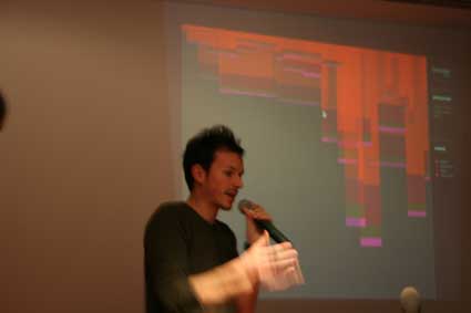
In the Traffic Mixer is a special case, it’s a bit more than a visualization. The sound here is partly about giving expressiveness to the numbers, but it’s also about getting the user involved with the visualization. By drawing circles on the map, streets are selected, and produce audio noise. There’s both a visual and a sound feedback, which adds more variables to shape the result and makes the experience more immersive. When we presented to the public, Cristobal, who directed this piece, got a bit carried away demoing. He stood there for a while constructing sounds and playing with different musical intensities. When he concluded, the public applauded. It was like he had made a sound performance. With a visualization.
Do you have plan to develop the project any further?
At this point I just want to polish it, I’m not planning to go further than that. This project could be seen as an exercise, a prototype for something bigger, with more areas, more cities, with the time dimension, connecting to different online APIs. But these kind of functionalities would be quite a big endeavor and I couldn’t work on that, at least in a near future. But I would be delighted if someone would start off this point and make something better out of it.
Thanks Steph!
CoW is exhibited at Medialab Prado in Madrid, until February 24, along with the other projects developed during the Visualizar workshop.
All images courtesy of Steph Thirion.