Book review: Tactile – High Touch Visuals

Tactile – High Touch Visuals, edited by R. Klanten, S. Ehmann and M. Huebner. 0a1tactile.jpg
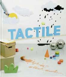
(Amazon USA and UK.)

Publisher Die Gestalten says: Tactile shows how graphic design is moving into three-dimensional objects and products. The innovative examples documented in the book demonstrate how designers are developing and implementing their ideas spatially from the very outset of a project. Tactile proves that spatial innovation in graphic design is not limited to personal work or artistic endeavours, but is being sought out more and more often by commercial clients, for example, in store design.

When i’m in Berlin, i spend ages in bookshops, i’d leaf through a book, wondering whether i should buy it or not. If it’s a book about contemporary design or art, i feel like the old bat who’ve seen most of what’s inside the book at a biennale or fair. Sometimes i discover the work of an artist i like in the book, i’ll then take my notepad and pen (sorry to disappoint anyone who thinks i’m cool enough to have blackberry or i-phone) and write down the name of the artist, and once i’m back home i google the name. But sometimes there is a book that makes me say “Gosh! i’m still such an ignorant, am i not?” I turn page after page and discover creators i’d never heard about. Go! I collect my bonus, and go straight to the cash machine.

Tactile is one of those book. It demonstrates in a very visual way (there’s very very little text inside) how digital technology has freed designers from their screens and sheets of paper and allowed them to explore 3D with collages, sculptures, installations and objects. I like the way most of the works presented in Tactile are still very close to their 2D origins, there’s no cheating, no ambition to be a product designer (though sometimes they should), it’s pure 2D made and cut to inspire our 3D ordinary existence.

A selection of goodies from each chapter:

Chapter 1.
Type & Poster, in which graphic design dresses in foam, wool, ice, meat (!!) or bricks and ventures in the great outdoors.

0aaaudubonn.jpg
Thundercut for Global Inheritance

Chapter 2
Objects, Scenes & Paperworks is an orgy of origami, cardboard landscapes, heroes and characters going literally for a walk out of the pages. There’s Michael Salter‘s robots made of styrofoam, Simon Elvins‘ fabulous Paper Record Player
0aamartinpostelergun.jpg
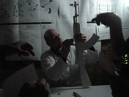
Paper Gun Factory by Martin Postler (images courtesy of Noam Toran)

After having investigated the history and the aesthetics of the AK-47, also called the Kalashnikov after its inventor, designer Martin Postler (whose project Life/Machine – Scenes from a Roboted Life you might remember) freed the AK-47 from its lethal substance by deconstructing it into a paper model construction set and putting the emphasis purely on the weapon aesthetics. What remains of the gun itself when void of purpose: Is it still a gun? Is it still a beautiful object if its lethal function is eliminated?

0aimnterbtussta.jpg
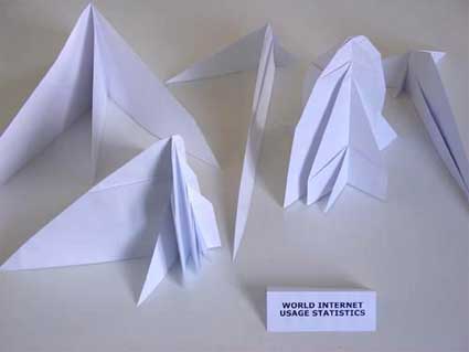
I also like Etienne Cliquet‘s ordigami internet statistics (also available in keyboards, computer fan, audiospeakers, etc.)

Chapter 3
Dressed Up is probably the chapter which brings you the most surreal examples of the trends. Graphic design is wrapped around the body, stuck onto faces and twisted in the hair.

Love at first sight for the work of IJM.

0aaijma.jpg
IJM, Chinese Spring

0adollohair.jpg
The ueber-talented team from Uchu Country created a Relax Magical Hair Tour extravaganza for Relax magazine

Bryony Birkbeck designed the costumes for the On Board video of Friendly Fires.

0amouthfuuu.jpg
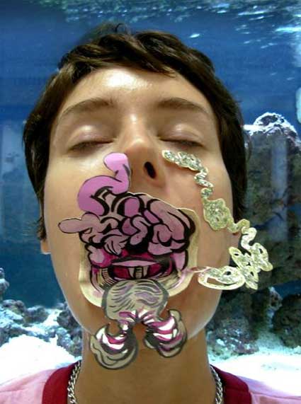
Christa Donner: Alternative Anatomies, Mouthful, documentation of collaborative public intervention, with Kristine Seeley

Chapter 4
Products & Sculptures is an entertaining mix of hand-made (where the un-perfection becomes valuable) and high-tech (think rapid prototyping, new materials, etc.)

0aasandrinepell.jpg
Sandrine Pelletier, Battlefield III

0aa8puccdle.jpg
FromKeetra‘s THE GREAT SLUMBER a.k.a.Blood Puddle Pillows

Chapter 5
Indoor Installations shows how some graphic designers take a scene you’d expect to see flat and quiet on a piece of paper or a computer screen and import it into a building, making visitors think that they are living in a comic strip or a “drawing installation.”

0aaafgre4.jpg
Jonas Liverod, Drawing installation at Kabusa Konsthall, Sweden.

0aafulfuro.jpg
Fulguro, Label Suisse (Music Festival)

Chapter 6
Outdoor Installations: see previous chapter, except that this time, it’s the great outdoor for everyone, sharing some methods and sometimes a certain penchant for subversion with street art.

0aaquatrecentr78.jpg
Teleklettergarten

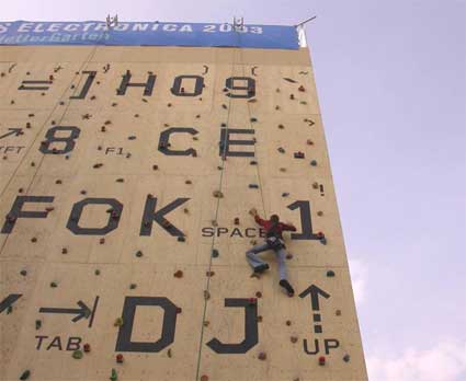
For ars electronica 2003, Bitnik and FOK, transformed the facade of the Linz’Art University in to a gigantic keyboard, inviting members of the audience to used it as a climbing wall. They get a crash course in climbing and software development. After that climbers and programmers collaboratively inputed code into an oversized programming environment. During one week, they programmed codes, scripts and tools and demonstrated various software functions. Not only did the Teleklettergarten turned programming into a physical experience, it also use this public and collaborative programming interface to collectively demonstrate against the arbitrary awarding of software patents for core functions which are the basis of day-to-day work with computers. By ensuring that the illegal action (the execution of patented code) is performed by an anonymous collective, no single person can be made responsible whilst being able to publicly demonstrate the restriction these patents mean for programmers and for the whole user community.

Image appearing on the home page: Agata Bogacka, Glass, edition, 2004.

Related book reviews: Super Holland Design, Hand Job: A Catalog of Type, JPG 2: Japan Graphics, Hidden Track: How Visual Culture Is Going Places.

English & Pockett shuts down

SINGAPORE – UK-based branding agency English & Pockett has folded after six months in business in Asia. The UK office has also closed, 23 years after its London launch.

Links for 2008-01-10 [del.icio.us]

More Than an Ad School

NEW YORK (AdAge.com) — In a telling nod to the radical changes afoot in the marketing world, the industry's leading institution for graduate studies, the Adcenter at Virginia Commonwealth University, is ushering in 2008 with an extreme makeover — including a new name, a new look and a $9 million new home.

Fontasy.de: Chernobyl

Fontasy.de: Chernobyl

Types make a difference.

Advertising Agency: BUTTER.Berlin, Berlin, Germany
Creative Directors: Timm Holm, Michael Preuss
Art Director: Timm Holm
Designers: Björn v. Buchholtz, Anna Weil
Copywriter: Michael Preuss
Published: October 2007

Fontasy.de: Hiroshima

Fontasy.de: Hiroshima

Types make a difference.

Advertising Agency: BUTTER.Berlin, Berlin, Germany
Creative Directors: Timm Holm, Michael Preuss
Art Director: Timm Holm
Designers: Björn v. Buchholtz, Anna Weil
Copywriter: Michael Preuss
Published: October 2007

Fontasy.de: Guantanamo

Fontasy.de: Guantanamo

Types make a difference.

Advertising Agency: BUTTER.Berlin, Berlin, Germany
Creative Directors: Timm Holm, Michael Preuss
Art Director: Timm Holm
Designers: Björn v. Buchholtz, Anna Weil
Copywriter: Michael Preuss
Published: October 2007

Fontasy.de: Ground Zero

Fontasy.de: Ground Zero

Types make a difference.

Advertising Agency: BUTTER.Berlin, Berlin, Germany
Creative Directors: Timm Holm, Michael Preuss
Art Director: Timm Holm
Designers: Björn v. Buchholtz, Anna Weil
Copywriter: Michael Preuss
Published: October 2007

Fontasy.de: Auschwitz

Fontasy.de: Auschwitz

Types make a difference.

Advertising Agency: BUTTER.Berlin, Berlin, Germany
Creative Directors: Timm Holm, Michael Preuss
Art Director: Timm Holm
Designers: Björn v. Buchholtz, Anna Weil
Copywriter: Michael Preuss
Published: October 2007

LEGO: Rubik’s Cube

LEGO: Rubik's Cube

Advertising Agency: Jung von Matt, Hamburg, Germany
Creative Directors: Jan Rexhausen, Dörte Spengler-Ahrens, Arno Lindemann
Art Director / Photographer: Keat Aun Tan
Account Manager: Katharina Schablitzki
Image Editing: Florian Reckert
Production: Philipp Wenhold
Final artwork: Susanne Hermann

Tuborg: Fish

Tuborg: Fish

The summer starts here.

Advertising Agency: Noble Graphics Creative Studio, Sofia, Bulgaria
Creative Director: Chavdar Kenarov
Art Director / Copywriter: Georgi Kasabov
Published: Summer 2007

Tuborg: Seahorse

Tuborg: Seahorse

The summer starts here.

Advertising Agency: Noble Graphics Creative Studio, Sofia, Bulgaria
Creative Director: Chavdar Kenarov
Art Director / Copywriter: Georgi Kasabov
Published: Summer 2007

Tuborg: Lobster

Tuborg: Lobster

The summer starts here.

Advertising Agency: Noble Graphics Creative Studio, Sofia, Bulgaria
Creative Director: Chavdar Kenarov
Art Director / Copywriter: Georgi Kasabov
Published: Summer 2007

Tuborg: Turtles

Tuborg: Turtles

The summer starts here.

Advertising Agency: Noble Graphics Creative Studio, Sofia, Bulgaria
Creative Director: Chavdar Kenarov
Art Director / Copywriter: Georgi Kasabov
Published: Summer 2007

Footstock: Knives

Footstock: Knives

2008 National Figure Eight Endurance Barefoot Championships

Advertising Agency: BVK, Milwaukee, USA
Creative Director: Gary Mueller
Art Director: Giho Lee
Copywriter: Ross Lowinske
Photographer: Jeff Salzer
Published: October 2007

Footstock: Shattered glass

Footstock: Shattered glass

2008 National Figure Eight Endurance Barefoot Championships

Advertising Agency: BVK, Milwaukee, USA
Creative Director: Gary Mueller
Art Director: Giho Lee
Copywriter: Ross Lowinske
Photographer: Jeff Salzer
Published: October 2007

Footstock: Razor blades

Footstock: Razor blades

2008 National Figure Eight Endurance Barefoot Championships

Advertising Agency: BVK, Milwaukee, USA
Creative Director: Gary Mueller
Art Director: Giho Lee
Copywriter: Ross Lowinske
Photographer: Jeff Salzer
Published: October 2007

Tinker Hatfield and the birth of Nike Air

This is a great interview about how Tinker Hatfield from Nike came up with the design for exposing the “Air Bubble” which is now an iconic feature of Nike.

var addthis_pub = ‘publicisnz’;

Visualizar workshop: HumanFlows

As announced a few days ago, i’m going to highlight some of projects developed in November during the Visualizar workshop curated by Jose Luis de Vicente and organized by the Medialab Prado in Madrid. Participants had two weeks to develop data visualization projects, with the help of three instructors, in addition to assistants and collaborators.

Here’s a first project: Human Flows, by Miguel Cabanzo (with the collaboration of Nathan Yau, Mónica Sánchez and Iman Moradi), aims to visually and interactively map global migrations in a bid to understand their causes. In its current state, it is a framework with which to develop further visualisations.

Miguel is a graphic designer with a growing interest in interactive installations. He is originally from Bogotá, where he studied visual communication, and worked as art director and freelancer). He’s been living in Venice for 3 years as a masters’ student at IUAV, University of Venice.

0agrossdomestic.jpgGross Domestic Product

Human Flow’s aim is to “visually and interactively mapping global migrations in a bid to understand its causes.” Why do you think that there is a need to map migration in a new way? Isn’t there already online instruments which do just that? Which new elements does HF brings to the issue?

Most of the online instruments tend to concentrate on particular moments on migration, showing a partial view of the problem. This happens because global migrations are strongly connected with the current situation (economical, political, social, etc.) of each sending and receiving country, and that produces one of the usual ideas of the migrant: they migrate because they are poor, or their home counties are insecure. But even if this is partially true, I think that seeing this migrations from an historical point of view can raise interesting questions: Why did migrations to Germany become so strong from mid nineties, even from European citizens? Why is so important for Latin American people to go to the United States? Why are Africans risking their lives crossing the ocean to be here? Why were migrations in the eighties so different from today’s migrations?

I think mapping problems helps to understand where the problems are and underline how hard they are. Even if the prototype has inflows from just 13 “well-being” countries from the world, it is incredible to see how 70% of the global population has moved to those countries for the past 15 years, and continues to do so. Why?

0aimmmmigrflow.jpg

2ngry, your website, mentions that you study at IUAV, in Venezia. I spent 4 years as a `’migrant” in Northern Italy myself and although i’m European i experienced how the issue of migration is still a very problematic one here, even more than in other countries. That might be explained by the fact that migration is a relatively new phenomenon in the country. Is there anything in the very particular situation of Venezia which inspired this project or makes it more relevant?

Yes. Even if my position as a student put me somehow aside of the xenophobia problems, is obvious that migration is more than an issue here. Being a relatively new thing, migration seems to be a problem for a lot of northern Italians, who tend to see foreigners (or better: non-tourists) as a threat for the economy. And with the high percentage of illegals entering the country each day, a lot of right wing politicians are basing their careers on it.

0aamigroplois.jpg
Image from Migropolis, Buba sells fake bags in Venice

So if on the one hand you see people praising SS methods against immigrants, in the other you have companies devoted to using them in order to make money, spending a lot in advertising with immigrants as their target group. Add to the picture that lots of Africans are selling Chinese or Napoletan fake bags on the Venetian streets (and “robbing” precious money to the glass stores selling Chinese glass), and you have a strange, contradictory scenario.

Having this in mind, I get involved the past year in a fantastic project called Migropolis, a book about immigration and its spectacularization in Venice. Working for this publication gave me some knowledge about the issues, and served as a starting point for humanflows.

Now that the project is online and working, do you find that the visualization taught you elements that you didn’t suspect would emerge? How does the final result differ from your own expectations?

If brilliant colors means well being, and the flows are going from dark colors to brilliant ones, you can confirm the idea of the poverty-based migration. Of course there were some surprises. I didn’t expect to see so many people going to Russia or germany, and even if I come from Latin America and I know the situation, it was a surprise to see how much people is going in search for their American dream.

Now, I see the project as a framework for further development. To be really enlighten, the project still needs to show more interesting data and, more importantly, clever connections between the data. For instance, it would be interesting to see how migration is affecting criminality in receiving countries, or how much taxes the immigrants are paying, how much they are contributing to the local economy. Remittances are another important field to visualize.

I am very satisfied with the job done, this is a very good starting point.

Do you have any plan to develop the project further?

Yes, humanflows is part of my MA thesis, so the project will be developed furthermore in its conceptual and graphical part in order to show it as part of an exhibition in the near future.

Thanks Miguel!

Also by Medialab Prado: the Interactivos? workshop.

Weetabix: Milk

Weetabix: Milk

Nature’s breakfast.

Advertising Agency: Dentsu Brussels, Belgium
Creative Directors: Wain Choi, Roger Tavares
Art Director: Eric Jamez
Copywriter: Jan Vandenplas
Photographer: Studio Habousha
Other additional credits: Coline Carnoy
Published: December 2007