Burberry's Scrolling Website for Its New Fragrance Is a Thing of Beauty
Posted in: Uncategorized
British luxury brand Burberry has launched a new fragrance, My Burberry, and you can even put your name on it, sort of.
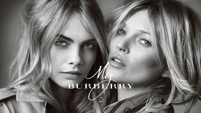
The spot promoting it is your typical fragrance spot (good looking people, nothing makes sense, etc.) featuring Kate Moss and Cara Delevingne, but what really shines is the website.
It’s a beautifully designed, interactive, one-scroll site. The background starts as gently falling rain (“My Burberry is a contemporary grand floral that captures the fragrance of a London garden after the rain”) and includes images of flowers, the iconic Burberry trench, and is generally a lovely Internet experience when you consider all of the alternatives out there.
The bottle itself is well designed, although I think the font chosen for “My” in “My Burberry” kills the look a little. You can even have the bottle engraved—a personalized touch pointing back to brand messaging—although again, I think it takes away from the general aesthetic of the bottle.
I could probably scroll up and down this site for a solid 15 minutes though.
![]()


