Good friend Alex Haigh, A.K.A. Thinkdust finally dropped a personal project that’s been in the making for quite some time now.
HypeForType is a digital type foundry featuring typefaces made by some of the hottest artists and designers out there. Names such as Alex Trochut, Si Scott and Jon Burgerman are only a few of the giants in the line-up.
The idea, the approach, the website, everything’s top quality and sure to cause a buzz in the upcoming days.
Be sure to drop by and get yourself some type goodness.
Of course words are important in the ad game, but there are lots of other ways to communicate. The use of colors, font sizes, art, and even the media you choose say even more about the product than mere copy.
Paul Hirsch has been practicing communications since 1983. He now owns his own marketing/pr firm in Northern California. Paul specializes in media relations, marketing collateral, website copy development and ad design. You can learn more about him on Facebook or by visiting www.nowville.com/paulhirsch.
There is a constant tension in creative departments regarding the value of copy vs. art. I’ll commit some old copywriter heresy and say when push comes to shove I’ll give art a small edge. Copywriters sometimes become a bit inwardly focused, whereas art is usually on target with the brand and messaging. Nothing is 100%, of course, but I find art to be a bit more reliable communications tool.
Paul Hirsch has been practicing communications since 1983. He now owns his own marketing/pr firm in Northern California. Paul specializes in media relations, marketing collateral, website copy development and ad design. You can learn more about him on Facebook or by visiting www.nowville.com/paulhirsch.
One year after the Brussels’ exhibition Holy Fire. Art of the Digital Age, Yves Bernard from iMAL and Domenico Quaranta curate a show that, once again, puts a magnifying lens on the new media art pieces that have found their place on the art market continue
I’ve never had any interest in football (that’s soccer for you, American friendz.) Never ever. I come from a country that never won any championship (and if they ever did, well… i still don’t care), i find men in shorts a rather pathetic affair and i just don’t get sport on tv anyway. There’s been just one exception to this until last week and it was Eric Cantona, his sardines, his iced tea commercials continue
Abstract render savvy / Depthcore’s father Justin Maller just popped out some hot freshness down at his site. Over 20 pieces for your eyes to get blown away.
Castellon’s Contemporary Art Space has recently opened a delightful exhibition that re-invents architectural space through the most intangible strategies: mist, light, colour and sound continue
A la frontière entre le réel et le surnaturel, les clichés de Chris Scarborough nous projettent dans un monde où ses personnages ont des yeux de mangas. Poétique. La suite en images.
Le portfolio de l’artiste portugais Joao Oliveira sobrement intitulé On Repeat. Des magnifiques illustrations et compositions, pour la plupart en noir et blanc. Des oeuvres à découvrir dans la suite et sur son site web.
The online channel covers in a very professional and surprisingly fast and elegant way the opening receptions (vernissages) of exhibitions and events and i’m grateful to them for that. I profess an intense dislike for vernissages where people seemed to be more passionate about tepid wine and showing off their mere presence at an art event than about the artworks on show…. but that doesn’t mean i’m not curious about vernissages continue
Coup de cœur sur l’impressionnant style de l’artiste islandais Siggi Eggertsson agé de 25 ans. Formé à la typographie, il est maintenant basé à Londres. Sur son portfolio, des travaux d’illustrations comme des portraits ou des paysages mêlant pixel-art, pop et couleurs rétro.
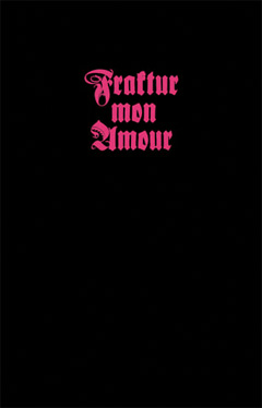
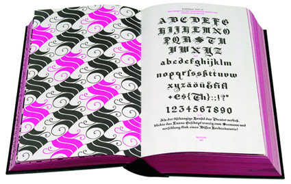
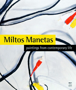
I would usually not write about monographies but nothing feels better than breaking my own rules today: the first book is starring blackletter also known as Fraktur or Gothic type, the second one is dedicated to the paintings of Miltos Manetas.
Fraktur Mon Amour, by designer Judith Schalansky (Amazon USA and UK.)
Publisher Princeton Architectural Press says: Blackletter also known as Fraktur or Gothic type was commonly used throughout Europe in the Middle Ages. By the end of the Renaissance it had mostly been replaced by the typeface Latin Antiqua. The use of Blackletter type became taboo in Germany after World War II because it was incorrectly associated with the Nazis who actually banned its use in 1941 because it was falsely believed to be a Jewish invention. Revelations about the true history and meaning of Blackletter type have resulted in a resurgence in usage by graphic designers. (…)
Fraktur Mon Amour reproduces 300 variations of Blackletter fonts ranging from historical fonts to contemporary reinventions in a sensuous beautifully crafted hot-pink prayer book-style catalog that is destined to become a fetish object for designers and type enthusiasts. Each Blackletter font is presented on a full page along with its complete alphabet date of origin the name of its designer and its original foundry. On the facing page is a composition created from that font that explores the subversive beauty of this unique typeface. In addition 137 of these fonts–including four created exclusively for this book–are collected on an enclosed CD (Mac and PC) for free private and restricted commercial use. Fraktur Mon Amour is the winner of several awards including the Type Directors Club of New York’s 2007 Award for Typographic Excellence.
Who knew that fonts could have such fascinating lives? I believe this book has received a huge echo in design blogs but as it is the most elegantly and skilfully designed book i have received in 2008, i thought it deserved a few more words here. Closed it looks like a bible. Open it and you get over 700 pages of pure pink font porn. My expertise and talent at discussing fonts being extremely limited i’ll end with a video flip through the book:
Miltos Manetas: Paintings from Contemporary Life, (Bilingual edition italian-english at Amazon USA and UK.)
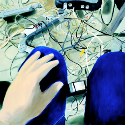
Publisher Johan & Levi Editore writes: Every electronic componenet portrayed bears witness to a certain period in the development of technology, implicitly marking the pace and duration of Manetas’ research and immediately flagging up a ‘present’ and a ‘past.’
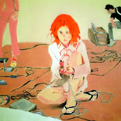
In his work Manetas acts as an observer of this daily phenomenon. At times he works from a ‘subjective’ angle, bearing witness to both our total involvement in technology, and the sense of alienation that comes from interacting with machines. Other times he takes a ‘bird’s eye view’ to draw attention to the gestures, often underestimated or taken for granted in daily life, that man performs on machine, in a world which is lacking in concrete ‘actions/ that point up to what is going on.
Echoing Baudelaire’s famous ‘Painter of Modern Life’, Manetas, as an observer of the contemporary world, is part of a time-honoured tradition in art> the practice of depicting man and the elements which represent modernity in the era in question has been a prerogative of the Impressionists, the Realists and the exponents of New Objectivity, not to mention the paintings of Post-Revolutionary Russia, where ‘modern’ meant ‘industrial.’
Joysticks and joypads, plugs, keyboards and routers, a shoe lost among cables, a pair of feet emerging behind an open laptop, videocassettes, websites and girls watching intensely at a computer screen. Miltos Manetas hands a thought-provoking mirror to the gadgets blogs, tech magazines and even new media art exhibitions. The soft-coloured canvases reminds us that we are not merely ‘users’ ‘interacting’ with ‘devices’, but people absorbed in activities which might still appear as trivial to some but are nevertheless essential to our new human equilibrium.
The introduction essay is penned by the only media theorist and guru who is as flamboyant as Manetas himself: Lev Manovich.
On 24th – 25th January and 13th February, Manetas will perform some live internet paintings in the East Wing of The Courtauld Institute of Art in London. The Internet Paintings will also be included in the forthcoming exhibition, Unreal, “Altered Perspectives in Painting’ at the Saatchi Gallery, London.
Image on the homepage part of Judith Schalansky’s fraktur set.
The year draws to an end and so is rhizome’s fund raising campaign. I guess most of you know the fantastic work they are doing every single day to promote and support technology-based art. Culture tends to suffer more than many other fields in tougher times (but please feel free to disagree and prove me wrong), so please consider donating $25 or more. They will undoubtedly give it back to you in many forms.
Next on the list is Turbulence. They made it more pleasant to send the money in the right place by offering you the possibility to buy artworks by Jason Freeman, Yury Gitman, Michael Takeo Magruder, Michael Mandiberg, Mouchette, Preemptive Media, and Jody Zellen.
Paddy Johnson, the smart, inspiring and invaluable art blogger of the US scene is also launching an end of the year Fundraiser.
May i encourage you to write me if you think i should add an organization to this tiny list?
Image on the homepage by Dante Busquets, an extremely talented photographer i met last month in Sao Paulo.
This is site is run by Sascha Endlicher, M.A., during ungodly late night hours. Wanna know more about him? Connect via Social Media by jumping to about.me/sascha.endlicher.