Monsoon takes a Ride-A-Rolla in Toyota Corolla

Toyota Corolla got Athens-Ga-based Monsoon to take a ride and play their song Ride-A-Rolla in a new Corolla through a car wash. To up the ante, this is a 360º experience. To get the footage, they mounted four Kodak 4K 360 cams to specific features of the car and stitched it all together to created one seamless story. Keep in mind this wasn’t done for Toyota the brand, by its agency of record Saatchi, but for Local Toyota Dealers by Atlanta-based 22Squared. Pretty impressive.

Agency: 22Squared
EVP, Chief Creative Officer: John Stapleton
SVP, Executive Creative Director: Kevin Botfeld
VP, Creative Director: Mitch Segall
VP, Creative Director: Eric Burke
VP, Director of Digital Experience: Daniel Brown
Digital Art Director: Stephen Bridges
Associate Digital Design Director: Mark Damiano
Art Director: Julie Kaufman
Copywriter: Bobby O’neil
Integrated Production:
SVP, Director of Integrated Production: Matt Silliman
VP, Director of Video Production: Bryan Jameson
Editor/Motion Graphics Designer: Mark Creasy
User Experience Director: Harley Jebens
Director of Business Affairs: Danielle Zubriski
Executive Video Producer: Ben Tischler
Executive Integrated Producer: Rob Downs
Senior Integrated Producer: Courtney Brown
Integrated Producer: Wes Rollend
Development:
Director of Development: Ted Duncan
Senior Creative Technologist: Carson Britt
Strategy:
Associate Strategy Director: Hillary Traylor
Senior Strategist: Natalie Webb
Project Management:
Senior Project Manager: Debbie Ebbets
Project Manager: Turquoise Taylor
Account Management:
EVP, Executive Group Director: Amanda Ferber
SVP, Group Account Director: Julie Winner
Management Supervisor: Austen Tully
Senior Account Executive: Bailey Davis

Client Dollars Are Flowing To Digital In A Big Way

The Interactive Advertising Bureau (IAB) today announced that U.S. internet ad revenues have set a new first quarter high at $15.9 billion in Q1 2016, outpacing last year’s Q1 record-setting $13.2 billion. T he 21 percent year-over-year jump represents the sharpest spike in four years when compared to other first quarter earnings. “These landmark revenues […]

The post Client Dollars Are Flowing To Digital In A Big Way appeared first on AdPulp.

AIR Brussels creates 360 experience to help end cyber bullying.

Here’s a heart-wrenching experience from AIR Brussels, created for the Belgian telecom operator VOO and the Belgian Federal Police.

Get paid for your selfies with "Pay your selfie™" – ad research via selfies.

So if you need an extra twenty bucks and take selfies all the time why not download the app Pay Your Selfie™, which is basically the marketing research people cutting out the facebook middlemen and paying you directly for the data you give them.

As a user of the app you get a “task”, such as selfie yourself brushing your teeth, eating ice-cream, having a protein bar, or similar, and each task has a cash value from 20 cents to $1. When you’ve reached the sum $20 bucks you can cash out. What’s in it for the marketers? Where and how you take the selfie reveals more honest information to them than you might have in a focus group. Crest had a “selfie with your favourite crest product “task out for a month, and the selfie results showed a spike in people brushing their teeth between 4-6 pm, just in time for happy hour. This is the type of information not so easily gleaned from focus groups.

The NYT more, they’re interviewed people using the app for research and those who are taking selfies, and shows that this may indeed be a better way to get consumer data. For the users there’s the option of privacy, there’s no need to share the selfie sin public at all. Unless you want to. Which also means that the users of selfie do not have to be on Instagram or Twitter or anything else. This makes the selfie-taker relax and not worry so much about staging the picture, instead simply completing the test so they can cash out their $20 bucks. Many consumers don’t mind telling brands what they really want at all, but on their terms. By cutting out the creepy facebook stalking, and handing a bit of the profit to the consumers themselves Pay Your Selfie has a chance at becoming really big. Teenagers who have emigrated from Instagram to snapchat, and take a thousand selfies a day already, may find the app to be a fun game where you can actually earn cash too.

Jean McLaren, president of Marc USA calls it “automated voyeurism”, a phrase that will stick I’m sure.

About 11 percent of the men in the Crest photos were shirtless, a level of comfort the brand rarely sees when it uses other tools in its research arsenal, said Kris Parlett, a senior communications manager for P.&G. Oral Care. Other research methods include recruiting volunteers to record videos of their oral care routine in their bathrooms or to brush their teeth in “insight suites,” mocked-up home bathrooms with mirrors that allow analysts to observe them.
“It’s not data you could get through Nielsen,” said Michelle Smyth, a founder of Pay Your Selfie, referring to the bare-chested photos. “It’s one-of-a-kind research.”

MNSTR gets all Leisure Suit Larry for Playboy fragrances

French Agency MNSTR helped design this 8-bit pastiche to seduction games like Leisure Suit Larry, except strangely it’s PG rated. I tried playing this game and I wasn’t so much bothered by the concept (there’s an option to choose to be a female) so much as I was the incessant branding everywhere. Like way too much branding. And I mean, waaaaaaaaay too much branding. More importantly, Playboy was the granddaddy of sophistication and sex. This seems like a tame version of what Axe might have done a few years ago before it decided it wanted to save the world through kisses.

Client: Coty International
Design and storytelling: Agence MNSTR
Creative Director: Louis Bonichon
Art Director: Thomas Balland
Brand Manager: Richard Gala
Agency Management: Audrey Mazet, Olivia Renoud-Grapp

California REALTORS now have their own emojis

Red Tettemer O’Connell + Partners have created CARmojis. That’s c.a.r. as in California Association of REALTORS. It’s available in the app store now. There’s an obvious question to be asked here which is why? As in why would I want to California Realtor emojis? I can’t think of a reason at all. In terms of just a PR stunt I guess it gets their name out, but it’s kind of a pointless exercise.

Judging by the reviews of the app, the only people who like it are realtors. No-realtor people are not happy with the idea that in order to use the app, one must give it access to everything. Take this review for instance by Tulabelle:

“Help me understand why one MUST agree to give up their privacy when agreeing to use this APP?! By agreeing you tell them they can use ANYTHING you have ever typed including credit card numbers and private communications. You think you have a reasonable right to privacy but your (sic) agreeing take it away!!!!!!”

Not a good look, C.A.R.

Client: California REALTORS
Agency: Red Tettemer O’Connell + Partners
Chief Creative Officer: Steve Red
Executive Creative Director: Steve O’Connell
VP, Group Creative Director: Todd Taylor
VP, Group Creative Director: Ryan Scott
Managing Partner: Carla Mote
Designer: Dave Wiest
Copywriter: Megan Auld-Wright
VP, Digital Strategy: Uri Weingarten
Interactive Creative Director: Derek Little
Tech lead: Aaron Grando
Digital Strategist: Josh Sirulnik
VP, Director of Client Services: Susan Baraczek
Account Manager: Gillian Darr

Letter to my dear – 3000 generations grand-child to visualize nuclear waste (2016) (Sweden)

“Letter to my dear” has been created by the artist Lennart Grebelius, in collaboration with Forsman & Bodenfors to bring the question of our moral responsibility to future generations to the fore. If you want to skip https://youtu.be/Pf9s68ZZoho?t=852directly to the letter and past all those “great great great”, do so as the letter itself is a long way in.

Nuclear waste has to be stored for 100,000 before it becomes safe for people, animals and nature itself. 100,000 years corresponds to 3,000 generations.

“The time perspective is dizzying and our responsibility for what we do today becomes so very obvious when you make it concrete. Do we really have the right to demand that the citizens of the future shall guard our radioactive rubbish?” says Lennart Grebelius.

The art project Letter to my dear is based on Grebelius’ book with the same title. Most of Grebelius’ earlier art projects revolve around time, chance and numbers, which is also very much the case for Letter to my dear where the 100,000 years are physically made visible. The core of the work is a letter to a child of a future generation.

Twin logos of the week: Meet Brave the browser lion & Workfront Lion

This simply amused me – am not saying these logos are identical or even inspired by each other.

We’ve always suffered from trends in logotypes. Some years it’s squeezed drops, other years it’s the human-like starburst. Then there’s bevelling, swooshes, checkmarks and ribbons. The multicoloured type. The nautical circle look. And so on. I’m not sure if this is happening more often as people get logos done for a fiver, or just pick an illustrated symbol they like at a cheap logo-factory, or if it’s the same as it ever was. This pairing, having selected such similar colours as well, just struck me as really funny.

For a more similar example see Quark and the Scottish Art Council.

"Trump Clause" – legal clauses to use in case Trump wins and you emigrate to Canada

Using the current trend to promise moving to Canada if Trump wins (Lena Dunham, the world will hold you to that statement), Grey Canada created the site http://trumpclause.com/. It’s not totally off the wall, Google Trends says that searches for “How can I move to Canada?” spiked upwards of 1,150% after Trump’s win during Super Tuesday in March. The site is actually a hidden ad for Canadian immigration lawyer, Andy J. Semotiuk at Pace Law in Toronto, and if you need help moving to Canada there’s a mailto on the site putting you in touch with him. Good call! The site shares these hypothetical legal clauses which you can tweet facebook and share to your hearts content – there not much in the way of actual information in how to get a residence permit in Canada. Seeing as people like to virtue signal how much they despise Trump creating a sharable set of clauses is very likely to spread, however it doesn’t really tell you who the sender is so this may not help that immigration lawyer.

“The Trump Clause is made up of 10 different clauses, each created and chosen based on data analytics of the most popular and relevant conversations currently being discussed in social media.” the release states, for example “There’s a clause for people who are taking a new job in the U.S. and want their expenses covered both ways if they quit.” I dunno guys, maybe don’t take a job in the USA at all if you can’t deal with the current nominees? “There’s another for people who are buying a new house in the U.S. and want the seller to pay them back half the forthcoming depreciation amount. There’s even one to get you out of a long-distance relationship with someone living in the U.S.”

The clauses seem more childish than funny, this is an idea that sort of failed somewhere half-way along the way. Why would anyone buy property in a country where they don’t want to live? I mean, apart from Chinese rich kids currently busy buying Canada. It might just be the tone that failed to hit the mark. The logo is pretty cute though.

Meanwhile, Trump has been asked for his reaction regarding Lena Dunham. “Well, she’s a B actor and has no mojo. I heard Whoopi Goldberg said that too – that would be a great, great thing for our country if she got out. We’ll get rid of Rosie? Oh I love it. Now I have to get elected because I’ll be doing a great service to our country. I have to. Now it’s much more important. In fact, I’ll immediately get off this call and start campaigning right now,” Trump said on Fox News making light of the statements. Donald don’t care.

Youtube Gaming has launched

No doubt in an effort to keep the Youtube gamers from leaving Youtube and heading over to Twitch, as well as increase the number of users, Youtube has launched its own live stream gaming service. Youtube Gaming which was announced at last E3 back in June, is now live and works on the web, Android and iOS. The nav is clean and easy to use. It has also incorporated some of the more popular Youtube channels like Machinima.You can bet the competition for content will heat up now.

As Time magazine points out, Google originally wanted to buy Twitch, but Amazon bought it for 970 million in August of last year.
Remember kids: your LP videos are valuable and there are now two platforms who will make tons of money off of your content. Keep that in mind.

At the moment, Youtube Gaming is only available in the US and UK.

The Palette Sites collections – from Brand Palette to Daily Palette

Art Directors, designers and all ye visual creatives, prepare your bookmarks. We already showed you Brand Colors, the place where you can find any brands palette, earlier here. We’ve found a few more glorious palette sites. At Colorhunt.co you get a new palette every day. Web designer Steve Degrave made a nifty color palette generator where you can upload an image and get a palette from that. The funniest palette generator might be Poke Palettes, which identifies every HTML color code on a Pokémon.

The High Museum Of Atlanta wants you to use your smartphone.

Most museums don’t want visitors taking selfies and photographs. Atlanta’s High Museum of Art is completely different though. Using a refreshed version of a mobile app called Artclix, which SapientNitro’s Second Story developed originally, the High Museum revamped the app and reimagined the museum experience to make it interactive and personalized for each visitor.

Now, when you go to the High you can take photos to your heart’s content. The ArtClix app uses image-recognition technology to provide engaging multimedia content. Which is good. because standing in front of a Picasso is so boring.

Visitors are also encouraged to share their photos on social media on social media and leave comments in the ArtClix community forums. And don’t worry if you have nothing too intellectual to say. They have “Highmojis.” Emoji-style graphics that allow visitors to share their reactions to the art. Because nothing sums up Guernica like LOL.

When you’re done sharing your words of wisdom via three letters, you can take an ArtSelfie with a work of art and share on social media. “Hey look! It’s me in front of The Physical Impossibility of Death in the Mind of Someone Living!

There’s even a special time of day where you can do this, and allow people who actually came to see the art to do so without smartphone interference.
I made that last part up but it would be great, wouldn’t it? Seriously, can you not go for an hour without that stupid phone glued to your hand?

Maybe they can revamp this app for concerts, because everyone loves it when you film the show. Or I know: add a special “Amen” emoji for religious folk when they go to their houses of worship. Or an extra sad emoji for funerals!

Credits:
Client: High Museum of Art
Agency: Second Story

Facebook group icons redesigned to remove chip on woman's shoulder

In a Medium post (why not public Facebook?) Caitlin Winner explains how she redesigned the group of friends icon at facebook, and why.

Much to my dismay, not long into my tenure as a Facebook designer I found something in the company glyph kit worth getting upset about. There in the middle of the photoshop file were two vectors that represented people. The iconic man was symmetrical except for his spiked hairdo but the lady had a chip in her shoulder. After a little sleuthing I determined that the chip was positioned exactly where the man icon would be placed in front of her, as in the ‘friends’ icon, above. I assumed no ill intentions, just a lack of consideration but as a lady with two robust shoulders, the chip offended me.

Insert pun of “she has a chip on her shoulder about chips on women’s shoulders” – but sure, that makes sense. Odd little design idiosyncrasies tend to drive designers batty. That’s why they’re designers. Off she went, to fix the shoulder. And once that was done, she wanted to give her better hair, that old school helmet-bob is not feeling very modern these days.

Once she had sorted out the best hair for the woman, she went on to fix the man, making his shoulders a little softer and creating a silhouette for cases where a gendered icon was inappropriate. Then she moved on to placing ladies first, as the old saying goes.

Next, I was moved to do something about the size and order of the female silhouette in the ‘friends icon’. As a woman, educated at a women’s college, it was hard not to read into the symbolism of the current icon; the woman was quite literally in the shadow of the man, she was not in a position to lean in.
My first idea was to draw a double silhouette, two people of equal sizes without a hard line indicating who was in front. Dozens of iterations later, I abandoned this approach after failing to make an icon that didn’t look like a two headed mythical beast. I placed the lady, slightly smaller, in front of the man.
The old ‘groups’ icon featured two men and one woman, the woman sat in the back left behind the larger centered man. It was an obvious refresh to use three unique silhouettes instead and, here again, I placed the lady first.

The new icons were saved into facebooks own work files and then with the help of other designers and front end engineers trickled their way out to the platform and apps once little iconic step at a time.

Prada gets illustrated for its eyewear collection

Acne, The Mill, and Milan-based agency April created an immersive digital experience called Prada Raw Avenue which mixes traditional fashion illustration and animation for the Prada Raw Eyewear Model S30. They handpicked the internationally renowned illustrators, to help bring this project together. They are:

Carly Kuhn (Los Angeles)
Megan Hess (New York)
Blair Breitenstein (Seattle)
Judith Van Den Hoek (Netherlands)
Wong Ping (Hong Kong)
Vida Vega (London)

I love the concept of bringing to life Prada through the eyes of other creative people. And while the concept works great on a mobile device, on desktop, though, you use a lot of the immersiveness. In fact, it’s not that intuitive or immersive and it gets kind of clunky. Guess that’s what happens when you go all in one one format.

Ten Essential Business Tools In 2015

2015 brings new challenges for business and new demands for more sophisticated accounting for small business. Information Technology has advanced, the healthcare reform law in the United States moves into penalty and tax credit stages, and a new generation of online financing and business lending has grown to take center stage. The trends in increased […]

The post Ten Essential Business Tools In 2015 appeared first on AdPulp.

Delivery gets personal with PhoneAddress™

PhoneAddress™ (which most certainly has a ™ at the end, although I feel rather stupid writing it like that), is an app which lets you use your smartphone to provide a delivery address.

Interesting, sure, although one might consider its user are somewhat limited; there’s a reason most of us aren’t accepting packages in unconventional locations. That reason is convenience – I can envision only a few select situation where this technology would actually be a huge benefit. One might be food delivery, “pizza in the park” as articulated by DDB Brussels, the other in situations which require great geographical specificity – for example couriering a package to a specific customer in an airport. Other than that, it’s not immediately obvious why this would be useful. It feels more like a clever framework on which other ideas can be build on top of; more of a mechanic than anything else.

DDB Brussels:

Forget your home address, here’s PhoneAddress™, a totally new service developed by Belgian mobile provider BASE. PhoneAddress™ is a new application that lets your online orders be delivered to your ‘phone address’ instead of your home address. Do you want to have pizza in the park? Or do you want to get swimming trunks delivered on the beach? PhoneAddress™ makes it all possible. And the great thing about it, this new app connects the delivery service with the consumers in an interactive way, so whenever you move, your address moves with you. Via the GPS signals from your phone the app knows exactly where you are when you need your orders delivered.

Anyway, I’m going to come forward and call it before someone else does. Before 2015 is out, someone will have paired this with a drone to make the first GPS PhoneAddress™ powered Drone Delivery Service. It’ll probably happen in America, and it’ll probably be called something like Drone Out of Home, or Drone & Deliver or Drone to Go. And god help us all, it’ll deliver condoms, or a beer, or Evian, or jellybeans, or whoever jumps on this first. If I was DDB Brussels, I’d make it happen before someone else does.

Watch the case study video here.

Credits BASE PhoneAddress™

Client: BASE
Client contact: Michel Moriaux, Isabelle Bacro

Agency: DDB Brussels
Creative director: Peter Ampe
Creative team: Tim Arts & Stefan van den Boogaard
Account team: Francis Lippens, Melissa Bekaert, Romy Vierhouten
Strategic director: Dominique Poncin
Content & Insight Planner: Michael D’hooge
Head of digital: Geert Desager
Digital producer: Maarten Breda
Webdeveloper: Christophe Gesquière
Webdesigner: Cédric Lopez Fernandez

Digital Production Company: MediaMonks
Video production house: ThinkFish
Partners: Royal Delivery

This advertising trio are trying to get you laid again.

“Find love when you least expect it, just open a tab.” That’s the promise of advertising trio Adam Lowe, Daniel Hall and Shib Hussain, who plan to utilise the ‘new tab’ button in Google Chrome to bring dating to your desktop. From the cheeky minds behind Adland Chat Up Lines, Tab is a desktop-based dating service that lets you browse the web and find a date at the same time.

So how does it work? Presumably pretty simply:

After installing the Chrome extension, whenever a user opens a new tab they are greeted with a potential match. If both users click the heart, they can exchange messages in the same window. If not, they simply carry on browsing the Internet until they’re ready to open the next tab. The service banks on the fact that people open hundreds of tabs a day whilst browsing the Internet.

Co-founder Shib Hussain told Adland:

We designed Tab to be the most seamless and frictionless way to find love online. It fits into people’s normal online behaviour, so you can find love in every corner of the Internet.

For people like me who have basically given up on a) A work-life balance, and b) Ever finding anything approximating love, this could be exactly what us busy antisocial creative types need. Despite hearing almost daily from my Art Director how I should be on Tinder, I’m simply not excited by the idea of being actively rejected in both real life, and actively on the online dating scene. This might be a nice way of creating those serendipitous chance meetings in life, only in your browser as you desperately seek inspiration on Reddit. And who knows, maybe in a few years we’ll be asking “What’s a nice girl like you, doing in a Tab like this?”

You can find out more about Tab by visiting their site www.tab.dating (currently in beta, and launching later in the year).

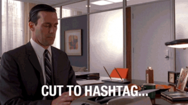
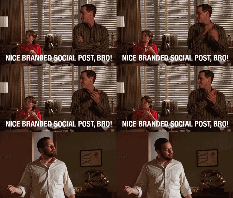
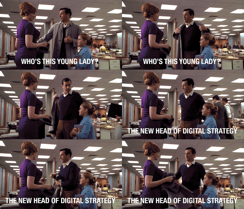
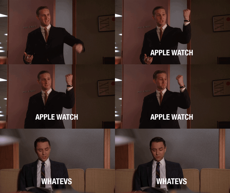
Your New Favorite Tumblr Shows What Mad Men Would Be Like in the Digital Age

Mad Men may be over, but it’s sure to live on forever in our hearts—and our animated GIFs.

An entertaining Tumblr, Mad Men Integrated, imagines what the show might look like in today’s digitally fueled agency environment.

Making light of digital strategy jargon might seem like low-hanging fruit—the word hashtag is immediately funny in this context—but the whole concept and execution here is delightful. Even if you don’t work for a digital, social or media agency, the reactions of Peggy, Pete, Don and the gang will give you a smile. 

Check out some of the GIFs below and head to the Tumblr for more.


I Spent £5.89 on Twitter Advertising And Here's What I Learned

We’ve all heard the one “If you’re not the customer then you’re the product being sold.” Well guess what – it’s painfully true. Twitter, Facebook and all those other social media platforms don’t specifically exist to give you warm fuzzy feelings when confronted with a cat doing something cute. They’re there to make bundles of cold hard cash selling your eyeballs to advertisers. I gave £5.89 to twitter and here’s what I learned.

1) Always check out your ad on multiple devices before running a campaign. Seriously, a lot of devices.

I decided to run a topical ad the day after Carlsberg was plastered all over social media with their “Probably the best poster in the world” stunt (a Shoreditch-based poster which dispensed free beer). I was going to use some borrowed interest to make myself relevant and funny. Unfortunately, while my ad looked acceptable enough in photoshop and on a PC screen, I later found out that it looked like shit on any mobile device. Huge mistake. Why did I not check this out before running the ad? Because I didn’t give it any consideration. Check out your ad on several iOS and Android screens before even thinking of hitting the go switch.

2) Consider what you’re CTA and business aims are.

My ad didn’t really have any Call To Action, or any business aims beyond making people laugh and maybe, just maybe crossing the eyes of a few ECDs. Then six months down the line when they’re reading my portfolio, some tiny unconcious bias creeps in, a few neurons remember the name of David Felton, and BAM – I’m drinking beers on a beach while we shoot a commercial for the Hawaii Tourist Board. But you should have less nebulous aims that that. Luckily, Twitter spoon-feeds you across the entire process and lets you customise your campaign to drive traffic, raise awareness, promote sharing and clicks or whatever you fancy. Here’s a big learning on my part: advertising on twitter is an extremely simple process. They could not make it any easier for you. It’s almost as if they want your money or something.

3) It’s true, adlanders all have iPhones and Macs.

There’s a bit of a cliche across the ad world that we’re all a bunch of Mac loving, iPhone using, Apple junkies. Personally, I’m fine with anything; I like my four-year old piece of shit Samsung phone, but I’m also not saying no to a brand new MacBook Pro at work if someone offers. Well the rumours are true. Out of 574 impressions, 505 were from iOS users. Even more shocking out of the 102 people who clicked or interacted with my ad, 100 were Apple users. That’s 98%. Now this leads to an interesting question – did my ad reach such a disproportionally high number of iOS users because I specifically targeted the advertising industry using industry keywords and accounts only followed by ad people, or because iOS users are more likely to interact with advertising? I’m veering towards the former, although there’s plenty of solid quantifiable evidence out there that Apple users spend more on apps, use more apps, and are willing to pay more for an app on average. Do they take this willingness forward when it comes to their relationship with advertising too?

Conclusion

It was good fun running my own miniature campaign on twitter, even if only reached 574 people and cost £5.89. My engagement rate of 18% was very high, well above the industry average based on any metric I’ve seen. However, I’m not sure it was high for a good reason – my dark and basically illegible ad, was a great example of a lack of preparation and it’s not too hard to imagine people clicking on it just to simply try to see what was going on.

The great thing about online adverting is there’s no minimum spend. It’s not like print where you need a media buyer, an agency and deep pockets just to get started. You could literally run a campaign where you only spent $5 per day. So my advice – give it a try. You can play around with being the client for the price of a cup of coffee.

Twitter ads used for trolling timelines : Weev promotes white supremacy tweets

Twitter has growing pains in the ad department, and ironically tweets made twitter stock plummet. When each twitter feed of brand or celebrity (verified for $15,000 or not) was seen as an advertising channel already, making brands buy to be seen more, was going against what brands had already learned about the media. Advertising in social has cut its teeth on going viral by retweets, not on buying placements in feeds. It is a bit like when Facebook introduced promoted posts, and GM decided to leave the platform taking their $10 million with them. The social media kool-aid is a bunch of numbers hard to quantify, a lot of flameouts over names like juan, sombreros, and Belvedere vodka’s use of a comedy skit with a line about going down easy. Away from advertising there’s feminism’s toxic twitter wars, and Slate points out how how twitter rewards trolling and conflict over discourse. The supplement brand Protein World turned trolling into a social media strategy, which paid off. Desperate for cash, Twitter now grabs at straws, blames marketers’ ‘Reluctance To Buy New Kind Of Ad’. Like David Auerbach at Slate says,