The Boy Garbage Collector in this Thai Ad Will Sweep Up the Pieces of Your Shattered Heart

If you’ve arrived at this ad without having seen Ogilvy’s previous work for Thai Life Insurance, take a minute or two to get familiar—here and here. Oh, and grab some tissues first, you old softie.

OK, now that we’re up to speed, here’s the latest spot from the wizards of weeping, the sultans of sobbing, the ballers of bawling. 

In the perfect short-film-style vignette, we follow the life of our unlikely hero, Pornchai Sukyod: a husky schoolboy with unusual superhero aspirations. Despite its three-and-a-half-minute run time, it’s a flawlessly shot and edited spot that presents a concise, poignant narrative—with a reveal that feels nothing at all like an insurance commercial.


Brands Are Having Way Too Much Fun With the #FiveWordsToRuinADate Hashtag Game

Social media moves quickly, and yesterday’s trending #KissAGingerDay is today’s #FiveWordsToRuinADate.

Mere mortals have been playing the hashtag game by tweeting quips like “A salad for the lady?,” “I’m an Android user,” and “Do they have WiFi here?” But brands are also hopping on board.

Some tweets are a little predictable, and some are more clever than others, but generally it’s good, clean fun for everyone. (Except it’s Twitter, so take what I said about good and clean and fun with a grain of salt, please.)

Got a favorite?


Cisco Shows You the World's Last Traffic Jam in Goodby's Artful New Campaign

One day, all the world’s persistent infrastructure problems will be obsolete, says Cisco. Indeed, you’ll only be able to see them in museums.

That’s the theme of “Building Tomorrow Today,” a new Cisco campaign by Goodby, Silverstein & Partners that begins today with “The Last Traffic Jam,” a striking 30-second spot that shows a traffic jam—now a remnant of the past—as an art piece in a gallery.

Future ads will depict other “last” scenarios, including the last long checkout line and the last product recall, as frozen moments from the past that are now displayed in an art gallery.

GSP creative directors Justin Moore and Nick Klinkert spoke to AdFreak about the “The Last Traffic Jam”:

AdFreak: This is a clever idea. How did you arrive at this concept of a Museum of Lasts?
Moore: “People talk a lot about ‘firsts’ in tech. So we loved the idea that ‘lasts’ can represent a more interesting view of the future—a way of showing how the Internet of everything can have a real, positive impact on people’s lives. After we got to the idea of ‘lasts,’ the museum concept felt like a pretty short leap.”

Klinkert: “Research found that business and technology leaders feel more and more responsibility to solve exceedingly complex problems in the world, with the help of technology. The ultimate goal is to confine these problems that affect us all to the past. The team quite quickly became interested in a place where all these problems could live—’the museum of lasts.’ “

Where did you film this, and what were the production challenges?
Klinkert: “We shot these in Zaragoza, Spain. They built these massive, beautiful buildings for the water expo in 2008, and they gave us the scale and the look that we were after. The ‘art installations’ are actually real people standing very still (and treated in post) to replicate hyperrealistic statues of people.”

Can you tell me about the visual look?
Moore: We wanted to make the point that technology is ultimately about people. So we spent a lot of time looking at the work of artists like Ron Mueck and researching how modern museums create exhibitions.

Klinkert: Visually, we were interested and inspired by the amazing, hyperreal sculptures of Sam Jinks and Ron Mueck, and the way large-scale installations in museums work these days. A lot of them have an interactive component to them, a lot of them are playing with relative size, and they are very fascinating to look at.

Did you storyboard exactly how the tableaux would look, almost like doing little paintings?
Klinkert: We had a pretty clear idea of how it would look at first, but a lot of exploration went into the final execution of it. The traffic jam is obviously a universal problem that affects a lot of people. We wanted to illustrate the frustration, impatience and the boredom of the people in the traffic jam. We toyed around with a lot of other ideas, but at the end of the day we wanted it to look as if an artist picked up a chunk of congested freeway in a major metropolitan city and put it in an elegant museum space.

Why the British voiceover?
Moore: We’re just looking for something fresh and interesting. We tried lots of voices. But something about the English accent seemed to suit the cadence of the words.

How does this evolve the Cisco campaign from last year’s work?
Moore: Strategically, we’ve got a sharper point of view on what Cisco’s vision is for the future, and how it relates to what they’re doing right now. Creatively, the campaign’s just getting better and better.

Klinkert: It’s really a creative expression of what they are doing right now, Cisco is helping to make the Internet of everything possible. And with that, hopefully we can see the last traffic jam or the last product recall in the not-too distant future.


Aubrey Plaza and Newcastle Want a Ton of Small Brands to Buy a Super Bowl Ad Together

Newcastle Brown Ale keeps finding new and interesting ways not to appear on the Super Bowl. This year it’s already tried crashing the Doritos contest (sort of). And now it’s gotten Aubrey Plaza on board to introduce a truly, audaciously stupid idea: getting small brands everywhere to all go in on a Super Bowl spot together.

“Instead of blowing Newcastle’s marketing budget, let’s team up to blow all of our marketing budgets!” the 30-year-old Parks and Recreation star says in the video below about Newcastle’s so-called “Band of Brands” idea.

Because what could be more compelling for any brand than to share 30 seconds of airtime (price tag: $4.5 million) with 20 of 30 other brands?

Interested parties should head to NewcastleBandOfBrands.com, where you can, according to Plaza, “find out how our brand can help your brand help our brand, most importantly.”


It's Kiss a Ginger Day, So Jimmy John's Is Now Flirting With Wendy's

Of all of the holidays that are made up, National Cheese Pizza Day (Sept. 5) remains one of my favorites. Today just so happens to be National Kiss a Ginger Day—meaning, you should kiss a person with red hair, not the spice in your cupboard.

Well, sandwich chain Jimmy John’s took the opportunity to tweet a fellow fast-food restaurant and famous ginger, Wendy’s. The latter’s response was pretty fun, too, and fans are going wild for it.

A+ for use of emoji and keeping things light and fun.

Now, as you can see below, it could be Chester Cheetah’s turn to make his move.


Was McDonald's 'Signs' Ad on the Golden Globes Inspiring or Abominable?

McDonald’s really wants people to think it cares about community. But go figure, not everyone is convinced.

The brand’s new ad from Leo Burnett, which aired Sunday during NFL games and on the Golden Globe Awards, focuses on McDonald’s franchises that have, over the past 20 years, used their roadside signs to support, celebrate or otherwise acknowledge local and national events, both happy and tragic—everything from 9/11 to the homecoming of troops to a nearby base to Boston’s spirit in the wake of the marathon bombing to the 30th wedding anniversary of a couple who’ve celebrated every year of marriage at a McDonald’s. (The campaign includes a Tumblr page that explains some of the more specific examples.)

The centerpiece spot, part of a broader brand refresh that began with the quite well-liked “Archenemies” ad, got a less-than-enthusiastic response on Twitter during NBC’s Globes telecast.“McDonald’s is presenting itself as the face of corporate kindness? PAY YOUR EMPLOYEES A LIVING WAGE,” said one detractor, in a post retweeted more than 80 times. Said another, “@McDonalds I just threw up in my mouth watching your commercial… Desperate attempt to rescue your image.”

To be fair, some viewers enjoyed the spot. “This McDonald’s marquee sign is fantastic!” tweeted the handle of Des Moines radio station Star 102.5. But the backlash around the fair pay debate is predictable, given the high profile of the recent Fight for 15 protests. And that makes a sign like “Keep Jobs in Toledo” seem kind of tone deaf, even if it technically refers to a nearby factory at risk of closure.

Plus, the soundtrack—a children’s choir covering indie pop band Fun’s “Carry On”—makes such a clumsy grab for the audience’s heartstrings that it’s hard not to think of crocodile tears. In the words of another viewer, “I’m not lovin’ it.”

See more of the Twitter reaction below. What do you think of the ad?

 
LOVIN’ IT

 
NOT LOVIN’ IT


Here Are the Funniest, Quirkiest Ads You'll See About Having Your Home Invaded

Kwikset, the keyless entry and re-keying company, unlocks the humor of home invasions in these amusing, mildly edgy tales of suburban paranoia to promote its SmartKey technology.

The ads, running exclusively on YouTube, posit a support group for people who can no longer invade the house of a woman named Amy because she has installed Kwikset locks. “I just can’t move past it,” a middle-aged music teacher despairs. “I’ve never laid my hands on a better piano.” Others in therapy entered Amy’s home uninvited to try on (and steal) her clothes, splash around in her hot tub and enjoy her home-theater system. Once, when Amy was away for a week, they threw a wild party at the house, and some dude secretly lived in the guest bathroom to avoid paying rent.

“It’s easier to give an acquaintance a key than it is to ask for it back when the two of you lose touch,” says Nick Lange, creative director of Nurture Digital, which created the campaign. “We’re targeting homeowners who know their spare keys are in circulation, but who can’t quite justify the hassle and expense of hiring a locksmith to change their lock.”

While using the same fear-response mechanism that drives those disturbing commercials for home-safety systems and related security services, Kwikset suggests the threat in cheeky fashion instead of trying to scare the crap out of us. The comedy—directed in classic sitcom fashion by Shawn Wines—allows the viewer to evaluate the product’s potential without feeling unduly manipulated. “We felt that humor was a way to make the message of these ads fresh,” says Lange. “It’s a fine line when your whole campaign is about breaking and entering.”

Could some folks object to the campaign’s tone (making light of serious crime), or its other un-PC elements, like an elderly neighbor who keeps showing up at Amy’s because she’s forgotten where she really lives?

“The fact that these pieces take risks that might rub some viewers the wrong way was a serious concern,” says Lange. “When viewers look carefully, though, they’ll see that the stereotypes being referenced here are ultimately turned on their heads. The older woman who sometimes forgets which house is hers is revealed to be a master lock-picker who knows exactly what she wants—her neighbor’s hot tub.”

“A lot of our favorite comedy pushes viewers a little outside their comfort zone,” he adds, “and we felt that doing the same would make these ads most worth our audience’s time.”


Newcastle Begins Ambush of This Year's Super Bowl by Crashing the Doritos Campaign

You might remember Newcastle Brown Ale’s antics around last year’s Super Bowl—a little stunt from Droga5 called “If We Made It” that imagined what a Newcastle Super Bowl ad might have looked like if they could have afforded one.

The whole thing went pretty well, to say the least.

Given that success, Newcastle obviously had to screw with this year’s game, too. And so it begins its 2015 Super Bowl ambush with the video below—in which the brewer, which still doesn’t have $4 million lying around, pretends to crash a certain “Crash the Super Bowl” contest by a certain unnamed snack maker (OK, Doritos), so that it can get on the Super Bowl for free.

Newcastle’s fake Doritos ad, also made by Droga5, is amusingly bad—which frankly is a step up from some of the actual Doritos finalists, which are short on the amusing part. It’s full of stupidly obvious Newcastle product placement, in keeping with the brand’s ethos of undercutting typical marketing tactics. There’s even a case study (see below) about the “failed attempt to infiltrate a snack chip contest.”

“We had such a good time almost making that Huge Sports Match ad last year, we decided we’d stop at nothing to finally make our way into the Really Large American Football Contest in 2015. Even if we still can’t afford it,” the brand tells us.

It’s a bit of a convoluted premise—Newcastle’s meta anti-advertising stunts often have a kind of pretzel-like structure to them. But the brand confirms there’s more silliness to come in the next few weeks, so it should be fun to see what else they have in store.

CREDITS
Client: Newcastle Brown Ale
Campaign: Newcastle: Chores. A beer ad disguised as a snack chip ad.
Title: Chores

Agency: Droga5 NY
Creative Chairman: David Droga
Chief Creative Officer: Ted Royer
Group Creative Director: Scott Bell
Senior Art Director: Dan Kenneally
Senior Copywriter: Ryan Raab
Chief Creation Officer: Sally-Ann Dale
Head of Broadcast Production: Ben Davies
Senior Broadcast Producer: David Cardinali
Broadcast Producer: Bill Berg
Global Chief Strategy Officer: Jonny Bauer
Head of Strategy: Chet Gulland
Strategist: Nick Maschmeyer 
Social Strategist: Rebecca Russell 
Communications Strategist: Kevin Wang  
Group Account Director: Dan Gonda
Account Director: Nadia Malik
Account Manager: Ashton Atlas

Client: Heineken USA, Newcastle Brown Ale
Senior Director, Portfolio Brands: Charles Van Es
Brand Director: Priscilla Dohnert
Brand Manager: Brett Steen

Production Company: Droga5 Studios | Film
Director: Mike Long
Line Producer: Jessica Bermingham
DP: Brian Lannin

Editorial: Droga5 AV
Editor: Joseph Schulhoff


Your First Ikea Commercial of 2015 Is Strange, Soaring and Really Quite Lovely

Ikea’s list of 2014 advertising triumphs is endless: the horny chairs for Valentine’s Day; the awesome RGB billboard; the whirling-kitchen ad; the ethereal ode to sleep for Ikea beds; the climbing-wall billboard; the hilarious pitch of catalog as tech device. Almost no marketer had a better year.

Now, Mother London gets the brand off and running for 2015 with the remarkable spot below, in which a flock of itinerant T-shirts are seen flying around the world before finally finding a home.

It was directed by Blink’s Dougal Wilson—who actually made two of Adweek’s 10 best ads of 2014 (Lurpak’s “Adventure Awaits” and John Lewis’s “Monty the Penguin”). The spot also features some great puppeteering work by Blinkink directors Jonny & Will.

Hopefully it’s just the beginning of another strong year for Ikea. Full credits below.

CREDITS
Client: Ikea
Agency: Mother, London
Director: Dougal Wilson
Production Company: Blink
Puppeteering: Jonny & Will, Blinkink
Editor: Joe Guest, Final Cut
Postproduction: MPC


Justin Bieber's Calvin Klein Ads Make Everyone Everywhere Question Everything

Stop the presses. Justin Bieber is making a Justin Bieber face in ads for Calvin Klein, and people are losing their minds.

“Is he actually hot in these pictures?” some people are asking. “Will he ever be as hot as Marky Mark?” other people are wondering. “Can we please bring back David Beckham?” further people are begging (even though Beckham’s underwear pics were for H&M, because Beckham was too good for Calvin Klein).

In any event, these topics—surprise, bargaining, regret—are apparently the relevant considerations when weighing the cultural significance of Justin Bieber wearing C.K. jeans and underwear. (Dutch model Lara Stone also appears in the campaign, but most people seem more interested in Bieber.)

He, reportedly, has been teasing the idea that he might appear in C.K. ads for some time now—almost a year, which has only stoked the fires of frenzy among people looking for a chance to freak out over Justin Bieber taking off his shirt.

“This is so dumb, why are we even talking about this?” was the majority response—31 percent, or 13,200 votes—of a highly scientific BuzzFeed reader poll about the new ads, as measured at 11:24 p.m. on Tuesday night. “I, like, don’t hate it? ¯_(?)_/¯” was the runner up, with 20 percent. “No no no no” followed at 19 percent.

The photography—and/or Photoshopping—certainly has some aesthetic appeal, for people willing to embrace or at least overlook the fact that it’s Justin Bieber making a Justin Bieber face. On the other hand, Calvin Klein probably likes the fact that Justin Bieber’s face comes with 59 million Twitter followers, many of whom like Justin’s Bieber face, and might want to buy Calvin Klein jeans and underwear after looking at it.

So, all in all, it seems like a pretty good plan.


One of Doritos' Crash the Super Bowl Finalists Is Just Like This Award-Winning Ad From 2010

There’s nothing in the Doritos “Crash the Super Bowl” rules that says the consumer-made ads have to be good. But they do—according to the judging criteria—have to be original.

One of the 10 finalists unveiled today may have a bit of a problem in that department. That’s because the plot of Jason Johnson’s “Trouble in the Back Seat” is very similar to that of “Drama Queen,” a well-known ad from director Rogier Hesp (produced by TWBA/PHS Helsinki) that won the Young Director Award at Cannes in 2010.

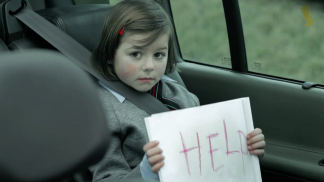
In both ads, after parents get pulled over by the police, kids in the backseat hold up “Help!” signs, pretending they’ve been kidnapped. (In the Doritos ad, a brother and sister are mad at Dad for not handing over his chips. In Hesp’s spot, which advertised the Young Director Award itself, the girl in the backseat is simply “Born to create drama.”)

Adweek wrote about the “Drama Queen” ad when it was made, as did many of the ad blogs. The YouTube version has 4.5 million views. It’s not obscure.

See both ads below.

According to the “Crash the Super Bowl” rules, “originality and creativity” are supposed to count for 40 percent of the judging score. (“Adherence to the creative assignment” counts for 30 percent, and “Overall appeal to the general public as a Doritos Super Bowl ad” counts for 30 percent.) Doritos picked the 10 finalists, meaning the brand either didn’t know how similar “Trouble in the Back Seat” is to “Drama Queen”—or didn’t care.

It might be a coincidence. Johnson talks about his inspiration for the ad in the video below, and certainly doesn’t mention an industry-targeted Finnish spot from five years ago:

Still, it could be awkward for Doritos if one of its in-game spots is deemed to be a rip-off by ad people. And that could happen. Doritos will air two of the 10 finalists on the Super Bowl. The brand will pick one, but the other—the grand-prize winner—is meant to be selected by public vote.


These Funny, Adorable Photos Capture Tiny Moments of Agency Life in Miniature

Agency life is different everywhere, of course, but mostly it’s the same. And few art projects capture the clichés and peculiarities of that existence quite like Derrick Lin’s photographs.

Lin, a brand strategist at Resource/Ammirati in Columbus, Ohio, has been taking photos over the past year of miniature figurines in typical agency situations, from the mundane to the slightly less mundane. The results are amazing: funny, beautifully crafted, oddly poignant—and relatable to people in office jobs everywhere, not just in advertising.

Lin spoke to the Daily Mail earlier this year, and explained the project this way:

I have always been fascinated by all things miniature and by small details, so it occurred to me that the miniature figures, with the contrast of their size and their lively poses, could be a great medium to express our many emotions.

In the advertising industry, every day moves fast, and sometimes it can be stressful. Our work days are never short of those little moments any agency person will immediately understand. But I realized that those moments were actually universal and that anyone who works in an office could easily relate to them.

I try to find the amusing light out of our daily frustrations, be it stress, escape or imagination. I actually start with the captions. I look for a humorous and straightforward way to visualize each idea, and then I think about how to plant the punch line alongside the picture without being too obvious.

I use my iPhone and office lighting to take the photos because I want to achieve a friendly and “everyday” style. Shortly after starting my Instagram page, I had co-workers cheering for me and volunteering to be in the pictures, they are always encouraging me to share my series with the Internet.

Check out some of his recent photos below, and the whole series on Tumblr and Instagram.

Via Design Taxi.

 
“Can’t believe we still have to come to work when it’s this cold.”

 
“Well, everyone is back in the office. Now what?”

 
“After counting the number of pitches won, campaigns released, and potential disasters avoided, we are ready to flip over the last page of the year.”

 
“Sometimes it takes a lot for ideas to be noticed.”

 
“Office holiday parties can be fun unless you happen to be an introvert.”

 
“Office fridge cleaning day.”

 
“Fetching the best ideas from our memories can be challenging some days.”

 
“We’re thankful our clients are spending quality time with their families.”

 
“Sometimes we wish the client can see what we see.”

 
“Waiting to see if we won a pitch makes time go by so slowly.”

 
“At the end of each week, it’s time to track all the work we did.”

 
“Working in advertising means we are always ready to jump in and help put out the fire.”

 
“Every vacationer knows there is a mountain of work waiting for them to come back.”

 
“Our work is subject to rigorous internal review before the client sees it.”

 
“On some days we wish there is more excitement in the office.”


11 Major Logo Redesigns of 2014: Which Did You Love, and Loathe?

2014 was a busy year for logo redesigns, but who actually improved on their old marks?

PM Digital put together the infographic below showing 11 major logo revamps from 2014. For each one, PM says whether it loved the new design, liked it, or would have preferred the old one be left alone. There are some oddities here: PM likes the new Olive Garden logo, which was widely panned, and doesn’t like the new Netflix logo, which we felt was a nice evolution.

What did you think of each redesign?

Below the chart, check out some analysis from Roy DeYoung, svp of creative strategy at PM Digital, about each mark.

Roy DeYoung, svp of creative strategy at PM Digital, analyzes each new logo:

Airbnb
Airbnb made waves with its logo redesign. Whether or not Airbnb intentionally created a provocative and somewhat sexual image, the flat redesign did accomplish the challenge to communicate the brand’s overhauled messaging and positioning. The company named this new symbol Bélo to indicate a sense of belonging and connectivity. Airbnb no longer thinks of itself as a simple home exchange provider, but a global connector. Bélo aside, the company also cleaned up and contemporized the wordmark. We’ll have to wait and see if this redesign becomes as iconic and universally recognized as Airbnb is hoping.

Pizza Hut
This year Pizza Hut overhauled its menu and needed an updated logo to support the change. To capture a millennial and mobile-focused audience’s attention, and communicate its new, slew of customized menu options, Pizza Hut de-cluttered and introduced a flat logo reminiscent of a blank pizza pie covered in sauce, and awaiting customers’ personalized choices. While this is definitely a radical change, the restaurant chain still managed to incorporate their iconic slanted roof symbol.

Hershey
It’s difficult to look at the new Hershey logo objectively as there is a significant heritage associated with its brand emblem. However, from a pure design standpoint, the new logo is far superior as it is cleaner, easier to decipher the hierarchy and will likely pop across a variety of devices and environments. In introducing a new logo, the brand also quietly dropped the ‘S, and essentially diluted ownership through this slight name change. Although, because of the historical connotations, it’s likely that people will continue to refer to the brand as Hershey’s rather than Hershey despite the new logo.

MLS
Coming off the heels of the World Cup, and the soccer frenzy it inspired in the United States, Major League Soccer needed to make a smart branding move to maintain interest and capitalize on the momentum of the global tournament. Their previous and outdated youth soccer patch-like logo was desperate for a more relevant overhaul. By introducing a crest as the face of the league, MLS is not only signifying that it’s ready for a new era of American soccer, but it’s also playing homage and leveraging the historical equity of the sport’s European roots. With this redesign, it took a complex, unclear illustration and added more visual integrity to the organization. Additionally, the crest will reproduce well across a range of environments, from flags at matches to mobile applications.

Foursquare
Foursquare completely changed the direction of its brand this year, and this logo redesign aptly communicates its new story. Now that Foursquare has siphoned its signature check-in feature to another app, the company is focused on serving customized local reviews and suggestions. The new logo is highly reminiscent of a pin you would place on a map signifying the company’s authority in location targeting. The brand has also graduated from its previous rounded, multicolored and playful typeface into a clear and commanding wordmark.

Southwest
As far as the typography goes, the wordmark treatment is a nice evolution, eliminating the dated convention of all-caps. While I think Southwest needs to move away from the oversized jet, the inclusion of the heart is puzzling. The brand is clearly trying to indicate a position of customer first, but it doesn’t align with the brand. Southwest has carved out its niche in the industry by putting price first—and the strategy seemingly works for the airline. Travelers choose Southwest to get the best price, not necessarily the best flying experience. The updated logo deviates from the essence of the brand.

Reebok
Reebok’s logo redesign offers a slight, yet contemporary, clean-up of the typographic treatment of its brand name. While the font evolution is positive, the symbol within the new logo is challenging. Although the previous logo shared undertones of Reebok’s competitors (Adidas and Nike), the new logo also does not feel completely original. The red triangle is reminiscent of both Citgo and Mitsubishi and will likely fail to achieve an instantly recognizable and differentiating status. Although introducing a color into the logo was a strong choice, this logo feels like a cop-out, or at least an unfinished product.

Netflix
Netflix’s logo update managed to fly under the radar because the changes were fairly minimal, which doesn’t necessarily constitute diminishment. Netflix must have decided it was time to clean up as this update, and the elimination of the drop shadow, has introduced a logo that is tidy and unblemished. Yes, the drop shadow might be dated from a design perspective, but it gave Netflix’s previous logo a hint of nostalgia for the vintage, back-lit cinema marquees. In following the design trends of today, Netflix has forgone the subtle homage to classic Hollywood movies to usher in a new brand era.

Olive Garden
Olive Garden’s logo update was a long-needed move. The predecessor to this update was not really a logo, it was a sign. Now with the shift to a logo, Olive Garden can confidently deploy its brand emblem across a range of environments and screen sizes. Olive Garden also implemented subtle repositioning through switching out Italian Restaurant in favor of Italian Kitchen under the brand name. This update showcases cleaner lines and more balance, which will help make an impact within digital promotions.

Black + Decker
Like everyone else this year, Black + Decker went flat. The previous Black + Decker logo was iconic and ingrained within the mind of consumers across every generation. The updated logo is straightforward and painstakingly clean. Additionally, the company also switched out the “&” in favor of the more timely “+” sign. Black + Decker is completely on top of the design trends of 2014, but in favor of gaining a trendier status symbol, it may have ceded some emotional connectivity that identified the brand to so many consumers.

PayPal
To mark the dissolution of its longtime marriage to Ebay, PayPal introduced a logo overhaul fit to usher the brand into this new era. The eye-catching overlaid Ps express motion and, subliminally, transaction. However, the redesign feels incomplete due to inconsistencies within the typography (kerning between the letters is slightly off). While this is a good step in the right direction, PayPal should reconsider another round of touch-ups to finish the job.


Ads Show How Cats Just Absolutely Destroy Bags of Temptations Treats in a Ravenous Fury

It’s rare for a brand to base an ad campaign around photographs of the product after it’s been completely torn up and clawed and chewed to pieces and is looking like hell.

Temptations cat treats is doing it anyway. The brand recently noticed that cat owners seem to enjoy posting photos and videos of destroyed packs of cat treats to social media. So, with help from adam&eveDDB in London, it decided to subject some packs to a bit of professional destruction.

Check out the video below, in which a pack of wild animals (OK, probably high-paid cat models) is let loose upon a box of Temptations treats. It isn’t pretty, but it leads to some pretty fun print and out-of-home posters. The Mars brand is now encouraging consumers to start tagging their photos of apocalyptic bag ruination with the hashtag #PackAttack.


3 of Britain's Oldest Couples Recall Their Happiest Moment in Insurer's Touching Video

Three elderly couples recount the happiest moments of their lives in this sweet slice of branded content from British insurance company Beagle Street.

The four-minute film, directed by Gary Tarn, features interviews with Maurice and Helen Kaye, each over 100, who have been married for 80 years; Doug and Betty Hale, married for 73 years; and William and Maureen Norman, wed for 60 years.

The stories they tell aren’t especially earth-shattering, yet each tale is special and poignant in its way. The couples recall first meetings, wedding days and the births of their children. Recollections of a hospital visit to a wounded spouse during World War II, and the arrival of a dazzling engagement ring years after the nuptials, might have you reaching for the Kleenex.

Matthew Gledhill, Beagle Street’s managing director, says “Happiest Moment” was made to encourage the younger generation to “worry less and live in the moment with the people you care about most.” What’s more, he says, “the film and our research clearly show that happiness is linked much more heavily to relationships, friends and family than societal or monetary status.”

The video accompanies a survey of 1,000 Brits over 70 years of age. More than 12 percent said their happiest moment in life was the birth of their first child (suck it, younger siblings!), followed by their wedding day (11.5 percent) and the birth of their grandchildren (10 percent). For the record, the birth of other kids placed fourth at 8.5 percent.

Not taking loved ones for granted and believing in yourself were the top pieces of advice they had for living a happier life. Choosing the wrong career was the biggest regret. (As a journalist and blogger, I’ve got nothing to worry about. Right?)

Sure, the survey’s hardly scientific, and some might object to the film’s predictably treacly tone. Still, Beagle Street’s approach is compelling, and provides a refreshing change of pace. Older people are often the punch lines of jokes in commercials. It’s high time marketers (and all of us) respected their life experience and paid attention to what they have to say.

Via Hello You Creatives.


Tina Fey and Amy Poehler Explain Their Hosting Strategy for Sunday's Golden Globes

Tina Fey and Amy Poehler lay out their hosting strategies for this year’s Golden Globes in this blooper-reel-style NBC video that leans rather heavily on the ladies’ charm (and some well-timed edits), rather than the strength of their material.

For example: Tina’s “I’m not gonna dope” line, which would fall flat without the quick cut. Or Amy’s joke about Hollywood Foreign Press members being ghosts, which sounds like a rejected Anchorman line, though her bright-faced delivery makes it work. (We’ll ignore the Banksy thing altogether.)

Still, the spot fulfills its intentions to the letter. Awards shows are awkward and cursed with uninspired writing, but if the hosts are good enough, they still basically work.


Snuggie Finds Cozier and Fancier Ways for You to Look Like an Utter Fool

We haven’t heard much from Snuggie, the blanket with sleeves, in years. But no, they haven’t gone out of business. Quite the opposite. They’ve been working on some stunning new designs and even cozier fabrics—and they’re making a big, comfy marketing push this holiday.

Looking for a blanket that looks like a tuxedo or an evening gown? You’re in luck! Are you an elderly person who wants to see people’s faces when you dress up in a board-shorts or bikini blanket? You jokester—they’ve got that, too!

With a new belt and fitted cuffs, the Snuggie has never been better. And the ads are as campy as ever—though they may never do anything as wretched as these old holiday spots.


Everyone in This Amazing Stock Photo Collection Is a Cancer Patient or Survivor

Nowhere is the world more carefree than inside stock photographs. The sense of normalcy they communicate is so pervasive, it’s become cliché. Which is why it’s such a stroke of genius that Isobar Poland is developing a stock-photo bank using only models who are cancer patients or survivors.

Life for them, of course, has been anything but carefree. Thus, their involvement in the “Photos for Life” project is joyfully defiant on a few levels. It shows cancer isn’t a death sentence—indeed, that patients and survivors are just as capable of the most stereotypical happiness possible. And it lifts the gloom from the disease and bathes it in ridiculously perfect lighting.

Prices start at $75 for use on the web and in magazine, or as little as $8 for personal use. All profits go to the Rak’n’Roll Win Your Life! foundation to finance therapy for cancer patients. More images below.

CREDITS
Agency: Isobar, Poland
Managing Creative Director: Maciej Nowicki
Senior Copywriter: Jan Cie?lar
Senior Art Director: Rafa? Ry?
Photographers: Pawe? Fabja?ski, ?ukasz Zi?tek, Jacek Poremba, Karol Grygoruk
Production Company: ShootMe
Production Company Producer: Micha? Majewski
Graphic Designers: Adam Zawiasi?ski, Bart?omiej Bednarski
Programmer: Piotr Budek
Account Manager: Aleksandra Matuszewska
Integrated Director: Ewa Rzewuska-Wolska


This Family Is Completely, Ridiculously Pumped to Be Shopping at Kmart This Holiday

If you see this suburban family at your local Kmart, you’d better get out of their way.

Mom just got an email confirming their online holiday order is ready, thanks to Kmart’s free in-store pickup service. Now, nothing’s going to stop them from busting mad-ass moves as they strut across the parking lot and through the automatic doors to collect their discount merchandise.

The spot, by FCB Chicago, really shouldn’t work as well as it does. I expected it to fall flat, but it didn’t. Once the beat kicks in, the frenetic pace never lets up. The overblown earnestness of the actors—conveyed mainly through popping and locking, or something, and pouty hip-hop poses—is infectious (and a little bit frightening).

Mom’s frenzied hair flips and hyperactive hips reach a Miley Cyrus level of insanity. Dad’s all about the cool hand-jive. (Pump it, Pops!) And that baby, rocking those shades, looks—as one YouTube commenter succinctly puts it—”fly as hell.” At last, a tyke capable of taking out this little monster in a rattle battle.

Clothes, housewares, rotating disco-ball light—it really doesn’t matter what they bought. Let the ominous thump of DJ Milad’s “Just Got a Check” serve as a warning: There’s gonna be manically choreographed, bass-heavy bopping in the aisles, bitches!


Ikea Gave This Theater a Cozy Makeover So People Could Watch the Movies in Bed

The worst thing about going to the movies is having to sit upright for a few hours to watch the film. Everyone knows lying down is the ideal viewing position for anything on a screen—or anything at all, for that matter.

No stranger to putting dream-like imagery in its advertising, Ikea moves even more directly into the bedroom with its latest stunt.

Moviegoers in the Russian town of Khimki are being treated to quite a surprise this month. After purchasing their tickets, patrons are led to a theater that’s been completely gutted and transformed into a giant bedroom, entirely outfitted with Ikea furniture.

Take a look-see at the video, which has some time-lapse shots of the construction and lots of shots of glee on people’s faces. The stunt runs through Dec. 14.

This is cool and all, but does Ikea make toilets too?