Airbnb Entices Travelers to See the World Through a New Kind of Window

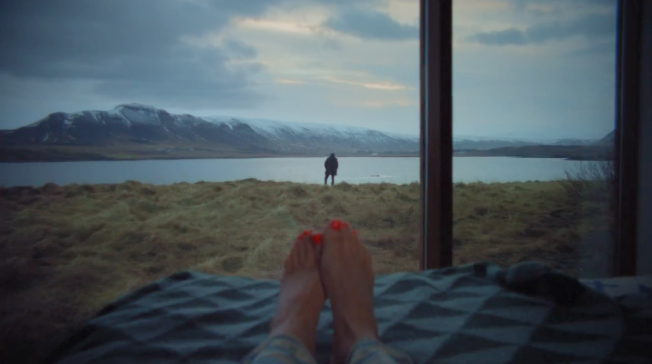
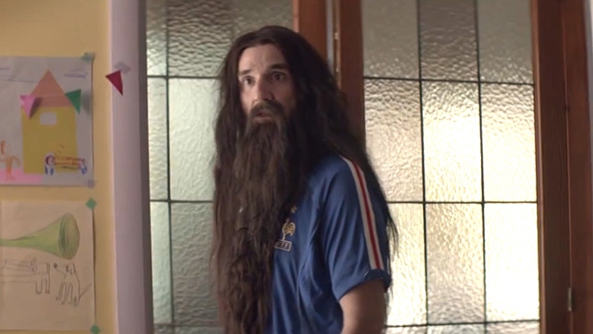
In its latest ad from Pereira & O'Dell, Airbnb offers you something you can't get at the average hotel: someone else's view of the world. 

"I want you to feel at home here," says the narrator of the worldly spot, which peers through windows and from balconies in an artful approach highlighting Airbnb's role as a sort of peer-to-peer room rental service.

The ad's apartments, lofts, bungalows and rural hideaways take you everwhere from a working farm to a downtown fireworks festival, driving home the point that Airbnb now gives you access to hundreds of thousands of listings across 192 countries.

So, where will you go?

CREDITS
Client: Airbnb
Agency: Pereira & O'Dell
Chief Creative Officer: P.J. Pereira
Vice President, Executive Creative Director: Jaime Robinson
Creative Directors: Rafael Rizuto, Eduardo Marques
Art Director: Ben Sweitzer
Copywriter: Chris Ryan
Vice President, Client Services: Gary Theut
Account Director: Marisa Quiter
Management Supervisor: Nidhi Chinai
Senior Account Executive: Jen Wantuch
Vice President, Strategy: Nick Chapman
Associate Strategy Director: Molly Cabe
Associate Strategists: Beth Windheuser, Sara Lezama
Vice President, Media Strategy: Joshua Brandau
Associate Media Director: Jasmine Summerset
Media Supervisor: Pete Fishman
Associate Media Strategist: Katie McKinley
Vice President, Production: Jeff Ferro
Broadcast Producer: Bill Spangler
Senior Interactive Producer: Erin Davis
Senior Print Producer: James Sablan
Director of Business Affairs: Kallie Halbach
Production Company: Tool
Director: Alma Har'el
Director of Photography: Alma Har'el
Executive Producer, Managing Director, Live Action: Oliver Fuselier
Producer: Christopher Leggett
Editorial Company: Rock Paper Scissors
Editor: Stewart Reeves
Assistant Editor: Luke McIntosh
Editorial Producer: Alexandra Zickerick
Visual Effects, Online: A52
Executive Producers: Jennifer Sofio Hall, Megan Meloth
Producers: Meredith Cherniack, Scott Boyajan
Flame Artists: Brendan Crockett
Color Correction: Paul Yacono
Sound Mix, Design: Lime Studios
Sound Design: Johannes Hammers
Mixer: Loren Silber
Assistant Mixers: Patrick Navarre, Susie Boyajan-Queen
Music:
Title: Windows
Composer, Arranger: Zach Shields
Studio Engineer, Mixer: Alexander Burke
Engineer: Chris Mullings
String Players; Catherine Campion, Paul Cartwright, Chrysanthe Tan, Kiara Perico, Manoela Wunder, Leah Metzler
Choir Leader: Dedrick Bonner
Singers: Maize Olinger, Don, Amanda Lunt, Karly, Ryan Shields, Ricky, Anika, Zach Shields, Ben Shields
Engineer: Chris Mullings
Trumpet: Danny Levin
Percussion: Ryan Shields, Zach Shields
Piano: Zach Shields


The First Brand on the Moon Could Be a Japanese Energy Drink

If someone told you the first brand on the moon would take the form of an aluminum can filled with energy-drink powder and the dreams of little children, you'd probably believe them—because it's the future, after all. 

What if that person was me, and I told you the can is actually a time capsule built to last 30 years on the moon's craggy surface—to be opened by future space explorers, and also to promote a beverage that they (or we) never knew existed?

Japanese company Otsuka is doing just that. It's packaging a powered form (just add moon water) of its amazingly named beverage Pocari Sweat into just such a crafted vessel, along with the laser-inscribed dreams, and sending it to the moon in 2015 on the SpaceX-funded Falcon 9 rocket and Astrobotic Technology's "Griffin Lander."

The can will be left on the moon's surface as a kind of mini billboard, or as the Verge calls it, "the first commercial product delivered to another world for marketing purposes."

Far out.


Ogilvy Apologizes for Shooting Malala Yousafzai in Mattress Ad

Someone at Ogilvy India thought it would be a good idea to depict Malala Yousafzai being shot by the Taliban to sell Kurl-On mattresses. Clearly it wasn't.

Ogilvy has now officially apologized for the ad, saying it is "contrary to the beliefs and professional standards of Ogilvy & Mather and our clients." It was originally sent to Ads of the World, which has since taken it down, though you can still see the full ad on AOTW's Facebook page. (The concept is that Kurl-On mattresses help you "Bounce back." The Malala ad shows her falling after being shot, bouncing off a mattress and rising to receive a humanitarian award.)

Other ads in the series featured Steve Jobs being ousted by Apple and Gandhi being tossed off a train for refusing to move from first class. I can only imagine the creatives said, "Geez, we should probably get a woman in there." And Malala is a great choice. Except what happened to her wasn't a cartoon, which is where the whole thing falls apart. Plus, she didn't just "bounce back." She soared above. The ad really is the ultimate trivialization of a horrific event.

Malala has appeared in ads—most notably, Bing's "Heroic Women of 2013" spot. But you know, celebrating her strength and courage is different than shooting her again.

What do you think? If you think the world is way too sensitive now and offended over everything, let me know in the comments without threatening to shoot me. That won't help your point.


X-Men Meet Mad Men in Quiznos’ Newest Pop Culture Sandwich

Quiznos' Toasty.tv, a branded content hub that got an early boost from a popular Game of Thrones-House of Cards mashup, is once again pounding together two pop culture icons.

The results of Mad X-Men: Don Draper's Future Past are mixed, but one theme is consistent with the previous video: The main actor (Ross Marquand, who also played Quiznos' Frank Underwood and Rust Cohle in a spot-on AT&T parody) may not look the part, but he sure talks the part.

Somewhat ironically, the video's best scenes are almost pure Mad Men homage, with a random X-Men reference thrown in at the end. (If you're going to put that much effort into Mystique special effects, why waste it being awkward and quasi-homophobic? Eh, it's your money, Quiznos.)

Via Digg.


Quirky Re/Max Ads Suggest Your Dream Home Isn’t What You Think

Re/Max's first ads since it went public are here, and they're Zooey Deschanel-grade quirky.

Four new spots by Leo Burnett in Chicago, which the 40-year-old company tapped in August, feature eager people looking for their dream homes and Re/Max agents guiding them to something even better—though in a different way—than what they'd imagined.

The tagline is, "Dream with your eyes open," but one spot puts it best: "With a Re/Max agent, you'll see how much better than a dream home the right home can be."

While the ads have an odd (and vaguely annoying) rhyming pattern in the voiceover, there's something endearing about the heart of the message. Re/Max is pitting expectations against reality, and trying to show that sometimes the reality can be better.

Credits below.

CREDITS
Client: Re/Max
Agency: Leo Burnett/Lapiz USA
Ad or Campaign: “Dream With Your Eyes Open”
Executive Creative Director: Laurence Klinger
Creative Director: Manuel Torres
Associate Creative Director, Art Director: Flavio Pina
Associate Creative Director, Copywriter: Lizette Morazzani
Executive Producer: Ken Gilberg
Producer: Mariana Perin
Senior Music Producer: Chris Clark
Executive Vice President, Director of Planning: Wells Davis
Vice President, Strategy Director: Howard Laubscher
Strategy Director: Felipe Cabrera
Executive Vice President, Account Director: Richard Roche
Vice President, Account Director: Ernesto Adduci
Account Supervisor: Sara Abadi
Account Executive: Spencer Colvin
Production Company, Visual Effects: MPC
Directors: Paul O’Shea, Dan Marsh
Executive Producer: Asher Edwards
Line Producer: Zak Thornborough
Post Producer: Diana De Vries


How’d They Do That? Remarkable British Ad Goes in Utero to ‘Film’ an Unborn Baby

If you happened to catch this PSA on television in Britain this month, you might be left wondering if it is—could it somehow possibly be?—real footage. And that's the point.

The spot, from Grey London, shows an unborn baby drifting around inside the womb in what is surely the most real-seeming in-utero footage ever. It is, however, all CGI.

"The craft and technique that Digital Domain and [Radical Media director] Chris Milk put into making the ad was amazing, and the end result looks so brilliantly life-like that we hope people will walk away from it questioning whether it's real or not," says Grey deputy executive creative director Vicki Maguire.

The ad, for the British Heart Foundation, even has the baby do the voiceover (in a child's voice). She talks about how she might inherit a heart condition from her parents.

"I wanted to create a sincere and simple piece of film, forging a deeply emotional connection with a girl who needs saving even before she is born," says Milk, who also made Arcade Fire's stunning interactive experience The Wilderness Downtown. "The story is told in a world that is familiar but still a mystery. She's invited us in because she has something to say. Something vital."

Credits below.

CREDITS
Client: British Heart Foundation
Agency: Grey, London
Creative Director: Vicki Maguire
Copywriter: Clemmie Telford
Art Director: Lex Down
Managing Partner: Sarah Jenkins
Business Director: Eve Bulley
Account Manager: Grant Paterson
Account Executive: Isaac Hickinbottom
Agency Producer: Vanessa Butcher
Creative Producer: Gemma Hose
Planner: Ruth Chadwick
Media Agency: PHD, London
Media Planner: Monica Majumdar
Production Company: @radical Media
Director: Chris Milk
Visual Effects: Digital Domain
Editor: Brian Miller
Producers: Ben Schneider, Sam Storr
Postproduction: Digital Domain
Soundtrack Composer: Vampire Weekend
Audio Postproduction: Grand Central


French Dad Hates His Family but Loves Football in Citröen’s New Ad

When you wake up looking like Jim Morrison and Brian Wilson's weird soccer hooligan man-baby, you've slept too long. You might want to get up, dust off the cobwebs and maybe get a friggin' haircut, ya big hippie. 

This delightfully absurd spot from French automaker Citröen and agency Les Gaulois opens with a groggy, unkempt man waking up from what appears to be a pretty satisfying Rip Van Winkle-ish snooze. He wakes up and shuffles to the window, and then we see him assemble the fragments of the years he slept through. 

Take a look below to see what happens next. 

Via Adeevee.

CREDITS

Advertising Agency: Les Gaulois, Puteaux, France
Creative Directors: Gilbert Scher, Marco Venturelli, Luca Cinquepalmi
Art Director: Marie Donnedieu
Copywriter: Ouriel Ferencz
Director: Eric Lynne


Crotches Are King in Betabrand’s Test of 30 Different Ad Photos

Advertising lore would have us believe that attractive women are the key to getting either gender to linger longer on your ad. But in digital, could it be that the male crotch is actually the key to click-through gold?

"Time and again, close-up shots of male crotches came up victorious, by a sizable margin," online retailer Betabrand says of the recent ad test for its Dress Pant Sweatpants. 

Betabrand tested 30 images of the pants on Facebook and Twitter, and each time, the crotch shown above rose to the occasion. (You can see some of the alternative shots of the pants on their site.)

In the Facebook promotion/ad test, the retailer says its photo of an iPad near a man's crotch yielded:
• 28,000 free site visits as a result of shares
• 64 percent more engagement (shares, likes, follows)
• 60 percent more on-site email signups
• 30 percent more clicks for the dollar
• 20 percent more purchases

Continuing the test with photo posts on Twitter, the brand says that yet again "King Crotch delivered." 

• 4 times the purchases
• 1.5 times the number of Retweets
• 78 percent more followers as a result of tweets
• 67 percent more Favorites

 "For better or worse, it's a brave new world of advertising, where clicks guide a brand's identity," says Betabrand founder Chris Lindland. "For now, ours appears to be squarely focused below the belt."

Will other brands catch on? If so, apologies in advance about your Facebook news feed.


24-Hour Chain Pays Local Merchants to Advertise Overnight on Their Security Gates

Delis, grocery stores, liquor marts and bakeries in Bogota, Colombia—most which close at 8 p.m.—agreed to advertise for one of their competitors, Carulla, by turning their late-night security shutters into billboards for the 24-hour supermarket chain.

The campaign from Ogilvy paid local merchants to post messages on their metal gates, including "The butcher is asleep. The one at Carulla on 85th is awake" and "In here we have everything but if you need it now, go to the Carulla on 63rd."

It reminds me a bit of that DHL stunt (which DHL insisted it didn't approve or condone) that showed competitors of the delivery service carrying large packages touting DHL. Points to Carulla for devising a nonprank concept that delivered for all concerned, with participating stores providing a little extra convenience to customers.

Credits below.

CREDITS
Client: Carulla
Agency: Ogilvy & Mather Colombia
Chief Creative Officer: Jhon Raúl Forero
Executive Creative Directors: Juan Pablo Álvarez, Mauricio Guerrero
Creative Directors: Julio César Herazo, Amples Regiani
Copywritters: Julio César Herazo, José Cárdenas, Jorge Villareal
Art Directors: Amples Regiani, Gabriel Escobar, Mauricio Reinoso
Graphic Designer: Maria Fernanda Ancines
Production Company: Direktor Films
Director: Felipe Suarez
Producer: Lali Giraldo


Trained Dancers Are Completely Appalled by This Ballet Ad for Free People Clothing

Imagine a Gatorade ad where a kicker misses every field goal, or a Nike spot where a runner trips over hurdles. It would be a little bizarre.

Something similar, though perhaps not as obvious to the average viewer, happens in this ad from Free People clothing, and it has many trained dancers in an uproar. The spot and the print ads all feature a model in beautiful Free People clothing and pointe shoes, but it's painfully obvious she's not an experienced dancer. Dancers do not go on pointe without having extensive training—and frankly, really strong ankles.

This photo on the Free People site has dancers riled up, too.

I spoke with a friend who's a former pro dancer: "Like other sports, ballet is super athletic, and to be on your toes in pointe shoes is not something you just do. You need very good training," she said.

Me: "It's not just that she's improperly posed, is that correct? It's also dangerous?"

Her: "It's super dangerous. Her foot is sickled. Her ankles are not supporting her body and her position well."

The comments on Free People's YouTube channel and Facebook page echo those thoughts.

"Has she been TRAINED????? Her feet are TERRIBLE, her lines are TERRIBLE… I could go on. This is OFFENSIVE to dancers out there. You went and decided to cast some local 'ballet dancer' because she had your look. Shame on you, there are plenty of professionals out there that would have looked stunning in this."

"Please take this shit down."

"This is genuinely offensive to people who are actually dancers. It's clear she hasn't been dancing since she was three … next time hire a professional to model dance-wear.?"

Free People should take some dance lessons from Under Armour, which is doing it right with American Ballet Theatre soloist Misty Copeland.

We've reached out to Free People for their point of view and will update when we hear back.


Shutterfly Congratulates Thousands of Women for Babies They Didn’t Have

This morning, Shutterfly, a photo/card printing website, sent out a mass email congratulating tons of people on their newborn babies. Which would be incredibly thoughtful, had many of the recipients actually given birth.

The error blew up on Twitter, as well as on Shutterfly's Facebook page. For many recipients, it was just a humorous gaffe. But for people who have struggled with miscarriage, infertility or the loss of a child, Shutterfly's email seemed particularly cruel.

Via Facebook: "I lost a baby in November who would have been due this week. It was like hitting a wall all over again."

Shutterfly issued an apology within a few hours of the emails going out:

But there was also talk of a second batch that got sent out this afternoon:

Pouring one out for Shutterfly's PR team right now.


Coca-Cola Builds Adorable Mini Kiosks to Sell Mini Cokes

"It's the little things in life that makes us happy." That's the message in this print and outdoor Coca-Cola campaign from Ogilvy Berlin, and it's true in advertising generally. Unusually little things tend to get big props—whether you're talking doll houses, mini Abe Lincolns or tiny billboards.

Ogilvy placed these mini kiosks in five major German cities. They sold mini cans of Coke, which was the whole point, but also various other miniature products. They even had a pint-size vending machine. The kiosks sold an average of 380 mini cans per day, which Ogilvy says is 278 percent more than a typical Coke vending machine.

Via The Denver Egotist.


Real People Thank Those Closest to Them, While They Still Can, in Emotional Ogilvy Ads

Get out your Kleenex, because Ogilvy Amsterdam and funeral insurance company Dela have brought back their Cannes-conquering "Why wait until it's too late?" campaign—urging people to "say something wonderful" to those they love here and now.

One of three new long-form ads takes place at a concert hall, as a woman named Martine surprises her widowed father midway through the show by taking the stage and serenading him with a song expressing her admiration and affection. In another, elderly Leo, who has struggled with illness of late, appears poolside during his wife's exercise class to thank her for more than 50 years of companionship and devotion. Finally there's Mark, an overweight, bullied teen, who pays tribute to a special teacher who helped him overcome his social awkwardness.

These are real people, not actors, and their reactions are genuine (Martine's dad and Mark's teacher struggle to hold back tears), which ratchets up the emotional intensity, despite the fact that the approach is fairly restrained given the campaign's premise.

This is powerful stuff—an evocative concept expertly realized—though it makes me feel just a tad uncomfortable, like I'm peeking at intimate moments where perhaps I shouldn't pry.

Maybe my discomfort stems at least partly from the realization that there are people I haven't taken the time to thank and praise. By going so boldly public, the folks in these ads remind the rest of us that a few heartfelt words spoken in private can make all the difference.


Ikea’s Family Tree Ads Show the Beds on Which Each New Generation Was Conceived

Ikea would like to remind you that the odds are pretty good your parents produced you by having sex on its furniture.

New print ads from the brand in Germany offer a twist on the family-tree motif, with pictures of Ikea beds—dating back to its first, from the late 1940s—inserted in between generations of ancestors. The tagline is, "Where family starts."

That's based on a fun fact—that 10 percent of Europeans were conceived on one of the brand's beds—unearthed by German agency thjnk, which created the campaign (and also made Ikea's clever space-maximizing RGB billboard earlier this year).

Each ad in the new series also features not just beds but one piece of Ikea furniture designed for another room in the house, because why be boring?

Full ads plus credits below.

CREDITS
Client: Ikea
Agency: Thjnk
Chief Creative Officer: Armin Jochum
Creative Directors: Torben Otten, Georg Baur, Bettina Olf
Art Director: Niko Auf dem Berge
Copywriter: Karl Wolfgang Epple
Account Managers: Björn-Thore Bietz, Constanze Frink, Svenja Gollmer, Meike Freymuth
Art Buyer: Lina Eggers
Freelancer Photographer: Kerstin Lakeberg


This Danish ‘Get Out the Vote’ PSA Is So Full of Sex and Violence, It Was Pulled Immediately

If you thought the U.S. had weird political ads, check out this bit of insanity from Denmark: a 90-second cartoon that stars a character called Voteman, who isn't apathetic about voting, or about getting pleasured by five ladies at the same time at the 12-second mark.

The video also includes a decapitation, dolphin surfing, lots of violence as well as more sex—as Voteman goes on a 'roid-rage rampage, physically forcing Danes to vote in the upcoming European election (where they'll decide on weighty topics like climate regulation, agricultural subsidies, and chemicals in toys).

The video was posted Monday on the Danish Parliament's social media sites before being swiftly removed. The parliament speaker later told the Associated Press that the government should "be more careful with what we put our name to."

Warning: This cartoon is NSFW.

Adweek responsive video player used on /video.


Agency Stages Live Car Crash on the Radio as a Warning to Distracted Drivers

It's awards season, and the case studies keep rolling in. This one, from Jung von Matt in Germany, for a campaign to get drivers to stop talking on their mobile phones, should do well among radio judges who enjoy simulated violence for the greater good.

The agency set up a stunt during a live radio show (not during a commercial break) in which a person called in to request a song—and admitted he was driving on the highway. Of course, from there, it doesn't end well.

Adweek responsive video player used on /video.


This Musical Ad From a Plastic Surgery Supergroup Is Face-Melting

"Are you one of the boring people who don't want to be beautiful? Because everyone can be beautiful when you're made—of PLASTIC!"

Well, I have to admit, I'm feeling pretty boring right now after watching this half music video, half commercial for a place called Persky Sunder Plastic Surgery. The "song" touting the miracles of plastic surgery features The Plastics, made up of some pretty extreme surgery-seekers.

There's Venus D'Lite, a contestant on RuPaul's drag race; Toby Sheldon, who spent $100,000 to look like Justin Bieber; and Kitty Jay, who spent $25,000 to look like Jennifer Lawrence (but came out more like Amanda Bynes).

If you haven't pressed play yet, nothing else I say could possibly help prepare you for what's to come.

Via DailyDot.


5 Marketing and Creativity Books That Stand the Test of Time

I recently cleaned out my Mullen office after 31 years at the agency and lugged my remaining books to my new office at Boston University. When I shared a photo of the transition, someone asked which of the many marketing and creativity books I'd collected over the years still held up.

So I made a list.

It doesn't include many of the more recent hits; it's too soon to tell if they'll truly hold up. So no Malcolm Gladwell or Clay Shirky or Steven Johnson. Nor does it include many of my personal favorites (Helmut Krone, The Book or D&AD's The Copy Book). I excluded others that I’d recommend you read (Ken Segall’s Insanely Simple or Ken Auletta's Googled). Why leave them out? Because the question was quite specific.

So here's the answer: five marketing/creative books that have stood the test of time.

1. A Technique for Producing Ideas, James Webb Young (1965)

This 48-page gem was published in 1965, and written, I believe, 20 years earlier. There is no better advice for understanding where creative ideas come from and how to generate them.

The art of producing ideas has nothing to do with luck, serendipity or the shower. It's not about where you go to look for them; it's a matter of "how you train your mind in the method by which all ideas are produced." Once you understand that an idea is nothing more or less than a new combination of old elements, that you can learn to create combinations and collisions, and that the process involves both an active and passive mode, you're on your way.

(Where to buy it.)

2. The Soul of a New Machine, Tracy Kidder (1981)

It's not book about marketing per se, but it is a book about innovation.

I worked at Data General during the years that Tom West's engineering team was racing the calendar to develop a faster machine to compete against Digital Equipment Corporation's VAX in the emerging 32-bit minicomputer market. Kidder, who was embedded in the company chronicling the team's round-the-clock efforts, tells the compelling story of what happens when you abandon top-down management and instead inspire creativity and innovation from below.

The engineers in the basement of DG never worked for the money. They worked for the challenge of inventing and creating something new. The lessons—speed, collaboration, freedom, and project management—are still relevant for any fast-paced creative organization striving to invent anything new and motivate people to do so.

(Where to buy it.)

3. Bill Bernbach's Book, Bob Levenson (1987)

I bought this book the day it came out 27 years ago. Within hours I had devoured every chapter, every ad, every Bernbach quote.

Even then, ads featured in the book were 20 years old. But the thinking was as fresh as could be and in many ways remains so. Many of Bernbach's quotes could have been written for the digital age and social media.

A few of my favorites: "To succeed, a brand (or a person or product, for that matter) must establish its own unique personality, or it will never be noticed." "The only difference between the forgettable and the enduring is artistry." "If you stand for something, you will always find some people for you and some against you. If you stand for nothing, you will find nobody against you and nobody for you." I still go back to Bernbach for inspiration.

(Where to buy it.)

4. The Book of Gossage, Howard Gossage, edited by Bruce Bendinger (1995)

"Nobody reads ads. People read what interests them, and sometimes it's an ad." I heard Jim Mullen use a version of that line many times and always thought it was his until I picked up The Book of Gossage.

It was given to me by a planner who said, "Jeff Goodby swears by Gossage’s thinking."  It was the 1960s when Gossage criticized the industry for talking "advertisingese." Instead he suggested having conversations with people, even if in those days it simply meant a coupon.

More importantly he espoused being interesting. Relentlessly pounding people with the same message over and over made no sense to him. If it's interesting, people will remember it. If it's not, no number of forced exposures would make up for the shortcomings. The idea of involving readers and being interesting: Now there are two ideas that hold up.

(Where to buy it.)

5. The Cluetrain Manifesto, Rick Levine, Christopher Locke, David "Doc" Searls, David Weinberger (2000)

Go back and read it. Fourteen years ago it predicted and explained much of what has happened since. A number of the original 95 theses ring perfectly true today.

Examples:

Thesis 16: Already, companies that speak in the language of the pitch, the dog-and-pony show, are no longer speaking to anyone.

Thesis 17: Companies that assume online markets are the same markets that used to watch their ads on television are kidding themselves.

Thesis 23: Companies attempting to "position" themselves need to take a position. Optimally, it should relate to something their market actually cares about. 

For anyone still trying to understand how to market in the digital age, this is a great read. It's not about technology. It's about behavior.

(Where to buy it.)

Runners-up:

I've recently been reading The Hero and the Outlaw and that remains relevant. As does Jon Steel's Truth, Lies and Advertising. If you’ve got time, read them all.

My current favorites:

Creativity, Inc. by Ed Catmull and A More Beautiful Question by Warren Berger.

Edward Boches, former chief creative officer and chief innovation officer for Mullen, is now a professor of advertising at Boston University. You can follow him on Twitter at @EdwardBoches.


Sunscreen Brand Trains Tattoo Artists to Look for Signs of Skin Cancer

In Brazil, sunscreen brands are all about creating advertising that goes above and beyond in offering you protection.

This case study for Sol de Janeiro showcases a campaign from Ogilvy Rio in which 450 tattoo artists were trained to check their customers for signs of skin cancer. That follows last week's magazine ad from Nivea and FCB São Paolo, which included a removable child-tracking bracelet to help beachgoers from losing their kids.

The Sol de Janeiro work, which relied on lectures from an oncologist, is a smart if narrowly targeted way to raise awareness and signal the brand's devotion to the cause. And for what it's worth, some of the artists have already pointed their clients toward dermatologists, according to the video.

It's also a way better idea than any campaign that encourages consumers to actually get branded tattoos.


Design Student Cleans All the Unsightly Blemishes Off Dr. Zizmor’s Subway Ads

Some things are integral to the New York experience, and getting lost in Dr. Zizmor's subway ads (which have been up since at least the early '90s) is one of them. But one graphic design student doesn't see it that way. Hyo Hong finds them graphically offensive and has set out to clean them up.

On the surface, her redesign makes a lot of sense for the dermatologist. As you'll see in the video below, she's changed the side of the ad that reads "clear skin" to have just that—a clear background, which reinforces the ad's message.

But if Hong had done her research, she'd know she's only helping Dr. Zizmor's lie. (His Yelp reviews tell quite a different story from his ads.) And let's be frank, she's being a bit rude. New Yorkers deal with a lot of shit, and these ads are part of what makes the city great. They are a weird little gem that has stood the test of time. The bizarre rainbow, the horrendous before and after photos—well, they help distract you from the "It's showtime" crew or someone's overbearing cologne.

Thanks, Hyo Hong, but do we really need an underground Giuliani looking out for our aesthetic well being?

Via Gothamist.