Banker in Need of an Orgasm? There's a Vibrator for That

The 1 percent truly get everything catered to them.

Sex toy maker Lelo has launched Pino, a vibrator especially made for bankers. The device itself is your standard stretchable vibrating silicon ring, but the devil is in the packaging details. It comes with matching Lelo silver cufflinks, a money clip engraved with “Always Be Closing” and a pinstripe shirt inlay—all for the price of $159.

Lelo claims it made the product after realizing that 6 percent of its online sales in 2014 were delivered directly to financial offices and stock exchanges, and that 71 percent of people you make $200,000 a year or more who responded to its global sex survey owned more than five of its products.

Why “the ultimate stimulus package” is catered to those employed in the financial sector, and wouldn’t work for the rest of us folks, doesn’t really make any sense. But if you’re in the market to buy something for the banker who has more money than he or she can spend, here’s something that might be missing from their briefcase that you can afford.


Adorable Ad Might Actually Make You Care About the Plight of British Hedgehogs

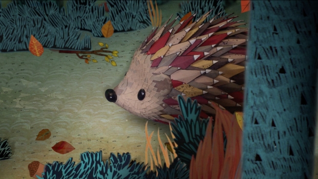
The cuteness factor is awwwf the charts in “Saving Harry,” a two-minute animated film by Wildlife Aid U.K. that follows the journey of the titular hedgehog from suburbia back to the woods where he belongs.

An adorable hedgehog puppet moves through an amazingly well-realized illustrated world. Every element is superbly crafted, from Harry’s pale reflection in the puddle to the grimy, discarded food tins and liquor bottles in the alley, and ultimately, the soft sod of the forest floor and ringed bark of the towering trees.

“I’m Seeing Stars,” the piano-based tune on the soundtrack, performed by the Elephant Rooms, creates just the right mood—slightly somber, but hopeful, too. Some versions of the clip include the vocal track, and the singer sounds a lot like Kate Bush. You can buy the song on YouTube, with all proceeds supporting the cause.

Though stylized, the presentation is also fairly realistic. (Thankfully, Harry doesn’t sing or bust a move.) This approach underscores the seriousness of the message, as Britain’s hedgehog population has dropped to 1 million from 30 million since the 1950s.

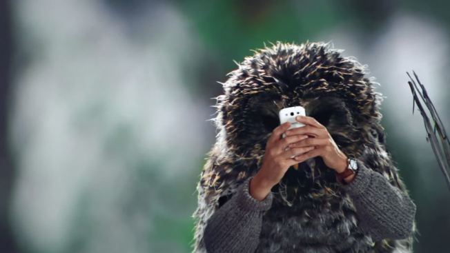
A tad too real, perhaps, and rather odd, is the sight of Mr. Owl perched on a branch overhead, observing Harry’s return to the wild. Owls sometimes prey on hedgehogs. It sent a shiver down my spine(s).


This Hipster Business Name Generator Is About to Become Your New Obsession

Forget all those sites that randomly generate band names, stripper names and hobbit names. This one could make you rich, my friends. Brooklyn rich!

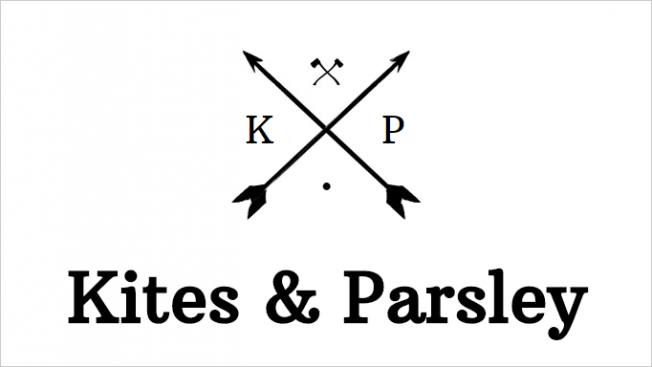
The Hipster Business Name Generator creates a random combination of quirky nouns and drops them under a stylized X, with the requisite stylish dingbats and initials. The resulting names—such as Fox & Otter, Spyglass & Bean, Whiskey & Cake—are good for a laugh, especially when paired with icons of tiny rabbits, knives and muffins.

The site, which was quickly generating passaround among creative types today, seems to be a marketing effort for domain registration site NamesCheap.com, where you can conveniently book a site for your lovely new business venture. Or maybe the creators simply picked a booking site at random, though that seems unlikely. 

Try it for yourself and let us know your most fruitful combinations. A few of our favorites below.

Hat tip to my friend Paul Crawford for sharing this on Facebook, though to be clear, his agency’s not the one behind it.


Gillette Posts Image of Its 1904 Razor Design, and Literally Everyone Thinks It's Better Than Today's

It’s a funny thing, really. A brand celebrates its 110th anniversary by showing how it’s evolved and taking pride in the innovation that’s led to its success in men’s grooming. 

Alas, no such love was reciprocated by Gillette’s Facebook followers when it shared an image of a 1904 razor design this week—its very first patent, it happily told fans!

Practically everyone who replied said how disappointed they are with the way the product has evolved. They think the quality has gone way down while the price has skyrocketed.

Ouch.

 
A simple post on Nov. 17 was met with … quite a bit of disdain. 

 
You have to give the brand manager credit for staying professional and on brand here, despite the comments.

 
Still poised and steady-handed. 


The Ultimate Rebranding: How a Veteran Creative Shifted Genders Mid-Career

Despite all their turnover and relentless pursuit of revenue, ad agencies often end up feeling like big families. And announcing any sort of life change to your family, especially a family of 500 colleagues, can be daunting.

So, imagine telling this family that you’ll soon begin transitioning from female to male, and you’ll have the first inkling of the road Chris Edwards began traveling nearly 20 years ago.

Edwards, a longtime creative director for Boston-based Arnold Worldwide, announced his gender transition in 1995. Over the next 12 years, he underwent 28 medical procedures to complete the transformation. And throughout, he maintained his role as a writer and creative leader, working on major national and global accounts.

In his upcoming memoir, titled Balls, Edwards shares an array of stories about his gender switch, along with the more traditional reminscences about a life in the already unpredictable world of advertising.

This week is GLAAD’s National Transgender Awareness Week, and we asked Edwards to tell us a bit more about his story. Check out our conversation below.

AdFreak: So, what’s the status of your book?
Chris Edwards: My manuscript is currently in the hands of a bunch of editors at various New York publishing houses. I’m hoping one of them will make me an offer soon. This is still a subject that makes some people nervous, so if I haven’t found the right editor by January, I will likely publish it myself. Either way, interested readers can sign up to get an alert when the book is available at chrisedwardsballs.com.

Is it really going to be called Balls? Because that’s amazing.
Ha. Yes it is. When I announced at work that I was going to be transitioning, so many people came up to me and told me I had balls. I always laughed it off with, “Well, that’s a few surgeries down the road.” But I knew what they meant, and it’s true.

It takes a lot of courage to change your gender to begin with. But to stay at the same job and do it openly in front of 500 co-workers and clients, yeah, you’ve gotta have quite the set of cojones. I was telling this “balls” story to my former boss, Pete Favat, over a few too many vodka sodas, and he was like, “Dude, that should be the title!” And we both cracked up.

The next day I thought, do I really have the balls to call my book Balls? Looks like the answer turned out to be yes. I’ve been told I’ll probably need a subtitle, though. I’m thinking “It takes some to get some,” but that might be pushing it.

I’m guessing your target audience is a lot bigger than just those considering a gender switch. Who else do you think would enjoy this book, and what do you hope they’ll get out of it?
Well, all you ad peeps will enjoy the book because agency life is the backdrop, and I name names, so you may read about someone you know. You’ll laugh a lot, too. My sense of humor helped get me through 28 surgeries and innumerable awkward moments, so it was critical that the tone of the book reflect that.

Yes, this book will surely appeal to a transgender audience, but really it’s for anyone who’s ever felt uncomfortable in their own skin—for whatever reason. It’s about having the courage to be true to yourself and realizing that, instead of fearing what other people will think, you can actually control it. I was able to use what I learned working in advertising to rebrand myself and market the “new me” to friends, family and co-workers with great success. I hope people read my story and come away empowered, inspired and more accepting of others who are transitioning.

At risk of one big spoiler here, how would you describe the way your colleagues and clients at Arnold handled your transition?
Ah, total spoiler! But without giving too much away … It was 1995. Transgender wasn’t even really a word yet. The only frame of reference people had was Silence of the Lambs, The Crying Game and guests on Jerry Springer.

I knew I had my work cut out for me when it came to changing perceptions, so I took it upon myself to be the educator. Arnold was very much like a family back then, so it felt like everyone was on this journey with me, and we all learned as we went. Some people had issues. And there were definitely some awkward moments, especially around me using the men’s room. But overall the response was incredibly positive. I’d like to think it was solely because of the way I handled the situation, but it probably didn’t hurt that Ed Eskandarian, the agency’s owner and CEO at the time, was also my father.

You were the creative director on McDonald’s “Singing Fish” spot, one of my personal favorites. What other work are you most proud of?
Ah, yes, “Frankie the Fish” will always have a special place in my heart. You know, we made a toy replica that plays the original jingle and club re-mix. I think there are still a few left on Amazon if you’re interested. Anyway, another McDonald’s spot I’m proud of is “McNuggets Guys.” I saw this YouTube video of two guys rapping about how much they love McNuggets (one of the rappers is now the star of the HBO series Silicon Valley) and turned it into a 30-second TV spot that went viral. I believe it was one of the first if not the first TV spot to use YouTube footage.

I’m also extremely proud of the early work I did for [the anti-tobacco campaign] Truth. Of all the spots I worked on, the most memorable one was probably “Project SCUM,” which is the name of the actual marketing plan Big Tobacco used to target gays and homeless people. Insane, right? While the facts we dug up were disturbing, it was so satisfying to get to do creative work that actually made a difference. Since the inception of the Truth campaign, teen smoking has gone down from 23 percent to 9 percent. Feels great to know I had a little something to do with that.

What advice would you give to someone who’s thinking about publicly changing genders but is worried it could create a difficult situation among friends, family and co-workers?
It’s pretty much the same advice I’d give anyone about to undergo a major life change of any kind: Take the lead and develop a game plan in advance. Script out and rehearse what you’re going to say. Make a list of who you want to tell personally and in what order. Educate and be patient—you may have been living with it in your head for a while, but it’s still new news to everyone else. Be open and encourage questions. Use your sense of humor to put people at ease. Oh, and read my book. 🙂

Chris Edwards is a veteran creative director and copywriter based in Boston. To sign up for updates about the status of his memoir, BALLS, visit his website.


Diet Racism: The Official Drink of Brands That Just Don't Get It

The official drink of the Washington Redskins … and Dave & Buster’s?

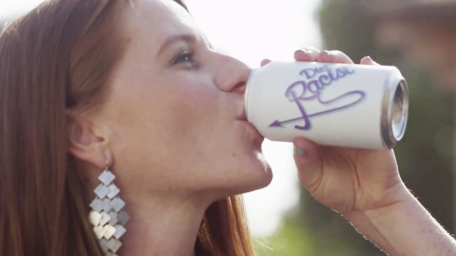
College Humor created this fake ad a little while back for Diet Racism—the drink that has all the sweet ignorance of regular racism but with none of the guilt or self-awareness. It’s the drink of choice for people who don’t realize that the phrase “I’m not racist, but …” doesn’t magically make whatever comes after it less racist.

It’s actually been quite a year for discussions of racism involving brands. Maybe this fake commercial could be a good hiring tool for potential brand or social media managers. If they laugh, maybe they’ll be a little less likely to go full-on racist in a tweet.

If they tell you the Irish really were persecuted too, well, there’s a red flag.


FCB's Giant Eco-Civic Project Would Create a South African Flag Visible From Space

FCB South Africa is running an idea up the flagpole. A really big idea. In fact, the idea is ginormous. And its main component is a South African flag so large, it will be visible from space, 30 miles above the Earth.

The Giant Flag project was put in motion last month by Guy Lieberman, the agency’s head of green and social new business development. The initiative is ultimately designed to foster national pride, improve the lives of people in need and make a lasting impact on South Africa’s economy and environment.

“Yes, it is big. And it is wild,” Lieberman tells AdFreak. “It’s both an unreasonable project—in the good sense of the term—as well as a practical one.”

So, how big and wild are we talking?

The proposed flag will measure 66 hectares—that’s nearly 165 acres, about the size of 66 soccer fields. Its red, green, blue and gold sections will consist of millions of cacti and succulent plants that can thrive in the semi-arid Karoo region, offsetting some 90,000 tons of carbon emissions annually. Solar panels designed to power the equivalent of 4,000 homes will make up the flag’s triangular black patch. (They will also “harvest” rainwater to feed the flag’s living components.) The white areas will be access roads.

The project will provide more than 700 jobs in Camdeboo Municipality, where the unemployment runs over 40 percent, and support tourism, hospitality and various enterprises over the long haul. Moreover, Lieberman says, it will serve as a symbol of hope, cooperation and sustainable growth for South Africa and beyond.

But … where did the whole giant-flag idea come from?

Lieberman drew his inspiration from the 2010 FIFA World Cup in South Africa, noting “the nation’s huge emotional response to our flag.” After the World Cup, FCB launched the much-praised “Keep Flying” campaign to encourage the nation to maintain its momentum. “The CEO of FCB South Africa [John Dixon, since succeeded by Brett Morris] called me into his office,” Lieberman recalls, “and said that while the [“Keep Flying”] campaign was amazing, it was fleeting and we needed to look for a legacy project on the flag, something that could live on. And so the Giant Flag idea was born.”

Of course, a 66-hectare flag can’t be built on the cheap. What’s the price tag, and who’s footing the bill?

Crowdfunding and corporate efforts are under way. All told, it will cost about $20 million, with $2 million being the threshold to begin the massive germination project, followed by clearing the land, fencing off the site, building roads and constructing the solar field. “There has been half a million dollars sunk to date,” says Lieberman, “and a variety of commitments, soft to definitive, of around $6.5 million.”

Individuals can donate $10 to sponsor a plant, $100 for a section of road and $250 for a solar panel. What’s more, South Africa’s Department of Environmental Affairs is lending its support, and corporate sponsors such as Google and Toyota “have come on board because they see the value this will have on the nation, as well as on their brand,” Lieberman says. “It also speaks to their commitment to game-changing initiatives, and in this sense the Giant Flag is not tied to any one nation—it is global.” (Google is providing a monthly $10,000 AdWords grant to promote the project, as well as cloud services for the Giant Flag app.)

In a way, the initiative represents the confluence and expansion of two industry trends—agencies launching intellectual property efforts and creating installations designed to have a broader social impact. Many such projects have succeeded (including FCB’s own fascinating billboards in Peru), but they have been far less ambitious, and staged on a more manageable scale.

So, how does Lieberman respond to critics who say the Giant Flag is a grand idea, and great PR for FCB, that will probably never fly, owing to its cost, complexity and all manner of potential pitfalls?

“I understand why they would say that,” he says. “It’s unlike anything that has come before—there is no easy framework for them to grasp on to. How could they possibly see it happening? But that’s OK. The Giant Flag will happen. … There are too many people who can already feel it in the landscape.”


Meet the Doll That's Proportioned Like a Real Woman, and Comes With 'Imperfection' Stickers

She’s just like the iconic Barbie, but normal.

The Lammily doll has the proportions of an average 19-year-old woman’s body, based on data from the CDC—unlike the Barbie doll, whose proportions will never be replicated by any actual human. But not only does the Lammily doll, created by 26-year-old Nickolay Lamm, have a normal waistline—she also comes with a sticker extension pack, in case you want to add moles or body scars or even cellulite.

It started as an art project, but interest grew for a “normal Barbie,” and now the Lammily doll is available for purchase.

“I wanted to show that reality is cool,” Lamm tells Time magazine. “A lot of toys make kids go into fantasy, but why don’t they show real life is cool? It’s not perfect, but it’s really all we have. And that’s awesome.”

To illustrate his point, he created a video transforming a Lammily doll into a Barbie doll via Photoshop—a clever play off videos we’ve seen dating all the way back to Dove’s “Evolution.”

Critics will surely point out that while Lamm is about reality and inclusion, the doll is only available as a white brunette. But Lamm has raised half a million dollars via crowdfunding, so hopefully we’ll see more dolls available, cellulite and all.


Santa Is Caught With His Pants Down in Poo-Pourri's Hilariously Inappropriate Christmas Ad

When you think of Santa Claus dropping loads all over the world, you envision bags full of gifts. But it seems jolly St. Nick leaves less happy presents in people’s homes too, at least according to this gleefully scatalogical Christmas ad from Poo-Pourri.

The before-you-go toilet spray—makers of the 2013 viral hit “Girls Don’t Poop,” which has 30 million YouTube views—is back with quite the seasonal surprise. Yes, the three-minute video below proves without a doubt that, as its title indicates, “Even Santa Poops.”

Here, he’s seen pooping in some British family’s house—posh British people being, as the original video proved, particularly amusing when talking about poop. But wouldn’t you know it—the three girls of the home aren’t asleep. They barge in on Santa while he’s on the can, claiming to have been woken by the smell.

And indeed, Claus does appear to have polluted the place with his Santa stink, having not used the Poo-Pourri that was sitting right there.

The concept will surely be off-putting to some, but the scriptwriting is pretty strong—one poop joke after another, many of them actually quite inspired, and some of them delivered by the squeaky-clean sisters.

That it is well done shouldn’t be a surprise: The spot was written and directed by Pete Marquis and Jamie McCelland, with concept and copywriting by Joel Ackerman. The former worked on the hilarious Hello Flo videos, while the latter wrote and directed “Girls Don’t Poop.” It’s like a dream team of bodily-functions humorists.

We caught up with Poo-Pourri creator and CEO Suzy Bátiz to ask how the ad came to be, and what kind of reaction she’s expecting from it.

How did the idea to do a Christmas commercial come about?
The holidays are a perfect time to promote Poo-Pourri as it is the perfect gift and a huge hit during the holidays as it creates laughs and, above all else, it really works. It’s the gift that everyone can use. So we wanted to continue the success we’ve had with our other online videos with original, timely creative content that drives customer engagement.

What was the scripting process like? Did you come up with various scenarios before settling on this one?
Other people wonder how Santa gets to all the houses, fits down the chimney or is he even real? At Poo-Pourri, we think a little differently, a little unexpectedly. We think Santa is just like us. He has to poop too, especially after eating cookies and milk all night.

That’s when we decided to reach out to our dream team: Joel Ackerman, our original writer on “Girls Don’t Poop,” and Pete and Jamie, the directing team and comedic geniuses behind the Hello Flo viral videos, which we are big fans of in our offices.

We definitely went through a number of concepts and scenarios with every brainstorm session and script review. With each session we continued to elevate the concept to get to the final. For example, the concept started with one girl and then progressed to three girls who were sisters. Then we gave Santa more of an attitude. And then we finally topped it off with Bethany, our “Poo Girl,” making an entrance as a throwback to our other videos and something our loyal Poo-Pourri brand followers would appreciate.

How did you find the right Santa for this? And who is the actor?
What actor? We flew him in first class from the North Pole. Yes, Santa is a union actor.

No, really, we auditioned several possible Santas, and none were feeling right. Then Pete and Jamie thought of a friend, who was a comedic actor, and just happened to look the part. We auditioned him, he began improvising, and we knew right away he would be a great fit. His name is Mike Faella, aka “Santa Mike.”

How far did you want to take the humor with the girls and their potty mouths?
As always, we looked for the balance of shock value versus clever, witty comedy that is the essence of the Poo-Pourri voice. Our brand is known for our witty, confident and playful spirit that we bring through in everything we do.

We did have a lot of fun, however, seeing a lot of giggles from the girls, because we actually were asking them to say “poop” and “fart,” words they hadn’t ever been given permission to talk about before.

Are you expecting an enthusiastic response, or do you think there might be a few Grinches out there?
Absolutely, we are expecting a great response! Whenever you create something that pushes boundaries, you’re going to have passionate lovers and passionate haters, but it’s all passion. We hope to have touched on a funny take on a traditional story—an unexpected twist to a holiday classic tale.

Our brand is built on the unexpected. Like in our first video, “Girls Don’t Poop,” you had a beautiful British girl saying things like “creamy behemoth.” It’s the same here. You have innocent little girls saying unexpected things. And you have Santa pooping in a house … certainly an unexpected scenario. Yes, he does exist. And, yes, his poop stinks too!

CREDITS
Client: Poo-Pourri
Production Company: World War Seven
Executive Producer: Josh Ferrazzano
Producer: Mike Begovich
Directors: Pete Marquis & Jamie T. McCelland (Pete & Jamie)
Concept: Joel Ackerman and Hector Batiz
Writers: Pete Marquis & Jamie T. McCelland (Pete & Jamie)
Copywriter: Joel Ackerman
Director of Photography: Kevin Phillips
Production Designer: Russell Jaeger
Wardrobe Stylst: Karla Cavalli & Harmoni Everett
Hair & Makeup Artist:  Colleen Hogan
Editor: Karen Kourtessis (Beast)
Sound Design: Chirs Stangroom (Hobo Audio)
Colorist: Robert Crosby (Neptune Post)
Santa: Mike Faella
Sister #1: Isabella Blake Thomas
Sister #2: Ava Devoe
Sister #3: Haylie Di Fronzo
Lady on Santa’s Lap: Bethany Woodruff


Asus Has Finally Created the Perfect Digital Device for Birds With Arms

Stop it, you’re quilling me.

Birds with tiny human arms and hands soar in sublimely silly style thanks to SuperHeroes’s first global campaign for the Asus Transformer T100 2-in-1. It’s also the inaugural work from the New York office the Amsterdam-based agency perhaps best known for its prankvertising efforts on behalf of LG.

In “Modern Birds,” a freaky fingered flock demonstrates the features of the Asus laptop/tablet hybrid. The idea is that birds know how to get stuff done #OnTheFly.

Savvy consumers of Internet culture will recognize that birds with arms are nothing new. 

“We’ve always loved the birds with arms meme,” agency ecd Rogier Vijverberg tells AdFreak. “And when looking for a spokesperson for Asus we saw the match. Birds are truly always on the move, plus they would allow us to have a great outside perspective on our modern human race.”

Besides, he says, “it’s a crowded market, so to stand out and get noticed, you need to also stand out in communication.”

Edward, a tufted titmouse with an attitude, stars in a trio of spots. He praises Asus to the skies and taunts users of competing devices: “My T100 has up to 11 hours of battery life to keep me productive. Eleven hours, pecka-face!”

Beyond the spots from directors Andrew Watson and Maarten Boon via production house Minivegas, SuperHeroes has more creative lined up for the campaign.

“There’s a bunch of work for Asus in the pipeline,” Vijverberg says. “It’s fully global, launching in Asia, the Middle East, Europe and the Americas. Apart from (the three films), we have a Facebook game, loads of social content and more memes coming up.”

So, who’d win an all-out war between ad mascots with asinine appendages: Asus’ birds with arms or Cravendale’s cats with thumbs?

CREDITS
Client: Asus
Client contacts: Chinwen Weng, Clio Kuo, David Chen

Agency: SuperHeroes
ECD: Rogier Vijverberg
Copywriters: Elliot Stewart Franzen, Dimitri Hekimian
Art Director: Quentin Deronzier
Designers: Nando Pawirodikromo, Krister Lima
Client Services Director: Django Weisz Blanchetta
Producers: Evelien Schenkkan, Severien Jansen
Strategic/Planning Director: Felipe Camara
Interactive Designer: Krister Lima       
Developers: Chris Noble-Partridge

Production and Postproduction: Minivegas
Directors: Andrew Watson, Maarten Boon
Scriptwriter: Andrew Watson
Executive Producer: Brian Bourke
Producer: Sanne Rosinga
Postproduction Producer: Marloes de Rijke
Editor: Sander van der Aa
Lead Compositor: Sven de Jong
Sound Design: Kaiser Sound


21 Designers Show Off Their Tattoos, and Tell the Stories Behind Them

There’s a certain amount of pressure on designers when they decide to get tattoos. It’s like a hairdresser’s hairstyle, or an architect’s home—the choices you make seem weightier, more personal somehow, given your background.

Creative Bloq recently asked 21 designers to show off their tattoos, and explain what makes them special. And the designs, and inspirations, are varied and fascinating.

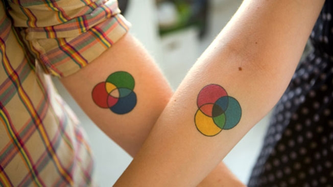
Facebook designer Russ Maschmeyer and freelance letterer and illustrator Jessica Hische got the tattoos above. His is RGB. “I convinced him it would be ‘conceptually stronger’ if I got the CMYK version of the same tattoo,” Hische says. “He was a little freaked out about having a couple’s tattoo, but the more we talked about it the more it made sense. Russ got additive color (RGB) since his career passions were primarily screen-based; I got subtractive color (CMY) because I started my career in print design.”

Typographer Carey Smith has tattoos of 26 tiny letters. “I didn’t start off thinking I’d get the whole alphabet,” she says. “I got the first one (j) on a whim, then the next few (g, a, q) without thinking much about it. … It’s the most uneconomical way of getting tattooed ever. You pay by the hour, and these little letters take about seven minutes each.”

Check out all 21 over at Creative Bloq, which has links to all the tattoo artists as well.

Via Design Taxi.


NYC Sparkles in Ogilvy's Gorgeous Animated Christmas Ad for Tiffany

Ice shimmers on the streets of Manhattan in Ogilvy’s animated holiday ad for Tiffany & Co. It sparkles from the trees and bridges, too. Its glow radiates from Broadway marquees and glimmers among the steel and glass towers that rise into the wintry sky.

I’m not talking about frozen water, people!

This is Tiffany, so, naturally, it’s diamonds and other precious stones illuminating a bejeweled yuletide wonderland.

The spot’s style and sensibility evokes the early Mad Men era, recalling a simpler consumer age when a glittering engagement ring could cast away all sorrows and an exquisite brooch could mend a broken heart. It’s a glitzy, romantic fantasy where an animated Audrey Hepburn wouldn’t feel out of place.

brightcove.createExperiences();

Such seasonal wish fulfillment seems entirely on brand for Tiffany. It’s all sparkle and shine—nothing heavy, no deep meaning, as soft as falling snow.

The 80-second clip, animated by Psyop, is part of a larger campaign that also includes print and out-of-home elements. (It’s separate from the luxury subway car that Sid Lee built for the brand.) This marks Ogilvy’s first big creative push for Tiffany since winning the brand’s account back in February.

Some grinches might decry this gaudy vision, preferring more thoughtful or emotionally resonant holiday scenarios. Fair enough. But I say, there’s no harm in imagining a wondrous world where the wind echoes with love songs and every gift is an absolute gem.

CREDITS
Client: Tiffany
Agency: Ogilvy & Mather, New York
Chief Marketing Officer, Ogilvy & Mather, Lauren Crampsie
Chief Creative Officer, Ogilvy New York, Chris Garbutt
Group Creative Director, Debra Fried
Creative Director, Jeff Leaf
Executive Producer, Maureen Phillips
Animation: Psyop
Music: “Out of the Blue” by Chauncey Jacks
Executive Group Director, Leyland Streiff
Account Supervisor, Kat Bear
Account Executive, Aniella Opalacz


Dave & Buster's Just Posted a Tweet It's Going to Regret for a Long Time

And your massive brand Twitter fail of the day goes to … Dave & Buster’s!

To advertise its Taco Tuesday, the restaurant chain made a joke that pretty clearly went over the line, prompting incredulity from its Twitter followers. “I hate tacos, said no Juan ever,” the tweet read.

Obviously, this isn’t the first time a brand has tweeted out something outrageous—in this case, racist. But the question remains: How does this kind of stuff make it into the actual world?

See some of the reaction to the tweet below. As of 1:40 p.m. ET, the tweet is still live—40 minutes after it was posted. Apology surely coming soon.

UPDATE: The tweet was deleted at around 1:41 p.m. ET.


This Grocery Store's New Look Was Inspired by Everything From Pixar to BuzzFeed

Sure, megachains like Whole Foods and Trader Joe’s can pull off a hip, millennial-savvy vibe. But what about those old-school regional grocers?

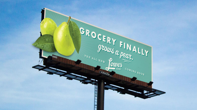
Lowes Foods, with around 100 locations in the Carolinas and Virginia, recently set Winston-Salem, N.C., agency The Variable to the task of creating a brand image that breaks most of the usual grocery conventions.

“It’s not every day that a client asks you to help them rethink an entire category, much less their entire business,” said David Mullen, director of account management for The Variable. “It’s been thrilling to partner with the Lowes Foods team to create a new and unique in-store experience, and then market it in provocative ways that stand out in a category known for playing it safe.”

The agency describes the new look and tone as “if Pixar created a grocery store, but talked about itself the way BuzzFeed would.” The rebrand has rolled out to 14 locations so far, and more are in transition.

Check out some of the grocery store’s ads and in-store designs below:


This Apple Store in London Looks Just Like a Regular Apple Store, Except It Sells Real Apples

Don’t come looking for free Wi-Fi. This Apple Store doesn’t have it.

That’s because it sells real apples—the nontechnological kind.

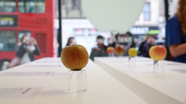
London’s Borough Market, one of the oldest markets in the U.K., is marking its 1,000th anniversary this year. (Yes, it’s been around for a millennium.) As part of the celebrations, it treated shoppers to a delightful concept—creating a “Real Apple Store” for the weekend that was a clever copy of Apple’s iconic retail establishments.

Actual apples were displayed on lucite pedestals just like an iPhone or iPad would be, but instead of technical specs, the signs showed each apple’s unique flavor notes and history.

Take a look below at some more photos of this great little shop. It remains unclear whether the apples themselves were marked up tp 500 percent of their actual value.

Via Design Taxi.


Mini-Documentary Looks at How to Balance Inspiration and Obligation as a Creative

Mac Premo is a guy who makes art, and has always made art, and here’s a pretty cool mini-documentary about Mac Premo that you might well mistake for an ad for Mac Premo.

Created by a guy named Bas Berkhout, it’s beautifully shot and edited, with a narrative that pretty much breezes right by. Mac Premo, for his part, seems pretty deep. He’s just trying to find his way through the vast void that is a life lived with the knowledge that the only inevitable truth is death. Thankfully, there’s the beautiful paradox of striving to fill his existential chasm by caring about things like baseball and steak and wine and family.

Of course, videos about the struggles of being an artist, real as they may be, are generally pretty trying. The psychological sausage-making of any calling makes for a limited frame—especially a calling that’s intrinsically self-indulgent. But this does about as good a job as the genre can. Rather than, say, parading out a supercut of platitudes from a string of working artists, it takes a closer look at the story of a single talented creative who seems successful enough as a both an independent creator and hired gun, but not super famous.

Yes, self-descriptions like “stuff maker” deserve skewering, when perfectly serviceable words like “artist” exist to say the same thing, better. But the clip, and its generally self-reflective tone, certainly play their part in conveying a sort of rallying cry for a certain audience—and illustrating a small example of how fine the line between content and marketing can be.

“To be the arbiter of good stories is to live forever,” Premo says, in the ad’s conclusion.

Or at least, it can delude yourself into thinking you can.


Here's a Pretty Fly Apartment on Airbnb: a Refurbished KLM Airplane

KLM Royal Dutch Airlines, which warmed heart-cockles recently with its lost-and-found beagle, delivers another winner by listing a “Spacious Airplane Apartment” on Airbnb.

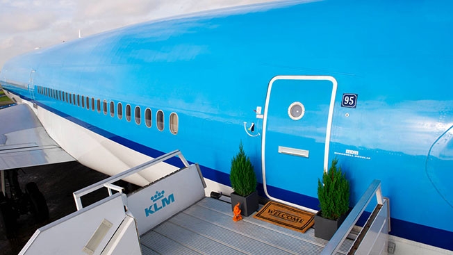
Yes, they turned an airplane parked at Schiphol Airport in Amsterdam into an apartment with two bedrooms, multiple bathrooms, Wi-Fi and a panoramic view from the cockpit. Pretty sweet, right? It’s the closest any of us can come to being Elvis without abusing Percodan. (It’s also a step up from Airbnb’s Ikea listing.)

“On November 28, 29 or 30, you have the chance to spend the night inside this fly apartment. Tell us before November 20 why you would like to spend the night. We’ll fly in the winners from anywhere in the world,” the listing says.

Unfortunately, KLM stomped on this raging fire of awesome with some seriously bogus house rules, including “no marshmallow roasting with the jet engines” (lame), “the consumption of alcohol is not allowed” (lamer), “no flying” (OK, that one makes sense) and worst of all, “don’t use the inflatable emergency slide.”

Whatever, KLM. If I didn’t want to use an inflatable emergency slide, I would stay in a building like a normal person.

Via Design Taxi. More photos below.


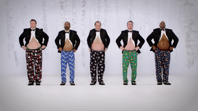
Kmart and Joe Boxer Go for Belly Laughs in Holiday Sequel to 'Jingle Balls'

Kmart and Joe Boxer’s “Show Your Joe” ad (rechristened “Jingle Balls” by some) was one of the big hit of 2013’s holiday season—to the tune of 18 million YouTube views.

Now, here’s the sequel.

The musical body parts have changed a bit, but fans of last year’s spot will appreciate the surprise ending here. Plus, it looks like the original “Jingle Joes” will soon be returning—at least to this website, where you personally will be able to “give them a jingle.”

The new spot, like last year’s, was made by FCB Chicago and directed by Christian Weber. It begins airing on TV tonight.


Infographic: The Typical Life of an Agency Employee, at Work and at Home

What inspires agency people? How do they get to work? What’s their favorite color? What animal would they be? What would they be doing if they weren’t working in advertising.

Shushu, a senior copywriter at BBR Saatchi & Saatchi in Tel-Aviv, asked 128 of his colleagues those questions, and many more, and collected the results in the infographic below—giving a snapshot of the lives at his agency, and perhaps in advertising generally.

Bonus points for asking where they’ve had sex with colleagues; negative points for asking how many times they go to the bathroom every day.

Via The Inspiration Room.


10 Ad Mascots You Probably Didn't Know Were Related to Kermit The Frog

Jim Henson creations have a storied history in advertising, going back to the 1950s, when a violent proto-Kermit pitched Wilkins Coffee with 10-second TV spots.

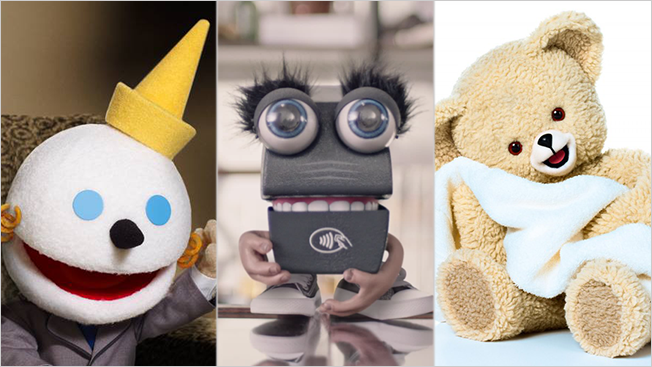
Tappy, the latest creation from Jim Henson’s Creature Studio, is similarly off-kilter in his role as a living credit card reader at a checkout counter. 

Tappy is the new voice of Softcard, an e-payment product that works at McDonald’s and other major chains that now accept phone swipes as currency. Softcard needed a new mascot and some rebranding after changing its name from Isis, an unfortunate name since being co-opted by the infamous terror state.

Tappy is a bit out there as a concept, turning a boring inanimate object into a somewhat obnoxious little critter, but that’s what the Henson team has done for decades, building characters for brands to support their more artful Muppet projects. In fact there’s a roster of corporate mascots that come from The Jim Henson Co. that you might not know are basically cousins to Kermit, Oscar and Big Bird. For Instance, Snuggle bear is part muppet and so is Jack In The Box’s oversized snowman.

Here’s a look at the some of the characters made by Jim Henson’s Creature Studio for commercials and video marketing:

Tappy, Softcard
In a history of oddities, Tappy stands out among the Henson creations for sheer adsurdity. He’s a credit-card reading machine with teeth. We could learn to love him, maybe, on a long enough timeline.

Mel, Kraft
Mel the MilkBite is part dairy, part granola bar and totally confused. He’s a character with an identity crisis, pondering, “What am I?”

Life, Pacific Blue Cross
Life is a Muppet in the classic sense, and he promoted insurance for Pacific Blue Cross. In the commercials, he bites people in the butt, symbolizing unexpected events like dental emergencies.

Polar Bear, Coca-Cola
The Coca-Cola polar bear, which debuted in commercials in 1993, is a classic, and Jim Henson’s Creature Shop brought him to life for appearances with the public.

Puppet Jack, Jack in the Box
Puppet Jack has very similar mannerisms to Kermit, like when he throws his hands in the air and freaks out. A true pitchman who knows where to find a receptive audience, he shows up on couches to educate stoners about fast-food deals.

Great Chocolate Factory Mystery Experience in 4D, Hershey’s

Hershey’s Great Chocolate Factory Mystery Experience is an interactive show featuring talking candy bars at Hershey’s HQ in Pennsylvania. Henson made the digital puppets for the experience.

Lenny, Lending Tree
Lenny could be brothers with Kermit, given he’s so obviously Muppet and green. He basically just follows around a guy named Len, trying to talk him out of taking a loan from a bank.

Fairy-tale characters, Reading Is Fundamental

The literacy effort Reading Is Fundamental featured puppets alongside famous cartoon characters for this ad inspiring adults to read to children.

Rico, Air New Zealand
Rico was a rather NSFW spokesppupet whose South American accent and wordplay raised eyebrows, such as when he praised “a nice Kiwi beach.” He was best known for the viral marketing collaborations with edgy celebrities, including Snoop Dogg and Lindsay Lohan.

Snuggle Bear, Snuggle

Snuggle the fabric softener bear has deep Muppet roots. The bear debuted in 1983, a creation of Kermit Love (not related to the frog), who also made Big Bird.