Take a Tour of Lego's Simpsons Kwik-E-Mart Set Before It's Unveiled at SXSW

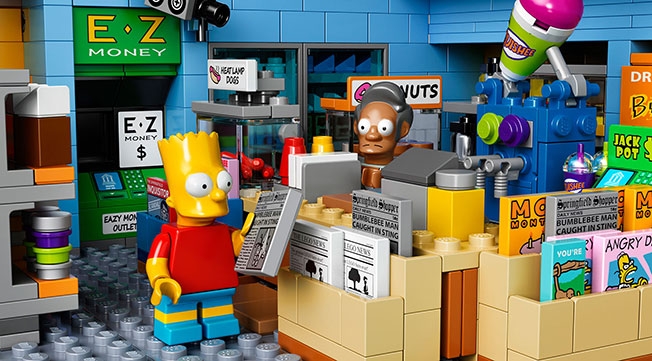
One of the coolest branded buildings at SXSW this year will be particularly difficult to get into. That’s because it’s only 5 inches high, 14 inches wide and 10 inches deep. D’oh!

Having had great success with its first Simpsons construction set and minifigures, Lego will physically unveil its new Simpsons product at SXSW on Friday—the iconic Kwik-E-Mart featured regularly in the show.

The set goes on sale May 1. For hard-core fans of the Fox cartoon, it’s a treasure trove. And it also has Easter eggs for Lego fans, including very rare dark orange bricks.

Among its more interesting features:

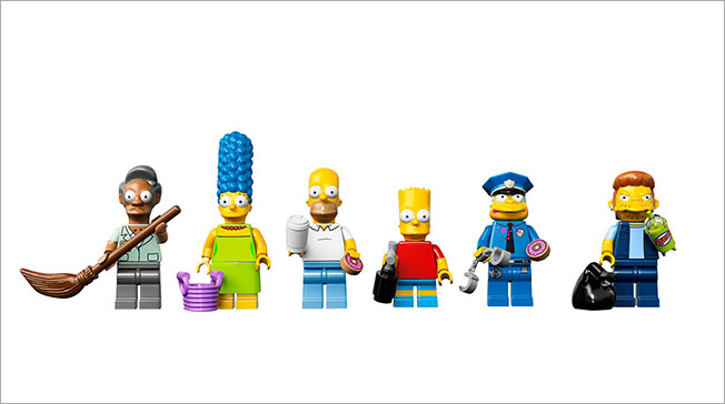
• Six minifigures: Homer Simpson, Bart Simpson, Marge Simpson, Apu Nahasapeemapetilon, Chief Wiggum and Snake (aka Jailbird)
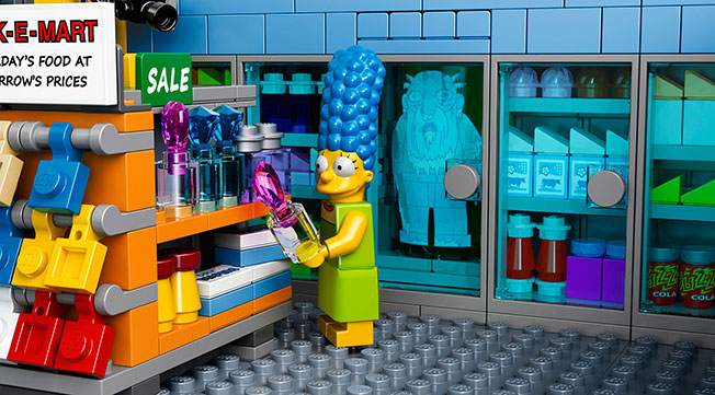
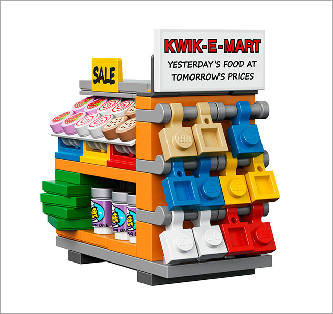
• Opening rear walls, a removable roof with secret vegetable garden, Kwik-E-Mart signage, light-blue walls, dusty blue floors, turquoise welcome mat, shelves, refrigerated cases, counter, Buzz Cola soda fountain, juice dispensers, coffee machine, two arcade games, ATM, crates of Powersauce bars, surveillance cameras, rear storage closet with a rat, cheese, rat hole and an exit door
• Shelves featuring beauty products, diapers, dog food, pastries, fruits, vegetables and more—including Krusty-O’s and Chef Lonelyheart’s Soup for One
• Refrigerator cabinets with a variety of beverages including cans of Buzz Cola … and frozen Jasper
• Counter with a cash register, magazine and card display, lottery machine, hot dog oven, donut display and a Squishee dispenser with 2 Squishees
• Chief Wiggum’s police car featuring an opening trunk, removable roof and space for three minifigures

Many more pics below.


Whole Neighborhood Learns Sign Language to Surprise Deaf Resident in Samsung Ad

Samsung Turkey has launched a website with a video call center for the hearing impaired, and it’s announced it with quite the stunt.

In the video below, titled “The Most Emotional Surprise of the Year,” we follow Muharrem, a hearing-impaired man, through his morning routine. A month of preparation (including sign language training) and many cameras later, Muharrem goes through the city and is greeted by people who can communicate just like he does.

It ends with Muharrem approaching a large screen, with a woman signing to him “A world without barriers is our dream, as well.” She announces the video call center for the hearing impaired, and then the “gotcha” moment happens.

Lot of tears. From Muharrem and maybe a viewer or two.


14 People Who Are So Over SXSW Before It Even Starts

Here we are, less than 24 hours from the spectacle that is SXSW. As the minions descend on Austin, and the rest of the world gawks from afar, there’s a vocal contingent who literally can’t even.

A healthy disdain for SXSW has developed in recent years, and seems to be hitting a crescendo, oh, right about now. Below, check out some snark-laden tweets from people who are going, can’t go—or are already there but would rather be anywhere else.

See you in Austin, haters!

And then there’s poor Colin Hanks, who’s actually excited to be there.


Facebook Gets Even Friendlier With Striking Outdoor Ads and Mosaic of Digital Content

A few weeks ago, we posted Facebook’s great new commercials about friendship, directed by Mike Mills. But there’s a lot more where that came from—in various other media.

The “Friends” campaign also includes Facebook and Instagram ads, outdoor billboards, print ads and off-Facebook digital advertising to connect with people at different points in their day, both on and off the social network itself.

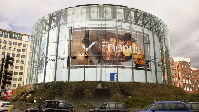
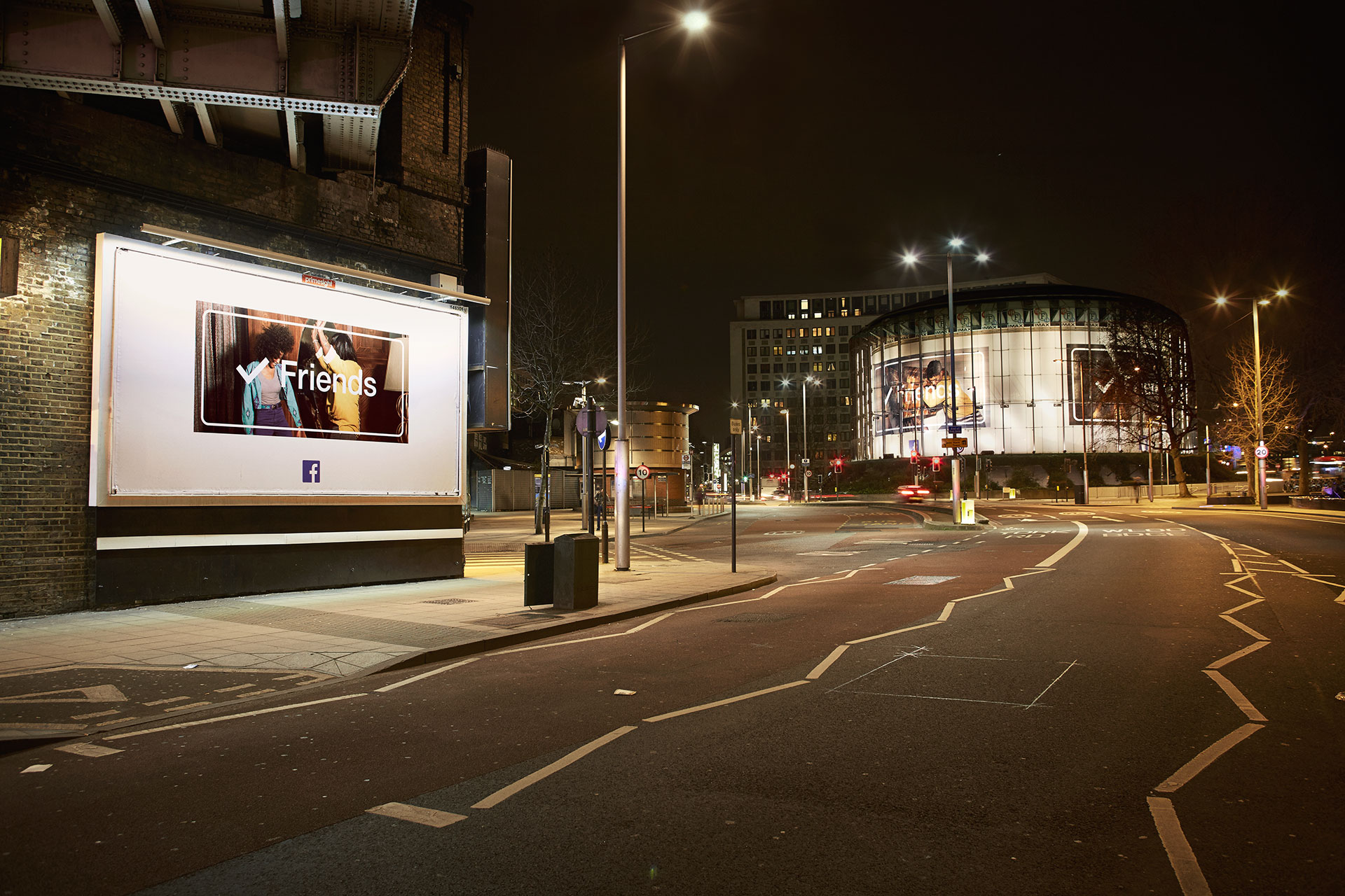
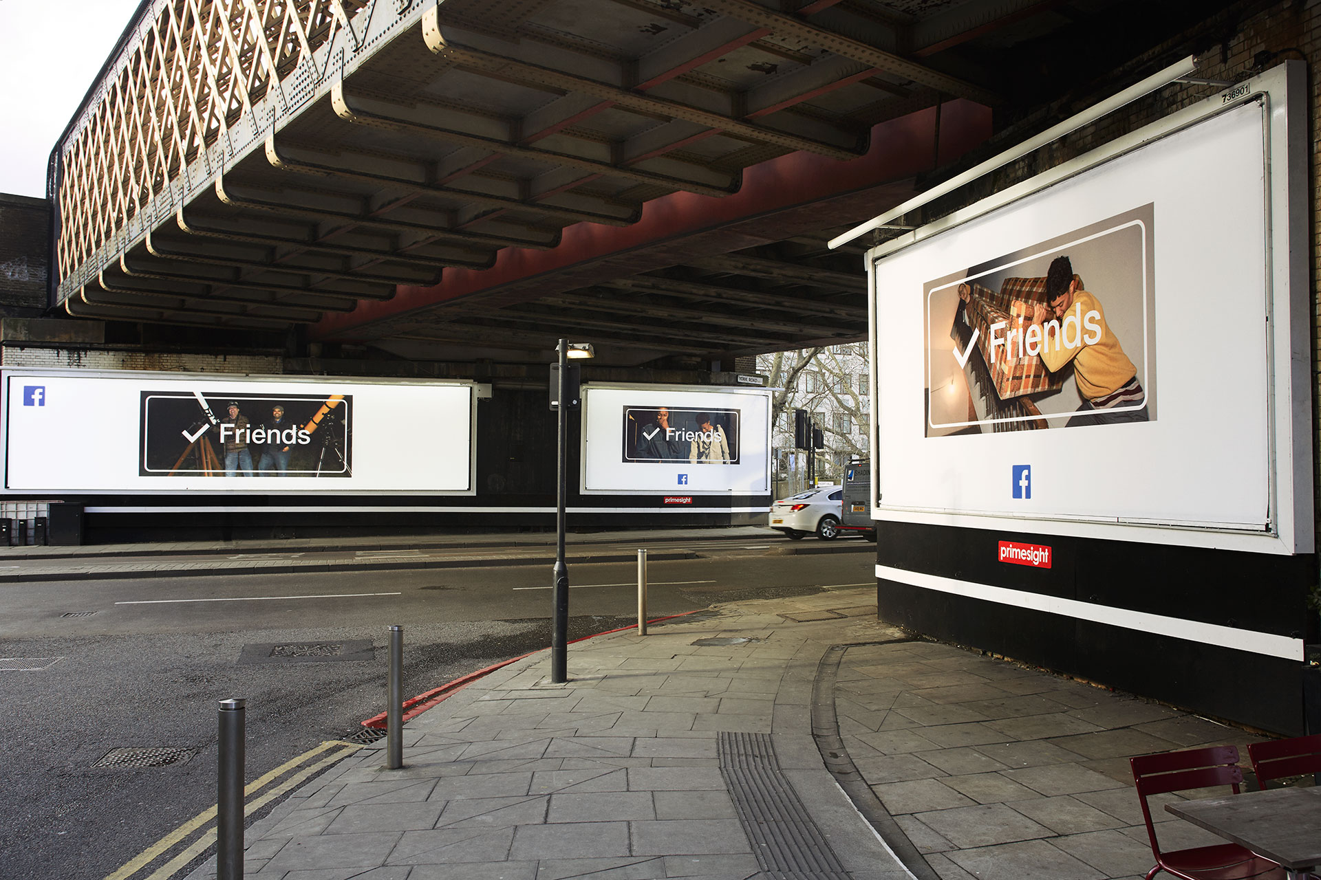
AdFreak’s exclusive look at the billboards shows how striking they are—simple and very nicely art directed, with great snapshots of friends framed by the word itself, next to a check mark. A small Facebook icon is the only branding, again showing the brand’s newfound confidence as an advertiser. (It’s an iconic brand by now, and is finally acting like one.)

The digital experience is interesting, too. The site, friends.fb.co, including all sorts of clickable content—leading to quirky little videos and photos, all of which are sharable on Facebook with a click.

Facebook will also be on hand at SXSW Interactive this weekend, partnering with Turner Sports to broadcast the Selection Sunday celebration at Turner’s live NCAA March Madness Bracket Lounge. The Facebook Live show will be streamed on the NCAA March Madness Facebook page at 6 p.m. CT on Sunday.

See more of the Facebook billboards below.


Clever Outdoor Ads List Cost of Their Own Square Footage If They Were Homes in England

Several hard-hitting outdoor campaigns have protested soaring home prices in the U.K. lately, including these bleak billboards narrated by people who’ve been priced out of London. Now, AMV BBDO has unleashed a clever campaign on behalf of Homes for Britain, which advocates pressuring politicians to help build homes people can afford.

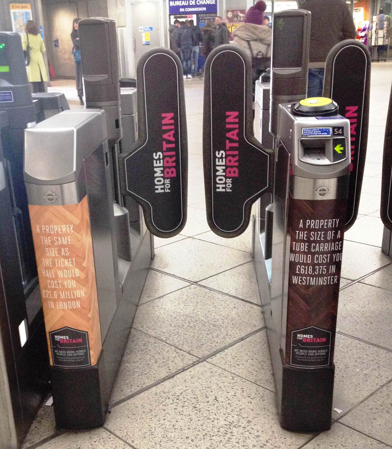
The centerpiece is an outdoor campaign in the Westminster subway station. The ads call attention to their own square footage and calculate how much that amount of space would cost if it were part of a home in London, Edinburgh, Bath, York or Oxford.

In addition to wall posters, there are more intriguing placements, including ads on escalator steps (the area of a single step would cost £6,111 in central London) and inside train cars (a single car would cost £618,375 in Westminster and £302,182 on average in London).

Check out more ads below. Via The Inspiration Room.


NatGeo's Killing Jesus Website Might Be the Greatest Story Ever Scrolled

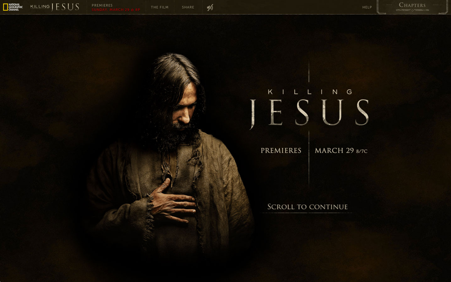
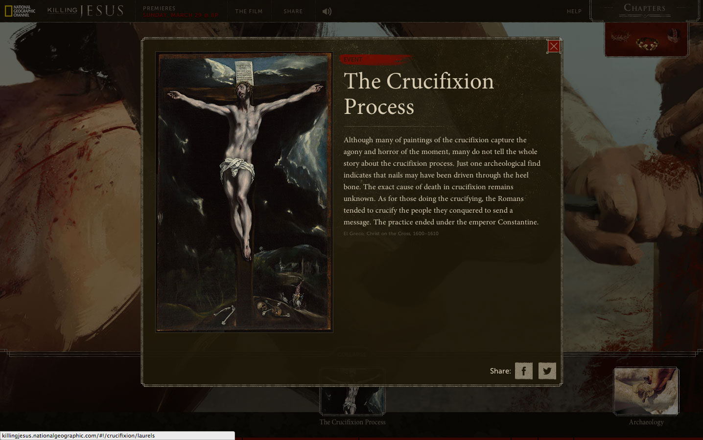
Mullen has created a digital experience of Biblical proportions to support National Geographic Channel’s Killing Jesus, a three-hour docudrama premiering March 29, which is Palm Sunday. The show is based on the best-selling book of the same name.

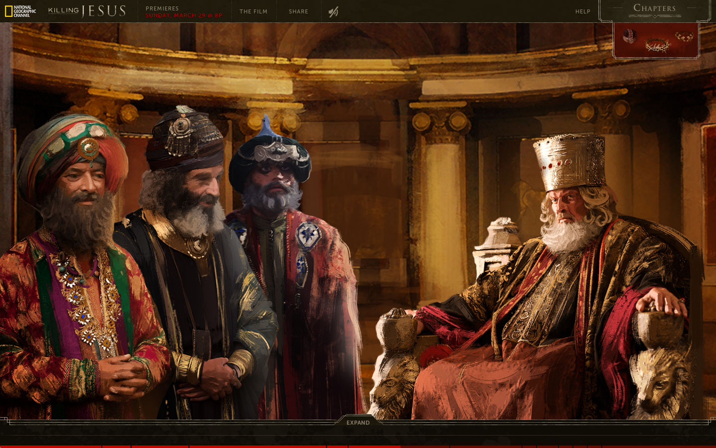
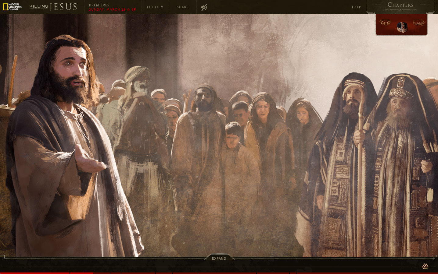
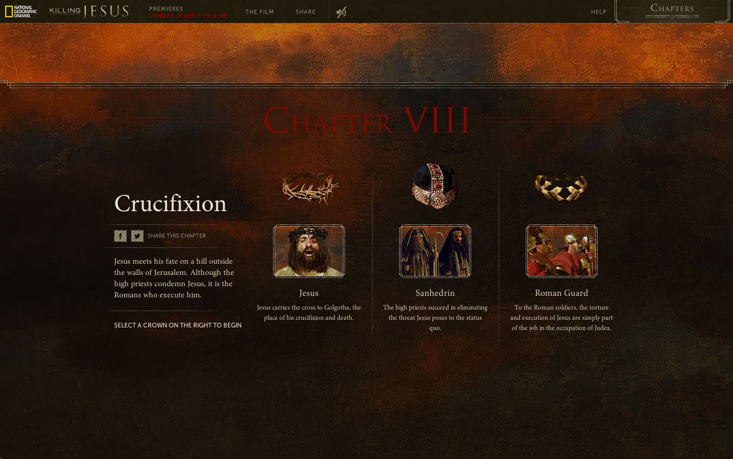
An immensely detailed, immersive website tells the story from three different perspectives: Son of God (the view of Christ and his disciples); Son of Man (the view of the Jewish priests of the time); and Threat to Rome (taking in political/economic implications). Each perspective is represented by a different crown: thorns, religious headdress and Roman laurels. This technique provides users with a panoramic perspective of Jesus’s life, allowing them to explore events from every conceivable angle.

“We were looking to tell the story in a way that allowed people to see it from several different vantage points,” says Mullen associate creative director Allison Rude. “Our war room on this project resembled the wall from ‘A Beautiful Mind’ as we pieced together historical fact, religious scripture and custom illustrations.”

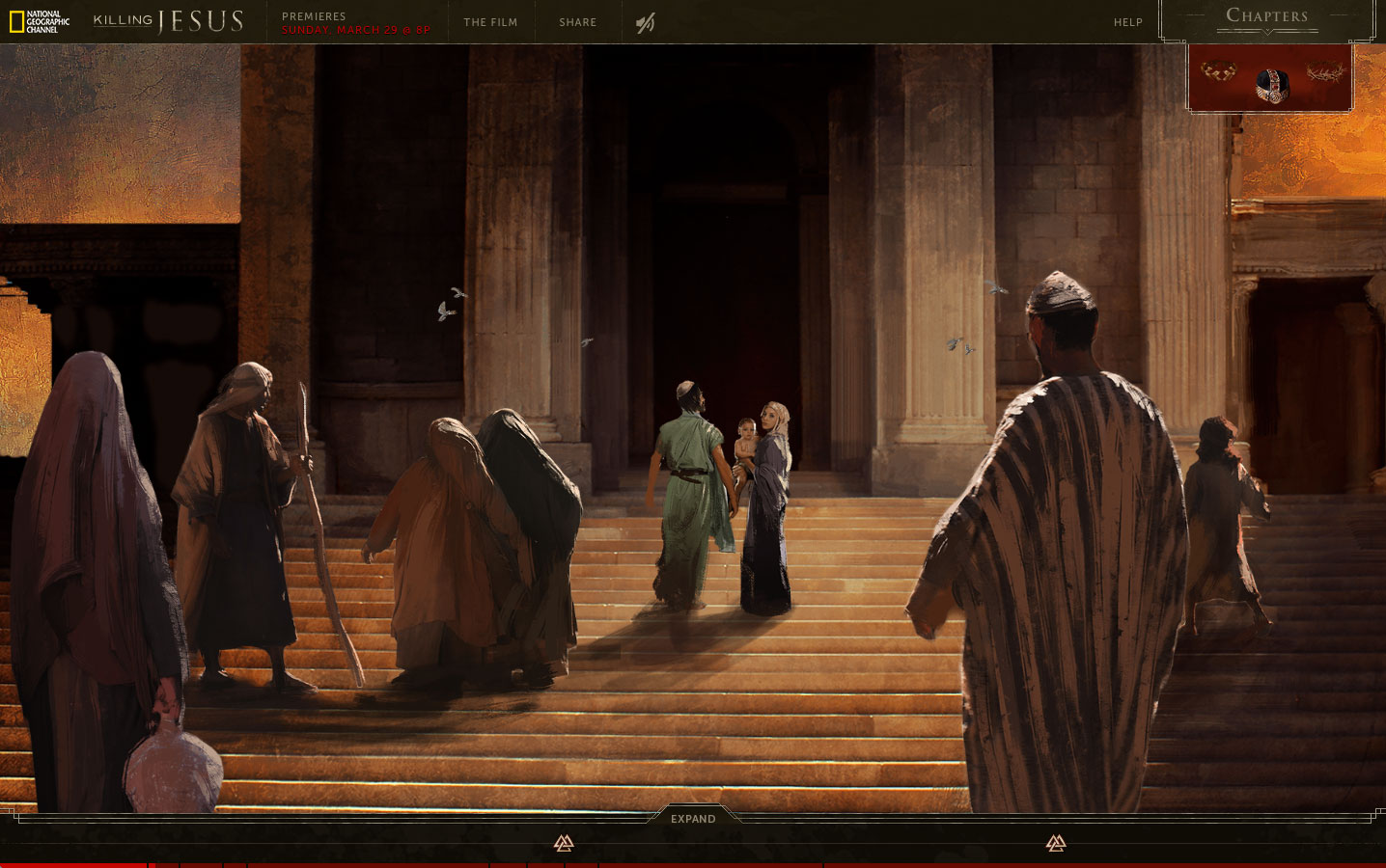
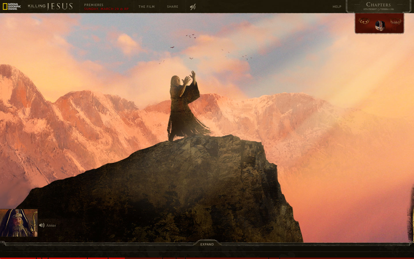
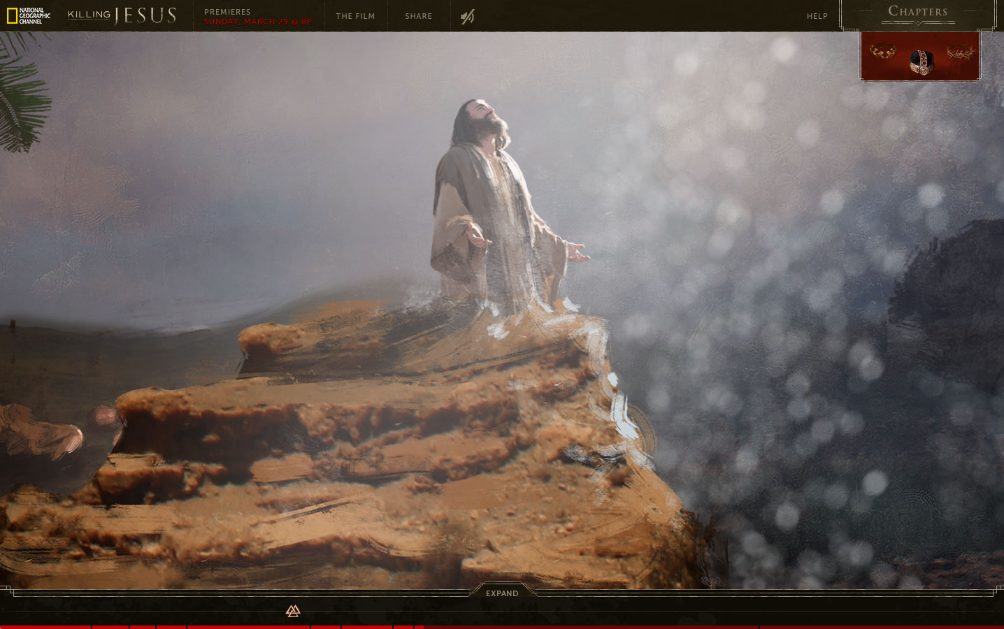
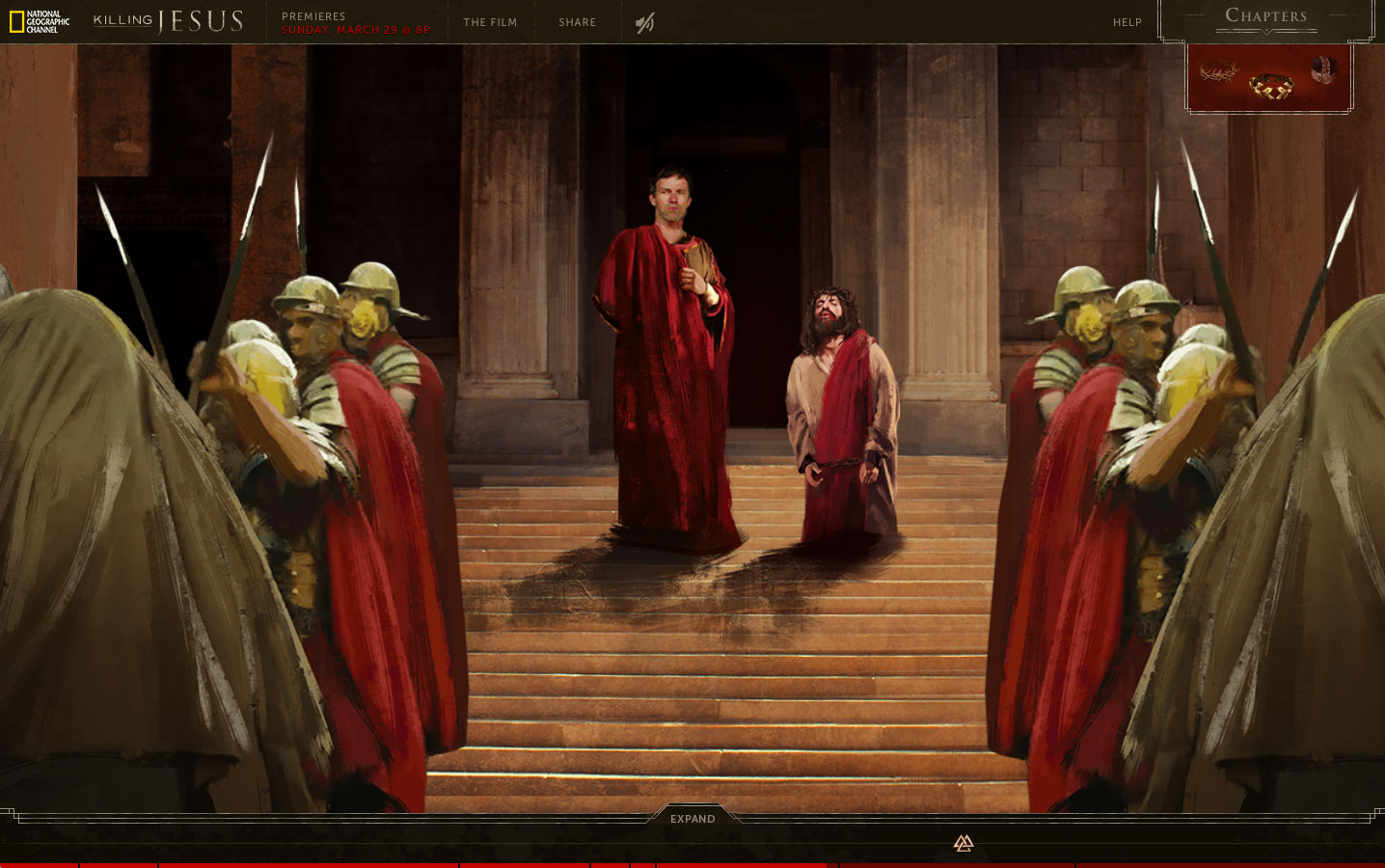
French artist Bastien Lecouffe Deharme created the impressive artwork, and his hand-drawn contributions grace the site’s eight self-contained chapters, which span Christ’s story from his birth in a Bethlehem stable through the crucifixion at Calvary. The amount of interactive information and analysis is pretty staggering. Users could lose hours (days?) investigating the various timelines (from three perspectives, no less).

That said, the navigation is intuitive, and all aspects of the presentation (based on my 30-minute spin through the site) seem compelling.

The technical specs are suitable impressive. The site’s scrollable panoramas contain more than 3,000 individual images, animated with 14,000 keyframes, along with 185 sound, music and voiceover tracks. All of this was made using 290,000 lines of code, which Mullen says is four times the size of its two previous NGC sites combined. Those sites supported the cable net’s Killing Lincoln and Killing Kennedy programs.

But wait, there’s more. Supplemental material includes a Killing Jesus microsite with articles, video clips, photo galleries, deleted scenes and cast Q&As, as well as an NGC blog campaign called “Killing with Kindness,” inspired, we’re told, by Christ’s teachings on love and charity, and promoted on social media with the #KillingWithKindness hashtag.

Like Mullen’s earlier NGC outings—and The Martin Agency’s similar digital work for the JFK Library—this initiative’s vast scale can seem overwhelming at times, especially for a story whose elements are so familiar. Still, the bold, multi-view style—respectful, yet rigorously researched and probing—is fairly innovative, and might give users fresh insight.

Given the weighty nature of the subject matter, Killing Jesus’s all-in approach seems appropriate and isn’t overkill at all.

CREDITS
Brand: National Geographic Channel
Client: Matt Zymet, Executive Director, Digital Media
Client: Ashley Kalena, Digital Media Producer
Agency: Mullen
Chief Creative Officer: Mark Wenneker
Executive Creative Director: Tim Vaccarino
Executive Creative Director: Dave Weist
Associate Creative Director: Allison Rude
Associate Creative Director: Brian Leech
Associate Creative Director: Scott Slagsvol
Copywriter: Eugene Torres
VP, Executive Producer: Tiffany Stevens
Senior Digital Producer: Alyssa Hartigan
Senior Digital Producer: Kim Ryan
Group Account Director: Rebekah Pagis
Account Director: Jessica Zdenek
Assistant Account Executive: Stephanie Costa
Director of Development Operations: Steve Laham
Senior QA Engineer: Ryan Nelsen
SVP, Creative Director/Technologist: Christian Madden
SVP, Director of Interactive: Mathey Ray
Associate Creative Director/Technologist: Joe Palasek
Senior Creative Technologist: Justin Bogan
Creative Technologist: Adam Riggs
Creative Technologist: Stefan Harris
Associate QA Engineer: Amber Archambeault
Senior Production Designer: Terri Navarra
Senior Content Manager: Caroline Roberts
Motion Designer: Jeremiah True
VP, Digital Production Manager: Steve Haroutunian
Senior Creative Technologist: Costa Boudouvas
Senior Experience Designer: Charlene McBride
Senior Experience Designer: Krista Siniscarco
Junior Production Designer: Candice Latham
SVP, Director of Broadcast Production: Zeke Bowman
Animator: Eric Ko
VP, Director of Art Production: Tracy Maidment
Senior Art Producer: Jessica Manning
VP, Senior Video Editor: Jessica Phearsome
Senior Copy Writer: Kelly McAuley
Assistant Editor: Libby Ryerson
Assistant Editor: Nick Brecken
Business Manager: Vanessa Fazio

Animation/Graphics
Artist: Bastien Lecouffe Deharme
Artist Representation: Shannon Associates

Music
Sound Design: Mike Secher

Audio Post
Sound Design/Mixer: Mike Secher


Carlsberg Makes the Most NFSW Ad Ever, Along With a Few Other Gems

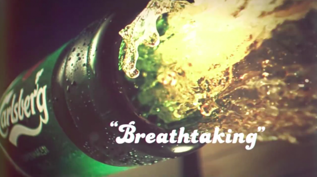
Carlsberg doesn’t do things half-ass. If the Danish brewer is going to do something, it will make it the best in the world—at least, according to three new ads that admit that might not actually be true at all.

The campaign, by 72andSunny in Amsterdam and the new Copenhagen office of New York’s MacGuffin Films, imagines what would happen if Carlsberg made erotic dramas, sang karaoke or taught language courses. In each, it would excel—”probably,” the ads say.

The campaign marks the return of the famous “If Carlsberg Did” theme after an absence of four years. “Carlsberg beer is made by natural, unique ingredients, and MacGuffin have helped us make these come to life in a refreshing and indulging way. Hereby, the beer itself is put on a pedestal, just where we think it should be. Probably,” says Carlsberg director of strategy and innovation Didrik Fjeldstad.

See the other spots below.

CREDITS
Client: Carlsberg
Spot: “If Carlsberg Did”
Agency: 72andSunny Amsterdam
Production Company: MacGuffin Films New York
Director: Nick Fuglestad
Exe. Producer: Sam Wool


Huge Mole on Man's Face Becomes an Advertising Superstar in Brilliantly Insane Video

We’ve seen hilarious ad awards call for entries. We’ve seen slutty ad awards call for entries. Now, it’s time for a brilliant but batshit crazy ad awards call for entries.

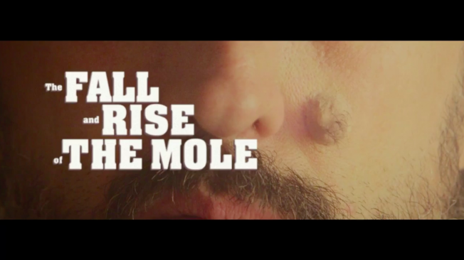
Borghi/Lowe Brazil created the video below for Creative Club São Paulo, and it’s just wildly odd and wonderful. It tells the story of a mole on a man’s face, who eventually breaks free and enjoys his own celebrated career—in advertising.

It’s beautiful yet gross, disturbingly conceived yet gorgeously made. It deserves an award of its own.


Phone Need a Charge at SXSW? Mophie and a Pack of St. Bernards Want to Help

Since we’re still living in a world where unlimited phone batteries don’t exist—and a world where dogs are still super awesome—cell-savior Mophie is coming to SXSW with a pretty unique promotion. 

Photo: Mophie

If you’re in attendance, and need a little extra juice, you can tweet a screenshot of your dying battery from noon to 6 p.m. CT time on Friday and Saturday to @mophie with the hashtag #mophierescue, and they’ll literally send a St. Bernard (the dogs known for saving people in the Alps) with a human equipped with a charger. 

If you’re selected, a dog from the St. Bernard Rescue Foundation will arrive with a Mophie Power Reserve to charge you up. 

Also, if you see one of these pups on the street, you can pose with them and send a tweet to be eligible for a prize. Mophie’s Kevin Malinowski told USA Today, “They are obviously traditionally known for saving peoples’ lives, so we took that and molded it into our own thing.”

He added, “So at the end of the day, it’s Mophie and St. Bernards save the people of South By and the people save the St. Bernards.”


Getty Images Talks Vince Vaughn, and How Stock Photos Have Gotten Better by Getting Worse

Vince Vaughn’s fake stock photos for the movie Unfinished Business were hilarious because they were so cheesy. But they were Photoshopped from real stock photos—showing just how clichéd a lot of stock business imagery has been.

But it’s evolving, says Getty Images, which did the Vaughn campaign with New Regency 20th Century Fox. And it’s taking its cues more than ever from social media, as the visual language of photography evolves thanks to apps like Instagram, Snapchat and Pinterest.

AdFreak chatted with Rebecca Swift, director of creative planning at iStock by Getty Images, about the Vince Vaughn photos and why “perfection” is no longer everything when it comes to business images.

AdFreak: The Unfinished Business photos with Vince Vaughn were great. Where did you get the idea to make those?
Rebecca Swift: New Regency Twentieth Century Fox and Getty Images have worked together for years. The studios’ digital marketing division pitched the concept and collection for the film Unfinished Business. The of idea working together to create a play on traditional corporate stock imagery with iStock by Getty Images, the biggest player in stock imagery, was born. The idea was to have a bit of fun—it’s brilliant to see them all over social media, and how people are making them their own.

Why Photoshop old photos instead of shooting new ones?
The awkward Photoshopping was part of the fun! We wanted to create a series of photos that would be instantly recognizable—playing off all the classic stock tropes—an idea which feeds directly into the business storyline of the film. The best way to do this was by taking existing images from the Essentials collection on iStock by Getty Images and Photoshopping the actors’ faces in, which creates this wonderful “double-take” effect—classic stock with a twist.

—Clichéd/perfect

—Authentic/imperfect

The original stock images that you used look cheesy to us today. I’m not sure how old they are, but clearly they’re out of date, aren’t they?
Classic stock images are familiar to us because we have seen the same scenario visualized thousands of times before. Clichés get ideas across, but it’s just one style. iStock by Getty Images offers a wide range of imagery to suit the endlessly varied needs of our customers. Our Signature collection, for example, features realistic, more authentic looking stock images that a growing number of businesses are using to tell their stories and engage consumers.

Has social media taught us to feel differently about what makes a business image engaging?
People love pictures, and that’s flooded into business communications. Audiences relate to brand imagery in the same way they do to their social media feeds. Social media—Instagram, Snapchat, Pinterest and others—certainly has made all areas of life more visual and public. At iStock by Getty Images, we’ve embraced this trajectory from the beginning. That’s why we provide images taken from the “inside”—i.e., people who are in the moment—showcasing real emotions, real body language and a broader range of people. These increasingly popular images bring an authenticity that resonates with the viewer.

Older stock images were earnest and “perfect.” There’s a trend toward authenticity, reality and imperfection now, right? How do strike the right balance there?
Older images traditionally were created by professional photographers skilled in the techniques of producing perfect imagery. At the same time, brands wanted images that reproduced well in print, often at large sizes.

In recent years, we have become accustomed to mobile photography that is imperfect and full of technical errors. We even add filters and lens flares to our images to make them less technically perfect.

The key trend is in visual storytelling—we forgive technical errors in favor of authentic storytelling. If a brand is keen to convey accessibility and familiarity—their “everyman credentials”—imagery that is relevant to a social media-viewing audience is effective. Imagery that reflects the aesthetics of user-generated content works. By way of contrast, if a brand wants to convey professionalism and expertise, more technically apt imagery would reflect this. Ultimately, achieving the right balance depends on your audience and your message.

—Clichéd/perfect

—Authentic/imperfect

How did the Lean In collection approach these kinds of issues?
The Getty Images Lean In collection was created to harness the power of pictures and our massive global customer base to overturn clichés and shift perceptions by promoting authentic images of women in media and advertising. The partnership celebrated its one-year anniversary last month, and one year on, we are seeing photos from the collection being licensed in over 65 countries, including Qatar, Kuwait and Korea, and sales doubling.

What else makes a good business stock photo, or any stock photo for that matter, these days?
Stock images are offered as a blank canvas for our customers to use along with other design elements to tell their own story. The more conceptual an image or the more compelling the story that can be attached to the image, the more successful it is.

Good business images are likewise great representations of the way we now do business. In an office, in the home, on the move, in a coffee shop, in a workshop—we relate best to the familiar and most engaging. We gravitate toward imagery that visualizes the way we personally do business and consequently are more sympathetic toward brands that use this imagery. If the people featured in the images around us are not dressed or styled as we expect, we reject them as tired and clichéd. If the photographic technique is one that has been overused by brands, we also find them tiring.

—Clichéd/perfect

—Authentic/imperfect


Another 'World's Hardest Job' Campaign Says Moms Should Be Paid $260,000 a Year

A new British campaign from Interflora for Mother’s Day (which is in March in the U.K.) has almost an identical concept as last year’s famous “World’s Toughest Job” from American Greetings—but with a little twist.
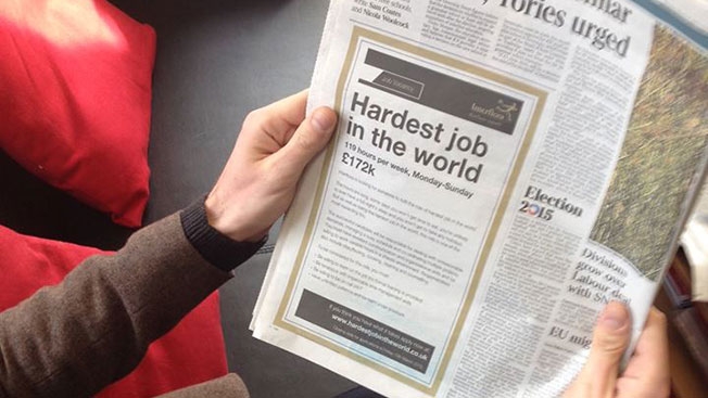
This one is called “Hardest Job in the World” (that’s not the twist), and it included a fake ad that ran Monday in the Times newspaper. Styled as a job ad, it said candidates must be willing to work 119 hours a week, be willing to learn on the job, ne tenacious with impeccable time management skills, be on call 24/7, have unlimited patience and be calm under pressure.

The difference is, while American Greetings listed Mom’s salary as $0, the Interflora ad said the salary is £172,000 a year, or about $260,000 a year. At least, that’s what moms should earn—if they were paid 40 hours a week (plus 79 hours a week of overtime) in jobs like teachers, chauffeur, psychologist, housekeeper, head chef and personal assistant.

Moms, try the calculator here, and see how much you should really be earning.


Clothing Retailer's Shopping Bags Turn Inside Out to Become Recycling Mailers

Attention, Swedish shoppers: More Rag Bags are on the way!

For now, check out DDB Stockholm’s case study video for the sustainability campaign, which generated significant media coverage last year, along with a win at the Epica Awards and three nominations at Cannes.

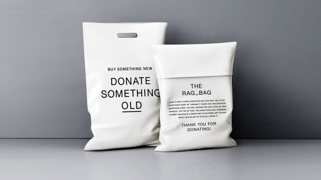
The initiative, for Swedish fashion brand Uniforms for the Dedicated, features biodegradable shopping bags that can be used to ship unwanted garments to charitable organizations. One thousand bags were produced in a pilot program, and consumers could order them free of charge. The bags are twin-sided. When turned inside out, they become slick mailers, labeled with the addresses of individuals’ chosen charities, as well as proper postage.

“I don’t have the exact number of returns [in terms of clothing donations], but we have sold out of the bags,” DDB Stockholm CEO David Sandstrom tells AdFreak, though more will be in production for spring. “We also have a Rag Bag site, where you as a business can sign up for bags. We got interest for 600,000 bags from different companies.”

Unlike some preachy sustainability ventures, Rag Bag scores by embracing consumerism. It creates a realistic framework to nudge folks into making donations, and provides them with a rewarding experience. And a bag. (Until they mail it off with old shirts inside, that is.)

“Our hope is that this will stretch beyond what can be called a campaign,” says Sandstrom. “Wouldn’t it be great if this became a retail standard?”


Like Clockwork, These Brands Found Time for Absurd Tweets About the Apple Watch

By now you’ve heard all about Apple’s new gadget—that futuristic iPhone accesory known as the Apple Watch. When the biggest brand in the world releases a new product, it’s a cultural event. And that means Twitter explodes as everyone—including brands—offers their hot take on the new timepiece.

Check out some of the brand tweets below, whose subtext is clear: Apple is cool, but it’s time to pay attention to us instead. 


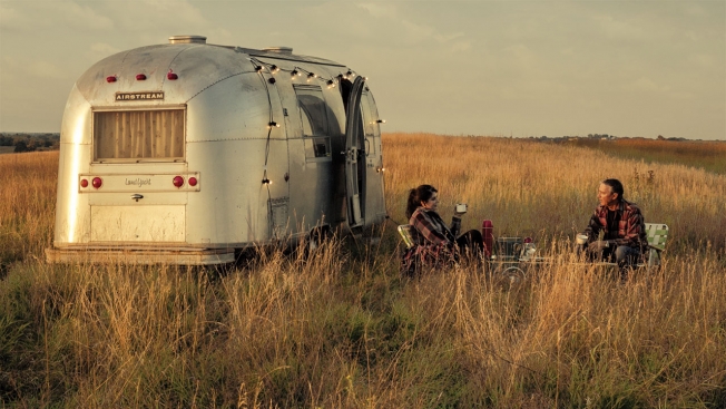
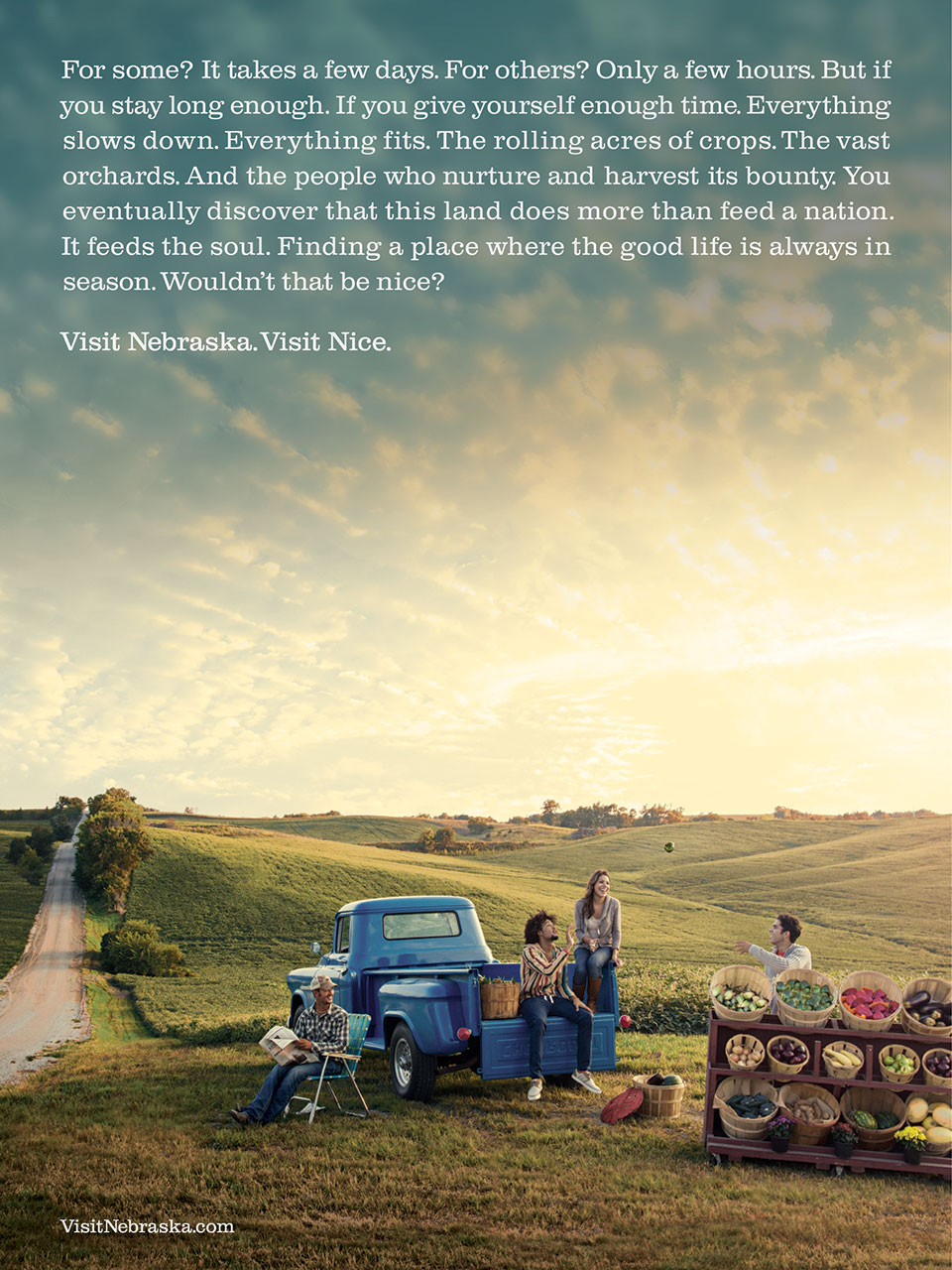
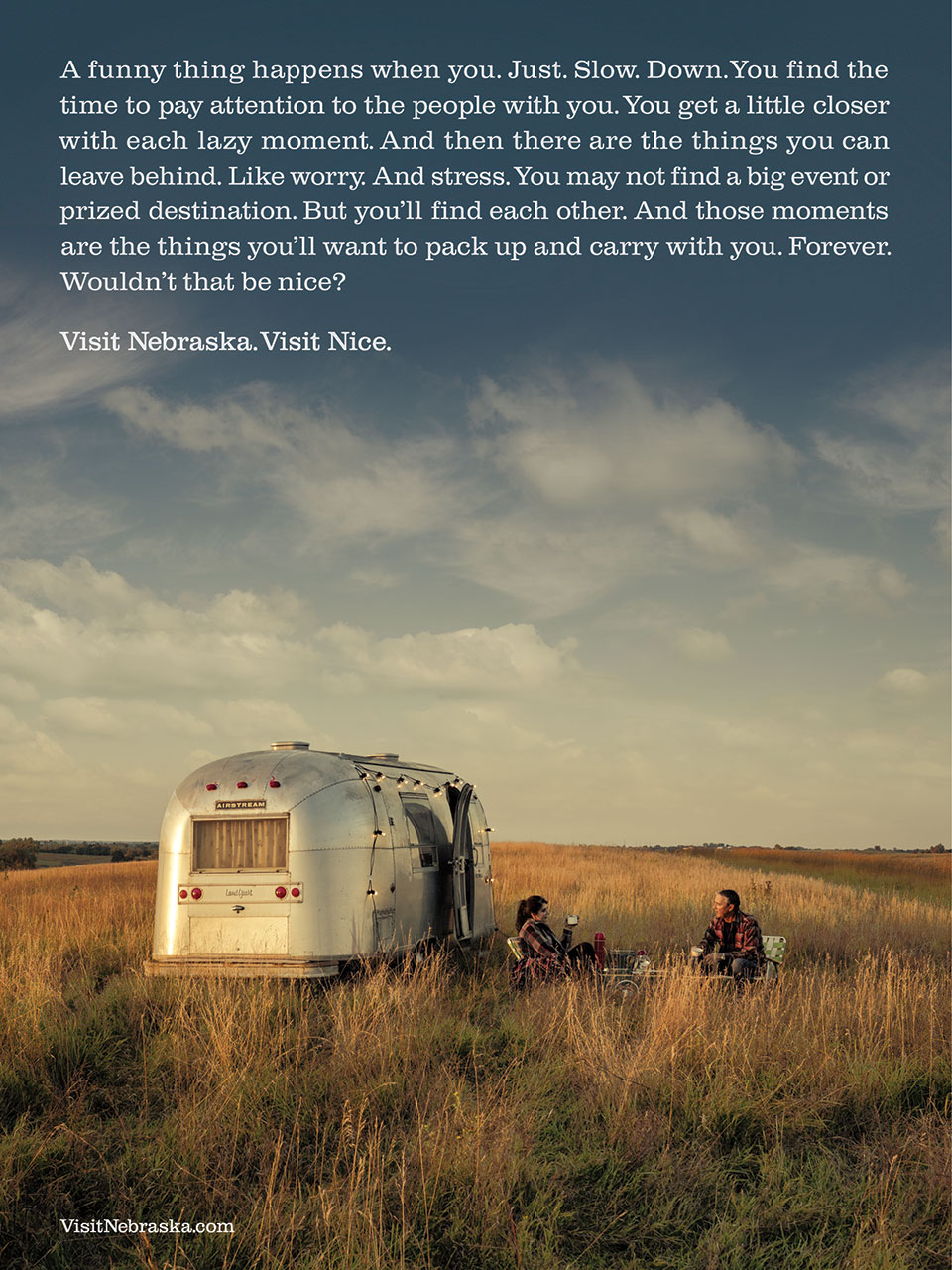
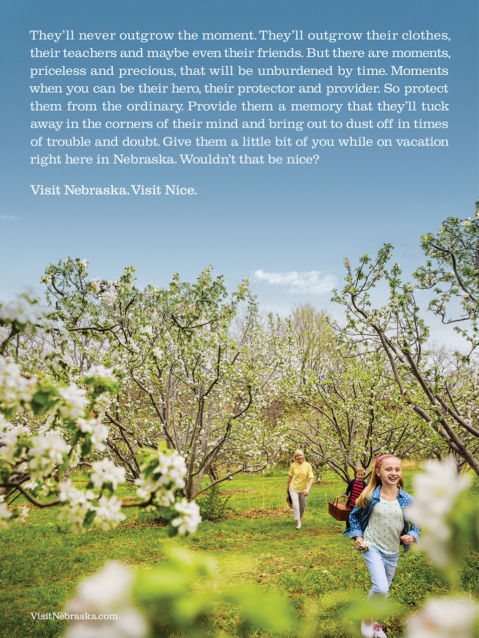
'Visit Nice,' Says Nebraska in America's Most Humble Tourism Ads

Not every state has a Disney World, a National Mall or a Times Square. So, how do you attract visitors if you don’t have something astounding, amazing or awe-inspiring to show them? How about something … nice?

Nebraska has been doing that lately with perhaps the country’s most unassuming tourism ad campaign, featuring the tagline “Visit Nebraska. Visit Nice.”

“When you visit Nebraska, it’s less about the attractions, and the jam-packed vacation agenda of things to see and do. It’s more about the simple, spontaneous, nice moments you enjoy with the ones you love,” says Omaha ad agency Bailey Lauerman.

In other words, visiting Nebraska isn’t about getting amped up; it’s about slowing down. And the ads embody that. The TV spots feature slow-motion footage of people enjoying quiet landscapes, and the print ads have long copy—you have to slow down to read them.

The idea of “Visit Nice” seemed perhaps too humble to some Nebraskans when the campaign launched last year. But it seems to be growing on people. With gorgeous photography by Andy Anderson, the print ads in particular are eye-catching—they won Best of Show at the Nebraska Addys this year.

Check out more of the work below.

CREDITS
Client: Nebraska Tourism Commission
Executive Director: Kathy McKillip
Agency: Bailey Lauerman
Chief Creative Officer: Carter Weitz
Associate Creative Director: Ron Sack
Senior Copywriter: Nick Main
Account Executive: Rich Claussen
Brand Manager: Matt Emodi & Kelsey Dempsey
Designer: Andrea Trew
Agency Producer: Sally Mars
Media: Sandra Cranny and Sierra Frauen
Diane Kraijcek, Director of Research
Production Manager: Gayle Adams
Senior Art Director: Jim Buhrman Jr.
Photographer: Andy Anderson
Digital Retouch: Michael Perez and Joe McDermott


Apple Watch May Be the Future, but Its First TV Ad Borrows From the Past

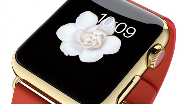
For a product Apple hopes will be revolutionary, the first TV commercial for the Apple Watch, unveiled today, had an instantly recognizable style. And no wonder—it’s a style that’s gained no small measure of equity since the advent of the iPhone in 2007. And the ads continue to look and sound great.

The formula is simple: Device against white background, turning in space to show the physical design, cycling through apps on screen to show functionality, all set to an energetic, catchy tune—in this case, the Holychild track “Running Behind.” (It’s like doing a super-fancy product demo, and understandably so—products that haven’t existed before need fairly basic marketing to explain them.)

This spot gets to do a few more things—show off the bands as jewelry, for example. And it’s quite clever that, thanks to some handclaps, the device gets a round of applause right out of the gate. “The watch is coming,” says the copy at the end, quickly dissing all rivals.

But otherwise it’s business as usual, if gorgeously so.


Toyota Challenges Meteorologists to Drive Around With Sunroofs Synced to Their Forecasts

Everyone loves to complain about the weatherman messing up the forecast, but Toyota decided to actually do something about it.

At least, that’s the premise of this new reality-style ad for the automaker’s Aygo model (sold in Europe). In the two-minute spot, three television forecasters are given special versions of the car to drive, with a sunroof rigged to stay closed when he or she predicts rain, and open when he or she expects it to shine—regardless of what actually comes out of the skies.

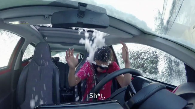
Cue obvious footage of one weather anchor cursing as a small mountain of snow dumps onto her head (did she not see it, or did the rules bar her from sweeping it off before she got in?), and another hilariously pleading for mercy as he gets drenched in a downpour.

It’s all framed as an experiment, if tongue in cheek, so the results aren’t surprising— the world’s favorite rhetorical punching bags get the weather right some of the time. And as with most documentary marketing, it should probably be taken with more than one grain of salt.

In other words, Toyota isn’t exactly taking much of a risk by piling on. But it’s fun enough to watch, in a revenge-schadenfreude kind of way. For all those times you got caught in a thunderstorm without an umbrella, sit back and grab some popcorn, because it sure beats blaming the atmosphere.

Agency: Del Campo Saatchi and Saatchi Spain.


Mercedes Accelerates to Its Top Speed in Real Time Through 4 Short Ads

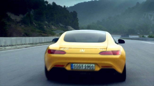
These four brief ad from Jung von Mott illustrate, in real time, just how quickly the Mercedes-AMG GT S accelerates from 0 to its top speed of 310 kilometers per hour (roughly 193 miles per hour).

The German ads are designed to be viewed sequentially, running between other commercials in traditional TV ad blocks for maximum interruptive effect. By the end of the first spot, which lasts 3.8 seconds, the car is moving at 100 kph. By the end of the second, it’s doing 200 kph. It hits 310 kph during the fourth spot.

(Just toolin’ down the Autobahn to pick up some milk at the local Edeka market. Supergeil!)

The whole thing lasts less than 20 seconds, and the copy—displayed one word at a time on screen—flies by awfully fast. Honda and Hyundai took similar zippy routes recently, so I guess the speed-reading trend is in high gear until the next car-commercial gimmick comes down the pike.

Frankly, following such rapid text makes me kind of dizzy. Advertisers, feel free to slam on the brakes anytime. Via Ads of the World.


People Ignore a Giant Lump Growing on a Street in This Clever Cancer PSA Stunt

Never underestimate people’s power not to give a damn about what’s right in front of them.

We’ve seen this time and again in outdoor ad stunts, and this latest one from AMV BBDO in London is quite amusing to watch. It’s a PSA for Cancer Research U.K., which wanted to communicate that British people are missing the first signs of cancer. Well, no wonder they ignore small lumps in their bodies when they just walk right past weird giant lumps growing in the real world.

Model makers Artem built the lumps.

“The road lumps had to match the paving bricks of the street used for the shoot, and be distorted in such a way that made it appear as if a ‘tumor’ was growing in the road,” the company says. “The lumps had to be light enough to carry on and off set, but durable enough for a van to go over them; one of the lumps was reinforced in fiberglass to allow for a road sweeper to go over it.”

CREDITS
Client: Cancer Research U.K.
Agency: AMV BBDO, London
Creative Directors: Mike Crowe, Rob Messeter
Copywriter: Charlotte Adorjan
Art Director: Michael Jones
Agency Planners: Emily Harlock, Sarah Sternberg
Account: Gareth Collins, Emily Atkinson, Ally Humpherys
Agency Producer: Sophie Horner
Media Agency: Mediacom
Media Planner: Lucy Mitchell
Production Company: Rogue
Producer: Maddy Easton
Director: Sam Cadman
Sound: Gary Turnball / Grand Central Recording Studios
Post: Joseph Tang / The Mill
Editor: Kev Palmer / TenThree
Model Makers: Artem
Music: The Sound Works


1840s Prospectors Find the Mother Lode of Liquid Gold in CP+B's First Velveeta Ad

Kraft has changed how it defines consumers who eat Velveeta, from age and gender (millennial males) to mind-set (fun people who like to indulge). As such, new ads for Velveeta Shells & Cheese feature a broadly appealing pair of prospectors from the 19th century instead of a cool dude who sells remote-control helicopters at a mall.

In one TV ad breaking today, the bearded prospectors, one older and one younger, marvel at the “liquid gold” they’re eating, and the young one asks the oldster how he found it. Then what looks like a campfire conversation in the woods pulls back to reveal a whole different scene entirely.

Future spots will also find humor in the odd placement of frontiersmen in a modern supermarket. The campaign also includes online ads, social media marketing and a new wrinkle for the brand, radio ads, said Tiphanie Maronta, a senior brand manager at Kraft.

The ads are the first for Velveeta from Crispin Porter + Bogusky, which inherited the brand from Wieden + Kennedy in an agency consolidation late last year. 


adam&eveDDB Changes Its Name to eve&adamDDB for International Women's Day

There’s lot of marketing around International Women’s Day this Sunday. And now, London agency adam&eveDDB has joined in with a symbolic gesture—changing its name to eve&adamDDB for a couple of days.

They even changed the signage outside their building as you can see below.
 

Adweek responsive video player used on /video.

brightcove.createExperiences();