Urban Calligraphy

Blaqk, c’est le nom de la collaboration entre Greg Papagrigoriou et Simek, deux artistes vivant à Athènes. En jouant avec talent entre formes et typographies, ces derniers parviennent à magnifier chaque endroit qu’ils occupent avec un travail sur les lettres hallucinants. Un rendu splendide à découvrir dans la suite.

Urban Calligraphy29
Urban Calligraphy28
Urban Calligraphy27
Urban Calligraphy26
Urban Calligraphy25
Urban Calligraphy24
Urban Calligraphy23
Urban Calligraphy22
Urban Calligraphy21
Urban Calligraphy20
Urban Calligraphy19
Urban Calligraphy18
Urban Calligraphy17
Urban Calligraphy16
Urban Calligraphy15
Urban Calligraphy14
Urban Calligraphy13
Urban Calligraphy12
Urban Calligraphy11
Urban Calligraphy10
Urban Calligraphy9
Urban Calligraphy8
Urban Calligraphy7
Urban Calligraphy6
Urban Calligraphy5
Urban Calligraphy4
Urban Calligraphy3
Urban Calligraphy2
Urban Calligraphy1

Handcut Paper

Annie Vought a développé ces oeuvres pour sa collection basée sur des correspondances manuscrites. L’artiste a cherché à reconsidérer les textes comme un échange ayant plus de valeurs que celui des formes digitales. Un rendu splendide de cette artiste vivant en Californie, à découvrir dans la suite.


Handcut Paper7
Handcut Paper6
Handcut Paper5
Handcut Paper4
Handcut Paper3
Handcut Paper1
Handcut Paper8
Handcut Paper2

Sabeena Karnik: Typography

Sabeena Karnik is a Graphic Designer from Mumbai. She is a freelancer specializing in paper typography and has developed her own style in 3D sculpturing using paper. Her recent works include a typography campaign for Tanishq jewellery and a title design for a short documentary for The American Cancer Society. She teaches painting, calligraphy and sells art in her free time.

Why are you a Graphic Designer?
Right since I can remember, art was chasing me. I always had a pencil in hand and colors were in plenty. I would be doodling all the time, even the walls of my house were not spared. So taking up art as a career was a very natural instinct. It was a hard choice to make between applied art and fine art. But I can never make something just to keep myself happy, I think that is what fine art is all about. For me creating something has to be for others be it a product, the way it looks, the way it is presented. That is basically the work of a graphic designer. Hence it had to be applied art. I do a lot of paintings too, but its again an idea that I am presenting and working around.

Did you attend school for fine art or design?
Yes, I graduated from Sophia Polytechnic Institute of Art and Design in Mumbai, with a typography major.

You have a distinct style of Typographic expression. How did you develop this style?
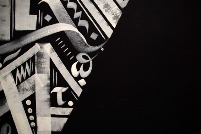
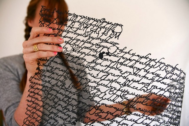
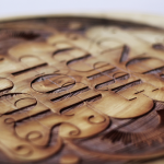
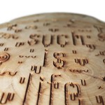
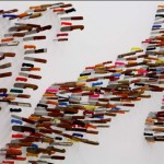
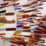
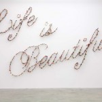
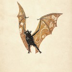
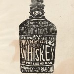
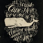
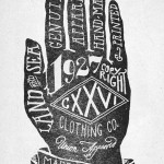
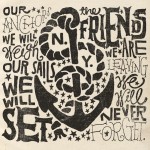
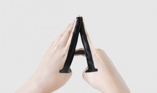
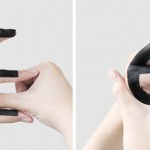
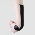
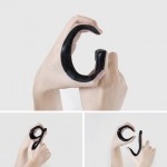
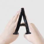
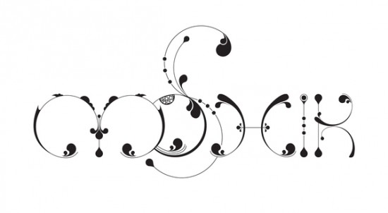
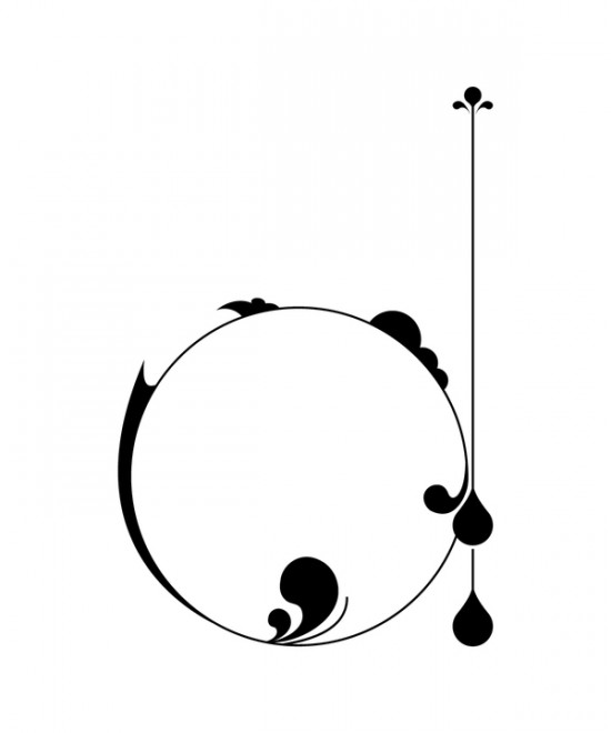
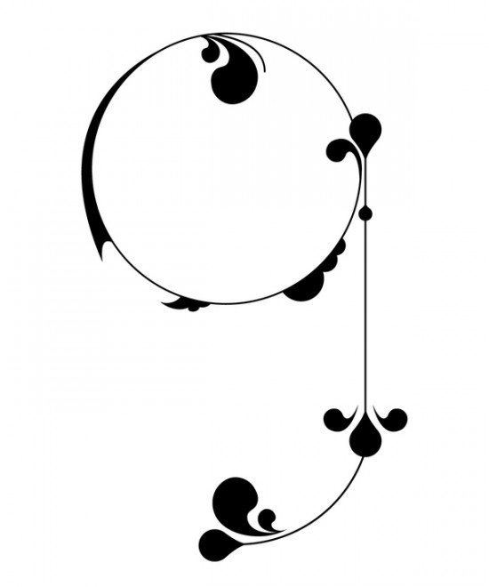
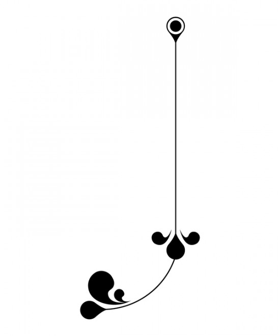
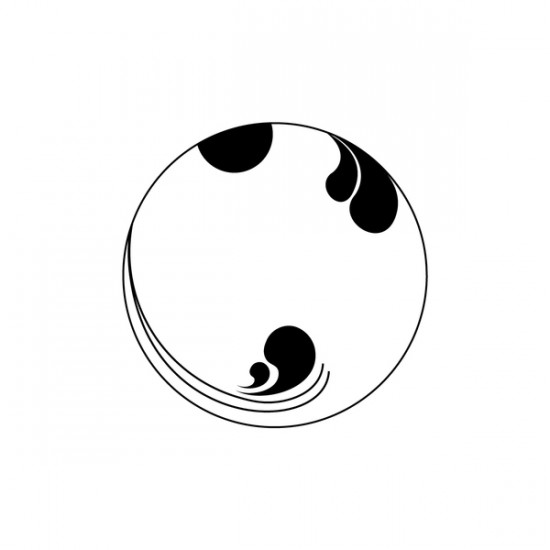
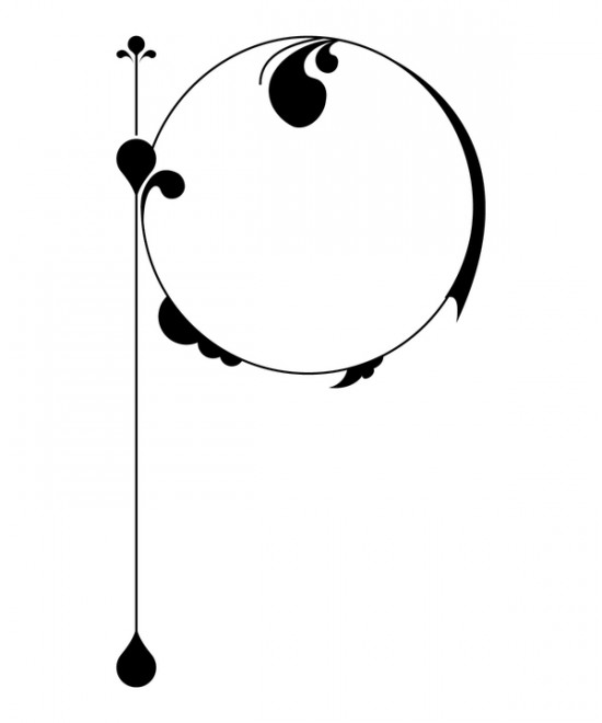
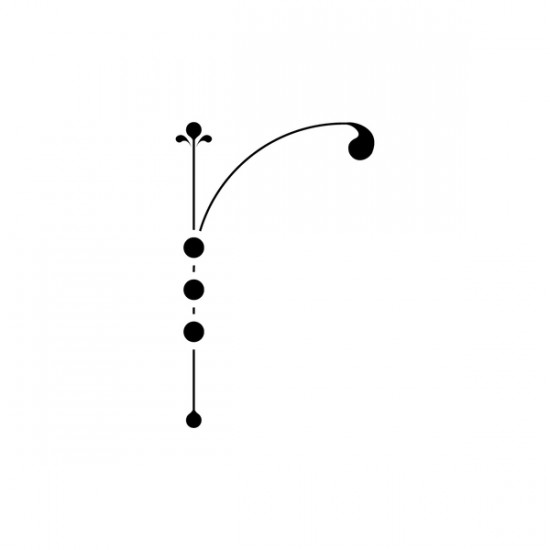
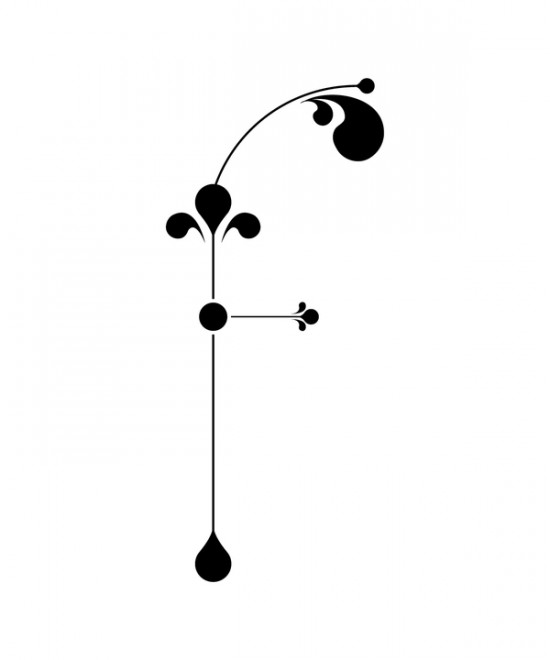
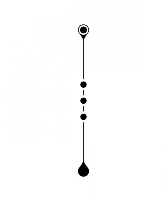
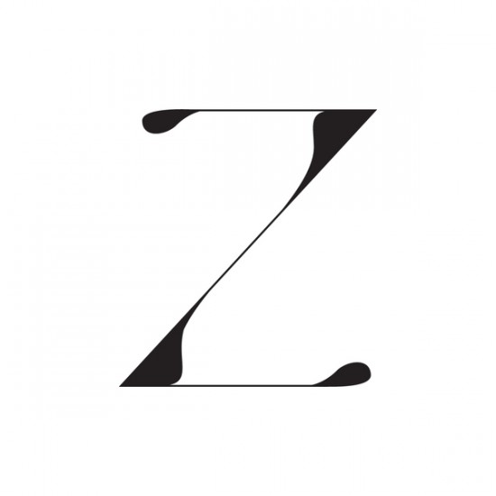
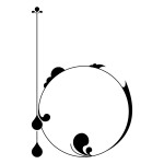
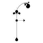
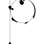
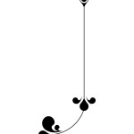
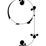
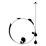
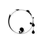
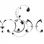
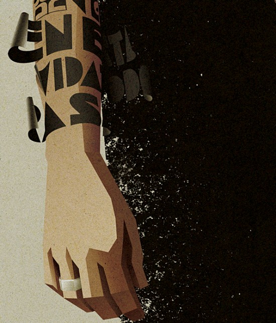
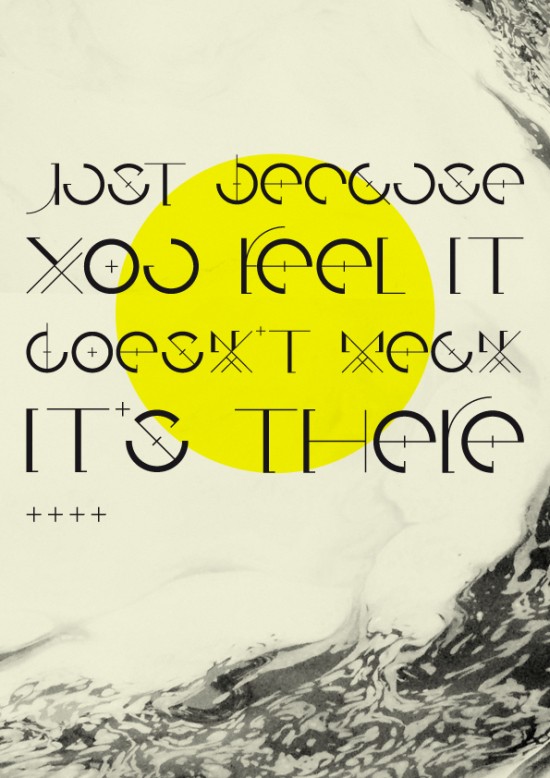
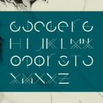
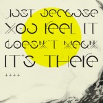
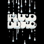
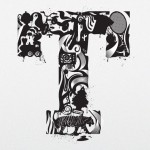
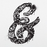
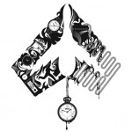
Its been a fascination ever since I was a kid. I used to cut out and collect alphabets that looked unique. I loved letters so much that I started drawing them out and developing my own style. Thats when I got immersed in Calligraphy too. In the meantime paper brought the sculpturor out in me. Paper has the most magnificent ability to turn into anything with the right technique and application. Each fold, bend and curve can be interpreted differently. It has so much of depth.
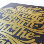
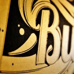
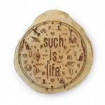
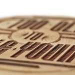
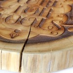
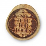
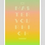
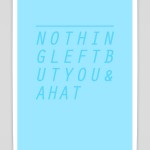
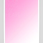
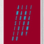
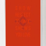
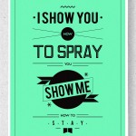
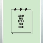
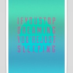
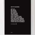
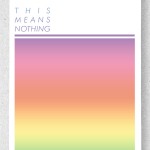
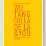
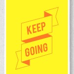
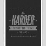
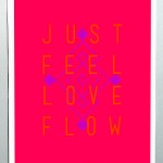
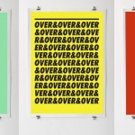
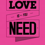
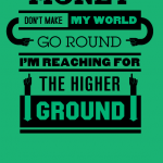
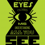
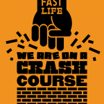
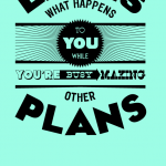
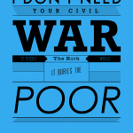
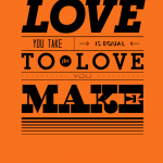
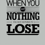
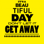
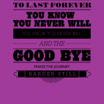
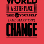
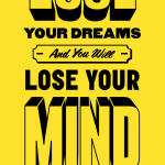
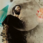
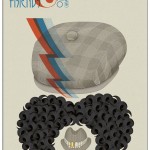
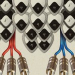
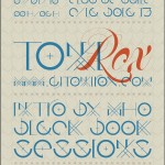
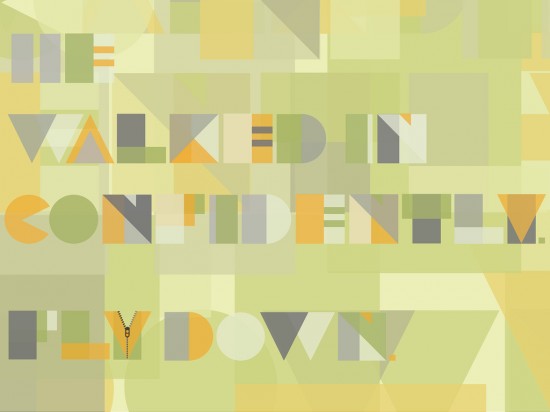
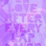
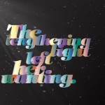
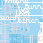
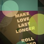
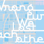
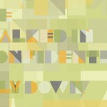
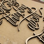
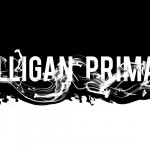
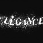
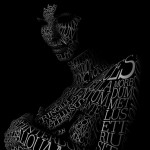
In a way now, I am combining the three, paper, typography and calligraphy. Typography being the skeleton while the inner detailing being calligraphy, just done all with paper. The photography is an integral part of my work. The end product has to be captured in the right kind of light, which can give multiple views to the viewer and thereby alter what is being conveyed.

Were there any particular role models for you when you grew up?
I haven’t had any one particular role model. Places and people in general have always fascinated me. My travels to Africa as a child have helped to find my own perspective as an artist. Stories I came across in people, nature, artworks I have seen have played a major role in bringing out the artist in me.

Who was the most influential personality on your career in graphic design?
Achyut Palav under whom I learnt calligraphy has been very influential. Im also inspired by Jen Stark a young paper sculpturer, her works defy the force of gravity.

When did you start freelancing?
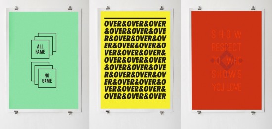
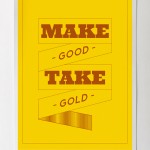
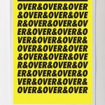
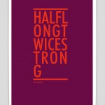
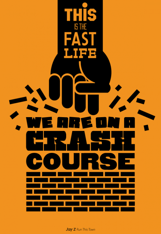
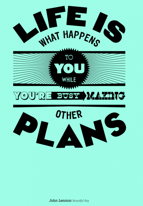
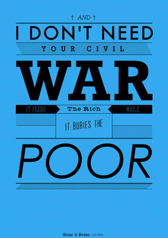
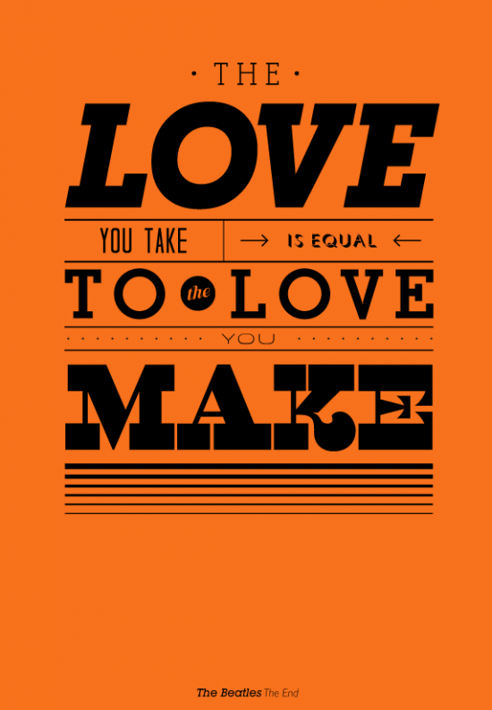
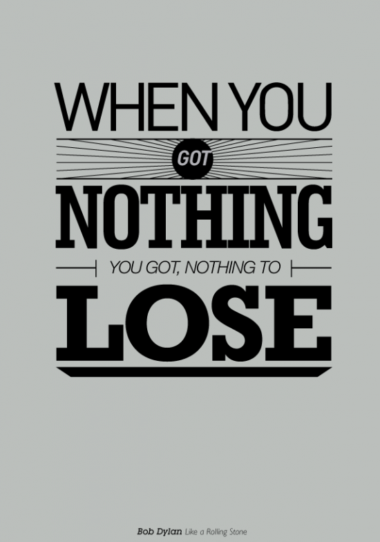
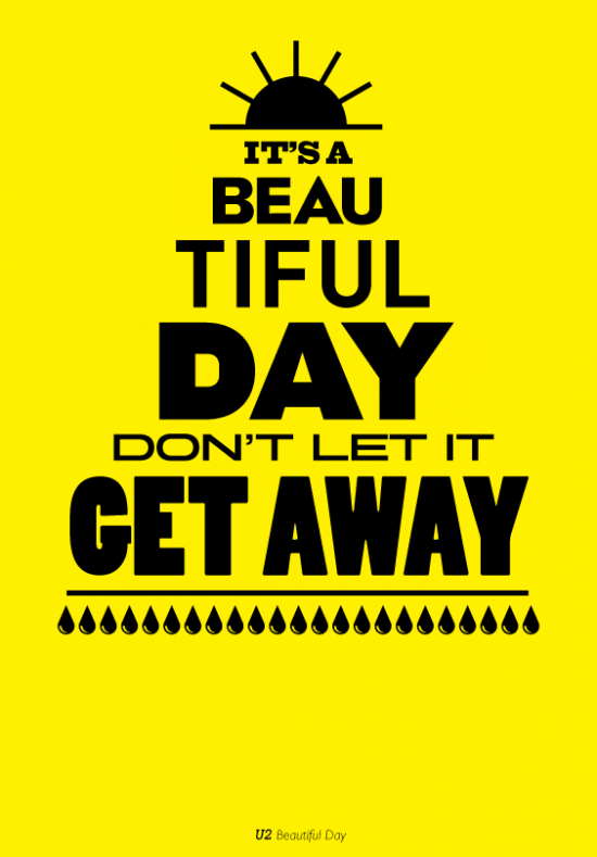
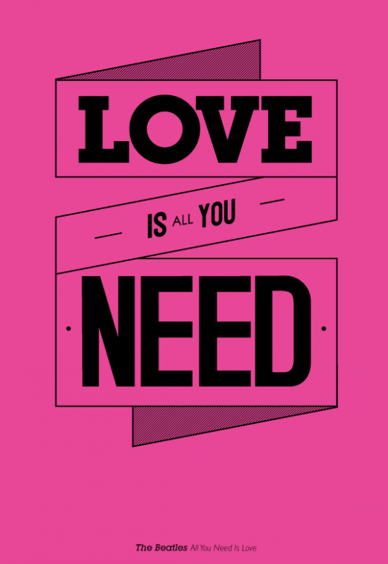
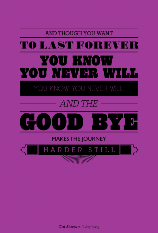
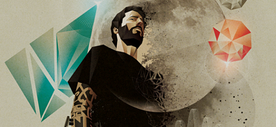
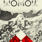
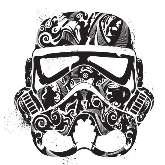
I started Freelancing in 2008. I did a lot of logo and corporate identity independently, lived in Africa for a few years and worked for design houses, made paper products for an NGO, did paintings for an art store. Freelancing happened out of choice. It gives a me time and opportunities to discover my own potential everyday through the assignments I get. Over the last one year the focus has shifted to typography purely. The paper typography project that started as personal work, has now garnered so much interest by public and designers from all over the world, it made me take my capability of it more seriously, and to develop it further.

Was there any time when you wanted to quit graphic design?
I have taken breaks but never felt like quitting.

Are many advertising agencies hiring graphic designers/typographers? Do you work more with agencies or publishers?
Yes agencies are hiring designers with special skills all the time. There is always a demand for fresh new work and ideas that are out of the box. Your work has to be seen by the right people at the right time.
Unfortunately, type design is not given the importance it deserves in India.
I have worked with agencies, a tv producer and at the moment with a publisher too for a book cover design.

Do you have clients who give you steady work or do you advertise for new clients often?
Steady work is constant and clients change constantly too. The best way to advertise yourself to the world is to showcase all your creative work and keep updating your skills.

Any other Indian graphic designers who you admire?
I admire the work of Raja Sandhu. He is based in Canada. Strong typography, simple and stylish work.

What advice do you have for aspiring creative professionals? Would you advise them to take on graphic design as a career option?
I would advice aspiring creative professionals to not forget to draw. The computer is a tool. Find your own calling and pursue that. Do not hesitate to be different. Have the best work from your portfolio in design sites and promote your work in the right way. Keep looking for inspiration and keep sketching. The pencil is mightier than anything else. Also, I will add, designing and art isn’t everything. Travel, read, meet people, broaden and expand Syour horizon.

Do you think Clients are opening up to keeping aside a decent respectable budget for design work? Do you think clients are understanding that they need to invest in Design as a communication tool and also to cut the clutter, and that good design comes at a price?
Clients have a very big budget to advertise their brand. To an extent it depends on the brand also.
And if that involves good  design so be it. The agency gets the better of it and a small part of it goes to the designer thats been hired. Like I said earlier, very few campaigns in India involve good illustration and type design. The trend is slowly changing.

Who would you like to take out for dinner?
Leonardo Da Vinci. We would need an interpreter though.
Jeff Nishinaka. He is the most brilliant Japanese paper sculpturer.

What’s on your iPod?
From western Classical to pop, Bach to Backstreet Boys

Mac or PC?
Neither at the moment
But a mac as a laptop and PC as desktop.

Sabeena’s work can be found here.


Just My Type Exhibition

Just My Type est une exposition qui a eu lieu en février dernier à Cape Town. Le but de celle-ci était de mettre en avant les talents de Jason De Villiers, Ben Johnston et Simon Berndt pour la création typographique. Des oeuvres réussies à découvrir dans la suite de l’article.


just-my-type-exhibition11

just-my-type-exhibition10

just-my-type-exhibition9

just-my-type-exhibition8

just-my-type-exhibition7

just-my-type-exhibition6

just-my-type-exhibition5

just-my-type-exhibition4

just-my-type-exhibition3

just-my-type-exhibition2

just-my-type-exhibition1


Previously on Fubiz

Copyright Fubiz™ – Suivez nous sur Twitter et Facebook

Knife Typography

Focus sur le projet de l’artiste Farhad Moshiri appelé “Life is beautiful” et présenté notamment à la galerie Perrotin en 2009. En plantant des couteaux pour créer ces quelques mots en relief, le résultat est à découvrir dans la suite en images.

knife-typography4

knife-typography3

knife-typography2


Previously on Fubiz

Copyright Fubiz™ – Suivez nous sur Twitter et Facebook

Jon Contino

Jon Contino est un illustrateur qui parvient à nous transporter dans son univers avec un style ancien très réussi. Des jeux de contrastes et de typographies à découvrir dans une séries de visuels dans la suite de l’article consacré à cet artiste.


jon-contino7

jon-contino6

jon-contino5

jon-contino4

jon-contino3

jon-contino2

jon-contino1


Previously on Fubiz

Copyright Fubiz™ – Suivez nous sur Twitter et Facebook

Hand-Painted Type

L’artiste Tien-Min Li a pu penser une expérience typographique en cherchant les relations entre la lettre sous sa forme majuscule et sa forme minuscule. Des transformations à partir de lettres peintes sur sa main à découvrir en images dans la suite de l’article.


hand-painted-type7

hand-painted-type6

hand-painted-type4


Previously on Fubiz

Copyright Fubiz™ – Suivez nous sur Twitter et Facebook

Tips on Posters

Basé à Londres, Mr. Phomer est un artiste amoureux de typographie mais aussi de la culture populaire. Ce dernier nous propose une série de posters rappelant des adages et conseils. Avec des choix de couleurs intéressants, le rendu est à découvrir dans une série de visuels.


tips-on-posters18

tips-on-posters17

tips-on-posters16

tips-on-posters15

tips-on-posters14

tips-on-posters13

tips-on-posters12

tips-on-posters11

tips-on-posters10

tips-on-posters9

tips-on-posters8

tips-on-posters7

tips-on-posters6

tips-on-posters5

tips-on-posters4

tips-on-posters3

tips-on-posters2

tips-on-posters1


Previously on Fubiz

Copyright Fubiz™ – Suivez nous sur Twitter et Facebook

Him Her

Nessim Higson nous propose sa dernière animation en jouant sur la typographie. “Him Her” se veut être l’histoire d’une relation entre lui et elle, simplement par l’enchainement de lettres retraçant les phrases les plus importantes d’une romance. A découvrir dans la suite.


himher5

himher4

himher3


Previously on Fubiz

Copyright Fubiz™ – Suivez nous sur Twitter et Facebook

Music Philosophy

Music Philosophy est un excellent projet mêlant musique et graphisme. Le designer Mico reprend les paroles d’une chanson connue d’un groupe ou d’un artiste qu’il affectionne, pour en faire une composition typographique. Plus de visuels à découvrir dans la suite de l’article.


music-philosophy15

music-philosophy14

music-philosophy13

music-philosophy12

music-philosophy11

music-philosophy10

music-philosophy9

music-philosophy8

music-philosophy7

music-philosophy6

music-philosophy5

music-philosophy4

music-philosophy3

music-philosophy2

music-philosophy1


Previously on Fubiz

Typefaces by Moshik

Coup de projecteur sur la typographie imaginée par Moshik Nadav. Cet artiste de Jérusalem, spécialisé dans le graphisme et la typographie, nous offre ici une série de lettres au design épuré et recherché. Plus de visuels de son travail dans la suite de l’article.


moshik3

moshik4

moshik5

moshik6

moshik7

moshik8

moshik9

moshik10

moshik11

moshik12

moshik13

moshik14

moshik15

moshik16


Previously on Fubiz

Vicente Garcia Morillo

Une série d’illustrations de l’artiste Vicente Garcia Morillo. Cet illustrateur madrilène exprime tout son talent dans ces créations pour un rendu de grande qualité, jouant brillamment avec les typographies. Plus de visuels dans la suite de l’article.


morillo6

morillo7

morillo11

morillo9

morillo8

morillo3

morillo2

morillo1

morillo

morillo5


Previously on Fubiz

Six Word Story Every Day

Inspirés de l’anecdote selon laquelle Hemingway aurait eu à écrire une histoire en six mots, le rédacteur Van Horgen et la graphiste Anna Ulku se sont lancés dans un défi intéressant : chaque jour, six mots sont choisis, typographiés et illustrés avec talent. Plus de visuels dans la suite.


022110

6words8

022110

6words7

011610

6words4

6words3

6words2

032610

6wordsbanner


La suite de leur projet est disponible dans la galerie.

Previously on Fubiz

Sean Freeman

Sean Freeman est un graphiste et amateur de typographie plein de talent, actuellement installé à Londres. Il récupère des objets pour créer des images saisissantes aux textures riches. De nombreux exemples de son style et de ses illustrations sont disponibles dans la suite.


seanfreeman1

seanfreeman3

seanfreeman5

seanfreeman7

seanfreeman8

seanfreeman9

seanfreeman10

seanfreeman15

seanfreeman12

seanfreeman16

seanfreeman18


Previously on Fubiz

Steven Bonner Illustrations

Coup de cœur pour le travail du graphiste Steven Bonner, un illustrateur freelance basé à Stirling en Ecosse. Actuellement représenté par NB Illustration, voici de nombreux exemples de ses travaux en tant que typographe. Une sélection également disponible dans la suite.


40_start1

15_skinnylogo

23_lettertnew1

24_ampersannew1

26_runningnew1

16_aandpnew

27_fluidnew1


D’autres images de son travail dans la galerie / Portfolio Akastudio

Previously on Fubiz

Typography Videoclip

Un très beau travail du graphic-designer David Pino basé à Amsterdam pour le groupe El Pino & the Volunteers. L’idée est de reprendre l’artwork de la pochette, avec près de 700 lettres de polystyrène formant les paroles de la chanson. A découvrir en vidéo dans la suite.


typo2

elpino2

elpino1

Previously on Fubiz

Hetilica Bold FOR FREE

As a part of a College final exam I had to make a typeface which I ended up naming Hetilica.

Based on information signs of alcohol licenses among several beverage expendiums in the area of Cartagena, Chile; Hetilica is composed of wide strokes and the brush’s interaction with the medium.

You can download it 100% free by clicking here.

Please feel free to use and spread as you please. Just let me know when you do so I can see it in action.

Cheers and thanks.

Hetilica Bold

Hetilica Bold

This font I just finished is based on the local alcohol stores around the beach in the city of Cartagena over here in Chile. It was a project for our school workshop class and I’ll be giving it out for free in the upcoming days, just gotta adjust some minor tweaks, add a few more characters and maybe, just maybe release it in a couple more weights.

Anyways stay sharp for the release of this and a couple more fonts of mine.

Thanks for dropping by.

Everlasting Idea? / La même idée, presque mot à mot

separation2007b separation2009b
THE ORIGINAL?
Cultura Inglesa English Courses – 2007
Source : Adsoftheworld,
Agency : Lew Lara Sao Paulo (Brazil)
LESS ORIGINAL :
Everlast “all or nothing” – 2009
Source : Cannes 2009 Longlist
Agency : JWT Dubaï (UAE)
Pendant que les mots se séparent en deux, Joe lui se coupe en quatre pour rétablir la vérité…
1 people like this post.

Like it? 

The Design Chapel 2

One of my favorite designers, Robert Lindström, has just updated his amazing DesignChapel after well over a year and pops back with a fresh new blog to keep track of his doings.

Showcasing some of his personal work and the ones made with NorthKingdom. 100% quality on every project.