In Memoriam: Kodak Scenic Spots

I took my first Kodak Photo Spot (wiki) pictures at my spring break trip to the Disney World in the mid-1990s, and through all these years I’ve never stopped admiring their genius. It’s a marketing idea whose elegance has rarely been emulated. I love how organically spreadable the signs were, how they subtly nudged you to spend another scarce frame of  film, and how they made people’s lives a little bit better by giving their memories just the right composition.

Of course today the Kodak Picture Spot is something that could probably be built straight into the digital camera wired to recognize the subject and to statistically analyze thousands of photos taken from the same spot to recommend the optimal composition and camera settings.

A Kodak photo spot, (K. Mikey M on Flickr / group)

Eastmanhouse.org:

“As photography became more engrossed in American culture in the early 20th century, The Eastman Kodak Company began to look for new ways to advertise photography and its cameras. With the rise of the automobile industry and the development of American highways, the company began a campaign called “Kodak Scenic Spots.” Starting in 1920, Kodak began to place signs throughout American highways that advertised both their name and the practice of photography by marking interesting and beautiful scenery. Initially, these signs appeared on the roads outside of Kodak’s hometown of Rochester, NY in order to test the effectiveness of the idea. Within a year, they began sending members of their advertising department across the country to select the most scenic views to be awarded signs. By 1939, Kodak had placed 6,000 scenic spot signs across the country.

The exact phrases used in these signs changed over time. When the company began the campaign, the signs read: “Picture Ahead! Kodak as you go.” Eventually, the use of the work “Kodak” as a verb was stopped and the signs were changed to read: “Kodak Scenic Spot.” After the initial campaign ended in 1939, Kodak continued to place these signs sporadically in theme parks and tourist locations until the late 1980s. These signs also carried a new label, which read: “Kodak Picture Moment.”

Map of Kodak Picture Spots at Magic Kingdom (source)

Websites Morph To Users’ Cognitive Styles

And we are back.

As you might know, I’ve been busy for the past two weeks moving to a new place, hence no internet, hence the lack of updates. I’m all set now, and we are back to our usual schedule. I’d never have to deal with so much customer service before in such concentration, and I have to thank all these people for taking most of the pain out of the process.

Excellent Moving truly lives up to its name. They sent me a huge truck and two guys who were running up and down the stairs with the furniture that can be barely lifted by a normal human. They were perfectly on time and on budget even though I had severely underestimated the number of boxes my possessions would fit in. If you need to move around Boston, you can’t go wrong with them.

I wonder if agents sitting on the front row of desks at a real estate office usually get more walk-in business, and I’m glad one of them did because he found just the place (if you know Cambridge, you know how old and run-down many apartments here are; I’d seen seven of those). Call Apartment Rental Experts on Porter and ask for Paul.

Moving utilities has been a breeze using NStar’s website. Comcast continues to provide great service even though they had to send a second technician to fix something that had been overlooked by the first one. It took two business days from the initial call for the internets to resume their smooth flow.

And of course, many thanks to AdLab readers for sticking around and nudging me to get back online:

“The crowd demands entertainment!
Толпа требует развлечений!
Gloata cere distractie!
众人需要娱乐”

To kick off our summer season, here’s an article from MIT Tech review about websites that recognize the cognitive style of visitors by the way they click around and adapt their interfaces accordingly:

“The researchers’ initial studies show that morphing a website to suit different types of visitors could increase the site’s sales by about 20 percent. While quite a few sites, such as Amazon.com, offer personalized features, many of those sites adapt by drawing information from user profiles, stored cookies, or long questionnaires. The Sloan system, however, adapts to unknown users within the first few clicks on the website by analyzing each user’s pattern of clicks.

In addition to guessing at each user’s cognitive style by analyzing that person’s pattern of clicks, the system would track data over time to see which versions of the website work most effectively for which cognitive styles.”

Do Not Reply to This Email


(source)

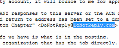
Three reasons not to tell people NOT TO REPLY TO THIS EMAIL. First, CAPS are annoying. Second, the whole thing is kinda rude. Third, people hit “reply” anyway, and if you have “…@donotreply.com”, it actually ends up in the inbox of the owner of donotreply.com domain and the greatest misdirected hits end up on this blog

“Instead of letting people just hit reply to these support mails, they make the customer click on a link,” Faliszek said. “It’s sad, too, because I’ll get these e-mails from people and they’re like ‘Oh, man, I really wanted to grill, but it’s not working.’ Sometimes they’ll even send pictures of their grill, too.” (from Washington Post)

Fisheye Quake

Fisheye Quake is a version of quake (software rendering) that allows you to play in ANY fov [field of vision], i.e. 10 to 360 and over.”

Bookmarkable Advertising

Last week’s news about Rolling Stone and Men’s Health running promos where readers are invited to snap images of ads and send them in reminded me of a draft that I’ve been kicking around for a few months about bookmarkable advertising. It’s not finished or polished but, I hope, useful for something.

Also, between now and when I had first started writing this, I heard about a “grabbable” banner format offered by one of the large networks. I couldn’t find any references or samples, but if you know something, please drop me a line.

Oh, and I’m on vacation this week away from all things broadband so this blog is on autopilot.

People bookmark ads. They circle ads with red markers, cut them out, paste them on the fridge, carry them inside wallets, give ads away, put ads on the walls. Given the opportunity and a good reason, people archive, manage and retrieve ads. Naturally, it is in advertisers’ best interests to encourage this behavior because bookmarking gives the ad another chance to do its job, which is why we often see the dotted “cut here” lines around ads.
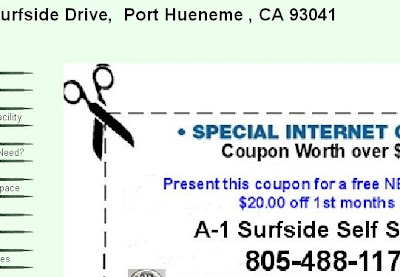

The “dotted line and scissors” bookmarking/clipping metaphor has been extended online (source).

As a theoretical side note, “bookmarking” is used loosely here and refers to any activity of storing an ad for future reference as close to its original form as possible (writing information down doesn’t count). Some activities are physical (clipping, putting away, sorting, retrieving), others are also mental (remembering where to look, creating an arrangement system, evaluating).

WHAT ADS GET BOOKMARKED?

In order to be bookmarked, an ad needs to satisfy two conditions:

1. It needs to carry a promise of some future value. Coupons are an obvious example of an ad type that gets bookmarked often. Look at how people manage their coupon collections and you will find that the complexity of some systems is as mind-boggling as Yu-Gi-Oh. Which is why there are coupon organizers for sale (do they offer coupons for coupon organizers?).

The value doesn’t have to be monetary, however; it can also be informational or social. For example, a classified ad for a plumber whose services you know you’ll need when you move in two months is more likely to be saved than an ad for a wedding dress you see a week after the event.

2. It needs to be easy to bookmark.

The problem with advertising on the web is that while the digital medium itself provides almost unlimited mechanisms for archiving, manipulating and retrieving the information, most online ads have all the fleeting properties of a TV commercial.

Let’s look at other media.

BOOKMARKING OFFLINE

Print ads are bookmarked more than any other type in part because print in general is easy to archive. You open a newspaper, see an ad you like, and you can either put the entire issue away, tear the page out, or cut out one particular ad. Print is also easy to annotate — you just write on it.

Magazine ads are bookmarked too, although often for a different reason — they are cheap and pretty dorm room decorations.
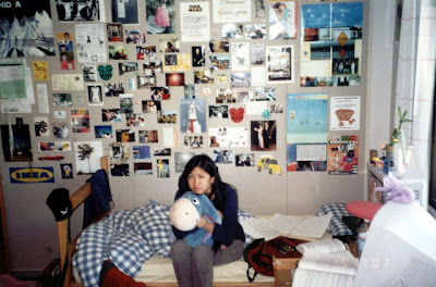

Magazine ads are bookmarked and used as wall decorations. See annotations to the original image on Flickr.

Billboards and TV ads are usually bookmarked through a secondary medium: billboards are photographed, TV commercials are DVRed. Some are saved for their social value (look what a cool billboard I have found); other purposes might have nothing to do with the ad itself and are just part of the scenery. (Billboards can also be bookmarked with cell-phones if they sport an advanced bar code.)
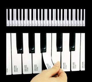

Some outdoor ads are designed to be bookmarked.

Other offline media are even harder to bookmark. External devices have been invented for bookmarking radio songs (and many have flopped); you don’t hear a lot about people bookmarking radio ads. Locations can be bookmarked through some kind of mechanism that involves a cell phone, such as mobile post-its by Siemens.

Generally, the more bookmarking options for content a particular medium provides, the easier it is to save advertising messages. Not so online.

THE WEB

Historically, the web medium has offered multiple ways of easy content archival, from copy/pasting to complex social bookmarking tools. Online ads, however, are not trivial to bookmark at all. Not only are they largely impossible to store for any extended period of time, but they are also difficult to go back to within the same user session. In 2003, Jakob Nielsen wrote:

Many a time we’ve been working on a site and noticed an interesting, relevant advertisement. This typically happens in the dead time between clicking a link to follow some item in depth and getting a refreshed page. So, we make a mental note to return and follow up on the ad. Oops, we can’t. When we go back, there is a different advertisement, breaking one of the oldest principles of interaction design: stability.

Technically, there are ways to save an online ad. You can make a screenshot of the entire page and then cut out the relevant parts, or you can save the page on your hard drive, but I haven’t met many people collecting online ads this way so that they can reference their sales message at a later date.

How to save an individual ad depends on the ad’s type and your tech savvy.

Sites that compile online coupons usually offer some way to save and group them within the site itself. These coupons are also designed to be be printed out. I don’t think I’ve ever seen a coupon-type ad on a third-party site that could be clipped from the site itself.

Image ads can be saved as regular images but will lose any link information, and the context they provide is often insufficient for the ad to be used effectively at a later date.

Flash ads, including video, can be downloaded using browser plug-ins with the link information retained, but these tools are not widespread.

Text link units are not really ads but rather pointers to ads.
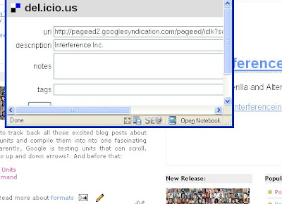
Finally, text ads can be archived, arranged and retrieved with third-party tools such as del.icio.us. This method presents a different problem — that of click fraud. Someone can easily collect a dozen of links from AdSense ads on this site and click AdLab (and perhaps the advertisers) out of this particular business. Also, after the links expire, the bookmarks will not be pointing anywhere because the ads are not archived.

WHAT IS TO BE DONE?

Advertisers could equip their ad units with a clipping mechanism — a small scissor icon that, when clicked, would produce a printer-friendly stand-alone version of the ad with extended information for future reference.

Online ad networks could offer a repository of all offers they serve and a link that says “view more offers from this vendor” or “view similar offers”.

An ad repository could be offered by ad filtering services such as AdBlock Plus, which may work out well for all parties. (See? Ad filters may turn out to be a good thing.)

… to be continued

Virtual Personal Space, Spam Museum, Fictional Fiction, Wait Times, iPhone Usability

As usual, too many open browser tabs with interesting stories that don’t deserve to languish in the del.icio.us obscurity:

Anti-social bot invades Second Lifers’ personal space (Nov 2007)
“A software bot that masquerades as an ill-mannered human user within the popular virtual world Second Life is being used by UK researchers to investigate the psychology of its inhabitants. The bot starts a conversation with human users and deliberately invades their personal space to see how they will react.”

A trip down spam memory lane
Commemorating spam’s 30th anniversary, New Scientist rounds up a bunch of interesting links, such as this archive that’s been aggregating spam for the past 10 years.

NY Times on fictional fiction:
“‘Charm’ was released in the fictional small town of Pine Valley, Pa., as part of the [ABC’s soap “All My Children”] story line. […] It has sold more than 100,000 copies and made its debut in February at No. 13 on the New York Times best-seller list.”

The Psychology of Waiting Lines (1985):

  • Uncertain waits are longer than known, finite waits.
  • Occupied time feels shorter than unoccupied time.
  • People want to get started
  • Unfair waits are longer than equitable waits
  • Unexplained waits are longer than explained waits
  • The wore valuable the service, the longer the customer will wait
  • Solo waits feel longer than group waits

iPhone Usability Evaluation Report:

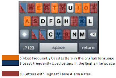
“One feature of the popup keyboard on the iPhone is the drag and lift feature which is said to reduce errors. Unfortunately not one user discovered this feature.”

Campaign Monitor is built for designers who can create great looking emails for themselves and their clients, but need software to send each campaign, track the results and manage their subscribers.

Elevator Design Rooted in Deception

A fascinating reading for experience designers comes this week from The New Yorker that has obtained and published time-lapsed security camera footage of a man who, in 1999, spent 41 hours stuck in an elevator, and accompanies it with a detailed feature about the history and specifics of the “vertical transportation” industry. The article also has a few great paragraphs of observations on human behavior and how elevators are designed to accommodate for it:

“Smart elevators are strange elevators, because there is no control panel in the car; the elevator knows where you are going. People tend to find it unnerving to ride in an elevator with no buttons; they feel as if they had been kidnapped by a Bond villain. Helplessness may exacerbate claustrophobia. In the old system—board elevator, press button—you have an illusion of control; elevator manufacturers have sought to trick the passengers into thinking they’re driving the conveyance. In most elevators, at least in any built or installed since the early nineties, the door-close button doesn’t work. It is there mainly to make you think it works. (It does work if, say, a fireman needs to take control. But you need a key, and a fire, to do that.) Once you know this, it can be illuminating to watch people compulsively press the door-close button. That the door eventually closes reinforces their belief in the button’s power. It’s a little like prayer. Elevator design is rooted in deception—to disguise not only the bare fact of the box hanging by ropes but also the tethering of tenants to a system over which they have no command.”

How Would a Wii Dance Pole Work?

If Peekaboo ever goes through with its idea to create a dance pole connected to Wii, how would it actually work as an input device? Would it come with a piece of apparel that detects your body movements and positions, kind of like Wiimote does now?

Heat Map of Search Results Clicks

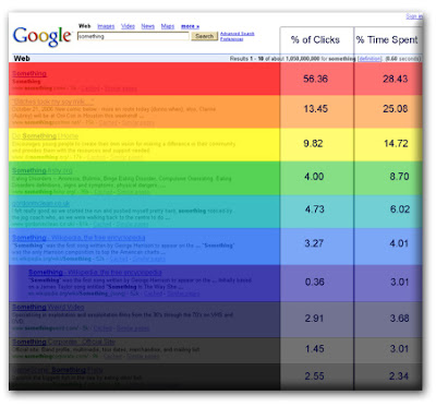
A heat map of Google clicks and attention distribution on a Google search results page from a 2006 eyetracking study. Useful for making PowerPoints more dramatic, but beware of the methodological limitations.

Study: Why E-Mails Are Often Misunderstood


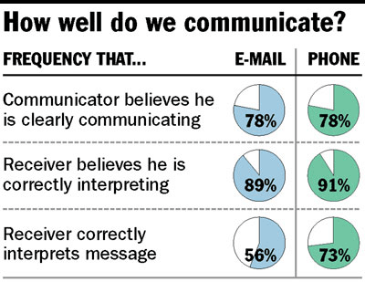
image credit: csmonitor

Paper “Egocentrism over E-Mail” (2005, pdf): “People tend to believe that they can communicate over e-mail more effectively than they actually can. Studies further suggest that this overconfidence is born of egocentrism, the inherent difficulty of detaching oneself from one’s own perspective when evaluating the perspective of someone else.”

Forgotten Media Skills

Rewinding VCR tapes. Balancing the tonearm. Calling collect. Formatting floppy disks. Loading film into a camera. Numbering punchcards. Getting up from a couch to change channels or volume. Dialing. Remembering phone numbers. Using carbon paper. Rewinding a tape with a pen. Sending a telegram. Sending a telex.

More in this great list of obsolete skills.

— via textually

Animated Business Cards

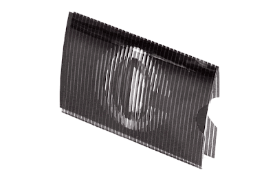
This animated business card by Chung Dha works on the same principle as the animated packaging for the hearing aid covered here last November. The author explains:

“This is my animated businesscard, I design after receiving a special book called magic moving images. I learned how to design myself and developed a special way to make this. The card exist of a outer sleeve with vertical raster and the animated pictures are made in a special way.”

(This is probably the book: Magic Moving Images.)

Watch the video of the card in action:

See other cool business cards on Adlab.

— via Brand Flakes

Turn Gag Widget into Research Tool

Adlab’s reader Doug writes: “Sawyer’s Nickname Generator seems like a great, but missed, opportunity to gather data on ABC viewers and users. ABC just needs to add a few other variables like age, sex, and income.”

My nickname? Speed bump.

Future: Billboards with Face Recognition

How long will it take for face recognition technology that has already found its way into inexpensive consumer electronics to be integrated into digital signage?

Check the specs on Sony Cyber-shot T200:

“Because the face makes the photo, Sony has created Face Detection technology that recognizes up to 8 faces in a photo and automatically controls focus, exposure, color and flash to bring out the best in everyone. Unlike some competitive systems, Sony Face Detection makes skin tones look more natural and reduces red-eye with pre-strobe flash.

In Smile Shutter Mode, the DSC-T200 helps you capture more smiles by shooting automatically when your subject laughs, smiles, even grins – only when focus is fixed. You select the person to watch and the expression to catch — your Cyber-shot® camera’s Face Detection system and intelligent Smile Shutter algorithm do the rest!”

We know that the advertising applications are already in the labs: Last year, Microsoft showed off one such billboard.

Earlier:

Bridging The Gap Between Online and Offline Shopping

A couple of years ago, I posted a small blurb on Fast Company’s blog about how customer expectations of offline retail are being shaped by their online shopping experiences. Last month, Business Week published an article pretty much to the same effect:

“The Internet hasn’t destroyed brick-and-mortar retailing, as many once feared. But has it ever changed consumer behavior. Across the U.S., stores are playing catch-up with shoppers habituated not only to the speed and convenience of purchasing online but also to the control it gives them.”

Here’s my in-store experience wish list:

1. Cross-selling of relevant and complementary products (if you like this, you will also like that and that)
2. Customer reviews. Somewhat counterintuitively, many product categories will benefit from negative reviews just as well as from the positive ones. Negative reviews help buyers overcome the “paradox of choice” and make up their mind faster instead of abandoning the purchase altogether. Plus, less post-purchase remorse and fewer returns. I would especially love a way to check GameSpot reviews before plunking another $50 for a game.
3. Online ordering + in-store pick-up.
4. Full product info look-up, including the manuals.
5. Bookmarking / “save for later” functionality.

Retailers gotta act quick if they want to have some control over the converging experiences. In a few years, people will be carrying web browsers in their pockets and won’t be needing all this retail innovation. Then they would go to Barnes & Noble to browse books and order the ones they like on Amazon right from the store.

On a related note, I really like the idea behind Target Lists.

Jakob Nielsen: Get Web 1.0 Right First

Jakob Nielsen’s newest alertbox on the web 2.0’s dangers to site profitability: “Instead of adding Facebook-like features that let users “bite” other users and turn them into zombies, the B2B site would get more sales by offering clear prices, good product photos, detailed specs, convincing whitepapers, an easily navigable information architecture, and an email newsletter.”

Color-Blind Image Simulation


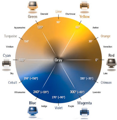
Color wheel as seen by a red-insensitive protanope.

To test how your ads are seen by the color-blind, you can use Vischeck, an online tool and a set of downlodable Photoshop filters for PC and Mac.

More tools. A color-blind-friendly interface on Summize.

Earlier:
Advertising for the Color-Blind
Tool: How Color Blind People See Text
Advertising in Braille
The Robotic Shopping Assistant
Playboy in Braille


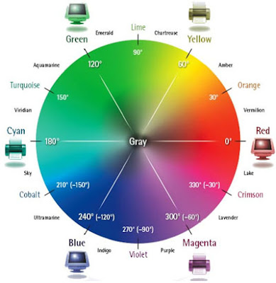
A regular color wheel (source).

10 Forces That Shape Headline Writing

I remembered a great quote from an old colleague of mine: “The web is the only medium in which you must create content which impresses machines.” This is especially true for headlines, and, increasingly, not only blog headlines. With online versions of traditional newspapers adding Digg Me buttons and incorporating automated contextual advertising and other technological novelties, the fine art of headline writing is under more and tighter constraints then ever before. Why and for what purpose are headlines written today?

  1. For others to read the article. That’s what headlines and titles (there’s a difference: headlines have verbs in them) have been invented for, after all: to attract readers’ attention to the content under them. A corollary: it also needs to attract readers’ attention when it is found out of its original context, for example, on someone else’s site.
  2. For others to notice it in the RSS reader (this was a topic of a separate post on RSS usability last year).
  3. For the author to like it. This is straightforward: you wouldn’t slap a subjectively ugly headline on your article (although in newspapers, copy editors often do) because you will be the one staring at it before anyone else sees it. And long after that, too.
  4. For the author to find it. How do you link back to your old posts relevant to the subject at hand? I use my own search box, and I got into the habit of using keywords that I’m likely to remember months or even years down the road.
  5. For others to find it. This is the non-profit SEO part where you write you headline so that it comes up for a search on the topic the article is about and helps someone out. This means two things: the article needs to be in the top search results, and the headline needs to prompt the click.
  6. For others to find it, for a different reason. In the for-profit world of SEO, you’ll write your headline so that it drives people who search for something that your site in general (but not necessarily each particular post) is promoting. The real trick here is to make the headline keyword-rich without it sounding artificial.
  7. For others to find it again, in their own information universe. It is terribly difficult to locate something you’ve bookmarked on del.icio.us when your bookmark count is in the thousands unless you know (or, importantly, you think you know) what the title was (Tags, while invented for a good purpose, are a mess).
  8. For the AdSense funnel, where the searcher clicks on your link in the search engine, arrives at your blog, looks around, and then bounces off through a well-targeted AdSense ad that is closer to what he’s been searching for in the first place.
  9. For AdSense robots to display the right ads. I don’t really know how much weight is assigned by the AdSense and other contextual ad algorithms to headlines, but it has to be significant since post titles are also page titles.
  10. To influence social forces on Digg and other similar content microcosms. There are plenty of guides on writing Diggable headlines out there.

Google Translation Bots Get Swear Words Right

While the translation bots are not famous for understanding human speech with great accuracy, one thing Google’s bots get right is swearing.

Google has just released a series of language translation bots that you can invite for a chat and that would act as simultaneous interpreter when you have a conversation with another foreign-language speaking human.

You probably don’t want to use it for important conversations: Israeli journalists recently got themselves into a diplomatic scandal when their translation software misfired and one of the questions to the Dutch Foreign Minister resulted in”The mother your visit in Israel is a sleep to the favor or to the bed.”

So. Google’s English to Russian bots translate “Let’s go drinking” as “Let’s find potable” and “Shipping up to Boston” as “Navigation to Pskov“. But swearing? Dead on.

Public Restrooms As Retail Traffic Driver


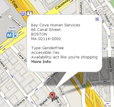
Act like you’re shopping: a map of public restrooms in Boston and around the world at safe2pee.org.

On the one hand, Boston’s frequent bathroom visitors want to legislate access to retail-based restrooms: “Patients suffering from intestinal disorders urged lawmakers yesterday to pass a bill requiring private businesses to open up their bathrooms to people during medical emergencies or face a fine of $100.” (Metro).

On the other hand, Westminster’s (that’s in the center of London) city council created a system where people with the urge send a “toilet” text message and get locations of the nearest facilities sent to their cell phones. “Stores started signing up almost immediately, according to councilor Alan Bradley. And, once through the doors, there is every likelihood that the potential customer will relax and become an actual customer.” (Retail Wire via Store Media News).

Of course, Charmin bathrooms show just how appreciated a good branded bathroom at the right time could be. And I think it was Paco Underhill in Why We Buy who suggested that bathrooms in supermarkets can be used to sample relevant products from the suppliers — paper towels, soap, toilet paper, towels, napkins, perhaps also combs or mirrors.

If you are interested in bathroom (re)design for your company or a client, take a look at Public Toilet Design.


Public Toilet Design: From Hotels, Bars, Restaurants, Civic Buildings and Businesses Worldwide