Frank Underwood of House of Cards Gets Campaign Posters Inspired by Those From History

The third season of Netflix’s government drama House of Cards will officially be available to stream on Friday. And (spoiler alert) Frank Underwood has consolidated his power. Apparently, lots of scheming, backstabbing and murdering pays off.

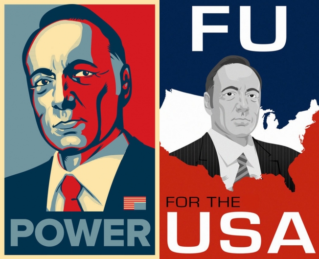
What better way to celebrate the Underwood’s success than to imagine what his presidential campaign posters would have looked like, had he taken a more traditional route? That’s exactly what Mashable did, taking inspiration from real presidential posters from Obama, Kennedy, Johnson, Taft and more. 

Oh, and for good measure, there are a few touting Claire’s rise, too. 

See the whole gallery here.


Quiznos Cooks Up a Winner With ‘House of Thrones,’ but Will Funny Videos Be Enough?

The buzz is heating up for Quiznos, who has scored a hit with its House of Cards/Game of Thrones mashup called House of Thrones.

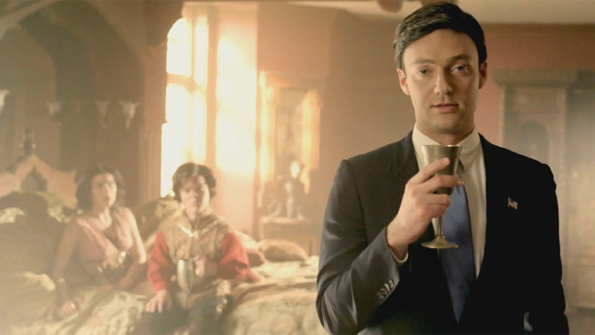
Machiavellian Congressman Frank Underwood is transported to the Seven Kingdoms, where he eliminates characters as mercilessly as George R. R. Martin himself—though he avoids killing fan favorites like Tyrion Lannister, settling instead for a merciless teasing.

Hindered by a script that is only mildly funny, the spot is held aloft by an exceptional Kevin Spacey impersonator and a spot-on concept: crossing two of today's hottest properties for maximum viral effect. They even give a few spoiler-ish nods to the fans who've read all the way up through A Dance of Dragons.

Windowseat in Los Angeles created the video, which is part of Quiznos' new content strategy for its recently launched Toasty.tv site—an interesting ploy, considering that Quiznos has just filed for bankruptcy and people are questioning whether this kind of buzz will actually sell sandwiches.

Given the target market, this kind of advertising is great for the brand. But before they invest in entertainment, they should probably focus on making subs that aren't substandard.


The 10 Most Epic TV Show Promos of 2013

It was a mixed bag for TV generally in 2013, but not a bad year for TV promos—in fact, some of the most inventive ads on the dial (or the Web) were from folks promoting new or returning shows.

For the most part, good marketers eschewed parades of "Our show is so great!" quotes, cliffhangery snippets of dialogue and trying to unironically mimic movie trailers—and just let a few powerful images, or sometimes a single powerful image, speak to the viewer. Sometimes it was a clever in-joke, sometimes a stylish montage, sometimes the sheer chutzpah of the idea. But we picked 10 of the promos that wowed us the most from a surprisingly large pool of good creative.

From edgy cable fare like Archer to a broad network series like Community, there was plenty to love before the show even started. Tell us what you think (and what we missed) in the comments.


Season 2 Trailer for House of Cards Is Literally Just Robin Wright Smoking

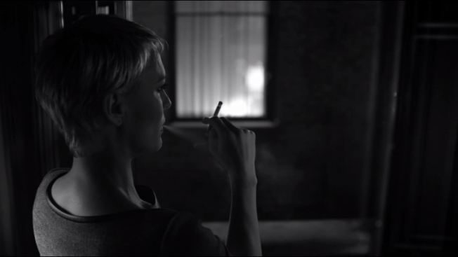
Netflix's political series House of Cards got a rapid renewal on the heels of its watercoolery first season, and now it's taking the less-is-more approach to promoting season two. The first spot for the Feb. 14 premiere is just Robin Wright, shot in black and white, taking a long, luxurious pull on a cigarette, her back almost entirely to the camera. Wright's character gives scenery-chewing, camera-addressing narrator Kevin Spacey a run for his money in terms of pure, Machiavellian, chess-with-people politicking, and it's appropriate that Netflix has opted for the unexpected with this early spot. Time will tell whether the new season is as much fun as the last, but this trailer shows the network certainly isn't lacking for confidence.


Media Decoder Blog: Lucky 13: Recapping the “House of Cards” season finale.

In the final episode of Season 1, Frank Underwood’s ultimate goal, at least for this season, is revealed, but he has newsies on his tail who smell a rat and/or a big story.

Media Decoder Blog: In Recap of ‘House of Cards’ Episode 12, Ashley Parker and David Carr Conclude Journalists Always Vote for the Better Story

In recapping Episode 12, Ashley Parker and David Carr conclude that journalists always vote for the better story.

Twin Towers / Château Lapompe (cuvée 2010)

chateau2007 chateau2009
THE ORIGINAL?
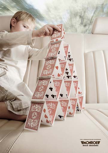
Monroe “Shock Absorbers” – 2007
Source : Cannes Archive Online
Agency : Joe Public Johannesburg (South Africa)
LESS ORIGINAL :
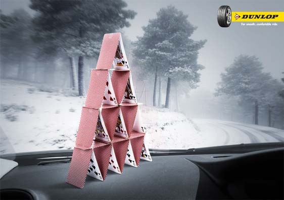
Dunlop “For smooth … comfortable ride” – 2010
Source : Adsoftheworld
Agency : K I D, Bangkok, (Thaïland)
De sacrées tours jumelles dont l’originalité s’effondre sous nos yeux!
2 people like this post.