ICC World Cup 2011: Ogilvy
Posted in: UncategorizedAdvertising Agency: Ogilvy & Mather, Mumbai, India
National Creative Directors: Abhijit Avasthi, Rajiv Rao
Creative Director & Chairman: Piyush Pandey,
Senior Creative Directors: Heeral Akhaury, Sukesh Kumar Nayak
Copywriters: Sukesh Kumar Nayak, Lolita D’souza, Vedashree Khambhate
Art Directors: Heeral Akhaury, Vinit Sanghvi, Devang Patel
Account Management: Navin Talreja, Dharam Valia, Mudit Trivedi, Rahul Bhambri, Sukhvinder Singh Wilkhoo
Photographer: Palani Mohan
Illustrator: Deelip Khomane
Digital Imaging: Imagerom
Killer Jeans : Statue
Posted in: UncategorizedVintage denim from Killer Jeans
Advertising Agency: Grey, Mumbai, India
National Creative Directors: Amit Akali, Malvika Mehra
Executive Creative Directors: Karan Rawat, Rohit Malkani
Art Director: Karan Rawat, Suhas Panchal
Copywriter: Rohit Malkani
Client Services Director: Aparna. K
Account Supervisor: Kamia Wahi
Illustrator: Sanjay Shetye
Photographer: Karan Rawat

Top fonts of 2010 : MyFonts.Com
Posted in: UncategorizedMyFonts’ parade of most popular fonts of 2010 is based on sales, so ultimately this is the list that customers/designers voted for. And a fascinating collection it is too, offering striking, charming and highly original faces for all tastes and budgets. Some trends? “Friendly and human” is big, with typefaces sporting rounded corners, soft silhouettes or hand-drawn letterforms. Scripts are going as strong as ever. And two cities have risen to prominence as typographic metropoli, 7500 miles apart: Buenos Aires and Berlin.
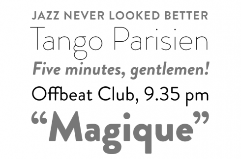
Not only was Brandon Grotesque the most successful new sans serif of the year, it was also the best selling 2010 release overall. Designer Hannes von Döhren took a fresh look at the geometric modernist classics from early twentieth-century Germany. Giving Brandon long ascenders and descenders, he took his cues from the more stylish and decorative typefaces of that genre, such as Erbar or Kabel. Brandon Grotesque makes sensible use of the compass and ruler: the geometric shapes were optically corrected for better legibility and harmony. The rounded corners lend the typeface a softer look in large sizes.
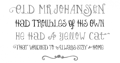
Lady René is probably the most whimsical and spontaneous font to have come out of Agentina’s Sudtipos foundry, usually known for its elaborate, polished script fonts (of which we will encounter a classic example below). In fact, Lady René was not drawn by one of the collective’s regulars; it is the first typeface by newcomer Laura Varsky. Born out of a love of illustration and a reverence for the written word, her font has the directness and spontaneity of a handmade drawing. Alejandro Paul’s hard work made sure that, although unpolished in nature, the font is technically impeccable, its character set full of surprises.
 Having joined MyFonts just over a year ago, Laura Worthington was one of 2010’s most outstanding designers, producing one best-selling font after the other. Origins was her biggest hit: a semi-connected calligraphic script with a confident flow. Based on hand-lettering with a Crow Quill pen on parchment paper, it has natural, rough outlines that contribute to its subtly antiquated feel. With gracious ascenders and descenders, Origins lends an elegant and somewhat formal touch to headlines, titling, invitations, branding and more.
Stereotypes is run by designer Sascha Timplan, whose output these past twelve months has been quite something. St Ryde, his successful text and display face, joins the ranks of lively yet legible typefaces with rounded terminals (think Fritz, Sauna or Haptic). Combining a sophisticated structure with playful details, St Ryde has a logic and a charisma all its own. It is a semi-serif rather than a sans; while it swings and bounces at display sizes, it looks more static and regular when used small. With multiple figure sets, small caps and open italics, it was made for serious typographic work, in spite of its unorthodox forms.
 Alejandro Paul of Sudtipos is a master of that fascinating genre in contemporary type design that could be labeled “acrobatic scripts.” His ground-breaking Affair helped define the genre; it became available at MyFonts in early 2010 and has remained hugely popular throughout the year. Affair is one of those OpenType-programmed script fonts that need contemporary layout software to function as intelligently as it was designed; when using such OpenType-enabled programs, the font will help you select the ideal version of each letter in a particular combination to create amazing headlines and logos. Stunning stuff.
 Let’s hear it for another highly creative character from Berlin: Ulrike Wilhelm. Her one-woman foundry LiebeFonts (which is German for “sweet fonts”) published a series of witty, mildly successful picture fonts during its first year. It was her first alphabetical font LiebeErika that led to her breakthrough, skyrocketing into the upper reaches of our Hot New Fonts list. LiebeErika is special: despite its hand-made look, it is regular, lucid and readable. With well-drawn, supple curves and thin, compressed characters, it has charm as well as sensibility. It is also full of extras, such as cheerful alternate forms and figures, ligatures, nicely designed key words (“and”, “the”, “by”) and more.
 One of MyFonts’ greatest hits of the past two years is the Museo series from Jos Buivenga’s exljibris foundry. The family started out as a semi-serif, then branched out into the sans-serif genre with the cool, clean Museo Sans. Museo Slab logically completed the suite and, as was to be expected, it has been hugely successful throughout the past year. The sturdy slab serifs combine perfectly with the family’s friendly geometry, resulting in a wonderfully readable typeface.
In the well-establshed genre of exuberant formal script fonts, Breathe by Maximiliano R. Sproviero is a special case. Designed to look alive, fresh and airy, the font takes a jump from the work of Didot and his contemporaries from around 1800 to today’s fashion of endless swashes and flourishes. Breathe Pro comes with over 1000 glyphs, including huge sets of alternates, swashes, historical forms, ligatures and more. If you want a less intricate font in the same style, choose Breathe Standard.
 Sketching type was once a skill every graphic designer had to master in order to produce convincing mock-ups and tell the typesetter how the final result should look. With the recent crop of sketched fonts, the mock-up has now become the final product. Of the various hand-made versions of classics we’ve seen the last couple of years, Hiekka Graphics’ Sketchetik is the biggest hit. Based on that 1950s modern classic that is still the world’s best-selling font family today, Sketchetik combines lucid Swiss proportions with a loose hand-drawn look.
 Argentinean-born Ricardo Rousselot learnt from some of the best American lettering artists when working in Chicago in the 1960s. Having moved to Barcelona in 1975 he has drawn logos and developed packaging for some of the biggest Spanish brands. Rousselot, now in his seventies, has finally begun publishing his hand-rendered alphabets as digital fonts. Despeinada, the first release from his foundry EdyType, was an immediate hit: it has been the year’s most succesful informal script. Its name means “uncombed” — an apt name for this loose, spontaneous handwriting font that is rough and precise at the same time.
 Few foundries have been as successful last year as Hannes von Döhren’s HVD Fonts — in fact, two of his typefaces were among the year’s absolute best sellers. Livory was the biggest surprise: a thoughtful variation on the French sixteenth-century model, it was the year’s most popular oldstyle text font. Designed in collaboration with Livius Dietzel, its aim was to combine classic proportions with shapes full of verve and an audacious “fusion” of glyphs. The result is fluid and vigorous oldstyle without a trace of nostalgia.
MyFonts and MyFonts.com are registered service marks of Bitstream, Inc. Other technologies, font names, and brand names are used for information only and remain trademarks or registered trademarks of their respective companies.
Sony Micro Vault : Noah’s Ark
Posted in: UncategorizedVodka Smoke : Lets Go
Posted in: UncategorizedAdvertising Agency: McCann Erickson, New Delhi, India
Regional Executive Creative Director: Prasoon Joshi
Chief Creative Officer: Ashish Chakravarty
Creative Directors: Rohit Devgun, Kapil Batra
Art Director: Shikha Trikha
Copywriter: Aneesh Ayyappan
Illustrator / Designer: Shikha Trikha
Typographer: Shikha Trikha
Post Production: 
Orbits
Posted in: UncategorizedNatural Wood Finish Hair Colour.
Posted in: UncategorizedAd Verbatim
Posted in: UncategorizedTerence DCosta is a very dear friend and a very very talented Advertising Creative, working out of the Himalayas in Nepal. He writes this column ‘Ad Verbatim’ for himself and for us.
Leave your blinkers by the door and come on in. Let’s have a chat. The parlour has no spiders no, no, no and I am just the fly. Your average fly on the wall, swattable solely by subjectivity. And the objective of it all is objectivity of course. We’re going to take off those rose-tinted Raybans and take a quick tongue in cheek peek at anything even remotely connected to the world of Advertising.
We have the freedom to dissect, debate and certainly to disagree. And because I prefer a light-veined plasma over the mundane phlegm, we shall, occasionally digress. But before we do, what in heaven’s name is all the fuss around Creativity?
Now I did say ‘remotely’ connected to advertising…
Jokes aside. What according to you, is creativity? What does the consumer believe it is? Are you on the same page with your agency or client when it comes to a basic understanding of that which makes the advertising soul tick? More often than not, we either haven’t bothered to stop and ask or we’ve been far too busy being productive or worse, ‘creative’, to listen. It isn’t like asking you to stare into a mirror and ponder existence. It isn’t rocket science either.
Creativity is the ability to make something out of, a supposed, nothing. The nothing is supposed because we, unlike the dude (or if you’re into nature, the dudette) upstairs, aren’t true creators. We just borrow from the universal scheme of things. And so does Mr. Cameron.
If you brush your tresses in a way you’ve never done nor seen anyone do before, you could be accused of creativity just as much as when you liqui-doodled while you took a leak. But in advertising, creativity is a little more. It is the ability to make a purposeful something out of a directive set of insights, analyses and givens. Pity, to the average creative bloke, the last bit is often overlooked as ‘nothing’.
As a result, you get what I call ‘creative calisthenics’. I call them that because I see this erudite supermonkey perched prettily on the advertising iceberg – serendipitously far removed from the hogwash of marketing and sales mumbo jumbo. Nonchalant to the point of condescension when he’s faced with absolutely anything rational. The calisthenics are what you get when you chuck him a brief. It’s a regimen he’s elevated to an art form. Watch closely as he cartwheels backwards into a tempestuous trance and promptly pole-vaults in with an in-your-face solution he’s yanked out of his musty closet of unused (read locally) formulae. Note the toothy grin.
“Formula 184 should do the trick. No try 901. Yes 901, that’s the one you need!”
(you don’t ask why because you realize he’s programmed not to do whys – much like your brand manager)
“It’s creative, isn’t it?”
“Erm… it is… but..”
“Then there you go. Run along now and don’t forget to bow.”
(the last thing you see before you pass out is a faceless someone holding up a placard that reads ‘applause’).
And so the stories go. Twice more tragic are the ones that twist tangentially from the lesser confines of the client’s own imagination and rocket into the predictable obvious as a mutated series of conveyor belt options uncannily reminiscent of fifth-grade autistic art. Haha, that’s a different fettle of kitsch. Ah well, time to fly. This wall’s getting too wet for my liking, you liqui-doodler you!
MF Global Sify Securities: Nodders
Posted in: UncategorizedIndian Oil Xtramile by Y&R
Posted in: UncategorizedNational Bank of Oman | The Donation Box that paid for itself
Posted in: UncategorizedBexomer by Point Blank
Posted in: UncategorizedInterview: Anil Kakar
Posted in: UncategorizedAnil started his advertising career close to 18 years ago and has worked with agencies such as Leo Burnett, Enterprise Nexus, Ambience Publicis, SSC&B Lintas and Percept Hakuhodo. Along the way, he has helped build brands such as Canon, Panasonic, Pantaloon, Taj Hotels, FedEx, Killer Jeans, Westside, Raymond, Siyaram, The Times Of India, Femina, The Economic Times, Brand Equity, Indiatimes.com, Pierre Cardin, Thums Up, Lakme, Vicks, Nerolac Paints, Park Avenue, to name a few. Anil’s work has been featured in several award shows and advertising festivals. His work for The Times Of India was the first Indian campaign to have won the Campaign of the Year award at the Asia Pacific Adfest; the campaign also picked up the same award at the Abby Awards. His work for Vladivar Vodka and Georgia Gullini clothing was showcased in the international Archive magazine. At SSC&B, Anil’s creative work helped the agency win the ‘Most improved agency of the year’ title, moving up from Rank 52 to Rank 18 in less than a year, within the Lowe network. As Bombay Creative Head at Percept, his work helped the agency garner more than 40 awards over a span of 2 years. Anil has been a member of the jury at the New York Festivals, Goafest and the Outdoor Advertising Awards. Anil regularly contributes articles to FHM magazine and is also working on his first fiction novel.
Why are you into advertising?
When I was a kid, my father owned an ad agency. Back then, there were no computers and he used to manually cut typefaces printed on bromides. He used to cut it very carefully, with a pair of scissors set the type for each ad with his own hands. As a teenager, I couldn’t help but get fascinated by the whole process. Often, I used to help him source typefaces from Letraset and various international magazines and I think that exposed me to the wonder of advertising; unknowingly, it helped me find beauty in typography, writing and art. Thanks to him, I could tell a Bodoni from a Futura, while I was still in school. In retrospect, this went a long way in defining the future. As it turned out, a few years later, my father got a job and so we had to move out and I found myself in Bombay and that marked the turning point of my life. I remember, a long, long time ago, while I was still wet behind the ears, I visited the CAG exhibition where I happened to see the Mauritius Tourism campaign and an electric sort of feeling ran through my spine and that was when I decided, I should be in advertising.
Did you attend school for fine art or design or Communications?
I did a Copywriting Course from AAAI and yes, I even graduated from the Mohammed Khan School of Advertising.
With your busy schedule as an ECD, do you have enough time left to indulge in Creative?
I follow a hands-on approach to work. I believe it’s the only way to stay focused on the creative output and the only way to keep your work fresh and contemporary. I’d be restless if I didn’t do at least an ad a week.
Were there any particular role models for you when you grew up?
I’ve had no role models but I’ve certainly had the good fortune of meeting and working with a whole lot of wonderful and incredibly talented people. Some of them include Mohammed Khan, Rajiv Agarwal, Sharmeen Mitha, Arun Kale, Agnello Dias, Ajay Chandwani, Elsie Nanji, K V Sridhar, Prashant Godbole, Zarvan Patel, Anand Halve and Vikram Gaikwad, among many others. Since I spent years working with these people, it’s quite obvious that they’ve had an impact on my work.
Who was the most influential personality on your career in Advertising?
Mohammed Khan. Without a doubt, he’s still the greatest Creative Director India has ever had. He’s easily the most honest, the most stylish, the most awe-inspiring and the most passionate advertising person I have ever met. I wish life had a rewind button and I could simply go back to the years I spent in Enterprise. Why can’t we have more creative directors like him?
Where do you get your inspiration from?
Arty museums, seedy bars, twitter, wikipedia, coffee shops, wherever I can get it from.
Tell us something about the work environment at Percept.
Percept has had a unique culture and a unique way of working. Since I had moved to Percept with my earlier boss, Ajay Chandwani, I found it a lot easier to bring in a creative culture, so to speak. We had a lot of fun producing some good work, some of which went on to win prestigious awards at Goafest, New York Festivals, Graphis and Montreux. It was quite exciting being part of the transformation, since it was the first time Percept had won so many awards.
Do you have any kind of a program to nurture and train young talent?
Percept does have knowledge sharing sessions every weekend, wherein renowned professionals are invited from the industry to share their knowledge and help train young talent.
What about new and young film makers/photographers? Do you consciously keep looking for newer talent and try someone completely new?
It depends on the nature of the project and the skill-sets required to execute the job. Obviously, the creative output is sacrosanct and if someone younger can bring more value to the table, I’ll be open to it.
What do you think of the state of Print advertising right now. At least here in India, the released work is most often too sad? Why do you think it has lost the shine? Why are the younger lot more interested in TV? Is it because TV creative (after the script of course) is outsourced to a production house?
I think it’s really sad to see print and particularly, writing for print, die in this country. It’s equally sad to see the younger lot ignoring print completely. There was a time when we used to fight among each other to work on a print campaign, but quite apparently, all that is now history. I think it’s bullshit when they say people don’t have the time to read, I think the real reason is that quite evidently, most writers are not writing any more and most planners and juries are not supporting writing any more. A premier Indian newspaper supplement once carried an article titled ‘The Death of Copy’. Ironically, the article was over 600 words in length. The article contradicted the very premise it was based on; that people don’t read any more. Last I checked, newspapers were still on the stands, blogs are gaining more importance and we see more and more bookstores than ever. The fact is, when you write copy that is relevant and intriguing, people will read it; when you have fun writing an ad, someone out there will have fun reading it.
About 12 years ago, all IIM and other B-School grads had advertising as their first choice of career option. Today it does not even feature in the list. How does that reflect in the quality of non-creatives in the industry? Is that one reason why the current print work sucks?
Great advertising is born out of a collaboration between a business insight and a disruptive idea. Obviously, it would be horribly wrong to have one without the other; that would most definitely affect the quality of any creative work and not just print alone. Now, more than ever, this industry needs as many bright thinkers as it can get.
More and more young people are web savvy and want to work on the internet or on more entrepreneurial ventures. Has that affected the quality of people advertising has been getting?
On the contrary, it’s helped push the envelope. It’s always good to have young, web savvy creative talent around, considering it’s common knowledge that the internet will gain even more ground as a medium, in the days to come. It’s also refreshing to see so many creative people start out independently. I firmly believe the next big creative revolution will be digitized and more often than not, the big ideas will come from
independent creative hotshops. Traditional advertising and beliefs will undergo a massive transformation and it will be exciting to witness a paradigm shift.
Do you think brands whose advertising wins awards do well in the market?
Without a doubt. According to The Gunn Report, more than 70% of the brands which win awards go on not just meet, but exceed sales targets. Advertising which wins awards obviously stands head and shoulders above the ones which don’t, and therefore gets noticed better and therefore, results in sales. It’s quite simple, really.
What advice do you have for aspiring creative professionals?
Stay hungry. Stay foolish. Never, ever waste money on an expensive portfolio case;
all your employer cares about is what’s inside.
What is your dream project?
To work on a campaign for Volkswagen.
Mac or PC?
Mac. Dead argument, innit?
Who would you like to take out for dinner?
Salman Rushdie. He’s got to be the most fascinating man on earth.
What’s on your iPod?
Jack Johnson, Pearl Jam, One Republic, The Fray, GMS and good ole’ Pink Floyd.
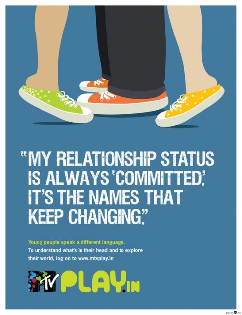
MTVplay.in by Bates141
Posted in: UncategorizedRoyal Enfield by W+K India
Posted in: Uncategorizeddesicreative 2010-11-14 04:00:48
Posted in: UncategorizedYamaha Musical Instruments are patronised by some of the most accomplished artists around the world. Yamaha Music Square stores are operated under the direct supervision of Yamaha, retailing some of the finest Yamaha musical instruments. The idea behind this poster campaign is to encourage young, budding artists to take to Yamaha. The campaign focuses on the ambitions of a budding artist, while making them relate to the affordablity of Yamaha products.
The look and feel is young and yuppie, lending to the appeal while the message is loud and clear. The campaign is not intended as a mainstay campaign. It is meant to create extensive visibility in activation opportunities among the youth audience.
Advertising Agency: Bold Creative Shop, Bangalore
Client: Music Square
Creative Director: Mahadev Kaushik
Art Director: Santhosh K
Illustrator: Santhosh K
Copywriter: Mahadev Kaushik
