Colorless Coca-Cola Can Is Lovely, and Might Be Good for the World, Too

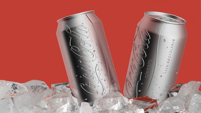
Most spec redesigns of classic brand logos aren’t that great, so I cringed when I saw that someone was putting a new spin on Coca-Cola cans. Turns out I underestimated Ryan Harc, whose colorless can with a convex logo pressed right into the aluminum is pretty snazzy.

This apparently might be more eco-friendly than painting the cans, as it could reduce energy use and pollution in both the production and recycling processes. Plus, it looks like it was dispensed from a vending machine in The Bourne Identity, which is a good thing.

Not that Coke is going to ditch its iconic red anytime soon, of course.

Via PSFK.


Japan Is Selling Zoo Jeans, Fashionably Ripped by Lions, Tigers and Bears

Fashion designers can be temperamental beasts, but this is ridiculous.

Supporters seeking to raise funds to renovate the Kamine Zoo in Hitachi, Japan, have launched a brand billed as “the only jeans on earth designed by dangerous animals.” Sheets of material are attached to tires and big rubber balls that are tossed into enclosures with lions, tigers and bears, which use their teeth and claws to give a whole new meaning to the phrase “distressed denim.” That torn, chewed-up fabric is then used to create fashionably tattered Zoo Jeans.

Mithun Romandani, a men’s buyer at swanky London department store Selfridges, told the Guardian that he was unimpressed with the results because “the rips are too sporadic” and they “don’t look natural.” Hey dude, tell that to the lions. (I wouldn’t be so quick to give a bad review to an artiste that can sever your spine with a single chomp.)

Check out the video below, with the gnawing and the clawing and such. It’s got more bite than Levi’s new campaign, that’s for sure.

Via (appropriately enough) Devour.


German Radio Station Sums Up the Destruction of Brazil in This Simple 9-Second Ad

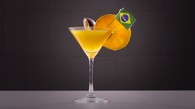
Just when we thought we’d seen enough reaction to Germany’s shellacking of Brazil in Tuesday’s World Cup match, here is German radio station Radio Bayern 3 with a concise metaphorical translation. Um, cheers?

Via Digg.


Even If You Hate Greenpeace and Love Lego, You Have to Admire This Gorgeous Attack Ad

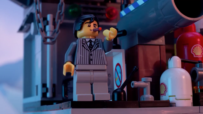
Greenpeace takes a page from Chipotle’s marketing playbook—haunting animation plus a distressing cover of a well-known song—in its continuing assault on Lego for partnering with Shell on a set of Shell-branded Lego products.

Attacking a beloved brand like Lego isn’t easy. But if you’re going to do it, you need to do it right. And this spot, showing a Lego version of the Arctic drowning in a sea of oil, is incredibly well made by creative agency Don’t Panic—who, you’ll remember, also did the memorable Save the Children ad which brought the Syrian war to London.

The visuals in the Greenpeace spot are beautiful, and the ethereal cover of “Everything Is Awesome,” from The Lego Movie, is the perfectly ironic backdrop. Yes, it is angering people (check out the YouTube comments if you’re looking for a grand old time), but Greenpeace is rarely interested in making friends as it pursues its enemies.

You can debate whether Lego was right to partner with Shell—here is Greenpeace’s point of view, and here is Lego’s reply to the attack ad. But as a pure PR play, “Everything Is NOT Awesome” (which has topped 1 million views since Tuesday) is itself pretty awesome.


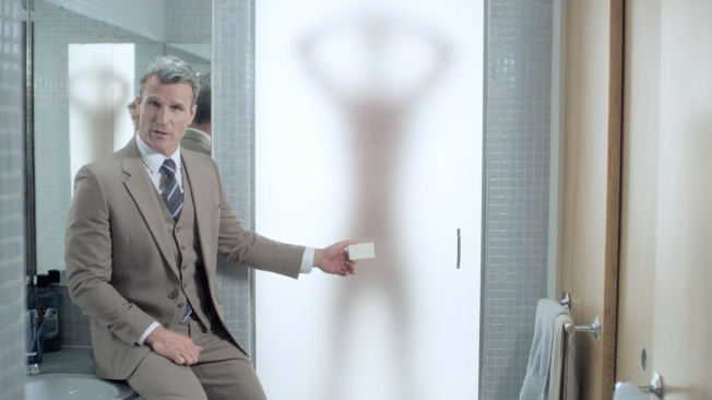
Neutrogena Warns Men Not to Wash Their Junk and Their Face With the Same Soap

Neutrogena is very concerned about “Junkface,” which is apparently what happens when a man washes his Downtown Manville and then his face with the same bar of soap. Naturally, the brand suggests its own Men’s Face Wash as a solution to this problem.

This Canadian campaign from DDB Toronto assumes that men start low and move up in the shower, but what if they wash their face first? Even if we assume Junkface is a real thing and not another pseudo-problem invented so a product can then solve it, the concept is pretty easily undone.

The Junkface website has its moments, though. The importance of keeping owls away from your mating parts cannot be overemphasized.

And if you do buy Neutrogena products to fight Junkface, be sure to also invest in the True Clean Towel—the only towel that keeps you from drying your face with your testicles.


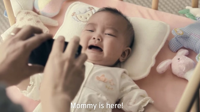
Thailand Does It Again With an Ad That Will Leave You Bawling Like This Baby

We’ve all been there, as a father, family member or designated baby holder. Mom hands off her bundle of joy to you as she grabs four minutes of alone time in the Applebee’s bathroom. Now it’s you and Junior. Alone. And he just. Starts. BAWLING.

There’s nothing like the sound of a weeping baby to whip you into a state of panic. And you want nothing more than to find Mommy. But if Mommy’s gone, and you’re in Thailand, you grab your cellphone from DTAC in a frantic effort to distract the child with soothing technology.

Let’s just say it doesn’t quite work out as planned.

This new DTAC ad, from Y&R Thailand, is the latest in a spree of sob-fest spots from Thailand in recent years. (Man, they’re good at this stuff.) The premise is debatable—show me a living human infant who is immune to cartoon penguins—but the sentiment is a sweet one, and parents with vague underlying guilt about the smartphone as babysitter will relate.

Plus, it’s refreshing to see a tech ad where the gadget most certainly doesn’t save the day. Not every tech marketer would be OK with that.

Check out the spot below. Spoiler: Dad doesn’t eat the baby.


8 New England Agencies Had 72 Hours Each to Brand a Startup. Here's the Winning Entry

The Ad Club, the advertising trade organization of New England, recently held its first “Brand-a-thon” contest for creative agencies to come up with branding campaigns for area startups in just three days.

Eight shops competed on behalf of nine startups. (Hill Holliday worked on two.) Third place and a check for $500 went to Forge Worldwide for its work on eyewear-on-wheels startup Project 2020. In second place, earning $1,000, was Allen & Gerritsen, which teamed with Supplet, an organic products subscription service for new moms.

The night’s big winner was Nail Communications in Providence, Rhode Island, which took home $2,500 and bragging rights for its work on Spray Cake, a product invented by a pair of Harvard students that “makes warm, fresh and delicious cake as easy as a whipped cream-style can of our batter, a pan, and an oven or microwave.”

That cash prize seems like a fair payout for a couple of all-nighters—even if Spray Cake, which won an innovation contest at Harvard and could be on store shelves by the end of the summer, isn’t the future of dessert.

Check out Nail’s Spray Cake video below.


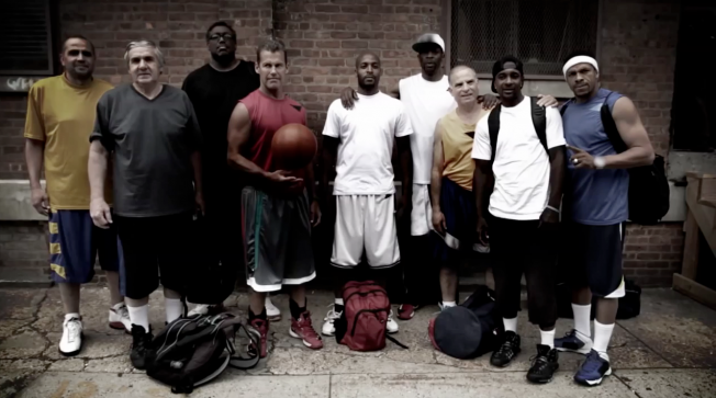
Old Geezers Battle Young Whippersnappers at Basketball in Centrum's Short Film

Sometimes experience proves more powerful than youth. That’s certainly true in this new long-form spot for Pfizer’s Centrum from Leo Burnett in Chicago, which pairs middle-aged basketball players against a group of twenty-something guys.

We won’t spoil what happens, but you can probably guess.

Yep, it’s not surprising that in a film made for a multi-vitamin, we’d see the older gents have still got game. Though that doesn’t make it any less entertaining to watch the young punks get schooled.

The film was shot in Goat Park in Harlem and has already garnered half a million views online. Maybe the appeal of watching real people play basketball has something to do with it. Or maybe we’re a bit sick of the soccer.

Credits below.

CREDITS
Client: Pfizer/Centrum
Agency: Leo Burnett Chicago
Ad or Campaign: Stay on Top of Your Game
Chief Creative Officer: Susan Credle
Executive Creative Director: Jeanie Caggiano
Creative Directors: Amanda Butts, Nuno Ferreira
Associate Creative Directors: Dave Derrick, Stephanie Simpson
Creative Team: Roberto Blanco, Javier Valle, Lauren Wetula
Digital Strategist: Ian Beacraft
Executive Producer: Juan Woodbury
Producer: Mark Phan
Production Company: Greenpoint Pictures
Directors: Michael Kuhn & Niles Roth
Executive Producer: Tatiana Rudzinski
Producer: JP Bouchard
VFX/SPX: Utopic
Editorial: Utopic
Editor: Tim Kloehn
Music Company: Jira Productions
Composer: Dejion Madison
Director of Photography: Nate Corbin

BMW Goes for a Spin on the World's Most Insane Racetrack: an Aircraft Carrier

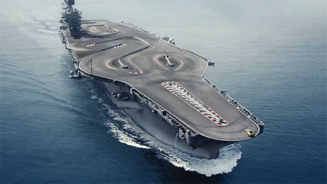
It’s one thing to drive at breakneck speeds around a barren salt flat or abandoned airport, but the pucker factor goes up a few notches when you’re teetering on the edge of an aircraft carrier.

In BMW’s questionably real “Ultimate Racetrack” ad for the BMW M4, we see the typical anonymous, black-gloved stunt driver fishtailing and drifting around a course built on what looks like the redesigned deck of an aircraft carrier.

Several YouTube commenters believe it’s fake, and Jalopnik points out some pretty compelling reasons to be dubious, such as the inconvenient fact that aircraft carriers don’t have rounded edges. We’ve reached out to Cundari, BMW’s agency in Canada, and will update with more information if we hear back.

That said, it sure doesn’t feel fake when you’re watching the car cut around those edges and risk a drop into the ocean. 

If nothing else, the ad highlights the fact that the only three differences between one high-adrenaline car ad and all the others like it: location, location, location.


Southwest Airlines Is Completely, Hopelessly, Head-Over-Heels in Love in New Ads

When it comes to airports and traveling by plane, what’s not to love?

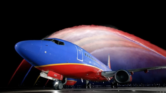
GSD&M spins the Beatles’ flower-power anthem “All You Need Is Love” in these Southwest Airlines ads celebrating the carrier’s emancipation from the Wright Amendment. The 35-year-old legislation restricted long-distance flights from Love Field in Dallas to protect business at the competing Dallas/Fort Worth International. When the amendment expires in October, Southwest can jet nonstop all over the country from Love Field.

Happy spots feature fireworks, a colorful water-cannon salute on the tarmac and an “All You Need Is Love” sing-along at a Texas Rangers game. “Love Moment,” the most offbeat commercial of the bunch, captures a few seconds of Love Field activity in super slow-motion—which is exactly how time seems to pass when your flight’s been delayed. Kidding, of course. The folks look as pleased as punch to hang around the terminal taking selfies.

An indie band called Echosmith provides the Fab Four cover. Their version’s got nothing on the original, but it sure beats airport muzak.

brightcove.createExperiences();


Shock Top Beer Is One Smooth Talker in Fun Series of Bar and Liquor Store Stunts

The next time you’re perusing the shelves at your local beer shop and you hear a voice coming from the cooler, there’s a chance it’s a sixer of Shock Top Belgian White trying to chat you up.

Not since Red Stripe’s bodega bonanza have we seen something this odd happening to unsuspecting potential party people. Liquor store shoppers and bar-goers alike find themselves face-to-citrus-face with Shock Top’s chatty mascot in a series of videos.

The mascot, named Wedgehead, is like the PG-13 lovechild of Andrew Dice Clay and Triumph the Insult Comic Dog—a kind of Joe Pesci Lite, but quite a bit smoother with the ladies. He actually gets some good zingers in, like when he tells one curiously investigative customer, “Take it easy, CSI.” 

He also takes a few digs at the competition. “You guys know these beers, they’re trying too hard, you know what I mean? Fifteen names? Wildebeest Three-Headed Unicorn? What is that? Seventeen varieties served in a fedora. Come on. I’ll do mine in a glass.”

Check out the clips below to see how it all went down. There’s also an outdoor ad that continues the talking motif.

We’ve reached out to several agencies linked to Shock Top, but so far none has taken credit for the videos, so we’ll update when we hear back on credits. 

The real question, of course, is whether the stunts are real or staged. Without a behind-the-scenes video or official word from the marketer, we’re left to watch and decide for ourselves. If Wedgehead were here, I’m sure I know what he’d say.

<p>

<p>


Mom Gets Burned by Facebook for This Remake of Coppertone's Classic Ad

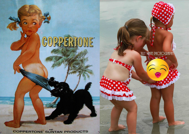
Facebook takes its no-nudity policy very seriously—so seriously that one mom found herself banned from the network for 24 hours after posting what she thought was an innocent remake of Coppertone’s original tan-line-revealing ad from the 1950s.

During a trip to the beach, North Carolina photographer Jill White took a snapshot of her 2-year-old daughter’s back—including, true to the sunscreen brand’s famous imagery, a naked part of her daughter’s butt—while one of her daughter’s friend’s played the part of swimsuit-yanking cocker spaniel.

When White shared the shot on Coppertone’s Facebook page, some commenters complained, and Facebook asked White to delete the photo or limit its viewing by applying stricter privacy settings. After she ignored the request, she was locked out for a day.

Facebook says it didn’t find White’s image to be pornographic. But it’s far from the social media site’s first flap over censorship, especially related to mothers and their offspring. After years of struggling to consistently police breastfeeding photos, Facebook just last month began allowing exposed female nipples in breastfeeding photos (and even that got off to a rough start).

Once Facebook let White back on, she reposted the shot—covering the offending bare-ass bit with a puckered emoji (+1 to mom, for the sass). Looking at the censored version of the image, it is difficult to imagine the uncensored one being anything but harmless. Yet Coppertone has been making its own imagery more demure in recent decades, though it still sparks debate about whether the branding is inappropriate—and if so, why.

Regardless, it’s pretty clear that it’s natural to err on the side of protecting children. It’s also natural for a mother to bristle at the implication she is somehow not protecting her child, especially when the notion seems irrational. But mostly, it’s natural for Facebook to err on the side of trying to cover its own ass.


Sweden Designs the First Summer Festival Poster You Can Climb On

Snask, an agency in Stockholm, made a huge 3-D poster for this year’s Malmö Festival, which is essentially a massive street fair that runs through the second half of August. The “poster” is actually a series of giant 3-D letters, numbers, and shapes that took 14 people over 900 hours to make. They’re made out of plywood, in case anyone out there cares.

Calling this thing a poster feels a bit off. It’s more of an art installation. You can’t even see the whole image from the ground; you have to be up in the air to do that. That said, it’s way cooler than your typical poster, and it’s going to be a centerpiece of the festival, so visitors can climb all over it and stuff.

See more images and the photographed poster below.

Via Joquz and Design Taxi.


Nescafé Print Ads Include Pop-Up Paper Mugs for Two, So You Can Both Scald Yourselves

Ahh, the morning paper. You’ve just settled into your seat on the train, or perhaps a park bench, to enjoy the morning light and digest the news of the day. But there are two things missing: your cup of morning joe, and another person to enjoy this peaceful moment of solitude with you.

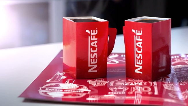
Yes, the folks at Nescafé France have deemed reading a newspaper to be “a rather lonely moment.” As a cure for this intolerable isolation, they’ve invented branded newspaper wrappers that come with pop-up paper mugs, apparently with coffee powder in them. If you happen to be near some hot water, well you’re in luck! Instant coffee!

There are two mugs: one for you, and one for the person you are now sharing your Metro newspaper with! 

See below as actors convincingly use these paper advertisements as actual mugs, filling them with scalding liquid. And note the relief on their faces as they once again avoid another moment of being totally and inescapably alone. 

Via Ads of the World.

CREDITS
Client: Nescafé
Agency: Geometry Global, Paris
Chief executive officer: Reza Ghaem-Maghami
Executive creative director: Yvan Hiot
International creative director: Patrick Sullivan
Art director: Nicolas Gagner
Copywriter: Romain R. Nonis
Account manager: Margaux Delacommune
Art Director: David Lin
Art buyer: Annette Hallum
Chief Creative Officer / Worldwide Creative Director: Michael Kutschinski
Designer: Olivier brechon
Print manager: Karine Prigent / Redworks
Media planner: Severine Bernelin / Neo
Production: Ateliers Marina, Marsellus


Galactic Empire Turns Frankfurt Airport Into a Fully Armed, Operational Battle Station

The Empire might not be running the galaxy anymore, but it seems to be doing a stellar job running an airport in Germany. 

With more than 1 million views already (likely thanks to its red-herring title, “Leaked Star Wars Episode VII Filmset Footage!”), the video below shows Imperial Walkers and shuttles making good use of the Frankfurt Airport, where an orderly and rather uneventful invasion of Earth seems to be under way.

While not an official promo for the Star Wars: Episode VII, currently in development, the fan-made clip is still getting people pumped for the series’ return.

“Ok, I know it’s fake, but damn … I’m so looking forward to seeing new Star Wars material,” noted one YouTube viewer. “It got me straight back there, as a kid seeing this kind of stuff for the first time. It might as well have been real.”

It’s unclear how many Bothans died to bring us this footage.

Via Laughing Squid.


Expedia Says Travel Makes You So Interesting, You'll Ruin the Lives of Professional Entertainers

Expedia travels into amusing territory with three new commercials from Ogilvy & Mather in London. In each spot, achingly average people become intensely interesting to friends and co-workers after taking trips booked through the client’s website and mobile app.

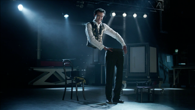
In fact, they become so darn fascinating—sharing silly holiday snaps and gushing about their experiences—that a magician who saws himself in half, a stuntman riding fiery explosions and an acrobatic horse whisperer can’t compete in the battle for attention.

The ads are the latest from Expedia’s pan-European “Travel Yourself Interesting” campaign, which won a Creative Effectiveness Lion last month at Cannes. Gerry Human, chief creative officer at the agency, says the goal is to “steer away from travel marketing clichés.”

Indeed, the work achieves that objective in entertaining fashion with its tongue-in-cheek appeal to our ingrained vanity and sloth. Who wouldn’t want to earn praise just for taking a vacation? Making talented folks who worked hard to master their craft look like dull dweebs is the cherry on top. (Stupid magician—make yourself disappear!)

brightcove.createExperiences();

brightcove.createExperiences();

brightcove.createExperiences();

CREDITS
Client: Expedia
Senior Marketing Director: Andrew Warner
Agency: Ogilvy & Mather London
Copywriters: Simon Lotze, Jon Morgan
Art Directors: Miguel Nunes, Mike Watson
Executive Creative Director: Gerry Human
Planner: Mattijs Devroedt
Account Leads/Directors: Mark Lainas, Larry Ball-Piatti
Account Managers: Briony Gittins, Joseph Grigg, Anastasia Selezneva
Media Agency: PHD
Production company: TV – Moxie Productions; Online film – Disqo
Music: Track – “Travel Yourself Interesting”; Siren Music – Stuart Hancock
Exposure: TV, online, radio


Ad Shows That Hyundais Drive Well Even If You're Blindfolded, or Not There at All

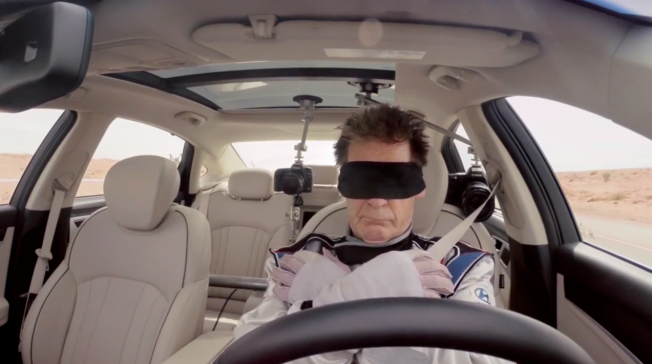
To show off its “Smart Caring” driver assistance features, Hyundai set up an empty car convoy, in which a stuntman (who was blindfolded, mind you) led a bunch of driverless cars down an empty highway to test their response to some basic driver’s-ed-video stuff—namely the cruise control, lane keeping and emergency braking features.

Also, the stunt people who were driving the other cars all leaped from them on to a padded flatbed, which was pretty awesome.

The idea that these cars can drive themselves shouldn’t have to fight for my attention in a commercial, so Hyundai may have overdone it with all the extra Volvo Trucks-style stunt work here. But there’s really no better way to show off what these cars can do, so we’ll call it a wash and say that living in the future is great.


Ad for Meat Marinades Takes Woman Down Rabbit Hole of Wiener Gobbling and Ham Straddling

Hey there, incredibly hip and hot millennials. Packaged seasoning brand Flava-it wants you to know its marinades are like a raunchy meat party in your mouth.

This loony new ad for the U.K. marketer features a gathering of twenty-somethings sporting all the obligatory styles—fluorescent daisy dukes, thick-rimmed glasses, mountain-man beard. One bite of a sandwich leads a magenta-haired woman into a phantasmagoria of inappropriate foodplay, ultimately leaving her with eyes wide and hair mussed.

Because, in case the innuendo was too subtle, the brand’s wares will make you feel like you’re having an orgasm.

The “Meat Lust” campaign, created with digital agency Code Computerlove, also includes a BuzzFeed-style quiz, because that’s what the kids are doing these days. It will judge how much you love meat by asking you what your favorite MeatLoaf song is, but replacing real titles with food wordplay (e.g., “I Will Eat Anything For Love (but I won’t eat that)” and “You Took The Meat Right Out Of My Mouth”) and by telling you to pick an animal you can milk (a cat, goat, cow, donkey, potato or naked woman).

In other words, it certainly strikes the right ironically over-the-top tone for a certain kind of fun-loving dude. Or maybe just for very cheeky meatheads.


What Are the Best Looking Beer Cans in America?

Beer cans are booming, which is great if you like your craft brew easily portable, crushable and recyclable. But it’s also great if you’re a packaging designer.

The can comeback, led by brands like Ska Brewing, Oskar Blues and New Belgium, has opened up a 360-degree canvas for label designers typically restricted to the few stickers on a beer bottle.

Thrillest has (with the help of CraftCans.com guru and Canned! author Russ Phillips) created a handy gallery of its picks for the “10 coolest-looking beer cans in America.” And while I was glad to see a few of my personal favorites on the list (including my friends and neighbors at Good People Brewing in Birmingham, Alabama), I feel like they left off a few brews that are practically works of art.

You can see Phillips’ picks above and learn more about each on Thrillest.

Below are a few of my own selections:

21st Amendment: Hell or High Watermelon
I can’t say I’m too interested in drinking a watermelon wheat beer, but man, I love the whimsical design.

 
New Belgium: Shift

Great minimalist design here, especially compared to the brewer’s famed Fat Tire look.

 
MadTree: Gnarly Brown

A beer that looks like it’d drink you if it had the chance.

 
Brindle Dog: Orange Grove Wheat

This one doesn’t seem to be around anymore, but you can read the designer’s story here.

What are some of your favorite beer can designs? Or aesthetics aside, what are your favorite canned beers overall?


These Trippy 3-D Paintings Will Baffle Your Brain and Spark Your Creativity

Here’s an idea that could make outdoor advertising not only more attention-grabbing but also more shareable.

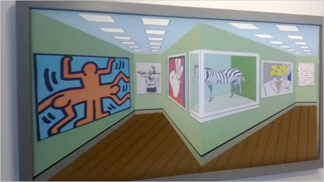
Given how many award-show judges were mesmerized by Honda’s mind-bending “Illusions” ad from mcgarrybowen (which won gold at Cannes and the public choice award in The One Show’s Automobile Advertising of the Year), agencies might want to look into the real-world optical awesomeness of reverse perspective.

As you can see in the videos below from British artist Brian Weavers and “reverspective” innovator Patrick Hughes, the painters create 3-D images that seem to shift before your eyes as you look at them from different angles.

While out-of-home marketers have been using 3-D tricks for years, this approach takes it a big step further. Seeing an ad like this would certainly stop you in your tracks and likely even make you pull out your smartphone to shoot some video and blow your friends’ minds.

I couldn’t find many examples of reverse perspective in high-profile ad placements, but let us know in the comments if you know of some beyond the Nokia case study below.

 
To see even more interesting uses of reverse perspective, check out this video featuring the art style’s best-known pioneer, Patrick Hughes:

 
Here’s how Nokia used reverspective to launch the Lumia: