Dull Pre-Roll Ads Begone Thanks to BETC’s ‘Ad Filter’ for D&AD

If you’re sick and tired of the bland, insipid and often annoying pre-roll ads that are commonplace throughout the web these days, the folks at BETC and D&AD have cooked up something worthwhile in the wake of the latter’s 2015 awards show. The parties involved have unveiled the aptly titled “Ad Filter,” which replaces tired pre-rolls with some of the most memorable ads that happen to be past D&AD winners and will likely make you less inclined to hit skip.

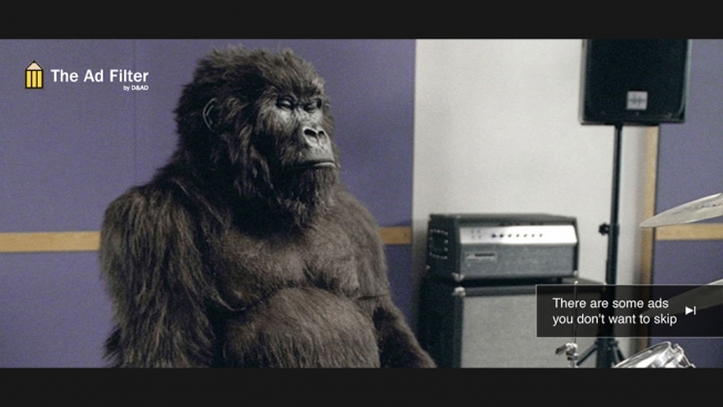
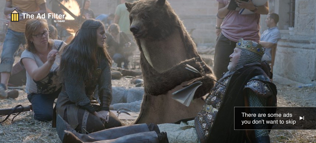
The plug-in works for both Chrome and Firefox and once you hit the on switch, the usual bad pre-rolls get blocked in favor of some of the most classic ads in recent times, including Fallon’s Phil Collins-loving gorilla drummer for Cadbury and the Jean-Claude Van Damme split spot for Volvo. Olivier Apers, executive creative director at BETC Paris, simply states, “We wanted to demonstrate that people don’t hate advertising, they just hate bad advertising.” By trying to inspire a little creativity before people watch their video of choice, we say the ads–all D&AD affiliation aside–were wisely chosen.

Credits:

Advertising Agency: BETC / BETC Digital, France
Chief Creative Officer: Stephane Xiberras
Executive Creative Director: Olivier Apers
Art Director: Alphons Conzen, Jonathan Baudet-Botella
Copywriter: Adrian Skenderovic
Development: Cogit
Motion Design: Raphaël Benhamou

This Browser Extension Replaces Boring Old Preroll With the World's Best Ads

Looking for a browser extension that approaches ad blocking a bit more creatively? D&AD and Paris agency BETC have just the thing.

The British ad organization, which just handed out its 2015 awards last week, has now released The Ad Filter, an extension for Chrome and Firefox that blocks regular preroll ads and automatically replaces them with D&AD winners from past years.

It might seem odd for an ad group and a famous agency to promote ad blocking, but D&AD and BETC say the plug-in is designed to “celebrate creativity by inspiring and stimulating people in the industry and beyond.”

“We wanted to demonstrate that people don’t hate advertising, they just hate bad advertising,” says Olivier Apers, creative director BETC Paris.

Check out the demo below, and download The Ad Filter here. It certainly works. I installed it, and quickly saw Vodafone’s “The Kiss,” Hahn SuperDry’s “Pioneering Beering” and LG Kompressor Elite’s “Somethings Lurking” spots.

CREDITS
Client – D&AD
Brand Management – Laura Kelly
Agency – BETC X BETC Digital
Agency Management – Niamh O’Connor, Anaïs Pirajean
Chief Creative Officer – Stéphane Xiberras
Executive Creative Director – Olivier Apers
Art Directors – Alphons Conzen, Jonathan Baudet-Botella
Copywriter – Adrian Skenderovic
Development – Cogit
Motion Design – Raphaël Benhamou


Sujata Keshavan : Interview

Sujata Keshavan
Chairperson: Ray+Keshavan/Brand Union
Judge, Branding, D&AD awards 2014.

What does your role as a D&AD judge entail?
The D&AD awards are highly respected and are widely regarded as the Gold Standard of awards. It really means a great deal to creative professionals to win a pencil. The best thing about being a judge, is that one gets the opportunity to see the most recent, most brilliant work, the best of the best. It gives you a sense of the state of design in the world.

What are you hoping for and expecting from the entrants this year?
I have heard that D&AD attracts the very best entries of all competitions. I have very high expectations. I will be looking for innovative ideas that reflect creative thinking which is not gimmicky or attempting to be clever in a facile way.

How did you get involved with the work that D&AD do?
While I have judged competitions in many countries, I have not really been involved with D&AD before. I was delighted to have been asked to judge this year. I think it reflects the fact that D&AD is probably looking to extend its reach more substantially in India and other regions in Asia.

What do you think of the Indian Creative Industry?
There is a huge amount of talent in the 1.2 billion people in India. It is a deep civilization with a culture in art, craft and literature that goes back thousands of years. What people lack is access to a good design education and an overall exposure to great design. If only more people had this, there would be a huge creative renaissance.

What are your hopes and where did you think the Indian creative industry will be in 10 years?
Liberalisation of the Indian economy, combined with globalization and the internet revolution has led to incredible opportunities for the Indian creative industries. There is so much to be done, and design is an integral part of the growth story. Young people today are breaking out of traditional boundaries and I see a great deal of enterprise and innovation bubbling up from the grass roots. Instead of taking small steps, technology and access to information enables people to leapfrog. In 10 years, I think that the creative industries will have matured and reached the critical mass to have great impact. I am extremely optimistic about where India is headed.

What steps did you need to take to get to where you are in your career today? E.g. Qualifications, work experiences.
I was one of those lucky designers who had a textbook design education. I did my undergraduate training at NID (The National Institute of Design) in Ahmedabad, India. The brainchild of Charles Eames, the 6 year programme was strongly influenced by the design schools at Ulm and Basel. It gave me a wonderful understanding of what design is and how powerful it can be to change things. I then did a graduate degree in graphic design from Yale. I returned to India in 1987 to set up Ray+Keshavan, the first professional design firm in the area of brand design.

Do you have any advice for anyone trying to break into the Indian creative industry?
I honestly think that this is one of the easiest industries to break into. The entry barriers to the creative industries are extraordinarily low. Unlike architecture or engineering, one does not need to have a qualification or to be certified by an association to become a designer. All one has to do is to focus on developing a strong portfolio of work. Again, the industry promotes a liberal non-hierarchical environment, and is most welcoming of newcomers. As India develops, there is huge opportunity for design so I would very much encourage young designers to break right in.

At Yale, I was fortunate to study with some great designers who have shaped design vocabulary and thinking in the 20th century. They included the legendary designer of Corporate Identity, Paul Rand; the gentleman designer Bradbury Thompson who redefined print, the iconic swiss teachers Armin Hoffmann and Wolfgang Weingart and the celebrated font designer Mathew Carter. They often presented divergent points of view, but what each of them did was to up the ante and inspire us to reflect more critically on our own work.

In particular, Paul Rand was hugely inspiring, and fostered my love of identity design. He was the most intelligent of my teachers, and I understood from him the importance of intelligence in design. Other great heroes of mine have been Andy Warhol and Alan Fletcher.

But above all else, the art and craft traditions of India are astonishing in their depth and breadth and continue to be an abiding source of inspiration.


Bangalore Airport Logo

Bangalore Airport

Delhi Airport LogoST

delhi airport

Mumbai Airport logo-01


The post Sujata Keshavan : Interview appeared first on desicreative.

Dan Wieden and Others Reveal the Work They Wish They’d Done in D&AD Ads

Envy makes advertising go round—when creatives aren't busying copying ideas, they're coveting them. D&AD celebrates that dynamic with a series of new spots, created by Wieden + Kennedy in London, to promote the awards show's 2014 call for submissions.

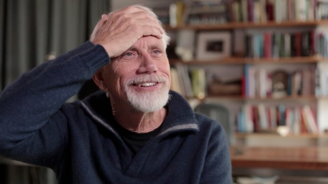
In the videos, industry heavyweights including Dan Wieden share their picks for work from the past year that they "wish they'd done." In Wieden's case, it's an ad by Barton F. Graf 9000 that proposes changing the titles of devastating hurricanes from apparently random names like Katrina and Sandy to names like Marco Rubio and Michele Bachmann, in an attempt to lay blame for the natural disasters on politicians who deny climate change. It's sort of like an "Oh, diss, gotcha dummy" on the dilapidated playground of American politics—but done in a way Wieden hopes will actually have some positive effect.

The other spots focus on media beyond straight advertising. For the digital category, W+K alum Iain Tait, now at Google Creative Lab, praises Philips's Internet-connected, color-changing lightbulbs. For the design category, Jessica Walsh of Sagmeister & Walsh spotlights the new "W" logo for the Whitney Museum, in what may be, perhaps unsurprisingly, the most opaque explanation to the uninitiated—because design work that looks good doesn't always translate to the most down-to-earth or persuasive argument.

The parts of the promos most worth envying may be the opening zoetrope animations that Nexus's Productions Factory Fifteen developed. The spinning toys pack in quick references to past standout work—the advertising bit, for example, includes the Guardian's "Three Little Pigs" opus (BBH), Honda's flying motors (W+K) and Cadbury's famous Phil Collins gorilla (Fallon). For insiders, the presence of such greats should amp the challenge to submit—or maybe just render it moot. Nobody is ever going to make anything half as good as a big-feeling simian beating the crap out of a drum kit.


Will Animation

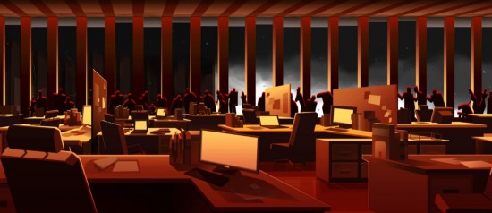
Eusong Lee a pu réaliser cette vidéo d’animation appelée “Will” retraçant la triste histoire d’un père allant travailler au World Trade Center le 11 septembre 2001 et laissant sa fille à leur domicile. Avec des choix visuels magnifiques et une musique de Julian Kleiss.


will-animation6

will-animation5

will-animation3


Previously on Fubiz

Copyright Fubiz™ – Suivez nous sur Twitter et Facebook