NatGeo's Killing Jesus Website Might Be the Greatest Story Ever Scrolled
Posted in: Uncategorized
Mullen has created a digital experience of Biblical proportions to support National Geographic Channel’s Killing Jesus, a three-hour docudrama premiering March 29, which is Palm Sunday. The show is based on the best-selling book of the same name.
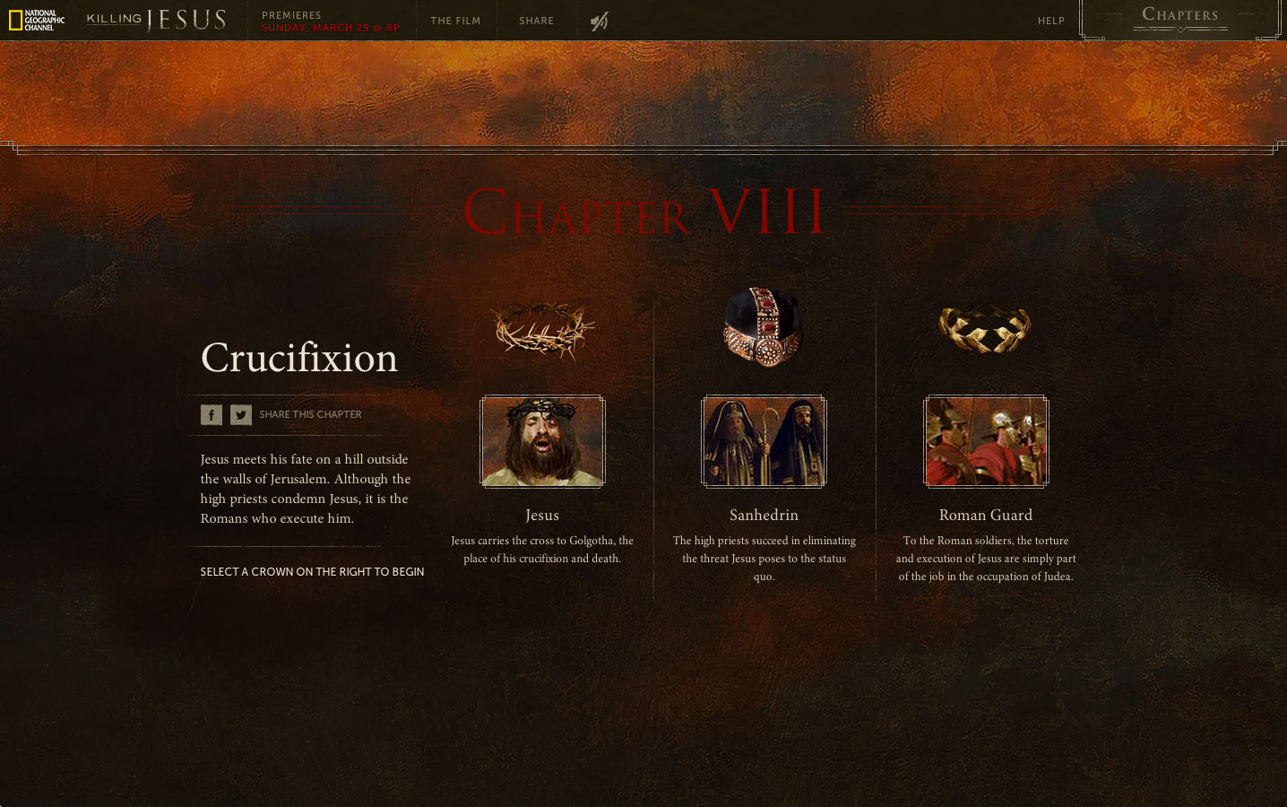
An immensely detailed, immersive website tells the story from three different perspectives: Son of God (the view of Christ and his disciples); Son of Man (the view of the Jewish priests of the time); and Threat to Rome (taking in political/economic implications). Each perspective is represented by a different crown: thorns, religious headdress and Roman laurels. This technique provides users with a panoramic perspective of Jesus’s life, allowing them to explore events from every conceivable angle.
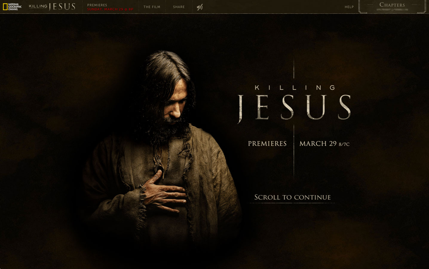
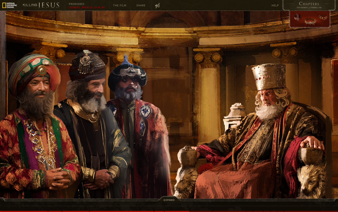
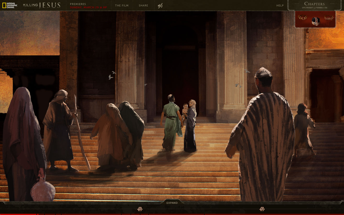
“We were looking to tell the story in a way that allowed people to see it from several different vantage points,” says Mullen associate creative director Allison Rude. “Our war room on this project resembled the wall from ‘A Beautiful Mind’ as we pieced together historical fact, religious scripture and custom illustrations.”
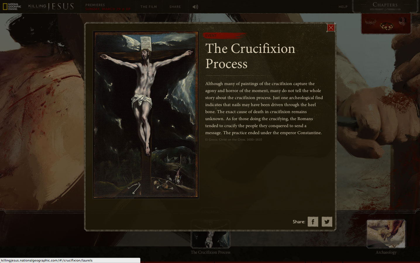
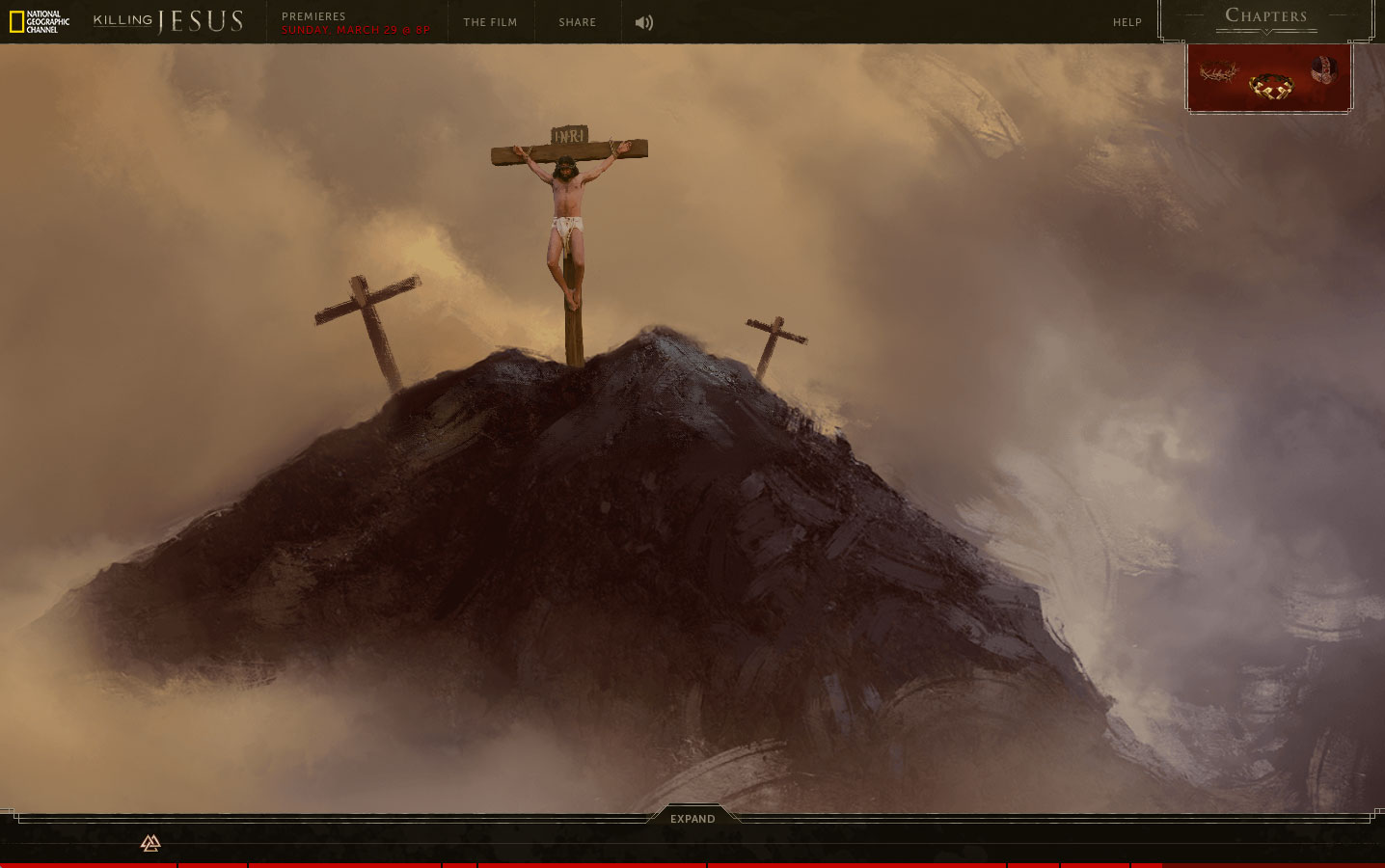
French artist Bastien Lecouffe Deharme created the impressive artwork, and his hand-drawn contributions grace the site’s eight self-contained chapters, which span Christ’s story from his birth in a Bethlehem stable through the crucifixion at Calvary. The amount of interactive information and analysis is pretty staggering. Users could lose hours (days?) investigating the various timelines (from three perspectives, no less).
That said, the navigation is intuitive, and all aspects of the presentation (based on my 30-minute spin through the site) seem compelling.
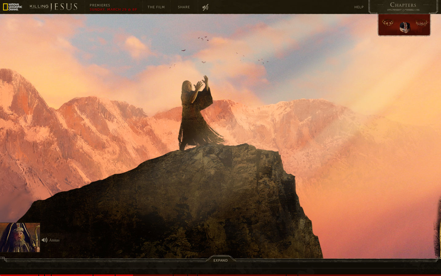
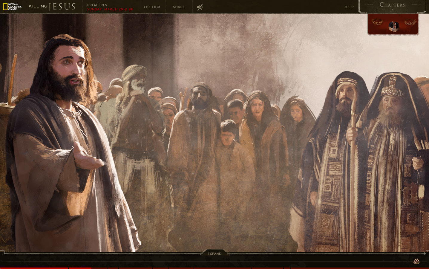
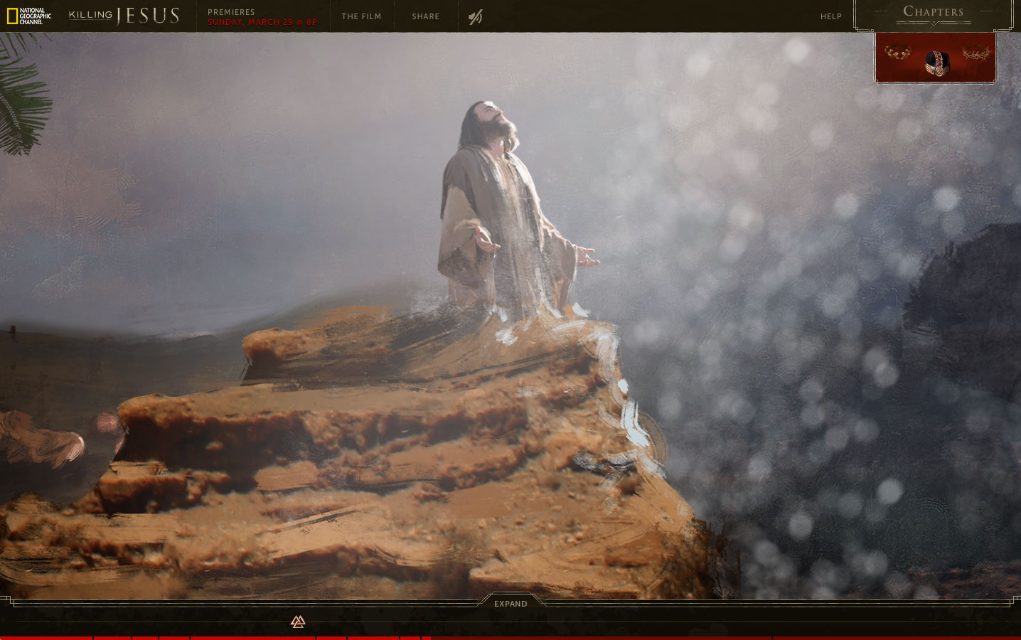
The technical specs are suitable impressive. The site’s scrollable panoramas contain more than 3,000 individual images, animated with 14,000 keyframes, along with 185 sound, music and voiceover tracks. All of this was made using 290,000 lines of code, which Mullen says is four times the size of its two previous NGC sites combined. Those sites supported the cable net’s Killing Lincoln and Killing Kennedy programs.
But wait, there’s more. Supplemental material includes a Killing Jesus microsite with articles, video clips, photo galleries, deleted scenes and cast Q&As, as well as an NGC blog campaign called “Killing with Kindness,” inspired, we’re told, by Christ’s teachings on love and charity, and promoted on social media with the #KillingWithKindness hashtag.
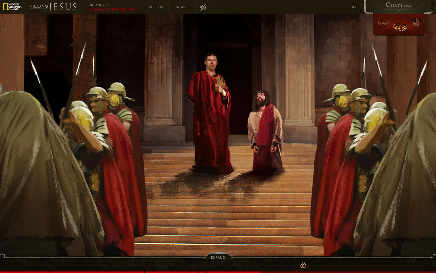
Like Mullen’s earlier NGC outings—and The Martin Agency’s similar digital work for the JFK Library—this initiative’s vast scale can seem overwhelming at times, especially for a story whose elements are so familiar. Still, the bold, multi-view style—respectful, yet rigorously researched and probing—is fairly innovative, and might give users fresh insight.
Given the weighty nature of the subject matter, Killing Jesus’s all-in approach seems appropriate and isn’t overkill at all.
CREDITS
Brand: National Geographic Channel
Client: Matt Zymet, Executive Director, Digital Media
Client: Ashley Kalena, Digital Media Producer
Agency: Mullen
Chief Creative Officer: Mark Wenneker
Executive Creative Director: Tim Vaccarino
Executive Creative Director: Dave Weist
Associate Creative Director: Allison Rude
Associate Creative Director: Brian Leech
Associate Creative Director: Scott Slagsvol
Copywriter: Eugene Torres
VP, Executive Producer: Tiffany Stevens
Senior Digital Producer: Alyssa Hartigan
Senior Digital Producer: Kim Ryan
Group Account Director: Rebekah Pagis
Account Director: Jessica Zdenek
Assistant Account Executive: Stephanie Costa
Director of Development Operations: Steve Laham
Senior QA Engineer: Ryan Nelsen
SVP, Creative Director/Technologist: Christian Madden
SVP, Director of Interactive: Mathey Ray
Associate Creative Director/Technologist: Joe Palasek
Senior Creative Technologist: Justin Bogan
Creative Technologist: Adam Riggs
Creative Technologist: Stefan Harris
Associate QA Engineer: Amber Archambeault
Senior Production Designer: Terri Navarra
Senior Content Manager: Caroline Roberts
Motion Designer: Jeremiah True
VP, Digital Production Manager: Steve Haroutunian
Senior Creative Technologist: Costa Boudouvas
Senior Experience Designer: Charlene McBride
Senior Experience Designer: Krista Siniscarco
Junior Production Designer: Candice Latham
SVP, Director of Broadcast Production: Zeke Bowman
Animator: Eric Ko
VP, Director of Art Production: Tracy Maidment
Senior Art Producer: Jessica Manning
VP, Senior Video Editor: Jessica Phearsome
Senior Copy Writer: Kelly McAuley
Assistant Editor: Libby Ryerson
Assistant Editor: Nick Brecken
Business Manager: Vanessa Fazio
Animation/Graphics
Artist: Bastien Lecouffe Deharme
Artist Representation: Shannon Associates
Music
Sound Design: Mike Secher
Audio Post
Sound Design/Mixer: Mike Secher
![]()


