Infographic: What Millennials Want From Native Ad Content

With more marketers putting their eggs in the native advertising basket, it’s always good to hear that the tactic might actually be working.

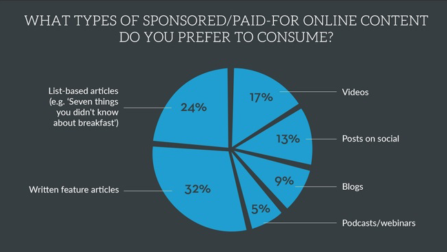
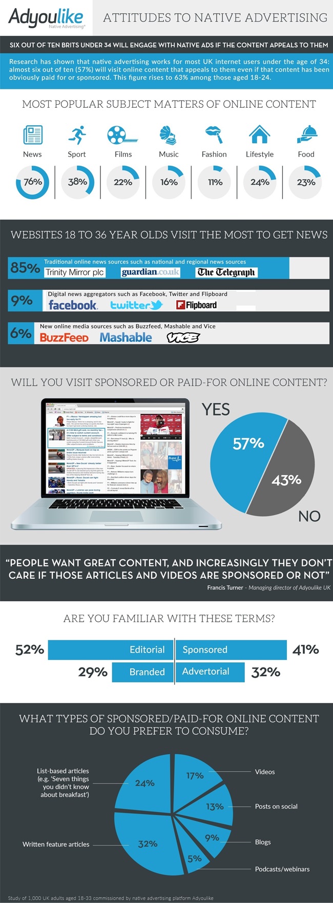
According to the infographic below, based on interviews of 1,000 U.K. residents ages 18 to 33 by native ad platform Adyoulike, 57 percent are willing to check out sponsored online content, as long as it’s interesting.

For younger adults, those 18 to 24, the willingness rises even higher, to 63 percent. The research also looked at kinds of content those surveyed were interested in, with news, sports, lifestyles and food proving most popular.

It’s hard to say how well these British findings might relate to American audiences. Survey participants overwhelmingly favored traditional news outlets like The Guardian, with only a scant 6 percent saying they most often get their news from newer sites like BuzzFeed, Mashable and Vice. It’s likely American audiences would skew more strongly toward more millennial-friendly sites like these.

Check out the infographic below:


Infographic: Here's Just How Much Crappy Beer Americans Are Drinking

Sure, we Americans drink a whole lot of light beer, but do you realize just how much?

The infographic below from the team at alcohol-fueled site VinePair shows the staggering scope of mainstream beer sales—especially Bud Light, which tallies $3 billion more in sales than its closest competitor, Coors Light.

The data, via IRI and Beer Advocate, are from 2013 but likely still quite accurate. Yuengling stands alone as the only privately owned craft beer in the Top 20, and VinePair notes that smaller brewers make up just 15 percent of sales. (Oh, and the site has another graphic suggesting microbrewed upgrades for the light beer lovers among you.)

If nothing else, the chart highlights the silliness of Budweiser’s Super Bowl ad positioning craft beer as some sort of anti-American hipster insurgency. Anheuser-Busch seems to be doing just fine without having to spend millions in ad dollars to crush the craft beer movement.


Infographic: 8 Types of ‘Working Dead’ Zombies Plaguing Your Productivity

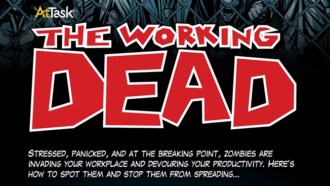
Next time you hear someone complain they can't do good marketing for a product because it's "too boring," show them this infographic for enterprise work management software AtTask.

Collaboration software is usually dry as a bone, but the team at AtTask created "The Working Dead" to share easily digestible bits of human flesh survey data about how poor workplace performance is linked to poor project management. 

Check out the graphic below. Which kind of zombie is plaguing your office—Shufflers, Crawlers or those pain-in-the-ass Howlers?


Infographic: Where to Go on a First Date

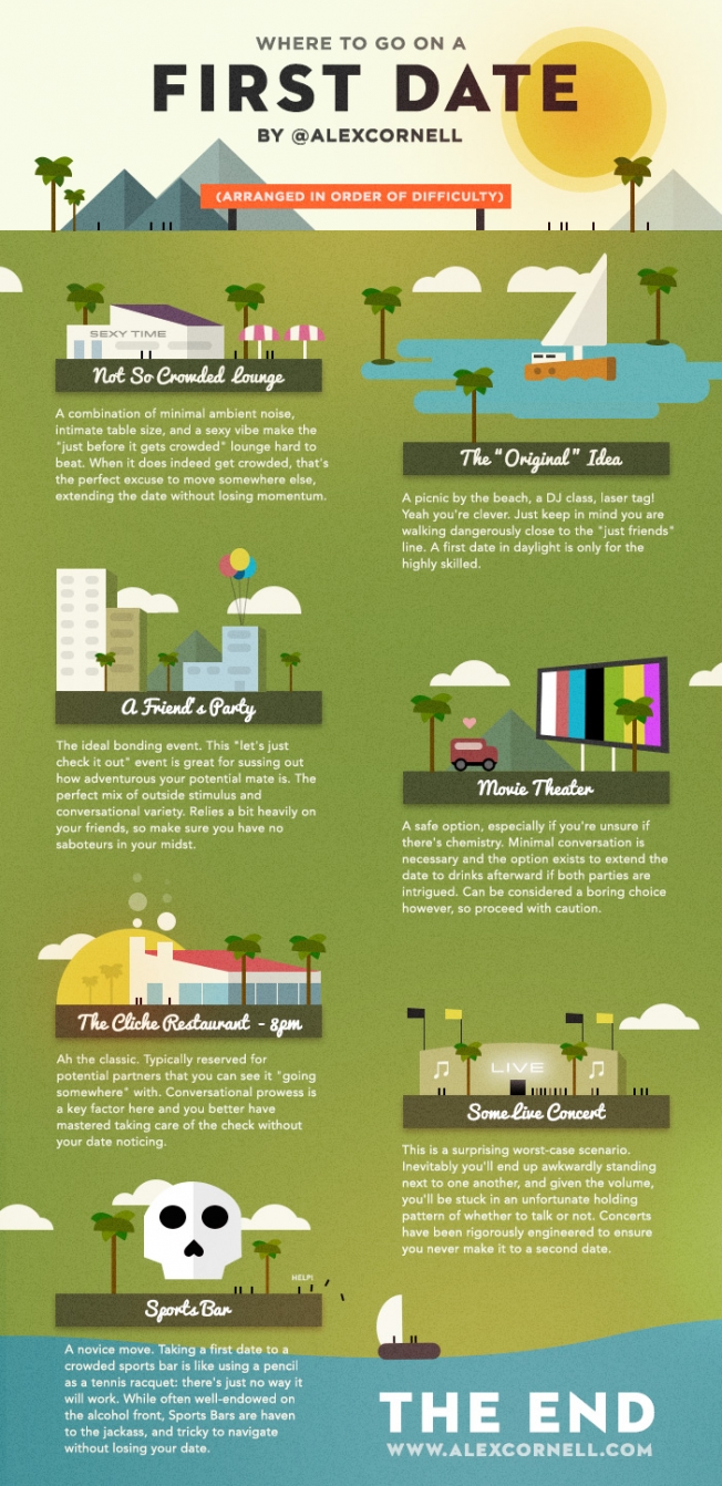
San Francisco-based designer Alex Cornell slapped together an instructional chart about where to go on a first date, and I have to say he's pretty much on point. In some cases, he's even being too nice. Anyone who takes a first date to a sports bar deserves the crappy evening ahead of them, in my opinion. I'd also argue with him about house-party dates if we were in the same room, because unless something like this happens, they're generally awkward for the other person. But whatever, those are minor nitpicks. Alex made a pretty helpful (and respectful) date-advice poster, with none of that obsessive, dating-as-a-science Ted Mosby crap or any fratty PUA weirdness. His seating-suggestions poster is similar in tone, and similarly helpful, although the visuals are a bit lazier.


Infographics XXXL

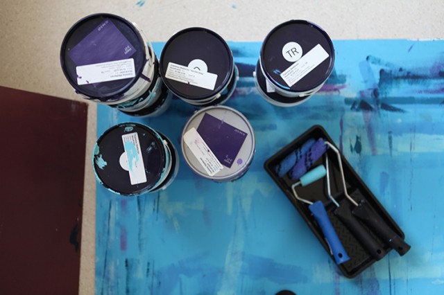
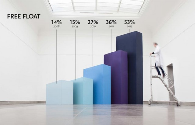
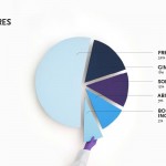
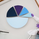
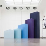
Après le projet Hand Lettering Cover, le studio belge Soon a imaginé pour son client « Ablynx » une série d’infographies réalisée à échelle géante. Une idée astucieuse et réalisée avec talent qui permet de proposer des histogrammes et autres infographies à taille XXXL. Plus d’images dans la suite.

Infographics XXXL8
Infographics XXXL10
Infographics XXXL9
Infographics XXXL5
Infographics XXXL3
Infographics XXXL2
Infographics XXXL1
Infographics XXXL11
Infographics XXXL
Infographics XXXL12

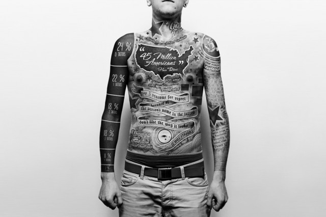
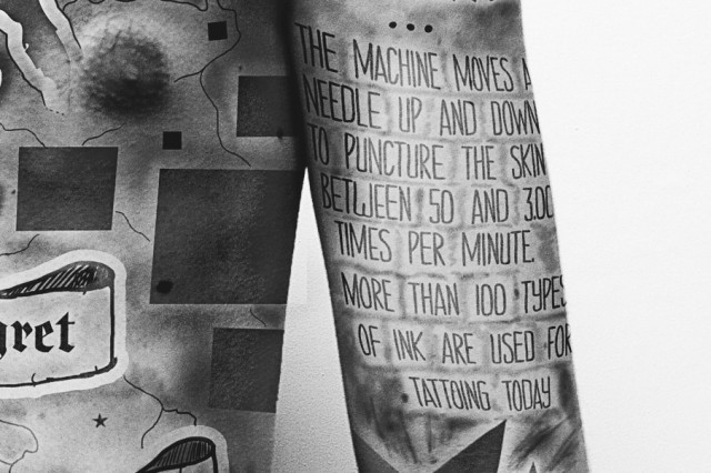
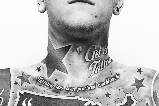
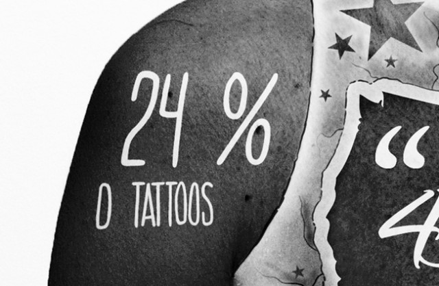
Tattoo Infographics

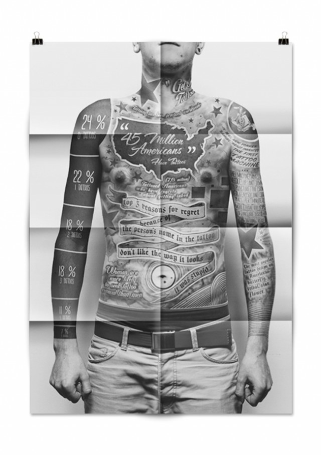
Etudiant à la Academy Of Fine Arts en Pologne, le créatif et designer Paul Marcinkowski a eu l’excellente idée de créer une infographie complète sous la forme d’un tatouage, le tout sur l’ensemble du corps. Une superbe idée très bien réalisée à découvrir en détails et en images, dans la suite de l’article.

Tatoo Infographics1
Tatoo Infographics4
Tatoo Infographics6
Tatoo Infographics5
Tatoo Infographics3
Tatoo Infographics2
Tatoo Infographics7

YOUTUBE KLUBI #8: Visualize

This edition is going to feature a few of my favourite data visualization pieces that will hopefully help you drift off into tranquil space full of swirling shapes and colours as you grind through the last hours of the week… and you might learn something interesting as well.
First up, one of my favourite piece of all time. […]