Facebook Just Updated Its Logo Ever So Slightly. Can You Tell the Difference?
Posted in: Uncategorized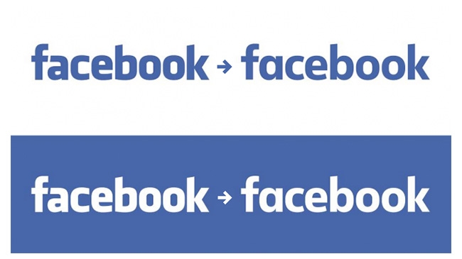
Facebook has basically used the same logo since 2005—its name in white, in Klavika font, on a blue background. But this week, the company, which is now allegedly worth more than Walmart, decided to change its logo font, opting for a custom font designed in-house, according to Mashable.
Click the play button in this tweet to see the old and new logos overlaid on each other:
New Logo for Facebook done In-house with Eric Olson. http://t.co/7s36a5ulR8 pic.twitter.com/ykoOOwd8co
— Sven Grothe (@svengrothe) July 1, 2015
The new typeface is an attempt to “modernize” the logo and make it appear more “friendly and approachable,” says Josh Higgins, Facebook’s creative director. Higgins also noted that Facebook explored many options but ultimately landed on updating its logo instead of redesigning it completely.
So, what’s different? The changes might be hard to spot until you focus on the “a” in the logo, which is now rounder and thinner.
Say hello to the new Facebook logo pic.twitter.com/ofoFm4JQmK
— Christophe Tauziet (@ChrisTauziet) June 30, 2015
The new Facebook logo was designed by @joshwhiggins, @timbelonax, Eric Olsen and crew
— Christophe Tauziet (@ChrisTauziet) July 1, 2015
It’s definitely a subtle change, though not as subtle as Google’s most recent logo tweak.
What do you think?
