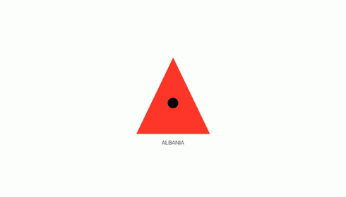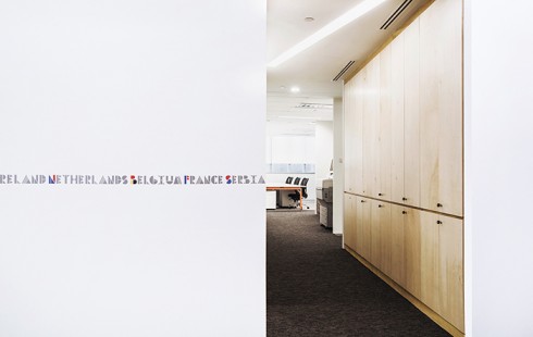
Sabeena Karnik is a Graphic Designer from Mumbai. She is a freelancer specializing in paper typography and has developed her own style in 3D sculpturing using paper. Her recent works include a typography campaign for Tanishq jewellery and a title design for a short documentary for The American Cancer Society. She teaches painting, calligraphy and sells art in her free time.
Why are you a Graphic Designer?
Right since I can remember, art was chasing me. I always had a pencil in hand and colors were in plenty. I would be doodling all the time, even the walls of my house were not spared. So taking up art as a career was a very natural instinct. It was a hard choice to make between applied art and fine art. But I can never make something just to keep myself happy, I think that is what fine art is all about. For me creating something has to be for others be it a product, the way it looks, the way it is presented. That is basically the work of a graphic designer. Hence it had to be applied art. I do a lot of paintings too, but its again an idea that I am presenting and working around.
Did you attend school for fine art or design?
Yes, I graduated from Sophia Polytechnic Institute of Art and Design in Mumbai, with a typography major.
You have a distinct style of Typographic expression. How did you develop this style?
Its been a fascination ever since I was a kid. I used to cut out and collect alphabets that looked unique. I loved letters so much that I started drawing them out and developing my own style. Thats when I got immersed in Calligraphy too. In the meantime paper brought the sculpturor out in me. Paper has the most magnificent ability to turn into anything with the right technique and application. Each fold, bend and curve can be interpreted differently. It has so much of depth.
In a way now, I am combining the three, paper, typography and calligraphy. Typography being the skeleton while the inner detailing being calligraphy, just done all with paper. The photography is an integral part of my work. The end product has to be captured in the right kind of light, which can give multiple views to the viewer and thereby alter what is being conveyed.
Were there any particular role models for you when you grew up?
I haven’t had any one particular role model. Places and people in general have always fascinated me. My travels to Africa as a child have helped to find my own perspective as an artist. Stories I came across in people, nature, artworks I have seen have played a major role in bringing out the artist in me.
Who was the most influential personality on your career in graphic design?
Achyut Palav under whom I learnt calligraphy has been very influential. Im also inspired by Jen Stark a young paper sculpturer, her works defy the force of gravity.
When did you start freelancing?
I started Freelancing in 2008. I did a lot of logo and corporate identity independently, lived in Africa for a few years and worked for design houses, made paper products for an NGO, did paintings for an art store. Freelancing happened out of choice. It gives a me time and opportunities to discover my own potential everyday through the assignments I get. Over the last one year the focus has shifted to typography purely. The paper typography project that started as personal work, has now garnered so much interest by public and designers from all over the world, it made me take my capability of it more seriously, and to develop it further.
Was there any time when you wanted to quit graphic design?
I have taken breaks but never felt like quitting.
Are many advertising agencies hiring graphic designers/typographers? Do you work more with agencies or publishers?
Yes agencies are hiring designers with special skills all the time. There is always a demand for fresh new work and ideas that are out of the box. Your work has to be seen by the right people at the right time.
Unfortunately, type design is not given the importance it deserves in India.
I have worked with agencies, a tv producer and at the moment with a publisher too for a book cover design.
Do you have clients who give you steady work or do you advertise for new clients often?
Steady work is constant and clients change constantly too. The best way to advertise yourself to the world is to showcase all your creative work and keep updating your skills.
Any other Indian graphic designers who you admire?
I admire the work of Raja Sandhu. He is based in Canada. Strong typography, simple and stylish work.
What advice do you have for aspiring creative professionals? Would you advise them to take on graphic design as a career option?
I would advice aspiring creative professionals to not forget to draw. The computer is a tool. Find your own calling and pursue that. Do not hesitate to be different. Have the best work from your portfolio in design sites and promote your work in the right way. Keep looking for inspiration and keep sketching. The pencil is mightier than anything else. Also, I will add, designing and art isn’t everything. Travel, read, meet people, broaden and expand Syour horizon.
Do you think Clients are opening up to keeping aside a decent respectable budget for design work? Do you think clients are understanding that they need to invest in Design as a communication tool and also to cut the clutter, and that good design comes at a price?
Clients have a very big budget to advertise their brand. To an extent it depends on the brand also.
And if that involves good design so be it. The agency gets the better of it and a small part of it goes to the designer thats been hired. Like I said earlier, very few campaigns in India involve good illustration and type design. The trend is slowly changing.
Who would you like to take out for dinner?
Leonardo Da Vinci. We would need an interpreter though.
Jeff Nishinaka. He is the most brilliant Japanese paper sculpturer.
What’s on your iPod?
From western Classical to pop, Bach to Backstreet Boys
Mac or PC?
Neither at the moment
But a mac as a laptop and PC as desktop.
Sabeena’s work can be found here.


