
Jun
30
Orange to spend £30m advertising new positioning
Posted in: UncategorizedLONDON – Orange has unveiled its new global marketing campaign and announced it is to spend a record £30m on its UK advertising push.
LONDON – Orange has unveiled its new global marketing campaign and announced it is to spend a record £30m on its UK advertising push.
Edelman is set to lose European health MD and executive vice president Kate Triggs.

Careful now, without protection from the sun you might be crushed by the big C. Is it just me who keeps reading “Cancertone” instead of “Coppertone” now?
LONDON – Castrol is to step up its involvement with football by becoming a global sponsor of the 2010 FIFA World Cup, Marketing can exclusively reveal.
LONDON – Haymarket Media Group has reported a record year with profits up 5% as it continues to strengthen its magazine portfolio with the acquisition of Windpower Monthly and Compliance Week.
The rising gas prices are really irritating people over in the USA – and people aren’t shy of using this in some way when advertising. Allan1 gossiped about getting one of those $500 a month, free gas to drive a billboard car deals which might save your wallet. Now weekendamerica reports that the Tanforan Shell station in San Bruno offers “stress relief” where drivers can vent their anger against the oil companies by plunging a man dressed as a Shell employee into a tank – and free car washes for the best rant about gas prices: “Cashiers are trained to really encourage all forms of expression during the rant. Well, except for throwing a chair through the window.“
Genius, this idea from Bobak Bakhtiari, “a former mental health worker” – could’ve sworn he was a former ad man. Check out the photos at they even have a rooftop band playing, while a Shell employee sits in the tank waiting to get dunked.
How are your cashiers encouraging people to vent?
If someone comes in and they’re upset, we have this protocol where they confuse them by intercepting with really positive feedback suddenly. Let’s say someone comes in and they’re like, “What the hell is wrong with you? Do you see those gas prices? What’s wrong with you guys?” and starts getting revved up. The cashier will typically say: “Great! Wonderful! Look,” and just point up to a sign that says “Express Rant = Free Express Wash.”“Your anger just earned you a car wash, ma’am.”
Exactly. Or “Your anger can earn you a car wash in few seconds, please step to the side over there.” They’re directed to guide them to the side of the store where they are monitored as they rant.What’s the price of gas at your station right now?
A gallon of unleaded is going for $4.87.What? That’s outrageous! How can you charge that? That’s insane! You’re crooks! You’re criminals!
Excellent, I love this! Keep going with it…
LONDON – Tesco will today announce its intention to appeal against findings of the Competition Commission, following its two-year investigation into the grocery sector.
NEW DELHI – India Today Group is targeting the booming Indian auto market with the launch of the Indian edition of world’s largest-selling auto magazine, Autobild, as a joint venture with German publisher Axel Springer.
HONG KONG – The Hong Kong Tourism Board has unveiled a Facebook application designed to drive awareness of the range of activities in the territory.
JAKARTA – Global healthcare giant Abbott Laboratories has put on hold a creative pitch for its milk formula brand PediaSure in Indonesia following a series of management changes at the company.

“Everywhere’s a catwalk” oh that’s just perfect isn’t it? I’m not leaving the house until someone invents a non-stinky and permanent way of removing hair off my legs, where I won’t have to waste six minutes of every day with gobs of icky stinky cream that doesn’t do much but irritate my skin. Gosh, sorry, I just hate veet.
ad agency: EURO RSCG Sydney
LONDON – Trinity Mirror warned today that a deteriorating advertising market will push profits down 10% in what the Daily Mirror publisher described as a “very uncertain economic outlook”.
LONDON – Vodafone has launched a music community on MySpace across the UK, Germany, Italy and Spain that allows people to share their music experiences on the social networking site.
Stephen Foster examines the global market jitters as WPP worries about its TNS bid, Toyota is hit by its move into SUVs, and ad revenues tail off at Trinity Mirror.
LONDON – Sir Martin Sorrell’s WPP Group is reported to be putting the finishing touches to a £1bn-plus bid for market research firm TNS, which would break up its merger with German rival Gfk.
 (TrendHunter.com) Guitar Hero Aerosmith has just been announced by Activision and the 5 members of Aerosmith
In the past Guitar Hero has featured many of the hottest bands, but this will be the first to focus exclusively…
Web agency Starring has joined forces with Fria Tidningen and created a website against FRA with the goal to sabotage the email traffic which the recently passed FRA-law now allows the Swedish National Defence Radio Establishment to read, or as they put it: “the right to intercept all internet exchange points that exchange traffic that crosses Swedish borders”. (I guess it is best described as a mini-Echelon).
Swedish bloggers have been writing about this relentlessly since the discussions began, at one point creating a “blog-quake” where nearly every blog in Sweden was listed on the blog-trendgraph site Knuff.se was talking about FRA.
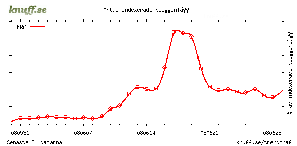
So Starring’s response is a site called HejFRA! (Hello FRA) – where Swedes can fetch a nice little .sigfile to use in their emails, with the idea to “pollute” the data that FRA catches. (Much like those echelon sigfiles years ago, remember them?). You can generate new versions by the click of a button, here’s the first one that I got
Hello FRA!
There’s no reason to read my mails. I have nothing to do with the ETA, Devrimci Sol or al-Qaida. I’ve never Ibadat (عبادة) nor built carbombs, I barely know what бомба means. But thanks for your interest!PS. – Terrorist attacks won’t likely be planned over unencrypted emails. Sabotage the FRA law at
www.hejfra.se
Creative posse at Starring: Fredrik Lundgren – Creative Director, Mattias Cederfeldt – Art Director,
Mia Robertsson – Copywriter, Marlene Hernbrand – Production leader, Johan Sahlen – Techical production leader.
 (TrendHunter.com) Holographic Text Messages will rock your world. With 1.5 million views in just a couple weeks, this viral video proves it. The video, by Inha Luke Yoo describes the concept as HoloText Messaging.
The…
Waaaah! Two whole days without airports nor art exhibitions. Which means that i’ll finally have some time to write about several shows and events i visited over the past few weeks.
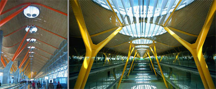
Barajas airport by Richard Rogers
Talking about airports i have the feeling that i’ve spent so much time this year at the gorgeous Terminal 4 of Barajas airport that i should probably update my dopplr account and write that my home city these days is MAD T4. My last visit there was when i went to check out the results of the Interactivos? workshop at Medialab Prado.
The projects selected saw their lucky authors guided through the whole development process by Ãlvaro Cassinelli, Simone Jones, and the Medialab Prado research group integrated by Julian Oliver, Pablo Valbuena and Daniel Canogar.
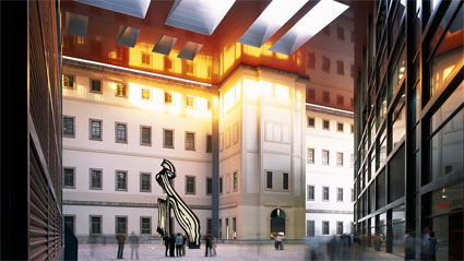
Reina Sofia Museum Extension. Photo: Philippe Ruault
Going to Medialab Prado is always a great pleasure, there are tortillas de patatas all over the city, Medialab’s headquarters are located in the heart of Madrid’s cultural district, a few meters away from the Jean Nouvel-revamped Reina SofÃa Museum, and now, right in front of Medialab Prado there’s one of the most stunning Herzog & de Meuron‘s work ever: an ex-power station turned into the social and cultural center of Caixa Forum’s Obra Social. The architects played one of their usual abracadabra tricks and removed the base of the building to leave a covered plaza under the brick structure, which now appears to float above visitors’ heads. The roof is no less admirable wrapped as it is in rusty steel panels. Alongside the building is one of those vertical gardens that made the fame of French botanist Patrick Blanc.
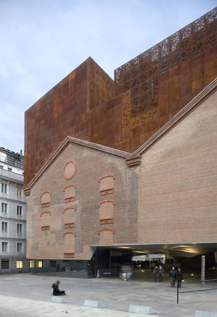
Caixa Forum, Madrid. Image Duccio Malagamba
The presentation of the projects realized during the workshop at Medialab Prado took place on June 14. There weren’t quite as many visitors as there were spectators cheering in front of their screen to see the football match opposing Spain to Sweden that evening. Still, the place was packed, the show was exciting, there were free beers and artists delivering a moving Oscar ceremony-style performance, saying how wonderful the workshop had been and thanking everyone that had made their project possible.
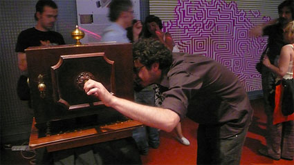
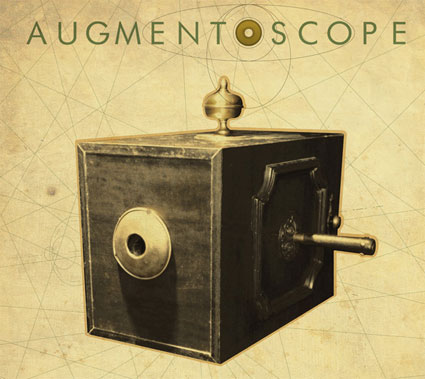
I’ll be detailing some of the projects over the next few weeks. Today i asked Barcelona-based Eloi Maduell Garcia to talk us through his Augment(0)scope work. Inspired by visualization and optical devices from XVIII century, this instrument allows spectators to take a peek trough its lens and discover an interactive projection, a circular panorama made of hundreds of pictures culled from the Greenpeace-Spain photoblog fotodenuncia. On this website, users from all over Spain are posting and tagging environmental misdeeds that are in urgent need of receiving more attention from politicians in the country.
Your original proposal involved a “box will be hanging on the ceiling over user’s head”. the final installation is different. What made you change your mind about the setting? Are there other elements of the projects which had to be modified due to some technical or other aspects that emerged during the working process?
Well the initial idea was something more similar to a “periscope”, i liked the idea of building something coming from the Twenty Thousand Leagues Under The Seas from Jules Verne, something that in my imaginarium is related with old times and technology which was my intention. The problem that changed my initial design was so simple : with the materials that we had available in MediaLab workshop it was too difficult to build up a mechanical object which could give power and signal to the hardware (VGA + USB serial port wires) and which could be able to rotate freely 360º. It’s a really basic and mechanical problem, that tells us about the limitations we have with “electrical” and so “digital” art, we can’t get rid of being wired to power!
We solved the problem by making the structure stand in a rotatory base with the computer and all the hardware on it, so then the problem was restricted to give power to the whole rotary hardware system, so just 2 wires (+ – ) . We looked in the industry for rotary connectors but what we found was so expensive that we decided to do one DIY ourselfes : on the floor base we fixed 2 cooper discs separated by a small step and on the rotary structure we put 2 cooper heads which were contacting the bottom cooper discs, so then the upper structure was turning over a central axe with weels and gived us power to the whole hardware.
That was the basic change over the initial hardware design, it was important for me to try to keep the 360º capacity of rotation, to give a sense of freedom of immersive rotation. By giving a real rotation range, people could feel and understand that turning in the real world meant a turn in the virtual world, reinforcing the idea of freedom inside the visualization orientation.
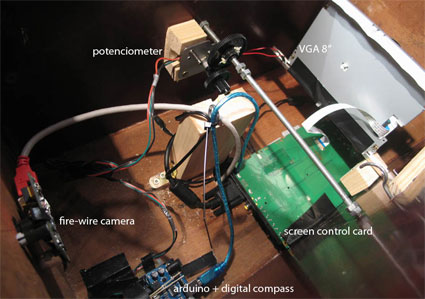
Image courtesy of the artist
In the software side also during the process with collaborators some simplifications were done because there were not that many coders in the group, so we decided to make it more simple, and basically meant to forget about using Augmented Reality techniques in the set. At the same time those techniques after the collaboration process were partially not needed at all so we decided to don’t use them.
Why did you choose to keep a “vintage” and early cinema look to the project? How important is the retro design for augment(o)scope?
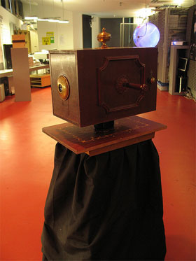 Well in fact it was part of the initial idea, to return to the very basics of immersive engineering, where just lenses and perspective drawing could give people from XVIII century the feeling of being in another reality. The intention was to make something similar with present technology, but the outside look of it should remind us the “old times” to show that in fact, just the vision technology around this installation had changed, the “fair” attraction that the piece produces is closely the same as back in time.
That’s an important part of the piece, to keep a vintage look on the outside, but a present technological hardware on the inside.
Augment(o)scope tells us about time passing by, it’s an optical instrument coming from the past that told to us about present and so future times. That’s why half of the project is the box look, the other half is the content visualized inside. The installation suggests that nothing has changed at all since then. Environmental conscience hasn’t been developed that much as technology for example.
Can you discuss the content of what users can see inside the device? Why did you choose to display this kind of data (once again it seems different from what i could read in the original proposal written down in the forum page)?
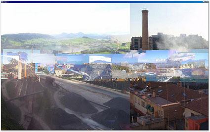
Image courtesy of the artist
First of all i’ve to say that my initial proposal wasn’t really closed when i got to the first presentation on MediaLab and i was looking for a collaborative process from the early stages of the project so the group would be able to discuss the content and the way things will happen inside the installation. That’s why the original proposal changed or evolved from an initial display to a different one, that was an important part of my needs on that workshop.
We made quite a lot of discussion sessions with all the group about which data to use and how to interact and finally we decided to communicate with Greenpeace Spain which has a website called fotodenuncias which is a photoblog where any user could post picture on a map in Spain to denounce environmental misdeeds. They accepted to collaborate so we got the whole pictures and locative data database from the mapXperience.com studio.
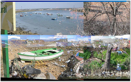
Image courtesy of the artist
All these pictures and datas are made by individual people who are creating an interactive collaborative piece without knowing it at all. I liked the idea of putting the effort of many people together to empower or amplify their consequent actions.
At the end what we have inside is a collection of circular nested panoramas of the pictures from the website. From the user’s point of exploration it gives a strange vision of a virtual landscape full of pollution, destruction and contamination. The user could move forwards and backwards with a lever and turn around to explore this several layers of blended panorama’s.
Are the images geo-located?
On the present version they’re not geolocated. The images inside have been chosen to “match” as if they were part of a continuous panorama. For example image i has some relation with image i+1 and i-1. When i say “relation” i mean, for example, that if in “image i” we’ve a coast line and the sea line in the horizon, then image i+1 has a sea line also and a the line of the horizon is closer to the last one. At this stage, it was more important to give an idea of a continuous landscape than its geolocation. In next versions i’d like to implement some kind of geo-located distribution (as that was the original idea and concept of orientation). We already have the data associated with each picture so it’s totally doable.
Another thing that is left for the next version is the text data associated with each image. Every image has a text related to it, so this text would be used a part of the texture and information augmentation in next releases.
So you plan to further develop the project?
Well, I have a good relation with the company which created the site and they are open to update the data from the new posts. That could be a way to keep updating the pictures.
Also there are some functionalities that i would like to add to the project as we had no time at all to develop them during the workshop and evolve the first prototype to a more clean and accurate version.
So yes i’m planning to keep working on it and explore other ideas related to the project. An object that let us cross the walls and see what’s on that direction, orientation, space and from the past to the future 😉
Thanks Eloi!
As an editor of Trend Hunter, I’ve made a lot of wild discoveries. In the fashion field, in particular, it’s amused me to see the different ways in which designers stage their creativity on the runways.…
This is site is run by Sascha Endlicher, M.A., during ungodly late night hours. Wanna know more about him? Connect via Social Media by jumping to about.me/sascha.endlicher.