AUTO. SUEÑO Y MATERIA – Cars and landscapes

50k

Cars have shaped the 20th century probably more than any other product of technology. Ever since Carl Benz created the first “horseless carriage” (1885), the automobile has had a deep impact on almost every single aspect of our life: landscapes, architecture, geo-political relationships (necessity to gain control of the areas that produce its fuel), social and labour movements, even the air we breathe continue

AUTO. SUEÑO Y MATERIA – Artificial traffic jam in the mountains

129k

The latest exhibition at Laboral, AUTO. DREAM AND MATERIAL, showcases 100 artworks which, each in their own way, explore the relationship between car culture and art creation in recent decades continue

Images from a day at the Salone del Mobile in Milan

69k

The Salone del Mobile in Milan was boring but Jurgen Bey saved my day with his Slow Car continue

Alarm Dance

Just a quick video that will hopefully inspire you merry ways to end 2008:

Daniel Eatock spent two months in 2007 living and working in Vilnius (Lithuania). He noticed that car alarms were constantly interrupting the peace. The alarms were so sensitive that even a whisper would set them off. One day, out of sheer frustration, Eatock left his desk, found the car whose alarm had been interrupting his peace every five minutes, and waited patiently for the siren to switch on. When the siren sounded, he started dancing like a madman. He made videos of several of his car alarm dances, never touching the car, only dancing to the sound pollutants.

Seen at Nowhere, Now / Here, an exhibition that revisits the definition and perception of design.

Nowhere/Now/Here runs until Mon, April 20 , 2009 at LABoral Centro de Arte y Creación Industrial in Gijon, Spain.

All-Inclusive. A Tourist World

Just back from Frankfurt where i participated to the marvelously organized and well-attended Node08 Forum for Digital Art conference. As i was in town for two days, i visited All-Inclusive. A Tourist World at the Schirn Kunsthalle.

0aahoyunnn.jpg
Ho-Yeol Ryu, Airport, 2005. Courtesy Ho-Yeol Ryu

All-Inclusive. A Tourist World presents works from 30 artists depicting and commenting on various phenomena influenced by the continually growing tourist industry.

Vladimir Raitz pioneered modern package tourism when in 1950 his company, Horizon, provided arrangements for a two-week holiday in Corsica. For an all inclusive price of £32.10s.-, holiday makers could sleep under canvas, sample local wines and eat a meal containing meat twice a day. Within ten years, his company had started mass tourism to Palma, Lourdes, Costa Brava, Sardinia, Minorca, Porto, Costa Blanca and Costa del Sol.

0aamaaaltaa.jpg
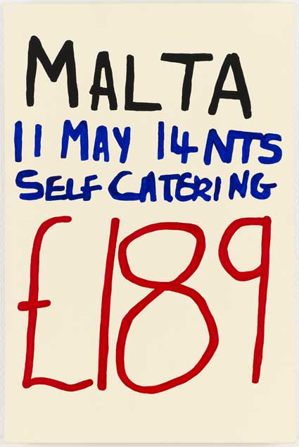
Jonathan Monk, #129, MALTA £189, (From the series: Holiday Paintings, 1992-2000). Photo: Anders Sune Berg, Copenhagen

An increase in the standard of living, affordable air travel and the development of the package tour enabled international mass tourism to thrive. For someone living in greater London, Venice today is almost as accessible as Brighton was 100 years ago.

The World Tourism Organization (UNWTO) forecasts that international tourism will continue growing at the average annual rate of 4 % (at least in places where global warming won’t totally destroy the sector.) As a result international arrivals are expected to reach over 1.56 billion by the year 2020.

0aalasecurittty.jpg
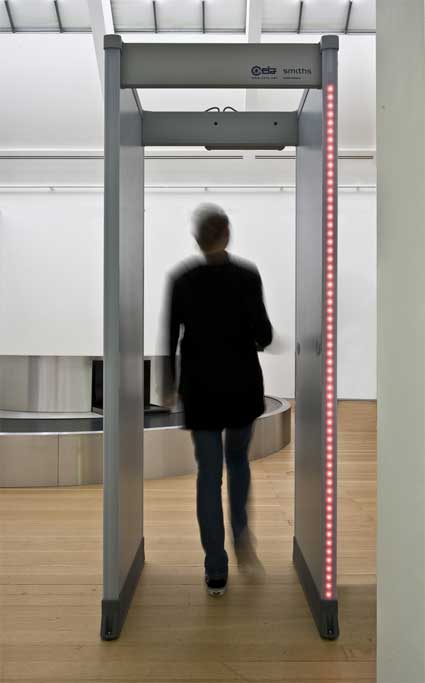
Ayse Erkmen, Safety Doors, 1996-2008. Photo: Norbert Miguletz

The All-Inclusive exhibition opens with 2 artworks which both evokes two of the most unpleasant moments that pave the tourist’s journey: the passage through security with AyÅŸe Erkmen‘s Safety Doors which will inevitably ring as you go through, and the wait for your suitcase with a baggage conveyor belt turning around its own axis by the Scandinavian artist duo Michael Elmgreen and Ingar Dragset .

0aaabeltveyo.jpg
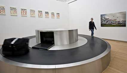
Uncollected (Baggage reclaim) (2005)

Further away, you’re met with another tourist staple: Tensa-barriers that control more than they guide your way along the long long queues. Eva Grubinger‘s Crowd, 2007 is separating one room of the exhibition to another one. There’s no alternative: you have to go through it and feel as foolish as ever.

0aalaqueuelagu.jpg
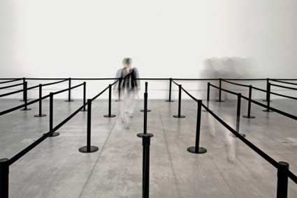
Eva Grubinger, Crowd, 2007. © VG Bild-Kunst, Bonn 2007, Foto: Markus Hawlik

The mood is set, you’re not here to dream and get an overview of the most charming aspects of tourism. And you might exit the show feeling guilty to contribute to the phenomenon. Not that this will stop you from booking a Summer holiday next week.

0inlanderhau.jpg
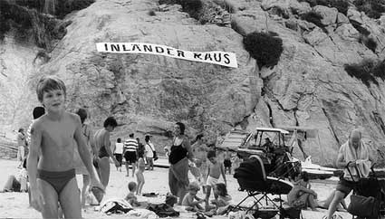
Santiago Sierra, Banner suspended in front of a cove, Cala San Vicente, Mallorca, Spain. August 2001. Photo: Santiago Sierra

One of the most symbolic artworks show in Frankfurt is Santiago Sierra‘s 2001 action on a Spanish beach. In August, the peak of touristic period, he had a huge banner hung from a rock wall overseeing a beach in Mallorca that read “Inländer Raus” (“Natives, go away”), targeting the tension on the resort island between the Spanish residents and the German tourists. out). The work not only inverts the classic xenophobic motto “Auslander Raus” (Foreigners get the hell out), but it also overtly refers to German retirees and celebrities who have virtually displaced the Spanish natives in Majorca.

Responding to complains, the town council immediately ordered the banner torn down, then had it re-installed, and finally it mysteriously disappeared. Soon after the announcement that Sierra had been selected for the Venice Biennale, a series of articles in Spain’s mainstream press attacked the decision, probably because people were afraid the artist might destroy the Biennale pavilion.

The work evokes also the tremendous impact that tourism can have on an entire area. Think of Benidorm, that village turned “the Manhattan of the Costa Blanca”, or of that forgotten city in the Basque city which has become a tourists magnet since its Guggenheim Museum opened in 1997.

0aaenswwiss.jpg
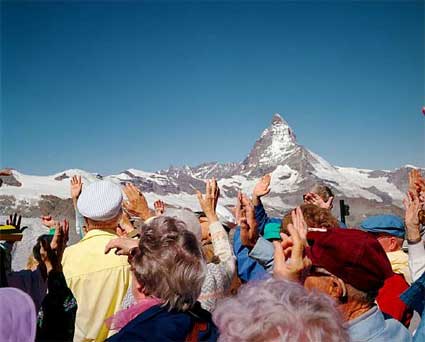
Martin Parr, The Matterhorn, 1990

The number one favourite activity of the tourist is taking picture. There are plenty of those in the show. Not by tourists but by renown photographers. Martin Parr’s (more in Martin Parr retrospective: from fish & chips to mass tourism) depict tourist patterns of behavior frozen to clichés in a Swiss mountain resort.

0aaunlimitedsu.jpg
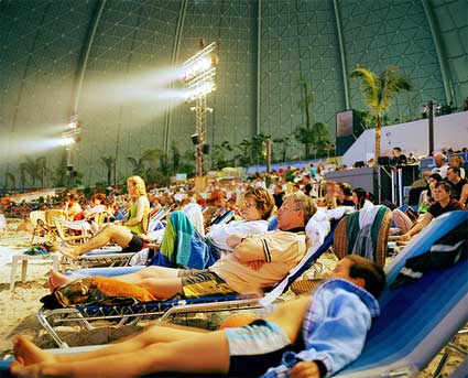
Reiner Riedler, Schilift, 2005

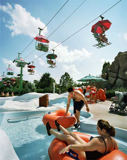
Reiner Riedler‘s lens focuses on artificial tourist landscapes. His photo series Artificial Holidays show people sunbathing on an indoor tropical island in Berlin, skying in Dubai, having dinner at the bottom of Florida’s very own Mexican pyramid are based on similar stereotypes. They confirm the theory that tourist photography mainly serves the purpose of confirmation and not of discovery.

0aaschischis.jpg
Reiner Rieder, Indoor Pool “Tropical Islands” in Berlin Brandenburg

Thomas Struth’s Museum Photographs show tourists in shorts, jeans and t-shirts with their cameras and guidebooks as they wander around museums with a look on their face that says that no matter how interested they might or might not be in the paintings hung on the walls, they just “have to” be there and be seen contemplating the works. You look at them and find it a bit repulsive then you realize you’re just one of them, no matter how educated and refined you might be. Last year, for example, art travel packets -including flights, car rental, entry tickets and hotel- enabled the enlightened to tour the most distinguished event of the European art Summer: the Venice Biennale, Art Basel, documenta in Kassel, and Skulptur. Projekte in Münster.

0aasibbiuuiu.jpg
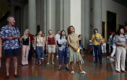
Thomas Struth, Audience 8 (Galleria dell’Accademia) Firenze, 2004

0aaainfirnzz.jpg
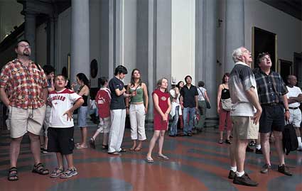
Thomas Struth, Audience 1, Firenze, 2004

NL Architects‘s futuristic scenarios do not forecast a brighter future. In their manipulated images, tourism is used as a weapon by invaders coming to your shores with amusement parks erected on the decks of aircraft carriers.

0aacruissuire.jpg
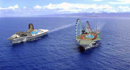
NL Architects, Cruise City, 2003. Courtesy: NL Architects, Amsterdam

00aapluginciu.jpg
NL Architects, Plugin City, 2007. Courtesy: NL Architects, Amsterdam

Tourism and travels are not just about cultural city trips and long afternoons at the beach, it can also be grounded in political and economic circumstances. The Moroccan artist Yto Barrada has captured this fact in A Life Full of Holes: The Straits Project, her photo series about Tangier and the Straits of Gibraltar. The narrow channel that divides Europe and Africa is a sea basin just 14 km across in some places. It is one of the most traveled waterways in the world, but few Africans are able to cross it. The photos examine the hope of migration, its influence on the Tangier cityscape and the temptations of leaving to begin a new life in the other side of the sea.

0aaytoobarr.jpg
Yto Barrada, Women at Window, 2002. Foto © MUMOK

0aadadabay.jpg
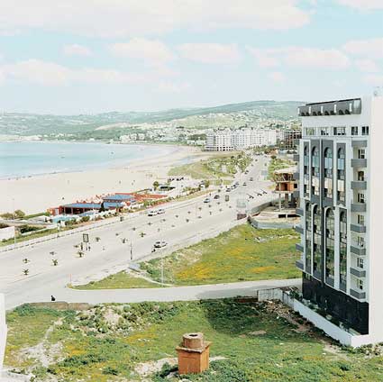
Yto Barrada, Bay of Tangier, 2002 (From the series: The straight project, 1999-2003)

All-Inclusive reminds us that tourism is one of the most powerful economic forces in the world and as such it is one of the hottest topics in the debate over globalization. Tourism doesn’t just bring mouthwatering economic perspectives, it comes with ecological and political aspects: migration, terrorism, pollution of the environment, prostitution, etc.

Both Stern and FAZ have slideshows.
“All-Inclusive. A Tourist World” is on show at the Schirn in Frankfurt from 30 January to 4 May 2008,

Visualizar workshop: Cascade on Wheels

Working together with Cristóbal Castilla, José Hernández, Ricard Marxer, Julian Oliver and Nicolas Tremeaud, Steph Thirion developed a gorgeous traffic data visualization project during the Visualizar workshop which took place at MediaLab Prado in Madrid last November.

Cascade on Wheels intends to express the quantity of cars we live with in big cities nowadays. The data set of daily car count averages is visualized per street (and segments of streets) in the center of Madrid in 2006.

To better express the meaning and extent of the harm car traffic is doing to both the city and its inhabitants, the team created two visualizations of the same dataset. One is a 3D representation, where holes are used as a metaphor of the volume of cars, in a map where the streets look like open wounds. The second is a sound toy, where noise is the metaphor, and the user has to explore the data by drawing its own visualizations.

Steph is half portuguese half french and has been living for 4 years in Barcelona. He works mostly as a web designer and developer for advertising agencies and design studios. He also teaches classes about being creative with code. Right now he is focusing his energy on personal projects and on teaching. I asked him a few questions about his data visualization work:

Cascade on Wheels “intends to express the quantity of cars we live with in big cities nowadays.” Why do you think that there is a need to map urban traffic in a new way? Isn’t there already online instruments which do just that? Which new elements does CoW brings to the issue?

Most traffic mappings are realtime information for drivers, to help them trace their route depending on the current state of traffic. The broader view, which is representing the average quantities over time, is not so popular. That’s a shame, because this is about something that affects every single inhabitant of the city, not just the drivers.

And the existing maps that cover this subject usually have failed to make that data truly readable. The website of the Kansas Department of Transportation hosts static maps with average car count for each of its cities, and they are worth the detour, they’re even pretty, but have poor readability. The Madrid website where our data set comes from also hosts a static map, but it has bad readability, lacks precision, and – although the source data is quite rich, categorized by types of vehicles – only shows the totals.

So I wouldn’t complain of a lack of data, but I think there’s a blank space that is begging to be drawn on. I’d love to see more visualizations on this subject.

wallsmap.jpg
Wall Map

We wanted to fix some of these issues. While trying to find a functional and readable way to represent all that data we had, we were inspired by Ben Fry‘s Isometrick Blocks, where different spatial angles and perspectives reveal different visualizations of the same data. In our Walls Map piece, streets are raised in space relatively to their traffic. Seen from the top it is a flat 2D street map, but once the angle is tilted and the view enters 3D, shapes like walls are revealed, holding additional data on their sides: the proportions of car types. By rotating the model or tilting the angle it’s quite easy to explore the data, see where most traffic concentrates, how it branches out, or which streets have many buses and which don’t.

Moreover, a defining element of the project was emotion. Apart from representing the data, the idea was to express its meaning. In its early prototype the streets in Walls Map were actually lowered, making holes in the ground. The walls of the columns were red, so the streets looked like fresh wounds contouring the buildings. We ended up reversing them to improve readability, and the streets became walls, which is also a great metaphor for traffic.

At the end of the concept process, we ended up with two different visualization ideas we were happy with, and we couldn’t choose one, so we did both. The Traffic Mixer, which is the second piece, is a weird and beautiful hybrid. It’s both a visualization and sound toy, where the user explores and gets involved with the data in a playful way. Here the metaphor for traffic is audio noise. On this piece, emotion was given prominence over direct readability, so the two pieces ended up complementing each other.

trafficmixer.jpg
Traffic Mixer

You choose to visualize a data set of daily car count averages per street (and segments of streets) in the Madrid city center. The project is currently exhibited in Madrid. Have had a chance to discuss with visitors? How are they reacting to a project which engages so closely with their everyday life?

Sadly, I haven’t had the chance yet. The inauguration of the exposition was the evening before we left Madrid. And until now Walls Map, which is the clearer piece data-wise, has been at an early stage. There’s been only shapes, no numbers. Users have been able to see the differences between streets, but couldn’t read that on the avenue a block away from there, more than 100.000 cars passed by every day. Hopefully now that we’re updating the piece we’ll get feedback. The Medialab, where the pieces are exposed, is the perfect setting for that.

Now that the project is online and working, do you find that the visualization taught you elements that you didn’t suspect would emerge? How does the final result differ from your own expectations?

The biggest impact was before the visualization, when we first laid our eyes on the numbers. For me it was the first time I read that kind of data on streets I knew, and while it wasn’t a surprise that we cohabit with huge amounts of cars, seeing the actual numbers was still a shock.

After the visualization was complete, I think the only surprise was at noticing that some segments of streets had high quantities of cars while the next one had a tenth of it. In some cases that can be explained by the fact that not all streets are accounted in the data set, so some traffic can flow into non-visible streets. But when there’s such a big difference between segments, it’s actually because the traffic goes into the underground tunnels. So you can see it on the visualization, the city council of Madrid actually did a good job in making part of the traffic disappear in the underground.

Can you give us some details about the sound element of the project? How does it work? How does it complete the data visualization?

In the Traffic Mixer is a special case, it’s a bit more than a visualization. The sound here is partly about giving expressiveness to the numbers, but it’s also about getting the user involved with the visualization. By drawing circles on the map, streets are selected, and produce audio noise. There’s both a visual and a sound feedback, which adds more variables to shape the result and makes the experience more immersive. When we presented to the public, Cristobal, who directed this piece, got a bit carried away demoing. He stood there for a while constructing sounds and playing with different musical intensities. When he concluded, the public applauded. It was like he had made a sound performance. With a visualization.

Do you have plan to develop the project any further?

At this point I just want to polish it, I’m not planning to go further than that. This project could be seen as an exercise, a prototype for something bigger, with more areas, more cities, with the time dimension, connecting to different online APIs. But these kind of functionalities would be quite a big endeavor and I couldn’t work on that, at least in a near future. But I would be delighted if someone would start off this point and make something better out of it.

2080798756_bcb25cd768_o.jpg

Thanks Steph!

CoW is exhibited at Medialab Prado in Madrid, until February 24, along with the other projects developed during the Visualizar workshop.

All images courtesy of Steph Thirion.

Trevor Paglen’s talk at Transmediale

0alittletrevor.jpgThe talk i was looking forward to listen to during the Transmediale conference last week was Trevor Paglen‘s who was part of Session 4: Techno-Historical Collusions: The Making Of A Trojan Horse.

(Previously, in the same session: Eva Horn’s talk at Transmediale)

Paglen works at the border of art and research and is currently completing a PhD in the Department of Geography at the University of California at Berkeley. His artistic work deliberately blurs the lines between social science, contemporary art, and other more obscure disciplines in order to construct unfamiliar, yet meticulously researched ways to interpret the world around us. He has published two books (Torture Taxi: On the Trail of the CIA’s Rendition Flights (Amazon USA and UK) which documents the use by the CIA of modified commercial aircraft for extraordinary rendition; and I Could Tell You But Then You Would Have to be Destroyed by Me (Amazon USA and UK) about the secret world of military imagery and jargon revealed by patches from classified projects) and is currently preparing the third one (Blank Spots on a Map, 2008/09).

One day Paglen arrived at his office to find man standing in front of his door, looking with intensity at a picture hung outside of the office. At some point, the man tried to pick out the image out of its frame. Paglen intervenes and asks him what he think he’s doing. The guy then asks him “Do you know what that place is?” Starts a dialog where the man reveals that he used to be a pilot. He and his companions at the army were instructed that there were places in the desert where they would not be able to fire at all, where they could not land under any circumstance. One of these places was just called “The Box”. But one of the pilots ran out of gas and has no choice but land on “The Box.” A week later, the guy comes back. He wouldn’t say anything. “That place belongs to the Black World.” The black World, as military insiders call it, is the world of classified programs, projects, and places, whose outlines, even existence, are deeply-held secrets.

0aguantanemorio8.jpg
Tail Numbers/Gold Coast Terminal, Las Vegas, NV/Distance ~1 mile/5:27 pm

Paglen then showed us pages from the Department of Defense Budget Fiscal Year 2008. The document is publicly available but presents some puzzling numbers. For example, a whopping $ 12.3 million is allocated to toilets which, the document states, must provide soldiers with equipment 2 enhance their efficiency and efficacy.”

Paglen showed more images from a documents of classified strategic RDT&E programs. Some projects with mysterious names such as “Pilot Fish”, “Retract Juniper,” “Chalk Coral”, etc. receive huge budget but, unlike the toilets do not present any justification. Sometimes the sum allocated to a project does not appear at all, leaving blank spots in the budget. The National Security Agency has mostly blanks in its budget.

00aacodenames6.jpg
Code Names: Classified Military Programs Active Between 2001 and 2007

One of Paglen’s work inspired by the military budget is Code Names is a list of words, phrases, and terms that designate active military programs whose existence or purpose is classified.

So what happens with these “Selected Sites Associated with Classified Military Activity”? Money doesn’t disappear like that. Paglen calls them the “Black Dollars”. A number of places where these figures congeal are located in the South West of the country, more precisely in the desert. That area has a long history of being an unexplored region. In World War II, these places became useful to hide secret bases where airplanes were tested. Also the Manhattan Project in 1945.

0aamnahatnaprojec.jpg
Manhattan Project, “Jumbo” atomic device being positioned for “Trinity” test at Alamogordo, New Mexico (souce)

This Black World started to get more importance in the ’80s. The Black Budget became then a big part of the defense budget with President Reagan, a man fascinated by secret weapons.

Paglen showed more documents to prove his point.

The next issue he tackled was “How do we study something that doesn’t exist? Something that must stay hidden?”

Paglen turned to geography to make emerge a negative image of these black spots on maps. That’s where he compares his work to the one of an astronomer because he deals with dark matters, with phenomena which are detectable only through the influence they exercise on the visible world.

0aalimiteetel8.jpg
Open Hangar/Cactus Flats, NV/Distance ~18 miles/10:04 am

He uses similar instruments as astronomers’ to create his Limit Telephotography series.

Many of the military bases and installations hidden deep in deserts and buffered by dozens of miles of restricted land are so remote that a civilian might be able to see them with an unaided eye. In order to visually document these places, Paglen uses high powered telescopes whose focal lengths range between 1300mm and 7000mm. At this level of magnification, hidden aspects of the landscape become apparent. Because of the distance and the heat coming off the desert, these images have peculiar aesthetical qualities that sometimes evoke impressionists paintings rather than photography.

Limit-telephotography resembles astrophotography, a technique that astronomers use to photograph objects that might be trillions of miles from Earth.

Flight Tracking
CIA sets up civilian front companies to hide these “black” operations, making it look like a normal business. But even front companies must produce flight logs, registration papers, and other legal documents. And most of them publicly available. That’s the kind of data you check to know if a plane will land on time for example. Now how do you find front companies? Documents such as the Civil Aircraft Landing Permits lists the planes which are allowed to land on military landfills. These are companies you have never heard of. You can get a list of the planes these airlines own and from there track information about where they land and from where they fly.

0aatermanirla9.jpg
Terminal Air

Terminal Air, a visualization system that Trevor Paglen developed together with the Institute for Applied Autonomy tracks the CIA aircrafts. You can register and get an email message when a CIA plane is coming to your city.

These companies leave other traces. They must have addresses. One of them lead Paglen to a law office which is weird for an aviation company. No one would answer his questions. Then there are signatures at the bottom of documents belonging to the companies. He deciphered the names and found individuals which, unlike the rest of us, leave no electronic trace: they have no credit history, no driver license, etc. They all have a single address which is a PO Box in Virginia. Paglen went there and discovered that the PO Box was used by hundreds and hundreds of names. It’s a long collection of ghosts, of fictional characters. Which makes sense as these people are in the business of making other people disappear.

0atylertae.jpg
Signature of a non-existing airline company member (image source)

Paglen also practices some Amateur Anthropology.

These people involved in secret activities have colleagues which are the only persons with whom they are allowed to talk about their jobs. They organize reunions and form bonds. They also give awards to each other but they can’t exactly say what this award is for. So someone would get an award for his or her “significant contribution in a remote location.”

0aaleadpilot76.jpg
One of Paglen’s slides showing the cryptic information of someone involved in one of the secret programs he’s investigating

Paglen is also into Amateur geo-spacial intelligence. He and his collaborators make maps of the world based on those flights.

He then reminded us of the case of Khalid El-Masri, a German citizen who was abducted, flown to Afghanistan, interrogated and tortured by the CIA for several months in one of those Black Sites and then released without charge. The extrajudicial detention was apparently due to a mis-spelling of El-Masri’s name. When the CIA realized El-Masri was the wrong guy, they threw him on another plane and freed him in Albania.

0aaasaltpit3.jpg
Aerial view of Salt Pit (image)

It is believed that the jail were he was detained was a secret CIA detention center outside Kabul called the Salt Pit. For five months, El-Masri says, he was locked in a solitary cell in the Salt Pit and interrogated by Arabic-speaking inquisitors who asked him repeatedly if he was involved with the Sept. 11 hijackers, if he’d journeyed to Jalalabad on a false passport, if he hung out with Islamic extremists living in Germany (via).

Symbology.

0aadontaski.jpg
NOYFB. Fabric patch, Edition of 50, 2006

Military have all sorts of patches, icons and insignia. They reveal anything that they do or are. These markers of identity and program heraldry begin to create a peculiar symbolic regime when they depict one’s affiliation with what defense-industry insiders call the “black world”.

0aailpooool.jpgThe symbols and insignia shown in Paglen’s Symbology series provide a glimpse into how contemporary military units answer questions that have historically been the purview of mystery cults, secret societies, religions, and mystics: How does one represent that which, by definition, must not be represented?

Both the icons and words used on the patches are weird. “Alone and on the Prowl”, sometimes with inside jokes “Gustatus Similis Pullus” (Tastes Like Chicken); “Doing God’s works with other people’s money,” NOYFB (None of Your Fucking Business), etc.

You can see some of these patches until February at the Transmediale exhibition which runs until February 24 at the House of World Cultures in Berlin.

Related: Interview with the Institute for Applied Autonomy; Tracking the Torture Taxis; The Captives.

DIY tractor culture in Poland

The Żak Gallery in Berlin is currently running a delightful exhibition

0alevieuxsurletract.jpg
Łukasz SkÄ…pski, “Machines”, 2005-2007, Courtesy Å»ak Gallery

In the ’60s Poland it was almost impossible to acquire a tractor in Poland. Agricultural machines produced by the country were available mainly for state-owned enterprises. For private farmers these tractors were too expensive and they weren’t even robust or efficient enough for the mountain region. Out of necessity they constructed their own machines using spare parts and bits and pieces from whatever machines they could find. Including decommissioned army vehicles and pre-WWI German machines.

0aamototracte.jpg
Łukasz SkÄ…pski, “Machines”, 2005-2007, Courtesy Å»ak Gallery

Since 2005 Łukasz Skąpski has been traveling all over Poland to document the story of the tractors hand-constructed by farmers. He also made a video where farmers talk fondly about their machines, how it goes faster than it is allowed, how they can drive very steep roads with it and how robust the vehicle is. Considered that somewere built decades ago most of them look like little marvels.

0aaaundernierpou.jpg
Łukasz SkÄ…pski, “Machines”, 2005-2007, Courtesy Å»ak Gallery

Also at the Å»ak gallery is Skapski’s latest photo series of self-made houseboats.

00atracteruoragne.jpg
Łukasz SkÄ…pski, “Machines”, 2005-2007, Courtesy Å»ak Gallery

On view at the Żak Gallery in Berlin until March 3.

Fotopolis has a few more pics.