Paul Jackson leaves Capital for Australia radio network DMG
Posted in: UncategorizedPaul Jackson is to leave his position as programme director at Global Radio’s 95.8 Capital FM, to take a new job at Lachlan Murdoch’s Australian radio network, DMG.
Paul Jackson is to leave his position as programme director at Global Radio’s 95.8 Capital FM, to take a new job at Lachlan Murdoch’s Australian radio network, DMG.
Dyson is to hire a series of marketers as part of a wider internal restructure that will see it double the number of engineers working for the brand to 700.
The inaugural International Marketing Festival in Edinburgh is set to launch later this month, featuring speakers from brands such as Sony Music, LoveFilm and Google.
Dans le cadre d’un projet à l’université Washington de St. Louis, la talentueuse Natalie Sklobovskaya a réalisé une série de pictogrammes cohérents partant d’une espèce animale pour ensuite la décliner sur d’autres. Un style très pur et fin à découvrir dans la suite.
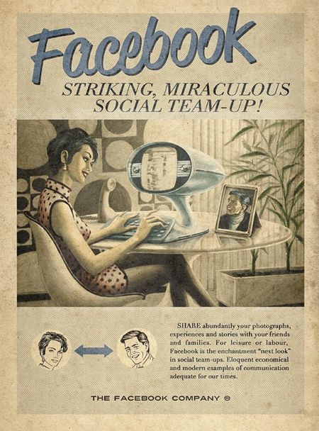
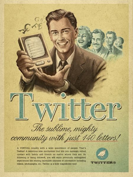
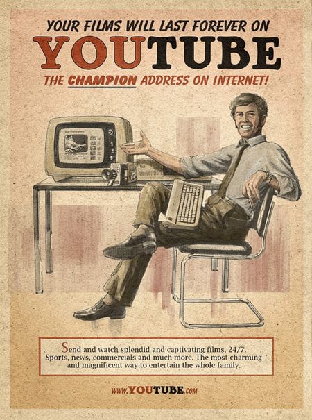
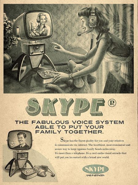
Cool fake oldies for Social Media. Which one do you prefer?
Facebook vintage print ad

Twitter vintage print ad

Youtube vintage print ad

Skype vintage print ad

Advertiser: Maximidia
Agency: Moma Propaganda Brazil
Satya has started The Indian Type Foundry and with it released a much needed professionally designed Unicode Devnagri typeface called Fedra Hindi. DesiCreative in a small chat with Satya Rajpurohit.
Tell us something about the Indian Type Foundry. What is your vision with The Indian Type Foundry.
Indian Type Foundry is a small company based in Ahmedabad which specializes in designing high quality multilingual fonts for the indian market.
Our intention in starting the ITF was to make people aware of typography and to provide well-designed fonts for the Indian market. It is also important for us to educate people — both our clients and design students — about typography, fonts and font licensing. In order to do this, we’re planning on giving lectures, holding workshops and publishing related articles on the web, in books and in magazines. Eventually, we want people to understand and appreciate the effort that goes into designing typefaces, so that they can start buying them legally and using them properly.
Tell us something about you. How did you develop an interest in Typography?
I studied Graphic Design at the National Institute of Design (NID) in Ahmedabad. Although we didn’t have any specific type design courses at NID, there were 3 typography courses that introduced us to the basics and took us to an advanced level in typography. But it was my internship at Linotype in Germany that gave me in-depth insights into type design. Eventually, I did my degree project with Dalton Maag in London and worked simultaneously with Peter Bilak of Typotheque to develop Fedra Hindi.
What prompted you to start a type foundry in India?
Though I was keenly interested in Type Design, I never thought of starting a new company. It actually happened incidentally. After finishing Fedra Hindi, we thought that releasing a Devanagari typeface from Typotheque (Peter’s existing company in Netherlands) was not a liable option as it wouldn’t have reached to the right people. And that is how we came to the decision of starting a new company in India which would specialize in Indian scripts. Fedra Hindi was the excuse.
How did you foster a relationship with Peter Bilak.
In 2006, Peter Bilak was invited to speak at the Kyoorius Design Yatra, an annual design conference. I was already a big fan of his work but had never met him in person. There, I got to know that he was keenly interested in Indian scripts. I got in touch with him through e-mail and he wanted me to help him with his research on Indian scripts. Later, while doing an internship at Linotype, Germany, he invited me to visit his studio in the Hague. It was on this trip that he offered the opportunity to work with him on Fedra Hindi. Two years later, Fedra Hindi was born.
How has been the response to Fedra Hindi? How did you decide on the name?
So far we have received a good response from all the clients who have used our fonts. However, it has not yet reached the masses. A new font generally takes up to 3 to 4 years to become popular and it only has been a year since we released Fedra Hindi.
Fedra Sans was originally commissioned by Paris-based Ruedi Baur Integral Design and developed as a corporate font for Bayerische Rück, a German insurance company, as part of their new visual identity. It was designed my Peter Bilak. Fedra Hindi is a Devanagari extension to the Fedra Sans.
How can we buy/license Fedra for use in India?
If you are based in India, you can buy it online – directly from ITF’s website.
Did you get an encouraging response from Advertising Agencies? We would assume Advertising Art Directors would be happiest to see a well designed quality Indic font for a change.
No. Not yet. I am waiting though!
What kind of research did you have to do to create Indic Fonts. Did you dig deep into Indian Culture/Art History etc for any Font inspirations?
It depends. If am working on a companion typeface, I don’t spend much time on research; because in that case, the basic skeleton is already there, I only need to match the look and feel of the typeface to their Latin counterparts. But, if I had to work on a new script altogether, which I am not comfortable with, I need to do a lot of research before I start drawing final letterforms, which includes: looking into the history of the script, it’s evolution, familiarizing with the script using children books, gathering and analyzing various handwriting samples, studying existing fonts, calligraphy practice, and discussions with the natives who are familiar with the script. The research phase alone may take 3 – 6 months depending on the complexity of the script. And then, 8 – 12 months designing the fonts from scratch.
How many Devnagri Fonts have been released by ITF? Any other languages?
So far we have two devanagari font families in the library, that is: Fedra Hindi and Kohinoor Devanagari. Both of which are Unicode compliant and come in 5 upright styles.
Kohinoor Devanagari is a part of a super family called Kohinoor Multiscript which will eventually support all the 9 major indian scripts. Kohinoor already supports, Latin, Tamil and Devanagari scripts. Gularati, Bengali and Gumukhi are in progress; while Malayalam, Oriya, Telugu, Kannada and Arabic will follow.
Although we only sell Fedra Devanagari and Latin from ITF, it supports also Tamil (coming soon), Arabic, Armenian, Cryllic and Greek scripts.
How does the font work with a traditional QWERTY keypad?
At the moment Fedra Hindi is available in Unicode format exclusively. Fedra Hindi is also available in other popular local formats like Krutidev (Remington) etc, however we don’t encourage our clients to use these formats since it does not allow the user to avail any of the advanced open type features and extended conjuncts. Also, local formats don’t allow users to use two scripts at the same time since they use Latin slots to fill Indic characters.
What kind of response are you getting in India with your fonts? Have any mainstream publications approached you?
So far we have sold our fonts to a few design studios, publication houses and to some broadcasting companies in India and the response was amazing. Our clients are looking forward to see our new upcoming fonts. However we have not sold fonts to any mainstream publications like newspapers and book houses as yet. The reason probably is that our fonts are only available in Unicode format and their production setup use local formats and proprietary softwares. I am sure they are aware of the demerits of the poorly designed fonts they are using but It’s very tough for them now to use a relatively new format which they are not familiar with. But if they
want to set international standards and present their designs in front of global readers, the they must shift from local, poorly designed fonts to high quality Unicode fonts. We all know that most of the newspapers have the same content everyday, it’s just the fonts and well crafted editorial design that makes a difference.
In a country where most people, including top end clients, are design illiterate, how are you planning to convince people that Fonts have IPR and people need to pay to get a good quality font?
Yes, it’s true that most people can’t differentiate between a poorly designed font and well crafted font. But it is necessary for us to educate people, our clients and design students about typography, fonts and font licensing. To do this we plan on conducting workshops, organizing lectures and publishing relevant articles on the web, in books and magazines. We want people to understand and appreciate the effort that goes into designing typefaces. This would be the first step in getting them to buy fonts and use them legally.
Mac or PC?
Depends. I use Mac primarily but in order to do Open Type encoding and testing final fonts, I need a PC too.
Who would you like to take out for dinner?
Yvonne Catterfeld? : )
What’s on your iPod?
Bollywood Oldies and Rajasthani Folk Music
some of Satya’ work. His typefoundry is here.
 Indian Type Foundry’s Fedra Hindi
Engrez Sans Bold: The Character Set
InterFace Bengali Dalton Maag
Kohinoor Font by the Indian Type Foundry
Kohinoor Light : Development proof
Kohinoor Latin
Kohinoor Multi Script Support
Kohinoor Tamil Styles
Kohinoor Tamil
‘Rajdhani’ as under development
Rupee Symbol for Kohinoor Font
Phones 4u has signed a deal with Sky 1 to sponsor music talent show ‘Must Be the Music’ across TV, online and mobile.

Usando apenas quatro aplicativos no iPad, o músico Scott Harris e o fotógrafo Jordan Hollender gravaram um remix de “Eye Of The Tiger”.
Os apps usados foram: Real Drums, Pro Keys, Baby Scratch, GuitarMania .
Segundo Harris, a escolha dos aplicativos não foi apenas pelo melhor som, mas também pelo visual, em uma gravação que levou alguns dias e várias sessões de ensaio.
 Post originalmente publicado no Brainstorm #9
Twitter | Facebook | Contato | Anuncie

Quantas redes sociais mais faltam para ganhar um trailer-paródia de “The Social Network”? Já foi o MySpace, o YouTube, e agora chegou a vez do Twitter.
Aqui o Twitter é acusado de tornar a internet idiota, permitindo que qualquer pessoa irrite seus amigos sem consequências dizendo coisas sem propósito. Tem até a trilha sonora parodiada. “Se o Twitter fosse tedioso e inútil como dizem, alguem já teria tweetado sobre isso.”
Ainda não decidi qual é o melhor. Estou entre esse e o do YouTube. Assista abaixo, em inglês, sem legendas.
 Post originalmente publicado no Brainstorm #9
Twitter | Facebook | Contato | Anuncie
Ontem, participei do evento de lançamento do LG Life’s Good LAB, uma plataforma de co-criação desenvolvida pela LG do Brasil, para coletar ideias e soluções vindas dos consumidores.
Centralizado na página do Facebook, o que faz com que a participação das pessoas ocorra mais naturalmente, o projeto é uma resposta sólida à nova demanda dos consumidores modernos – ávidos em contribuir com aquilo que há de melhor.
Embora seja a co-criação a cereja do bolo, neste projeto da LG, o que realmente me chamou a atenção foi o caso da empresa utilizar o Facebook como centralizador exclusivo de todo o serviço. Não que o Facebook seja pouco utilizado para atividades como essa, mas a exclusividade em utilizar a rede social, enriquece uma tendência muito presente no ecossistema digital, que é a substituição dos tradicionais ‘hotsites’ por redes sociais.
O fato das redes sociais abrigarem pessoas prontas para se relacionar, interagir, sofrer ou impor influência sobre os demais, facilita para que a comunicação seja mais efetiva, duradoura e envolvente.
Quem também inclui um serviço importante numa rede social, foi a Delta Airlines. A partir de agora, companhia aérea disponibiliza a venda de tickets no Facebook (apenas para usuários dos Estados Unidos).
Bob Kupbens, VP de e-commerce da companhia aérea, soltou um comentário pertinente sobre o porque deste serviço convergir para a mídia social: “Os clientes passam mais tempo on-line e procuram novas formas de se conectarem conosco. Agora, oferecemos tecnologia onde os clientes estão: do próprio site até a nossa página do Facebook e sites de notícias da Internet, e muito mais.”
Ele resumiu boa parte do que eu queria falar neste post. Foi dado o recado?

As computers and mobile phones have become cheaper and easier to access, even in the most remote areas of developing countries, the distances between people have shrunk. The media messages that were once available to the select few are now accessible to all, from the super-rich to some of the poorest and most vulnerable people on the planet. Adolescent girls make up one such group. Plan International CEO Nigel Chapman discusses the dangers–and the solutions.